视图基类View有四个构造方法,分别是:
(1)带一个参数的构造方法public View(Context context)(2)带两个参数的构造方法public View(Context context, AttributeSet attrs)(3)带三个参数的构造方法public View(Context context, AttributeSet attrs, int defStyleAttr)(4)带四个参数的构造方法public View(Context context, AttributeSet attrs, int defStyleAttr, int defStyleRes)
构造方法的四个参数说明如下:(1)Context context,视图的上下文(2)AttributeSet attrs,视图的属性设置(3)int defStyleAttr,默认的样式属性(4) int defStyleRes,默认的样式资源
styles.xml定义的样式风格允许用在多个地方,这些地方的优先级顺序为:style属性>defStyleAttr>defStyleRes
===========================================================================================
第一个,系统默认的button
- <Button
- android:layout_width="match_parent"
- android:layout_height="wrap_content"
- android:text="这是系统默认的Button"/>
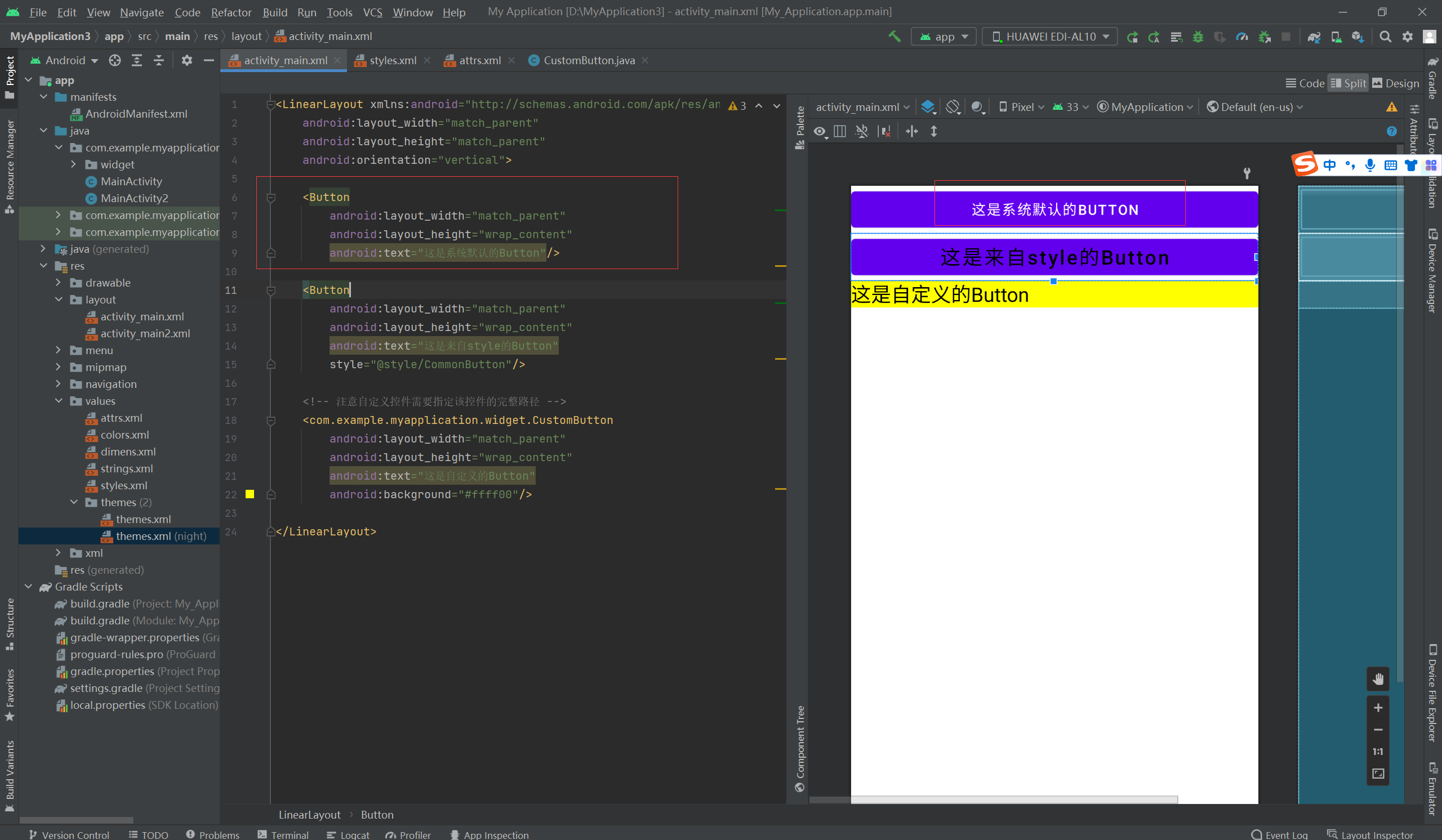
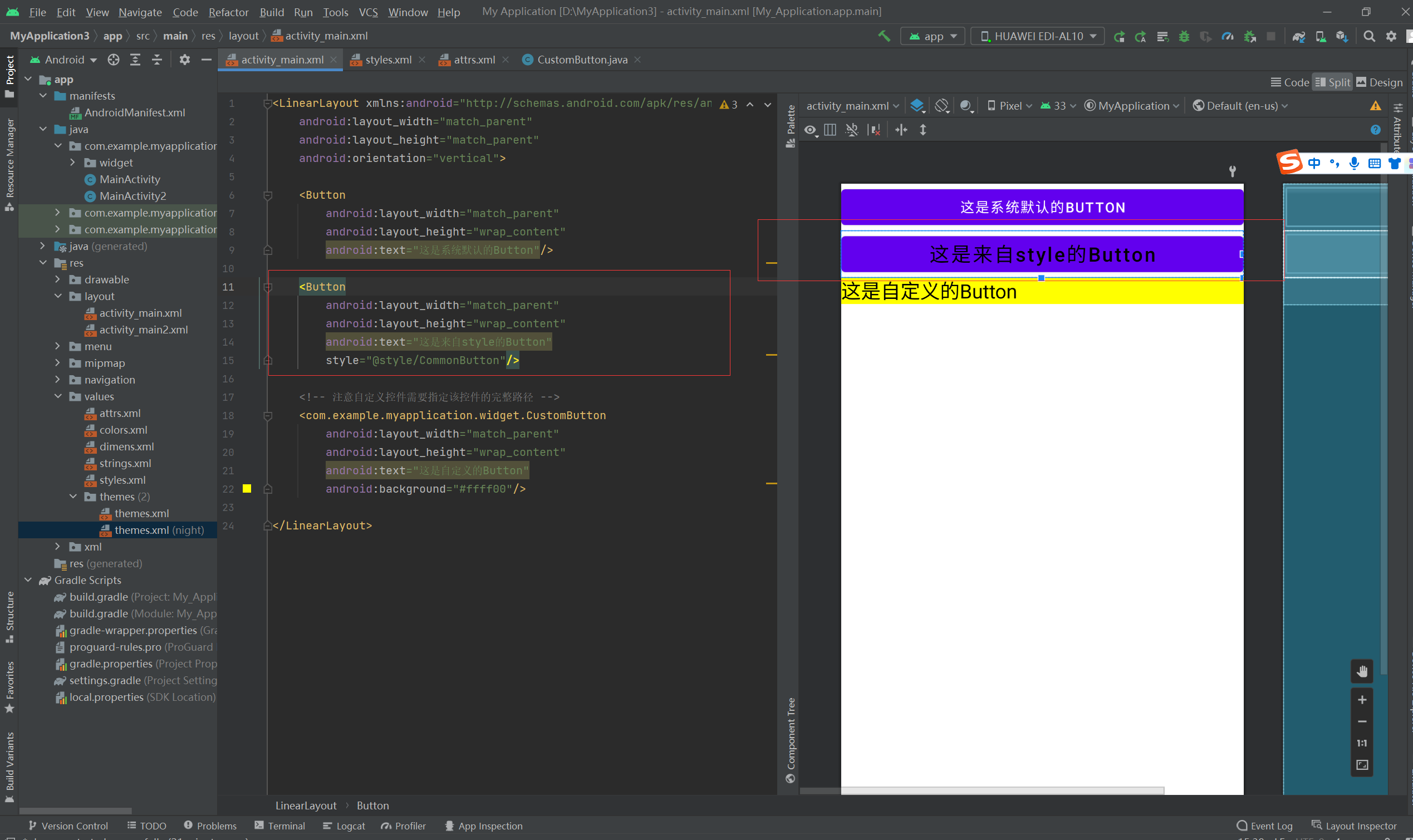
第二个,来自style的button

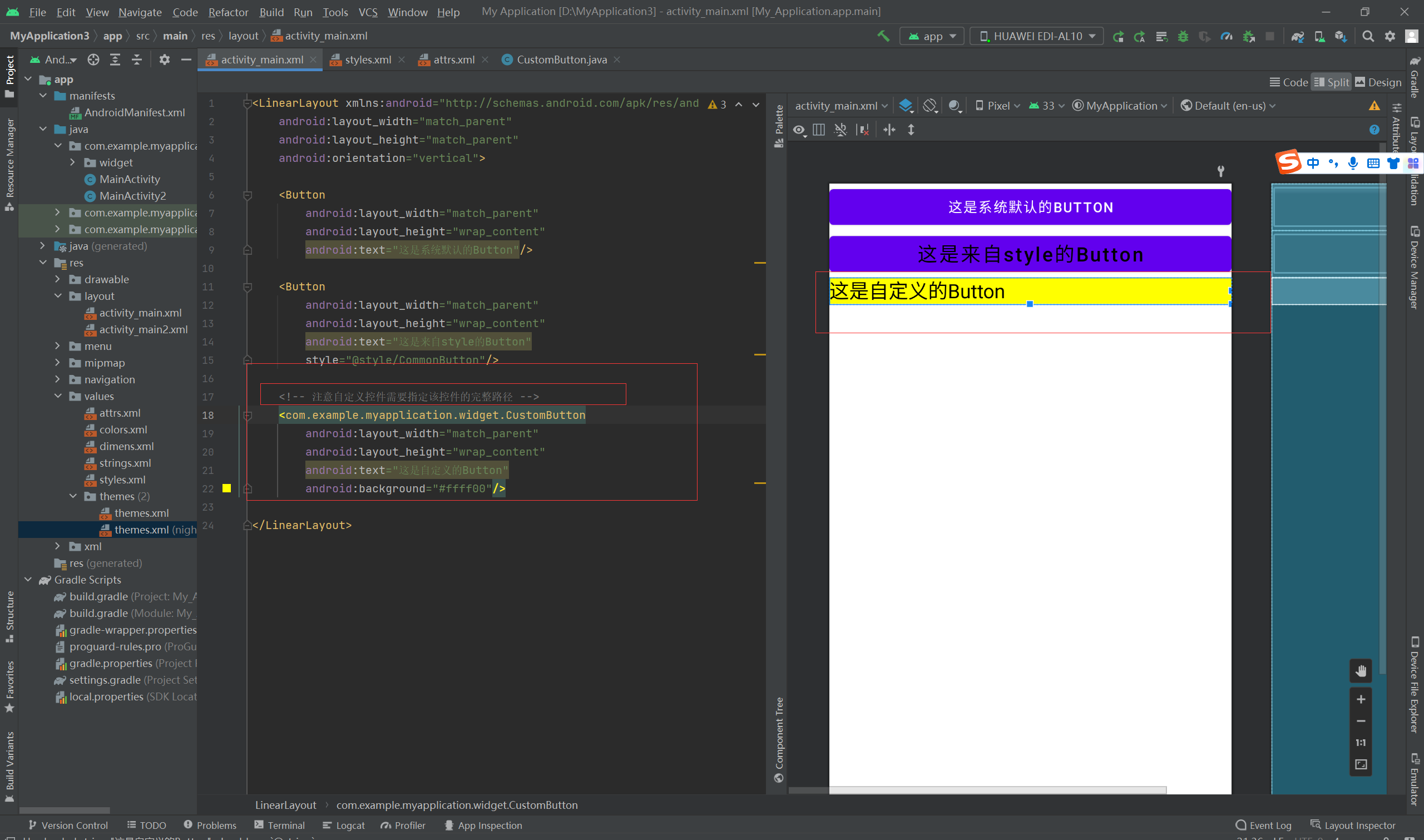
第三个,自定义样式
- <LinearLayout xmlns:android="http://schemas.android.com/apk/res/android"
- android:layout_width="match_parent"
- android:layout_height="match_parent"
- android:orientation="vertical">
-
- <Button
- android:layout_width="match_parent"
- android:layout_height="wrap_content"
- android:text="这是系统默认的Button"/>
-
- <Button
- android:layout_width="match_parent"
- android:layout_height="wrap_content"
- android:text="这是来自style的Button"
- style="@style/CommonButton"/>
-
- <!-- 注意自定义控件需要指定该控件的完整路径 -->
- <com.example.myapplication.widget.CustomButton
- android:layout_width="match_parent"
- android:layout_height="wrap_content"
- android:text="这是自定义的Button"
- android:background="#ffff00"/>
-
- </LinearLayout>

第三个参数:defStyleAttr,指定默认的样式属性:
- <?xml version="1.0" encoding="utf-8"?>
- <resources>
-
- <declare-styleable name="CustomButton">
- <attr name="customButtonStyle" format="reference" />
- </declare-styleable>
-
- </resources>

- <resources>
-
- <!-- Base application theme. -->
- <style name="AppTheme" parent="Theme.AppCompat.Light.DarkActionBar">
- <!-- Customize your theme here. -->
- <item name="colorPrimary">@color/colorPrimary</item>
- <item name="colorPrimaryDark">@color/colorPrimaryDark</item>
- <item name="colorAccent">@color/colorAccent</item>
- <item name="customButtonStyle">@style/CommonButton</item>
- </style>
-
-
-
-
- <style name="CommonButton">
- <item name="android:textAllCaps">false</item>
- <item name="android:textColor">#000000</item>
- <item name="android:textSize">20sp</item>
- </style>
-
- </resources>

代码:
- package com.example.myapplication.widget;
-
- import android.annotation.SuppressLint;
- import android.content.Context;
- import android.util.AttributeSet;
- import android.util.Log;
- import android.widget.Button;
- import com.example.myapplication.R;
-
- @SuppressLint("AppCompatCustomView")
- public class CustomButton extends Button
- {
- private final static String TAG = "CustomButton";
-
- public CustomButton(Context context)
- {
- super(context);
- Log.d(TAG, "只有一个输入参数");
- }
-
- public CustomButton(Context context, AttributeSet attrs)
- {
- this(context, attrs, R.attr.customButtonStyle);
- Log.d(TAG, "有两个输入参数");
- }
-
- public CustomButton(Context context, AttributeSet attrs, int defStyleAttr)
- {
- // 使defStyleAttr奏效的三个条件:
- // 1、attrs.xml增加定义风格属性(如customButtonStyle),且format值为reference
- // 2、styles.xml增加某种风格的样式定义(如CommonButton)
- // 3、AndroidManifest.xml的application节点的android:theme指定了哪个主题(如AppTheme),就在该主题内部补充风格属性与样式的对应关系,如
- //
- @style/CommonButton
- //super(context, attrs, defStyleAttr); // 设置默认的样式属性
- // 下面不使用defStyleAttr,直接使用R.style.CommonButton定义的样式
- this(context, attrs, 0, R.style.CommonButton);
- Log.d(TAG, "有三个输入参数");
-
- }
-
- @SuppressLint("NewApi")
- public CustomButton(Context context, AttributeSet attrs, int defStyleAttr, int defStyleRes)
- {
- super(context, attrs, defStyleAttr, defStyleRes);
- Log.d(TAG, "有四个输入参数");
-
- }
- }


