-
CSS3之两面翻转的盒子案例
目录
第一步:不多说,首先我们先来一个框架
- html>
- <html>
- <head>
- <meta charset="utf-8">
- <title>title>
- head>
- <body>
- body>
- html>
第二步:添加两个盒子
- html>
- <html>
- <head>
- <meta charset="utf-8">
- <title>title>
- head>
- <body>
- <div class="bodys">
- <div class="first">我是翻转前div>
- <div class="two">我是翻转后div>
- div>
- body>
- html>
第三步:这里的话我们先给最大盒子添加一下样式
- html>
- <html>
- <head>
- <meta charset="utf-8">
- <title>title>
- head>
- <style>
- #bodys {
- position: relative;
- width: 350px;
- height: 350px;
- transform-style: preserve-3d; /*这个属性就是让其出现翻转效果的核心*/
- margin: 200px auto;
- }
- style>
- <body>
- <div id="bodys">
- <div class="first">我是翻转前div>
- <div class="two">我是翻转后div>
- div>
- body>
- html>
这里的话我给大合照加了一个宽高,和外边距主要是改变一下位置,方便我们看变化,其中
transform-style: preserve-3d;属性
第四步:我们给两个div小盒子添加一下样式
- html>
- <html>
- <head>
- <meta charset="utf-8">
- <title>title>
- head>
- <style>
- #bodys {
- position: relative;
- width: 350px;
- height: 350px;
- transform-style: preserve-3d;
- /*这个属性就是让其出现翻转效果的核心*/
- margin: 200px auto;
- }
- .first,
- .two {
- position: absolute;
- top: 0;
- left: 0;
- width: 100%;
- height: 100%;
- text-align: center;
- line-height: 300px;
- color: aqua;
- border-radius: 50%;
- font-size: 20px;
- }
- style>
- <body>
- <div id="bodys">
- <div class="first">我是翻转前div>
- <div class="two">我是翻转后div>
- div>
- body>
- html>
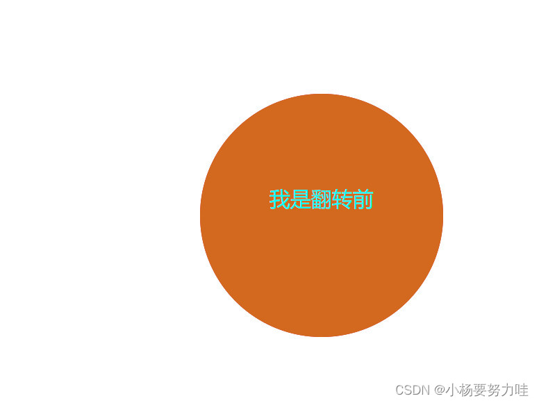
这里出现这样的原因是因为我们还没有添加背景颜色,现在给添加上
第五步:添加背景颜色
- html>
- <html>
- <head>
- <meta charset="utf-8">
- <title>title>
- head>
- <style>
- #bodys {
- position: relative;
- width: 350px;
- height: 350px;
- transform-style: preserve-3d;
- /*这个属性就是让其出现翻转效果的核心*/
- margin: 200px auto;
- }
- .first,
- .two {
- position: absolute;
- top: 0;
- left: 0;
- width: 100%;
- height: 100%;
- font-size: 30px;
- text-align: center;
- line-height: 300px;
- color: aqua;
- border-radius: 50%;
- }
- .first {
- background-color: chocolate;
- }
- .two {
- background-color: crimson;
- }
- style>
- <body>
- <div id="bodys">
- <div class="first">我是翻转前div>
- <div class="two">我是翻转后div>
- div>
- body>
- html>
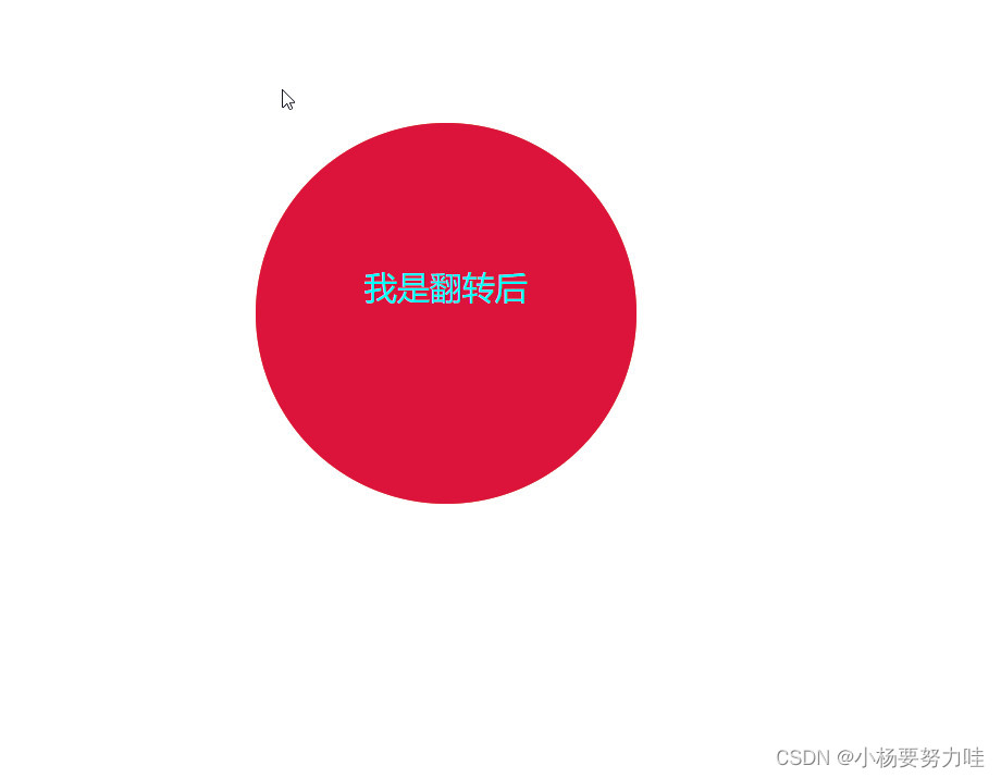
大家可以发现,虽然说我们的动画还没开始动,但现在是不是应该就相当于动画做好后,反翻转前,所以是不是应该显示的是翻转前的圆?这里我们就要用到z-index
第七步:调整代码
- html>
- <html>
- <head>
- <meta charset="utf-8">
- <title>title>
- head>
- <style>
- #bodys {
- position: relative;
- width: 350px;
- height: 350px;
- transform-style: preserve-3d;
- /*这个属性就是让其出现翻转效果的核心*/
- margin: 200px auto;
- }
- .first,
- .two {
- position: absolute;
- top: 0;
- left: 0;
- width: 100%;
- height: 100%;
- font-size: 30px;
- text-align: center;
- line-height: 300px;
- color: aqua;
- border-radius: 50%;
- }
- .first {
- background-color: chocolate;
- z-index:999;
- }
- .two {
- background-color: crimson;
- }
- style>
- <body>
- <div id="bodys">
- <div class="first">我是翻转前div>
- <div class="two">我是翻转后div>
- div>
- body>
- html>
这样就达到了我们想要的效果,那么准备工作都做好了,所以我们现在就开始做动画啦
第八步:制作动画
- html>
- <html>
- <head>
- <meta charset="utf-8">
- <title>title>
- head>
- <style>
- #bodys {
- position: relative;
- width: 350px;
- height: 350px;
- /*这个属性就是让其出现翻转效果的核心*/
- margin: 200px auto;
- transform-style: preserve-3d;
- transition: all 0.5s;
- }
- #bodys:hover {
- transform: rotateY(180deg);
- }
- .first,
- .two {
- position: absolute;
- top: 0;
- left: 0;
- width: 100%;
- height: 100%;
- font-size: 30px;
- text-align: center;
- line-height: 300px;
- color: aqua;
- border-radius: 50%;
- }
- .first {
- background-color: chocolate;
- z-index: 999;
- }
- .two {
- background-color: crimson;
- }
- style>
- <body>
- <div id="bodys">
- <div class="first">我是翻转前div>
- <div class="two">我是翻转后div>
- div>
- body>
- html>
这里我们给#bodys添加了一个transform: rotateY(180deg); 目前的话我们已经可以初步实现翻转了,但背景色和文字还没有改变,所以我们要继续添加
第九步:优化
- html>
- <html>
- <head>
- <meta charset="utf-8">
- <title>title>
- head>
- <style>
- #bodys {
- position: relative;
- width: 350px;
- height: 350px;
- /*这个属性就是让其出现翻转效果的核心*/
- margin: 200px auto;
- transform-style: preserve-3d;
- transition: all 0.5s;
- }
- #bodys:hover {
- transform: rotateY(180deg);
- }
- .first,
- .two {
- position: absolute;
- top: 0;
- left: 0;
- width: 100%;
- height: 100%;
- font-size: 30px;
- text-align: center;
- line-height: 300px;
- color: aqua;
- border-radius: 50%;
- }
- .first {
- background-color: chocolate;
- z-index: 999;
- }
- .two {
- background-color: crimson;
- transform: rotateY(180deg);
- }
- style>
- <body>
- <div id="bodys">
- <div class="first">我是翻转前div>
- <div class="two">我是翻转后div>
- div>
- body>
- html>
这里的话我们给。two添加了一个翻转,原因是因为前面的代码实现的效果都是.first的内容,所以我们想要。two实现,就要给他加一个翻转,这里是个人理解,初步接触这一块,不确定一定对
下方附上全部代码
- html>
- <html>
- <head>
- <meta charset="utf-8">
- <title>title>
- head>
- <style>
- #bodys {
- position: relative;
- width: 350px;
- height: 350px;
- /*这个属性就是让其出现翻转效果的核心*/
- margin: 200px auto;
- transform-style: preserve-3d;
- transition: all 0.5s;
- }
- #bodys:hover {
- transform: rotateY(180deg);
- }
- .first,
- .two {
- position: absolute;
- top: 0;
- left: 0;
- width: 100%;
- height: 100%;
- font-size: 30px;
- text-align: center;
- line-height: 300px;
- color: aqua;
- border-radius: 50%;
- }
- .first {
- background-color: chocolate;
- z-index: 999;
- }
- .two {
- background-color: crimson;
- transform: rotateY(180deg);
- }
- style>
- <body>
- <div id="bodys">
- <div class="first">我是翻转前div>
- <div class="two">我是翻转后div>
- div>
- body>
- html>
-
相关阅读:
使用Go和Node.js构建用静态脚本进行数据解析的TCP服务器
08.23递归 以及python算法(快排,冒泡,选择)
LVS集群
【Linux】程序地址空间
第三阶段第一章——PySpark实战
Mysql-Xtrabackup备份恢复
【Rust日报】2022-12-05 探索 docker 的 WASM 技术预览
The ‘<‘ operator is reserved for future use. 错误解决
shell脚本入门
vue2.6 + ts 使用vuex
- 原文地址:https://blog.csdn.net/tea_tea_/article/details/125897494
