-
让她/他心动的520/521告白方法(9个方法+链接+代码,原生HTML+CSS+JS实现)
文章目录
一、pikachu告白信件
详细步骤教程(https://blog.csdn.net/weixin_44009656/article/details/124822366?utm_source=app&app_version=5.4.0&code=app_1562916241&uLinkId=usr1mkqgl919blen)
1.效果图

2.代码
1.envelope.html
<!DOCTYPE html> <html lang="en"> <head> <meta charset="UTF-8"> <title>envelope</title> <link rel="stylesheet" href="envelope.css"> </head> <body> <div class="container" > <div class="envelope" ></div> <div class="card" id="test"> <!-- 添加文案--> <h1 class="message" >WILL YOU BE MY VALENTINE?</h1> <div class="pikachu"> <div class="limbs"></div> <div class="heart"></div> <div class="arms"></div> <div class="smile"></div> </div> </div> <div class="cover"></div> <div class="lid"></div> <div class="shadow"></div> </div> <script> window.onload = function (){ var go = document.getElementById("test"); go.onclick = function (){ location.href = "./pikachu.html" } } </script> </body> </html>- 1
- 2
- 3
- 4
- 5
- 6
- 7
- 8
- 9
- 10
- 11
- 12
- 13
- 14
- 15
- 16
- 17
- 18
- 19
- 20
- 21
- 22
- 23
- 24
- 25
- 26
- 27
- 28
- 29
- 30
- 31
- 32
- 33
- 34
2.envelope.css
@import url('https://fonts.googleapis.com/css2?family=Pangolin&display=swap'); /*重置浏览器样式*/ * { margin: 0; padding: 0; } /* 使主体居中 vw:视窗宽度的百分比(1vw 代表视窗的宽度为 1%) vh:视窗高度的百分比 */ body { height: 100vh; width: 100vw; background: #FFE3EC; font-family: 'Pangolin', cursive; font-size: 1vmin; /*弹性布局*/ display: flex; /*设置flex子项在每个flex行的交叉轴上的中心对齐,交叉轴方向为column,即垂直方向**/ align-items: center; /*设置flex子项在主轴上的中心对齐*/ justify-content: center; } /* 使用相对定位(什么时候用相对定位或绝对定位?在文档流中相对定位的元素占有位置,而且会影响后面的元素(块元素、行内块元素),比如两个div并排,另外一个会换行。而绝对定位就是把该元素从文档流中踢出,不会占用文档流的位置,也不会影响后面的元素。) vmin:当前 vw 和 vh 中较小的一个值 vmax:当前 vw 和 vh 中较大的一个值 */ .container { position: relative; top: 0vmin; } /*相对定位,并设置背景色和大小*/ .envelope { position: relative; background: #eb7885; height: 30vmin; width: 48vmin; } /*.cover {*/ /* position: absolute;*/ /* height: 0;*/ /* width: 0;*/ /* border-bottom: 15vmin solid #f5b5bb;*/ /* border-left: 24vmin solid transparent;*/ /* border-right: 24vmin solid transparent;*/ /* top: 15vmin;*/ /* z-index: 3;*/ /*}*/ /*.cover::after { !*left triangle*!*/ /* position: absolute;*/ /* content: '';*/ /* border-left: 24.5vmin solid #0a0a0a;*/ /* border-bottom: 15vmin solid transparent;*/ /* border-top: 15vmin solid transparent;*/ /* top: -15vmin;*/ /* left: -24vmin;*/ /*}*/ /*.cover::before {*/ /* position: absolute;*/ /* content: '';*/ /* border-right: 24.5vmin solid #0a0a0a;*/ /* border-bottom: 15vmin solid transparent;*/ /* border-top: 15vmin solid transparent;*/ /* top: -15vmin;*/ /* left: -0.5vmin;*/ /*}*/ .cover { position: absolute; height: 0; width: 0; border-bottom: 15vmin solid #f5b5bb; border-left: 24vmin solid transparent; border-right: 24vmin solid transparent; top: 15vmin; z-index: 3; } .cover::after { /*left triangle*/ position: absolute; content: ''; border-left: 24.5vmin solid #ffbbc1; border-bottom: 15vmin solid transparent; border-top: 15vmin solid transparent; top: -15vmin; left: -24vmin; } .cover::before { position: absolute; content: ''; border-right: 24.5vmin solid #ffbbc1; border-bottom: 15vmin solid transparent; border-top: 15vmin solid transparent; top: -15vmin; left: -0.5vmin; } /*创建信件打开的动画,使用rotateX(),围绕其在给定的度数在x轴旋转*/ @keyframes open { 100% { transform: rotatex(180deg); } } /*信件合上的动画*/ @keyframes open-rev { from { transform: rotatex(-180deg); } } .lid { position: absolute; height: 0; width: 0; border-top: 15vmin solid #ff8896; border-left: 24vmin solid transparent; border-right: 24vmin solid transparent; top: 0; /*设置旋转元素的基点位置,为盒子的顶部边缘*/ transform-origin: top; animation: open-rev 2s; } .container:hover .lid { animation: open 0.5s; animation-fill-mode: forwards; } @keyframes slide { 100% { transform: translatey(-15vmin); z-index: 2; } } @keyframes slide-rev { from { transform: translatey(-15vmin); } } .card { position: absolute; /*白色的卡片*/ background: white; height: 25vmin; width: 43vmin; display: flex; /*设置div水平显示*/ flex-direction: column; /*设置flex子项在每个flex行的交叉轴上的中心对齐,交叉轴方向为column,即垂直方向**/ align-items: center; /*设置flex子项在主轴上的中心对齐*/ justify-content: center; left: 2.5vmin; top: 0vmin; animation: slide-rev 0.2s ease-out; } .message { position: absolute; top: 5vmin; } .pikachu { position: absolute; background: #f9ebaa; height: 8vmin; width: 10vmin; border-radius: 40%; top: 15vmin; display: flex; } .pikachu::before { content: ''; position: absolute; background: #f9ebaa; height: 6vmin; width: 9vmin; border-radius: 90% 90% 60% 60%; top: -4vmin; left: 0.5vmin; } .pikachu::after { content: ''; position: absolute; background: transparent; height: 1vmin; width: 1vmin; top: 2vmin; left: -1.5vmin; color: #4a4947; border-radius: 50%; box-shadow: 4vmin -3.5vmin, 8vmin -3.5vmin, 2vmin -2vmin #fad598, 10vmin -2vmin #fad598, 3vmin 5vmin #f9ebaa, 9.3vmin 5vmin #f9ebaa; } .limbs { position: relative; width: 0; height: 0; border-left: 1vmin solid transparent; border-right: 1vmin solid transparent; border-bottom: 6vmin solid #f9ebaa; border-radius: 80%; top: -6vmin; left: 1vmin; transform: rotate(-20deg); } .limbs::before { content: ''; position: absolute; background: #f9ebaa; width: 5vmin; height: 2vmin; border-radius: 40%; top: 10vmin; left: 4vmin; box-shadow: -1vmin 1.5vmin #f9ebaa; } .limbs::after { content: ''; position: absolute; width: 0; height: 0; border-left: 1vmin solid transparent; border-right: 1vmin solid transparent; border-bottom: 6vmin solid #f9ebaa; border-radius: 80%; top: 3vmin; left: 5vmin; transform: rotate(40deg); } .heart { position: relative; width: 5vmin; height: 4vmin; top: 2vmin; left: 0.6vmin; } .heart:before, .heart:after { position: absolute; content: ""; left: 2.5vmin; top: 0; width: 2.5vmin; height: 4vmin; background: #fc978b; border-radius: 2.5vmin 2.5vmin 0 0; transform: rotate(-45deg); transform-origin: 0 100%; } .heart:after { left: 0; transform: rotate(45deg); transform-origin: 100% 100%; } .smile { position: relative; background: transparent; height: 1vmin; width: 1vmin; border-radius: 50%; border-bottom: 0.3vmin solid #4a4947; left: -5vmin; top: -1.3vmin; } .smile::before { position: absolute; content: ''; background: transparent; height: 1vmin; width: 1vmin; border-radius: 50%; border-bottom: 0.3vmin solid #4a4947; left: 0.7vmin; } .arms { position: relative; background: #f9ebaa; width: 4.2vmin; height: 2vmin; border-radius: 60% 60% 90% 60% / 50% 50% 90% 90%; top: 3vmin; left: -5vmin; } .arms::after { content: ''; position: absolute; background: #f9ebaa; width: 4vmin; height: 2vmin; border-radius: 60% 60% 90% 60% / 50% 50% 90% 90%; left: 5vmin; top: 0vmin; } .container:hover .card { animation: slide 0.2s; animation-delay: 0.5s; animation-fill-mode: forwards; } .shadow { position: relative; top: 3vmin; border-radius: 50%; opacity: 0.7; height: 2vmin; width: 48vmin; background: #e8c5d0; }- 1
- 2
- 3
- 4
- 5
- 6
- 7
- 8
- 9
- 10
- 11
- 12
- 13
- 14
- 15
- 16
- 17
- 18
- 19
- 20
- 21
- 22
- 23
- 24
- 25
- 26
- 27
- 28
- 29
- 30
- 31
- 32
- 33
- 34
- 35
- 36
- 37
- 38
- 39
- 40
- 41
- 42
- 43
- 44
- 45
- 46
- 47
- 48
- 49
- 50
- 51
- 52
- 53
- 54
- 55
- 56
- 57
- 58
- 59
- 60
- 61
- 62
- 63
- 64
- 65
- 66
- 67
- 68
- 69
- 70
- 71
- 72
- 73
- 74
- 75
- 76
- 77
- 78
- 79
- 80
- 81
- 82
- 83
- 84
- 85
- 86
- 87
- 88
- 89
- 90
- 91
- 92
- 93
- 94
- 95
- 96
- 97
- 98
- 99
- 100
- 101
- 102
- 103
- 104
- 105
- 106
- 107
- 108
- 109
- 110
- 111
- 112
- 113
- 114
- 115
- 116
- 117
- 118
- 119
- 120
- 121
- 122
- 123
- 124
- 125
- 126
- 127
- 128
- 129
- 130
- 131
- 132
- 133
- 134
- 135
- 136
- 137
- 138
- 139
- 140
- 141
- 142
- 143
- 144
- 145
- 146
- 147
- 148
- 149
- 150
- 151
- 152
- 153
- 154
- 155
- 156
- 157
- 158
- 159
- 160
- 161
- 162
- 163
- 164
- 165
- 166
- 167
- 168
- 169
- 170
- 171
- 172
- 173
- 174
- 175
- 176
- 177
- 178
- 179
- 180
- 181
- 182
- 183
- 184
- 185
- 186
- 187
- 188
- 189
- 190
- 191
- 192
- 193
- 194
- 195
- 196
- 197
- 198
- 199
- 200
- 201
- 202
- 203
- 204
- 205
- 206
- 207
- 208
- 209
- 210
- 211
- 212
- 213
- 214
- 215
- 216
- 217
- 218
- 219
- 220
- 221
- 222
- 223
- 224
- 225
- 226
- 227
- 228
- 229
- 230
- 231
- 232
- 233
- 234
- 235
- 236
- 237
- 238
- 239
- 240
- 241
- 242
- 243
- 244
- 245
- 246
- 247
- 248
- 249
- 250
- 251
- 252
- 253
- 254
- 255
- 256
- 257
- 258
- 259
- 260
- 261
- 262
- 263
- 264
- 265
- 266
- 267
- 268
- 269
- 270
- 271
- 272
- 273
- 274
- 275
- 276
- 277
- 278
- 279
- 280
- 281
- 282
- 283
- 284
- 285
- 286
- 287
- 288
- 289
- 290
- 291
- 292
- 293
- 294
- 295
- 296
- 297
- 298
- 299
- 300
- 301
- 302
- 303
- 304
- 305
- 306
- 307
- 308
- 309
- 310
- 311
- 312
- 313
- 314
- 315
- 316
- 317
- 318
- 319
- 320
- 321
- 322
- 323
- 324
- 325
- 326
- 327
- 328
- 329
- 330
- 331
- 332
- 333
- 334
- 335
- 336
- 337
- 338
- 339
- 340
3.pikachu.html
<!DOCTYPE html> <html lang="en"> <head> <meta charset="UTF-8"> <title>pikachu</title> <link rel="stylesheet" href="pikachu.css"> </head> <body> <div class="wrapper"> <h2>Will you be my valentine?</h2> <div class="pikachu"> <div class="head"> <div class="ears left brown"><div class="ears-inside yellow"></div></div> <div class="ears right brown"><div class="ears-inside yellow"></div></div> <div class="face yellow"> <span class="eye left brown"></span> <span class="eye right brown"></span> <span class="mouth">w</span> <span class="cachete left"></span> <span class="cachete right"></span> </div> </div> <div class="body yellow"> <div class="heart"></div> <div class="paw left yellow"></div> <div class="paw right yellow"></div> </div> <div class="leg left yellow-dark"></div> <div class="leg right yellow-dark"></div> <div class="tail yellow-dark"></div> </div> </div> </body> </html>- 1
- 2
- 3
- 4
- 5
- 6
- 7
- 8
- 9
- 10
- 11
- 12
- 13
- 14
- 15
- 16
- 17
- 18
- 19
- 20
- 21
- 22
- 23
- 24
- 25
- 26
- 27
- 28
- 29
- 30
- 31
- 32
- 33
- 34
- 35
- 36
4.pikachu.css
@import url(https://fonts.googleapis.com/css?family=Loved+by+the+King); body,html { background: #FFE3EC; height:100%; font-family: 'Loved by the King', cursive; } div, ul, span{ display: block; position: absolute; margin: auto; padding: 0; top: 0; bottom: 0; right: 0; left: 0; } .brown { background-color: #452211;} .yellow { background-color: #ffd814} .yellow-dark { background-color: #e0a100} .wrapper { height: 450px; width: 300px; } h2 { text-transform: uppercase; text-align: center; font-size: 2em; color: #452211; } .pikachu{ top: auto; height: 65%; width: 140px; } .pikachu::before { position: absolute; content: ''; background: rgba(0,0,0,0.15); height: 10px; width: 90%; margin: auto; left: 0; right: 0; bottom: 95px; border-radius: 50%; } .pikachu .head { bottom: auto; height: 120px; width: 120px; z-index: 3; } .pikachu .head .face{ width: 120px; height: 70px; top: auto; border-radius: 40px 40px 30px 30px; z-index: 2; } .face .eye { width: 14px; height: 14px; border-radius: 50%; bottom: auto; top: 28px; -webkit-animation: blink 4s infinite; } .eye.left { right: auto; left: 32px; } .eye.right { left: auto; right: 32px; } .face .mouth { text-align: center; height: 10px; } .face .cachete { width: 16px; height: 16px; border-radius: 50%; bottom: auto; top: 38px; background-color: #e64900; z-index: 9; } .cachete.left { right: auto; left: 10px; } .cachete.right { left: auto; right: 10px; } .pikachu .head .ears{ width: 20px; height: 90px; bottom: auto; border-radius: 50%; overflow: hidden; z-index: 1; } .ears.left{ right: auto; left: 10px; } .ears.right{ left: auto; right: 10px; } .ears .ears-inside{ top: auto; height: 70px; width: 30px; border-radius: 50%; } .ears.right .ears-inside{ position: absolute; left: -50%; } .pikachu .body { bottom: auto; top: 80px; height: 105px; width: 130px; border-radius: 80px 80px 40px 40px; overflow: hidden; z-index: 2; } .pikachu .body .paw{ bottom: auto; top: 50px; height: 15px; width: 30px; z-index: 9; border-bottom: 1px solid #e0a100; border-top: 1px solid #FFFFFF; } .pikachu .body .paw.left{ right: auto; left: 15px; border-radius: 0 50% 50% 0; } .pikachu .body .paw.right{ left: auto; right: 15px; border-radius: 50% 0 0 50%; } .pikachu .body .heart { width: 40px; height: 40px; bottom: auto; top: 10px; z-index: 8; animation:beat 0.45s infinite; -webkit-animation:beat 0.45s infinite; } .pikachu .body .heart:before, .pikachu .body .heart:after { position: absolute; content: ""; left: 20px; top: 30px; width: 50%; height: 100%; background: #e64900; -moz-border-radius: 20px 20px 0 0; border-radius: 10px 10px 0 0; -webkit-transform: rotate(-45deg); -moz-transform: rotate(-45deg); -ms-transform: rotate(-45deg); -o-transform: rotate(-45deg); transform: rotate(-45deg); -webkit-transform-origin: 0 100%; -moz-transform-origin: 0 100%; -ms-transform-origin: 0 100%; -o-transform-origin: 0 100%; transform-origin: 0 100%; } .pikachu .body .heart:after { left: 0px; -webkit-transform: rotate(45deg); -moz-transform: rotate(45deg); -ms-transform: rotate(45deg); -o-transform: rotate(45deg); transform: rotate(45deg); -webkit-transform-origin: 100% 100%; -moz-transform-origin: 100% 100%; -ms-transform-origin: 100% 100%; -o-transform-origin: 100% 100%; transform-origin :100% 100%; } .pikachu .leg { z-index: 1; bottom: auto; top: 172px; height: 20px; width: 30px; } .pikachu .leg.left { right: auto; left: 20px; border-radius: 80px 10px 80px 10px; } .pikachu .leg.right { left: auto; right: 20px; border-radius: 10px 80px 10px 80px; } .pikachu .tail { z-index: 1; height: 40px; width: 50px; left:auto; bottom: auto; top: 70px; border-radius: 10% 30%; } .signature { position: absolute; margin: auto; bottom: 0; top: auto; } .signature p{ text-align: center; font-family: Helvetica, Arial, Sans-Serif; font-size: 0.85em; } .signature .much-heart{ display: inline-block; position: relative; margin: 0 4px; height: 10px; width: 10px; background: #AC1D3F; border-radius: 4px; -ms-transform: rotate(45deg); -webkit-transform: rotate(45deg); transform: rotate(45deg); } .signature .much-heart::before, .signature .much-heart::after { display: block; content: ''; position: absolute; margin: auto; height: 10px; width: 10px; border-radius: 5px; background: #AC1D3F; top: -4px; } .signature .much-heart::after { bottom: 0; top: auto; left: -4px; } .signature a { color: #333; text-decoration: none; font-weight: bold; } @keyframes blink{ 0% { height: 14px; top: 28px;} 5% { height: 2px; top: 34px;} 10% { height: 14px; top: 28px;} 40% { height: 14px; top: 28px;} 50% { height: 2px; top: 34px;} 55% { height: 14px; top: 28px;} 100% { height: 14px; top: 28px;} }- 1
- 2
- 3
- 4
- 5
- 6
- 7
- 8
- 9
- 10
- 11
- 12
- 13
- 14
- 15
- 16
- 17
- 18
- 19
- 20
- 21
- 22
- 23
- 24
- 25
- 26
- 27
- 28
- 29
- 30
- 31
- 32
- 33
- 34
- 35
- 36
- 37
- 38
- 39
- 40
- 41
- 42
- 43
- 44
- 45
- 46
- 47
- 48
- 49
- 50
- 51
- 52
- 53
- 54
- 55
- 56
- 57
- 58
- 59
- 60
- 61
- 62
- 63
- 64
- 65
- 66
- 67
- 68
- 69
- 70
- 71
- 72
- 73
- 74
- 75
- 76
- 77
- 78
- 79
- 80
- 81
- 82
- 83
- 84
- 85
- 86
- 87
- 88
- 89
- 90
- 91
- 92
- 93
- 94
- 95
- 96
- 97
- 98
- 99
- 100
- 101
- 102
- 103
- 104
- 105
- 106
- 107
- 108
- 109
- 110
- 111
- 112
- 113
- 114
- 115
- 116
- 117
- 118
- 119
- 120
- 121
- 122
- 123
- 124
- 125
- 126
- 127
- 128
- 129
- 130
- 131
- 132
- 133
- 134
- 135
- 136
- 137
- 138
- 139
- 140
- 141
- 142
- 143
- 144
- 145
- 146
- 147
- 148
- 149
- 150
- 151
- 152
- 153
- 154
- 155
- 156
- 157
- 158
- 159
- 160
- 161
- 162
- 163
- 164
- 165
- 166
- 167
- 168
- 169
- 170
- 171
- 172
- 173
- 174
- 175
- 176
- 177
- 178
- 179
- 180
- 181
- 182
- 183
- 184
- 185
- 186
- 187
- 188
- 189
- 190
- 191
- 192
- 193
- 194
- 195
- 196
- 197
- 198
- 199
- 200
- 201
- 202
- 203
- 204
- 205
- 206
- 207
- 208
- 209
- 210
- 211
- 212
- 213
- 214
- 215
- 216
- 217
- 218
- 219
- 220
- 221
- 222
- 223
- 224
- 225
- 226
- 227
- 228
- 229
- 230
- 231
- 232
- 233
- 234
- 235
- 236
- 237
- 238
- 239
- 240
- 241
- 242
- 243
- 244
- 245
- 246
- 247
- 248
- 249
- 250
- 251
- 252
- 253
- 254
- 255
- 256
- 257
- 258
- 259
- 260
- 261
- 262
- 263
- 264
- 265
- 266
- 267
- 268
- 269
- 270
- 271
- 272
- 273
- 274
- 275
- 276
- 277
- 278
- 279
- 280
- 281
- 282
- 283
- 284
- 285
- 286
- 287
- 288
- 289
- 290
- 291
- 292
- 293
- 294
- 295
- 296
- 297
- 298
- 299
- 300
- 301
- 302
- 303
- 304
- 305
- 306
- 307
- 308
- 309
- 310
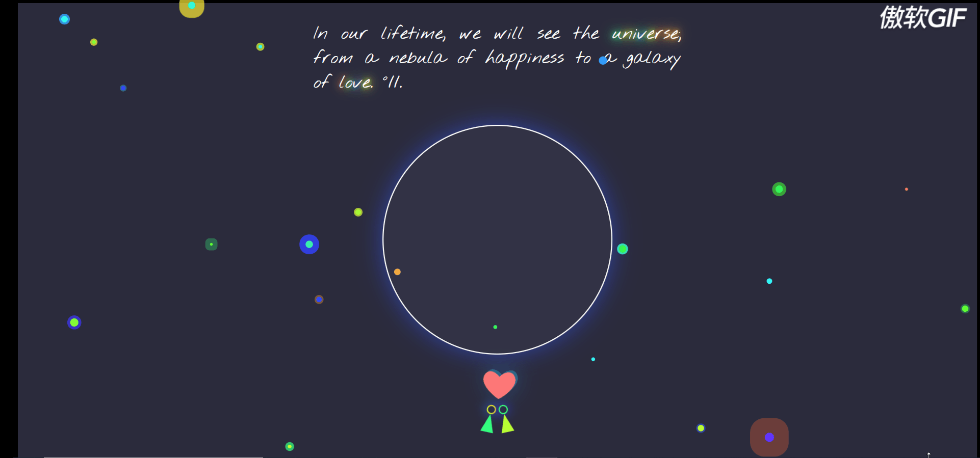
二、告白小宇宙
1.效果图
2.代码
1.index.html
<!DOCTYPE html> <html lang="en"> <head> <meta charset="UTF-8"> <title>universe love</title> </head> <body> <link href='https://fonts.googleapis.com/css?family=Nothing+You+Could+Do' rel='stylesheet' type='text/css'> <link href='https://fonts.googleapis.com/css?family=Playfair+Display&text=°//.'rel='stylesheet' type='text/css'> <link href='https://fonts.googleapis.com/css?family=Codystar' rel='stylesheet' type='text/css'> <link rel="stylesheet" href="index.css"> <p>In our lifetime, we will see the <span>u</span><span>n</span><span>i</span><span>v</span><span>e</span><span>r</span><span>s</span><span>e</span>; from a nebula of happiness to a galaxy of <span>l</span><span>o</span><span>v</span><span>e</span>. °//.</p> <ul class="stars"> <li></li> <li></li> <li></li> <li></li> <li></li> <li></li> <li></li> <li></li> <li></li> <li></li> <li></li> <li></li> <li></li> <li></li> <li></li> <li></li> <li></li> <li></li> <li></li> <li></li> <li></li> <li></li> </ul> <div class="universe"> <div class="earth"></div> <div class="heart"></div> <div class="cutie girl"></div> <div class="cutie boy"></div> </div> </body> </html>- 1
- 2
- 3
- 4
- 5
- 6
- 7
- 8
- 9
- 10
- 11
- 12
- 13
- 14
- 15
- 16
- 17
- 18
- 19
- 20
- 21
- 22
- 23
- 24
- 25
- 26
- 27
- 28
- 29
- 30
- 31
- 32
- 33
- 34
- 35
- 36
- 37
- 38
- 39
- 40
- 41
- 42
- 43
- 44
- 45
- 46
2.index.css
@charset "UTF-8"; p { margin: 0 auto; max-width: 22em; padding: 1em; font-size: 4vmin; text-align: justify; } span:nth-of-type(1) { animation: shine-1 4s infinite linear; text-shadow: 0 0 0.25em #33ff96, 0 0 0.5em #33ff96, 0 0 0.75em #33ff96; } span:nth-of-type(2) { animation: shine-2 4s infinite linear; text-shadow: 0 0 0.25em #ccff33, 0 0 0.5em #ccff33, 0 0 0.75em #ccff33; } span:nth-of-type(3) { animation: shine-3 4s infinite linear; text-shadow: 0 0 0.25em #ffdd33, 0 0 0.5em #ffdd33, 0 0 0.75em #ffdd33; } span:nth-of-type(4) { animation: shine-4 4s infinite linear; text-shadow: 0 0 0.25em #33b1ff, 0 0 0.5em #33b1ff, 0 0 0.75em #33b1ff; } span:nth-of-type(5) { animation: shine-5 4s infinite linear; text-shadow: 0 0 0.25em #44ff33, 0 0 0.5em #44ff33, 0 0 0.75em #44ff33; } span:nth-of-type(6) { animation: shine-6 4s infinite linear; text-shadow: 0 0 0.25em #333aff, 0 0 0.5em #333aff, 0 0 0.75em #333aff; } span:nth-of-type(7) { animation: shine-7 4s infinite linear; text-shadow: 0 0 0.25em #33c9ff, 0 0 0.5em #33c9ff, 0 0 0.75em #33c9ff; } span:nth-of-type(8) { animation: shine-8 4s infinite linear; text-shadow: 0 0 0.25em #ff8b33, 0 0 0.5em #ff8b33, 0 0 0.75em #ff8b33; } span:nth-of-type(9) { animation: shine-9 4s infinite linear; text-shadow: 0 0 0.25em #33ffcf, 0 0 0.5em #33ffcf, 0 0 0.75em #33ffcf; } span:nth-of-type(10) { animation: shine-10 4s infinite linear; text-shadow: 0 0 0.25em #ff5833, 0 0 0.5em #ff5833, 0 0 0.75em #ff5833; } span:nth-of-type(11) { animation: shine-11 4s infinite linear; text-shadow: 0 0 0.25em #33b4ff, 0 0 0.5em #33b4ff, 0 0 0.75em #33b4ff; } span:nth-of-type(12) { animation: shine-12 4s infinite linear; text-shadow: 0 0 0.25em #d3ff33, 0 0 0.5em #d3ff33, 0 0 0.75em #d3ff33; } @keyframes shine-1 { 10% { text-shadow: 0 0 0.25em #ff6333, 0 0 0.5em #ff6333, 0 0 0.75em #ff6333; } 20% { text-shadow: 0 0 0.25em #33adff, 0 0 0.5em #33adff, 0 0 0.75em #33adff; } 30% { text-shadow: 0 0 0.25em #ffe733, 0 0 0.5em #ffe733, 0 0 0.75em #ffe733; } 40% { text-shadow: 0 0 0.25em #33ff81, 0 0 0.5em #33ff81, 0 0 0.75em #33ff81; } 50% { text-shadow: 0 0 0.25em #4e33ff, 0 0 0.5em #4e33ff, 0 0 0.75em #4e33ff; } 60% { text-shadow: 0 0 0.25em #ffbe33, 0 0 0.5em #ffbe33, 0 0 0.75em #ffbe33; } 70% { text-shadow: 0 0 0.25em #33ff5c, 0 0 0.5em #33ff5c, 0 0 0.75em #33ff5c; } 80% { text-shadow: 0 0 0.25em #7eff33, 0 0 0.5em #7eff33, 0 0 0.75em #7eff33; } 90% { text-shadow: 0 0 0.25em #96ff33, 0 0 0.5em #96ff33, 0 0 0.75em #96ff33; } } @keyframes shine-2 { 10% { text-shadow: 0 0 0.25em #3347ff, 0 0 0.5em #3347ff, 0 0 0.75em #3347ff; } 20% { text-shadow: 0 0 0.25em #33ffeb, 0 0 0.5em #33ffeb, 0 0 0.75em #33ffeb; } 30% { text-shadow: 0 0 0.25em #33ff96, 0 0 0.5em #33ff96, 0 0 0.75em #33ff96; } 40% { text-shadow: 0 0 0.25em #ebff33, 0 0 0.5em #ebff33, 0 0 0.75em #ebff33; } 50% { text-shadow: 0 0 0.25em #ccff33, 0 0 0.5em #ccff33, 0 0 0.75em #ccff33; } 60% { text-shadow: 0 0 0.25em #ff9c33, 0 0 0.5em #ff9c33, 0 0 0.75em #ff9c33; } 70% { text-shadow: 0 0 0.25em #c5ff33, 0 0 0.5em #c5ff33, 0 0 0.75em #c5ff33; } 80% { text-shadow: 0 0 0.25em #69ff33, 0 0 0.5em #69ff33, 0 0 0.75em #69ff33; } 90% { text-shadow: 0 0 0.25em #33c9ff, 0 0 0.5em #33c9ff, 0 0 0.75em #33c9ff; } } @keyframes shine-3 { 10% { text-shadow: 0 0 0.25em #33beff, 0 0 0.5em #33beff, 0 0 0.75em #33beff; } 20% { text-shadow: 0 0 0.25em #33ff85, 0 0 0.5em #33ff85, 0 0 0.75em #33ff85; } 30% { text-shadow: 0 0 0.25em #33fff8, 0 0 0.5em #33fff8, 0 0 0.75em #33fff8; } 40% { text-shadow: 0 0 0.25em #b1ff33, 0 0 0.5em #b1ff33, 0 0 0.75em #b1ff33; } 50% { text-shadow: 0 0 0.25em #33beff, 0 0 0.5em #33beff, 0 0 0.75em #33beff; } 60% { text-shadow: 0 0 0.25em #6dff33, 0 0 0.5em #6dff33, 0 0 0.75em #6dff33; } 70% { text-shadow: 0 0 0.25em #33ffa7, 0 0 0.5em #33ffa7, 0 0 0.75em #33ffa7; } 80% { text-shadow: 0 0 0.25em #33ff44, 0 0 0.5em #33ff44, 0 0 0.75em #33ff44; } 90% { text-shadow: 0 0 0.25em #338bff, 0 0 0.5em #338bff, 0 0 0.75em #338bff; } } @keyframes shine-4 { 10% { text-shadow: 0 0 0.25em #5cff33, 0 0 0.5em #5cff33, 0 0 0.75em #5cff33; } 20% { text-shadow: 0 0 0.25em #ffe033, 0 0 0.5em #ffe033, 0 0 0.75em #ffe033; } 30% { text-shadow: 0 0 0.25em #33ffe0, 0 0 0.5em #33ffe0, 0 0 0.75em #33ffe0; } 40% { text-shadow: 0 0 0.25em #33f8ff, 0 0 0.5em #33f8ff, 0 0 0.75em #33f8ff; } 50% { text-shadow: 0 0 0.25em #6333ff, 0 0 0.5em #6333ff, 0 0 0.75em #6333ff; } 60% { text-shadow: 0 0 0.25em #33ffe7, 0 0 0.5em #33ffe7, 0 0 0.75em #33ffe7; } 70% { text-shadow: 0 0 0.25em #33a3ff, 0 0 0.5em #33a3ff, 0 0 0.75em #33a3ff; } 80% { text-shadow: 0 0 0.25em #66ff33, 0 0 0.5em #66ff33, 0 0 0.75em #66ff33; } 90% { text-shadow: 0 0 0.25em #33ffb8, 0 0 0.5em #33ffb8, 0 0 0.75em #33ffb8; } } @keyframes shine-5 { 10% { text-shadow: 0 0 0.25em #33b1ff, 0 0 0.5em #33b1ff, 0 0 0.75em #33b1ff; } 20% { text-shadow: 0 0 0.25em #33ff74, 0 0 0.5em #33ff74, 0 0 0.75em #33ff74; } 30% { text-shadow: 0 0 0.25em #5c33ff, 0 0 0.5em #5c33ff, 0 0 0.75em #5c33ff; } 40% { text-shadow: 0 0 0.25em #c2ff33, 0 0 0.5em #c2ff33, 0 0 0.75em #c2ff33; } 50% { text-shadow: 0 0 0.25em #33d6ff, 0 0 0.5em #33d6ff, 0 0 0.75em #33d6ff; } 60% { text-shadow: 0 0 0.25em #5533ff, 0 0 0.5em #5533ff, 0 0 0.75em #5533ff; } 70% { text-shadow: 0 0 0.25em #33ff96, 0 0 0.5em #33ff96, 0 0 0.75em #33ff96; } 80% { text-shadow: 0 0 0.25em #ff5833, 0 0 0.5em #ff5833, 0 0 0.75em #ff5833; } 90% { text-shadow: 0 0 0.25em #44ff33, 0 0 0.5em #44ff33, 0 0 0.75em #44ff33; } } @keyframes shine-6 { 10% { text-shadow: 0 0 0.25em #33ffcc, 0 0 0.5em #33ffcc, 0 0 0.75em #33ffcc; } 20% { text-shadow: 0 0 0.25em #c2ff33, 0 0 0.5em #c2ff33, 0 0 0.75em #c2ff33; } 30% { text-shadow: 0 0 0.25em #fff533, 0 0 0.5em #fff533, 0 0 0.75em #fff533; } 40% { text-shadow: 0 0 0.25em #ff7e33, 0 0 0.5em #ff7e33, 0 0 0.75em #ff7e33; } 50% { text-shadow: 0 0 0.25em #6633ff, 0 0 0.5em #6633ff, 0 0 0.75em #6633ff; } 60% { text-shadow: 0 0 0.25em #b8ff33, 0 0 0.5em #b8ff33, 0 0 0.75em #b8ff33; } 70% { text-shadow: 0 0 0.25em #3344ff, 0 0 0.5em #3344ff, 0 0 0.75em #3344ff; } 80% { text-shadow: 0 0 0.25em #33ff81, 0 0 0.5em #33ff81, 0 0 0.75em #33ff81; } 90% { text-shadow: 0 0 0.25em #ffdd33, 0 0 0.5em #ffdd33, 0 0 0.75em #ffdd33; } } @keyframes shine-7 { 10% { text-shadow: 0 0 0.25em #33ffe4, 0 0 0.5em #33ffe4, 0 0 0.75em #33ffe4; } 20% { text-shadow: 0 0 0.25em #ffa733, 0 0 0.5em #ffa733, 0 0 0.75em #ffa733; } 30% { text-shadow: 0 0 0.25em #33ff74, 0 0 0.5em #33ff74, 0 0 0.75em #33ff74; } 40% { text-shadow: 0 0 0.25em #ffbb33, 0 0 0.5em #ffbb33, 0 0 0.75em #ffbb33; } 50% { text-shadow: 0 0 0.25em #d6ff33, 0 0 0.5em #d6ff33, 0 0 0.75em #d6ff33; } 60% { text-shadow: 0 0 0.25em #ff8533, 0 0 0.5em #ff8533, 0 0 0.75em #ff8533; } 70% { text-shadow: 0 0 0.25em #ffa733, 0 0 0.5em #ffa733, 0 0 0.75em #ffa733; } 80% { text-shadow: 0 0 0.25em #9cff33, 0 0 0.5em #9cff33, 0 0 0.75em #9cff33; } 90% { text-shadow: 0 0 0.25em #ff4433, 0 0 0.5em #ff4433, 0 0 0.75em #ff4433; } } @keyframes shine-8 { 10% { text-shadow: 0 0 0.25em #ff8533, 0 0 0.5em #ff8533, 0 0 0.75em #ff8533; } 20% { text-shadow: 0 0 0.25em #9cff33, 0 0 0.5em #9cff33, 0 0 0.75em #9cff33; } 30% { text-shadow: 0 0 0.25em #33f5ff, 0 0 0.5em #33f5ff, 0 0 0.75em #33f5ff; } 40% { text-shadow: 0 0 0.25em #ffb833, 0 0 0.5em #ffb833, 0 0 0.75em #ffb833; } 50% { text-shadow: 0 0 0.25em #ffcc33, 0 0 0.5em #ffcc33, 0 0 0.75em #ffcc33; } 60% { text-shadow: 0 0 0.25em #3381ff, 0 0 0.5em #3381ff, 0 0 0.75em #3381ff; } 70% { text-shadow: 0 0 0.25em #33ff8f, 0 0 0.5em #33ff8f, 0 0 0.75em #33ff8f; } 80% { text-shadow: 0 0 0.25em #ff6333, 0 0 0.5em #ff6333, 0 0 0.75em #ff6333; } 90% { text-shadow: 0 0 0.25em #33ffe0, 0 0 0.5em #33ffe0, 0 0 0.75em #33ffe0; } } @keyframes shine-9 { 10% { text-shadow: 0 0 0.25em #333dff, 0 0 0.5em #333dff, 0 0 0.75em #333dff; } 20% { text-shadow: 0 0 0.25em #33ffa0, 0 0 0.5em #33ffa0, 0 0 0.75em #33ffa0; } 30% { text-shadow: 0 0 0.25em #47ff33, 0 0 0.5em #47ff33, 0 0 0.75em #47ff33; } 40% { text-shadow: 0 0 0.25em #ff4733, 0 0 0.5em #ff4733, 0 0 0.75em #ff4733; } 50% { text-shadow: 0 0 0.25em #41ff33, 0 0 0.5em #41ff33, 0 0 0.75em #41ff33; } 60% { text-shadow: 0 0 0.25em #3370ff, 0 0 0.5em #3370ff, 0 0 0.75em #3370ff; } 70% { text-shadow: 0 0 0.25em #333dff, 0 0 0.5em #333dff, 0 0 0.75em #333dff; } 80% { text-shadow: 0 0 0.25em #33c5ff, 0 0 0.5em #33c5ff, 0 0 0.75em #33c5ff; } 90% { text-shadow: 0 0 0.25em #33eeff, 0 0 0.5em #33eeff, 0 0 0.75em #33eeff; } } @keyframes shine-10 { 10% { text-shadow: 0 0 0.25em #8bff33, 0 0 0.5em #8bff33, 0 0 0.75em #8bff33; } 20% { text-shadow: 0 0 0.25em #ff6333, 0 0 0.5em #ff6333, 0 0 0.75em #ff6333; } 30% { text-shadow: 0 0 0.25em #ff7e33, 0 0 0.5em #ff7e33, 0 0 0.75em #ff7e33; } 40% { text-shadow: 0 0 0.25em #8bff33, 0 0 0.5em #8bff33, 0 0 0.75em #8bff33; } 50% { text-shadow: 0 0 0.25em #e7ff33, 0 0 0.5em #e7ff33, 0 0 0.75em #e7ff33; } 60% { text-shadow: 0 0 0.25em #ffb833, 0 0 0.5em #ffb833, 0 0 0.75em #ffb833; } 70% { text-shadow: 0 0 0.25em #5f33ff, 0 0 0.5em #5f33ff, 0 0 0.75em #5f33ff; } 80% { text-shadow: 0 0 0.25em #33ffa7, 0 0 0.5em #33ffa7, 0 0 0.75em #33ffa7; } 90% { text-shadow: 0 0 0.25em #ff4433, 0 0 0.5em #ff4433, 0 0 0.75em #ff4433; } } @keyframes shine-11 { 10% { text-shadow: 0 0 0.25em #cfff33, 0 0 0.5em #cfff33, 0 0 0.75em #cfff33; } 20% { text-shadow: 0 0 0.25em #33ffc5, 0 0 0.5em #33ffc5, 0 0 0.75em #33ffc5; } 30% { text-shadow: 0 0 0.25em #ff8f33, 0 0 0.5em #ff8f33, 0 0 0.75em #ff8f33; } 40% { text-shadow: 0 0 0.25em #3374ff, 0 0 0.5em #3374ff, 0 0 0.75em #3374ff; } 50% { text-shadow: 0 0 0.25em #3a33ff, 0 0 0.5em #3a33ff, 0 0 0.75em #3a33ff; } 60% { text-shadow: 0 0 0.25em #99ff33, 0 0 0.5em #99ff33, 0 0 0.75em #99ff33; } 70% { text-shadow: 0 0 0.25em #ffeb33, 0 0 0.5em #ffeb33, 0 0 0.75em #ffeb33; } 80% { text-shadow: 0 0 0.25em #3363ff, 0 0 0.5em #3363ff, 0 0 0.75em #3363ff; } 90% { text-shadow: 0 0 0.25em #77ff33, 0 0 0.5em #77ff33, 0 0 0.75em #77ff33; } } @keyframes shine-12 { 10% { text-shadow: 0 0 0.25em #5c33ff, 0 0 0.5em #5c33ff, 0 0 0.75em #5c33ff; } 20% { text-shadow: 0 0 0.25em #ffeb33, 0 0 0.5em #ffeb33, 0 0 0.75em #ffeb33; } 30% { text-shadow: 0 0 0.25em #ffb833, 0 0 0.5em #ffb833, 0 0 0.75em #ffb833; } 40% { text-shadow: 0 0 0.25em #e4ff33, 0 0 0.5em #e4ff33, 0 0 0.75em #e4ff33; } 50% { text-shadow: 0 0 0.25em #ff9933, 0 0 0.5em #ff9933, 0 0 0.75em #ff9933; } 60% { text-shadow: 0 0 0.25em #52ff33, 0 0 0.5em #52ff33, 0 0 0.75em #52ff33; } 70% { text-shadow: 0 0 0.25em #33ff4b, 0 0 0.5em #33ff4b, 0 0 0.75em #33ff4b; } 80% { text-shadow: 0 0 0.25em #33d3ff, 0 0 0.5em #33d3ff, 0 0 0.75em #33d3ff; } 90% { text-shadow: 0 0 0.25em #ffb433, 0 0 0.5em #ffb433, 0 0 0.75em #ffb433; } } .stars { position: fixed; top: 0; left: 0; height: 100%; width: 100%; margin: 0; padding: 0; list-style: none; } .stars li { position: absolute; top: 0; left: 0; height: 1vmin; width: 1vmin; content: ''; border-radius: 100%; } .stars li:nth-child(1) { animation: twinkle-1 1s 0.1s infinite linear; background: #85ff33; transform: translate(6vw, 70vh) scale(1.8); } .stars li:nth-child(2) { animation: twinkle-2 1s 0.2s infinite linear; background: #beff33; transform: translate(70vw, 93vh) scale(1.4); } .stars li:nth-child(3) { animation: twinkle-3 1s 0.3s infinite linear; background: #3347ff; transform: translate(31vw, 65vh) scale(1.2); } .stars li:nth-child(4) { animation: twinkle-4 1s 0.6s infinite linear; background: #33f1ff; transform: translate(77vw, 61vh) scale(1.2); } .stars li:nth-child(5) { animation: twinkle-5 1s 0.9s infinite linear; background: #33ff3a; transform: translate(49vw, 71vh) scale(0.6); } .stars li:nth-child(6) { animation: twinkle-6 1s 0.4s infinite linear; background: #58ff33; transform: translate(97vw, 67vh) scale(1.4); } .stars li:nth-child(7) { animation: twinkle-7 1s 0.4s infinite linear; background: #ffa733; transform: translate(39vw, 59vh) scale(1.4); } .stars li:nth-child(8) { animation: twinkle-8 1s 0.8s infinite linear; background: #33ffeb; transform: translate(25vw, 10vh) scale(0.8); } .stars li:nth-child(9) { animation: twinkle-9 1s 1s infinite linear; background: #33ffad; transform: translate(30vw, 53vh) scale(1.6); } .stars li:nth-child(10) { animation: twinkle-10 1s 0.2s infinite linear; background: #ff7033; transform: translate(91vw, 41vh) scale(0.6); } .stars li:nth-child(11) { animation: twinkle-11 1s 0.2s infinite linear; background: #33ff5f; transform: translate(78vw, 41vh) scale(1.6); } .stars li:nth-child(12) { animation: twinkle-12 1s 0.7s infinite linear; background: #58ff33; transform: translate(20vw, 53vh) scale(0.6); } .stars li:nth-child(13) { animation: twinkle-13 1s 1s infinite linear; background: #33ff3a; transform: translate(62vw, 54vh) scale(1.6); } .stars li:nth-child(14) { animation: twinkle-14 1s 0.7s infinite linear; background: #6333ff; transform: translate(77vw, 95vh) scale(2); } .stars li:nth-child(15) { animation: twinkle-15 1s 0.8s infinite linear; background: #33ffda; transform: translate(18vw, 1vh) scale(1.6); } .stars li:nth-child(16) { animation: twinkle-16 1s 0.4s infinite linear; background: #3358ff; transform: translate(11vw, 19vh) scale(1); } .stars li:nth-child(17) { animation: twinkle-17 1s 0.8s infinite linear; background: #d6ff33; transform: translate(28vw, 97vh) scale(0.8); } .stars li:nth-child(18) { animation: twinkle-18 1s 1s infinite linear; background: #33fff1; transform: translate(5vw, 4vh) scale(1.4); } .stars li:nth-child(19) { animation: twinkle-19 1s 0.1s infinite linear; background: #81ff33; transform: translate(8vw, 9vh) scale(0.8); } .stars li:nth-child(20) { animation: twinkle-20 1s 0.1s infinite linear; background: #adff33; transform: translate(35vw, 46vh) scale(1.2); } .stars li:nth-child(21) { animation: twinkle-21 1s 0.8s infinite linear; background: #339cff; transform: translate(60vw, 13vh) scale(1.8); } .stars li:nth-child(22) { animation: twinkle-22 1s 0.4s infinite linear; background: #33ffff; transform: translate(59vw, 78vh) scale(0.8); } @keyframes twinkle-1 { 75% { box-shadow: 0 0 0 0.5vmin #3d33ff; } 100% { box-shadow: 0 0 0 1.5vmin rgba(129, 255, 51, 0); } } @keyframes twinkle-2 { 75% { box-shadow: 0 0 0 0.4vmin #3352ff; } 100% { box-shadow: 0 0 0 1.4vmin rgba(51, 255, 173, 0); } } @keyframes twinkle-3 { 75% { box-shadow: 0 0 0 0.7vmin #ff8f33; } 100% { box-shadow: 0 0 0 1.7vmin rgba(116, 255, 51, 0); } } @keyframes twinkle-4 { 75% { box-shadow: 0 0 0 0.7vmin #33ff44; } 100% { box-shadow: 0 0 0 1.7vmin rgba(61, 51, 255, 0); } } @keyframes twinkle-5 { 75% { box-shadow: 0 0 0 0.2vmin #33ff88; } 100% { box-shadow: 0 0 0 1.2vmin rgba(255, 190, 51, 0); } } @keyframes twinkle-6 { 75% { box-shadow: 0 0 0 0.8vmin #33ff7e; } 100% { box-shadow: 0 0 0 1.8vmin rgba(126, 255, 51, 0); } } @keyframes twinkle-7 { 75% { box-shadow: 0 0 0 0.1vmin #33a3ff; } 100% { box-shadow: 0 0 0 1.1vmin rgba(146, 255, 51, 0); } } @keyframes twinkle-8 { 75% { box-shadow: 0 0 0 0.3vmin #daff33; } 100% { box-shadow: 0 0 0 1.3vmin rgba(170, 255, 51, 0); } } @keyframes twinkle-9 { 75% { box-shadow: 0 0 0 1vmin #3341ff; } 100% { box-shadow: 0 0 0 2vmin rgba(51, 255, 184, 0); } } @keyframes twinkle-10 { 75% { box-shadow: 0 0 0 0.1vmin #d6ff33; } 100% { box-shadow: 0 0 0 1.1vmin rgba(51, 255, 252, 0); } } @keyframes twinkle-11 { 75% { box-shadow: 0 0 0 0.8vmin #44ff33; } 100% { box-shadow: 0 0 0 1.8vmin rgba(255, 177, 51, 0); } } @keyframes twinkle-12 { 75% { box-shadow: 0 0 0 1vmin #33ff85; } 100% { box-shadow: 0 0 0 2vmin rgba(99, 255, 51, 0); } } @keyframes twinkle-13 { 75% { box-shadow: 0 0 0 0.3vmin #33ffc5; } 100% { box-shadow: 0 0 0 1.3vmin rgba(197, 255, 51, 0); } } @keyframes twinkle-14 { 75% { box-shadow: 0 0 0 0.9vmin #ff6633; } 100% { box-shadow: 0 0 0 1.9vmin rgba(255, 71, 51, 0); } } @keyframes twinkle-15 { 75% { box-shadow: 0 0 0 0.9vmin #ffeb33; } 100% { box-shadow: 0 0 0 1.9vmin rgba(51, 255, 201, 0); } } @keyframes twinkle-16 { 75% { box-shadow: 0 0 0 0.8vmin #33fffc; } 100% { box-shadow: 0 0 0 1.8vmin rgba(184, 255, 51, 0); } } @keyframes twinkle-17 { 75% { box-shadow: 0 0 0 0.4vmin #33ff88; } 100% { box-shadow: 0 0 0 1.4vmin rgba(51, 228, 255, 0); } } @keyframes twinkle-18 { 75% { box-shadow: 0 0 0 0.4vmin #33a3ff; } 100% { box-shadow: 0 0 0 1.4vmin rgba(51, 255, 136, 0); } } @keyframes twinkle-19 { 75% { box-shadow: 0 0 0 0.7vmin #f5ff33; } 100% { box-shadow: 0 0 0 1.7vmin rgba(51, 95, 255, 0); } } @keyframes twinkle-20 { 75% { box-shadow: 0 0 0 0.4vmin #e7ff33; } 100% { box-shadow: 0 0 0 1.4vmin rgba(197, 255, 51, 0); } } .earth { height: 50vmin; width: 50vmin; margin: 1em auto 0; animation: glow 10s infinite linear; background: rgba(170, 170, 238, 0.05); border-radius: 100%; box-shadow: inset 0 0 0 2px #fff, 0 0 2em 0 rgba(180, 255, 51, 0.5); } @keyframes glow { 10% { box-shadow: inset 0 0 0 2px #fff, 0 0 2em 0 rgba(82, 51, 255, 0.5); } 20% { box-shadow: inset 0 0 0 2px #fff, 0 0 2em 0 rgba(51, 160, 255, 0.5); } 30% { box-shadow: inset 0 0 0 2px #fff, 0 0 2em 0 rgba(51, 248, 255, 0.5); } 40% { box-shadow: inset 0 0 0 2px #fff, 0 0 2em 0 rgba(255, 197, 51, 0.5); } 50% { box-shadow: inset 0 0 0 2px #fff, 0 0 2em 0 rgba(51, 78, 255, 0.5); } 60% { box-shadow: inset 0 0 0 2px #fff, 0 0 2em 0 rgba(51, 88, 255, 0.5); } 70% { box-shadow: inset 0 0 0 2px #fff, 0 0 2em 0 rgba(51, 255, 177, 0.5); } 80% { box-shadow: inset 0 0 0 2px #fff, 0 0 2em 0 rgba(51, 255, 150, 0.5); } 90% { box-shadow: inset 0 0 0 2px #fff, 0 0 2em 0 rgba(255, 95, 51, 0.5); } } .heart { position: absolute; top: 102%; left: 50%; font-size: 8vmin; transform: translate(-50%, 0); } .heart:before { display: block; content: '❤'; animation: wiggle 2s infinite; color: #ff7777; transform-origin: center bottom; } @keyframes wiggle { 25% { text-shadow: -0.1em -0.1em 0 rgba(88, 51, 255, 0.5), -0.1em -0.1em 1em rgba(51, 218, 255, 0.5); transform: rotate(-5deg); } 75% { text-shadow: 0.1em -0.1em 0 rgba(51, 211, 255, 0.5), 0.1em -0.1em 1em rgba(51, 167, 255, 0.5); transform: rotate(5deg); } } .cutie { position: absolute; top: 122%; left: 50%; height: 2vmin; width: 2vmin; animation: kiss 1s infinite; border-radius: 100%; transform-origin: center top; } .cutie:before { position: absolute; top: 100%; left: 50%; border: 4vmin solid transparent; content: ''; transform: translate(-50%, -50%) scaleX(0.35); } .girl { margin-left: -1vmin; animation: kiss-boy 3s infinite; box-shadow: inset 0 0 0 2px #fffc33, 0 0 1em 0 #3377ff; transform: translate(-50%, 0) rotate(12deg); } .girl:before { border-bottom-color: #33ff7e; } @keyframes kiss-boy { 50% { transform: translate(-40%, 0) rotate(15deg); } } .boy { margin-left: 1vmin; animation: kiss-girl 3s infinite; box-shadow: inset 0 0 0 2px #33ff85, 0 0 1em 0 #333aff; transform: translate(-50%, 0) rotate(-12deg); } .boy:before { border-bottom-color: #b8ff33; } @keyframes kiss-girl { 50% { transform: translate(-60%, 0) rotate(-15deg); } } *, *:before, *:after { position: relative; box-sizing: border-box; } html { height: 100%; font-family: 'Nothing You Could Do'; background: #000; color: #fff; } body { height: 100%; font-size: 1.25em; background: rgba(170, 170, 238, 0.25); } /*# sourceMappingURL=index.css.map */- 1
- 2
- 3
- 4
- 5
- 6
- 7
- 8
- 9
- 10
- 11
- 12
- 13
- 14
- 15
- 16
- 17
- 18
- 19
- 20
- 21
- 22
- 23
- 24
- 25
- 26
- 27
- 28
- 29
- 30
- 31
- 32
- 33
- 34
- 35
- 36
- 37
- 38
- 39
- 40
- 41
- 42
- 43
- 44
- 45
- 46
- 47
- 48
- 49
- 50
- 51
- 52
- 53
- 54
- 55
- 56
- 57
- 58
- 59
- 60
- 61
- 62
- 63
- 64
- 65
- 66
- 67
- 68
- 69
- 70
- 71
- 72
- 73
- 74
- 75
- 76
- 77
- 78
- 79
- 80
- 81
- 82
- 83
- 84
- 85
- 86
- 87
- 88
- 89
- 90
- 91
- 92
- 93
- 94
- 95
- 96
- 97
- 98
- 99
- 100
- 101
- 102
- 103
- 104
- 105
- 106
- 107
- 108
- 109
- 110
- 111
- 112
- 113
- 114
- 115
- 116
- 117
- 118
- 119
- 120
- 121
- 122
- 123
- 124
- 125
- 126
- 127
- 128
- 129
- 130
- 131
- 132
- 133
- 134
- 135
- 136
- 137
- 138
- 139
- 140
- 141
- 142
- 143
- 144
- 145
- 146
- 147
- 148
- 149
- 150
- 151
- 152
- 153
- 154
- 155
- 156
- 157
- 158
- 159
- 160
- 161
- 162
- 163
- 164
- 165
- 166
- 167
- 168
- 169
- 170
- 171
- 172
- 173
- 174
- 175
- 176
- 177
- 178
- 179
- 180
- 181
- 182
- 183
- 184
- 185
- 186
- 187
- 188
- 189
- 190
- 191
- 192
- 193
- 194
- 195
- 196
- 197
- 198
- 199
- 200
- 201
- 202
- 203
- 204
- 205
- 206
- 207
- 208
- 209
- 210
- 211
- 212
- 213
- 214
- 215
- 216
- 217
- 218
- 219
- 220
- 221
- 222
- 223
- 224
- 225
- 226
- 227
- 228
- 229
- 230
- 231
- 232
- 233
- 234
- 235
- 236
- 237
- 238
- 239
- 240
- 241
- 242
- 243
- 244
- 245
- 246
- 247
- 248
- 249
- 250
- 251
- 252
- 253
- 254
- 255
- 256
- 257
- 258
- 259
- 260
- 261
- 262
- 263
- 264
- 265
- 266
- 267
- 268
- 269
- 270
- 271
- 272
- 273
- 274
- 275
- 276
- 277
- 278
- 279
- 280
- 281
- 282
- 283
- 284
- 285
- 286
- 287
- 288
- 289
- 290
- 291
- 292
- 293
- 294
- 295
- 296
- 297
- 298
- 299
- 300
- 301
- 302
- 303
- 304
- 305
- 306
- 307
- 308
- 309
- 310
- 311
- 312
- 313
- 314
- 315
- 316
- 317
- 318
- 319
- 320
- 321
- 322
- 323
- 324
- 325
- 326
- 327
- 328
- 329
- 330
- 331
- 332
- 333
- 334
- 335
- 336
- 337
- 338
- 339
- 340
- 341
- 342
- 343
- 344
- 345
- 346
- 347
- 348
- 349
- 350
- 351
- 352
- 353
- 354
- 355
- 356
- 357
- 358
- 359
- 360
- 361
- 362
- 363
- 364
- 365
- 366
- 367
- 368
- 369
- 370
- 371
- 372
- 373
- 374
- 375
- 376
- 377
- 378
- 379
- 380
- 381
- 382
- 383
- 384
- 385
- 386
- 387
- 388
- 389
- 390
- 391
- 392
- 393
- 394
- 395
- 396
- 397
- 398
- 399
- 400
- 401
- 402
- 403
- 404
- 405
- 406
- 407
- 408
- 409
- 410
- 411
- 412
- 413
- 414
- 415
- 416
- 417
- 418
- 419
- 420
- 421
- 422
- 423
- 424
- 425
- 426
- 427
- 428
- 429
- 430
- 431
- 432
- 433
- 434
- 435
- 436
- 437
- 438
- 439
- 440
- 441
- 442
- 443
- 444
- 445
- 446
- 447
- 448
- 449
- 450
- 451
- 452
- 453
- 454
- 455
- 456
- 457
- 458
- 459
- 460
- 461
- 462
- 463
- 464
- 465
- 466
- 467
- 468
- 469
- 470
- 471
- 472
- 473
- 474
- 475
- 476
- 477
- 478
- 479
- 480
- 481
- 482
- 483
- 484
- 485
- 486
- 487
- 488
- 489
- 490
- 491
- 492
- 493
- 494
- 495
- 496
- 497
- 498
- 499
- 500
- 501
- 502
- 503
- 504
- 505
- 506
- 507
- 508
- 509
- 510
- 511
- 512
- 513
- 514
- 515
- 516
- 517
- 518
- 519
- 520
- 521
- 522
- 523
- 524
- 525
- 526
- 527
- 528
- 529
- 530
- 531
- 532
- 533
- 534
- 535
- 536
- 537
- 538
- 539
- 540
- 541
- 542
- 543
- 544
- 545
- 546
- 547
- 548
- 549
- 550
- 551
- 552
- 553
- 554
- 555
- 556
- 557
- 558
- 559
- 560
- 561
- 562
- 563
- 564
- 565
- 566
- 567
- 568
- 569
- 570
- 571
- 572
- 573
- 574
- 575
- 576
- 577
- 578
- 579
- 580
- 581
- 582
- 583
- 584
- 585
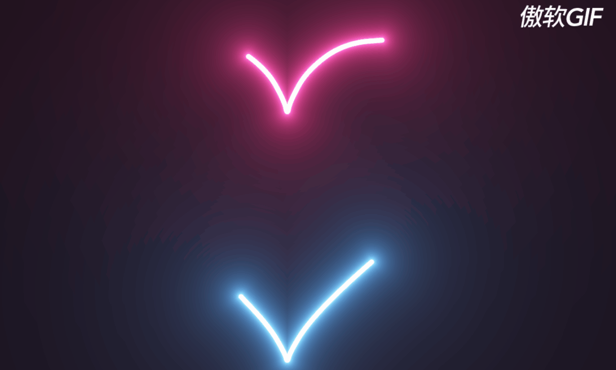
三、流光爱心
1.效果图
2.代码
1.index.html
<!DOCTYPE html> <html lang="en"> <head> <meta charset="UTF-8"> <title>Title</title> </head> <body> <canvas id="canvas" width="1400" height="600"></canvas> <script src="index.js"></script> </body> </html>- 1
- 2
- 3
- 4
- 5
- 6
- 7
- 8
- 9
- 10
- 11
2.index.css
body { background-color: #000; margin: 0; overflow: hidden; background-repeat: no-repeat; }- 1
- 2
- 3
- 4
- 5
- 6
3.index.js
var canvas = document.getElementById("canvas"); canvas.width = window.innerWidth; canvas.height = window.innerHeight; // Initialize the GL context var gl = canvas.getContext("webgl"); if (!gl) { console.error("Unable to initialize WebGL."); } //Time var time = 0.0; //************** Shader sources ************** var vertexSource = ` attribute vec2 position; void main() { gl_Position = vec4(position, 0.0, 1.0); } `; var fragmentSource = ` precision highp float; uniform float width; uniform float height; vec2 resolution = vec2(width, height); uniform float time; #define POINT_COUNT 8 vec2 points[POINT_COUNT]; const float speed = -0.5; const float len = 0.25; float intensity = 1.3; float radius = 0.008; //https://www.shadertoy.com/view/MlKcDD //Signed distance to a quadratic bezier float sdBezier(vec2 pos, vec2 A, vec2 B, vec2 C){ vec2 a = B - A; vec2 b = A - 2.0*B + C; vec2 c = a * 2.0; vec2 d = A - pos; float kk = 1.0 / dot(b,b); float kx = kk * dot(a,b); float ky = kk * (2.0*dot(a,a)+dot(d,b)) / 3.0; float kz = kk * dot(d,a); float res = 0.0; float p = ky - kx*kx; float p3 = p*p*p; float q = kx*(2.0*kx*kx - 3.0*ky) + kz; float h = q*q + 4.0*p3; if(h >= 0.0){ h = sqrt(h); vec2 x = (vec2(h, -h) - q) / 2.0; vec2 uv = sign(x)*pow(abs(x), vec2(1.0/3.0)); float t = uv.x + uv.y - kx; t = clamp( t, 0.0, 1.0 ); // 1 root vec2 qos = d + (c + b*t)*t; res = length(qos); }else{ float z = sqrt(-p); float v = acos( q/(p*z*2.0) ) / 3.0; float m = cos(v); float n = sin(v)*1.732050808; vec3 t = vec3(m + m, -n - m, n - m) * z - kx; t = clamp( t, 0.0, 1.0 ); // 3 roots vec2 qos = d + (c + b*t.x)*t.x; float dis = dot(qos,qos); res = dis; qos = d + (c + b*t.y)*t.y; dis = dot(qos,qos); res = min(res,dis); qos = d + (c + b*t.z)*t.z; dis = dot(qos,qos); res = min(res,dis); res = sqrt( res ); } return res; } //http://mathworld.wolfram.com/HeartCurve.html vec2 getHeartPosition(float t){ return vec2(16.0 * sin(t) * sin(t) * sin(t), -(13.0 * cos(t) - 5.0 * cos(2.0*t) - 2.0 * cos(3.0*t) - cos(4.0*t))); } //https://www.shadertoy.com/view/3s3GDn float getGlow(float dist, float radius, float intensity){ return pow(radius/dist, intensity); } float getSegment(float t, vec2 pos, float offset, float scale){ for(int i = 0; i < POINT_COUNT; i++){ points[i] = getHeartPosition(offset + float(i)*len + fract(speed * t) * 6.28); } vec2 c = (points[0] + points[1]) / 2.0; vec2 c_prev; float dist = 10000.0; for(int i = 0; i < POINT_COUNT-1; i++){ //https://tinyurl.com/y2htbwkm c_prev = c; c = (points[i] + points[i+1]) / 2.0; dist = min(dist, sdBezier(pos, scale * c_prev, scale * points[i], scale * c)); } return max(0.0, dist); } void main(){ vec2 uv = gl_FragCoord.xy/resolution.xy; float widthHeightRatio = resolution.x/resolution.y; vec2 centre = vec2(0.5, 0.5); vec2 pos = centre - uv; pos.y /= widthHeightRatio; //Shift upwards to centre heart pos.y += 0.02; float scale = 0.000015 * height; float t = time; //Get first segment float dist = getSegment(t, pos, 0.0, scale); float glow = getGlow(dist, radius, intensity); vec3 col = vec3(0.0); //White core col += 10.0*vec3(smoothstep(0.003, 0.001, dist)); //Pink glow col += glow * vec3(1.0,0.05,0.3); //Get second segment dist = getSegment(t, pos, 3.4, scale); glow = getGlow(dist, radius, intensity); //White core col += 10.0*vec3(smoothstep(0.003, 0.001, dist)); //Blue glow col += glow * vec3(0.1,0.4,1.0); //Tone mapping col = 1.0 - exp(-col); //Gamma col = pow(col, vec3(0.4545)); //Output to screen gl_FragColor = vec4(col,1.0); } `; //************** Utility functions ************** window.addEventListener("resize", onWindowResize, false); function onWindowResize() { canvas.width = window.innerWidth; canvas.height = window.innerHeight; gl.viewport(0, 0, canvas.width, canvas.height); gl.uniform1f(widthHandle, window.innerWidth); gl.uniform1f(heightHandle, window.innerHeight); } //Compile shader and combine with source function compileShader(shaderSource, shaderType) { var shader = gl.createShader(shaderType); gl.shaderSource(shader, shaderSource); gl.compileShader(shader); if (!gl.getShaderParameter(shader, gl.COMPILE_STATUS)) { throw "Shader compile failed with: " + gl.getShaderInfoLog(shader); } return shader; } //From https://codepen.io/jlfwong/pen/GqmroZ //Utility to complain loudly if we fail to find the attribute/uniform function getAttribLocation(program, name) { var attributeLocation = gl.getAttribLocation(program, name); if (attributeLocation === -1) { throw "Cannot find attribute " + name + "."; } return attributeLocation; } function getUniformLocation(program, name) { var attributeLocation = gl.getUniformLocation(program, name); if (attributeLocation === -1) { throw "Cannot find uniform " + name + "."; } return attributeLocation; } //************** Create shaders ************** //Create vertex and fragment shaders var vertexShader = compileShader(vertexSource, gl.VERTEX_SHADER); var fragmentShader = compileShader(fragmentSource, gl.FRAGMENT_SHADER); //Create shader programs var program = gl.createProgram(); gl.attachShader(program, vertexShader); gl.attachShader(program, fragmentShader); gl.linkProgram(program); gl.useProgram(program); //Set up rectangle covering entire canvas var vertexData = new Float32Array([ -1.0, 1.0, // top left -1.0, -1.0, // bottom left 1.0, 1.0, // top right 1.0, -1.0 // bottom right ]); //Create vertex buffer var vertexDataBuffer = gl.createBuffer(); gl.bindBuffer(gl.ARRAY_BUFFER, vertexDataBuffer); gl.bufferData(gl.ARRAY_BUFFER, vertexData, gl.STATIC_DRAW); // Layout of our data in the vertex buffer var positionHandle = getAttribLocation(program, "position"); gl.enableVertexAttribArray(positionHandle); gl.vertexAttribPointer( positionHandle, 2, // position is a vec2 (2 values per component) gl.FLOAT, // each component is a float false, // don't normalize values 2 * 4, // two 4 byte float components per vertex (32 bit float is 4 bytes) 0 // how many bytes inside the buffer to start from ); //Set uniform handle var timeHandle = getUniformLocation(program, "time"); var widthHandle = getUniformLocation(program, "width"); var heightHandle = getUniformLocation(program, "height"); gl.uniform1f(widthHandle, window.innerWidth); gl.uniform1f(heightHandle, window.innerHeight); var lastFrame = Date.now(); var thisFrame; function draw() { //Update time thisFrame = Date.now(); time += (thisFrame - lastFrame) / 1000; lastFrame = thisFrame; //Send uniforms to program gl.uniform1f(timeHandle, time); //Draw a triangle strip connecting vertices 0-4 gl.drawArrays(gl.TRIANGLE_STRIP, 0, 4); requestAnimationFrame(draw); } draw();- 1
- 2
- 3
- 4
- 5
- 6
- 7
- 8
- 9
- 10
- 11
- 12
- 13
- 14
- 15
- 16
- 17
- 18
- 19
- 20
- 21
- 22
- 23
- 24
- 25
- 26
- 27
- 28
- 29
- 30
- 31
- 32
- 33
- 34
- 35
- 36
- 37
- 38
- 39
- 40
- 41
- 42
- 43
- 44
- 45
- 46
- 47
- 48
- 49
- 50
- 51
- 52
- 53
- 54
- 55
- 56
- 57
- 58
- 59
- 60
- 61
- 62
- 63
- 64
- 65
- 66
- 67
- 68
- 69
- 70
- 71
- 72
- 73
- 74
- 75
- 76
- 77
- 78
- 79
- 80
- 81
- 82
- 83
- 84
- 85
- 86
- 87
- 88
- 89
- 90
- 91
- 92
- 93
- 94
- 95
- 96
- 97
- 98
- 99
- 100
- 101
- 102
- 103
- 104
- 105
- 106
- 107
- 108
- 109
- 110
- 111
- 112
- 113
- 114
- 115
- 116
- 117
- 118
- 119
- 120
- 121
- 122
- 123
- 124
- 125
- 126
- 127
- 128
- 129
- 130
- 131
- 132
- 133
- 134
- 135
- 136
- 137
- 138
- 139
- 140
- 141
- 142
- 143
- 144
- 145
- 146
- 147
- 148
- 149
- 150
- 151
- 152
- 153
- 154
- 155
- 156
- 157
- 158
- 159
- 160
- 161
- 162
- 163
- 164
- 165
- 166
- 167
- 168
- 169
- 170
- 171
- 172
- 173
- 174
- 175
- 176
- 177
- 178
- 179
- 180
- 181
- 182
- 183
- 184
- 185
- 186
- 187
- 188
- 189
- 190
- 191
- 192
- 193
- 194
- 195
- 196
- 197
- 198
- 199
- 200
- 201
- 202
- 203
- 204
- 205
- 206
- 207
- 208
- 209
- 210
- 211
- 212
- 213
- 214
- 215
- 216
- 217
- 218
- 219
- 220
- 221
- 222
- 223
- 224
- 225
- 226
- 227
- 228
- 229
- 230
- 231
- 232
- 233
- 234
- 235
- 236
- 237
- 238
- 239
- 240
- 241
- 242
- 243
- 244
- 245
- 246
- 247
- 248
- 249
- 250
- 251
- 252
- 253
- 254
- 255
- 256
- 257
- 258
- 259
- 260
- 261
- 262
- 263
- 264
- 265
- 266
- 267
- 268
- 269
- 270
- 271
- 272
- 273
- 274
- 275
- 276
- 277
- 278
- 279
- 280
- 281
- 282
- 283
四、520贺卡(1)
1.效果图

2.代码
1.index.html
<!DOCTYPE html> <html lang="en"> <head> <meta charset="UTF-8"> <title>hover</title> <link rel="stylesheet" href="index.css"> </head> <body> <div class="happy-valentines"> <div class="valentines-day-card"> <div class="clouds"></div> <div class="hearts"> <div class="heartOne"> <div class="left-side"></div> <div class="right-side"></div> </div> <div class="heartTwo"> <div class="left-side"></div> <div class="right-side"></div> </div> <div class="heartThree"> <div class="left-side"></div> <div class="right-side"></div> </div> <div class="heartFour"> <div class="left-side"></div> <div class="right-side"></div> </div> <div class="heartFive"> <div class="left-side"></div> <div class="right-side"></div> </div> </div> <span class="text"><span>Happy 520</br> Day!</span> </div> <p class="hover">- hover over the text -</p> </div> </body> </html>- 1
- 2
- 3
- 4
- 5
- 6
- 7
- 8
- 9
- 10
- 11
- 12
- 13
- 14
- 15
- 16
- 17
- 18
- 19
- 20
- 21
- 22
- 23
- 24
- 25
- 26
- 27
- 28
- 29
- 30
- 31
- 32
- 33
- 34
- 35
- 36
- 37
- 38
- 39
2.index.css
@import url('https://fonts.googleapis.com/css2?family=Pacifico&display=swap'); body { height: 100vh; display: flex; align-items: center; justify-content: center; background-color: #ff758f; } .valentines-day-card { position: relative; width: 400px; height: 300px; background-color: #ff8fa3; overflow: hidden; border:10px solid white; border-radius:10px; box-shadow: 0 0 100px rgba(0,0,0,.4); } .valentines-day-card:before { content:""; position: absolute; background-color: #ffb3c1; width:100px; height:100px; border-radius:50%; top:140px; left:-25px; box-shadow:60px 20px #ffb3c1,130px 10px #ffb3c1, 190px 20px #ffb3c1,260px -5px #ffb3c1, 340px 20px #ffb3c1; } .valentines-day-card:after { content:""; position: absolute; background-color: #ffccd5; width:100px; height:100px; border-radius:50%; top:160px; left:-40px; box-shadow: 50px 20px #ffccd5,120px 40px #ffccd5, 200px 15px #ffccd5,260px 30px #ffccd5, 330px 30px #ffccd5,380px 10px #ffccd5; } .clouds { position: absolute; width:100px; height:100px; border-radius:50%; background-color: #fff0f3; z-index:5; top:210px; left:-20px; box-shadow: 55px 30px #fff0f3, 125px 10px #fff0f3,175px 20px #fff0f3, 250px 10px #fff0f3, 320px 5px #fff0f3, 380px 10px #fff0f3; } .hearts { position: absolute; z-index:2; } .heartOne { position: absolute; left:100px; top:250px; animation: up 4s linear forwards 1s; } .heartTwo { position: absolute; left:270px; top:230px; animation: up 5s linear forwards 1.8s; } .heartThree { position: absolute; left:85px; top:415px; animation: up 5s linear forwards 3s; } .heartFour { position: absolute; left:320px; top:380px; animation: upTwo 9s linear infinite 3.5s; } .heartFive { position: absolute; left:150px; top:400px; animation: upTwo 13s linear infinite 4.5s; } .right-side:before, .right-side:after { position: absolute; content:""; transform-origin: left; animation: move 1s ease infinite; } .right-side:before { border-radius:50% 50% 50% 0; width:21px; height:20px; background-color: #c9184a; left:-0.26px; } .right-side:after { height:0; width:0; border-bottom:10px solid transparent; border-left: 15px solid #c9184a; top:19px; left:-0.26px; } @keyframes move { 0%, 100% {transform: rotateY(0);} 50% {transform: rotateY(-45deg);} } .left-side:before, .left-side:after { position: absolute; content:""; transform-origin: right; animation: move 1s ease infinite; } .left-side:before { border-radius:50% 50% 0 50%; width:20px; height:20px; left:-20.7px; background-color: #ff4d6d; } .left-side:after { height:0; width:0; left:-15px; border-bottom:10px solid transparent; border-right: 15px solid #ff4d6d; top:19px; } @keyframes up { 0% {transform: translateY(0);} 100% {transform: translateY(-200px);} } @keyframes upTwo { 0% {transform: translateY(0);} 100% {transform: translateY(-450px);} } .text { position: absolute; color: #800f2f; font-size:30px; font-family: 'Pacifico', cursive; line-height:1; text-align: center; width:380px; left:10px; z-index:3; top:320px; animation: up 1s ease forwards; transition: .2s; } .hover { color: white; font-family: 'Pacifico', cursive; text-align: center; } .text:hover span { display: none; } .text:hover:before { content:"Remember not to eat too much candy—you're sweet enough already."; font-size:25px; }- 1
- 2
- 3
- 4
- 5
- 6
- 7
- 8
- 9
- 10
- 11
- 12
- 13
- 14
- 15
- 16
- 17
- 18
- 19
- 20
- 21
- 22
- 23
- 24
- 25
- 26
- 27
- 28
- 29
- 30
- 31
- 32
- 33
- 34
- 35
- 36
- 37
- 38
- 39
- 40
- 41
- 42
- 43
- 44
- 45
- 46
- 47
- 48
- 49
- 50
- 51
- 52
- 53
- 54
- 55
- 56
- 57
- 58
- 59
- 60
- 61
- 62
- 63
- 64
- 65
- 66
- 67
- 68
- 69
- 70
- 71
- 72
- 73
- 74
- 75
- 76
- 77
- 78
- 79
- 80
- 81
- 82
- 83
- 84
- 85
- 86
- 87
- 88
- 89
- 90
- 91
- 92
- 93
- 94
- 95
- 96
- 97
- 98
- 99
- 100
- 101
- 102
- 103
- 104
- 105
- 106
- 107
- 108
- 109
- 110
- 111
- 112
- 113
- 114
- 115
- 116
- 117
- 118
- 119
- 120
- 121
- 122
- 123
- 124
- 125
- 126
- 127
- 128
- 129
- 130
- 131
- 132
- 133
- 134
- 135
- 136
- 137
- 138
- 139
- 140
- 141
- 142
- 143
- 144
- 145
- 146
- 147
- 148
- 149
- 150
- 151
- 152
- 153
- 154
- 155
- 156
- 157
- 158
- 159
- 160
- 161
- 162
- 163
- 164
- 165
- 166
- 167
- 168
- 169
- 170
- 171
- 172
- 173
- 174
- 175
- 176
- 177
- 178
- 179
- 180
- 181
- 182
- 183
- 184
- 185
- 186
- 187
- 188
- 189
- 190
五、520贺卡(2)
1.效果图

2.代码
1.index.html
<!DOCTYPE html> <html lang="en"> <head> <meta charset="UTF-8"> <title>open</title> <link rel="stylesheet" href="index.css"> </head> <body> <div class="valentines-day-card"> <input id="open" type="checkbox"> <label class="open" for="open"></label> <div class="card-front"> <div class="note">Click to Open</div> </div> <div class="card-inside"> <div class="text-one">Happy </div> <div class="heart"></div> <div class="smile"></div> <div class="eyes"></div> </div> </div> </body> </html>- 1
- 2
- 3
- 4
- 5
- 6
- 7
- 8
- 9
- 10
- 11
- 12
- 13
- 14
- 15
- 16
- 17
- 18
- 19
- 20
- 21
- 22
- 23
- 24
- 25
2.index.css
@import url('https://fonts.googleapis.com/css2?family=Mochiy+Pop+P+One&display=swap'); body { height: 100vh; display: flex; justify-content: center; align-items: center; background-color: #f2acac; font-family: 'Mochiy Pop P One', sans-serif; } input#open { display: none; } .valentines-day-card { position: relative; width: 300px; height:300px; transform-style: preserve-3d; transform: perspective(2500px); transition: .3s; } .card-front { position: relative; background-color: #fff0f3; width: 300px; height:300px; transform-origin: left; box-shadow: inset 100px 20px 100px rgba(0,0,0,.15), 30px 0 50px rgba(0,0,0,0.3); transition: .3s; } .card-front:before { content:""; position: absolute; width: 280px; height: 280px; background-color: #d04e4e; top: 10px; left: 10px; } .card-inside { position: absolute; background-color: #fff0f3; width: 300px; height:300px; z-index:-1; left:0; top:0; box-shadow: inset 100px 20px 100px rgba(0,0,0,0.22), 100px 20px 100px rgba(0,0,0,0.1); } .open { position: absolute; width: 300px; height:300px; left:0; top:0; background-color: transparent; z-index:6; cursor: pointer; } #open:checked ~ .card-front { transform: rotateY(-155deg); box-shadow: inset 100px 20px 100px rgba(0,0,0,.13), 30px 0 50px rgba(0,0,0,0.1); } #open:checked ~ .card-front:before { z-index:5; background-color: #fff0f3; width:300px; height:300px; top:0; left:0; box-shadow: inset 100px 20px 100px rgba(0,0,0,.1), 30px 0 50px rgba(0,0,0,0.1); } .note { position: relative; width: 200px; height: 150px; background-color: #fff0f3; top:75px; left:50px; color: #333; font-size:30px; display: flex; align-items: center; text-align: center; filter: drop-shadow(0 0 20px rgba(0,0,0,0.3)); } .note:before, .note:after { position: absolute; content:""; background-color: #ba1c1c; width: 40px; height:40px; } .note:before { transform: rotate(-45deg); top:-20px; left:80px; } .note:after { border-radius:50%; top:-35px; left:65px; box-shadow:30px 0 #ba1c1c; } .text-one { position: absolute; color: #333; font-size: 30px; top:30px; width:300px; text-align: center; } .text-one:before, .text-one:after { position: absolute; left:5px; text-align: center; width:300px; } .text-one:before { content:"Valentine's"; top:30px; color: #d04e4e; } .text-one:after { content:"day!"; top:60px; } .heart { position: relative; background-color: #d04e4e; height: 60px; width:60px; top:180px; left:120px; transform: rotate(-45deg); animation: .8s beat infinite; } .heart:before, .heart:after { content:""; background-color: #d04e4e; border-radius:50%; height: 60px; width: 60px; position: absolute; } .heart:before { top:-30px; left:0; } .heart:after { left:30px; top:0; } .smile { position: absolute; width:30px; height:15px; background-color: #333; z-index:1; border-radius: 0 0 100px 100px; top:200px; left:135px; overflow: hidden; } .smile:before { content:""; position: absolute; border-radius:50%; width:20px; height:20px; background-color: #030202; top:5px; left:5px; } .eyes { position: absolute; border-radius: 50%; background-color: #333; width:10px; height:10px; z-index:1; top:190px; left:165px; box-shadow: -40px 0 #333; transform-origin: 50%; animation: close 2s infinite; } @keyframes close { 0%, 100% { transform: scale(1, .05); } 5%, 95% { transform: scale(1, 1); } } @keyframes beat { 0%, 40%, 100% { transform: scale(1) rotate(-45deg); } 25%, 60% { transform: scale(1.1) rotate(-45deg); } }- 1
- 2
- 3
- 4
- 5
- 6
- 7
- 8
- 9
- 10
- 11
- 12
- 13
- 14
- 15
- 16
- 17
- 18
- 19
- 20
- 21
- 22
- 23
- 24
- 25
- 26
- 27
- 28
- 29
- 30
- 31
- 32
- 33
- 34
- 35
- 36
- 37
- 38
- 39
- 40
- 41
- 42
- 43
- 44
- 45
- 46
- 47
- 48
- 49
- 50
- 51
- 52
- 53
- 54
- 55
- 56
- 57
- 58
- 59
- 60
- 61
- 62
- 63
- 64
- 65
- 66
- 67
- 68
- 69
- 70
- 71
- 72
- 73
- 74
- 75
- 76
- 77
- 78
- 79
- 80
- 81
- 82
- 83
- 84
- 85
- 86
- 87
- 88
- 89
- 90
- 91
- 92
- 93
- 94
- 95
- 96
- 97
- 98
- 99
- 100
- 101
- 102
- 103
- 104
- 105
- 106
- 107
- 108
- 109
- 110
- 111
- 112
- 113
- 114
- 115
- 116
- 117
- 118
- 119
- 120
- 121
- 122
- 123
- 124
- 125
- 126
- 127
- 128
- 129
- 130
- 131
- 132
- 133
- 134
- 135
- 136
- 137
- 138
- 139
- 140
- 141
- 142
- 143
- 144
- 145
- 146
- 147
- 148
- 149
- 150
- 151
- 152
- 153
- 154
- 155
- 156
- 157
- 158
- 159
- 160
- 161
- 162
- 163
- 164
- 165
- 166
- 167
- 168
- 169
- 170
- 171
- 172
- 173
- 174
- 175
- 176
- 177
- 178
- 179
- 180
- 181
- 182
- 183
- 184
- 185
- 186
- 187
- 188
- 189
- 190
- 191
- 192
- 193
- 194
- 195
- 196
- 197
- 198
- 199
- 200
- 201
- 202
- 203
- 204
- 205
- 206
- 207
- 208
- 209
- 210
- 211
- 212
- 213
- 214
- 215
- 216
- 217
- 218
- 219
- 220
- 221
- 222
- 223
- 224
- 225
- 226
- 227
- 228
- 229
- 230
六、告白信封
1.效果图

2.代码
1.index.html
<!DOCTYPE html> <html lang="en"> <head> <meta charset="UTF-8"> <title>happy 520</title> <link rel="stylesheet" href="index.css"> </head> <body> <div id="center"> <div id="letter-top"></div> <div id="letter"></div> <div id="letter-inside"> <h1>You are the<br> <em>CSS</em> to my <em>HTML</em></h1> </div> <div id ='letter-top-triangle'></div> <div id ='letter-top-triangle2'></div> </div> <div class='heart one'></div> <div class='heart two'></div> <div class='heart three'></div> <div class='heart four'></div> <div class='heart five'></div> <div class='heart six'></div> </div> </body> </html>- 1
- 2
- 3
- 4
- 5
- 6
- 7
- 8
- 9
- 10
- 11
- 12
- 13
- 14
- 15
- 16
- 17
- 18
- 19
- 20
- 21
- 22
- 23
- 24
- 25
- 26
- 27
2.index.css
@import url(https://fonts.googleapis.com/css?family=Loved+by+the+King); #center { position: absolute; top: 50%; left: 50%; transform: translate(-50%,-50%); } h1 { font-family: 'Loved by the King', cursive; text-align: center; font-size: 2em; color: white; } em { color: #E72650; } #letter{ background-color: #f2f2f2; width: 300px; height: 200px; } #letter-top { position: absolute; background-color: #dbdbdb; width: 210px; height: 215px; top: -107px; left: 45px; border-top-left-radius: 20px; transform: scale(1, .5) rotate(45deg); z-index:1; } #letter-top-triangle { position: absolute; top: -12px; width: 0; height: 0; left: 130px; border-left: 80px solid transparent; border-right: 80px solid transparent; border-bottom: 180px solid #f2f2f2; transform: rotate(-90deg); z-index:3; } #letter-top-triangle2 { position: absolute; top: -5px; width: 0; height: 0; left: 12px; border-left: 80px solid transparent; border-right: 80px solid transparent; border-bottom: 180px solid #f2f2f2; transform: rotate(90deg); z-index:3; } #letter-inside { background: black; top: -95px; height: 170px; width: 250px; left: 20px; box-shadow: 2px -2px 2px rgba(0, 0, 0, 0.1), -2px 2px 2px rgba(0, 0, 0, 0.1), 4px -4px 2px rgba(0, 0, 0, 0.1), -4px -4px 2px rgba(0, 0, 0, 0.1); position: absolute; transform: rotate(-8deg); z-index:2; } .heart { position: absolute; top: 50%; left: 50%; transform: translate(-50%,-50%); } .heart:before, .heart:after { position: absolute; content: ""; left: 18px; top: 0px; width: 18px; height: 30px; background: #E72650; border-radius: 30px 30px 0 0; transform: rotate(-45deg); transform-origin: 0 100%; } .heart:after { left: 0; transform: rotate(45deg); transform-origin :100% 100%; } .one { transform: scale(0.8); opacity: 0.6; animation: up 15s linear infinite, side 6s ease-in-out infinite alternate; } .two { transform: scale(0.6); opacity: 0.9; animation: up 25s linear infinite, side 5s ease-in-out infinite alternate; } .three { transform: scale(0.8); opacity: 0.8; animation: up 20s linear infinite, side 4s ease-in-out infinite alternate; } .four { transform: scale(0.7); opacity: 0.9; animation: up 18s linear infinite, side 2s ease-in-out infinite alternate; } .five { transform: scale(0.6); opacity: 0.3; animation: up 7s linear infinite, side 1s ease-in-out infinite alternate; } .six { opacity: 0.8; animation: up 10s linear infinite, side 7s ease-in-out infinite alternate; } @keyframes up { 0% { top: 300px; } 100% { top: -500px; } } @keyframes side { 0% { margin-left: 0px; } 100% { margin-left: 50px; } }- 1
- 2
- 3
- 4
- 5
- 6
- 7
- 8
- 9
- 10
- 11
- 12
- 13
- 14
- 15
- 16
- 17
- 18
- 19
- 20
- 21
- 22
- 23
- 24
- 25
- 26
- 27
- 28
- 29
- 30
- 31
- 32
- 33
- 34
- 35
- 36
- 37
- 38
- 39
- 40
- 41
- 42
- 43
- 44
- 45
- 46
- 47
- 48
- 49
- 50
- 51
- 52
- 53
- 54
- 55
- 56
- 57
- 58
- 59
- 60
- 61
- 62
- 63
- 64
- 65
- 66
- 67
- 68
- 69
- 70
- 71
- 72
- 73
- 74
- 75
- 76
- 77
- 78
- 79
- 80
- 81
- 82
- 83
- 84
- 85
- 86
- 87
- 88
- 89
- 90
- 91
- 92
- 93
- 94
- 95
- 96
- 97
- 98
- 99
- 100
- 101
- 102
- 103
- 104
- 105
- 106
- 107
- 108
- 109
- 110
- 111
- 112
- 113
- 114
- 115
- 116
- 117
- 118
- 119
- 120
- 121
- 122
- 123
- 124
- 125
- 126
- 127
- 128
- 129
- 130
- 131
- 132
- 133
- 134
- 135
- 136
- 137
- 138
- 139
- 140
- 141
- 142
- 143
- 144
- 145
- 146
- 147
- 148
- 149
- 150
- 151
- 152
- 153
- 154
- 155
- 156
- 157
- 158
- 159
- 160
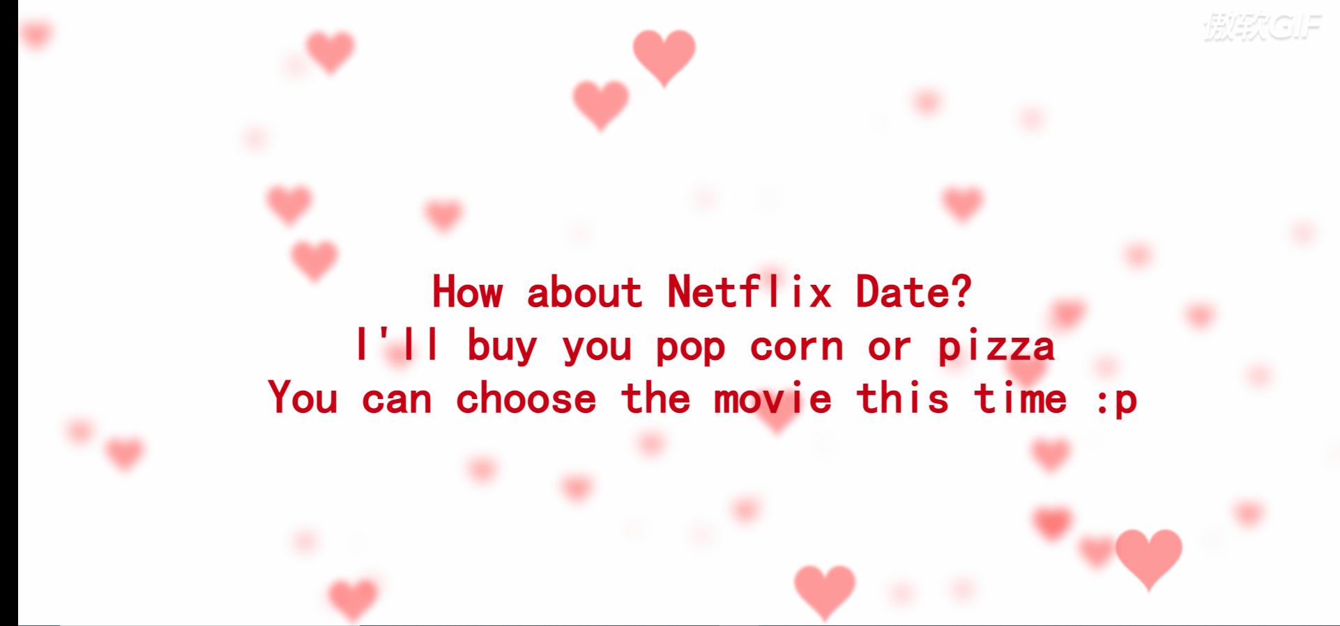
七、for love满屏爱心
1.效果图
2.代码
1.index.html
<!DOCTYPE html> <html lang="en"> <head> <meta charset="UTF-8"> <title>for love</title> <link rel="stylesheet" href="index.css"> </head> <body> <canvas></canvas> <h1>How about Netflix Date?<br/> I'll buy you pop corn or pizza<br/> You can choose the movie this time :p</h1> <script src="./index.js"></script> </body> </html>- 1
- 2
- 3
- 4
- 5
- 6
- 7
- 8
- 9
- 10
- 11
- 12
- 13
- 14
- 15
- 16
2.index.css
body{ overflow: hidden; margin: 0; } h1{ position: fixed; top: 50%; left: 0; width: 100%; text-align: center; transform:translateY(-50%); font-family: 'Love Ya Like A Sister', cursive; font-size: 40px; color: #c70012; padding: 0 20px; } @media (min-width:1200px){ h1{ font-size: 60px; } }- 1
- 2
- 3
- 4
- 5
- 6
- 7
- 8
- 9
- 10
- 11
- 12
- 13
- 14
- 15
- 16
- 17
- 18
- 19
- 20
- 21
3.index.js
var canvas = document.querySelector("canvas"), ctx = canvas.getContext("2d"); var ww,wh; function onResize(){ ww = canvas.width = window.innerWidth; wh = canvas.height = window.innerHeight; } ctx.strokeStyle = "red"; ctx.shadowBlur = 25; ctx.shadowColor = "hsla(0, 100%, 60%,0.5)"; var precision = 100; var hearts = []; var mouseMoved = false; function onMove(e){ mouseMoved = true; if(e.type === "touchmove"){ hearts.push(new Heart(e.touches[0].clientX, e.touches[0].clientY)); hearts.push(new Heart(e.touches[0].clientX, e.touches[0].clientY)); } else{ hearts.push(new Heart(e.clientX, e.clientY)); hearts.push(new Heart(e.clientX, e.clientY)); } } var Heart = function(x,y){ this.x = x || Math.random()*ww; this.y = y || Math.random()*wh; this.size = Math.random()*2 + 1; this.shadowBlur = Math.random() * 10; this.speedX = (Math.random()+0.2-0.6) * 8; this.speedY = (Math.random()+0.2-0.6) * 8; this.speedSize = Math.random()*0.05 + 0.01; this.opacity = 1; this.vertices = []; for (var i = 0; i < precision; i++) { var step = (i / precision - 0.5) * (Math.PI * 2); var vector = { x : (15 * Math.pow(Math.sin(step), 3)), y : -(13 * Math.cos(step) - 5 * Math.cos(2 * step) - 2 * Math.cos(3 * step) - Math.cos(4 * step)) } this.vertices.push(vector); } } Heart.prototype.draw = function(){ this.size -= this.speedSize; this.x += this.speedX; this.y += this.speedY; ctx.save(); ctx.translate(-1000,this.y); ctx.scale(this.size, this.size); ctx.beginPath(); for (var i = 0; i < precision; i++) { var vector = this.vertices[i]; ctx.lineTo(vector.x, vector.y); } ctx.globalAlpha = this.size; ctx.shadowBlur = Math.round((3 - this.size) * 10); ctx.shadowColor = "hsla(0, 100%, 60%,0.5)"; ctx.shadowOffsetX = this.x + 1000; ctx.globalCompositeOperation = "screen" ctx.closePath(); ctx.fill() ctx.restore(); }; function render(a){ requestAnimationFrame(render); hearts.push(new Heart()) ctx.clearRect(0,0,ww,wh); for (var i = 0; i < hearts.length; i++) { hearts[i].draw(); if(hearts[i].size <= 0){ hearts.splice(i,1); i--; } } } onResize(); window.addEventListener("mousemove", onMove); window.addEventListener("touchmove", onMove); window.addEventListener("resize", onResize); requestAnimationFrame(render);- 1
- 2
- 3
- 4
- 5
- 6
- 7
- 8
- 9
- 10
- 11
- 12
- 13
- 14
- 15
- 16
- 17
- 18
- 19
- 20
- 21
- 22
- 23
- 24
- 25
- 26
- 27
- 28
- 29
- 30
- 31
- 32
- 33
- 34
- 35
- 36
- 37
- 38
- 39
- 40
- 41
- 42
- 43
- 44
- 45
- 46
- 47
- 48
- 49
- 50
- 51
- 52
- 53
- 54
- 55
- 56
- 57
- 58
- 59
- 60
- 61
- 62
- 63
- 64
- 65
- 66
- 67
- 68
- 69
- 70
- 71
- 72
- 73
- 74
- 75
- 76
- 77
- 78
- 79
- 80
- 81
- 82
- 83
- 84
- 85
- 86
- 87
- 88
- 89
- 90
- 91
- 92
- 93
八、摇晃的红酒杯~
1.效果图

2.代码
1.index.html
<!DOCTYPE html> <html lang="en"> <head> <meta charset="UTF-8"> <title>dinner love</title> <link rel="stylesheet" href="index.css"> </head> <body> <h2>Have Dinner with Me<br/> On Friday?</h2> <div id="heart"> </div> <div class="glass-wrapper"> <div class="top"> <div class="liquid"> <div class="shadow"> </div> </div> <div class="shadow2"></div> </div> <div class="stand"></div> <div class="bottom"></div> <div class="heart h1"></div> <div class="heart h2"></div> <div class="heart h3"></div> <div class="heart h4"></div> <div class="heart h5"></div> <div class="heart h6"></div> </div> </body> </html>- 1
- 2
- 3
- 4
- 5
- 6
- 7
- 8
- 9
- 10
- 11
- 12
- 13
- 14
- 15
- 16
- 17
- 18
- 19
- 20
- 21
- 22
- 23
- 24
- 25
- 26
- 27
- 28
- 29
- 30
- 31
- 32
2.index.css
body { background-color: #fe9cd1; font-family: 'Dancing Script', cursive; } h2 { text-align: center; margin-top: 40px; font-size: 50px; color: #333; } #heart { position: absolute; left: calc(50% - 200px); top: calc(50% - 180px); width: 400px; height: 360px; opacity: 0.2; } #heart:before, #heart:after { position: absolute; content: ""; left: 200px; top: 0; width: 200px; height: 360px; background: red; -moz-border-radius: 100px 1000px 0 0; border-radius: 100px 100px 0 0; -webkit-transform: rotate(-45deg); -moz-transform: rotate(-45deg); -ms-transform: rotate(-45deg); -o-transform: rotate(-45deg); transform: rotate(-45deg); -webkit-transform-origin: 0 100%; -moz-transform-origin: 0 100%; -ms-transform-origin: 0 100%; -o-transform-origin: 0 100%; transform-origin: 0 100%; } #heart:after { left: 0; -webkit-transform: rotate(45deg); -moz-transform: rotate(45deg); -ms-transform: rotate(45deg); -o-transform: rotate(45deg); transform: rotate(45deg); -webkit-transform-origin: 100% 100%; -moz-transform-origin: 100% 100%; -ms-transform-origin: 100% 100%; -o-transform-origin: 100% 100%; transform-origin: 100% 100%; } .glass-wrapper { position: absolute; left: calc(50% - 150px); top: calc(50% - 230px); width: 300px; height: 500px; cursor: pointer; } .glass-wrapper:hover { animation: shake 1.3s ease; } .top { position: absolute; left: 70px; top: 80px; width: 150px; height: 250px; overflow: hidden; border: 5px solid #333; border-top-left-radius: 10px; border-top-right-radius: 10px; border-bottom-left-radius: 60%; border-bottom-right-radius: 60%; z-index: 2; } .top .liquid { position: absolute; bottom: 0; width: 150px; height: 150px; background-color: #c0392b; } .top .liquid .shadow { position: absolute; bottom: -100px; right: -100px; width: 300px; height: 300px; background-color: transparent; border-bottom-left-radius: 50%; border-bottom-right-radius: 50%; border: 100px solid rgba(0, 0, 0, 0.2); } .top .shadow2 { position: absolute; left: 20px; top: 10px; width: 10px; height: 160px; background-color: rgba(255, 255, 255, 0.3); border-bottom-left-radius: 100%; } .stand { position: absolute; left: 142px; top: 338px; width: 5px; height: 100px; border: 5px solid #333; border-top-width: 2px; border-bottom: 0; background-color: rgba(255, 255, 255, 0.3); } .bottom { position: absolute; left: 90px; top: 438px; width: 110px; height: 5px; border: 5px solid #333; border-top-left-radius: 10px; border-top-right-radius: 10px; background-color: rgba(255, 255, 255, 0.3); } .heart { position: absolute; width: 100px; height: 90px; top: 200px; } .heart.h1 { left: 120px; animation: transition-up 5s ease-in-out 1s infinite; } .heart.h2 { left: 150px; animation: transition-up 5s ease-in-out infinite; } .heart.h3 { animation: transition-up 5s ease-in-out 2s infinite; left: 90px; } .heart.h4 { animation: transition-up 5s ease-in-out 3s infinite; left: 115px; } .heart.h5 { animation: transition-up 5s ease-in-out 4s infinite; left: 135px; } .heart.h6 { animation: transition-up 5s ease-in-out 3.5s infinite; left: 140px; } .heart:before, .heart:after { position: absolute; content: ""; left: 25px; top: 0; width: 25px; height: 40px; background: #c0392b; -moz-border-radius: 50px 50px 0 0; border-radius: 50px 50px 0 0; -webkit-transform: rotate(-45deg); -moz-transform: rotate(-45deg); -ms-transform: rotate(-45deg); -o-transform: rotate(-45deg); transform: rotate(-45deg); -webkit-transform-origin: 0 100%; -moz-transform-origin: 0 100%; -ms-transform-origin: 0 100%; -o-transform-origin: 0 100%; transform-origin: 0 100%; } .heart:after { left: 0; -webkit-transform: rotate(45deg); -moz-transform: rotate(45deg); -ms-transform: rotate(45deg); -o-transform: rotate(45deg); transform: rotate(45deg); -webkit-transform-origin: 100% 100%; -moz-transform-origin: 100% 100%; -ms-transform-origin: 100% 100%; -o-transform-origin: 100% 100%; transform-origin: 100% 100%; } @keyframes transition-up { 0% { transform: translate3d(20px, 0, 0); } 20% { transform: translate3d(-20px, 0, 0); } 40% { transform: translate3d(20px, 0, 0); } 60% { opacity: 1; transform: translate3d(-20px, 0, 0); } 80% { transform: translate3d(10px, 0, 0); } 100% { opacity: 0; top: 10px; transform: translate3d(-10px, 0, 0); } } @keyframes shake { 0% { transform: rotate(0); } 25% { transform: rotate(10deg); } 50% { transform: rotate(-10deg); } 75% { transform: rotate(5deg); } 100% { transform: rotate(0deg); } } /*# sourceMappingURL=index.css.map */- 1
- 2
- 3
- 4
- 5
- 6
- 7
- 8
- 9
- 10
- 11
- 12
- 13
- 14
- 15
- 16
- 17
- 18
- 19
- 20
- 21
- 22
- 23
- 24
- 25
- 26
- 27
- 28
- 29
- 30
- 31
- 32
- 33
- 34
- 35
- 36
- 37
- 38
- 39
- 40
- 41
- 42
- 43
- 44
- 45
- 46
- 47
- 48
- 49
- 50
- 51
- 52
- 53
- 54
- 55
- 56
- 57
- 58
- 59
- 60
- 61
- 62
- 63
- 64
- 65
- 66
- 67
- 68
- 69
- 70
- 71
- 72
- 73
- 74
- 75
- 76
- 77
- 78
- 79
- 80
- 81
- 82
- 83
- 84
- 85
- 86
- 87
- 88
- 89
- 90
- 91
- 92
- 93
- 94
- 95
- 96
- 97
- 98
- 99
- 100
- 101
- 102
- 103
- 104
- 105
- 106
- 107
- 108
- 109
- 110
- 111
- 112
- 113
- 114
- 115
- 116
- 117
- 118
- 119
- 120
- 121
- 122
- 123
- 124
- 125
- 126
- 127
- 128
- 129
- 130
- 131
- 132
- 133
- 134
- 135
- 136
- 137
- 138
- 139
- 140
- 141
- 142
- 143
- 144
- 145
- 146
- 147
- 148
- 149
- 150
- 151
- 152
- 153
- 154
- 155
- 156
- 157
- 158
- 159
- 160
- 161
- 162
- 163
- 164
- 165
- 166
- 167
- 168
- 169
- 170
- 171
- 172
- 173
- 174
- 175
- 176
- 177
- 178
- 179
- 180
- 181
- 182
- 183
- 184
- 185
- 186
- 187
- 188
- 189
- 190
- 191
- 192
- 193
- 194
- 195
- 196
- 197
- 198
- 199
- 200
- 201
- 202
- 203
- 204
- 205
- 206
- 207
- 208
- 209
九、信封(2)
1.效果图

2.代码
1.index.html
<!DOCTYPE html> <html lang="en"> <head> <meta charset="UTF-8"> <title>box</title> <link rel="stylesheet" href="index.css"> </head> <body> <div class="valentines-day"> <div class="envelope"></div> <div class="heart"></div> <div class="text">HAPPY 520 DAY!</div> <div class="front"></div> <div class="text2">- hover over the envelope - </div> </div> </body> </html>- 1
- 2
- 3
- 4
- 5
- 6
- 7
- 8
- 9
- 10
- 11
- 12
- 13
- 14
- 15
- 16
- 17
2.index.css
body { display: flex; align-items: center; justify-content: center; height: 100vh; background-color: #f1e3d3; overflow: hidden; } .valentines-day { position: relative; cursor: pointer; } .envelope { position: relative; filter: drop-shadow(0 0 25px rgba(0,0,0,.3)); } .envelope:before { content:""; position: absolute; width:254px; height:254px; background-color: #ff9494; transform: rotate(-45deg); border-radius: 0 15px 0 0; left:-37px; top:-82px; } .envelope:after { content:""; position: absolute; background-color: #ff9494; width:360px; height:225px; left:-90px; top:45px; } .heart { position: relative; background-color: #e01911; display: inline-block; height: 180px; top:50px; left:0; transform: rotate(-45deg); width:180px; filter: drop-shadow(0 -10px 25px rgba(0,0,0,.3)); transition: .5s; } .heart:before, .heart:after { content:""; background-color: #e01911; border-radius:50%; height: 180px; width: 180px; position: absolute; } .heart:before { top:-100px; left:0;} .heart:after { left:100px; top:0;} .front { position: absolute; width:0; height:0; border-right: 190px solid #fbd2d2; border-top: 113px solid transparent; border-bottom: 113px solid transparent; top:44px; left:80px; z-index:4; } .front:before { content:""; position: absolute; width:0; height:0; border-left: 190px solid #fbd2d2; border-top: 113px solid transparent; border-bottom: 113px solid transparent; top:-113px; left:-170px; } .front:after { width:0; height:0; position: absolute; content:""; border-bottom: 150px solid #fce7e9; border-right:180px solid transparent; border-left: 180px solid transparent; top:-36px; left:-170px; } .text { position: absolute; font-family: arial; letter-spacing:5px; text-align: center; color: white; z-index:2; top:80px; left:15px; transition: .5s; } .valentines-day:hover .heart { transform: translateY(-50px) rotate(-45deg); } .valentines-day:hover .text { transform: translateY(-50px); } .text2 { position: absolute; top:275px; color: white; font-family: brush script mt; text-align: center; width:195px; font-size:20px; }- 1
- 2
- 3
- 4
- 5
- 6
- 7
- 8
- 9
- 10
- 11
- 12
- 13
- 14
- 15
- 16
- 17
- 18
- 19
- 20
- 21
- 22
- 23
- 24
- 25
- 26
- 27
- 28
- 29
- 30
- 31
- 32
- 33
- 34
- 35
- 36
- 37
- 38
- 39
- 40
- 41
- 42
- 43
- 44
- 45
- 46
- 47
- 48
- 49
- 50
- 51
- 52
- 53
- 54
- 55
- 56
- 57
- 58
- 59
- 60
- 61
- 62
- 63
- 64
- 65
- 66
- 67
- 68
- 69
- 70
- 71
- 72
- 73
- 74
- 75
- 76
- 77
- 78
- 79
- 80
- 81
- 82
- 83
- 84
- 85
- 86
- 87
- 88
- 89
- 90
- 91
- 92
- 93
- 94
- 95
- 96
- 97
- 98
- 99
- 100
- 101
- 102
- 103
- 104
- 105
- 106
- 107
- 108
- 109
- 110
- 111
- 112
- 113
- 114
- 115
- 116
- 117
- 118
- 119
- 120
- 121
- 122
- 123
- 124
- 125
- 126
- 127
- 128
- 129
- 130
- 131
- 132
- 133
- 134
- 135
- 136
十、链接
1.pikachu信封
链接:https://pan.baidu.com/s/1VOcJvm5555FVpdMA76XTJQ
提取码:LDL62.小宇宙
链接:https://pan.baidu.com/s/1In0Mp8o-RnMVykH15M8c8g
提取码:LDL63.流光爱心
链接:https://pan.baidu.com/s/1f7PzygmTcb-Xf9NidC23hw
提取码:LDL64.520贺卡(1)
链接:https://pan.baidu.com/s/17GW0-QU4hUU2OBXUrLoTNQ
提取码:LDL65.520贺卡(2)
链接:https://pan.baidu.com/s/1CS9vtfUWw_bxl68U6gapBQ
提取码:LDL66.告白信
链接:https://pan.baidu.com/s/1oeZDrFoFRXbEPVIzRWAvJA
提取码:LDL67.满屏爱心
链接:https://pan.baidu.com/s/1p52KmEzCooLgD9Dx4uWfZA
提取码:LDL68.红酒杯
链接:https://pan.baidu.com/s/1hibfhxDzmIKh_aKmZv-XWQ
提取码:LDL69.爱心信
链接:https://pan.baidu.com/s/1qeQLspAs5xsDtqCsjjbsmA
提取码:LDL6总结
emmm,这篇摆了,没写教程。昨天大半夜信心苦苦写的文,好不容易热榜第三,就等着前面两位大佬,到三天时间,我冲个第一,结果因为bug,文没了。所以摆了,没写教程。
还是祝大家520快乐,都能找到心仪的那个她,99不88.ps:要去上课了,下课回来挂链接,需要的家人们,可以现在评论区留言。或者关注下孩子。非常感谢
-
相关阅读:
猿创征文|【概率论基础进阶】随机事件和概率-概率及概率公式
PaddlePaddle:开源深度学习平台
掌握Java并发编程线程池的实现原理
java毕业设计电力公司员工安全培训系统Mybatis+系统+数据库+调试部署
【支持向量机】问题梳理
使用vs查看虚函数内存分布
ICCV2023人脸识别TransFace论文及代码学习笔记
单元测试UnitTest
VScode开发STM32/GD32单片机-环境搭建
Springmvc笔记
- 原文地址:https://blog.csdn.net/weixin_44009656/article/details/124856139