-
动手吧,vue做个好看的按钮01
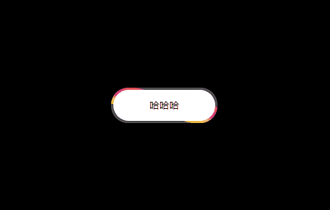
看下效果吧:
---直接上代码喽---
1、template部分
- <div class="box">
- <div class="butt" @click="buttClick">
- <div>哈哈哈div>
- div>
- div>
2、css部分
- .box {
- width: 500px;
- height: 300px;
- display: flex;
- align-items: center;
- justify-content: center;
- background-color: #000;
- .butt {
- display: flex;
- align-items: center;
- justify-content: center;
- position: relative;
- width: 150px;
- height: 50px;
- border: 1px solid transparent;
- color: #000;
- overflow: hidden;
- box-sizing: content-box;
- z-index: 0;
- cursor: pointer;
- border-radius: 25px;
- box-shadow: inset 0 0 6px 2px #888;
- div {
- display: flex;
- align-items: center;
- justify-content: center;
- width: 144px;
- height: 44px;
- color: #000;
- border-radius: 23px;
- background-color: #fff;
- }
- &::before {
- position: absolute;
- content: "";
- top: 50%;
- left: 50%;
- width: 30px;
- height: 150px;
- animation: sss 6s linear infinite;
- z-index: -1;
- transform-origin: center;
- transform: translate(-50%, -50%);
- background-image: linear-gradient(to left, #e71919, #d849b1, #f7f31d);
- }
- }
- }
- @keyframes sss {
- 100% {
- transform: translate(-50%, -50%) rotate(720deg);
- }
- }
-
相关阅读:
公元是什么意思,公历和农历
YOLOV8 C++ opecv_dnn模块部署
CSS精灵图和字体图标的使用
java商城免费搭建 VR全景商城 saas商城 b2b2c商城 o2o商城 积分商城 秒杀商城 拼团商城 分销商城 短视频商城
.NET 反向代理 YARP 自定义配置提供程序(Configuration Providers)
eyb:Redis学习(2)
.datastore@cyberfear.com.mkp勒索病毒的最新威胁:如何恢复您的数据?
vue 概述
BUUCTF--[ACTF2020 新生赛]Include
MySQL数据库断电修复(Database page corruption on disk or a failed)
- 原文地址:https://blog.csdn.net/weixin_44708870/article/details/133379083
