-
vant实现Select效果--单选和多选
vue项目无论是用element中的Select选择器,还是使用公司维护的组件,都可以轻松实现单选和多选的需求,但在移动端使用vant时,找了几遍发现居然没有提供Select组件,下面提供对单选和多选组件的封装。
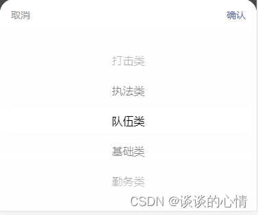
单选效果:
多选效果:

1、封装单选组件(VanFieldSelectPicker)
- <template>
- <div class="dh-field">
- <div class=" van-hairline--bottom">
- <van-field
- v-model="resultLabel"
- v-bind="$attrs"
- readonly
- :is-link="$attrs.disabled === undefined"
- input-align="right"
- error-message-align='right'
- class="dh-cell"
- @click="showPopu($attrs.disabled)"
- />
- <van-popup v-model="show" position="bottom">
- <van-field v-if="isSearch" v-model="searchVal" input-align="left" placeholder="搜索" @input="search"/>
- <van-picker
- v-bind="$attrs"
- :columns="columnsData"
- show-toolbar
- @cancel="cancel"
- @confirm="onConfirm"
- @change="change"
- :value-key="this.option.label"
- />
- van-popup>
- div>
- div>
- template>
- <script>
- export default {
- name: 'VanFieldSelectPicker',
- model: {
- prop: 'selectValue'
- },
- props: {
- columns: {
- type: Array,
- default: function () {
- return []
- }
- },
- selectValue: {
- type: [String, Number],
- default: ''
- },
- option: {
- type: Object,
- default: function () {
- return { label: 'label', value: 'value' }
- }
- },
- isSearch: {
- type: Boolean,
- default: false
- },
- offOption: { // 关闭option配置key-value;当数据是非集合的数组的时候,开启
- type: Boolean,
- default: false
- }
- },
- computed: {
- resultLabel: {
- get () {
- const res = this.columns.filter(item => {
- const data = this.offOption ? item : item[this.option.value]
- return data === this.resultValue
- })
- let label = ''
- if (res.length) {
- label = this.offOption ? res[0] : res[0][this.option.label]
- }
- return label
- },
- set () {
- }
- }
- },
- data () {
- return {
- show: false,
- searchVal: '',
- resultValue: this.selectValue,
- columnsData: []
- }
- },
- methods: {
- search (val) {
- if (val) {
- this.columnsData = this.columnsData.filter(item => {
- const data = this.offOption ? item : item[this.option.label]
- return data.indexOf(val) > -1
- })
- } else {
- this.columnsData = JSON.parse(JSON.stringify(this.columns))
- }
- },
- onConfirm (value, index) {
- const data = this.offOption ? value : value[this.option.value]
- this.resultValue = data
- this.show = !this.show
- this.$emit('confirm', value, index, this.resultValue)
- },
- change (val, index) {
- this.$emit('change', val, index, this.resultValue)
- },
- cancel (val, index) {
- this.show = !this.show
- this.$emit('cancel', val, index, this.resultValue)
- },
- showPopu (disabled) {
- this.columnsData = JSON.parse(JSON.stringify(this.columns))
- this.resultValue = this.selectValue
- if (disabled !== undefined && disabled !== false) {
- return false
- } else {
- this.show = !this.show
- }
- }
- },
- watch: {
- selectValue: function (newVal) {
- this.resultValue = newVal
- },
- resultValue (val) {
- this.searchVal = ''
- this.columnsData = JSON.parse(JSON.stringify(this.columns))
- this.$emit('input', val)
- }
- }
- }
- script>
- <style lang="scss" scoped>
- .dh-field {
- padding: 0;
- background:#fff;
- .dh-cell.van-cell {
- padding: 10px 0;
- }
- .dh-cell.van-cell--required::before {
- left: -8px;
- }
- .van-popup {
- border-radius: 20px 20px 0 0;
- }
- }
- style>
1.1 单选组件的使用
①使用到该组件的页面导入单选组件

② 在单选地方使用
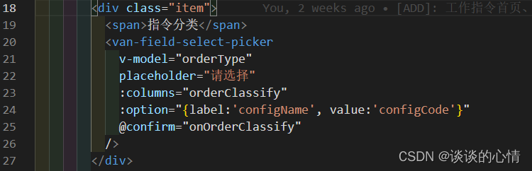
- <van-field-select-picker
- v-model="orderType"
- placeholder="请选择"
- :columns="orderClassify"
- :option="{label:'configName', value:'configCode'}"
- @confirm="onOrderClassify"
- />
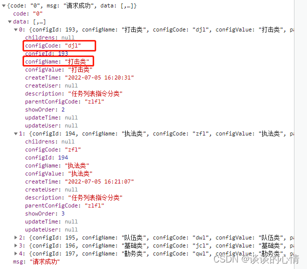
③orderClassify是后台返回的数据,{label:'configName', value:'configCode'} 对应选项的key-value,可以参考下面后台返回的数据
④单选事件 onOrderClassify 对应的方法
- onOrderClassify(data1, index, data2) {
- // data1 当前这一条的obj数据
- // index 当前选择的索引
- // data2 当前这一条数据的value
- this.orderName = data1.configName
- },
上面便是单选弹框的完整代码,下面开始多选组件的封装
2、封装多选组件(VanFieldCheckbox)
- <template>
- <div class="dh-field">
- <div class="van-hairline--bottom">
- <van-field
- v-model="resultLabel"
- v-bind="$attrs"
- readonly
- :is-link="$attrs.disabled === undefined"
- error-message-align='right'
- input-align="right"
- class="dh-cell"
- @click="showPopu($attrs.disabled)"
- />
- <van-popup v-model="show" position="bottom" class="" >
- <div class="van-picker__toolbar">
- <button type="button" class="van-picker__cancel" @click="cancel">取消button>
- <div class="van-ellipsis van-picker__title">{{$attrs.label}}div>
- <button type="button" class="van-picker__confirm" @click="onConfirm">确认button>
- div>
- <div style="max-height:264px; overflow-y:auto;">
- <van-field v-if="isSearch" v-model="searchVal" input-align="left" placeholder="搜索" @input="search"/>
- <van-cell title="全选">
- <template #right-icon>
- <van-checkbox v-model="checkedAll" name="all" @click="toggleAll"/>
- template>
- van-cell>
- <van-checkbox-group ref="checkboxGroup" v-model="checkboxValue" @change="change">
- <van-cell-group>
- <van-cell
- v-for="(item, index) in columnsData"
- :key="item[option.value]"
- :title="item[option.label]"
- clickable
- @click="toggle(index)"
- >
- <template #right-icon>
- <van-checkbox ref="checkboxes" :name="item[option.value]" />
- template>
- van-cell>
- van-cell-group>
- van-checkbox-group>
- div>
- van-popup>
- div>
- div>
- template>
- <script>
- export default {
- name: 'VanFieldCheckbox',
- model: {
- prop: 'selectValue'
- },
- props: {
- columns: {
- type: Array,
- default: function () {
- return []
- }
- },
- selectValue: {
- type: Array,
- default: function () {
- return []
- }
- },
- option: {
- type: Object,
- default: function () {
- return { label: 'label', value: 'value' }
- }
- },
- // 是否支持搜索
- isSearch: {
- type: Boolean,
- default: true
- }
- },
- computed: {
- resultLabel: {
- get () {
- const res = this.columns.filter(item => {
- return this.resultValue.indexOf(item[this.option.value]) > -1
- })
- const resLabel = res.map(item => {
- return item[this.option.label]
- })
- return resLabel.join(',')
- },
- set () {
- }
- }
- },
- data () {
- return {
- show: false,
- searchVal: '',
- columnsData: JSON.parse(JSON.stringify(this.columns)),
- checkboxValue: JSON.parse(JSON.stringify(this.selectValue)),
- checkedAll: false,
- resultValue: JSON.parse(JSON.stringify(this.selectValue))
- }
- },
- methods: {
- // 搜索
- search (val) {
- if (val) {
- this.columnsData = this.columnsData.filter(item => {
- return item[this.option.label].indexOf(val) > -1
- })
- } else {
- this.columnsData = JSON.parse(JSON.stringify(this.columns))
- }
- },
- getData (val) {
- const res = this.columnsData.filter(item => {
- return val.indexOf(item[this.option.value]) > -1
- })
- return res
- },
- onConfirm () {
- this.resultValue = this.checkboxValue
- this.show = !this.show
- this.$emit('confirm', this.resultValue, this.getData(this.resultValue))
- },
- change (val) {
- this.$emit('change', val, this.getData(this.resultValue))
- },
- cancel () {
- this.show = !this.show
- this.$emit('cancel', this.resultValue)
- },
- toggle (index) {
- this.$refs.checkboxes[index].toggle()
- },
- toggleAll (all) {
- this.$refs.checkboxGroup.toggleAll(this.checkedAll)
- },
- showPopu (disabled) {
- this.columnsData = JSON.parse(JSON.stringify(this.columns))
- this.checkboxValue = JSON.parse(JSON.stringify(this.selectValue))
- this.resultValue = JSON.parse(JSON.stringify(this.selectValue))
- if (disabled !== undefined && disabled !== false) {
- return false
- } else {
- this.show = !this.show
- }
- }
- },
- watch: {
- selectValue: function (newVal) {
- this.resultValue = newVal
- },
- resultValue (val) {
- this.searchVal = ''
- this.columnsData = JSON.parse(JSON.stringify(this.columns))
- this.$emit('input', val)
- },
- columnsData: {
- handler (val) {
- if (val.length && val.length === this.checkboxValue.length) {
- this.checkedAll = true
- } else {
- this.checkedAll = false
- }
- },
- immediate: true
- },
- checkboxValue: {
- handler (val) {
- if (val.length && val.length === this.columnsData.length) {
- this.checkedAll = true
- } else {
- this.checkedAll = false
- }
- },
- immediate: true
- }
- }
- }
- script>
- <style lang="scss" scoped>
- .dh-field {
- padding: 0;
- background:#fff;
- .dh-cell.van-cell {
- padding: 10px 0;
- }
- .dh-cell.van-cell--required::before {
- left: -8px;
- }
- .van-popup {
- border-radius: 20px 20px 0 0;
- }
- }
- style>
①使用到该组件的页面导入多选组件,和单选组件的导入一致,参考上面
② 在多选地方使用
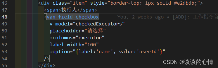
- <van-field-checkbox
- v-model="checkedExecutors"
- placeholder="请选择"
- :columns="executor"
- label-width="100"
- :option="{label:'name', value:'userId'}"
- />
③executor是后台返回的数据,{label:'name', value:'userId'}对应选项的key-value,可以参考下面后台返回的数据

④多选事件上面我没用到,我是直接v-model绑定了选中的数据,如果需要在事件中额外处理数据,可以通过@confirm="onConfirm" 来绑定事件(正常获取值用不到,直接v-model即可)
- onConfirm (data1, data2) {
- // data1 是当前选中数据的value的数组
- // data2 是当前选中数据的整个obj集合
- },
以上便是基于popup和cell、field封装的select单选、多选组件的完整代码。
-
相关阅读:
「高等数学」雅可比矩阵和黑塞矩阵的异同
创新趋势 | SaaS增长新趋势:产品驱动增长PLG(上)
国内表格软件-FineReport Count函数
转置矩阵的性质
算法补天系列之——前缀树+贪心算法
【GoWeb项目-个人Blog】数据库表设计
C# GraphicsPath 类学习
第9章:项目实战
Kamiya丨Kamiya艾美捷人α1-抗糜蛋白酶ELISA说明书
【亲测有效】3分钟 从零安装高匿名http协议带账号密码的代理服务 步骤超简单 仅限用于学习交流使用 勿用于其他用途
- 原文地址:https://blog.csdn.net/ljw124213/article/details/126058982
