-
【玩转CSS】盒子模型
🔥 信仰:一个人走得远了,就会忘记自己为了什么而出发,希望你可以不忘初心,不要随波逐流,一直走下去
🦋 欢迎关注🖱点赞👍收藏🌟留言🐾
🦄 本文由 程序喵正在路上 原创,CSDN首发!
💖 系列专栏:HTML5+CSS3+移动端前端
🌠 首发时间:2022年7月15日
✅ 如果觉得博主的文章还不错的话,希望小伙伴们三连支持一下哦✨ 学习目标
- 能够准确阐述盒子模型的 4 个组成部分
- 能够利用边框复合写法给元素添加边框
- 能够计算盒子的实际大小
- 能够利用盒子模型布局模块案例
- 能够给盒子设置圆角边框
- 能够给盒子添加阴影
- 能够给文字添加阴影
🧸 盒子模型
页面布局要学习三大核心:盒子模型、浮动和定位,学好盒子模型能非常好地帮助我们布局页面
1. 看透网页布局的本质
网页布局过程:
- 先准备好相关的网页元素,网页元素基本上都是盒子 Box
- 利用 CSS 设置好盒子样式,然后摆放到相应位置
- 往盒子里面装内容
网页布局的核心本质:就是利用 CSS 摆盒子
2. 盒子模型(Box Model)组成
所谓盒子模型:就是把 HTML 页面中的布局元素看作是一个矩形的盒子,也就是一个盛装内容的容器
CSS 盒子模型本质上是一个盒子,封装周围的 HTML 元素,它包括:边框、外边距、内边距和实际内容

3. 边框(border)
border 可以设置元素的边框,边框由三部分组成:边框宽度(粗细)、边框样式和边框颜色
语法:
border: border-width || border-style || border-color- 1
属性 作用 border-width 定义边框粗细,单位是 px border-style 边框的样式 border-color 边框颜色 DOCTYPE html> <html lang="en"> <head> <meta charset="UTF-8"> <meta http-equiv="X-UA-Compatible" content="IE=edge"> <meta name="viewport" content="width=device-width, initial-scale=1.0"> <title>盒子模型之边框title> <style> div { width: 300px; height: 200px; border-width: 5px; /* 实线边框 */ /* border-style: solid; */ /* 虚线边框 */ /* border-style: dashed; */ /* 点线边框 */ border-style: dotted; border-color: red; } style> head> <body> <div>div> body> html>- 1
- 2
- 3
- 4
- 5
- 6
- 7
- 8
- 9
- 10
- 11
- 12
- 13
- 14
- 15
- 16
- 17
- 18
- 19
- 20
- 21
- 22
- 23
- 24
- 25
- 26
- 27
- 28
- 29

边框简写:border: 1px solid red; /* 没有顺序之分 */- 1
边框分开写法:
border-top: 1px solid red; /* 只设定上边框,其余同理 */- 1
4. 表格的细线边框
border-collapse 属性控制浏览器绘制表格边框的方式,它控制相邻单元格的边框
语法:
border-collapse: collapse;- 1
- collapse 单词是合并的意思
border-collapse: collapse;表示相邻边框合并在一起
对前面小说排行榜案例进行该进
DOCTYPE html> <html lang="en"> <head> <meta charset="UTF-8"> <meta http-equiv="X-UA-Compatible" content="IE=edge"> <meta name="viewport" content="width=device-width, initial-scale=1.0"> <title>今日小说排行榜title> <style> table { width: 500px; height: 251px; } th { height: 35px; } table, td, th { border: 1px solid rebeccapurple; border-collapse: collapse; font-size: 14px; text-align: center; } style> head> <body> <table align="center" cellspacing="0"> <thead> <tr> <th>排名th> <th>关键词th> <th>趋势th> <th>今日搜索th> <th>最近七日th> <th>相关链接th> tr> thead> <tbody> <tr> <td>1td> <td>鬼吹灯td> <td>🟩td> <td>37435td> <td>1755523td> <td><a href="https://tieba.baidu.com/f?ie=utf-8&kw=%E9%AC%BC%E5%90%B9%E7%81%AF&fr=search" target="_blank">贴吧a> <a href="https://gimg2.baidu.com/image_search/src=http%3A%2F%2Ftu1.whhost.net%2Fuploads%2F20190322%2F13%2F1553234347-WEUxvwmusH.jpg&refer=http%3A%2F%2Ftu1.whhost.net&app=2002&size=f9999,10000&q=a80&n=0&g=0n&fmt=auto?sec=1659423152&t=213ca1853aeb315070cda482b002ba76" target="_blank">图片a> <a href="https://baike.baidu.com/item/%E9%AC%BC%E5%90%B9%E7%81%AF/10790?fr=aladdin" target="_blank">百科a>td> tr> <tr> <td>2td> <td>盗墓笔记td> <td>🟩td> <td>86124td> <td>675432td> <td><a href="#">贴吧a> <a href="#">图片a> <a href="#">百科a>td> tr> <tr> <td>3td> <td>西游记td> <td>🛑td> <td>39212td> <td>547654td> <td><a href="#">贴吧a> <a href="#">图片a> <a href="#">百科a>td> tr> <tr> <td>4td> <td>东游记td> <td>🛑td> <td>27523td> <td>756845td> <td><a href="#">贴吧a> <a href="#">图片a> <a href="#">百科a>td> tr> <tr> <td>5td> <td>甄嬛传td> <td>🟩td> <td>16321td> <td>785676td> <td><a href="#">贴吧a> <a href="#">图片a> <a href="#">百科a>td> tr> <tr> <td>6td> <td>水浒传td> <td>🛑td> <td>57576td> <td>1231421td> <td><a href="#">贴吧a> <a href="#">图片a> <a href="#">百科a>td> tr> <tr> <td>7td> <td>三国演义td> <td>🛑td> <td>22334td> <td>762586td> <td><a href="#">贴吧a> <a href="#">图片a> <a href="#">百科a>td> tr> tbody> table> body> html>- 1
- 2
- 3
- 4
- 5
- 6
- 7
- 8
- 9
- 10
- 11
- 12
- 13
- 14
- 15
- 16
- 17
- 18
- 19
- 20
- 21
- 22
- 23
- 24
- 25
- 26
- 27
- 28
- 29
- 30
- 31
- 32
- 33
- 34
- 35
- 36
- 37
- 38
- 39
- 40
- 41
- 42
- 43
- 44
- 45
- 46
- 47
- 48
- 49
- 50
- 51
- 52
- 53
- 54
- 55
- 56
- 57
- 58
- 59
- 60
- 61
- 62
- 63
- 64
- 65
- 66
- 67
- 68
- 69
- 70
- 71
- 72
- 73
- 74
- 75
- 76
- 77
- 78
- 79
- 80
- 81
- 82
- 83
- 84
- 85
- 86
- 87
- 88
- 89
- 90
- 91
- 92
- 93
- 94
- 95
- 96
- 97
- 98
- 99
- 100
- 101
- 102
- 103
- 104
- 105
- 106
- 107
- 108
- 109
- 110

5. 边框会影响盒子的实际大小
边框会额外增加盒子的实际大小,因此我们有两种方案解决:
- 测试盒子大小的时候,不量边框
- 如果测量的时候包含了边框,则需要 width/height 减去边框宽度
6. 内边距(padding)
padding 属性用于设置内边距,即边框与内容之间的距离
属性 作用 padding-left 左内边距 padding-right 右内边距 padding-top 上内边距 padding-bottom 下内边距 DOCTYPE html> <html lang="en"> <head> <meta charset="UTF-8"> <meta http-equiv="X-UA-Compatible" content="IE=edge"> <meta name="viewport" content="width=device-width, initial-scale=1.0"> <title>盒子模型之内边距title> <style> div { width: 200px; height: 200px; background-color: skyblue; padding-left: 20px; padding-top: 20px; } style> head> <body> <div> content盒子内容 div> body> html>- 1
- 2
- 3
- 4
- 5
- 6
- 7
- 8
- 9
- 10
- 11
- 12
- 13
- 14
- 15
- 16
- 17
- 18
- 19
- 20
- 21
- 22
- 23
- 24
- 25
- 26

padding 属性(简写属性)可以有一到四个值(重点)值的个数 表达意思 padding: 5px;1个值,代表上下左右都有5像素内边距 padding: 5px 10px;2个值,代表上下内边距是5像素,左右内边距是10像素 padding: 5px 10px 20px;3个值,代表上内边距5像素,左右内边距10像素,下内边距20像素 padding: 5px 10px 20px 30px;4个值,依次代表上右下左,顺时针方向 以上4种情况,我们实际开发都会遇到
当我们给盒子指定 padding 值之后,发生了两件事情:
- 内容和边框有了距离,添加了内边距
- padding 影响了盒子实际大小
也就是说,如果盒子已经有了宽度和高度,此时再指定内边距,会撑大盒子
解决方案:
如果保证盒子跟效果图大小保持一致,则让 width/height 减去多出来的内边距大小即可
DOCTYPE html> <html lang="en"> <head> <meta charset="UTF-8"> <meta http-equiv="X-UA-Compatible" content="IE=edge"> <meta name="viewport" content="width=device-width, initial-scale=1.0"> <title>盒子模型之内边距title> <style> div { width: 160px; height: 160px; background-color: skyblue; padding: 20px; } style> head> <body> <div> padding会影响盒子实际大小 div> body> html>- 1
- 2
- 3
- 4
- 5
- 6
- 7
- 8
- 9
- 10
- 11
- 12
- 13
- 14
- 15
- 16
- 17
- 18
- 19
- 20
- 21
- 22
- 23
- 24
- 25

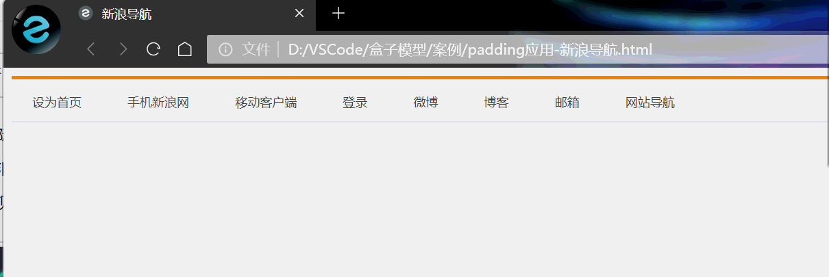
案例:新浪导航–padding影响盒子好处
padding 内边距可以撑开盒子,我们可以做非常巧妙的运用
因为每个导航栏里面的字数不一样多,我们可以不用给每个盒子宽度了,直接给 padding 最合适
案例相关取值:
- 上边框为 3 像素,颜色为 #ff8500
- 下边框为 1 像素,颜色为 #edeef0
- 盒子高度为 41 像素,背景颜色为 #fcfcfc
- 文字颜色为 #4c4c4c
DOCTYPE html> <html lang="en"> <head> <meta charset="UTF-8"> <meta http-equiv="X-UA-Compatible" content="IE=edge"> <meta name="viewport" content="width=device-width, initial-scale=1.0"> <title>新浪导航title> <style> .nav { height: 41px; border-top: 3px solid #ff8500; border-bottom: 1px solid #edeef0; background-color: #fcfcfc; /* 文字居中 */ line-height: 41px; } .nav a { /* a属于行内元素,此时必须要转换为行内块元素 */ display: inline-block; height: 41px; padding: 0 20px; font-size: 12px; color: #4c4c4c; text-decoration: none; } .nav a:hover { background-color: #EDEEF0; color: #ff8500; } style> head> <body> <div class="nav"> <a href="#">设为首页a> <a href="#">手机新浪网a> <a href="#">移动客户端a> <a href="#">登录a> <a href="#">微博a> <a href="#">博客a> <a href="#">邮箱a> <a href="#">网站导航a> div> body> html>- 1
- 2
- 3
- 4
- 5
- 6
- 7
- 8
- 9
- 10
- 11
- 12
- 13
- 14
- 15
- 16
- 17
- 18
- 19
- 20
- 21
- 22
- 23
- 24
- 25
- 26
- 27
- 28
- 29
- 30
- 31
- 32
- 33
- 34
- 35
- 36
- 37
- 38
- 39
- 40
- 41
- 42
- 43
- 44
- 45
- 46
- 47
- 48
- 49
小米侧边栏案例修改
DOCTYPE html> <html lang="en"> <head> <meta charset="UTF-8"> <meta http-equiv="X-UA-Compatible" content="IE=edge"> <meta name="viewport" content="width=device-width, initial-scale=1.0"> <title>小米侧边栏title> <style> /* 1. 把链接a转换为块级元素 */ a { display: block; width: 200px; height: 40px; background-color: #444346; text-decoration: none; font-style: 14px; color: #FFFFFF; /* text-indent: 2em; 这个不精确*/ padding-left: 30px; /* 让文字居中 */ line-height: 40px; } /* 2.经过链接变换背景颜色 */ a:hover { background-color: #FF6700; } style> head> <body> <a href="#">手机a> <a href="#">电视a> <a href="#">笔记本 平板a> <a href="#">出行 穿戴a> <a href="#">耳机 音箱a> <a href="#">家电a> <a href="#">智能 路由器a> <a href="#">电源 配件a> <a href="#">健康 儿童a> <a href="#">生活 箱包a> body> html>- 1
- 2
- 3
- 4
- 5
- 6
- 7
- 8
- 9
- 10
- 11
- 12
- 13
- 14
- 15
- 16
- 17
- 18
- 19
- 20
- 21
- 22
- 23
- 24
- 25
- 26
- 27
- 28
- 29
- 30
- 31
- 32
- 33
- 34
- 35
- 36
- 37
- 38
- 39
- 40
- 41
- 42
- 43
- 44
- 45
- 46

如果盒子本身没有指定 width/height 属性,则此时 padding 不会撑开盒子大小
7. 外边距(margin)
margin 属性用于设置外边距,即控制盒子和盒子之间的距离
属性 作用 margin-left 左外边距 margin-right 右外边距 margin-top 上外边距 margin-bottom 下外边距 margin 简写方式代表的意义跟 padding 完全一致
DOCTYPE html> <html lang="en"> <head> <meta charset="UTF-8"> <meta http-equiv="X-UA-Compatible" content="IE=edge"> <meta name="viewport" content="width=device-width, initial-scale=1.0"> <title>外边距margintitle> <style> div { width: 200px; height: 200px; background-color: pink; } .one { margin-bottom: 20px; } style> head> <body> <div class="one">1div> <div>2div> body> html>- 1
- 2
- 3
- 4
- 5
- 6
- 7
- 8
- 9
- 10
- 11
- 12
- 13
- 14
- 15
- 16
- 17
- 18
- 19
- 20
- 21
- 22
- 23
- 24
- 25
- 26
- 27

- 外边距典型应用
外边距可以让块级盒子水平居中,但是必须满足两个条件:
◦ 盒子必须指定了宽度(width)
◦ 盒子左右的外边距都设置为 auto
.header { width: 960px; margin: 0 auto; }- 1
常见的写法,以下三种都可以:
margin-left: auto; margin-right: auto;margin: auto;margin: 0 auto;
DOCTYPE html> <html lang="en"> <head> <meta charset="UTF-8"> <meta http-equiv="X-UA-Compatible" content="IE=edge"> <meta name="viewport" content="width=device-width, initial-scale=1.0"> <title>块级盒子水平居中对齐title> <style> .header { width: 900px; height: 200px; background-color: skyblue; margin: 0 auto; } style> head> <body> <div class="header">div> body> html>- 1
- 2
- 3
- 4
- 5
- 6
- 7
- 8
- 9
- 10
- 11
- 12
- 13
- 14
- 15
- 16
- 17
- 18
- 19
- 20
- 21
- 22
- 23

注意:以上方法是让块级元素水平居中,行内元素或者行内块元素水平居中给其父元素添加text-align: center;即可8. 外边距合并-嵌套块元素塌陷
使用 margin 定义块元素的垂直外边距时,可能会出现外边距的合并
对于两个嵌套关系(父子关系)的块元素,父元素有上外边距的同时子元素也有上外边距,此时父元素会塌陷较大的外边距值
解决方案:
- 可以为父元素定义上边框
- 可以为父元素定义上内边距
- 可以为父元素添加
overflow: hidden;
DOCTYPE html> <html lang="en"> <head> <meta charset="UTF-8"> <meta http-equiv="X-UA-Compatible" content="IE=edge"> <meta name="viewport" content="width=device-width, initial-scale=1.0"> <title>外边距合并-嵌套块元素塌陷title> <style> .father { width: 400px; height: 400px; background-color: purple; margin-top: 50px; /* border: 1px solid transparent; */ /* padding: 1px; */ overflow: hidden; } .son { width: 200px; height: 200px; background-color: pink; /* 会造成父元素塌陷 */ margin-top: 100px; } style> head> <body> <div class="father"> <div class="son">div> div> body> html>- 1
- 2
- 3
- 4
- 5
- 6
- 7
- 8
- 9
- 10
- 11
- 12
- 13
- 14
- 15
- 16
- 17
- 18
- 19
- 20
- 21
- 22
- 23
- 24
- 25
- 26
- 27
- 28
- 29
- 30
- 31
- 32
- 33
- 34
- 35
- 36

9. 清除内外边距
网页元素很多都带有默认的内外边距,而且不同浏览器默认的也不一致,因此我们在布局前,首先要清除下网页元素的内外边距
* { padding: 0; /* 清除内边距 */ margin: 0; /* 清除外边距 */ }- 1
- 2
- 3
- 4
注意:行内元素为了照顾兼容性,尽量只设置左右内外边距,不要设置上下内外边距,很多情况下上下内外边距是不起效果的。但是转换为块级和行内块元素就可以了
DOCTYPE html> <html lang="en"> <head> <meta charset="UTF-8"> <meta http-equiv="X-UA-Compatible" content="IE=edge"> <meta name="viewport" content="width=device-width, initial-scale=1.0"> <title>清除内外边距title> <style> /* 这句话也是我们CSS的第一行代码 */ * { padding: 0; margin: 0; } span { /* display: inline-block; */ background-color: skyblue; margin: 20px; } style> head> <body> 123 <ul> <li>abcli> ul> <span>行内元素尽量只设置左右的内外边距span> body> html>- 1
- 2
- 3
- 4
- 5
- 6
- 7
- 8
- 9
- 10
- 11
- 12
- 13
- 14
- 15
- 16
- 17
- 18
- 19
- 20
- 21
- 22
- 23
- 24
- 25
- 26
- 27
- 28
- 29
- 30
- 31
- 32

💞 PS 基本操作
因为网页美工大部分效果图都是利用 PS(Photoshop)来做的,所以以后我们大部分切图工作都是在 PS 里面完成
- 文件➔打开:可以打开我们要测量的图片
- Ctrl + R:可以打开标尺,或者视图➔标尺
- 右击标尺,把里面的单位改为像素
- Ctrl + 加号(+) 可以放大视图,Ctrl + 减号(-) 可以缩小视图
- 按住空格键,鼠标可以变成小手,拖动 PS 视图
- 用选区拖动,可以测量大小
- Ctrl + D 可以取消选区,或者在旁边空白处点击一下也可以取消选区

🐉 综合案例
1. 产品模块
布局分析

DOCTYPE html> <html lang="en"> <head> <meta charset="UTF-8"> <meta http-equiv="X-UA-Compatible" content="IE=edge"> <meta name="viewport" content="width=device-width, initial-scale=1.0"> <title>综合案例-产品模块title> <style> * { padding: 0; margin: 0; } body { background-color: #f5f5f5; } a { color: #333; text-decoration: none; } .box { width: 298px; height: 415px; background-color: #fff; /* 让块级的盒子水平居中对齐 */ margin: 100px auto; } .box img { width: 100%; } .review { height: 70px; font-size: 14px; /* 因为这个段落没有width属性,所以padding不会撑开盒子的宽度 */ padding: 0 28px; margin-top: 30px; } .appraise { font-size: 12px; color: #b0b0b0; margin-top: 20px; padding: 0 28px; } .info h4 { display: inline-block; font-weight: 400; } .info { font-size: 14px; margin-top: 15px; padding: 0 28px; } .info span { color: #ff6700; } .info em { font-style: normal; color: #ebe4e0; margin: 0 6px 0 15px; } style> head> <body> <div class="box"> <img src="img.jpg" alt=""> <p class="review">快递牛,整体不错蓝牙可以说秒连。红米给力p> <div class="appraise">来自于 117384232 的评价div> <div class="info"> <h4> <a href="#">Redmi AirDots真无线蓝...a>h4> <em>|em> <span>99.9元span> div> div> body> html>- 1
- 2
- 3
- 4
- 5
- 6
- 7
- 8
- 9
- 10
- 11
- 12
- 13
- 14
- 15
- 16
- 17
- 18
- 19
- 20
- 21
- 22
- 23
- 24
- 25
- 26
- 27
- 28
- 29
- 30
- 31
- 32
- 33
- 34
- 35
- 36
- 37
- 38
- 39
- 40
- 41
- 42
- 43
- 44
- 45
- 46
- 47
- 48
- 49
- 50
- 51
- 52
- 53
- 54
- 55
- 56
- 57
- 58
- 59
- 60
- 61
- 62
- 63
- 64
- 65
- 66
- 67
- 68
- 69
- 70
- 71
- 72
- 73
- 74
- 75
- 76
- 77
- 78
- 79
- 80
- 81
- 82
- 83
- 84
- 85
- 86
- 87

2. 快报模块

新知识点:去掉 li 标签前面的项目符号(小圆点)语法:
list-style: none;- 1
代码实现:
DOCTYPE html> <html lang="en"> <head> <meta charset="UTF-8"> <meta http-equiv="X-UA-Compatible" content="IE=edge"> <meta name="viewport" content="width=device-width, initial-scale=1.0"> <title>快报模块title> <style> * { margin: 0; padding: 0; } li { /* 去掉li前面的小圆点 */ list-style: none; } .box { width: 248px; height: 163px; border: 1px solid #ccc; margin: 100px auto; } .box h3 { height: 32px; /* 虚线下边框 */ border-bottom: 1px dotted #ccc; line-height: 32px; font-size: 14px; font-weight: 400; /* 左边空隙 */ padding-left: 15px; } .box ul li a { color: #666; font-size: 12px; /* 去掉下划线 */ text-decoration: none; } .box ul li a:hover { text-decoration: underline; } .box ul li { height: 23px; line-height: 23px; padding-left: 20px; } .box ul { margin-top: 7px; } style> head> <body> <div class="box"> <h3>品优购快报h3> <ul> <li><a href="#">【特惠】爆款耳机5折秒!a>li> <li><a href="#">【特惠】母亲节,健康好礼低至5折!a>li> <li><a href="#">【特惠】惠普GK100F机械键盘仅76.9!a>li> <li><a href="#">【特惠】9.9元洗100张照片!a>li> <li><a href="#">【特惠】长虹智能空调立省1000元!a>li> div> body> html>- 1
- 2
- 3
- 4
- 5
- 6
- 7
- 8
- 9
- 10
- 11
- 12
- 13
- 14
- 15
- 16
- 17
- 18
- 19
- 20
- 21
- 22
- 23
- 24
- 25
- 26
- 27
- 28
- 29
- 30
- 31
- 32
- 33
- 34
- 35
- 36
- 37
- 38
- 39
- 40
- 41
- 42
- 43
- 44
- 45
- 46
- 47
- 48
- 49
- 50
- 51
- 52
- 53
- 54
- 55
- 56
- 57
- 58
- 59
- 60
- 61
- 62
- 63
- 64
- 65
- 66
- 67
- 68
- 69
- 70
- 71
- 72
- 73
🌟 圆角边框
在 CSS3 中,新增了圆角边框样式,这样我们的盒子就可以变圆角了
border-radius 属性用于设置元素的外边框圆角
语法:
border-radius: length;- 1
radius 半径(圆的半径)
原理:(椭)元与边框的交集形成圆角效果
- 参数值可以为数值或者百分比的形式
- 如果是正方形,想要设置一个圆,把数值修改为高度或者宽度的一半即可,或者直接写为 50%
- 如果是个矩形,设置为高度的一半就可以做
- 该属性是一个简写属性,可以跟四个值,分别代表左上角、右上角、右下角、左下角
- 分开写:
border-top-left-radius、border-top-right-radius、border-bottom-right-radius、border-bottom-left-radius
DOCTYPE html> <html lang="en"> <head> <meta charset="UTF-8"> <meta http-equiv="X-UA-Compatible" content="IE=edge"> <meta name="viewport" content="width=device-width, initial-scale=1.0"> <title>圆角边框title> <style> .circle { width: 200px; height: 200px; background-color: skyblue; border-radius: 50%; } .rect { width: 300px; height: 100px; background-color: skyblue; border-radius: 50px; } .radius { width: 200px; height: 200px; background-color: skyblue; border-radius: 40px 50px 60px 70px; } style> head> <body> 1. 圆形的做法: <div class="circle">div> 2. 矩形的做法: <div class="rect">div> 3. 可以设置不同的圆角 <div class="radius">div> body> html>- 1
- 2
- 3
- 4
- 5
- 6
- 7
- 8
- 9
- 10
- 11
- 12
- 13
- 14
- 15
- 16
- 17
- 18
- 19
- 20
- 21
- 22
- 23
- 24
- 25
- 26
- 27
- 28
- 29
- 30
- 31
- 32
- 33
- 34
- 35
- 36
- 37
- 38
- 39
- 40
- 41
- 42

💮 盒子阴影
CSS3 中新增了盒子阴影,我们可以使用 box-shadow 属性来为盒子添加阴影
语法:
box-shadow: h-shadow v-shadow blur spread color inset;- 1
值 描述 h-shadow 必需,水平阴影的位置,允许负值 v-shadow 必需,垂直阴影的位置,允许负值 blur 可选,模糊距离 spread 可选,阴影的尺寸 color 可选,阴影的颜色 inset 可选,将外部阴影(outset)改为内部阴影 注意:
- 默认的是外阴影(outset),但是写代码时不需要写入这个值,否则阴影无效
- 盒子阴影不占用空间,不会影响其他盒子排列
DOCTYPE html> <html lang="en"> <head> <meta charset="UTF-8"> <meta http-equiv="X-UA-Compatible" content="IE=edge"> <meta name="viewport" content="width=device-width, initial-scale=1.0"> <title>盒子阴影title> <style> div { width: 200px; height: 200px; background-color: skyblue; margin: 100px auto; } /* 原来盒子没有影子,当鼠标经过才有影子 */ div:hover { box-shadow: 10px 10px 10px -4px rgba(0, 0, 0, .3); } style> head> <body> <div>div> body> html>- 1
- 2
- 3
- 4
- 5
- 6
- 7
- 8
- 9
- 10
- 11
- 12
- 13
- 14
- 15
- 16
- 17
- 18
- 19
- 20
- 21
- 22
- 23
- 24
- 25
- 26
- 27
- 28

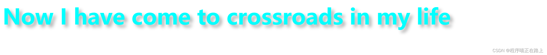
🐼 文字阴影(了解)
在 CSS3 中,我们可以使用 text-shadow 属性将阴影应用于文本
语法:
text-shadow: h-shadow v-shadow blur color;- 1
值 描述 h-shadow 必需,水平阴影的位置,允许负值 v-shadow 必需,垂直阴影的位置,允许负值 blur 可选,模糊距离 color 可选,阴影颜色 DOCTYPE html> <html lang="en"> <head> <meta charset="UTF-8"> <meta http-equiv="X-UA-Compatible" content="IE=edge"> <meta name="viewport" content="width=device-width, initial-scale=1.0"> <title>文字阴影title> <style> div { font-size: 40px; color: aqua; font-weight: 700; text-shadow: 5px 5px 6px rgba(0, 0, 0, .3); } style> head> <body> <div> Now I have come to crossroads in my life div> body> html>- 1
- 2
- 3
- 4
- 5
- 6
- 7
- 8
- 9
- 10
- 11
- 12
- 13
- 14
- 15
- 16
- 17
- 18
- 19
- 20
- 21
- 22
- 23
- 24
- 25
🧸 这次的分享就到这里啦,继续加油哦 🍒
🍭 有出错的地方欢迎在评论区指出来,共同进步,谢谢啦 -
相关阅读:
Python:功能强大的eval函数
响应格式规范
听说90%的人都没搞定手撕协程池这道面试题!
一文讲透CabloyJS全栈框架的来龙去脉
调试笔记--STM32连不上仿真器
C中的字符串
vue3中withDefaults是什么
uboot命令
Git本地项目提交到Gitee的操作流程
【学习笔记16】JavaScript函数封装习题
- 原文地址:https://blog.csdn.net/weixin_62511863/article/details/125720822
