-
CSS Grid详解
CSS Grid
首先,这是基本的样式及html:
<!DOCTYPE html> <html lang="en"> <head> <meta charset="UTF-8"> <meta http-equiv="X-UA-Compatible" content="IE=edge"> <meta name="viewport" content="width=device-width, initial-scale=1.0"> <title>Document</title> <style> * { margin: 0; padding: 0; } body, html { width: 100%; height: 100%; } .container { display: grid; } .item:nth-child(1) { background-color: red; } .item:nth-child(2) { background-color: orange; } .item:nth-child(3) { background-color: yellow; } .item:nth-child(4) { background-color: green; } .item:nth-child(5) { background-color: greenyellow; } .item:nth-child(6) { background-color: blue; } .item:nth-child(7) { background-color: blue; } </style> </head> <body> <div class="container"> <div class="item">1</div> <div class="item">2</div> <div class="item">3</div> <div class="item">4</div> <div class="item">5</div> <div class="item">6</div> </div> </body> </html>- 1
- 2
- 3
- 4
- 5
- 6
- 7
- 8
- 9
- 10
- 11
- 12
- 13
- 14
- 15
- 16
- 17
- 18
- 19
- 20
- 21
- 22
- 23
- 24
- 25
- 26
- 27
- 28
- 29
- 30
- 31
- 32
- 33
- 34
- 35
- 36
- 37
- 38
- 39
- 40
- 41
- 42
- 43
- 44
- 45
- 46
- 47
- 48
- 49
- 50
- 51
- 52
- 53
- 54
- 55
- 56
- 57
- 58
- 59
- 60
- 61
- 62
得到如下效果:

此时给最外层元素添加了display: grid;属性,但是,这还没有做任何事情,因为我们还没有定义我们希望我们的网格看起来如何。列与行
为了使它成为二维的,我们需要定义列和行。让我们创建三列和两行。我们将使用
grid-template-column(定义列的宽度)以及grid-template-row(定义行高)属性。.container { display: grid; grid-template-columns: 100px 100px 100px; grid-template-rows: 50px 50px; }- 1
- 2
- 3
- 4
- 5
这些值决定了我们希望列的宽度(100px)和行的高度(50px)。结果如下:

我们还可以使用repeat属性,它可以让代码看起来更整洁。它将会得到和上图一样的效果。
grid-template-columns: repeat(2, 100px 50px);等同于grid-template-columns: 100px 50px 100px 50px;.container { display: grid; grid-template-columns: repeat(3, 100px); grid-template-rows: repeat(2, 50px); }- 1
- 2
- 3
- 4
- 5
我们尝试使用其他的像素值
.container { display: grid; grid-template-columns: 200px 100px 100px; grid-template-rows: 100px 50px; }- 1
- 2
- 3
- 4
- 5
得到如下效果:

我们定义一个3x3的网格
.container { display: grid; grid-template-columns: 200px 100px 100px; grid-template-rows: 100px 50px 50px; }- 1
- 2
- 3
- 4
- 5
效果如下:

如果按照以上,我们定义为3x3的网格,会发现和上一例子的效果是一样的。这是因为我们只有六个项目来填充网格。如果我们还有三个,那么最低行也会被填满。fr(fraction)
先看一个例子:
.container { display: grid; grid-template-columns: 1fr 2fr 1fr; grid-template-rows: 100px 50px; }- 1
- 2
- 3
- 4
- 5
那么它的表现为1:2:1。效果如下:

我们也可以使用px和fr一起使用。.container { display: grid; grid-template-columns: 200px 2fr 1fr; grid-template-rows: 100px 50px; }- 1
- 2
- 3
- 4
- 5
它表现为第一列为
200px, 后面第二列与第三列为2:1的结果。效果如下:

间距
colum-gap:列间距row-gap: 行间距
下面先看一个简单的例子
.container { display: grid; grid-template-columns: repeat(3, 200px); grid-template-rows: repeat(2, 100px); column-gap: 20px; row-gap: 10px; }- 1
- 2
- 3
- 4
- 5
- 6
- 7
具体效果如下:

也可以简写,效果是一样的。.container { display: grid; grid-template-columns: repeat(3, 200px); grid-template-rows: repeat(2, 100px); gap: 10px 20px; }- 1
- 2
- 3
- 4
- 5
- 6
定位和调整
要定位和调整项目的大小,我们将定位它们并使用
grid-column以及grid-row属性。需注意,这是添加在子项目上的属性。先看一个简单的例子:
.container { display: grid; grid-template-columns: repeat(3, 200px); grid-template-rows: repeat(2, 100px); gap: 10px 20px; } .item:nth-child(1) { background-color: red; grid-column-start: 1; grid-column-end: 4; }- 1
- 2
- 3
- 4
- 5
- 6
- 7
- 8
- 9
- 10
- 11
我们希望 item1 从第一条网格线开始,在第四列线结束。换句话说,它将占据整行。效果如下:
需要注意的是,我们给这个网格定义为2x3的网格,那么当它超出后,表现形式就不会受我们设置而改变。也就是说我们只设置了grid-template-rows的前两行,所以第三行的行高是它本来的行高。
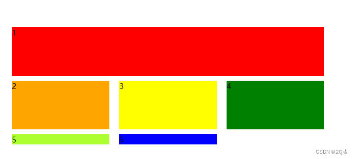
需要特别说明得是,列线和列不一样。以下四条红色的线就是列线。

我们再看一个列子试图明白其中的奥秘,它的父元素属性设置与上例中是一样的。.item:nth-child(1) { background-color: red; grid-column-start: 1; grid-column-end: 4; }- 1
- 2
- 3
- 4
- 5
效果如下:

auto-fit自适应列的数量,栅格将会根据容器的宽度调整其数量。
.container { display: grid; grid-template-columns: repeat(auto-fit, 200px); grid-template-rows: repeat(2, 100px); gap: 10px 20px; }- 1
- 2
- 3
- 4
- 5
- 6
它会根据盒子的容器自适应显示列数。然后这种方式右侧会有比较多的留白。效果如下:

minmax()定义的范围大于或等于 min, 小于或等于 max。
.container { display: grid; grid-template-columns: repeat(auto-fit, minmax(100px, 1fr)); grid-template-rows: repeat(2, 100px); gap: 10px 20px; }- 1
- 2
- 3
- 4
- 5
- 6
minmax(100px, 1fr)代表每列的列宽将至少为 100px,而如果有更多的可用空间,栅格布局会将其均分给每列,因为这些列变成了 fraction 单位,而不是 px。效果如下:

-
相关阅读:
【pytest】conftest.py使用
【EMC专题】电磁辐射的危害
vue中倒计时(日,时,分,秒)的计算和当前时间计时读秒
Word Embedding与Word2Vec学习
操作系统 面试第一弹
【个人简历】如何让人眼前一亮?简约大方(附模板)
Java软件开发流程
前端之TS类型声明
自定义注解
MySQL 中with rollup的用法,对分组再汇总
- 原文地址:https://blog.csdn.net/qq_40864647/article/details/125515076

- 最新文章
-
沪漂五周年了:我越来越迷茫了
Agentic Skill Routing 实战:别再把所有 Skill 塞进 AI Agent 上下文
MySQL-Seconds_behind_master的精度误差
[MAF预定义ChatClient中间件-03]CachingChatClient——利用缓存省钱省时间
AI的至暗历史:从万众期待到被政府撤资,AI的两次死亡徘徊
Agent OS :五种驯服不确定性的范式
PortSwigger SQL注入LAB11
数据库即时编译JIT
[Begin]AI Learn Data Day 0
深度学习进阶(二十七)现代 LLM 的核心架构设计其二:SwiGLU