-
学习vue3 五,传送,缓存组件以及过渡和过渡列表
目录
Teleport传送组件
Teleport Vue 3.0新特性之一。
Teleport 是一种能够将我们的模板渲染至指定DOM节点,不受父级style、v-show等属性影响,但data、prop数据依旧能够共用的技术;类似于 React 的 Portal。
主要解决的问题 因为Teleport节点挂载在其他指定的DOM节点下,完全不受父级style样式影响
用法
      header slot


      {{data}}
使用一个teleport标签包裹,并且使用to属性去跳转到想要的dom元素处,也可以使用class或者id选择器
      header slot


{{data}}keep-alive缓存组件
有时候我们离开这个组件后,不希望组件被重新渲染,那么就可以使用keep-alive
使用后会增加两个生命周期,onActivated和onDeActivated
onMounted之后执行一次
案例:
- <script setup lang="ts">
- import A from "./components/A.vue";
- import B from "./components/B.vue";
- import Card from "./components/Card.vue";
- import {shallowRef,ref,reactive,markRaw} from "vue";
- const comData = reactive([
- {
- name:"A",
- com: markRaw(A)
- },
- {
- name:"B",
- com: markRaw(B)
- },
- {
- name:"C",
- com: markRaw(Card)
- }
- ])
- const com = shallowRef(comData[0].com)
- const active = ref(0)
- function changeView(index:number){
- active.value = index
- com.value = comData[index].com
- }
- </script>
- <template>
- <div class="container">
- <div
- v-for="(item,index) in comData" :key="index"
- :class="{'active':active === index}"
- @click="changeView(index)">
- {{item.name}}
- </div>
- </div>
- <keep-alive :exclude="comData[0].name">
- <component :is="com"></component>
- </keep-alive>
- </template>
- <style scoped>
- .container {
- width: 500px;
- display: flex;
- justify-content: center;
- margin: 0 auto;
- }
- .container div {
- margin: 10px;
- cursor: pointer;
- width: 100px;
- height: 30px;
- line-height: 30px;
- border: 1px solid grey;
- text-align: center;
- }
- .active {
- background-color: skyblue;
- color: white;
- }
- </style>
A,B组件都不会被销毁了,而是进行缓存
这个api有三个props
include:要包含哪些组件
exclude:要排除哪些组件
max:最多有多少组件
B组件内
- <script setup lang="ts">
- import {onMounted,onActivated,onDeactivated} from "vue";
- onMounted(() => {
- console.log("b组件挂载")
- })
- onActivated(() => {
- console.log("b组件激活")
- })
- onDeactivated(() => {
- console.log("b组件失活")
- })
- </script>
- <template>
- <div class="context">
- <h1>我是b组件</h1>
- <div>
- <span>请输入:</span>
- <input type="text" style="width: 300px;height: 35px"/>
- </div>
- </div>
- </template>
- <style scoped>
- .context {
- width: 500px;
- height: 300px;
- background-color: #ccc;
- border: 1px solid grey;
- margin: 0 auto;
- }
- h1 {
- text-align: center;
- }
- </style>
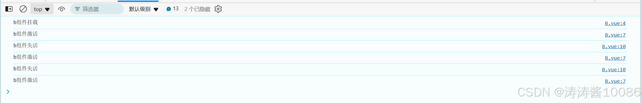
执行截图
transition动画组件
vue提供了transition来封装组件,可以对一个组件提供离开或者进入的过渡,对于以下四个都有作用
- 条件渲染 (使用 v-if)
- 条件展示 (使用 v-show)
- 动态组件
- 组件根节点
自定义 transition 过度效果,你需要对
transition组件的name属性自定义。并在css中写入对应的样式1. 过渡的类名
vue提供了六个类名来完成过渡
v-enter-from:定义进入过渡的开始状态。在元素被插入之前生效,在元素被插入之后的下一帧移除。
v-enter-active:定义进入过渡生效时的状态。在整个进入过渡的阶段中应用,在元素被插入之前生效,在过渡/动画完成之后移除。这个类可以被用来定义进入过渡的过程时间,延迟和曲线函数。
v-enter-to:定义进入过渡的结束状态。在元素被插入之后下一帧生效 (与此同时 v-enter-from 被移除),在过渡/动画完成之后移除。
v-leave-from:定义离开过渡的开始状态。在离开过渡被触发时立刻生效,下一帧被移除。
v-leave-active:定义离开过渡生效时的状态。在整个离开过渡的阶段中应用,在离开过渡被触发时立刻生效,在过渡/动画完成之后移除。这个类可以被用来定义离开过渡的过程时间,延迟和曲线函数。
v-leave-to:离开过渡的结束状态。在离开过渡被触发之后下一帧生效 (与此同时 v-leave-from 被移除),在过渡/动画完成之后移除。
案例:
和缓存组件代码联用
.fade-enter-active, .fade-leave-active {
    transition: all 0.5s ease;
}
.fade-enter-from, .fade-leave-to {
  width: 0px;
  height: 0px;
}
.fade-enter-to, .fade-leave-from {
  width: 500px;
  height: 500px;
}
2. 自定义过渡class名
enter-from-classenter-active-classenter-to-classleave-from-classleave-active-classleave-to-class
在这些props后接要自定义的名字即可换成自己想要的,相当于起别名
也可以指定过渡时间
...
可以分别指定,离开和进入的时间
... 自定义class只要是可以和css的动画库进行连用
案例:我们以animate.css为例
安装:npm install animate.css -S
引入:在main.ts中 import "animate.css"
- <transition
- enter-active-class="animate__animated animate__fadeInLeft"
- leave-active-class="animate__animated animate__fadeOutLeft">
- <keep-alive :exclude="comData[0].name">
- <component :is="com"></component>
- </keep-alive>
- </transition>
3. transition的生命周期
对于transition vue设计了八个生命周期函数,用于使用js来执行一些操作
- @before-enter="beforeEnter" //对应enter-from
- @enter="enter"//对应enter-active
- @after-enter="afterEnter"//对应enter-to
- @enter-cancelled="enterCancelled"//显示过度打断
- @before-leave="beforeLeave"//对应leave-from
- @leave="leave"//对应enter-active
- @after-leave="afterLeave"//对应leave-to
- @leave-cancelled="leaveCancelled"//离开过度打断
他们都会传入一个参数el:Element
enter和leave会多一个参数,done也就是一个回调,当过渡执行完毕时,会自动调用
4.appear
通过这个属性可以设置初始节点过度 就是页面加载完成就开始动画 对应三个状态
-
appear-active-class=""
-
appear-from-class=""
-
appear-to-class=""
>
transition-group
1. 过渡列表
同时渲染整个列表,我们会使用transition-group.组件
- 默认情况下,它不会渲染一个包裹元素,但是你可以通过
tagattribute 指定渲染一个元素。 - (也就是说不使用tag那么就是分散的元素节点没有生成一个父节点包裹)
- 过渡模式不可用,因为我们不再相互切换特有的元素。
- 内部元素总是需要提供唯一的
keyattribute 值。 - CSS 过渡的类将会应用在内部的元素中,而不是这个组/容器本身。
案例:
- <template>
- <div>
- <div class="anniu">
- <button @click="add">addbutton>
- <button @click="pop">popbutton>
- div>
- <transition-group
- enter-active-class="animate__animated animate__backInDown"
- leave-active-class="animate__animated animate__backOutDown"
- tag="div" class="context">
- <div
- class="showList"
- v-for="(item,index) in list" :key="index">
- {{item}}
- div>
- transition-group>
- div>
- template>
- <style scoped>
- .anniu {
- width: 200px;
- margin: 0 auto;
- }
- .anniu button {
- width: 80px;
- height: 35px;
- margin-left: 10px;
- }
- .context {
- width: 500px;
- height: 500px;
- margin: 20px auto;
- display: flex;
- flex-wrap: wrap;
- justify-content: center;
- border: 1px solid grey;
- }
- .showList {
- width: 25px;
- height: 25px;
- border: 1px solid grey;
- text-align: center;
- margin-top: 5px;
- }
- style>
2. 列表的移动过渡
组件还有一个特殊之处。除了进入和离开,它还可以为定位的改变添加动画。只需了解新增的 v-move 类就可以使用这个新功能,它会应用在元素改变定位的过程中。像之前的类名一样,它的前缀可以通过 name attribute 来自定义,也可以通过 move-class attribute 手动设置 案例:
- <template>
- <div>
- <button @click="change">randombutton>
- <transition-group tag="div" name="mmm" class="context">
- <div v-for="item in data" :key="item.id">
- {{item.value}}
- div>
- transition-group>
- div>
- template>
- <style scoped>
- .context {
- display: flex;
- width: calc(10 * 25px);
- flex-wrap: wrap;
- }
- button{
- width: 100px;
- height: 35px;
- font-size: 19px;
- margin-bottom: 30px;
- }
- .context div {
- width: 25px;
- height: 25px;
- text-align: center;
- border: 1px solid grey;
- }
- .mmm-move {
- transition: all 1s ease;
- }
- style>
map() 的返回值是一个新的数组,新数组中的元素为 “原数组调用函数处理过后的值”
3. 状态过渡
vue也可以给数字颜色等添加过渡
- <div>
- <input step="20" v-model="num.current" type="number" />
- <div>{{ num.tweenedNumber.toFixed(0) }}div>
- div>
- <script setup lang='ts'>
- import { reactive, watch } from 'vue'
- import gsap from 'gsap'
- const num = reactive({
- tweenedNumber: 0,
- current:0
- })
- watch(()=>num.current, (newVal) => {
- gsap.to(num, {
- duration: 1,
- tweenedNumber: newVal
- })
- })
- script>
- <style>
- style>
-
相关阅读:
经典算法题 -- 水仙花数
单例模式~
基于 Servlet 的博客系统
synchronized 实现原理
图的初识·遍历
记录PyTorch中半精度amp训练出现Nan的排查过程
GO语言 类型断言type
【数据结构】树与二叉树(五):二叉树的顺序存储(初始化,插入结点,获取父节点、左右子节点等)
qt 判断文件是否存在
node.js -- 身份认证
- 原文地址:https://blog.csdn.net/tian_liang_jia/article/details/140944758