-
【深耕 Python】Data Science with Python 数据科学(7)书352页练习题
写在前面
关于数据科学环境的建立,可以参考我的博客:
【深耕 Python】Data Science with Python 数据科学(1)环境搭建
往期数据科学博文:
【深耕 Python】Data Science with Python 数据科学(2)jupyter-lab和numpy数组
【深耕 Python】Data Science with Python 数据科学(3)Numpy 常量、函数和线性空间
【深耕 Python】Data Science with Python 数据科学(4)(书337页)练习题及解答
【深耕 Python】Data Science with Python 数据科学(5)Matplotlib可视化(1)
【深耕 Python】Data Science with Python 数据科学(6)Matplotlib可视化(2)
代码说明: 由于实机运行的原因,可能省略了某些导入(import)语句。
Question 1
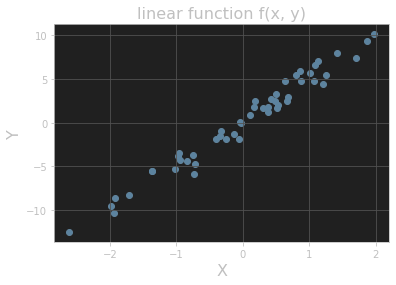
Add a title and axis labels to the plot shown in Figure 11.15.
# ex 1 import matplotlib.pyplot as plt y = 5 * x + rng.standard_normal(n_pts) fig, ax = plt.subplots() ax.scatter(x, y) plt.title("linear function f(x, y)", fontsize=16) plt.xlabel("X", fontsize=16) plt.ylabel("Y", fontsize=16) plt.grid() plt.show()- 1
- 2
- 3
- 4
- 5
- 6
- 7
- 8
- 9
- 10
输出的图像:
Question 2
Add titles to the histograms in Section 11.3.3.
Answer 1
# ex 2 values = rng.standard_normal(1000) fig, ax = plt.subplots() ax.hist(values) plt.title("histogram_1") plt.grid() plt.show()- 1
- 2
- 3
- 4
- 5
- 6
- 7
输出的图像:

Answer 2
fig, ax = plt.subplots() ax.hist(values, bins=20) plt.title("histogram_2") plt.grid() plt.show()- 1
- 2
- 3
- 4
- 5
输出的图像:

Question 3
One common plotting task is including multiple subplots in the same figure. Show that the code in Listing 11.10 creates vertically stacked subplots, as shown in Figure 11.18. (Here the suptitle() method produces a “supertitle” that sits above both plots. See the Matplotlib documentation on subplots for other ways to create multiple subplots.)
# ex 3 import numpy as np from math import tau x = np.linspace(0, tau, 100) fig, (ax1, ax2) = plt.subplots(2) fig.suptitle(r"Vertically stacked plots of $\cos(\theta)$ and $\sin(\theta)$.") ax1.grid() ax1.plot(x, np.cos(x)) ax2.grid() ax2.plot(x, np.sin(x))- 1
- 2
- 3
- 4
- 5
- 6
- 7
- 8
- 9
- 10
输出的图像:

Question 4
Add a plot of the function cos(x - t/8) to the plot in Figure 11.14 with color “orange” and linestyle “dashdot”. Extra credit: Add an annotation as well. (The extra-credit step is much easier in an interactive Jupyter notebook, especially when finding the right coordinates for the annotation label and arrow.)
#%% # ex 4 from math import tau import numpy as np import matplotlib.pyplot as plt x = np.linspace(0, tau, 100) fig, ax = plt.subplots() ax.set_xticks([0, tau / 4, tau / 2, 3 * tau / 4, tau]) ax.set_yticks([-1, -1 / 2, 0, 1 / 2, 1]) plt.grid() ax.set_xticklabels([r'$0$', r'$\tau/4$', r'$\tau/2$', r'$3\tau/4$', r'$\tau$']) ax.set_yticklabels([r'$-1$', r'$-1/2$', r'$0$', r'$1/2$', r'$1$']) ax.set_title("One period of cosine and sine", fontsize=16) ax.set_xlabel(r"$\theta$", fontsize=16) ax.set_ylabel(r"$f(\theta)$", fontsize=16) ax.annotate(r"$\cos(\theta)$", xy=(1.75, -0.3), xytext=(0.5, -0.75), arrowprops={"facecolor": "black", "width": 1}, fontsize=16) ax.annotate(r"$\sin(\theta)$", xy=(2.75, 0.5), xytext=(3.5, 0.75), arrowprops={"facecolor": "black", "width": 1}, fontsize=16) ax.annotate(r"$\cos(\theta - 2\pi / 8)$", xy=(1.83, 0.5), xytext=(1.0, 0.75), arrowprops={"facecolor": "black", "width": 1}, fontsize=16) fig.set_dpi(150) ax.plot(x, np.cos(x), color="red", linestyle="dashed") ax.plot(x, np.sin(x), color="blue", linestyle="dotted") ax.plot(x, np.cos(x - tau / 8), color="orange", linestyle="dashdot") plt.show()- 1
- 2
- 3
- 4
- 5
- 6
- 7
- 8
- 9
- 10
- 11
- 12
- 13
- 14
- 15
- 16
- 17
- 18
- 19
- 20
- 21
- 22
- 23
- 24
- 25
- 26
- 27
- 28
- 29
- 30
- 31
- 32
- 33
- 34
输出的图像:

参考文献 Reference
《Learn Enough Python to be Dangerous——Software Development, Flask Web Apps, and Beginning Data Science with Python》, Michael Hartl, Boston, Pearson, 2023.
-
相关阅读:
麦芽糖-紫杉醇maltose-Paclitaxel
第04章 Tableau高级操作
策略验证_指标买点分析技法_运用KDJ随机指标选择买点
如何在数据库中存储小数:FLOAT、DECIMAL还是BIGINT?
运放 + MOS管构成的恒流电路分析及实用环境器件参数选择
小知识(3) 解决谷歌翻译问题(浏览器/IDEA)
学生HTML个人网页作业作品:基于web在线汽车网站的设计与实现 (宝马轿车介绍)
STK 12.5.0发布
使用扩散模型从文本生成图像
prometheus 原理(架构,promql表达式,描点原理)
- 原文地址:https://blog.csdn.net/weixin_43031313/article/details/137267014
