-
[R] Underline your idea with ggplot2
Preview:
# 介绍:之前的教程中,我们学习了如何使条形图或直方图看起来更好
比如:
1. How to select a graph = calibrate the geom part2. How to select variables = calibrate the aes part3. How to add a title = calibrate the labs part4. How to put the bar in a certain order = fct_infreq in the aes part5. How to change the colour and how to fill the bars = the fill in aes part or geombar , or the option scale_fill6. How to adjust transparency = alpha# 今天我们将学习如何在图形中添加信息,编辑图例中的文本元素,并改变主题
# 添加图形中的信息使用geom_text()
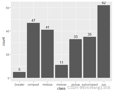
# 示例:在条形图上添加每个条形的计数
- ggplot(data = mpg, aes(x = class)) +
- geom_bar() +
- geom_text(stat = 'count', aes(label = ..count..), vjust = -0.5)
# 编辑图例中的文本元素并改变主题使用theme()
# 示例:改变坐标轴文本的大小和位置
- ggplot(data = mpg, aes(x = class)) +
- geom_bar() +
- theme(axis.text.x = element_text(angle = 45, size = 10))
# 理解数据可视化的指导原则
# 例如,平衡、强调、运动、模式、重复、节奏和多样性
# 使用散点图进行两个连续变量的数据可视化
# 使用条形图进行两个分类数据的数据可视化,并学习新的自定义设置
# 使用一个连续变量和一个分类变量进行数据可视化
Main Content
Add info in the plots:
首先,让我们来看看如何在图形中添加信息。在R中,我们可以使用
geom_text()函数来实现这一点。例如,如果我们想在条形图上显示每个条形的计数,我们可以这样做:- ggplot(data = mpg, aes(x = class)) +
- geom_bar() +
- geom_text(stat = 'count', aes(label = ..count..), vjust = -0.5)
-
ggplot(data = mpg, aes(x = class)): This sets up the basic plot using thempgdataset and specifies that theclassvariable should be mapped to the x-axis. -
geom_bar(): This adds a bar plot layer to the plot, creating a bar for each unique value of theclassvariable. -
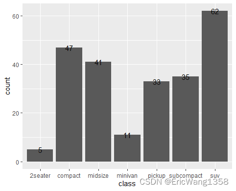
geom_text(stat = 'count', aes(label = ..count..), vjust = -0.5): This adds text labels to the plot. Thestat = 'count'argument tellsgeom_textto calculate the count of observations for each class. Theaes(label = ..count..)specifies that the count should be used as the label for each bar. Thevjust = -0.5argument adjusts the vertical position of the labels to place them above the bars. -
-
if vjust = 0.5
-
接下来,让我们讨论如何编辑图例中的文本元素并改变图形的主题。在R中,我们可以使用
theme()函数来实现这一点。例如,如果我们想改变坐标轴文本的大小和位置,我们可以这样做:- ggplot(data = mpg, aes(x = class)) +
- geom_bar() +
- theme(axis.text.x = element_text(angle = 45, size = 10))
Changing the text size and position in the x or y axis
+ theme(axis.text.x = element_text(angle = 45, size=10))+ theme(axis.text.x = element_text(angle = 45,size=7))-
family: Specifies the font family to be used for the axis text. For example, setting
family = "Arial"would use the Arial font for the axis text. -
face: Specifies the font style to be used for the axis text. This can be used to make the text bold, italic, or bold italic. For example, setting
face = "bold"would make the axis text bold. -
colour: Specifies the color of the axis text, ticks, and marks. For example, setting
colour = "red"would make the axis text red. -
size: Specifies the size of the axis text. For example, setting
size = 12would make the axis text 12 points in size. -
angle: Specifies the angle at which the axis text is displayed. For example, setting
angle = 45would rotate the axis text 45 degrees clockwise.
remove axis ticks and labels
you can remove axis ticks and labels using
element_blank()orsize=0intheme()inggplot2. Here's how you can do it:- library(ggplot2)
- # Create a basic plot
- p <- ggplot(data = mpg, aes(x = class)) +
- geom_bar() +
- geom_text(stat = 'count', aes(label = ..count..), vjust = -0.5)
- # Remove x-axis ticks and labels
- p + theme(axis.text.x = element_blank(),
- axis.ticks.x = element_blank())
- # Remove y-axis ticks and labels
- p + theme(axis.text.y = element_blank(),
- axis.ticks.y = element_blank())
Add the headcount for each bar in a graph which indicate proportion
ggplot(CUHKSZ_employment_survey_1,aes(fct_infreq(Occupation),y=(..count..)/sum(..count..),fill=Occupation))+geom_bar()+geom_text(stat='count',aes(label=..count..),vjust=+1.5)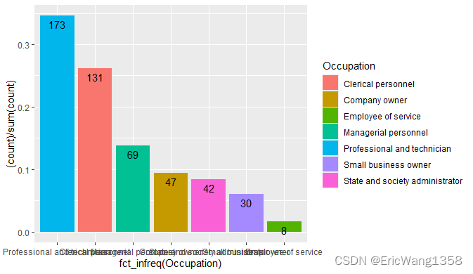
- ggplot(CUHKSZ_employment_survey_1, aes(x = fct_infreq(Occupation), fill = Occupation)) +
- geom_bar(aes(y = (..count..)/sum(..count..))) +
- geom_text(stat = 'count', aes(label = ..count.., y = (..count..)/sum(..count..)), vjust = +1.5) +
- labs(title="Occupation of CUHK Shenzhen students after graduation",x=NULL, y="Proportion")
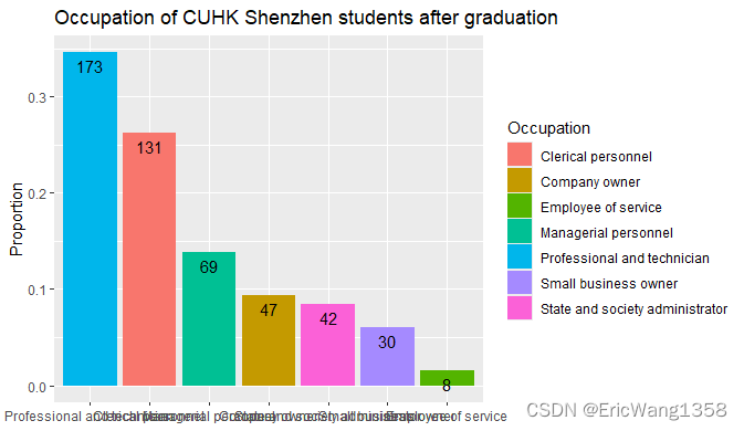
If you want to remove the x-axis label entirely, you can use
x = ""instead.- ggplot(CUHKSZ_employment_survey_1, aes(x = fct_infreq(Occupation), fill = Occupation)) +
- geom_bar(aes(y = (..count..)/sum(..count..))) +
- geom_text(stat = 'count', aes(label = ..count.., y = (..count..)/sum(..count..)), vjust = +1.5) +
- labs(title="Occupation of CUHK Shenzhen students after graduation", x = "", y = "Proportion")
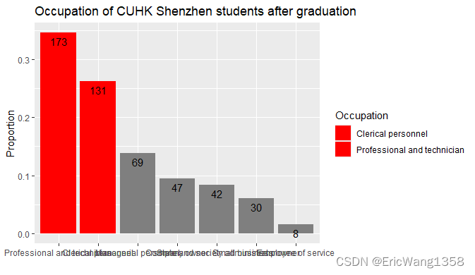
If I want to underline that students are more likely to become “Professional an technician” or “Clerical personnel”, I might use the same color for those category
Scale_fill_manual(values=c(“color1”,”color2”….)- # Define custom colors
- custom_colors <- c("Professional and technician" = "Red", "Clerical personnel" = "Red", "Other" = "grey")
- # Create the plot with custom colors
- ggplot(CUHKSZ_employment_survey_1, aes(x = fct_infreq(Occupation), fill = Occupation)) +
- geom_bar(aes(y = (..count..)/sum(..count..))) +
- geom_text(stat = 'count', aes(label = ..count.., y = (..count..)/sum(..count..)), vjust = +1.5) +
- labs(title="Occupation of CUHK Shenzhen students after graduation", x = "", y = "Proportion") +
- scale_fill_manual(values = custom_colors)
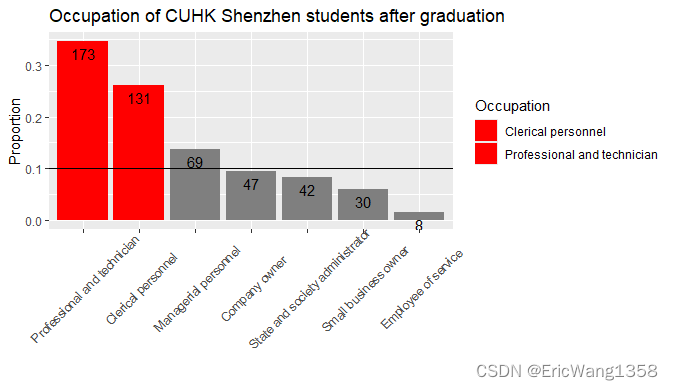
If I want to underline that students more than 10% of the students become “Professional an technician” “Clerical personnel” or “managerial personnel”, colour should de different and I should add a horizontal line
+geom_hline(yintercept=0.1)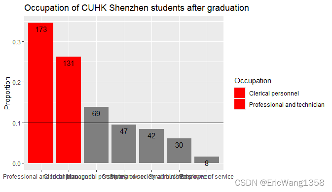
- ggplot(CUHKSZ_employment_survey_1, aes(x = fct_infreq(Occupation), fill = Occupation)) +
- geom_bar(aes(y = (..count..)/sum(..count..))) +
- theme(axis.text.x =element_text(angle = 45,vjust = 0.6))+
- geom_text(stat = 'count', aes(label = ..count.., y = (..count..)/sum(..count..)), vjust = +1.5) +
- labs(title="Occupation of CUHK Shenzhen students after graduation", x = "", y = "Proportion") +
- scale_fill_manual(values = custom_colors) +
- geom_hline(yintercept=0.1)
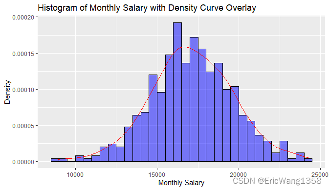
Demonstrate that your data are normally distributed by over-ploting a Gaussian curve on your histogram
- ggplot(CUHKSZ_employment_survey_1, aes(x = Monthly_salary_19, y = stat(density))) +
- geom_histogram(binwidth = 500, fill = "blue", colour = "black", alpha = 0.5, boundary = 8000) +
- geom_density(color = "red") +
- labs(title = "Histogram of Monthly Salary with Density Curve Overlay", x = "Monthly Salary", y = "Density")
Notice to use stat(density) here instead of ...density... , or it will report an Error
or more(
Warning message:
`stat(density)` was deprecated in ggplot2 3.4.0.
ℹ Please use `after_stat(density)` instead.
This warning is displayed once every 8 hours.
Call `lifecycle::last_lifecycle_warnings()` to see where this warning was generated. )
Underline the individuals who are overweigth in the BMI histogram = change the colour of the bar in an histogram
Decompose the histogram into two using the function subset
- ggplot(SEE_students_data_2,aes(x=BMI))+
- geom_histogram(data=subset(SEE_students_data_2,BMI<25),fill="Blue", alpha=0.5,binwidth = 1,color="Black")+
- geom_histogram(data=subset(SEE_students_data_2,BMI>25),fill="Red", alpha=0.5,binwidth = 1,color="Black")
-
相关阅读:
实现两数交换
Java小技能:多级菜单排序并返回树结构菜单列表
QCChart2D Charting 3.1 for .Net Crack
[微信]微信JS-SDK权限签名生成及验证
原生app 打开uni小程序 传参问题
高等数学(第七版)同济大学 习题5-4 个人解答
郁金香2021年游戏辅助技术中级班(一)
linux下硬盘分区和格式化和挂载以及启动自动挂载
单片机第三季-第一课:STM32基础
【数据结构】链表栈
- 原文地址:https://blog.csdn.net/m0_74331272/article/details/136518479
- 最新文章
-
【FHE】我们如何实现同态加密推理(八):SiLU 的密文化——两条路径,和一个 8 字节的开关
SQLcl 中 c/old/new 替换变量为何失效?先定位再替换
不让模型写作文,直接从它脑子里读答案:Jev 决策在 .NET 的两条路线
Halo插件:支持GitHub的图床附件策略
电视投屏界的“一股清流”!SimpleTVCast 6.0.0-beta 抢先体验:无需TV端App,界面大换血!✨
华三VXLAN集中式网关实战指南:Spine多活网关 + 双活接入(M-LAG)
软件更好写之后口碑会更重要
大 O、大 Omega、大 Theta 的区别,O(n) 复杂度是什么意思
Java标签跳转:一个鲜为人知但却很实用的小技巧
多智能体系统论文速读