-
封装一个Element-ui生成一个可行内编辑的表格(vue2项目)
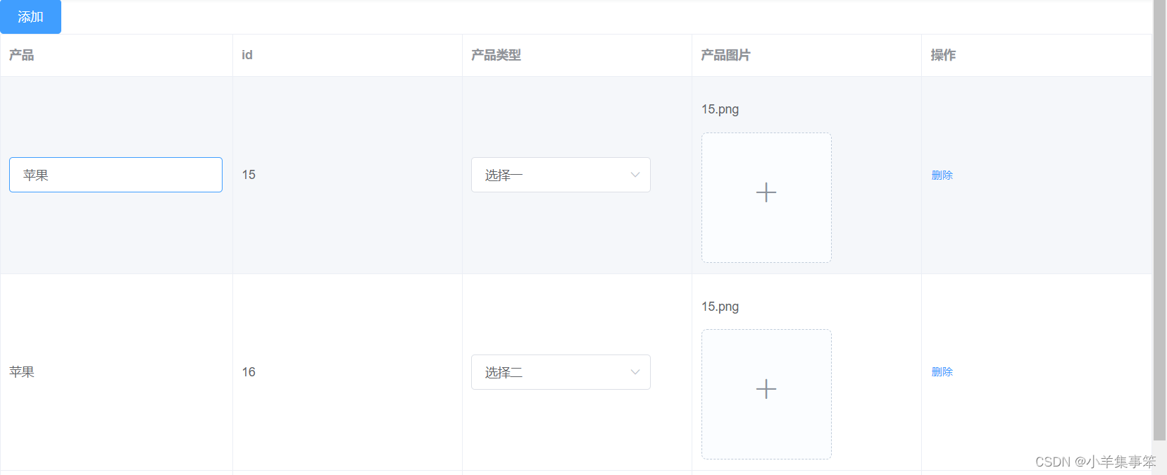
这个封装的是一个供整个项目使用的表格,可多次复用.放在一个全局使用的公共组件文件下.
大致功能介绍,封装自定义指令,点击获得焦点,显示输入框,失去焦点显示文本内容,类型是字典决定类型,图片可以显示图片名还是上传图片
子组件
- <template>
- <div>
- <el-table :data="tableData" border style="width: 100%">
- <el-table-column
- :prop="field.prop"
- :label="field.label"
- :min-width="field.minWidth || 140"
- v-for="(field, index) in fields"
- :key="index"
- show-overflow-tooltip
- >
- <template slot-scope="scope">
- <div v-if="field.slot">
- <slot :name="field.slot" :row="scope.row" />
- div>
- <div v-else>
- <div>
- <el-input
- v-if="field.iseditor && scope.row.isnameSelected"
- v-model="scope.row[field.prop]"
- @focus="cellClick(field, scope.row)"
- @blur="blurEvent(field, scope.row)"
- v-focus
- >
- el-input>
- <p @click="cellClick(field, scope.row)" v-else>
- {{ scope.row[field.prop] || "--" }}
- p>
- div>
- div>
- template>
- el-table-column>
- el-table>
- div>
- template>
- <style scoped>
- style>
- <style>
- .el-tooltip__popper {
- max-width: 1000px;
- }
- .disabled .el-upload--picture-card {
- display: none;
- }
- .avatar-uploader .el-upload {
- border: 1px dashed #d9d9d9;
- border-radius: 6px;
- cursor: pointer;
- position: relative;
- overflow: hidden;
- }
- .avatar-uploader .el-upload:hover {
- border-color: #409eff;
- }
- .avatar-uploader-icon {
- font-size: 28px;
- color: #8c939d;
- width: 178px;
- height: 178px;
- line-height: 178px;
- text-align: center;
- }
- .avatar {
- width: 178px;
- height: 178px;
- display: block;
- }
- style>
父组件
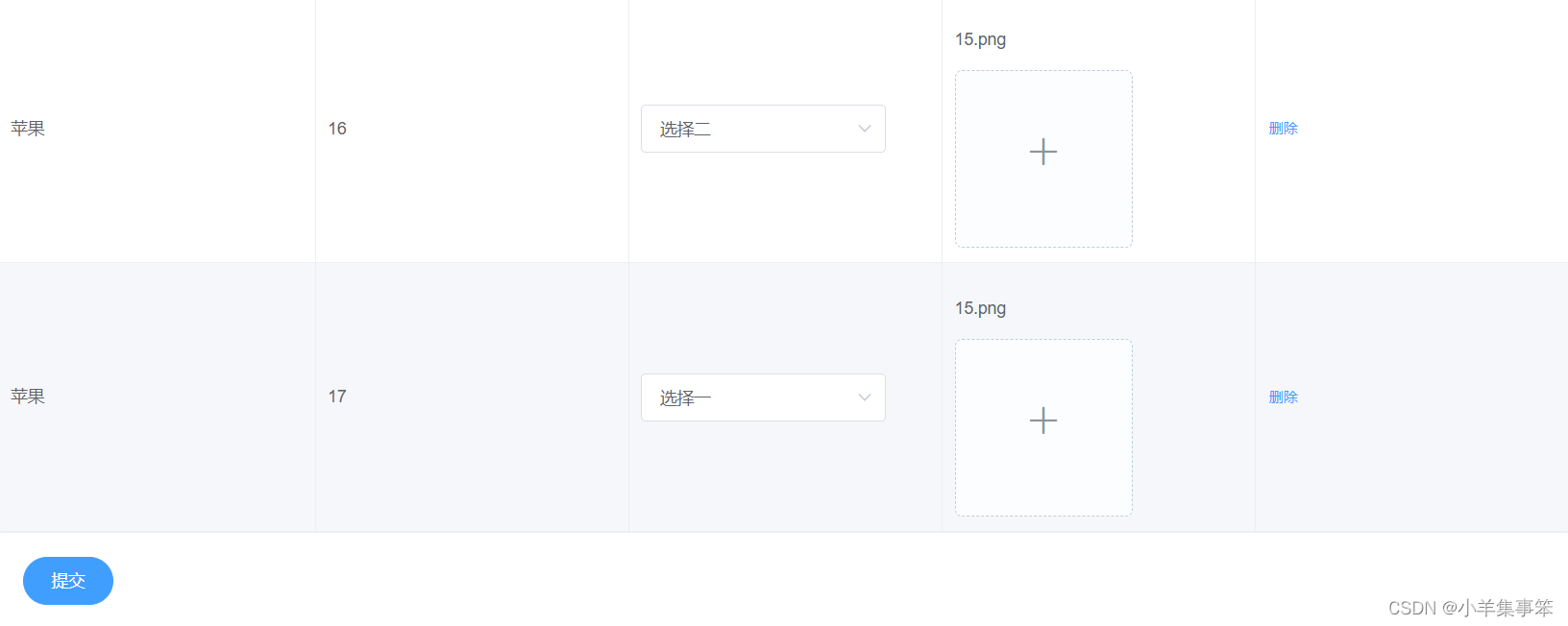
这里还有封装了一个文件上传的组件嵌套在表格中,算是拓展
- <template>
- <div>
- <el-button @click="hAdd" type="primary">添加el-button>
- <editComponents :fields="fields" :tableData="tableData">
- <template #action="{ row }">
- <el-button type="text" size="small" @click="del(row)">删除el-button>
- template>
- <template #paragraphImage="{ row }">
- <div>
- <p>{{ row.paragraphImage || "--" }}p>
- <el-upload
- ref="upload"
- :file-list="fileList1"
- :action="upLoadUrl"
- list-type="picture-card"
- :on-success="(e) => handleSuccess(e, row)"
- :on-error="handleError"
- >
- <i slot="default" class="el-icon-plus">i>
- <div slot="file" slot-scope="{ file }">
- <img
- class="el-upload-list__item-thumbnail"
- :src="file.url"
- alt=""
- />
- <span class="el-upload-list__item-actions">
- <span
- class="el-upload-list__item-preview"
- @click="handlePictureCardPreview(file)"
- >
- <i class="el-icon-zoom-in">i>
- span>
- <span
- v-if="!disabled"
- class="el-upload-list__item-delete"
- @click="handleRemove(file)"
- >
- <i class="el-icon-delete">i>
- span>
- span>
- div>
- el-upload>
- <el-dialog :visible.sync="dialogVisible">
- <img width="100%" :src="dialogImageUrl" alt="" />
- el-dialog>
- div>
- template>
- <template #paragraphType="{ row }">
- <div>
- <el-select v-model="row.paragraphType" placeholder="请选择">
- <el-option label="选择一" value="1">el-option>
- <el-option label="选择二" value="2">el-option>
- el-select>
- div>
- template>
- editComponents>
- <el-card>
- <div>
- <el-button type="primary" round @click="onSubmit">提交el-button>
- div>
- el-card>
- div>
- template>
- <style scoped>
- style>
-
相关阅读:
Azure 基础
Cesium深入浅出之自定义材质
公司日常业务开发中,我是如何基于antd定制属于自己的主题
04 后端增删改查【小白入门SpringBoot + Vue3】
SCSS的基本使用(一)
Lambda 表达式
软件设计23种设计模式
SELECT后面有自定义函数的优化方法
Games104现代游戏引擎入门-lecture14游戏引擎的引擎工具高级概念与应用
【云原生 | Kubernetes 系列】--Gitops持续交付 ArgoCD 部署与概念
- 原文地址:https://blog.csdn.net/weixin_53818172/article/details/133892992
