
一、用到的一些CSS技术
- 渐变
conic-gradient box-shadowclip-path- 变换、过渡
transform、transition - 动画
animation @keyframes - 伪类、伪元素
:hover、::before、::after … - 绝对布局
- 。。。
clip-path 生成网站
https://techbrood.com/tool?p=css-clip-path
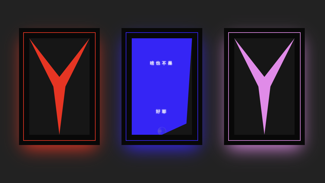
二、实现效果
三、代码
DOCTYPE html>
<html lang="en">
<head>
  <meta charset="UTF-8">
  <meta name="viewport" content="width=device-width, initial-scale=1.0">
  <title>卡片测试title>

  <style>
    body{
      margin: 0;
      padding: 0;
      height: 100vh;
    }
    .wrapper{
      position: relative;
      background: #222222;
      height: 100%;
      color: white;
      display: flex;
      align-items: center;
      justify-content: center;
      gap: 100px;
      padding: 10px;
      flex-wrap: wrap;
    }

    .wrapper .card-box{
      position: relative;
      width: 240px;
      height: 360px;
      text-align: center;
      box-shadow: 0 0 0 14px #080808,
      0 24px 56px var(--clr);
      background-color: var(--clr);

    }
    .wrapper .card-box .title.text{
      line-height: 4em;
    }

    .wrapper .card-box .text{
      line-height: 19em;
      letter-spacing: 8px;
      font-weight: 900;
      transform: scale(0);
      transition: 1.2s;
      filter: blur(4px);
    }
    .wrapper .card-box:hover .text{
      transform: scale(1);
      filter: blur(0);

    }

    .wrapper .card-box .mask{
      position: absolute;
      inset: 20px;
      box-shadow: 0 0 0 18px #080808;
    }


    .wrapper .card-box .icon{
      height: 100px;
      width: 100px;
      border-radius: 50%;
      margin: auto;
      position: absolute;
      inset: 0;
      border: 3px solid white;
      background: conic-gradient(var(--clr), green, var(--clr), yellow, var(--clr));
      transform: translateY(180px) scale(.1);
      opacity: 0;
      transition: all .8s 0s;

    }


    .wrapper .card-box:hover .icon{
      transition-delay: .4s;
      animation: 3s linear 1.05s infinite spin;
      transform: translateY(0) scale(1);

      opacity: 1;

    }

    @keyframes spin {
      0%{
        transform: rotate(0deg);
      }
      100%{
        transform: rotate(360deg);
      }
    }

    .wrapper .card-box .mask span,
    .wrapper .card-box .mask::after,
    .wrapper .card-box .mask::before{
      background: #161616;
      position: absolute;
      inset: 0;
      transition: .25s;
      clip-path: polygon(0 0, 50% 40%, 100% 0);
    }
    .wrapper .card-box:hover .mask span{
      transition-delay: 0;
      clip-path: polygon(0 0, 50% 0%, 100% 0);

    }


    .wrapper .card-box .mask::before{
      transition-delay: .2s;
      clip-path: polygon(0 0, 40% 50%, 50% 100%, 0% 100%);
      content: "";
    }
    .wrapper .card-box:hover .mask::before{
      clip-path: polygon(0 0, 0 100%, 50% 100%, 0% 100%);

    }

    .wrapper .card-box .mask::after{
      transition-delay: .4s;
      clip-path: polygon(100% 0, 60% 50%, 50% 100%, 100% 100%);
      content: "";
    }
    .wrapper .card-box:hover .mask::after{
      clip-path: polygon(100% 0, 100% 100%, 50% 100%, 100% 100%);

    }

  style>
head>
<body>

  <div class="wrapper">
    <div class="card-box" style="--clr: red;">
      <h3 class="title text">啥也没有<br><span class="detail text">好耶span>h3>
      <div class="icon">div>
      <div class="mask">
        <span>span>
      div>
    div>

    <div class="card-box" style="--clr: blue;">
      <h3 class="title text">啥也不是<br><span class="detail text">好耶span>h3>
      <div class="icon">div>
      <div class="mask">
        <span>span>
      div>
    div>

    <div class="card-box" style="--clr: violet;">
      <h3 class="title text">啥也啥也<br><span class="detail text">好耶span>h3>
      <div class="icon">div>
      <div class="mask">
        <span>span>
      div>
    div>

  div>

body>
html>
- 1
- 2
- 3
- 4
- 5
- 6
- 7
- 8
- 9
- 10
- 11
- 12
- 13
- 14
- 15
- 16
- 17
- 18
- 19
- 20
- 21
- 22
- 23
- 24
- 25
- 26
- 27
- 28
- 29
- 30
- 31
- 32
- 33
- 34
- 35
- 36
- 37
- 38
- 39
- 40
- 41
- 42
- 43
- 44
- 45
- 46
- 47
- 48
- 49
- 50
- 51
- 52
- 53
- 54
- 55
- 56
- 57
- 58
- 59
- 60
- 61
- 62
- 63
- 64
- 65
- 66
- 67
- 68
- 69
- 70
- 71
- 72
- 73
- 74
- 75
- 76
- 77
- 78
- 79
- 80
- 81
- 82
- 83
- 84
- 85
- 86
- 87
- 88
- 89
- 90
- 91
- 92
- 93
- 94
- 95
- 96
- 97
- 98
- 99
- 100
- 101
- 102
- 103
- 104
- 105
- 106
- 107
- 108
- 109
- 110
- 111
- 112
- 113
- 114
- 115
- 116
- 117
- 118
- 119
- 120
- 121
- 122
- 123
- 124
- 125
- 126
- 127
- 128
- 129
- 130
- 131
- 132
- 133
- 134
- 135
- 136
- 137
- 138
- 139
- 140
- 141
- 142
- 143
- 144
- 145
- 146
- 147
- 148
- 149
- 150
- 151
- 152
- 153
- 154
- 155
- 156
- 157
- 158
- 159
- 160
- 161
- 162
- 163
- 164