-
Android 开发学习(二)
文章目录
1. 控件 之 Notification(通知栏)
1.1 NotificationManager 的使用以及注意细节
NotificationManager类是一个通知管理器类,这个对象由系统维护的服务,以单例模式的方式获得,所以一般并不直接实例化这个对象。
在Activity中,可以使用Activity.getSystemService(String)方法获取NotificationManager对象。

通过NotificationCompat类的Builder构造器创建Notification对象。

Android8.0 新增了渠道的概念,如果没有设置,则通知无法在Android8.0的机器上显示!
Build.VERSION.SDK_INT的作用:
- Build.VERSION.SDK_INT 软件app安装在哪个手机上,该手机的操作系统版本号 比如8.1对应的SDK_INT是27

NotificationChannel对象第三个参数重要程度:


1.2 notification的使用


实现通知的效果:

代码案例:
<LinearLayout xmlns:android="http://schemas.android.com/apk/res/android" android:layout_width="match_parent" android:layout_height="match_parent" android:orientation="vertical" > <Button android:text="发出通知" android:onClick="sendNotification" android:layout_width="wrap_content" android:layout_height="wrap_content"/> <Button android:text="取消通知" android:onClick="cancelNotification" android:layout_width="wrap_content" android:layout_height="wrap_content"/> LinearLayout>- 1
- 2
- 3
- 4
- 5
- 6
- 7
- 8
- 9
- 10
- 11
- 12
- 13
- 14
- 15
- 16
- 17
- 18
- 19
- 20
意图触发类:
package com.example.mynotification; import android.app.Activity; import android.os.Bundle; import android.util.Log; import androidx.annotation.Nullable; public class NotificationActivity extends Activity { @Override protected void onCreate(@Nullable Bundle savedInstanceState) { super.onCreate(savedInstanceState); Log.e("itholmes","onCreate: 进入NotificationActivity"); } }- 1
- 2
- 3
- 4
- 5
- 6
- 7
- 8
- 9
- 10
- 11
- 12
- 13
- 14
- 15
- 16
- 17
通知类定义配置,触发等等效果:
package com.example.mynotification; import androidx.appcompat.app.AppCompatActivity; import androidx.core.app.NotificationCompat; import android.app.Notification; import android.app.NotificationChannel; import android.app.NotificationManager; import android.app.PendingIntent; import android.content.Intent; import android.graphics.BitmapFactory; import android.graphics.Color; import android.os.Build; import android.os.Bundle; import android.view.View; public class MainActivity extends AppCompatActivity { private NotificationManager manager; private Notification notification; @Override protected void onCreate(Bundle savedInstanceState) { super.onCreate(savedInstanceState); setContentView(R.layout.activity_main); // 通过getSystemService获取NotificationManager对象。 manager = (NotificationManager) getSystemService(NOTIFICATION_SERVICE); /** * 如果是android 8版本必须配置渠道: * Build.VERSION.SDK_INT: 是获取软件app安装在哪个手机上,该手机的操作系统的版本号 比如8.1对应的SDK_INT是27 * NotificationManager.IMPORTANCE_HIGH: 该值为26是android API版本,对应Android 8.0(Oreo)版本。 */ if (Build.VERSION.SDK_INT >= Build.VERSION_CODES.O){ NotificationChannel channel = new NotificationChannel("itholmes", "测试通知", NotificationManager.IMPORTANCE_HIGH); manager.createNotificationChannel(channel); } // 创建意图, 方便下面跳转意图。 Intent intent = new Intent(this, NotificationActivity.class); PendingIntent pendingIntent = PendingIntent.getActivity(this, 0, intent, 0); // 通过NotificationCompat类的Builder构造器创建Notification notification = new NotificationCompat.Builder(this,"itholmes") // 设置标题 .setContentTitle("官方通知") // 设置内容 .setContentText("世界那么大,想去走走") // 设置小图标,R.drawable.logo就是drawable目录下面的logo图片。 .setSmallIcon(R.drawable.logo) // 设置大图标,BitmapFactory.decodeResource将图片转换Bitmap形式。 .setLargeIcon(BitmapFactory.decodeResource(getResources(),R.drawable.logo)) // 设置小图标的颜色 Color.parseColor方法将颜色转换为int类型。 .setColor(Color.parseColor("#ff0000")) // 设置点击通知后的跳转意图 .setContentIntent(pendingIntent) // 设置点击通知后自动清除通知 .setAutoCancel(true) // .setWhen() 默认设置为当前时间 .build(); } public void sendNotification(View view){ // 调用notify方法来触发通知。 注意:id就是唯一标识的效果。 manager.notify(1,notification); } public void cancelNotification(View view){ // 调用cancel方法来取消通知。 manager.cancel(1); } }- 1
- 2
- 3
- 4
- 5
- 6
- 7
- 8
- 9
- 10
- 11
- 12
- 13
- 14
- 15
- 16
- 17
- 18
- 19
- 20
- 21
- 22
- 23
- 24
- 25
- 26
- 27
- 28
- 29
- 30
- 31
- 32
- 33
- 34
- 35
- 36
- 37
- 38
- 39
- 40
- 41
- 42
- 43
- 44
- 45
- 46
- 47
- 48
- 49
- 50
- 51
- 52
- 53
- 54
- 55
- 56
- 57
- 58
- 59
- 60
- 61
- 62
- 63
- 64
- 65
- 66
- 67
- 68
- 69
- 70
- 71
- 72
- 73
- 74
- 75
- 76
2. 控件 之 Toolbar(工具栏,个人感觉像 导航栏)
刚创建的项目,可以先去除原来的actionBar:
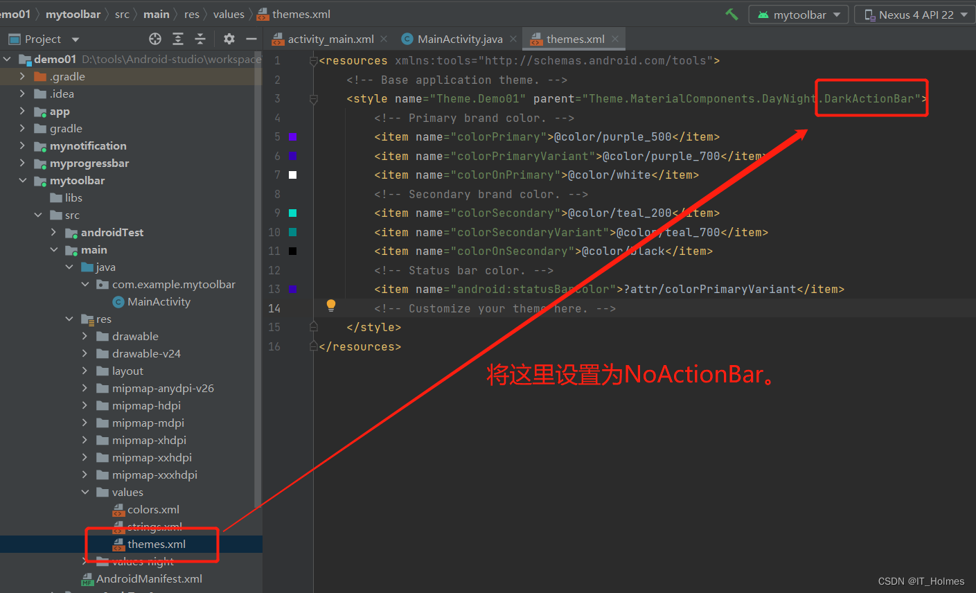

本次使用的是androidx的Toolbar。
Toolbar的基本属性:

示例如下:
<LinearLayout xmlns:android="http://schemas.android.com/apk/res/android" android:layout_width="match_parent" android:layout_height="match_parent" xmlns:app="http://schemas.android.com/apk/res-auto" android:orientation="vertical"> <androidx.appcompat.widget.Toolbar android:id="@+id/td" app:navigationIcon="@drawable/ic_baseline_arrow_back_ios_new_24" app:title="标题" app:titleTextColor="#ff0000" app:titleMarginStart="90dp" app:subtitle="子标题" app:subtitleTextColor="#00ffff" app:logo="@mipmap/ic_launcher" android:layout_width="match_parent" android:layout_height="?attr/actionBarSize" android:background="#ffff00" /> <androidx.appcompat.widget.Toolbar android:id="@+id/td2" app:navigationIcon="@drawable/ic_baseline_arrow_back_ios_new_24" android:layout_width="match_parent" android:layout_height="?attr/actionBarSize" android:background="#ffff00" > <TextView android:text="标题" android:layout_gravity="center" android:layout_width="wrap_content" android:layout_height="wrap_content" /> androidx.appcompat.widget.Toolbar> LinearLayout>- 1
- 2
- 3
- 4
- 5
- 6
- 7
- 8
- 9
- 10
- 11
- 12
- 13
- 14
- 15
- 16
- 17
- 18
- 19
- 20
- 21
- 22
- 23
- 24
- 25
- 26
- 27
- 28
- 29
- 30
- 31
- 32
- 33
- 34
- 35
- 36
- 37
- 38
- 39
- 40
- 41
- 42
- 43
- 44
- 45
- 46
package com.example.mytoolbar; import androidx.appcompat.app.AppCompatActivity; import androidx.appcompat.widget.Toolbar; import android.os.Bundle; import android.util.Log; import android.view.View; public class MainActivity extends AppCompatActivity { @Override protected void onCreate(Bundle savedInstanceState) { super.onCreate(savedInstanceState); setContentView(R.layout.activity_main); Toolbar toolbar = findViewById(R.id.td); // 获取到toolbar,添加Navigation的点击事件(目前对应,navigationIcon属性设置的图片最左侧那个。) // 这样之后最左侧的被点击后,就回触发! toolbar.setNavigationOnClickListener(new View.OnClickListener() { @Override public void onClick(View view) { Log.e("TAG","toolbar被点击了"); } }); } }- 1
- 2
- 3
- 4
- 5
- 6
- 7
- 8
- 9
- 10
- 11
- 12
- 13
- 14
- 15
- 16
- 17
- 18
- 19
- 20
- 21
- 22
- 23
- 24
- 25
- 26
- 27
- 28
- 29
3. 控件 之 AlertDialog(对话框)
效果如下:

基本属性:

示例如下:
activity_main.xml
<LinearLayout xmlns:android="http://schemas.android.com/apk/res/android" android:layout_width="match_parent" android:layout_height="match_parent" xmlns:app="http://schemas.android.com/apk/res-auto" android:orientation="vertical"> <Button android:text="显示对话框" android:onClick="dialClick" android:layout_width="wrap_content" android:layout_height="wrap_content"/> LinearLayout>- 1
- 2
- 3
- 4
- 5
- 6
- 7
- 8
- 9
- 10
- 11
- 12
- 13
- 14
dialog_view.xml
<LinearLayout android:layout_height="match_parent" android:layout_width="wrap_content" android:orientation="vertical" android:background="#ffff00" xmlns:android="http://schemas.android.com/apk/res/android"> <ImageView android:src="@mipmap/ic_launcher" android:layout_width="wrap_content" android:layout_height="wrap_content"/> <TextView android:text="哈哈,天气很好" android:layout_width="wrap_content" android:layout_height="wrap_content"/> LinearLayout>- 1
- 2
- 3
- 4
- 5
- 6
- 7
- 8
- 9
- 10
- 11
- 12
- 13
- 14
- 15
- 16
- 17
- 18
- 19
MainActivity
package com.example.mytoolbar; import androidx.appcompat.app.AppCompatActivity; import android.app.AlertDialog; import android.content.DialogInterface; import android.os.Bundle; import android.util.Log; import android.view.View; public class MainActivity extends AppCompatActivity { @Override protected void onCreate(Bundle savedInstanceState) { super.onCreate(savedInstanceState); setContentView(R.layout.activity_main); } public void dialClick(View view){ // 通过getLayoutInflater().inflate方法来获取layout布局信息 View dialogView = getLayoutInflater().inflate(R.layout.dialog_view,null); AlertDialog.Builder builder = new AlertDialog.Builder(this); // 这些set方法返回的都是builder,因此可以连贯起来。 builder // 设置图标 .setIcon(R.mipmap.ic_launcher) // 设置标题 .setTitle("我是对话框") // 设置消息 .setMessage("今天天气怎么样!") // 设置一个布局视图 .setView(dialogView) // 设置确认按钮 .setPositiveButton("确定", new DialogInterface.OnClickListener() { @Override public void onClick(DialogInterface dialogInterface, int i) { Log.e("tag","确认按钮被点击了"); } }) // 设置取消按钮 .setNegativeButton("取消",new DialogInterface.OnClickListener() { @Override public void onClick(DialogInterface dialogInterface, int i) { Log.e("tag","取消按钮被点击了"); } }) // 设置中间按钮 .setNeutralButton("中间",new DialogInterface.OnClickListener() { @Override public void onClick(DialogInterface dialogInterface, int i) { Log.e("tag","中间按钮被点击了"); } }); // 调用create方法创建一个AlertDialog对象 AlertDialog alertDialog = builder.create(); // 调用AlertDialog对象的show方法显示对话框 alertDialog.show(); } }- 1
- 2
- 3
- 4
- 5
- 6
- 7
- 8
- 9
- 10
- 11
- 12
- 13
- 14
- 15
- 16
- 17
- 18
- 19
- 20
- 21
- 22
- 23
- 24
- 25
- 26
- 27
- 28
- 29
- 30
- 31
- 32
- 33
- 34
- 35
- 36
- 37
- 38
- 39
- 40
- 41
- 42
- 43
- 44
- 45
- 46
- 47
- 48
- 49
- 50
- 51
- 52
- 53
- 54
- 55
- 56
- 57
- 58
- 59
- 60
- 61
- 62

4. 控件 之 PopupWindow(弹出层)
基本属性如下:

示例如下:
activity_main.xml
<LinearLayout android:orientation="vertical" android:layout_width="wrap_content" android:layout_height="wrap_content" xmlns:android="http://schemas.android.com/apk/res/android"> <Button android:text="弹出PopupWindow" android:onClick="popupClick" android:layout_width="wrap_content" android:layout_height="wrap_content"/> LinearLayout>- 1
- 2
- 3
- 4
- 5
- 6
- 7
- 8
- 9
- 10
- 11
- 12
- 13
- 14
popup_view.xml
<LinearLayout xmlns:android="http://schemas.android.com/apk/res/android" android:background="@mipmap/ic_launcher" android:orientation="vertical" android:layout_width="match_parent" android:layout_height="match_parent"> <Button android:id="@+id/btn1" android:layout_width="wrap_content" android:layout_height="wrap_content" android:padding="5dp" android:text="上海" /> <Button android:id="@+id/btn2" android:layout_width="wrap_content" android:layout_height="wrap_content" android:padding="5dp" android:text="关闭弹出层" /> LinearLayout>- 1
- 2
- 3
- 4
- 5
- 6
- 7
- 8
- 9
- 10
- 11
- 12
- 13
- 14
- 15
- 16
- 17
- 18
- 19
- 20
- 21
- 22
- 23
MainActivity
package com.example.mypopupwindow; import androidx.appcompat.app.AppCompatActivity; import android.os.Bundle; import android.util.Log; import android.view.View; import android.view.ViewGroup; import android.widget.Button; import android.widget.PopupWindow; public class MainActivity extends AppCompatActivity { @Override protected void onCreate(Bundle savedInstanceState) { super.onCreate(savedInstanceState); setContentView(R.layout.activity_main); } public void popupClick(View view){ // 获取要设置在popupWindow里的布局 View popupView = getLayoutInflater().inflate(R.layout.popup_view,null); /** * PopupWindow对象有参数构造器! * 第一个参数:设置在PopupWindow的布局。 * 第二、三参数:一个宽,一个高,而ViewGroup.LayoutParams.WRAP_CONTENT是为了彻底包裹popupView布局视图。 * 第四个参数:是否获取焦点。 该内容可以实现失去焦点,关闭弹出层效果。 */ PopupWindow popupWindow = new PopupWindow( popupView, ViewGroup.LayoutParams.WRAP_CONTENT,ViewGroup.LayoutParams.WRAP_CONTENT,true); // popupView中还有两个按钮 Button btn1 = popupView.findViewById(R.id.btn1); btn1.setOnClickListener(new View.OnClickListener() { @Override public void onClick(View view) { Log.e("TAG","onclick上海按钮触发"); } }); Button btn2 = popupView.findViewById(R.id.btn2); btn2.setOnClickListener(new View.OnClickListener() { @Override public void onClick(View view) { // 关闭弹出层 popupWindow.dismiss(); } }); // 设置背景 popupWindow.setBackgroundDrawable(getResources().getDrawable(R.drawable.logo)); // 相对某个控件的位置(正左下方), 这里就直接让其显示在当前view的下方实际就是按钮。 // 第二、三参数就是设置偏移量的,不填写就是无偏移 // 可以通过view.getWidth()和view.getHeight()来贴合! 也可以使用 - 负号 // popupWindow.showAsDropDown(view,view.getWidth(),-view.getHeight()); popupWindow.showAsDropDown(view); } }- 1
- 2
- 3
- 4
- 5
- 6
- 7
- 8
- 9
- 10
- 11
- 12
- 13
- 14
- 15
- 16
- 17
- 18
- 19
- 20
- 21
- 22
- 23
- 24
- 25
- 26
- 27
- 28
- 29
- 30
- 31
- 32
- 33
- 34
- 35
- 36
- 37
- 38
- 39
- 40
- 41
- 42
- 43
- 44
- 45
- 46
- 47
- 48
- 49
- 50
- 51
- 52
- 53
- 54
- 55
- 56
- 57
- 58
- 59
- 60
- 61
- 62
- 63
- 64
效果如下:

5. 布局 之 LinearLayout(布局)
基本属性:

android:gravity="center_horizontal|bottom"中间的 | 为或语句。该属性代表当前布局底部居中的效果。
android:divider=“@drawable/ic_launcher_background”
android:showDividers=“middle”,设置分割线,其实分割线就是设置图片,showDivider是显示位置(middle布局内部元素每两个之间有一个)android:layout_weight=“2”

<LinearLayout xmlns:android="http://schemas.android.com/apk/res/android" android:layout_width="match_parent" android:layout_height="match_parent" android:gravity="center_horizontal" android:divider="@drawable/ic_baseline_drag_handle_24" android:showDividers="middle" android:dividerPadding="100dp" android:orientation="vertical"> <LinearLayout android:layout_weight="2" android:layout_gravity="center_vertical" android:background="#ff0000" android:layout_width="100dp" android:layout_height="100dp"> LinearLayout> <LinearLayout android:layout_weight="1" android:background="#ffff00" android:layout_width="100dp" android:layout_height="100dp"> LinearLayout> <LinearLayout android:background="#00ffff" android:layout_width="100dp" android:layout_height="100dp"> LinearLayout> LinearLayout>- 1
- 2
- 3
- 4
- 5
- 6
- 7
- 8
- 9
- 10
- 11
- 12
- 13
- 14
- 15
- 16
- 17
- 18
- 19
- 20
- 21
- 22
- 23
- 24
- 25
- 26
- 27
- 28
- 29
- 30
- 31
- 32
- 33
- 34
- 35
效果如下:

6. 布局 之 RelativeLayout(相对布局)
基本属性:

属性也好区分,带有parent就是根据父容器定位。
- 赋予的值就是 true 或 boolean。
<RelativeLayout xmlns:android="http://schemas.android.com/apk/res/android" android:layout_width="match_parent" android:layout_height="match_parent" > <RelativeLayout android:layout_centerInParent="true" android:background="#ff0000" android:layout_width="100dp" android:layout_height="100dp"/> RelativeLayout>- 1
- 2
- 3
- 4
- 5
- 6
- 7
- 8
- 9
- 10
- 11
- 12
- 13
不带parent的属性,就需要指定组件id:


7. 布局 之 FrameLayout(框架布局)
效果如下:

基本属性:

android:foreground=“@drawable/ic_launcher_background”
android:foregroundGravity=“right|center” , 设置一个背景图片,并且设置位置。
8. 布局 之 TableLayout(表格布局)
TableLayout的基本属性:

android:collapseColumns属性使用:

也可以通过android:collapseColumns="0,2"这种形式操作:

android:stretchColumns="1"属性:指定可以伸展的列(针对剩余空间拉伸)。

android:shrinkColumns="1"属性:设置可以收缩的列。

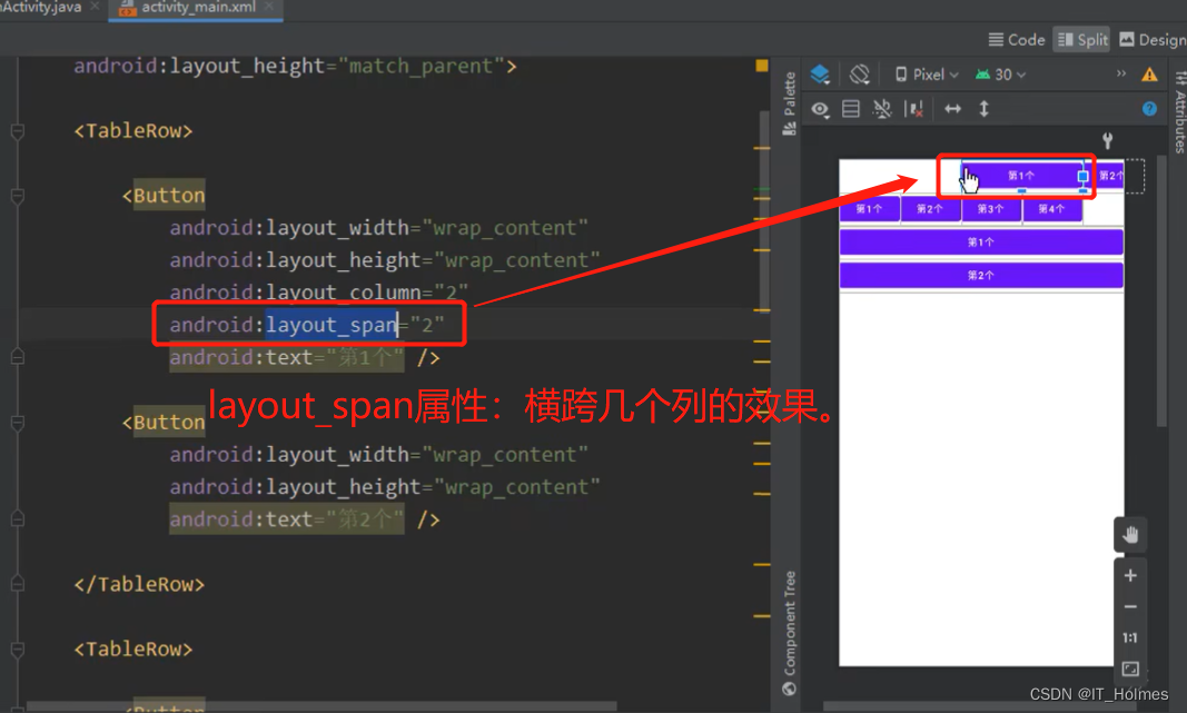
layout_column属性:

android:layout_span="2"属性:横跨几个列。
<TableLayout xmlns:android="http://schemas.android.com/apk/res/android" android:layout_width="match_parent" android:layout_height="match_parent" android:stretchColumns="1" android:shrinkColumns="1" > <TableRow> <Button android:layout_width="wrap_content" android:layout_height="wrap_content" android:layout_column="2" android:layout_span="2" android:text="第1个" /> <Button android:layout_width="wrap_content" android:layout_height="wrap_content" android:text="第2个" /> TableRow> <TableRow> <Button android:layout_width="wrap_content" android:layout_height="wrap_content" android:text="第1个" /> <Button android:layout_width="wrap_content" android:layout_height="wrap_content" android:text="第2个" /> <Button android:layout_width="wrap_content" android:layout_height="wrap_content" android:text="第3个" /> <Button android:layout_width="wrap_content" android:layout_height="wrap_content" android:text="第4个" /> <Button android:layout_width="wrap_content" android:layout_height="wrap_content" android:text="第5个" /> TableRow> TableLayout>- 1
- 2
- 3
- 4
- 5
- 6
- 7
- 8
- 9
- 10
- 11
- 12
- 13
- 14
- 15
- 16
- 17
- 18
- 19
- 20
- 21
- 22
- 23
- 24
- 25
- 26
- 27
- 28
- 29
- 30
- 31
- 32
- 33
- 34
- 35
- 36
- 37
- 38
- 39
- 40
- 41
- 42
- 43
- 44
- 45
- 46
- 47
- 48
- 49
- 50
- 51
- 52
- 53
- 54
- 55
- 56
- 57
- 58
- 59
9. 布局 之 GridLayout(网格布局)
GridLayout的基本属性:

其实columnCount和rowCount就是控制几列几行。

GridLayout下的子控件的属性:
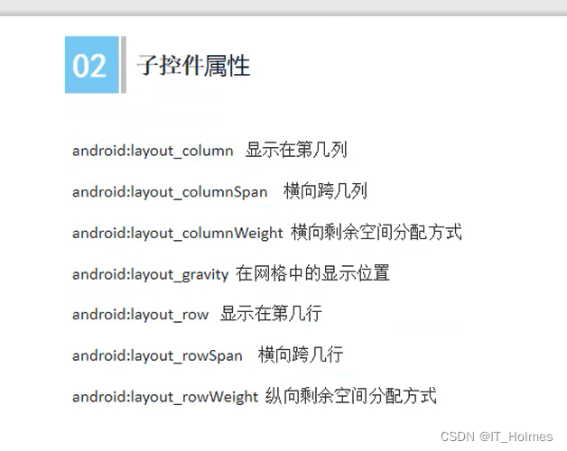

示例如下:
<GridLayout xmlns:android="http://schemas.android.com/apk/res/android" android:layout_width="match_parent" android:layout_height="match_parent" android:columnCount="4" android:rowCount="2" > <Button android:text="第1个" android:layout_width="wrap_content" android:layout_height="wrap_content"/> <Button android:text="第2个" android:layout_width="wrap_content" android:layout_height="wrap_content"/> <Button android:text="第3个" android:layout_columnWeight="1" android:layout_rowWeight="1" android:layout_width="wrap_content" android:layout_height="wrap_content"/> <Button android:text="第4个" android:layout_width="wrap_content" android:layout_height="wrap_content"/> <Button android:text="第5个" android:layout_row="1" android:layout_column="0" android:layout_columnSpan="3" android:layout_gravity="fill" android:layout_width="wrap_content" android:layout_height="wrap_content"/> GridLayout>- 1
- 2
- 3
- 4
- 5
- 6
- 7
- 8
- 9
- 10
- 11
- 12
- 13
- 14
- 15
- 16
- 17
- 18
- 19
- 20
- 21
- 22
- 23
- 24
- 25
- 26
- 27
- 28
- 29
- 30
- 31
- 32
- 33
- 34
- 35
- 36
- 37
- 38
- 39
- 40
- 41
- 42
- 43
- 44
- 45
- 46
10. 布局 之 ConstraintLayout(约束布局)
如下图,来设置约束布局的:


针对控件的相关操作:

guidelines 指导方针的使用:

配置查看:

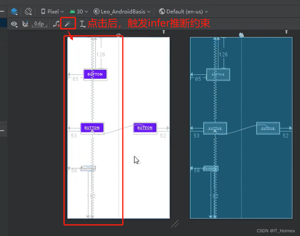
推断约束的使用:
-
相关阅读:
使用ServiceSelf解决.NET应用程序做服务的难题
MySQL的一个Bug修复提高了4倍性能
不学51直接学stm32可以吗?学stm32需要哪些基础?
Android MeidiaCodec之OMXPluginBase与QComOMXPlugin实现本质(四十)
聊一聊责任链模式
HCIA-综合实验(三)
超详细的PMP®小白备考攻略
Python——基础知识
go语言零碎笔记
基于Matlab分析的电力系统可视化研究
- 原文地址:https://blog.csdn.net/IT_Holmes/article/details/127329571

- 最新文章
-
沪漂五周年了:我越来越迷茫了
Agentic Skill Routing 实战:别再把所有 Skill 塞进 AI Agent 上下文
MySQL-Seconds_behind_master的精度误差
[MAF预定义ChatClient中间件-03]CachingChatClient——利用缓存省钱省时间
AI的至暗历史:从万众期待到被政府撤资,AI的两次死亡徘徊
Agent OS :五种驯服不确定性的范式
PortSwigger SQL注入LAB11
数据库即时编译JIT
[Begin]AI Learn Data Day 0
深度学习进阶(二十七)现代 LLM 的核心架构设计其二:SwiGLU