-
css详细笔记
前言
如何学习
- CSS是什么
- CSS怎样用
- CSS选择器(重点+难点)
- 美化页面(文字,阴影,超链接,列表,渐变…)
- 盒子模型
- 浮动
- 定位
- 页面动画 (特效效果)
1.什么是CSS
Cascade Style Sheet 层叠级联样式表
表现HTML或XHTML文件样式的计算机语言。
包括对字体、颜色、边距、高度、宽度、背景图片、网页定位等设定。发展史
CSS1.0读者可以从其他地方去使用自己喜欢的设计样式去继承性地使用样式;
CSS2.0融入了DIV+CSS的概念,提出了HTML结构与CSS样式表的分离。
CSS2.1融入了更多高级的用法,如浮动,定位等。
CSS3.0它包括了CSS2.1下的所有功能,是目前最新的版本,它向着模块化的趋势发展,又加了很多使用的新技术,如字体、多背景、圆角、阴影、动画等高级属性,但是它需要高级浏览器的支持。由于现在IE 6、IE 7使用比例已经很少,对市场企业进行调研发现使用CSS3的频率大幅增加,学习CSS3已经成为一种趋势
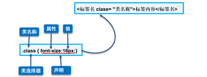
1.1 CSS的基本语法
- 首先讲解CSS的基本语法结构,由选择器和声明构成
- 然后对照具体的样式详细讲解语法,强调声明必须在{ }中
- 最后说明基本W3C的规范,每条声明后的;都要写
DOCTYPE html> <html lang="en"> <head> <meta charset="UTF-8"> <title>Titletitle> <link rel="stylesheet" href="css/style.css"> head> <body> <h1>相信光的人不会怕黑暗h1> body> html>- 1
- 2
- 3
- 4
- 5
- 6
- 7
- 8
- 9
- 10
- 11
- 12
- 13
- 14
- 15
- 16
- 17
- 18
- 19
- 20
- 21
- 22
- 23
- 24
- 25
- 26


1.2 引入CSS方式
- 行内样式
使用style属性引入CSS样式
<h1 style="color:red">style属性的应用h1> <p style="font-size:14px; color:green;">直接在HTML标签中设置的样式p>- 1
- 2
- 内部样式表
CSS代码写在 的
<style> h1{ color: green; } style>- 1
- 2
- 3
- 4
- 5
- 外部样式表
CSS代码保存在扩展名为.css的样式表中
HTML文件引用扩展名为.css的样式表,有两种方式 :
1.链接式(使用的最多)
使用 标签链接外部样式表,并讲解各参数的 含义, 标签必须放在标签中<head> <meta charset="UTF-8"> <title>Titletitle> <link rel="stylesheet" href="css/style.css"> head>- 1
- 2
- 3
- 4
- 5
- 6
2. 导入式
使用@import导入外部样式表<style> @import url("css/style.css"); style>- 1
- 2
- 3
链接式与导入式的区别
- 标签是属于XHTML范畴的,@import是属于CSS2.1中特有的。
CSS样式优先级
行内样式>内部样式表>外部样式表
就近原则:越接近标签的样式优先级越高2.选择器
2.1CSS基本选择器
<style> h1{ color:antiquewhite; } style>- 1
- 2
- 3
- 4
- 5
- 类选择器
一些特殊的实现效果,单纯使用标签选择器不能实现,从而引出类选择器
DOCTYPE html> <html lang="en"> <head> <meta charset="UTF-8"> <title>Titletitle> <style> .s1{ color: rgba(79, 159, 215, 0.667); } .s2{ color: antiquewhite; } .s3{ color:brown; } style> head> <body> <h1 class="s1">精彩人生h1> <p class="s2"> 既然选择远方,当不负青春,砥砺前行。 p> <p class="s3"> 青春由磨砺而出彩,人生因奋斗而升华! p> body> html>- 1
- 2
- 3
- 4
- 5
- 6
- 7
- 8
- 9
- 10
- 11
- 12
- 13
- 14
- 15
- 16
- 17
- 18
- 19
- 20
- 21
- 22
- 23
- 24
- 25
- 26
- 27
- ID选择器
ID选择器的名称就是HTML中标签的ID名称,ID全局唯一

DOCTYPE html> <html lang="en"> <head> <meta charset="UTF-8"> <title>Titletitle> <style> h1{ color:violet; } .s1{ color: rgba(21, 241, 65, 0.667); } .s2{ color: antiquewhite; } .s3{ color:brown; } #id{ color:yellow } style> head> <body> <h1 class="s1" id="id">精彩人生h1> <p class="s2"> 既然选择远方,当不负青春,砥砺前行。 p> <p class="s3"> 青春由磨砺而出彩,人生因奋斗而升华! p> body> html>- 1
- 2
- 3
- 4
- 5
- 6
- 7
- 8
- 9
- 10
- 11
- 12
- 13
- 14
- 15
- 16
- 17
- 18
- 19
- 20
- 21
- 22
- 23
- 24
- 25
- 26
- 27
- 28
- 29
- 30
- 31
- 32
- 33
- 34

小结
标签选择器直接应用于HTML标签
类选择器可在页面中多次使用
ID选择器在同一个页面中只能使用一次
基本选择器的优先级
ID选择器>类选择器>标签选择器2.2 高级选择器
2.2.1 层次选择器
- 后代选择器
在某个元素 的后面,祖爷爷 爷爷 爸爸 你
后代选择器两个选择符之间必须要以空格隔开,中间不能有任何其他的符号插入
DOCTYPE html> <html lang="en"> <head> <meta charset="UTF-8"> <meta http-equiv="X-UA-Compatible" content="IE=edge"> <meta name="viewport" content="width=device-width, initial-scale=1.0"> <title>Documenttitle> <style> body p{ background:darkmagenta } style> head> <body> <p>p1p> <p >p2p> <p>p3p> <ul> <li> <p>p4p> li> <li> <p>p5p> li> <li> <p>p6p> li> ul> <p>p7p> <p>p8p> body> html>- 1
- 2
- 3
- 4
- 5
- 6
- 7
- 8
- 9
- 10
- 11
- 12
- 13
- 14
- 15
- 16
- 17
- 18
- 19
- 20
- 21
- 22
- 23
- 24
- 25
- 26
- 27
- 28
- 29
- 30
- 31
- 32

- 子选择器 一代 儿子
body>p{ background:darkmagenta }- 1
- 2
- 3

- 相邻兄弟选择器
只有一个 ,相邻兄弟元素(向下)

DOCTYPE html> <html lang="en"> <head> <meta charset="UTF-8"> <meta http-equiv="X-UA-Compatible" content="IE=edge"> <meta name="viewport" content="width=device-width, initial-scale=1.0"> <title>Documenttitle> <style> .active + p{ background:darkmagenta } style> head> <body> <p>p1p> <p class="active">p2p> <p>p3p> <ul> <li> <p>p4p> li> <li> <p>p5p> li> <li> <p>p6p> li> ul> <p>p7p> <p>p8p> body> html>- 1
- 2
- 3
- 4
- 5
- 6
- 7
- 8
- 9
- 10
- 11
- 12
- 13
- 14
- 15
- 16
- 17
- 18
- 19
- 20
- 21
- 22
- 23
- 24
- 25
- 26
- 27
- 28
- 29
- 30
- 31
- 32
- 33
- 通用兄弟选择器
== 选中子一代当前元素的向下所以兄弟元素==
.active~p{ background: yellow; }- 1
- 2
- 3

2.3 结构伪类选择器
//ul 第一个元素 ul li:first-child{ background-color: aquamarine; } // ul 最后一个元素 ul li:last-child{ background-color:blue; }- 1
- 2
- 3
- 4
- 5
- 6
- 7
- 8
- 9

/*选中p1;定位到父元素,选择当前的第一个元素 选择当前p元素的父级元素,选中父级元素的第一个,并且才生效,顺序复效 选择父级元素p 的第n个元素*/ p:nth-child(1){ background-color:#aff; } /*选中父元素下的p元素的第二个,按照类型 选择父元素内具有指定类型的第n个元素*/ P:nth-of-type(1){ background-color: rgb(225, 26, 36); }- 1
- 2
- 3
- 4
- 5
- 6
- 7
- 8
- 9
- 10
- 11


小结
使用E F:nth-child(n)和E F:nth-of-type(n)的 关键点
- E F:nth-child(n)在父级里从一个元素开始查找,不分类型
- E F:nth-of-type(n)在父级里先看类型,再看位置
2.4 属性选择器
- E[attr=val]属性选择器‘
存在id属性的元素 a[]{} a[id]{ background-color: yellow; } 等同 a[id=first]{ background-color: yellow; }- 1
- 2
- 3
- 4
- 5
- 6
- 7
- 8
- 9

- E[attr=val]属性选择器*
** = 包含这个元素*
a[class*=link]{ background-color: red; }- 1
- 2
- 3
- 4

- E[attr^=val]属性选择器
^= 以这个开头
a[href^=https]{ background-color: red; }- 1
- 2
- 3

- E[attr$=val]属性选择器
- $= 以这个结尾
a[href$=jpg]{ background-color: red; }- 1
- 2
- 3

选择器小结

3.CSS的作用及字体样式
3.1 < span>标签
< span>标签 的作用:能让某几个文字或者某个词语凸显出来,从而添加对应的样式!

语法:好好学习,天天向上
- 1
3.2 字体样式
3.2.1字体类型 font-family
/* 一个字体族名和一个通用字体族名 */ font-family: "Gill Sans Extrabold", sans-serif;- 1
- 2
- 3

同时设置中文和英文时,计算机如何识别中英文不同类型

p{font-family:Verdana,"楷体";} body{font-family: "Times New Roman", "楷体";}- 1
- 2
3.2.2 字体大小 font-size
- 单位
px(像素)
em、rem、cm、mm、pt、pc
h1{font-size:24px;} h2{font-size:16px;} h3{font-size:2em;} span{font-size:12pt;} strong{font-size:13pc;}- 1
- 2
- 3
- 4
- 5
3.2.3字体风格 font-style
normal、italic和oblique
可变字体(Variable font)可以精确控制 oblique 字体的倾斜程度font-style: normal; font-style: italic; font-style: oblique; font-style: oblique 10deg;//字体倾斜角度- 1
- 2
- 3
- 4
3.2.4字体的粗细 font-weight
font-weight: normal; font-weight: bold; font-weight: lighter; font-weight: bolder;- 1
- 2
- 3
- 4
- 5
- 6
normal
正常粗细。与400等值。
bold
加粗。与700等值。
lighter
比从父元素继承来的值更细(字体内的粗细值范围)。
bolder
比从父元素继承来的值更粗(字体内的粗细值范围)字体属性 font 字体属性的顺序:`字体风格→字体粗细→字体大小→字体类型` p span{ font:oblique bold 12px "楷体"; }- 1
- 2
- 3
- 4
- 5
- 6
3.3文本样式
3.3.1 文本颜色color
- RGB
rgb(r,g,b) : 正整数的取值为0~255 - RGBA
在RGB基础上增加了控制alpha透明度的参数,其中这个透明通道值为0~1
color:#A983D8; color:#EEFF66; color:rgb(0,255,255); color:rgba(0,0,255,0.5);- 1
- 2
- 3
- 4

3.3.2 排版文本段落
水平对齐方式:
text-align属性
start
如果内容方向是左至右,则等于left,反之则为right。
end
如果内容方向是左至右,则等于right,反之则为left。
left
行内内容向左侧边对齐。
right
行内内容向右侧边对齐。
center
行内内容居中。
justify
文字向两侧对齐,对最后一行无效。
justify-all
和 justify 一致,但是强制使最后一行两端对齐。

首行缩进:text-indent:em或px
行高:line-height:px3.3.3 文本修饰和垂直对齐
文本装饰:text-decoration属性
.under { text-decoration: underline red;//红色下划线 } .over { text-decoration: wavy overline lime;//波浪线 } .line { text-decoration: line-through; } .plain { text-decoration: none;// a 链接自带下划线,none 去掉下划线 } .underover { text-decoration: dashed underline overline; } .blink { text-decoration: blink; } <p class="under">This text has a line underneath it.</p> <p class="over">This text has a line over it.</p> <p class="line">This text has a line going through it.</p> <p>This <a class="plain" href="#">link will not be underlined</a>, as links generally are by default. Be careful when removing the text decoration on anchors since users often depend on the underline to denote hyperlinks. </p> <p class="underover"> This text has lines above <em>and</em> below it. </p> <p class="blink">This text might blink for you, depending on the browser you use. </p>- 1
- 2
- 3
- 4
- 5
- 6
- 7
- 8
- 9
- 10
- 11
- 12
- 13
- 14
- 15
- 16
- 17
- 18
- 19
- 20
- 21
- 22
- 23
- 24
- 25
- 26
- 27
- 28
- 29
- 30
- 31
- 32
- 33
- 34
- 35
- 36
- 37
- 38
- 39
- 40
- 41

垂直对齐方式:vertical-align属性:middle、top、bottom3.3.4 超链接伪类和文本阴影
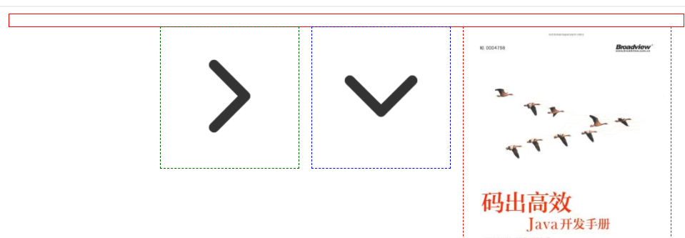
a{ text-decoration:none; } /*鼠标悬停未点击的样式*/ a:hover{ color:blue; font-size: 50px; } /*鼠标点击还没释放的样式*/ a:active{ color:rgb(249, 253, 0); } /*未点击访问时超链接的样式*/ a:link{ color:red; } /*访问后的样式*/ a:visited{ background-color:springgreen }/*文字阴影*/ #price{ text-shadow: 14px 10px 20px rgb(246, 18, 151); } <a href="https://www.manongbook.com/java/356.html"><img src="../../imagle/码出高效.jpg" alt=""> </a> <p> <a href>码出高效:Java开发手册</a> </p> <p> <a href="">京东商城</a> </p> <p><a href="">购买纸质书</a> </p> <p id="price"> 82.90元</p>- 1
- 2
- 3
- 4
- 5
- 6
- 7
- 8
- 9
- 10
- 11
- 12
- 13
- 14
- 15
- 16
- 17
- 18
- 19
- 20
- 21
- 22
- 23
- 24
- 25
- 26
- 27
- 28
- 29
- 30
- 31
- 32
- 33
- 34
- 35

设置伪类顺序:a:link–>a: visited–> a: hover --> a: active3.3.5 列表样式
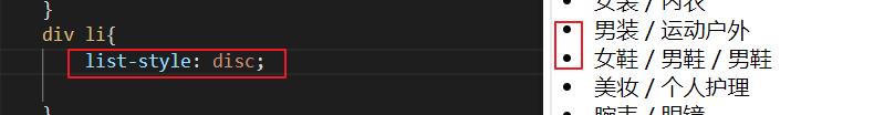
- list-style-type
- list-style-image
- list-style-position
- list-style
div li{ list-style: disc;// 实心圆 }- 1
- 2
- 3
div li{ list-style: circle; //空心圆 }- 1
- 2
- 3

div li{ list-style: square; // 实心正方形 }- 1
- 2
- 3

div li{ list-style: decimal; }- 1
- 2
- 3

div li{ list-style: none;//去掉前缀 }- 1
- 2
- 3
<style> h1{ color: red; } div li{ list-style: none; text-indent: 1em; } a{ text-decoration: none; color: #000; } style> <body> <h1 class="title"> 主题市场 h1> <div> <li> <a href="#">女装a> <span>/span> <a href="https://sports.tmall.com/">内衣a> li> <li> <a href="#">男装a> <span>/span> <a href="https://sports.tmall.com/">运动户外a> li> <li> <a href="#">女鞋a> <span>/span> <a href="https://sports.tmall.com/">男鞋a> <span>/span> <a href="https://sports.tmall.com/">男鞋a> li> <li> <a href="#">美妆a> <span>/span> <a href="https://sports.tmall.com/">个人护理a> li> <li> <a href="#">腕表a> <span>/span> <a href="https://sports.tmall.com/">眼镜a> li> <li> <a href="#">手机a> <span>/span> <a href="https://sports.tmall.com/">数码a> li> <li> <a href="#">零食a> <span>/span> <a href="https://sports.tmall.com/">茶酒a> <span>/span> <a href="https://sports.tmall.com/">进口食品a> li> div> body>- 1
- 2
- 3
- 4
- 5
- 6
- 7
- 8
- 9
- 10
- 11
- 12
- 13
- 14
- 15
- 16
- 17
- 18
- 19
- 20
- 21
- 22
- 23
- 24
- 25
- 26
- 27
- 28
- 29
- 30
- 31
- 32
- 33
- 34
- 35
- 36
- 37
- 38
- 39
- 40
- 41
- 42
- 43
- 44
- 45
- 46
- 47
- 48
- 49
- 50
- 51
- 52
- 53
- 54
- 55
- 56
- 57
- 58
- 59
- 60
- 61
3.3.6 背景样式
- 设置背景图像
background-image属性
background-repeat属性
"d1">"d2">"d3">- 1
- 2
- 3
- 4
- 5
- 6
- 7
- 8
- 9
- 10
- 11
- 12
- 13
- 14
- 15
- 16
- 17
- 18
- 19
- 20
- 21
- 22
- 23
- 24
- 25
- 26
- no-repeat : 不铺开,只显示一次

- repeat-x,repeat-y 只沿一个方向平铺

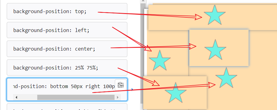
背景定位:background-position属性
Xpx Ypx : 表示水平位置和垂直位置 单位:px
X% Y% :使用百分比表示背景的位置
X,Y方向键:
- 水平:left ,center, right
- 垂直:top,center ,bottom
background-position: top; background-position: bottom; background-position: left; background-position: right; background-position: center;- 1
- 2
- 3
- 4
- 5
背景属性:background属性(背景样式简写)
背景颜色 background-color.d3{ background: red url(../../imagle/下.png) 300px 200px no-repeat ; }- 1
- 2
- 3

3.3.7 CSS渐变样式
网站推荐:http://color.oulu.me/
这个网站有自定义的渐变色模板,可直接引用。- 线性渐变
颜色沿着一条直线过渡:从左到右、从右到左、从上到下等 - 径向渐变
圆形或椭圆形渐变,颜色不再沿着一条直线变化,而是从一个起点朝所有方向混合

body{ background-image: linear-gradient(120deg, #f6d365 0%, #fda085 100%); }- 1
- 2
- 3

兼容Webkit内核的浏览器 -webkit-linear-gradient ( position, color1, color2,…)- 1
- 2
小结

4. 盒子模型
4.1什么是盒子模型
讲解盒子模型及属性,并说明
边框、外边框和内边框都是四个边,最后介绍盒子模型的立体结构。


盒子模型总尺寸= border + padding + margin + 内容宽度

4.2 边框
- border简写
border:1px solid #3a6587; border: 1px dashed red;- 1
- 2
粗细 + 样式 + 颜色
同时设置4个边框颜色时,顺序为上右下左 详细讲解分别上、下、左、右各边框颜色的不同设置方式,及属性值的顺序
其中样式有多种:边框样式 border-style
none
hidden
dotted
dashed
solid
double

边框粗细 border-width
边框的粗细,也可以分上下左右分别设置,以及可以简化边框设置


4.3 内外边距
外边距 margin
- margin-top
- margin-right
- margin-bottom
- margin-left
/* 分别对每个外框设置大小*/ margin-top: 1px ; margin-right : 2px ; margin-bottom : 2px ; margin-left : 1px ;- 1
- 2
- 3
- 4
- 5
- 6

/* 上右下左的顺时针方向设置*/ margin :3px 5px 7px 4px; margin :8px;/*默认四条边都是 8px*/ margin :3px 10px;- 1
- 2
- 3
- 4

margin :3px 5px 7px;- 1

外边距的妙用:网页居中对齐margin:0px auto;- 1

内边距 padding
- padding-left
- padding-right
- padding-top
- padding-bottom
padding-left:10px; padding-right: 5px; padding-top: 20px; padding-bottom:8px; 等同于 padding:20px 5px 8px 10px ;- 1
- 2
- 3
- 4
- 5
- 6
- 7

4.4圆角边框
四个属性值按顺时针排列
border-radius: 20px 10px 50px 30px;- 1

利用border-radius属性制作圆形的两个要点- 元素的宽度和高度必须相同
- 圆角的半径为元素宽度的一半,或者直接设置圆角半径值为50%
div{ width: 100px; height: 100px; border: 4px solid red; border-radius: 50%; }- 1
- 2
- 3
- 4
- 5
- 6
使用border-radius制作特殊图形:半圆形
<style> div{ background: red; margin: 30px; } div:nth-of-type(1){ width: 50px; height: 100px; border-radius:50px 0 0 50px ; } div:nth-of-type(2){ width: 100px; height: 50px; border-radius: 50px 50px 0 0; } div:nth-of-type(3){ width: 100px; height: 50px; border-radius: 0 0 50px 50px; } div:nth-of-type(4){ width: 50px; height:100px; border-radius: 0 50px 50px 0; } </style> <body> <div></div> <div></div> <div></div> <div></div> </body>- 1
- 2
- 3
- 4
- 5
- 6
- 7
- 8
- 9
- 10
- 11
- 12
- 13
- 14
- 15
- 16
- 17
- 18
- 19
- 20
- 21
- 22
- 23
- 24
- 25
- 26
- 27
- 28
- 29
- 30
- 31
- 32
- 33
- 34

4.5盒子阴影
div{ border:2px solid red; margin: 30px; box-shadow:inset 3px 3px 10px #06c/*内阴影 x轴位移阴影水平位移量 y轴 阴影模糊半径*/ } div:nth-of-type(1){ width: 50px; height: 100px; border-radius:50px 0 0 50px ; } div:nth-of-type(2){ width: 100px; height: 50px; border-radius: 50px 50px 0 0; } div:nth-of-type(3){ width: 100px; height: 50px; border-radius: 0 0 50px 50px; } div:nth-of-type(4){ width: 50px; height:100px; border-radius: 0 50px 50px 0; }- 1
- 2
- 3
- 4
- 5
- 6
- 7
- 8
- 9
- 10
- 11
- 12
- 13
- 14
- 15
- 16
- 17
- 18
- 19
- 20
- 21
- 22
- 23
- 24
- 25


补box-sizing 内容
content-box
设置一个元素的宽为 100px,那么这个元素的内容区会有 100px 宽

如果你加上外边框和内边框,则会溢出。

border-box
如果你将一个元素的 width 设为 100px,那么这 100px 会包含它的 border 和 padding,内容区的实际宽度是 width 减去 (border + padding) 的值

小结

5.浮动
5.1 标准文档流
标准文档流:指元素根据块元素或行内元素的特性按从上到下,从左到右的方式自然排列。这也是元素默认的排列方式
标准文档流组成- 块级元素(block)独占一行
< h1> < h6> < p> < div> 列表 - 内联元素(inline)不独占一行
< span>、< a>、< img/>、< strong>...
5.2 display
display: none;
display: none; 通常与 JavaScript 一起使用,以隐藏和显示元素,而无需删除和重新创建它们。

display:inline;
一个常见的例子是为实现水平菜单而生成行内的- 元素:

display:block;

display:inline-block;
行内块元素,元素既有内联元素的特性,也有块元素的特性。

-
块级元素与行级元素的转变(block、inline)
控制块元素排到一行(inline-block)
控制元素的显示和隐藏(none)5.3 浮动 float
左浮动 float:left;
.lay01 { border:1px #F00 dashed; float:left; } .lay02 { border:1px #00F dashed; float:left; } .lay03 { border:1px #060 dashed; float:left; }- 1
- 2
- 3
- 4
- 5
- 6
- 7
- 8
- 9
- 10
- 11
- 12

右浮动float:right;
默认值。元素不动,显示在文本出现的位置。float: none;.lay01 { border:1px #F00 dashed; float:right; } .lay02 { border:1px #00F dashed; float:none; } .lay03 { border:1px #060 dashed; float:none; }- 1
- 2
- 3
- 4
- 5
- 6
- 7
- 8
- 9
- 10
- 11
- 12

5.4 边框塌陷
我们可以看到如果内容设置宽度和浮动后,边框塌陷了

首先熟悉一下clear属性:- none - 允许两侧都有浮动元素。默认值
- left - 左侧不允许浮动元素
- right- 右侧不允许浮动元素
- both - 左侧或右侧均不允许浮动元素
- inherit - 元素继承其父级的 clear 值
使用 clear 属性的最常见用法是在元素上使用了 float 属性之后。

== 使用 clear 属性的最常见用法是在元素上使用了 float 属性之后。==

- 在父元素添加
overflow: auto;来解决此问题:或者hidden属性值,这个值在网页中经常使用,通常与< div>宽度结合使用设置< div>自动扩展高度,或者隐藏超出的内容(溢出处理)
.father{ border: 1px solid red; overflow: auto/hidden; }- 1
- 2
- 3

2. 父级添加伪类after.cl:after{ content: ''; /*在clear类后面添加内容为空*/ display: table; /*把添加的内容转化为块元素*/ clear: both; /*清除这个元素两边的浮动*/ }- 1
- 2
- 3
- 4

3. 浮动元素后面加空div
用一个无标签块元素撑开高度.clear{ clear: both; margin: 0; padding: 0; } </style> </head> <body> <div class="father"> <div class="lay01"><img src="../imagle/码出高效.jpg" alt=""></div> <div class="lay02"><img src="../imagle/下.png" alt=""></div> <div class="lay03"><img src="../imagle/右.png" alt=""></div> <div class="clear"></div> </div>- 1
- 2
- 3
- 4
- 5
- 6
- 7
- 8
- 9
- 10
- 11
- 12

5.5 补overflow 内容
overflow: scroll;/*scroll 溢出的内容用滚轮显示*/- 1

overflow: visible;/*内容会超过盒子呈现*/- 1

overflow: hidden;/*内容被修剪,其他内容不可见*/ overflow: auto;/*如果内容被修建,内容会显示滚动条查看*/- 1
- 2
小结
【清除浮动,防止父级边框塌陷的四种方法】
- 浮动元素后面加空div
简单,空div会造成HTML代码冗余 - 设置父元素的高度
简单,元素固定高会降低扩展性 - 父级添加overflow属性
简单,下拉列表框的场景不能用 - 父级添加伪类after
写法比上面稍微复杂一点,但是没有副作用,推荐使用
6、定位
会使用position定位网页元素
有五个不同的位置值:- static
- relative
- fixed
- absolute
- sticky
position: static;
静态定位的元素不受 top、bottom、left 和 right 属性的影响。它始终根据页面的正常流进行定位。
6.1 相对定位relative
position: relative;
设置相对定位的元素的 top、right、bottom 和 left 属性将导致其偏离其正常位置进行调整。

相对定位元素的规律- 设置相对定位的盒子会相对它原来的位置,通过指定偏移,到达新的位置
- 设置相对定位的盒子仍在标准文档流中,它对父级盒子和相邻的盒子都没有任何影响
- 设置相对定位的盒子原来的位置会被保留下来
#two { position: relative; top: 20px; left: 20px; background: blue; }- 1
- 2
- 3
- 4
- 5
- 6

6.2绝对定位 absolute
元素会被移出正常文档流,并不为元素预留空间,通过指定元素相对于最近的非 static 定位祖先元素的偏移,来确定元素位置。
- 绝对定位的元素从标准文档流中脱离,这意味着它们对其他元素的定位不会造成影响。
- 元素位置发生偏移后,它原来的位置不会被保留下来
- 设置了绝对定位但没有设置偏移量的元素将保持在原来的位置。
#three { position: absolute; background-color: rgb(57, 32, 220); top: 20px; left: 20px; } /*元素位置发生偏移后,它原来的位置不会被保留下来*/- 1
- 2
- 3
- 4
- 5
- 6
- 7

6.3 固定定位 fixed
固定定位与绝对定位相似,“One” 元素定位在离页面顶部 80px,离页面左侧 20px 的位置。
#one { position: fixed; top: 80px; left: 10px; }- 1
- 2
- 3
- 4
- 5
固定定位的特性
- 相对浏览器窗口来定位
偏移量不会随滚动条的移动而移动 - 固定定位的使用场景
一般在网页中被用在窗口左右两边的固定广告、返回顶部图标、吸顶导航栏等
6.4 z-index属性
z-index值大的层位于其值小的层上方

网页元素透明度opacity:x ,x值为0~1
filter: alpha(opacity=x) ,x值为0~100,越小越透明/* 整数值 */ z-index: 0; z-index: 3; z-index: 289; z-index: -1;/* 使用负值降低优先级 */- 1
- 2
- 3
- 4
- 5

小结

-
相关阅读:
机器学习笔记之马尔可夫链蒙特卡洛方法(四)吉布斯采样
els 方块停在方块上。
计算机视觉与深度学习-卷积神经网络-纹理表示&卷积神经网络-纹理表示-[北邮鲁鹏]
NVIDIA Jetson测试安装yolox过程记录
Linux基础学习记录
英语体系----词根词缀等----持续补充(词根词缀等,词汇,语法,简单句,长难句,写作)
Java并发-操作系统,进程,线程,并行并发?
15 Transformer 框架概述
学习Java到底要不要报班?自学可以吗?
leetcode每日一题第二十五天-剑指 Offer 67. 把字符串转换成整数(middle)
- 原文地址:https://blog.csdn.net/m0_53142039/article/details/125961274
