-
热力图展示相关矩阵
量化两个变量之间的关系通常使用皮尔逊相关系数,即衡量变量间的线性相关程度。
相关系数取值范围:[-1,1]:- -1 表示完全负线性相关
- 0 表示没有线性关系
- 1 表示完全正线性相关
越远离0,相关性越强。当变量数量超过2个时,通常使用相关矩阵表示,即用方阵形式表格表示每对变量之间的相关性。
下面通过Python示例说明如何计算相关矩阵,并使用热力图进行表示。
创建相关矩阵
首先创建示例数据集:
import pandas as pd data = {'assists': [4, 5, 5, 6, 7, 8, 8, 10], 'rebounds': [12, 14, 13, 7, 8, 8, 9, 13], 'points': [22, 24, 26, 26, 29, 32, 20, 14] } df = pd.DataFrame(data, columns=['assists','rebounds','points']) df # assist rebounds points # 0 4 12 22 # 1 5 14 24 # 2 5 13 26 # 3 6 7 26 # 4 7 8 29 # 5 8 8 32 # 6 8 9 20 # 7 10 13 14- 1
- 2
- 3
- 4
- 5
- 6
- 7
- 8
- 9
- 10
- 11
- 12
- 13
- 14
- 15
- 16
- 17
- 18
- 19
下面计算相关矩阵:
# 创建相关矩阵 df.corr() # assists rebounds points # assists 1.000000 -0.244861 -0.329573 # rebounds -0.244861 1.000000 -0.522092 # points -0.329573 -0.522092 1.000000 # 创建相关矩阵,保留三位小数 df.corr().round(3) # assists rebounds points # assists 1.000 -0.245 -0.330 # rebounds -0.245 1.000 -0.522 # points -0.330 -0.522 1.000- 1
- 2
- 3
- 4
- 5
- 6
- 7
- 8
- 9
- 10
- 11
- 12
- 13
- 14
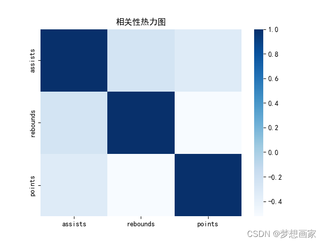
表格对角线的相关系数都为1,表示每个变量都完全自相关。其他数值表示每对变量的相关系数:
assists 和 rebounds 相关系数为 -0.245.
assists 和 points 相关系数为 -0.330.
rebounds 和 points 相关系数为 -0.522.相关矩阵可视化
下面同构pandas包中的样式选型可视化相关矩阵,使用不同的样式风格:
corr = df.corr() sns.heatmap(corr, xticklabels=corr.columns, yticklabels=corr.columns, cmap="Blues") # sns.heatmap(corr, xticklabels=corr.columns, yticklabels=corr.columns, cmap="RdYlGn") # sns.heatmap(corr, xticklabels=corr.columns, yticklabels=corr.columns, cmap="coolwarm") # sns.heatmap(corr, xticklabels=corr.columns, yticklabels=corr.columns, cmap="bwr") # sns.heatmap(corr, xticklabels=corr.columns, yticklabels=corr.columns, cmap="PuOr") plt.title('相关性热力图') plt.show()- 1
- 2
- 3
- 4
- 5
- 6
- 7
- 8
|

完整代码
import pandas as pd import seaborn as sns import matplotlib.pyplot as plt plt.rcParams["font.sans-serif"] = ["SimHei"] plt.rcParams['axes.unicode_minus'] = False data = {'assists': [4, 5, 5, 6, 7, 8, 8, 10], 'rebounds': [12, 14, 13, 7, 8, 8, 9, 13], 'points': [22, 24, 26, 26, 29, 32, 20, 14] } df = pd.DataFrame(data, columns=['assists', 'rebounds', 'points']) corr = df.corr() sns.heatmap(corr, xticklabels=corr.columns, yticklabels=corr.columns, cmap="Blues") # sns.heatmap(corr, xticklabels=corr.columns, yticklabels=corr.columns, cmap="RdYlGn") # sns.heatmap(corr, xticklabels=corr.columns, yticklabels=corr.columns, cmap="coolwarm") # sns.heatmap(corr, xticklabels=corr.columns, yticklabels=corr.columns, cmap="bwr") # sns.heatmap(corr, xticklabels=corr.columns, yticklabels=corr.columns, cmap="PuOr") plt.title('相关性热力图') plt.show()- 1
- 2
- 3
- 4
- 5
- 6
- 7
- 8
- 9
- 10
- 11
- 12
- 13
- 14
- 15
- 16
- 17
- 18
- 19
- 20
- 21
- 22
- 23
- 24
-
相关阅读:
sklearn机器学习——day12
带你入门HTML+CSS网页设计,编写网页代码的思路
【5G NR】RRC连接释放
电子学会2022年6月青少年软件编程(图形化)等级考试试卷(二级)答案解析
Seldom3.0: 支持App测试
基于SSM的学生实践管理平台开发
第四章 神经网络的学习——数据&损失函数&数值微分&神经网络的梯度&学习算法的实现
是否在CLI模式下
linux-centos虚拟机设置固定ip
java毕业设计软件工程在线学习平台源码+lw文档+mybatis+系统+mysql数据库+调试
- 原文地址:https://blog.csdn.net/neweastsun/article/details/125434995