-
WPF 附加属性+控件模板,完成自定义控件。建议观看HandyControl源码
相关连接
前言
今天说服了领导用WPF开发前端,原因就是开发相对来说比较方便,写小项目就不用前后端分离什么的了。反正就是有个机会写WPF了,真开心。我已经写了一年的Uniapp了
需要实现的效果
就是想写一个简单的变色控件。

附加属性
如果想知道附加属性,就得先了解依赖属性。详细的可以看我这篇文章
添加附加属性,以Test修改FontSize为例
知道了依赖属性之后,我解释一下附加属性是什么意思。附加属性就是为了方便在原有的控件基础上面进行细微的修改。我们先保证编译通过
附加属性的快捷键是propa
简单给TextBox添加一个附加属性
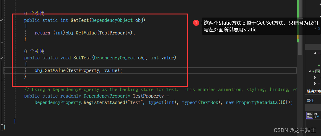
public partial class TextBlockExtension { public static int GetTest(DependencyObject obj) { return (int)obj.GetValue(TestProperty); } public static void SetTest(DependencyObject obj, int value) { obj.SetValue(TestProperty, value); } // Using a DependencyProperty as the backing store for Test. This enables animation, styling, binding, etc... public static readonly DependencyProperty TestProperty = DependencyProperty.RegisterAttached("Test", typeof(int), typeof(TextBox), new PropertyMetadata(10)); }- 1
- 2
- 3
- 4
- 5
- 6
- 7
- 8
- 9
- 10
- 11
- 12
- 13
- 14
- 15
- 16
- 17
- 18
- 19
- 20
- 21
这样我们就能编译通过了。
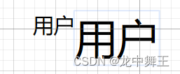
<TextBlock Text="用户" wpfEx:TextBlockExtension.Test="2"/>- 1
依赖属性使用
依赖属性有两种使用方法
触发器使用
样式定义
<Style x:Key="UserSelection" TargetType="TextBlock">"wpfEx:TextBlockExtension.Test" "FontSize" Value="10" />"wpfEx:TextBlockExtension.Test" Value="20"> Style>"FontSize" Value="20" /> - 1
- 2
- 3
- 4
- 5
- 6
- 7
- 8
- 9
- 10
- 11
- 12
- 13
- 14
- 15
- 16
- 17
简单使用
<TextBlock Text="用户" wpfEx:TextBlockExtension.Test="10" Style="{StaticResource UserSelection}"> TextBlock> <TextBlock Text="用户" wpfEx:TextBlockExtension.Test="20" Style="{StaticResource UserSelection}"> TextBlock>- 1
- 2
- 3
- 4
- 5
- 6
- 7
- 8
直接操控
附加属性修改
//如果想直接操控元素,得在PropertyMetadata进行操控。记得设置初始值 public static readonly DependencyProperty TestProperty = DependencyProperty.RegisterAttached("Test", typeof(int), typeof(TextBox), new PropertyMetadata(10,(s, e) => { //s是控件本身, var mdp = s as TextBlock; //如果控件是该元素的父组件,类似于Grid和DockPanel,就使用Parent来寻找,这里不展开 //var mdpParent = (s as FrameworkElement).Parent as TextBlock; if (mdp != null && e.NewValue != null) { mdp.FontSize = (int)e.NewValue; } }));- 1
- 2
- 3
- 4
- 5
- 6
- 7
- 8
- 9
- 10
- 11
- 12
- 13
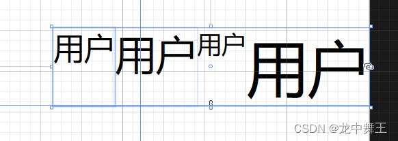
<TextBlock Text="用户" wpfEx:TextBlockExtension.Test="15"> TextBlock> <TextBlock Text="用户" wpfEx:TextBlockExtension.Test="20"> TextBlock> <TextBlock Text="用户"> TextBlock> <TextBlock Text="用户" FontSize="30"> TextBlock>- 1
- 2
- 3
- 4
- 5
- 6
- 7
- 8
- 9
- 10
- 11
- 12
- 13
- 14
结论
附加属性和依赖属性差不多,就是声明麻烦一点。因为Get,Set是需要额外写的。
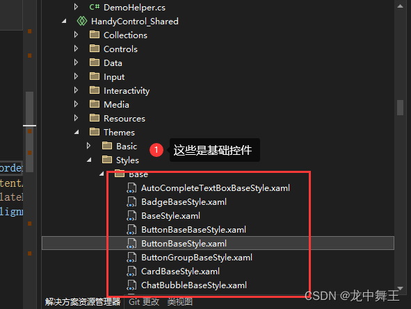
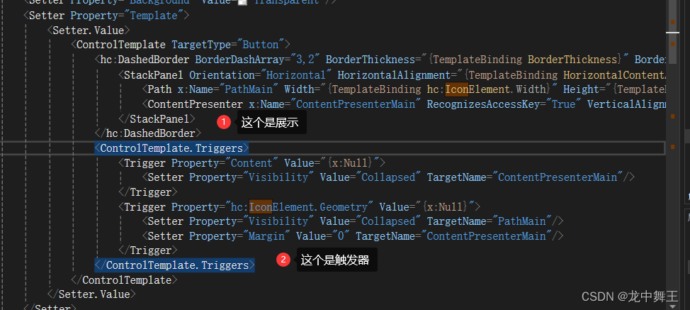
控件模板,在HandyControl的基础上面进行修改
控件模板一般用于按钮,我们只要会按钮的控件模板就可以了。
参考HandyControl的源码
HandyControl的Button有IconButton的样式源码。看一下还是挺有收获的。
参考样式代码<Style x:Key="ButtonDashedBaseStyle" BasedOn="{StaticResource ButtonBaseStyle}" TargetType="Button">"Background" Value="Transparent"/>"Template" >"Button"> <hc:DashedBorder BorderDashArray="3,2" BorderThickness="{TemplateBinding BorderThickness}" BorderBrush="{TemplateBinding BorderBrush}" Background="Transparent" CornerRadius="{Binding Path=(hc:BorderElement.CornerRadius),RelativeSource={RelativeSource TemplatedParent}}"> "Horizontal" HorizontalAlignment="{TemplateBinding HorizontalContentAlignment}" VerticalAlignment="{TemplateBinding VerticalContentAlignment}" Margin="{TemplateBinding Padding}"> hc:DashedBorder>x:Name="PathMain" Width="{TemplateBinding hc:IconElement.Width}" Height="{TemplateBinding hc:IconElement.Height}" Fill="{TemplateBinding Foreground}" SnapsToDevicePixels="True" Stretch="Uniform" Data="{TemplateBinding hc:IconElement.Geometry}"/> x:Name="ContentPresenterMain" RecognizesAccessKey="True" VerticalAlignment="Center" Margin="6,0,0,0" SnapsToDevicePixels="{TemplateBinding SnapsToDevicePixels}"/> "Content" Value="{x:Null}"> "Visibility" Value="Collapsed" TargetName="ContentPresenterMain"/> "hc:IconElement.Geometry" Value="{x:Null}"> "Visibility" Value="Collapsed" TargetName="PathMain"/> "Margin" Value="0" TargetName="ContentPresenterMain"/> - 1
- 2
- 3
- 4
- 5
- 6
- 7
- 8
- 9
- 10
- 11
- 12
- 13
- 14
- 15
- 16
- 17
- 18
- 19
- 20
- 21
- 22
- 23
- 24
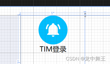
控件模板原型
我们想写一个控件模板,如果不是很熟练,我们就先把控件模板的原型写出来,这样更利于理解。
<DockPanel> <Border DockPanel.Dock="Top" Width="50" Height="50" CornerRadius="25" Background="DeepSkyBlue"> <Path Data="{wpfEx:MaterialGeometry Kind=BellRing}" HorizontalAlignment="Stretch" VerticalAlignment="Stretch" SnapsToDevicePixels="True" Stretch="Uniform" Width="25" Height="25" Fill="White" /> Border> <TextBlock Text="TIM登录" HorizontalAlignment="Center" /> DockPanel>- 1
- 2
- 3
- 4
- 5
- 6
- 7
- 8
- 9
- 10
- 11
- 12
- 13
- 14
- 15
- 16
- 17
- 18
- 19
- 20
- 21
- 22
控件模板
<Style x:Key="UserSelection" TargetType="RadioButton" BasedOn="{StaticResource {x:Type RadioButton}}">"Template" >"RadioButton" "Top" Width="50" Height="50" CornerRadius="25" Background="DeepSkyBlue"> "{wpfEx:MaterialGeometry Kind=BellRing}" HorizontalAlignment="Stretch" VerticalAlignment="Stretch" SnapsToDevicePixels="True" Stretch="Uniform" Width="25" Height="25" Fill="White" /> x:Name="ContentPresenterMain" RecognizesAccessKey="True" VerticalAlignment="Center" Margin="6,0,0,0" SnapsToDevicePixels="{TemplateBinding SnapsToDevicePixels}" /> - 1
- 2
- 3
- 4
- 5
- 6
- 7
- 8
- 9
- 10
- 11
- 12
- 13
- 14
- 15
- 16
- 17
- 18
- 19
- 20
- 21
- 22
- 23
- 24
- 25
- 26
- 27
- 28
- 29
- 30
- 31
- 32
- 33
然后里面能绑定的就绑定。也是照着HandyControl改的。注意这里的Banding用的是TemplateBinding
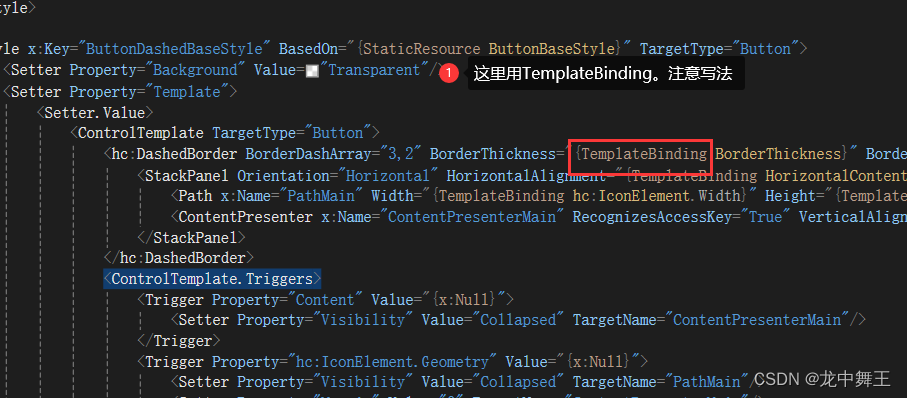
修改好的效果
<Style x:Key="UserSelection" TargetType="RadioButton" BasedOn="{StaticResource {x:Type RadioButton}}">"Template" >"RadioButton" "Top" Width="{TemplateBinding hc:IconElement.Width}" Height="{TemplateBinding hc:IconElement.Height}" CornerRadius="25" Background="{TemplateBinding Foreground}"> "{TemplateBinding hc:IconElement.Geometry}" HorizontalAlignment="Stretch" VerticalAlignment="Stretch" SnapsToDevicePixels="True" Stretch="Uniform" Width="25" Height="25" Fill="{TemplateBinding Background}" /> x:Name="ContentPresenterMain" RecognizesAccessKey="True" VerticalAlignment="Center" Margin="6,0,0,0" SnapsToDevicePixels="{TemplateBinding SnapsToDevicePixels}" /> - 1
- 2
- 3
- 4
- 5
- 6
- 7
- 8
- 9
- 10
- 11
- 12
- 13
- 14
- 15
- 16
- 17
- 18
- 19
- 20
- 21
- 22
- 23
- 24
- 25
- 26
- 27
- 28
- 29
- 30
- 31
- 32
- 33
- 34
- 35
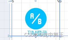
简单使用
<RadioButton Content="TIM登录" GroupName="UserSelect" Style="{StaticResource UserSelection}" Foreground="DeepSkyBlue" Background="White" hc:IconElement.Geometry="{wpfEx:MaterialGeometry Kind=AbTesting}" />- 1
- 2
- 3
- 4
- 5
- 6
- 7
控件模板触发器
完整样式
<ResourceDictionary xmlns="http://schemas.microsoft.com/winfx/2006/xaml/presentation" xmlns:wpfEx="clr-namespace:BluetoothWPF.WpfExtensions" xmlns:hc="https://handyorg.github.io/handycontrol" xmlns:x="http://schemas.microsoft.com/winfx/2006/xaml"> <Style x:Key="UserSelection" TargetType="RadioButton" BasedOn="{StaticResource {x:Type RadioButton}}">"Foreground" Value="Gray" />"Template" >"RadioButton"> "Top" Width="70" Height="70" CornerRadius="35" x:Name="Background"> "{TemplateBinding hc:IconElement.Geometry}" x:Name="Icon" HorizontalAlignment="Stretch" VerticalAlignment="Stretch" SnapsToDevicePixels="True" Stretch="Uniform" Width="35" Height="35" Fill="Gray" /> x:Name="ContentPresenterMain" RecognizesAccessKey="True" VerticalAlignment="Center" HorizontalAlignment="Center" Margin="6,0,0,0" SnapsToDevicePixels="{TemplateBinding SnapsToDevicePixels}" /> "IsMouseOver" Value="True"> "Background" Property="Background" Value="{Binding RelativeSource={RelativeSource TemplatedParent},Path=Background}" /> "Icon" Property="Fill" Value="White" /> "IsFocused" Value="True"> "Background" Property="Background" Value="{Binding RelativeSource={RelativeSource TemplatedParent},Path=Background}" /> "Icon" Property="Fill" Value="White" /> "HorizontalAlignment" Value="Right" />"Margin" Value="0 0 10 0" />"Background" Value="DeepSkyBlue" />"hc:IconElement.Geometry" Value="{wpfEx:MaterialGeometry Kind=AccountLock}" /> "Content" Value="管理员登录" /> Style> <Style TargetType="RadioButton" x:Key="UserSelectioin_User" BasedOn="{StaticResource UserSelection}"> "HorizontalAlignment" Value="Left" />"Margin" Value="10 0 0 0" />"Background" Value="Green" />"hc:IconElement.Geometry" Value="{wpfEx:MaterialGeometry Kind=Account}" /> "Content" Value="用户" /> Style> ResourceDictionary> - 1
- 2
- 3
- 4
- 5
- 6
- 7
- 8
- 9
- 10
- 11
- 12
- 13
- 14
- 15
- 16
- 17
- 18
- 19
- 20
- 21
- 22
- 23
- 24
- 25
- 26
- 27
- 28
- 29
- 30
- 31
- 32
- 33
- 34
- 35
- 36
- 37
- 38
- 39
- 40
- 41
- 42
- 43
- 44
- 45
- 46
- 47
- 48
- 49
- 50
- 51
- 52
- 53
- 54
- 55
- 56
- 57
- 58
- 59
- 60
- 61
- 62
- 63
- 64
- 65
- 66
- 67
- 68
- 69
- 70
- 71
- 72
- 73
- 74
- 75
- 76
- 77
- 78
- 79
- 80
- 81
- 82
- 83
- 84
- 85
- 86
- 87
- 88
- 89
- 90
- 91
简单使用
<RadioButton Style="{StaticResource UserSelectioin_Admin}" /> <RadioButton Style="{StaticResource UserSelectioin_User}" />- 1
- 2


结论
HandyControl的源码看了真的是打开眼界,但是WPF的Xaml有一个无法在内部简单计算的问题。比如我想Witdh=Height = CornerRadius*2。我可能就要写个触发器了。我后面回去测试一下有没有方法可以在Xaml里面简单计算的。
-
相关阅读:
PC端微信@所有人逻辑漏洞
半监督学习在恶意软件流量检测中的应用
Acwing 周赛135 解题报告 | 珂学家 | 反悔堆贪心
分享下我的tmux配置
台湾大学神经网络架构设计
28 mysql 数据记录的 存储更新删除
error: unable to read askpass response from
java基础16 GUI编程(Swing和AWT)
Spring Cloud 配置中心多环境配置bootstrap.yml
寒假训练——第三周(状压DP)
- 原文地址:https://blog.csdn.net/qq_44695769/article/details/136298453
