-
Echarts自定义柱状图
目录
效果图

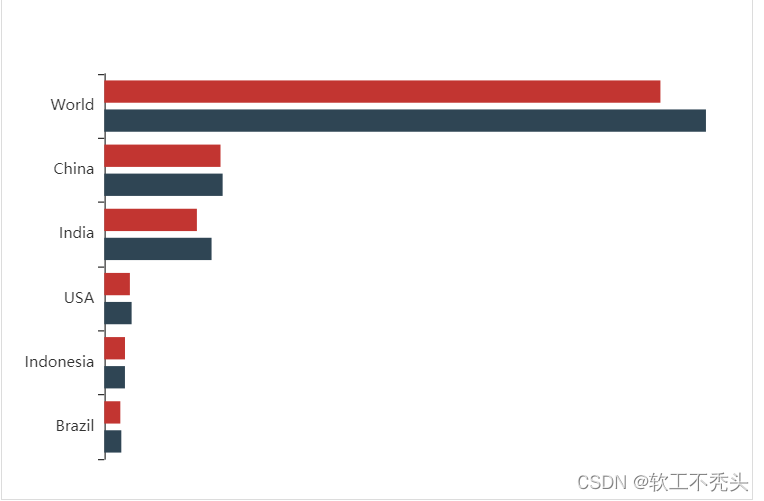
echarts官网找相似图
我们从echarts官网找到相似图形

将柱状图引入html页面中
准备容器
"main" style="width: 600px;height: 400px;">初始化echarts实例对象
const myChart = echarts.init(document.querySelector('#main'))指定配置项和数据(官网给的option)
- option = {
- title: {
- text: 'World Population'
- },
- tooltip: {
- trigger: 'axis',
- axisPointer: {
- type: 'shadow'
- }
- },
- legend: {},
- grid: {
- left: '3%',
- right: '4%',
- bottom: '3%',
- containLabel: true
- },
- xAxis: {
- type: 'value',
- boundaryGap: [0, 0.01]
- },
- yAxis: {
- type: 'category',
- data: ['Brazil', 'Indonesia', 'USA', 'India', 'China', 'World']
- },
- series: [
- {
- name: '2011',
- type: 'bar',
- data: [18203, 23489, 29034, 104970, 131744, 630230]
- },
- {
- name: '2012',
- type: 'bar',
- data: [19325, 23438, 31000, 121594, 134141, 681807]
- }
- ]
- };
将配置项给echarts
myChart.setOption(option)成功引入

自定义柱状图
将不需要的属性删除
- title: {
- text: 'World Population'
- },
- tooltip: {
- trigger: 'axis',
- axisPointer: {
- type: 'shadow'
- }
- },
- legend: {},

修改图形大小 grid
- // 图标位置
- grid: {
- top: "10%",
- left: "22%",
- bottom: "10%"
- },
不显示x轴
- xAxis: {
- show: false
- },
不显示y轴线和相关刻度
- //不显示y轴线条
- axisLine: {
- show: false
- },
- // 不显示刻度
- axisTick: {
- show: false
- },

y轴文字的颜色设置为自己想要的颜色
- axisLabel: {
- color: "#fff"
- },
修改第一组柱子相关样式(条状)
- name: "条",
- // 柱子之间的距离
- barCategoryGap: 50,
- //柱子的宽度
- barWidth: 10,
- // 柱子设为圆角
- itemStyle: {
- normal: {
- barBorderRadius: 20,
- }
- },

设置第一组柱子内百分比显示数据
- // 图形上的文本标签
- label: {
- normal: {
- show: true,
- // 图形内显示
- position: "inside",
- // 文字的显示格式
- formatter: "{c}%"
- }
- },

设置第一组柱子不同颜色
- // 声明颜色数组
- var myColor = ["#1089E7", "#F57474", "#56D0E3", "#F8B448", "#8B78F6"];
- // 给 itemStyle 里面的color 属性设置一个 返回值函数
- itemStyle: {
- normal: {
- barBorderRadius: 20,
- color:function(params){
- const num = myColor.length;
- return myColor[params.dataIndex % num];
- }
- }
- },

修改第二组柱子的相关配置(框状)
- name: "框",
- type: "bar",
- barCategoryGap: 50,
- barWidth: 15,
- itemStyle: {
- color: "none",
- borderColor: "#00c1de",
- borderWidth: 3,
- barBorderRadius: 15
- },
- data: [19325, 23438, 31000, 121594, 134141, 681807]

给y轴添加第二组数据
完整的y轴代码
- yAxis: [
- {
- type: "category",
- data: ["印尼", "美国", "印度", "中国", "世界人口(万)"],
- // 不显示y轴的线
- axisLine: {
- show: false
- },
- // 不显示刻度
- axisTick: {
- show: false
- },
- },
- {
- show: true,
- data: [702, 350, 610, 793, 664],
- // 不显示y轴的线
- axisLine: {
- show: false
- },
- // 不显示刻度
- axisTick: {
- show: false
- },
- axisLabel: {
- textStyle: {
- fontSize: 12,
- }
- }
- }
- ],

设置两组柱子层叠以及更换数据
给series 第一个对象里面添加
yAxisIndex: 0,给series 第二个对象里面添加
yAxisIndex: 1,把data中的数据更换成自己想要的数据即可

-
相关阅读:
基于kubernetes CI/CD实践
树莓派(四)树莓派外设开发基础篇
react之Component存在的2个问题
基于Web的足球青训俱乐部管理后台系统的设计与开发
讲座记录|1024学科周讲座分享
04 后端增删改查【小白入门SpringBoot + Vue3】
进程与线程
【Hadoop】-HDFS的Shell操作[3]
15.项目讲解之前端页面的实现
用Docker部署SSM项目
- 原文地址:https://blog.csdn.net/weixin_68854196/article/details/133949422
