-
CSS详细基础(六)边框样式
本期是CSS基础的最后一篇~

目录
一.border属性
border属性是用于指定元素边框的样式、宽度和颜色。可以通过设置一到四个值来定义上、右、下、左四个边框的样式。例如,使用border-top属性可以设置上边框的样式、宽度和颜色。border属性的初始值是none,表示没有边框。边框样式可以是实线、虚线、点状等等,可以使用dotted、dashed、solid等值来定义不同的样式。边框的宽度可以通过设置像素值来控制,例如1px代表1像素的宽度。边框的颜色可以使用颜色名称或者十六进制值来定义,例如red代表红色。在border属性中,还可以通过设置border-radius来定义边框的圆角效果。
- .bian {
- border-width: 5px;
- border-color: brown;
- border-style: solid;
- }
- img {
- border-width: 5px;
- border-color: rgb(236, 202, 6);
- border-style: solid;
- }
大部分元素均可以使用边框选择器,如下:

二.边框属性复合写法
边框的复合写法是通过使用border属性来同时设置边框的宽度、样式和颜色。具体语法是border: 宽度 样式 颜色;。例如,border: 1px solid black; 表示边框宽度为1像素,样式为实线,颜色为黑色。
- div
- {
- width: 500px;
- height: 500px;
- background-color: lawngreen;
- border-style: dashed;
- border-color: lightcoral;
- border-width: 5px;
- border-top-color: lightseagreen;
- }
- .bian
- {
- border: 3px solid greenyellow;
- }

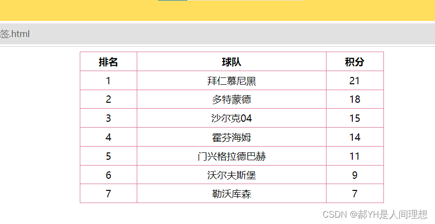
三.CSS修改表格标签
CSS同样可以用来修改表格标签table默认的样式,通过对table标签抑或td标签等均可实现~
- table
- {
- width: 500px;
- height: 249px;
- text-align: center;
- }
- table,td,th
- {
- border: 1px solid palevioletred;
- border-collapse: collapse;
- }
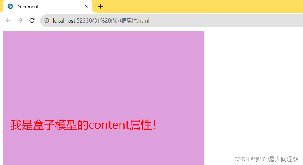
四.内边距属性
内边距padding,顾名思义,针对的是元素内部的样式:即内部元素相对于当前元素的距离
- div
- {
- width: 500px;
- height: 500px;
- background-color: plum;
- font-size: 30px;
- color: red;
- padding-left: 20px;
- padding-right: 20px;
- padding-top: 230px;
- }
如下图,文本与边距的距离受到了padding属性的控制~
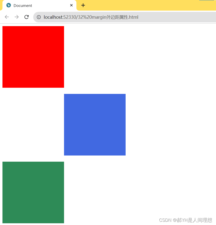
五.外边距属性
与padding相反,外边框属性时针对当前元素与上一级元素之间的距离等属性~
效果如下:
六.其他杂例
1.盒子元素水平居中
- div
- {
- width: 900px;
- height: 200px;
- background-color: chartreuse;
- line-height: 200px;
- text-align: center;
- font-size: 40px;
- color: black;
- /* margin: 0 auto; */
- }
原理很简单:即行高等于行间距~

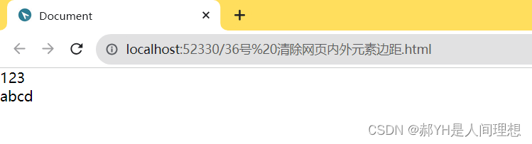
2.清除网页内外元素边距
细心的小伙伴一定会发现,网页整体本身存在着一定的内外边距,如下,并没有顶住上左的边界:

如下的通配符选择器可以实现内外边距的清零:
- *
- {
- margin: 0;
- padding: 0;
- }
3.外边距的合并与塌陷
margin合并:是指在垂直方向上,相邻的两个盒子的外边距会合并为一个外边距的现象。当一个盒子的上边距与下边距相遇时,它们会合并成一个较大的外边距。
而margin塌陷:是指在垂直方向上,父子元素之间的外边距不是简单地相加,而是取它们之间的最大值作为最终的外边距值。这样会导致子元素的外边距无法完全展示,因为它们的外边距被父元素的外边距所替代。
找来截图给大家直观地看一下:


如下一段代码案例:
- html>
- <html lang="en">
- <head>
- <meta charset="UTF-8">
- <meta http-equiv="X-UA-Compatible" content="IE=edge">
- <meta name="viewport" content="width=device-width, initial-scale=1.0">
- <title>Documenttitle>
- <style>
- div
- {
- width: 200px;
- height: 200px;
- background-color: blue;
- }
- .one
- {
- margin-bottom: 20px;
- }
- .two
- {
- margin-top:10px;
- /* 因为one的下边距大与two的上边距,所以会发生垂直合并,即选更大的20px作为两者之间的外边距。 */
- }
- .div2
- {
- width: 400px;
- height: 400px;
- background-color: brown;
- border: 5px solid black;
- }
- .three
- {
- margin-top: 50px;
- }
- style>
- head>
- <body>
- <div class="one">div>
- <div class="two">div>
- <div class="div2 two">
- <div class="three">div>
- div>
- body>
- html>

4.padding不会撑大盒子的情况
- html>
- <html lang="en">
- <head>
- <meta charset="UTF-8">
- <meta http-equiv="X-UA-Compatible" content="IE=edge">
- <meta name="viewport" content="width=device-width, initial-scale=1.0">
- <title>Documenttitle>
- <style>
- h1
- {
- background-color: plum;
- height: 50px;
- padding: 30px;
- }
- div
- {
- height: 90px;
- background-color: powderblue;
- }
- p
- {
- padding: 30px;
- background-color: purple;
- }
- style>
- head>
- <body>
- <h1>我是没有撑大的盒子标签h1>
- <div>
- <p>不会将盒子撑大。p>
- div>
- body>
- html>
七.综合案例——新浪导航栏仿真
做了一个案例玩,运用了大部分基础知识,大家可以参考看看~
- html>
- <html lang="en">
- <head>
- <meta charset="UTF-8">
- <meta http-equiv="X-UA-Compatible" content="IE=edge">
- <meta name="viewport" content="width=device-width, initial-scale=1.0">
- <title>Documenttitle>
- <style>
- div
- {
- height: 41px;
- border-top: 3px solid #ff8500;
- border-bottom: 1px solid #edeef0;
- background-color: #fcfcfc;
- line-height: 41px;
- }
- div a
- {
- font-size: 12px;
- color: #4c4c4c;
- text-decoration: none;
- display: inline-block;
- height: 41px;
- padding: 0 20px;
- }
- a:hover
- {
- background-color:#eee;
- color: #ff8500;
- }
- style>
- head>
- <body>
- <div class="nav">
- <a href="#">新浪导航a>
- <a href="#">手机新浪网a>
- <a href="#">移动客户端a>
- <a href="#">微博a>
- <a href="#">PC端a>
- div>
- body>
- html>

-
相关阅读:
pytorch的使用:使用神经网络进行气温预测
第一章:最新版零基础学习 PYTHON 教程(第三节 - 下载并安装Python最新版本)
idea工具,debug模式小技巧,调试正确姿势。快进收藏夹。
使用Element进行前端开发
Numpy 逻辑函数和位处理函数
AI 时代的向量数据库、关系型数据库与 Serverless 技术丨TiDB Hackathon 2023 随想
《数据结构C++版》实验三:二叉树实验
pdf怎么转换成jpg图片或png图片
【LeetCode热题100】--73.矩阵置零
【寻路】超级简单的A星寻路算法实现
- 原文地址:https://blog.csdn.net/jsl123x/article/details/133419290
