-
消除两个inline-block元素之间的间隔
发现问题
两个inline-block元素之间的间隔。如下图
期望
消除两个inline-block元素之间的间隔。
解决方法
1、父元素字体大小设置为0
间隔的形成是非元素标签形成的
/** 方案1,父元素字体大小设置为0 */ .wrap-font { font-size: 0; /*解决谷歌浏览下最小字体的限制*/ -webkit-text-size-adjust: none; } .wrap-font div { font-size: 14px; }- 1
- 2
- 3
- 4
- 5
- 6
- 7
- 8
- 9
- 10
2、父元素转化为flex元素
/** 方案2,父元素转化为 flex */ .wrap-flex { display: flex; }- 1
- 2
- 3
- 4
推荐此方法
3、子元素转化为table-cell
/** 方案3,子元素转化为 table-cell */ .wrap-table>div { display: table-cell; }- 1
- 2
- 3
- 4
4、
/** 方案4,使用word-spacing */ .wrap-letter-spacing { word-spacing: -1em; } .wrap-letter-spacing>div { word-spacing: 0; /*消除父元素底部的间隔*/ vertical-align: bottom; }- 1
- 2
- 3
- 4
- 5
- 6
- 7
- 8
- 9
- 10
同样的原理,也可以设置子元素的margin-left为负值来解决
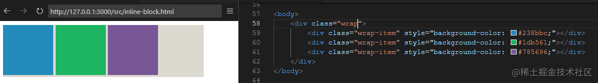
完整代码
DOCTYPE html> <html> <head> <meta charset="utf-8"> <title>解决inline-block/inline-flex中间的间隔title> <style> .wrap { width: 400px; background-color: #dcd9d0; } .wrap-item { display: inline-block; width: 100px; height: 100px; } /** 方案1,父元素字体大小设置为0 */ .wrap-font { font-size: 0; /*解决谷歌浏览下最小字体的限制*/ -webkit-text-size-adjust: none; } .wrap-font div { font-size: 14px; } /** 方案2,父元素转化为 flex */ .wrap-flex { display: flex; } /** 方案3,子元素转化为 table-cell */ .wrap-table>div { display: table-cell; } /** 方案4,使用word-spacing */ .wrap-letter-spacing { word-spacing: -1em; } .wrap-letter-spacing>div { word-spacing: 0; /*消除父元素底部的间隔*/ vertical-align: bottom; } style> head> <body> <div class="wrap wrap-flex"> <div class="wrap-item" style="background-color: #238bbc;">div> <div class="wrap-item" style="background-color: #1db561;">div> <div class="wrap-item" style="background-color: #785696;">div> div> body> html>- 1
- 2
- 3
- 4
- 5
- 6
- 7
- 8
- 9
- 10
- 11
- 12
- 13
- 14
- 15
- 16
- 17
- 18
- 19
- 20
- 21
- 22
- 23
- 24
- 25
- 26
- 27
- 28
- 29
- 30
- 31
- 32
- 33
- 34
- 35
- 36
- 37
- 38
- 39
- 40
- 41
- 42
- 43
- 44
- 45
- 46
- 47
- 48
- 49
- 50
- 51
- 52
- 53
- 54
- 55
- 56
- 57
- 58
- 59
- 60
- 61
其它的方法
- 子元素的闭合标签紧挨着下个元素的开始标签。
类似这样- float 配合清除浮动
- 绝对还有其它的方式,欢迎各位积极留言
-
相关阅读:
Java二维数组
Quartz 的关键接口详解
【Mysql】mysql | 命令 | 常用命令 | 登录指明端口
Spring中过滤器(Filter)和拦截器(Interceptor)的区别和联系
【Vim】单行与多行缩进
计算机毕设(附源码)JAVA-SSM基于的装修公司运营管理管理系统
golang设计模式——创建模式
BFO Publisher轻松将HTML转换为PDF
交换排序——冒泡排序、快速排序
什么是HTML?
- 原文地址:https://blog.csdn.net/u014752296/article/details/127414398
