-
前端三剑客 - CSS
1. 什么是CSS
CSS(Cascading Style Sheets)层叠样式表,可以对网页中的元素位置的排版进行像素级别的控制,实现页面的美化,还能够做到页面样式和结构的分离.这些样式自己是"叠加"的关系.
2. 语法规则
选择器{ 样式的声明内容(键值对的方式) }- 1
- 2
- 3
- 选择器: 页面中有很多元素,而选择器就是定位这些元素并选择它
- 声明内容: 修改后的样式
示例:
DOCTYPE html> <html lang="en"> <head> <meta charset="UTF-8"> <meta http-equiv="X-UA-Compatible" content="IE=edge"> <meta name="viewport" content="width=device-width, initial-scale=1.0"> <title>Documenttitle> <style> h1 { color: red; font-size: 30px; } style> head> <body> <h1>Helloh1> body> html>- 1
- 2
- 3
- 4
- 5
- 6
- 7
- 8
- 9
- 10
- 11
- 12
- 13
- 14
- 15
- 16
- 17
- 18
上面是在html文件中使用
style标签包裹CSS,对于这个标签放到哪里都是可以的,一般放在head标签中.这里的h1就是对所有的h1标签的格式进行格式化.3. 引入方式
示例代码介绍了一种CSS的引入方式:
内部样式,下面介绍这几种引入方式的用法和优缺点.- 内部样式
使用
style标签,把CSS嵌套到html中<head> <style> h1 { color: red; font-size: 30px; } style> head> <body> <h1>Helloh1> body> html>- 1
- 2
- 3
- 4
- 5
- 6
- 7
- 8
- 9
- 10
- 11
- 12
优点:使页面和样式表结构分割
缺点:分离的不够彻底,尤其是CSS多时
- 内联样式
直接在元素内部使用
style标签,写入CSS.<h1 style="color: green;">Helloh1>- 1
优点: 可以针对某个标签格式化
缺点:不能写太复杂的样式,这种写法的优先级高会覆盖其他样式
-
<style> h1{ color: red; } style> <h1 style="color: green;">Helloh1>- 1
- 2
- 3
- 4
- 5
- 6
- 7
- 外部样式
创建css文件,并且通过link标签引入.
// 1. 创建css文件 p{ color: red; } //2. 使用link标签引入 格式: "stylesheet" href="[CSS文件路径]"> "stylesheet" href="test.css">天下无双
- 1
- 2
- 3
- 4
- 5
- 6
- 7
- 8
- 9
- 10
- 11
优点: 彻底使样式和页面结构分离
缺点: 受到浏览器缓存影响,修改后不一定立即生效
4. 选择器
选择器可以明确选择的标签,选择器的种类分为下面两种(适用于标准CSS2)
4.1 基础选择器
特点: 由单个选择器构成
- 标签选择器
特点: 可以对同一标签快速格式化,但不能差异化的选择
p{ color: red; } div{ color: green; } <p>Onep> <p>Twop> <div>Onediv> <div>Twodiv>- 1
- 2
- 3
- 4
- 5
- 6
- 7
- 8
- 9
- 10
- 11

- 类选择器
特点: 可以差异化的选择不同标签,并且可以选择多个不同标签,
.t{ color: red; } <p class="t">Onep> <div class="t">Twodiv>- 1
- 2
- 3
- 4
- 5
- 6

语法规则:
.类名,类名一般使用英文注: 一个标签内部可以使用多个类名,可以实现对类格式共性的提取
- id选择器
特点:和类选择器差不多,但是语法格式是
#id名,对于同一个标签不能使用多个id选择器.t{ color: red; } #r{ font-size: 100px; } <p id="r">Onep> <div id="t">Twodiv>- 1
- 2
- 3
- 4
- 5
- 6
- 7
- 8
- 9
- 通配符选择器
使用*选择所有的标签
* { color: red; }- 1
- 2
- 3
小结
选择器 作用 特点 标签选择器 能选出所有相同标签 不能差异化选择 类选择器 能选出一个或多个标签 根据需求选择, 最灵活, 最常用. id 选择器 能选出一个标签 同一个 id 在一个标签 中只能出现一次 通配符选择器 选择所有标签 特殊情况下使用 4.2 复合选择器
特点: 把多种基础选择器综合起来
- 后代选择器
选择每个父元素中的某个子元素
语法格式:
元素1 元素2 {样式声明}- 1
- 元素 1 和 元素 2 要使用空格分割
- 元素 1 是父级, 元素 2 是子级, 只选元素 2 , 不影响元素 1
示例1: 把ol中的li颜色修改而不影响ol
ol li { color: red; } <ol> <li>AAAli> <li>BBBli> <li>CCCli> ol> <ul> <li>!!!li> <li>@@@li> <li>###li> ul>- 1
- 2
- 3
- 4
- 5
- 6
- 7
- 8
- 9
- 10
- 11
- 12
- 13
- 14

示例2: 后代不一定是儿子,也可以是孙子
ol li h3{ color: red; } <ol> <li>AAAli> <li>BBBli> <li> <h3>嘿嘿嘿h3> CCCli> ol>- 1
- 2
- 3
- 4
- 5
- 6
- 7
- 8

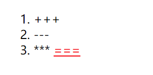
示例2: 不一定使用标签选择器,也可以是任意选择器的组合
.One li a{ color: red; } <ol class="One"> <li>+++li> <li>---li> <li>*** <a href="#">===a>li> ol>- 1
- 2
- 3
- 4
- 5
- 6
- 7
- 8
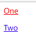
- 子选择器
与子代选择器相似,但是它只能选择子标签
语法格式:
元素1>元素2 { 样式声明 }- 1
- 使用大于号分割
- 只选儿子, 不选孙子元素
<div class="one"> <a href="#">Onea> <p><a href="#">Twoa>p> div>- 1
- 2
- 3
- 4
使用后代选择器会把One和Two都变为红色,因为Two是他的孙子
.one a{ color: red; }- 1
- 2
- 3

使用子选择器只会选择One
.one>a{ color: red; }- 1
- 2
- 3
- 并集选择器
可以选择多组标签
元素1, 元素2 { 样式声明 }- 1
- 通过 逗号 分割等多个元素
- 任何基础选择器都可以使用并集选择器
示例:把h1标签和a标签变红
h1, a { color: red; } <h1>111h1> <p>222p> <a href="#">333a>- 1
- 2
- 3
- 4
- 5
- 6
- 7

- 伪类选择器
1)链接伪类选择器
a:link 选择未被访问过的链接 a:visited 选择已经被访问过的链接 a:hover 选择鼠标指针悬停上的链接 a:active 选择活动链接(鼠标按下了但是未弹起)- 1
- 2
- 3
- 4
a:link { color: black; /*去除a标签的下划线*/ text-decoration: none; } a:visited{ color: green; } a:hover { color: red; } a:active{ color: blue; } "#">小猫- 1
- 2
- 3
- 4
- 5
- 6
- 7
- 8
- 9
- 10
- 11
- 12
- 13
- 14
- 15
- 16

当然选择器不止这几个,其他的需要我们在以后的遇到时学习.
5. CSS属性
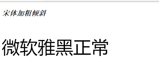
5.1 字体属性
属性 表示 示例 风格 font-family ‘微软雅黑’ ,‘Microsoft YaHei’ ‘宋体’ 大小 font-size 16px… 粗细 font-weight 可以使用英文也可以使用数字,英文和数字对应关系为: bold == 700, normal == 400 样式 font-style 倾斜:italic 正常:normal 示例:
<style> #one{ font-family: '宋体'; font-size: 16px; font-weight: bold; font-style: italic; } #two{ font-family: '微软雅黑'; font-size: 40px; font-weight: 400; font-style: normal; } style> <p id="one">宋体加粗倾斜p> <p id="two">微软雅黑正常p>- 1
- 2
- 3
- 4
- 5
- 6
- 7
- 8
- 9
- 10
- 11
- 12
- 13
- 14
- 15
- 16
5.2 文本属性
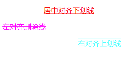
属性 表示 示例 颜色 color 预定义的颜色值color: red;十六进制形式color: #ff0000;RGB 方式color: rgb(255, 0, 0); 文本对齐 text-align center: 居中对齐;left: 左对齐;right: 右对齐 文本装饰 text-decoration underline 下划线;none 什么没有,但可以给 a 标签去掉下划线;overline 上划线;line-through 删除线 文本缩进 text-indent 只能控制段落的首行缩进,text-indent: 2em,向右缩进;text-indent: -2em,向左缩进 行高 line-height 见下面讲解 示例1:
<style> #one{ color: red; text-align: center; text-decoration: underline; text-indent: 2em; } #two{ color: #ff00ff; text-align: left; text-decoration: line-through; text-indent: 0em; } #three{ color: rgb(0, 255, 255); text-align: end; text-decoration: overline; text-indent: -2em; } style> <p id="one">居中对齐下划线p> <p id="two">左对齐删除线p> <p id="three">右对齐上划线p>- 1
- 2
- 3
- 4
- 5
- 6
- 7
- 8
- 9
- 10
- 11
- 12
- 13
- 14
- 15
- 16
- 17
- 18
- 19
- 20
- 21
- 22
- 23
- 认识RGB(R (red), G (green), B (blue) )
对于颜色是如何在显示器上显示的,在显示器上有许多"像素"构成,这些"像素"就可反映出一个具体的颜色.
计算机中针对 R, G, B 三个分量, 分别使用一个字节表示(8个比特位, 表示的范围是 0-255, 十六进制表示为 00-FF)
可以使用1.**预定义的颜色值(直接是单词)**2. 十六进制形式 3.RGB 方式 表示颜色
- 对于十六进制如果两两相同,就可以用一个来表示. 即#ff00ff => #f0f
- 行高
行高指的是上下文本行之间的基线距离
HTML 中展示文字涉及到这几个基准线 :
- 顶线
- 中线
- 基线 (相当于英语四线格的倒数第二条线)
- 底线
内容区:底线和顶线包裹的区域,即下图深灰色背景区域
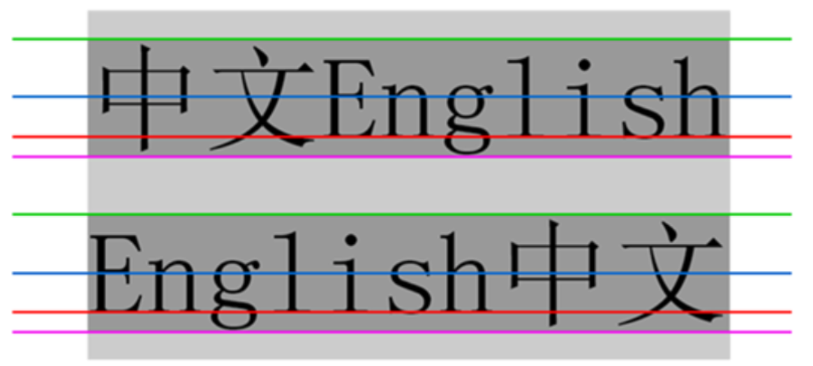
行高 = 上边距 + 下边距 + 字体大小
.line-height .one { line-height: 100px; } <div class="line-height"> <div> 上一行 div> <div class="one"> 中间行 div> <div> 下一行 div> div>- 1
- 2
- 3
- 4
- 5
- 6
- 7
- 8
- 9
- 10
- 11
- 12
- 13
- 14

5.3 背景属性
属性 表示 示例 背景颜色 background-color 可以使用RGB表示,但含有同时样式background-color: transparent; 就表示背景透明 背景图片 background-image: url(…); background-image: url(rose.jpg); 背景平铺 background-repeat: [平铺方式] repeat: 平铺;no-repeat: 不平铺;repeat-x: 水平平铺;repeat-y: 垂直平铺 背景位置 background-position: x y; 1.方位名词: (top, left, right, bottom)
2. 精确单位: 坐标或者百分比(以左上角为原点)
3. 混合单位: 同时包含方位名词和精确单位背景尺寸 background-size: 示例1: 背景颜色
<style> #one{ background-color: red; } #two{ background-color: rgb(0, 255, 0); } #three{ background-color: transparent; } style> <p id="one">背景红色p> <p id="two">背景绿色p> <p id="three">背景透明p>- 1
- 2
- 3
- 4
- 5
- 6
- 7
- 8
- 9
- 10
- 11
- 12
- 13
- 14

示例2:背景图片+背景平铺+背景颜色
<style> #one{ background-color: red; background-image: url(rose.jpg); background-repeat: no-repeat; height: 250px; } #two{ background-color: rgb(0, 255, 0); background-image: url(rose.jpg); background-repeat: repeat-x; height: 250px; } #three{ background-color: transparent; background-image: url(rose.jpg); background-repeat: repeat-y; height: 250px; } #four{ background-color: #00f; background-image: url(rose.jpg); background-repeat: repeat; height: 250px; } style> <p id="one">背景红色不平铺p> <p id="two">背景绿色水平平铺p> <p id="three">背景透明垂直平铺p> <p id="four">背景蓝色平铺p>- 1
- 2
- 3
- 4
- 5
- 6
- 7
- 8
- 9
- 10
- 11
- 12
- 13
- 14
- 15
- 16
- 17
- 18
- 19
- 20
- 21
- 22
- 23
- 24
- 25
- 26
- 27
- 28
- 29
- 30

注:
- 背景颜色和背景图片可以同时存在. 背景图片在背景颜色的上方
- 背景颜色默认是透明
- 背景平铺默认是平铺
示例2:
<style> #one{ background-image: url(flower.jpg); background-repeat: no-repeat; height: 250px; width: 600px; background-position: center; } #two{ background-image: url(flower.jpg); background-repeat: no-repeat; height: 250px; width: 600px; background-position: 20% 70%; } #three{ background-image: url(flower.jpg); background-repeat: no-repeat; height: 250px; width: 600px; background-size: contain; } #four{ background-image: url(flower.jpg); background-repeat: no-repeat; height: 250px; width: 600px; background-size: cover; } style> <p id="one">背景居中不平铺p> <p id="two">背景位置在背景的(20%,70%)不平铺p> <p id="three">背景包含不平铺p> <p id="four">背景覆盖不平铺p>- 1
- 2
- 3
- 4
- 5
- 6
- 7
- 8
- 9
- 10
- 11
- 12
- 13
- 14
- 15
- 16
- 17
- 18
- 19
- 20
- 21
- 22
- 23
- 24
- 25
- 26
- 27
- 28
- 29
- 30
- 31
- 32
- 33
- 34
- 35
背景位置注意点:
- 计算机的平面坐标系是水平向右为x正向,竖直向下为y正向
背景尺寸注意点:
- contain会把图像扩展至最大尺寸,以使其宽度和高度完全适应内容区域
- cover: 把背景图像扩展至足够大,以使背景图像完全覆盖背景区域 ,所以会导致背景图像的某些部分无法显示
- 可以填填百分比: 按照父元素的尺寸设置
5.4 圆的应用
可以使用 border-radius 使边框带圆角效果
格式:
border-radius: length;- 1
length 是内切圆的半径,越大越有弧线感.

示例:
<style> div{ width: 100px; height: 150px; background-color: rgb(83, 204, 83); border-radius: 10px; text-align: center; } style> <div> <p>(●'◡'●)p> div>- 1
- 2
- 3
- 4
- 5
- 6
- 7
- 8
- 9
- 10
- 11
- 12

使用
border设置宽度,风格和颜色,border:border-width|border-style|border-color- 1
示例: 设置粉色有浮雕效果的边框
<style> div{ width: 100px; height: 150px; border-radius: 10px; text-align: center; border: 0.5rem ridge pink; } style> <div> <p>(●'◡'●)p> div>- 1
- 2
- 3
- 4
- 5
- 6
- 7
- 8
- 9
- 10
- 11
- 12

边框属性参考https://developer.mozilla.org/zh-CN/docs/Web/CSS/border
生成圆形
让 border-radius 的值为正方形宽度的一半即可
<style> div{ width: 100px; height: 100px; border-radius: 50px; text-align: center; border: 2px ridge pink; } style> <div> <p>(●'◡'●) p> div>- 1
- 2
- 3
- 4
- 5
- 6
- 7
- 8
- 9
- 10
- 11
- 12

四边分别设置
border-radius 是一个复合写法,可以拆分为四个角分别设置 .
border-radius:2em; 等价于 border-top-left-radius:2em; border-top-right-radius:2em; border-bottom-right-radius:2em; border-bottom-left-radius:2em;- 1
- 2
- 3
- 4
- 5
- 6
同样可以设置圆形
<style> div{ width: 100px; height: 100px; border-top-left-radius:50%; border-top-right-radius:50%; border-bottom-right-radius:50%; border-bottom-left-radius:50%; border-style: solid; text-align: center; border-color: pink; } style> <div> <p>(●'◡'●) p> div>- 1
- 2
- 3
- 4
- 5
- 6
- 7
- 8
- 9
- 10
- 11
- 12
- 13
- 14
- 15
- 16

5.5 元素的显示模式
CSS的显示模式有很多种,下面介绍两种常用的显示模式
块级元素
常见元素:
h1~h6,p,div,ul,ol,li- 1
特点:
- 独占一行
- 高度,宽度,行高,内外边距是可以控制的
- 宽度默认和父元素相同
- 内部元素可以是块级的,也可以是行级
示例:
<style> p{ width: 50px; height: 100px; color: red; } style> <p>块级元素p> <p>块级元素p> <p>块级元素p>- 1
- 2
- 3
- 4
- 5
- 6
- 7
- 8
- 9
- 10

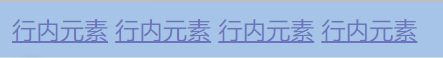
行内元素
常见元素:
a,span,strong,b,em,del,s,ins,u..- 1
特点:
- 不独占一行,一行可以显示多个
- 设置的高度,宽度,行高无效
- 左右边距有效(上下边距无效),内边距有效
- 宽度默认为内容本身宽度
- 行内元素内部只能是行内元素或者文本,不能放块级元素
示例:
<style> a{ width: 100px; height: 100px; } style> <a href="#">行内元素a> <a href="#">行内元素a> <a href="#">行内元素a> <a href="#">行内元素a>- 1
- 2
- 3
- 4
- 5
- 6
- 7
- 8
- 9
- 10
由于是行内元素,设置宽度,高度无效,但是不报错
注:
- a标签内尽量不要放入a标签
- a标签内部可以放块级元素
改变显示模式
使用
display属性修改元素的显示模式示例1: 修改块级元素为行内元素
<style> p{ width: 50px; height: 100px; color: red; display: inline; } style> <p>块级元素p> <p>块级元素p> <p>块级元素p>- 1
- 2
- 3
- 4
- 5
- 6
- 7
- 8
- 9
- 10
- 11

示例2: 修改行内元素为块级元素
<style> a{ width: 100px; height: 100px; color: green; display: block; } style> <a href="#">行内元素a> <a href="#">行内元素a> <a href="#">行内元素a> <a href="#">行内元素a>- 1
- 2
- 3
- 4
- 5
- 6
- 7
- 8
- 9
- 10
- 11
- 12

示例三: 修改块级元素为行内块元素(不独占一行,可以设置宽度,高度等属性)
<style> p{ width: 100px; height: 100px; color: red; display: inline-block; } style> <p>块级元素p> <p>块级元素p> <p>块级元素p>- 1
- 2
- 3
- 4
- 5
- 6
- 7
- 8
- 9
- 10
- 11

5.6 盒模型
HTML元素相当于一个矩形盒子,由边框,内容,内边距,外边距构成.

设置边框:
<style> div{ width: 100px; height: 200px; border: 10px solid pink; } style> <div>O(∩_∩)Odiv> <div>O(∩_∩)Odiv> <div>O(∩_∩)Odiv>- 1
- 2
- 3
- 4
- 5
- 6
- 7
- 8
- 9
- 10
 浅黄色部分是边框
我们设置的div是100*200,但是实际的div是120 * 220,这是因为边框宽度为10px,使盒子被撑大.
可以设置
box-sizing为border-box就不会被撑大了,其默认值为content-box<style> div{ width: 100px; height: 200px; border: 10px solid pink; box-sizing: border-box; } style> <div>O(∩_∩)Odiv> <div>O(∩_∩)Odiv> <div>O(∩_∩)Odiv>- 1
- 2
- 3
- 4
- 5
- 6
- 7
- 8
- 9
- 10
- 11

如果希望页面所有元素都不被撑大,可以使用通配符选择
*{ box-sizing: border-box; }- 1
- 2
- 3
设置内边距:
可以设置
padding控制,因为内边距是内容和边框的内容,所以只能设置其距离,不能像边框一样设置颜色,风格也可以分别设置四个方向距离:
padding-left: 20px; padding-top: 20px; padding-right: 20px; padding-bottom: 20px;- 1
- 2
- 3
- 4
设置4个数据,默认是按照上右下左的顺时针方向设置
padding: 20px 30px 10px 80px- 1
设置两个数据,先设置上下,后左右
padding: 10px 20px- 1
设置1个数据,对四个方向设置
padding: 10px- 1
示例:
<style> div{ width: 100px; height: 200px; padding: 20px; } style> <div>O(∩_∩)Odiv>- 1
- 2
- 3
- 4
- 5
- 6
- 7
- 8
 绿色部分为内边距
可以看见div可以被内边距撑大,要想不被撑大,可以设置
box-sizing: content-box;设置外边距:
外边距是盒子与盒子之间的距离,通过设置
margin设置也可以设置四个方向示例:
<style> .one{ margin-bottom: 50px; } div{ width: 200px; height: 200px; background-color: red; } style> <div class="one">O(∩_∩)Odiv> <div>O(∩_∩)Odiv>- 1
- 2
- 3
- 4
- 5
- 6
- 7
- 8
- 9
- 10
- 11
- 12
 深黄色部分是外边距
复合写法:
margin: 10px; // 四个方向都设置 margin: 10px 20px; // 上下为 10, 左右 20 margin: 10px 20px 30px; // 上 10, 左右 20, 下 30 margin: 10px 20px 30px 40px; // 上 10, 右 20, 下 30, 左 40- 1
- 2
- 3
- 4
小知识:
CSS外边距塌陷问题
对于两个元素的外边距不同并且竖直排列时,此时的这两个元素距离是两个margin的最大值
如果是水平排列,这是两个margin之和
设置块级元素居中
前提: 指定宽度(无宽度,这和父元素相同),把
margin设置为auto<style> .one{ width: 300px; height: 200px; margin: auto; background-color: green; } div{ width: 500px; height: 400px; background-color: red; } style> <div> <div class="one">div> div>- 1
- 2
- 3
- 4
- 5
- 6
- 7
- 8
- 9
- 10
- 11
- 12
- 13
- 14
- 15
- 16

注: 对于垂直居中, 不能使用 "上下 margin 为 auto " 的方式 ,并且margin只能针对块级元素
5.7 弹性布局
初体验:
<style> div{ width: 100%; height: 200px; background-color: pink; } div>span{ background-color: lightskyblue; width: 100px; } style> <div> <span>(●'◡'●)span> <span>O(∩_∩)Ospan> <span>┭┮﹏┭┮span> div>- 1
- 2
- 3
- 4
- 5
- 6
- 7
- 8
- 9
- 10
- 11
- 12
- 13
- 14
- 15
- 16

因为span行内元素所以高度设置无效.通过设置
display:flex后就不是行内元素了
再给div设置
justify-content: space-between,
flex布局基本概念:
flex 是 flexible box 的缩写. 意思为 “弹性盒子”. ,可以设置html元素的排列方式
概念:
- 被设置为 display:flex 属性的元素, 称为 flex container
- 它的所有子元素立刻称为了该容器的成员, 称为 flex item
- flex item 可以纵向排列, 也可以横向排列, 称为 flex direction(主轴)

常用属性:
justify-content :设置主轴上的子元素排列方式(默认主轴为水平方向)

示例:
<style> div{ width: 100%; height: 200px; background-color: pink; display: flex; justify-content: space-between; } div>span{ background-color: lightskyblue; width: 100px; } style> <div> <span>(●'◡'●)span> <span>O(∩_∩)Ospan> <span>(⊙o⊙)span> <span>♪(^∇^*)span> <span>\^o^/span> div>- 1
- 2
- 3
- 4
- 5
- 6
- 7
- 8
- 9
- 10
- 11
- 12
- 13
- 14
- 15
- 16
- 17
- 18
- 19
- 20
未指定属性,默认从左到右布局, 即
flex-start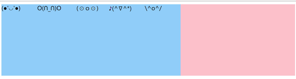
设置属性
flex-end元素排列到右边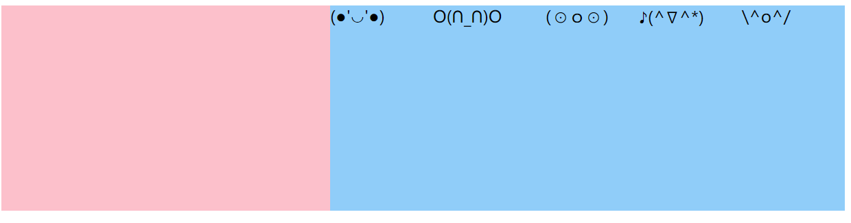
设置属性
center,元素居中排列
设置属性
space-around,元素平分剩余空间后排序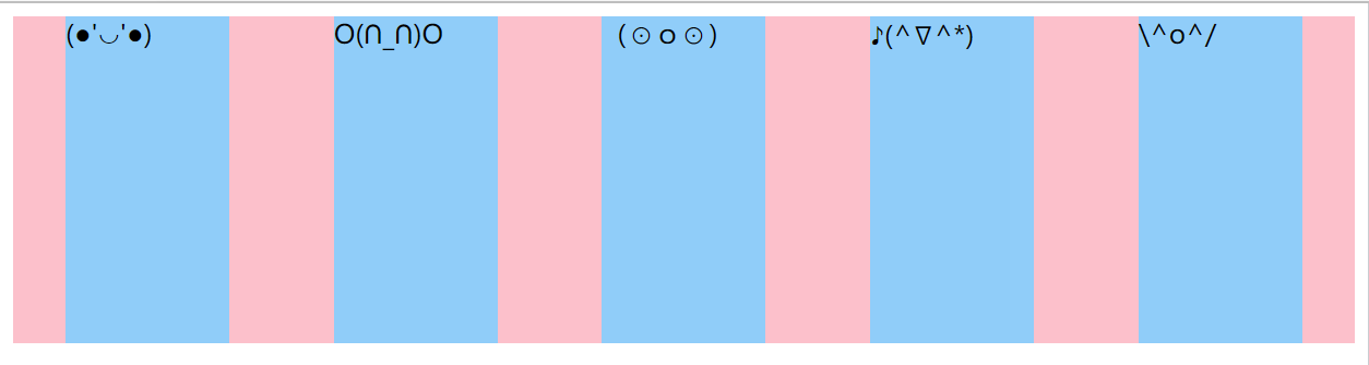
设置属性
space-between,左右两边先贴近元素,剩余元素在平分空间后排序
align-items :设置侧轴上的元素排列方式

示例: 设置主轴侧轴都为居中
<style> div{ width: 100%; height: 200px; background-color: pink; display: flex; justify-content: space-evenly; align-items: center; } div>span{ background-color: lightskyblue; width: 100px; height: 100px; border-radius: 50%; text-align: center; line-height: 100px; } style> <div> <span>(●'◡'●)span> <span>O(∩_∩)Ospan> <span>(⊙o⊙)span> <span>♪(^∇^*)span> <span>\^o^/span> div>- 1
- 2
- 3
- 4
- 5
- 6
- 7
- 8
- 9
- 10
- 11
- 12
- 13
- 14
- 15
- 16
- 17
- 18
- 19
- 20
- 21
- 22
- 23
- 24
- 25

-
相关阅读:
达梦数据库-锁表
为了拿捏后端打工人都要会的 Redis 数据结构,我画了 20 张图
MindSpore报错what(): scoped_acquire::dec_ref(): thread state must be current!
css之简介和基础选择器的介绍
【OpenCV学习】第1课:加载丶修改丶显示丶保存图像
学生体育铅球网页设计作品静态HTML网页模板源码 大学生体育铅球网站制作 简单校园体育网页设计成品
必看!TMS320C6678+Kintex-7开发板——FPGA案例开发资料(上)
ContentType:application/x-www-form-urlencoded请求方法遇到的坑【PHP】
element-plus form表单的二次封装
Leetcode(76)——最小覆盖子串
- 原文地址:https://blog.csdn.net/weixin_61543874/article/details/126918466

