-
前端面试题——CSS 高频
目录
三、CSS display的block、inline和inline-block的区别
五、CSS display: none;与visibility: hidden;的区别
一、CSS选择器及其优先级
选择器 格式 优先级权重 id选择器 #id 100 类选择器 .box 10 属性选择器 input[type="text"] 10 伪类选择器 p:first-child 10 标签选择器 div 1 伪元素选择器 p::after 1 相邻兄弟选择器 h1+p 0 通用兄弟选择器 h1~p 0 子代选择器 ul>li 0 后代选择器 li a 0 通配符选择器 * 0 优先级
!important > 内联样式 > id选择器 > 类、伪类、属性选择器 > 标签、伪元素选择器
权重:
!important: 10000
内联样式: 1000
id选择器: 100
类、伪类、属性选择器: 10
标签、伪元素选择器: 1
相邻兄弟选择器(+)、通用兄弟选择器(~)、子选择器(>)、后代选择器、通配符选择器(*): 0
二、CSS display属性值及其作用
属性值 作用 none 元素不显示,并且会从文档流中移除。 block 块元素。默认宽度为父元素宽度,可设置宽高,换行显示。 inline 行内元素。默认宽度为内容宽度,不可设置宽高,同行显示。 inline-block 行内块元素。默认宽度为内容宽度,可设置宽高,同行显示。 list-item 像块元素一样显示,并添加样式列表标记。 table 元素作为块级表格来显示。 inherit 规定应该从父元素继承display属性的值。 三、CSS display的block、inline和inline-block的区别
- block:会独占一行,多个block元素会各自新起一行。默认情况下,block元素宽度自动填满其父级宽度。可以设置width、height、margin和padding属性。
- inline:元素不会独占一行,多个相邻的行内元素会排列在同一行里,直到一行排列不下,才会新换一行,其宽度随元素的内容而变化,设置宽高不生效。但可以设置水平方向的margin和padding属性,不能设置垂直方向的margin和padding属性。
- inline-block:既有block的宽度高度特性又具有inline的同行特性。
- 行内元素:
- 设置宽高属性无效。
- 可以设置水平方向的margin和padding属性,不能设置垂直方向的margin和padding属性。
- 不会自动换行。
- 块级元素:
- 可以设置width、height、margin和padding属性。
- 可以自动换行。
- 多个块状,默认排列从上到下。
四、CSS隐藏元素的方法有哪些?
- display: none; 渲染树不会包含该渲染对象,因此该元素不会在页面中占据位置,也不会响应绑定的监听事件。
- visibility: hidden; 元素在页面中仍占据空间,但是不会响应绑定的监听事件。
- opacity: 0; 将元素的透明度设置为0,以此来实现元素的隐藏。元素在页面中仍然占据空间,并且能够响应元素绑定的监听事件。
- position: absolute; 通过绝对定位将元素移除可视区域内,以此来实现元素的隐藏。
- z-index: 负值; 使其它元素遮盖住该元素,以此来实现隐藏。
- clip/clip-path 使用元素裁剪的方法来实现元素的隐藏,这种方法下,元素仍在页面中占据位置,但是不会响应绑定的监听事件。
- transform: scale(0,0); 将元素缩放为0,来实现元素的隐藏。这种方法下,元素仍在页面中占据位置,但是不会响应绑定的监听事件。
五、CSS display: none;与visibility: hidden;的区别
(1)在渲染树中:
- display: none; 会让元素完全从渲染树中消失,渲染时不会占据任何空间。
- visibility: hidden; 不会让元素从渲染树中消失,渲染的元素还会占据相应的空间,只是内容不可见。
(2)是否继承属性
- display: none; 是非继承属性,子节点会随着父节点从渲染树消失,通过修改子孙节点的属性也无法显示。
- visibility: hidden; 是继承属性,子节点消失是由于继承了'hidden',通过设置visibility: visible;可以让子孙节点显示。
(3)修改常规文档流中元素的display通常会造成文档的重排,但是修改visibility属性只会造成本元素的重绘。
(4)如果使用读屏器,设置display: none;的内容不会被读取,设置的visibility: hidden;内容会被读取。
六、CSS对盒模型的理解
CSS 中的盒子模型包括 IE 盒子模型和标准的 W3C 盒子模型

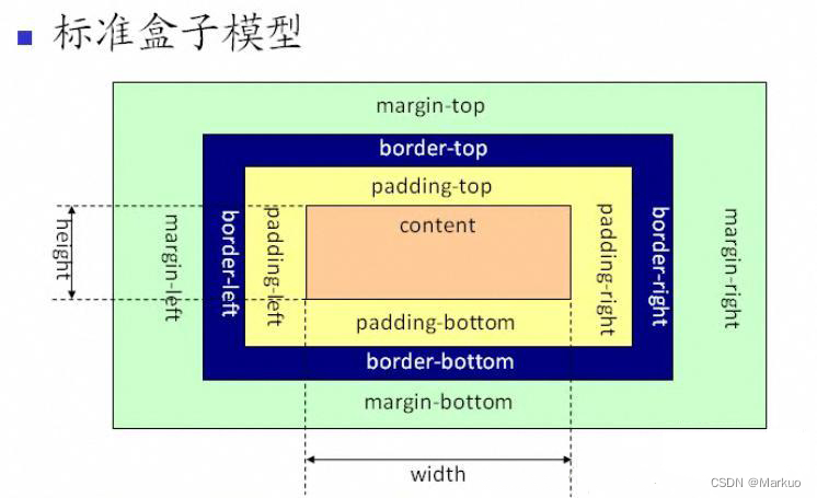
盒模型是由四个部分组成:margin、border、padding和content。
标准盒模型和IE盒模型的区别在于设置width和height时,所对应的范围不同。
- 标准盒模型的width和height属性的范围只包含了content
- IE盒模型的width和height属性的范围包含了border、padding和content
可以通过修改元素的border-sizing属性来改变元素的盒类型
- border-sizing: content-box; 表示标准盒模型(默认值)
- border-sizing: border-box; 表示IE盒模型(怪异盒模型)
七、CSS3中有哪些新特性?
-
CSS3选择器
- 属性选择器:E[att^=value]、E[att$=value]、E[att*=value]
- 伪类选择器::root、:not、:only-child、:first-child、:last-child、:nth-child(n)、:nth-last-child(n)、:nth-of-type(n)、:nth-last-of-type(n)、:target、:empty
-
CSS3边框与圆角
- 新的边框属性:border-image、boeder-radius、box-shadow
- 新的圆角属性:border-radius、border-top-left-radius、border-top-right-radius、border-bottom-right-radius、border-bottom-left-radius
-
CSS3背景与渐变
-
新的背景属性:background-clip、background-origin、background-size
-
渐变:线性渐变(background-image: linear-gradient(direction, color-stop1, color-stop2, ...);)、径向渐变(background-image: radial-gradient(shape size at position, start-color, ..., last-color);)
-
CSS3文本效果
新的文本属性:text-shadow、box-shadow、text-overflow、word-wrap、word-break
-
CSS3转换
- 2D转换:translate()、rotate()、scale()、skew()、matrix()
- 3D转换:matrix3d()、translate3d()、translateX()、translateY()、translateZ()、scale3d()、scaleX()、scaleY()、scaleZ()、rotate3d()、rotateX()、rotateY()、rotateZ()
-
CSS3过渡
过渡属性:transition、transition-property、transition-duration、transition-timing-function、 transition-delay
-
CSS3动画
动画属性:@keyframes、animation、animation-name、animation-duration、
animation-timing-function、animation-fill-mode、animation-delay、
animation-iteration-count、animation-direction、animation-play-state
-
CSS3多列
多列属性:column-count、column-gap、column-rule-style、column-rule-width、
column-rule-color、column-rule、column-span、column-width
八、CSS 单行 多行文本溢出隐藏
- 单行文本溢出隐藏
- overflow: hidden; // 溢出隐藏
- text-overflow: ellipsis; // 溢出用省略号显示
- white-space: nowrap; // 规定段落中的文本不进行换行
- 多行文本溢出隐藏
- overflow: hidden; // 溢出隐藏
- text-overflow: ellipsis; // 溢出用省略号显示
- // 注意:下面三个属性是CSS3的属性,不是所有浏览器都可以兼容,所以要在前面加上-webkit-来兼容部分浏览器
- display: -webkit-box; // 作为弹性伸缩盒子模型显示
- -webkit-box-orient: vertical; // 设置伸缩盒子的子元素排列方式: 从上到下垂直排列
- -webkit-line-clamp: 3; // 显示的行数
九、两栏布局的实现
两栏布局:左边一栏宽度固定,右边一栏宽度自适应。
- 利用浮动,将左边元素宽度设置为 200px,并且设置向左浮动。将右边元素的 margin-left 设置为 200px,宽度设置为 auto(默认为 auto,撑满整个父元素)。
- html>
- <html lang="en">
- <head>
- <meta charset="UTF-8">
- <meta http-equiv="X-UA-Compatible" content="IE=edge">
- <meta name="viewport" content="width=device-width, initial-scale=1.0">
- <title>Documenttitle>
- <style>
- .outer {
- height: 100px;
- }
- .left {
- float: left;
- width: 200px;
- background: pink;
- }
- .right {
- margin-left: 200px;
- width: auto;
- background: blanchedalmond;
- }
- style>
- head>
- <body>
- <div class="outer">
- <div class="left">
- left
- div>
- <div class="right">
- right
- div>
- div>
- body>
- html>
- 利用浮动,左侧元素设置固定大小,并左浮动,右侧元素设置 overflow: hidden; 这样右边就触发了 BFC,BFC 的区域不会与浮动元素发生重叠,所以两侧就不会发生重叠。
- html>
- <html lang="en">
- <head>
- <meta charset="UTF-8">
- <meta http-equiv="X-UA-Compatible" content="IE=edge">
- <meta name="viewport" content="width=device-width, initial-scale=1.0">
- <title>Documenttitle>
- <style>
- .left {
- width: 100px;
- height: 200px;
- float: left;
- background: pink;
- }
- .right {
- height: 200px;
- overflow: hidden;
- background: blanchedalmond;
- }
- style>
- head>
- <body>
- <div class="outer">
- <div class="left">
- left
- div>
- <div class="right">
- right
- div>
- div>
- body>
- html>
- 利用 flex 布局,将左边元素设置为固定宽度 200px,将右边的元素设置为 flex:1。
- html>
- <html lang="en">
- <head>
- <meta charset="UTF-8">
- <meta http-equiv="X-UA-Compatible" content="IE=edge">
- <meta name="viewport" content="width=device-width, initial-scale=1.0">
- <title>Documenttitle>
- <style>
- .outer {
- display: flex;
- height: 100px;
- }
- .left {
- width: 200px;
- background: pink;
- }
- .right {
- flex: 1;
- background: blanchedalmond;
- }
- style>
- head>
- <body>
- <div class="outer">
- <div class="left">
- left
- div>
- <div class="right">
- right
- div>
- div>
- body>
- html>
- 利用绝对定位,将父级元素设置为相对定位。左边元素设置为 absolute 定位,并且宽度设置为 200px。将右边元素的 margin-left 的值设置为 200px。
- html>
- <html lang="en">
- <head>
- <meta charset="UTF-8">
- <meta http-equiv="X-UA-Compatible" content="IE=edge">
- <meta name="viewport" content="width=device-width, initial-scale=1.0">
- <title>Documenttitle>
- <style>
- .outer {
- position: relative;
- height: 100px;
- }
- .left {
- width: 200px;
- height: 100px;
- position: absolute;
- background: pink;
- }
- .right {
- margin-left: 200px;
- height: 100px;
- background: blanchedalmond;
- }
- style>
- head>
- <body>
- <div class="outer">
- <div class="left">
- left
- div>
- <div class="right">
- right
- div>
- div>
- body>
- html>
- 利用绝对定位,将父级元素设置为相对定位。左边元素宽度设置为 200px,右边元素设置为绝对定位,左边定位为 200px,其余方向定位为 0。
- html>
- <html lang="en">
- <head>
- <meta charset="UTF-8">
- <meta http-equiv="X-UA-Compatible" content="IE=edge">
- <meta name="viewport" content="width=device-width, initial-scale=1.0">
- <title>Documenttitle>
- <style>
- .outer {
- position: relative;
- height: 100px;
- }
- .left {
- width: 200px;
- background: pink;
- }
- .right {
- position: absolute;
- top: 0;
- bottom: 0;
- right: 0;
- left: 200px;
- background: blanchedalmond;
- }
- style>
- head>
- <body>
- <div class="outer">
- <div class="left">
- left
- div>
- <div class="right">
- right
- div>
- div>
- body>
- html>
十、三栏布局的实现
三栏布局:左右两栏宽度固定,中间自适应布局。
- 利用绝对定位,左右两栏设置为绝对定位,中间设置对应方向大小的 margin 的值。
- html>
- <html lang="en">
- <head>
- <meta charset="UTF-8">
- <meta http-equiv="X-UA-Compatible" content="IE=edge">
- <meta name="viewport" content="width=device-width, initial-scale=1.0">
- <title>Documenttitle>
- <style>
- .outer {
- position: relative;
- height: 100px;
- }
- .left {
- width: 200px;
- height: 100px;
- position: absolute;
- top: 0;
- left: 0;
- background: pink;
- }
- .right {
- width: 200px;
- height: 100px;
- position: absolute;
- top: 0;
- right: 0;
- background: blanchedalmond;
- }
- .center {
- margin-left: 200px;
- margin-right: 200px;
- height: 100px;
- background-color: honeydew;
- }
- style>
- head>
- <body>
- <div class="outer">
- <div class="left">
- left
- div>
- <div class="center">
- center
- div>
- <div class="right">
- right
- div>
- div>
- body>
- html>
- 利用 flex 布局,左右两栏设置固定大小,中间一栏设置为 flex:1。
- html>
- <html lang="en">
- <head>
- <meta charset="UTF-8">
- <meta http-equiv="X-UA-Compatible" content="IE=edge">
- <meta name="viewport" content="width=device-width, initial-scale=1.0">
- <title>Documenttitle>
- <style>
- .outer {
- display: flex;
- height: 100px;
- }
- .left {
- width: 200px;
- background: pink;
- }
- .right {
- width: 200px;
- background: blanchedalmond;
- }
- .center {
- flex: 1;
- background-color: honeydew;
- }
- style>
- head>
- <body>
- <div class="outer">
- <div class="left">
- left
- div>
- <div class="center">
- center
- div>
- <div class="right">
- right
- div>
- div>
- body>
- html>
- 利用浮动,左右两栏设置固定大小,并设置对应方向的浮动。中间一栏设置左右两个方向的 margin 值。注意:这种方式HTML布局中间一栏必须放到最后。
- html>
- <html lang="en">
- <head>
- <meta charset="UTF-8">
- <meta http-equiv="X-UA-Compatible" content="IE=edge">
- <meta name="viewport" content="width=device-width, initial-scale=1.0">
- <title>Documenttitle>
- <style>
- .outer {
- height: 100px;
- }
- .left {
- float: left;
- width: 200px;
- height: 100px;
- background: pink;
- }
- .right {
- float: right;
- width: 200px;
- height: 100px;
- background: blanchedalmond;
- }
- .center {
- margin-left: 200px;
- margin-right: 200px;
- height: 100px;
- background-color: honeydew;
- }
- style>
- head>
- <body>
- <div class="outer">
- <div class="left">
- left
- div>
- <div class="right">
- right
- div>
- <div class="center">
- center
- div>
- div>
- body>
- html>
- 圣杯布局,利用浮动和负边距来实现。父级元素设置左右的 padding,三个子元素均设置向左浮动,中间一个子元素放在最前面,宽度设置为父级元素的宽度,因此后面两列都被挤到了下一行,通过设置 margin 负值将其移动到上一行,设置左侧子元素margin-left: -100%;,右侧子元素margin-left: 负的父级元素右padding值;,再利用相对定位,设置左定位的值为父级的左右padding的值,定位到两边。
- html>
- <html lang="en">
- <head>
- <meta charset="UTF-8">
- <meta http-equiv="X-UA-Compatible" content="IE=edge">
- <meta name="viewport" content="width=device-width, initial-scale=1.0">
- <title>Documenttitle>
- <style>
- .outer {
- padding-left: 200px;
- padding-right: 200px;
- height: 100px;
- }
- .left {
- float: left;
- margin-left: -100%;
- position: relative;
- left: -200px;
- width: 200px;
- height: 100px;
- background: pink;
- }
- .right {
- float: left;
- margin-left: -200px;
- position: relative;
- left: 200px;
- width: 200px;
- height: 100px;
- background: blanchedalmond;
- }
- .center {
- float: left;
- width: 100%;
- height: 100px;
- background-color: honeydew;
- }
- style>
- head>
- <body>
- <div class="outer">
- <div class="center">
- center
- div>
- <div class="left">
- left
- div>
- <div class="right">
- right
- div>
- div>
- body>
- html>
- 双飞翼布局,双飞翼布局相对于圣杯布局来说,左右位置的保留是通过中间列的 margin 值来实现的,而不是通过父元素的 padding 来实现的。本质上来说,也是通过浮动和外边距负值来实现的。
- html>
- <html lang="en">
- <head>
- <meta charset="UTF-8">
- <meta http-equiv="X-UA-Compatible" content="IE=edge">
- <meta name="viewport" content="width=device-width, initial-scale=1.0">
- <title>Documenttitle>
- <style>
- .left {
- float: left;
- margin-left: -100%;
- width: 200px;
- height: 100px;
- background: pink;
- }
- .right {
- float: left;
- margin-left: -200px;
- width: 200px;
- height: 100px;
- background: blanchedalmond;
- }
- .center {
- float: left;
- width: 100%;
- height: 100px;
- background-color: honeydew;
- }
- .center-main {
- margin-left: 200px;
- margin-right: 200px;
- height: 100px;
- background-color: cadetblue;
- }
- style>
- head>
- <body>
- <div class="outer">
- <div class="center">
- <div class="center-main">centerdiv>
- div>
- <div class="left">
- left
- div>
- <div class="right">
- right
- div>
- div>
- body>
- html>
十一、 水平垂直居中的实现
- 利用绝对定位,先将元素的左上角通过 top:50%和 left:50%定位到页面的中心,然后再通过 translate 来调整元素的中心点到页面的中心。该方法需要考虑浏览器兼容问题。
- html>
- <html lang="en">
- <head>
- <meta charset="UTF-8">
- <meta http-equiv="X-UA-Compatible" content="IE=edge">
- <meta name="viewport" content="width=device-width, initial-scale=1.0">
- <title>Documenttitle>
- <style>
- .outer {
- width: 100%;
- height: 100vh;
- position: relative;
- background-color: pink;
- }
- .content {
- width: 500px;
- height: 500px;
- position: absolute;
- top: 50%;
- left: 50%;
- transform: translate(-50%, -50%);
- background: blanchedalmond;
- }
- style>
- head>
- <body>
- <div class="outer">
- <div class="content">contentdiv>
- div>
- div>
- body>
- html>
- 利用绝对定位,设置四个方向的值都为 0,并将 margin 设置为 auto,由于宽高固定,因此对应方向实现平分,可以实现水平和垂直方向上的居中。该方法适用于子元素有宽高的情况。
- html>
- <html lang="en">
- <head>
- <meta charset="UTF-8">
- <meta http-equiv="X-UA-Compatible" content="IE=edge">
- <meta name="viewport" content="width=device-width, initial-scale=1.0">
- <title>Documenttitle>
- <style>
- .outer {
- width: 100%;
- height: 100vh;
- position: relative;
- background-color: pink;
- }
- .content {
- width: 500px;
- height: 500px;
- position: absolute;
- top: 0;
- left: 0;
- right: 0;
- bottom: 0;
- margin: auto;
- background: blanchedalmond;
- }
- style>
- head>
- <body>
- <div class="outer">
- <div class="content">contentdiv>
- div>
- div>
- body>
- html>
- 利用绝对定位,先将元素的左上角通过 top:50%和 left:50%定位到页面的中心,然后再通过 margin 负值来调整元素的中心点到页面的中心。该方法适用于子元素宽高已知的情况。
- html>
- <html lang="en">
- <head>
- <meta charset="UTF-8">
- <meta http-equiv="X-UA-Compatible" content="IE=edge">
- <meta name="viewport" content="width=device-width, initial-scale=1.0">
- <title>Documenttitle>
- <style>
- .outer {
- width: 100%;
- height: 100vh;
- position: relative;
- background-color: pink;
- }
- .content {
- width: 500px;
- height: 500px;
- position: absolute;
- top: 50%;
- left: 50%;
- margin-top: -250px; /* 自身高度的一半 */
- margin-left: -250px; /* 自身宽度的一半 */
- background: blanchedalmond;
- }
- style>
- head>
- <body>
- <div class="outer">
- <div class="content">contentdiv>
- div>
- div>
- body>
- html>
- 使用 flex 布局,通过 align-items:center; 和 justify-content:center; 设置容器的垂直和水平方向上为居中对齐,然后它的子元素也可以实现垂直和水平的居中。该方法要考虑兼容的问题。该方法在移动端用的较多。
- html>
- <html lang="en">
- <head>
- <meta charset="UTF-8">
- <meta http-equiv="X-UA-Compatible" content="IE=edge">
- <meta name="viewport" content="width=device-width, initial-scale=1.0">
- <title>Documenttitle>
- <style>
- .outer {
- width: 100%;
- height: 100vh;
- display: flex;
- align-items: center;
- justify-content: center;
- background-color: pink;
- }
- .content {
- width: 500px;
- height: 500px;
- background: blanchedalmond;
- }
- style>
- head>
- <body>
- <div class="outer">
- <div class="content">contentdiv>
- div>
- div>
- body>
- html>
- 父元素设置了flex布局,只需要给子元素加上margin: auto; 就可以实现垂直居中布局。
- html>
- <html lang="en">
- <head>
- <meta charset="UTF-8">
- <meta http-equiv="X-UA-Compatible" content="IE=edge">
- <meta name="viewport" content="width=device-width, initial-scale=1.0">
- <title>Documenttitle>
- <style>
- .outer {
- width: 100%;
- height: 100vh;
- display: flex;
- background-color: pink;
- }
- .content {
- width: 500px;
- height: 500px;
- margin: auto;
- background: blanchedalmond;
- }
- style>
- head>
- <body>
- <div class="outer">
- <div class="content">contentdiv>
- div>
- div>
- body>
- html>
十二、CSS 对Flex布局的理解及其使用场景
Flex是FlexibleBox的缩写,意为“弹式布局”,用来为盒装模型提供最大的灵活性。
任何一个容器都可以指定为Flex布局。行内元素也可以使用Flex布局。
注意:设为Flex布局以后,子元素的float、clear和vertical-align属性将失效。
采用Flex布局的元素,称为Flex容器(flex container),简称“容器”。
它的所有子元素自动成为容器成员,成为Flex项目(flex item),简称“项目”。
容器默认存在两根轴:水平的主轴(main axis)和垂直的交叉轴(cross axis),项目默认沿水平主轴排列。
设置在容器上的属性:
- flex-direction 属性决定主轴的方向(即项目的排列方向)。
- flex-wrap 属性定义如果一条轴线排不下如何换行。
- flex-flow 属性是flex-direction属性和flex-wrap属性的简写形式,默认值为row nowrap。
- justify-content 属性定义了项目在主轴上的对齐方式。
- align-items 属性定义项目在交叉轴上如何对齐。
- align-content 属性定义了多根轴线的对齐方式。如果项目只有一根轴线,该属性不起作用。
设置在项目上的属性:
- order 属性定义项目的排列顺序。数值越小,排列越靠前,默认为0。
- flex-grow 属性定义项目的放大比例,默认为0,即如果存在剩余空间,也不放大。
- flex-shrink 属性定义项目的缩小比例,默认为1,即如果空间不足,该项目将缩小。
- flex-basis 属性定义在分配多余空间之前,项目占据的主轴空间。浏览器根据这个属性计算主轴是否有多余空间。它的默认值为auto,即项目的本来大小。
- flex 属性是flex-grow、flex-shrink和flex-bassis的简写,默认值为 0 1 auto。
- align-self 属性允许单个项目有与其他项目不一样的对齐方式,可覆盖align-items属性。默认值为auto,表示继承父元素的align-items属性,如果没有父元素,则等同于stretch。
Flex布局是CSS3新增的一种布局方式,可以通过将一个元素的display属性值设置为flex从而使它成为一个flex容器,它的所有子元素都会成为它的项目。一个容器默认有两条轴:一个是水平的主轴,一个是与主轴垂直的交叉轴。可以使用flex-direction来指定主轴的方向。可以使用justify-content来指定元素在主轴上的排列方式,使用align-items来指定元素在交叉轴上的排列方式。还可以使用flex-wrap来规定当一行排列不下时的换行方式。对于容器中的项目,可以使用order属性来指定项目的排列顺序,还可以使用flex-grow来指定当排列空间有剩余的时候,项目的放大比例,还可以使用flex-shrink来指定当排列空间不足时,项目的缩小比例。
十三、为什么需要清除浮动?清除浮动的方式有哪些?
浮动的定义:非IE浏览器下,容器不设高度且子元素浮动时,容器高度不能被内容撑开。 此时,内容会溢出到容器外面而影响布局。这种现象被称为浮动(溢出)。
浮动的工作原理:
- 浮动元素脱离文档流,不占据空间(引起“高度塌陷”现象)
- 浮动元素碰到包含它的边框或者其他浮动元素的边框停留
浮动元素可以左右移动,直到遇到另一个浮动元素或者遇到它外边缘的包含框。浮动框不属于文档流中的普通流,当元素浮动之后,不会影响块级元素的布局,只会影响内联元素布局。此时文档流中的普通流就会表现得该浮动框不存在一样的布局模式。当包含框的高度小于浮动框的时候,此时就会出现“高度塌陷”。
浮动元素引起的原因?
- 父元素的高度无法被撑开,影响与父元素同级的元素
- 与浮动元素同级的非浮动元素会跟随其后
- 若浮动的元素不是第一个元素,则该元素之前的元素也要浮动,否则会影响页面的显示结构
清除浮动的方式:
- 给父级div定义height属性
父级盒子是无法确认高度的,需要有内容将高度撑起来,设置固定高度无法实现页面自适应,所以不推荐。
- html>
- <html lang="en">
- <head>
- <meta charset="UTF-8">
- <meta http-equiv="X-UA-Compatible" content="IE=edge">
- <meta name="viewport" content="width=device-width, initial-scale=1.0">
- <title>Documenttitle>
- <style>
- .parent {
- width: 100%;
- height: 200px;
- background-color: pink;
- }
- .child {
- float: left;
- width: 200px;
- height: 200px;
- background: blanchedalmond;
- }
- style>
- head>
- <body>
- <div class="parent">
- <div class="child">contentdiv>
- div>
- div>
- body>
- html>
- 最后一个浮动元素之后添加一个空的div标签,并添加 clear: both; 样式
- html>
- <html lang="en">
- <head>
- <meta charset="UTF-8">
- <meta http-equiv="X-UA-Compatible" content="IE=edge">
- <meta name="viewport" content="width=device-width, initial-scale=1.0">
- <title>Documenttitle>
- <style>
- .parent {
- width: 100%;
- background-color: pink;
- }
- .child {
- float: left;
- width: 200px;
- height: 200px;
- background: blanchedalmond;
- }
- .clear {
- clear: both;
- }
- style>
- head>
- <body>
- <div class="parent">
- <div class="child">contentdiv>
- <div class="clear">div>
- div>
- div>
- body>
- html>
- 包含浮动元素的父级标签添加 overflow: 'hidden'; 或者 overflow: auto;
- html>
- <html lang="en">
- <head>
- <meta charset="UTF-8">
- <meta http-equiv="X-UA-Compatible" content="IE=edge">
- <meta name="viewport" content="width=device-width, initial-scale=1.0">
- <title>Documenttitle>
- <style>
- .parent {
- width: 100%;
- background-color: pink;
- overflow: auto; /* overflow: hidden; 二者都可解决盒子塌陷 */
- }
- .child {
- float: left;
- width: 200px;
- height: 200px;
- background: blanchedalmond;
- }
- style>
- head>
- <body>
- <div class="parent">
- <div class="child">contentdiv>
- div>
- div>
- body>
- html>
- 使用:after伪元素。由于IE6-7不支持:after,使用 zoom: 1; 触发IE的hasLayout属性
- html>
- <html lang="en">
- <head>
- <meta charset="UTF-8">
- <meta http-equiv="X-UA-Compatible" content="IE=edge">
- <meta name="viewport" content="width=device-width, initial-scale=1.0">
- <title>Documenttitle>
- <style>
- .parent {
- width: 100%;
- background-color: pink;
- zoom: 1;
- }
- .parent:after {
- /* clear 属性只有块级元素才有效的,而::after 等伪元素默认都是内联水平,这就是借助伪元素清除浮动影响时需要设置 display 属性值的原因。*/
- display: block;
- content: '';
- clear: both;
- }
- .child {
- float: left;
- width: 200px;
- height: 200px;
- background: blanchedalmond;
- }
- style>
- head>
- <body>
- <div class="parent">
- <div class="child">contentdiv>
- div>
- div>
- body>
- html>
十四、对BFC的理解,如何创建BFC?
相关概念:
- Box:Box是CSS布局的对象和基本单位,一个页面是由很多个Box组成的,这个Box就是我们所说的盒模型。
- Formatting context:块级上下文格式化,它是页面中的一块渲染区域,并且有一套渲染规则,它决定了其子元素将如何定位,以及和其他元素的关系和相互作用。
- 块格式化上下文(Block Formatting Context,BFC)是Web页面的可视化CSS渲染的一部分,是布局过程中生成块级盒子的区域,也是浮动元素与其他元素的交互限定区域。
- 通俗来讲:BFC是一个独立的布局环境,可以理解为一个容器,在这个容器中按照一定规则进行物品摆放,并且不会影响其他环境中的物品。如果一个元素符合触发BFC的条件,则BFC中的元素布局不受外部影响。
创建BFC的条件:
- 根元素:body
- 元素设置浮动:float属性不为none以外的值
- 元素设置绝对定位:position属性不为relative和static以外的值
- display属性值为:inline-block、table-cell、table-caption、flex等
- overflow属性值为:hidden、auto、scroll
BFC的特点:
- 垂直方向向上,自上而下排列,和文档流的排列方式一致
- 在BFC中上下相邻的两个容器的margin会重叠
- 计算BFC的高度时,需要计算浮动元素的高度
- BFC区域不会与浮动的容器发生重叠
- BFC是独立的容器,容器的内部元素不会影响外部元素
- 每个元素的左margin值和容器的左border相接触
BFC的作用:
- 解决margin的重叠问题:由于BFC是一个独立的区域,内部的元素和外部的元素互不影响,将两个元素变为两个BFC,就解决了margin重叠问题
- 解决高度塌陷的问题:在对子元素设置浮动后,父元素会发生高度塌陷,也就是父元素的高度变为0。解决这个问题,只需要把父元素变成一个BFC。常用的办法是给父元素设置overflow: hidden;
- 创建自适应两栏布局:左边的宽度固定,右边的宽度自适应。左边设置float: left;,右边设置overflow: hidden;。这样右边就触发了BFC,BFC的区域不会与浮动元素发生重叠,所以两侧就不会发生重叠,实现了自适应两栏布局。
- html>
- <html lang="en">
- <head>
- <meta charset="UTF-8">
- <meta http-equiv="X-UA-Compatible" content="IE=edge">
- <meta name="viewport" content="width=device-width, initial-scale=1.0">
- <title>Documenttitle>
- <style>
- .left {
- width: 300px;
- height: 100vh;
- float: left;
- background-color: pink;
- }
- .right {
- height: 100vh;
- overflow: hidden;
- background: blanchedalmond;
- }
- style>
- head>
- <body>
- <div class="left">leftdiv>
- <div class="right">rightdiv>
- body>
- html>
十五、CSS position的属性有哪些?区别是什么?
属性值 概述 static 默认值。没有定位,元素出现在正常的文档流中,会忽略top、bottom、left、right或者z-index声明,块级元素从上往下纵向排列,行级元素从左向右排列。 absolute 生成绝对定位的元素,相对于static定位以外的第一个父元素进行定位。元素的位置通过left、top、right、bottom属性进行规定。可通过z-index进行层次分级。 relative 生成相对定位的元素,相对于其原来的位置进行定位。元素的位置通过left、top、right、bottom属性进行规定。 fixed 生成绝对定位的元素。指定元素相对于屏幕视口(viewport)的位置来指定元素位置。元素的位置在屏幕滚动时不会改变,比如回到顶部的按钮一般都是用此定位方式。 inherit 继承父元素的position值。 absolute的定位方式:
元素的定位为absolute设置了top、left,浏览器会根据什么去确定它的纵向和横向的偏移量?
浏览器会递归查找该元素的所有父元素,如果找到了一个设置了position: relative/absolute/fixed;的元素,就以该元素为基准定位。如果没有找到,就以浏览器边界定位。


relative的定位方式:
元素的定位永远是相对于元素自身位置的,和其他元素没关系,也不会影响其他元素。

fixed的定位方式:
元素的定位是相对于window(或者iframe)边界的,和其他元素没有关系。但是它具有破坏性,会导致其他元素位置的变化。

十六、实现一个三角形
CSS 绘制三角形主要用到的是 border 属性,也就是边框。平时在给盒子设置边框时,往往都设置很窄,就可能误以为边框是由矩形组成的。实际上,border 属性是由三角形组成的。
代码如下:
- html>
- <html lang="en">
- <head>
- <meta charset="UTF-8">
- <meta http-equiv="X-UA-Compatible" content="IE=edge">
- <meta name="viewport" content="width=device-width, initial-scale=1.0">
- <title>Documenttitle>
- <style>
- .box{
- width: 0;
- height: 0;
- border: 100px solid;
- border-color: orange blue red green;
- }
- style>
- head>
- <body>
- <div class="box">
- div>
- body>
- html>
效果图:

CSS 实现三角形的原则:通过上下左右边框来控制三角形的方向,用边框的宽度比来控制三角形的角度。
代码如下:
- html>
- <html lang="en">
- <head>
- <meta charset="UTF-8">
- <meta http-equiv="X-UA-Compatible" content="IE=edge">
- <meta name="viewport" content="width=device-width, initial-scale=1.0">
- <title>Documenttitle>
- <style>
- .box{
- width: 0;
- height: 0;
- border-top: 50px solid red;
- border-right: 20px solid transparent;
- border-left: 50px solid transparent;
- }
- style>
- head>
- <body>
- <div class="box">
- div>
- body>
- html>
效果图:

十七、如何解决1px 问题?
1px 问题指的是:在一些Retina屏幕的机型上,移动端页面的 1px 会变得很粗,呈现出不止 1px 的效果。
原因:CSS 中的 1px 并不能和移动设备上的 1px 划等号。
它们之间的比例关系有一个专门的属性来描述:
window.devicePixelRatio = 设备的物理像素 / CSS像素解决1px问题:
- 直接写0.5px
- 伪元素先放大后缩小
- viewport缩放来解决
-
相关阅读:
私域运营怎么做?掌握这几点你也会很快起盘........
linux-文件系统
OpenCV Series : Target Box Outline Border
离开大促的电商生意,应该怎么玩?
为什么在pycharm里的全国热力图没有数值
Struts2的拦截器
【LeetCode题目详解】第九章 动态规划part17 647. 回文子串 ● 516.最长回文子序列(day57补)
Python_偏函数
A1048 Find Coins(测试点1)
flutter系列之:做一个下载按钮的动画
- 原文地址:https://blog.csdn.net/qq_41623635/article/details/126502768