-
CSS3 animation 关键帧动画 keyframes
animation 基本用法
语法格式:
animation: name duration timing-function delay iteration-count direction;- 1
第一个参数:name (animation-name)
name定义动画的名字,CSS3定义采用” 关键帧[keyframes]“来定义动画:@keyframes mymove{ 0% { opacity : 1} 100% { opacity : 0} }- 1
- 2
- 3
- 4
如上例,定义了一个动画名字叫
mymove,0%代表动画初,100%代表动画末,中间的动画过程由浏览器渲染引擎进行渲染。可以使用时间段
0%~100%;或者通过关键词 “from” 和 “to”,等价于0%和100%。对应不同的浏览器需要加前缀做兼容。
第二个参数:duration (animation-duration)
duration规定完成整个动画持续的时间,必须带时间单位,s或者ms。实例:
DOCTYPE html> <html> <head> <meta charset="utf-8" /> <meta name="viewport" content="width=device-width, initial-scale=1"> <title>动画title> <link rel="stylesheet" href="css/animate.css"> <style> div { width:100px; height:100px; background:green; position:relative; animation:mymove infinite; animation-duration:5s; /* Safari and Chrome */ -webkit-animation:mymove infinite; -webkit-animation-duration:5s; } @keyframes mymove { from {top:0px;} to {top:200px;} } @-webkit-keyframes mymove /* Safari and Chrome */ { from {top:0px;} to {top:200px;} } style> head> <body> <p><strong>注释:strong>Internet Explorer 9 以及更早的版本不支持 animation-name 属性。p> <div>div> <p><b>注释:b>始终规定 animation-duration 属性,否则时长为 0,就不会播放动画了。p> body> html>- 1
- 2
- 3
- 4
- 5
- 6
- 7
- 8
- 9
- 10
- 11
- 12
- 13
- 14
- 15
- 16
- 17
- 18
- 19
- 20
- 21
- 22
- 23
- 24
- 25
- 26
- 27
- 28
- 29
- 30
- 31
- 32
- 33
- 34
- 35
- 36
- 37
- 38
- 39
- 40
- 41
- 42
- 43
- 44
- 45
页面效果:

第三个参数:animation-timing-function
timing-function规定动画运动方式的贝塞尔曲线,基本值有以下几种:linear
规定动画从头到尾的速度是相同的。
ease
默认;规定动画以低速开始,然后加快,在结束前变慢。
ease-in
规定动画以低速开始。
ease-out
规定动画以低速结束。
ease-in-out
规定动画以低速开始和结束。
实例:
DOCTYPE html> <html> <head> <meta charset="utf-8" /> <meta name="viewport" content="width=device-width, initial-scale=1"> <title>动画title> <link rel="stylesheet" href="css/animate.css"> <style> div { width:100px; height:50px; background:green; color:white; font-weight:bold; position:relative; animation:mymove 5s infinite; -webkit-animation:mymove 5s infinite; /* Safari and Chrome */ } #div1 {animation-timing-function:linear;} #div2 {animation-timing-function:ease;} #div3 {animation-timing-function:ease-in;} #div4 {animation-timing-function:ease-out;} #div5 {animation-timing-function:ease-in-out;} /* Safari and Chrome: */ #div1 {-webkit-animation-timing-function:linear;} #div2 {-webkit-animation-timing-function:ease;} #div3 {-webkit-animation-timing-function:ease-in;} #div4 {-webkit-animation-timing-function:ease-out;} #div5 {-webkit-animation-timing-function:ease-in-out;} @keyframes mymove { from {left:0px;} to {left:300px;} } @-webkit-keyframes mymove /* Safari and Chrome */ { from {left:0px;} to {left:300px;} } style> head> <body> <p><strong>注释:strong>Internet Explorer 9 以及更早的版本不支持 animation-timing-function 属性。p> <div id="div1">lineardiv> <div id="div2">easediv> <div id="div3">ease-indiv> <div id="div4">ease-outdiv> <div id="div5">ease-in-outdiv> body> html>- 1
- 2
- 3
- 4
- 5
- 6
- 7
- 8
- 9
- 10
- 11
- 12
- 13
- 14
- 15
- 16
- 17
- 18
- 19
- 20
- 21
- 22
- 23
- 24
- 25
- 26
- 27
- 28
- 29
- 30
- 31
- 32
- 33
- 34
- 35
- 36
- 37
- 38
- 39
- 40
- 41
- 42
- 43
- 44
- 45
- 46
- 47
- 48
- 49
- 50
- 51
- 52
- 53
- 54
- 55
- 56
- 57
- 58
页面效果:

cubic-bezier(n,n,n,n)
在
cubic-bezier函数中自己的值,可能的值是从0到1的数值。实例(通过
cubic-bezier函数来定义速度曲线):DOCTYPE html> <html> <head> <meta charset="utf-8" /> <meta name="viewport" content="width=device-width, initial-scale=1"> <title>动画title> <link rel="stylesheet" href="css/animate.css"> <style> div { width:100px; height:50px; background:green; color:white; font-weight:bold; position:relative; animation:mymove 5s infinite; -webkit-animation:mymove 5s infinite; /* Safari and Chrome */ } #div1 {animation-timing-function:cubic-bezier(0,0,0.25,1);} #div2 {animation-timing-function:cubic-bezier(0.25,0.1,0.25,1);} #div3 {animation-timing-function:cubic-bezier(0.42,0,1,1);} #div4 {animation-timing-function:cubic-bezier(0,0,0.58,1);} #div5 {animation-timing-function:cubic-bezier(0.42,0,0.58,1);} /* Safari and Chrome: */ #div1 {-webkit-animation-timing-function:cubic-bezier(0,0,1,1);} #div2 {-webkit-animation-timing-function:cubic-bezier(0.25,0.1,0.25,1);} #div3 {-webkit-animation-timing-function:cubic-bezier(0.42,0,1,1);} #div4 {-webkit-animation-timing-function:cubic-bezier(0,0,0.58,1);} #div5 {-webkit-animation-timing-function:cubic-bezier(0.42,0,0.58,1);} @keyframes mymove { from {left:0px;} to {left:300px;} } @-webkit-keyframes mymove /* Safari and Chrome */ { from {left:0px;} to {left:300px;} } style> head> <body> <p><strong>注释:strong>Internet Explorer 9 以及更早的版本不支持 animation-timing-function 属性。p> <div id="div1">lineardiv> <div id="div2">easediv> <div id="div3">ease-indiv> <div id="div4">ease-outdiv> <div id="div5">ease-in-outdiv> body> html>- 1
- 2
- 3
- 4
- 5
- 6
- 7
- 8
- 9
- 10
- 11
- 12
- 13
- 14
- 15
- 16
- 17
- 18
- 19
- 20
- 21
- 22
- 23
- 24
- 25
- 26
- 27
- 28
- 29
- 30
- 31
- 32
- 33
- 34
- 35
- 36
- 37
- 38
- 39
- 40
- 41
- 42
- 43
- 44
- 45
- 46
- 47
- 48
- 49
- 50
- 51
- 52
- 53
- 54
- 55
- 56
- 57
- 58
页面效果:

第四个参数:delay (animation-delay)
delay规定动画开始之前延迟执行的时间,单位是s或者ms。例子:
<!DOCTYPE html> <html> <head> <meta charset="utf-8" /> <meta name="viewport" content="width=device-width, initial-scale=1"> <title>动画</title> <link rel="stylesheet" href="css/animate.css"> <style> div { width:100px; height:100px; background:green; position:relative; animation:mymove 5s infinite; animation-delay:2s; /*Safari and Chrome*/ -webkit-animation:mymove 5s infinite; -webkit-animation-delay:2s; } @keyframes mymove { from {left:0px;} to {left:200px;} } @-webkit-keyframes mymove /*Safari and Chrome*/ { from {left:0px;} to {left:200px;} } </style> </head> <body> <p><strong>注释:</strong>Internet Explorer 9 以及更早的版本不支持 animation-delay 属性。</p> <div></div> </body> </html>- 1
- 2
- 3
- 4
- 5
- 6
- 7
- 8
- 9
- 10
- 11
- 12
- 13
- 14
- 15
- 16
- 17
- 18
- 19
- 20
- 21
- 22
- 23
- 24
- 25
- 26
- 27
- 28
- 29
- 30
- 31
- 32
- 33
- 34
- 35
- 36
- 37
- 38
- 39
- 40
- 41
- 42
- 43
页面效果:

如上,动画在第一次开始前,延迟了几秒。
第五个参数:animation-iteration-count
animation-iteration-count规定动画循环执行的次数,没有单位,其中,infinite为无限循环。例子:
DOCTYPE html> <html> <head> <meta charset="utf-8" /> <meta name="viewport" content="width=device-width, initial-scale=1"> <title>动画title> <link rel="stylesheet" href="css/animate.css"> <style> div { width:100px; height:100px; background:green; position:relative; animation:mymove 3s; animation-iteration-count:3; /* Safari and Chrome */ -webkit-animation:mymove 3s; -webkit-animation-iteration-count:3; } @keyframes mymove { from {top:0px;} to {top:200px;} } @-webkit-keyframes mymove /* Safari and Chrome */ { from {top:0px;} to {top:200px;} } style> head> <body> <p><strong>注释:strong>Internet Explorer 9 以及更早的版本不支持 animation-iteration-count 属性。p> <div>div> body> html>- 1
- 2
- 3
- 4
- 5
- 6
- 7
- 8
- 9
- 10
- 11
- 12
- 13
- 14
- 15
- 16
- 17
- 18
- 19
- 20
- 21
- 22
- 23
- 24
- 25
- 26
- 27
- 28
- 29
- 30
- 31
- 32
- 33
- 34
- 35
- 36
- 37
- 38
- 39
- 40
- 41
- 42
- 43
页面效果:

如上例,设置了
animation-iteration-count:3,动画一共执行了三次。第六个参数:animation-direction
animation-direction定义是否应该轮流反向播放动画。animation-direction: normal|alternate;- 1
如果动画循环,循环的方式是:
alternate(则动画会在奇数次数(1、3、5 等等)正常播放,而在偶数次数(2、4、6 等等)向后播放。)、normal(动画正常播放)。例子:
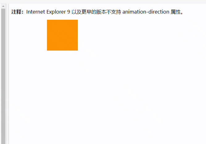
DOCTYPE html> <html> <head> <meta charset="utf-8" /> <meta name="viewport" content="width=device-width, initial-scale=1"> <title>动画title> <link rel="stylesheet" href="css/animate.css"> <style> div { width:100px; height:100px; background:red; position:relative; animation:mymove 5s infinite; animation-direction:alternate; /* Safari and Chrome */ -webkit-animation:mymove 5s infinite; -webkit-animation-direction:alternate; } @keyframes mymove { 0% {background:red; left:0px; top:0px;} 25% {background:yellow; left:200px; top:0px;} 50% {background:blue; left:200px; top:200px;} 75% {background:green; left:0px; top:200px;} 100% {background:red; left:0px; top:0px;} } @-webkit-keyframes mymove /* Safari and Chrome */ { 0% {background:red; left:0px; top:0px;} 25% {background:yellow; left:200px; top:0px;} 50% {background:blue; left:200px; top:200px;} 75% {background:green; left:0px; top:200px;} 100% {background:red; left:0px; top:0px;} } style> head> <body> <p><strong>注释:strong>Internet Explorer 9 以及更早的版本不支持 animation-direction 属性。p> <div>div> body> html>- 1
- 2
- 3
- 4
- 5
- 6
- 7
- 8
- 9
- 10
- 11
- 12
- 13
- 14
- 15
- 16
- 17
- 18
- 19
- 20
- 21
- 22
- 23
- 24
- 25
- 26
- 27
- 28
- 29
- 30
- 31
- 32
- 33
- 34
- 35
- 36
- 37
- 38
- 39
- 40
- 41
- 42
- 43
- 44
- 45
- 46
- 47
- 48
- 49
页面效果:
如果把动画设置为只播放一次,则该属性没有效果。
第七个参数:final (animation-fill-mode):
规定了动画在播放之前或之后,其动画效果是否可见。
动画的最后(达到
100%)时的状态,取值有:backwards(回到初始状态)、forwards(停在最终状态)、none、both。both:(根据animation-direction决定)当设置方向为反方向的时候,根据动画执行的次数判断是否处于
backwards还是forwards的状态,以上代码是执行偶数次,动画来回运动,最终回到初始状态即为backwards状态,当为奇数次时,则为结束状态forwards状态。例子:
DOCTYPE html> <html> <head> <head> <meta charset="utf-8" /> <meta name="viewport" content="width=device-width, initial-scale=1"> <title>动画title> <link rel="stylesheet" href="css/animate.css"> <style> div { width:100px; height:100px; background:green; position:relative; animation:mymove 1s ease-in 2 alternate both; /* Safari and Chrome */ -webkit-animation: mymove 1s ease-in 2 alternate both; } @keyframes mymove { 0%{-webkit-transform:translateX(0);} 50%{-webkit-transform:translateX(40px);} 100%{-webkit-transform:translateX(100px);} } @-webkit-keyframes mymove /* Safari and Chrome */ { 0%{-webkit-transform:translateX(0);} 50%{-webkit-transform:translateX(40px);} 100%{-webkit-transform:translateX(100px);} } style> head> <body> <p><strong>注释:strong>Internet Explorer 9 以及更早的版本不支持 animation-direction 属性。p> <div>div> body> html>- 1
- 2
- 3
- 4
- 5
- 6
- 7
- 8
- 9
- 10
- 11
- 12
- 13
- 14
- 15
- 16
- 17
- 18
- 19
- 20
- 21
- 22
- 23
- 24
- 25
- 26
- 27
- 28
- 29
- 30
- 31
- 32
- 33
- 34
- 35
- 36
- 37
- 38
- 39
- 40
- 41
- 42
- 43
页面效果:

animation可以设置多组动画
.showcon{ -webkit-animation: myMoveIn 2s linear 19s 1 forwards, myMoveOut 1s linear 25s 1 forwards; } // 1、动画延迟19s进入 myMoveIn 动画(动画匀速播放持续2s),播放一次后将停止在 myMoveIn 最终的状态。 // 2、动画延迟25s进入 myMoveOut 动画(动画匀速播放持续2s),播放一次后将停止在 myMoveOut 最终的状态- 1
- 2
- 3
- 4
- 5
例子:
DOCTYPE html> <html> <head> <head> <meta charset="utf-8" /> <meta name="viewport" content="width=device-width, initial-scale=1"> <title>动画title> <link rel="stylesheet" href="css/animate.css"> <style> html, body { height: 100%; } .center { width: 60px; height: 60px; background: green; background-size: 100% 100%; transform: scaleX(-1); animation: bounce 0.1s infinite; } @keyframes mymove { 0% { transform: translate(0, 0); animation-timing-function: cubic-bezier(0.215, 0.61, 0.355, 1); } 25% { transform: translate(calc(100vw - 128px), 10px) scaleY(-1); animation-timing-function: cubic-bezier(0.755, 0.05, 0.855, 0.06); } 50% { transform: translate(calc(100vw - 129px), calc(100vh - 200px)); animation-timing-function: cubic-bezier(0.755, 0.05, 0.855, 0.06); } 75% { transform: translate(0, calc(100vh - 128px)) scaleX(-1); } 100% { transform: translate(10px, 10px) translate3d(0, -4px, 0); } } body:hover .center { animation: mymove 2s linear infinite; } style> head> <body> <p><strong>注释:strong>Internet Explorer 9 以及更早的版本不支持 animation 属性。p> <div class="center">div> body> html>- 1
- 2
- 3
- 4
- 5
- 6
- 7
- 8
- 9
- 10
- 11
- 12
- 13
- 14
- 15
- 16
- 17
- 18
- 19
- 20
- 21
- 22
- 23
- 24
- 25
- 26
- 27
- 28
- 29
- 30
- 31
- 32
- 33
- 34
- 35
- 36
- 37
- 38
- 39
- 40
- 41
- 42
- 43
- 44
- 45
- 46
- 47
- 48
- 49
- 50
- 51
- 52
- 53
- 54
- 55
- 56
- 57
- 58
- 59
- 60
- 61
- 62
页面效果:

-
相关阅读:
‘Could not find first log file name in binary log index file‘的解决办法
SpringMVC 识 拦截器
雷电模拟器上使用第一个frida(四)第一个HOOK
【推荐】数字化转型和案例及IT规划资料整理合集
大数据课程K20——Spark的SparkSQL概述
LINUX笔记温习
IP网络矿用打点紧急广播方案
Python类的定义与使用
ubuntu 设置最大带宽
Lightsail VPS 实例在哪些方面胜过 EC2 实例?
- 原文地址:https://blog.csdn.net/HH18700418030/article/details/125978376
