-
【网页性能优化】-—— 关于图片懒加载
前言
提示:这里可以添加本文要记录的大概内容:懒加载是一种
网页性能优化的方式,它能极大的提升用户体验。就比如说图片,图片一直是影响网页性能的主要元凶,现在一张图片超过几兆已经是很经常的事了。如果每次进入页面就请求所有的图片资源,那么可能等图片加载出来用户也早就走了。所以,我们需要懒加载,进入页面的时候,只请求可视区域的图片资源。总结出来就两点:
- 全部加载的话会影响用户的体验
- 浪费用户的流量,有些用户并不想全部看完,全部加载会耗费大量流量
提示:以下是本篇文章正文内容,下面案例可供参考实现方式
html实现
最简单的实现方式是给
img标签加上loading="lazy"',比如<img src="./example.jpg" loading="lazy">- 1
该属性的兼容性还行,大家生产环境可以使用
js实现
我们通过js监听页面的滚动也能实现。
使用js实现的原理主要是判断当前图片是否到了可视区域:- 拿到所有的图片 dom
- 遍历每个图片判断当前图片是否到了可视区范围内
- 如果到了就设置图片的 src 属性
- 绑定 window 的 scroll 事件,对其进行事件监听
在页面初始化的时候,
src实际是放在data-src属性上的,当元素处于可视范围内的时候,就把data-src赋值给src属性,完成图片懒加载。// 在一开始加载的时候 <img data-src="http://xx.com/xx.png" src="" /> // 在进入可视范围内时 <img data-src="http://xx.com/xx.png" src="http://xx.com/xx.png" />- 1
- 2
- 3
- 4
- 5
使用背景图来实现,原理也是一样的,把background-image放在可视范围时,就把data-src赋值给src属性,完成图片加载// 在一开始加载的时候 <div data-src="http://xx.com/xx.png" style="background-image: none; background-size: cover;" >div> // 在进入可视范围内时 <div data-src="http://xx.com/xx.png" style="background-image: url(http://xx.com/xx.png); background-size: cover;" >div>- 1
- 2
- 3
- 4
- 5
- 6
- 7
- 8
- 9
- 10
- 11
下面展示一个demo:
<html lang="en"> <head> <meta charset="UTF-8" /> <title>Lazyloadtitle> <style> img{ display: block; margin-bottom: 50px; height: 200px; width: 400px; } style> head> <body> <img src="./img/default.png" data-src="./img/1.jpg" /> <img src="./img/default.png" data-src="./img/2.jpg" /> <img src="./img/default.png" data-src="./img/3.jpg" /> <img src="./img/default.png" data-src="./img/4.jpg" /> <img src="./img/default.png" data-src="./img/5.jpg" /> <img src="./img/default.png" data-src="./img/6.jpg" /> <img src="./img/default.png" data-src="./img/7.jpg" /> <img src="./img/default.png" data-src="./img/8.jpg" /> <img src="./img/default.png" data-src="./img/9.jpg" /> body> html>- 1
- 2
- 3
- 4
- 5
- 6
- 7
- 8
- 9
- 10
- 11
- 12
- 13
- 14
- 15
- 16
- 17
- 18
- 19
- 20
- 21
- 22
- 23
- 24
- 25
(关于判断可视区域相关内容介绍放在文末)
先获得所有图片的 dom ,通过
document.body.clientHeight获得可视区高度,再使用element.getBoundingClientRect()API直接得到元素相对浏览器的 top值,遍历每个图片判断当前图片是否到了可视区范围内。代码如下:function lazyload() { let viewHeight = document.body.clientHeight //获取可视区高度 let imgs = document.querySelectorAll('img[data-src]') imgs.forEach((item, index) => { if (item.dataset.src === "") return // 用于获得整个页面中某个元素的左,上,右和下分别相对浏览器视窗的位置 let rect = item.getBoundingClientRect() if (rect.bottom >= 0 && rect.top < viewHeight) { item.src = item.dataset.src item.removeAttribute('data-src') } }) }- 1
- 2
- 3
- 4
- 5
- 6
- 7
- 8
- 9
- 10
- 11
- 12
- 13
- 14
最后给
window绑定onscroll事件window.addEventListener('scroll', lazyload)- 1
这样就完成了一个图片懒加载的操作了。但是这样存在较大的性能问题,因为
scroll事件会在很短时间内触发多次,严重影响页面性能,我们需要一个节流函数来控制函数的多次触发,在一段时间内(如 200ms) 只执行一次回调。下面实现一个节流函数
function throttle(fn, delay) { let timer let prevTime return function (...args) { const currTime = Date.now() const context = this if(!prevTime) prevTime = curTime clearTimeout(timer) if(currTime - preTime > delay) { prevTime = currTime fn.apply(context, args) clearTimeout(timer) return } timer = setTimeout(function () { prevTime = Date.now() timer = null fn.apply(context, args) }, delay) } }- 1
- 2
- 3
- 4
- 5
- 6
- 7
- 8
- 9
- 10
- 11
- 12
- 13
- 14
- 15
- 16
- 17
- 18
- 19
- 20
- 21
- 22
- 23
然后修改一下
scroll事件window.addEventListener('scroll', throttle(lazyload, 200))- 1
拓展:IntersectionObserver
通过上面例子的实现,我们要实现懒加载都需要去监听
scroll事件,尽管我们可以通过函数节流的方式来阻止高频率的执行函数,但是我们还是需要去计算scrollTop,offsetHeight等属性,有没有简单的不需要计算这些属性的方式呢,答案就是IntersectionObserver。IntersectionObserver是一个比较新的 API,可以自动"观察"元素是否可见,Chrome 51+ 已经支持。由于可见(visible)的本质是,目标元素与视口产生一个交叉区,所以这个 API 叫做"交叉观察器"。我们来看一下它的用法:var io = new IntersectionObserver(callback, option) // 开始观察 io.observe(document.getElementById('example')) // 停止观察 io.unobserve(element) // 关闭观察器 io.disconnect()- 1
- 2
- 3
- 4
- 5
- 6
- 7
- 8
- 9
- 10
- 11
IntersectionObserver是浏览器原生提供的构造函数,接受两个参数:callback是可见性变化时的回调函数,option是配置对象(该参数可选)。目标元素的可见性变化时,就会调用观察器的回调函数
callback。callback一般会触发两次。一次是目标元素刚刚进入视口(开始可见),另一次是完全离开视口(开始不可见)。下面我们用
IntersectionObserver实现图片懒加载const imgs = document.querySelectorAll('img[data-src]') const config = { rootMargin: '0px', threshold: 0, } let observer = new IntersectionObserver((entries, self) => { entries.forEach((entry) => { if (entry.isIntersecting) { let img = entry.target let src = img.dataset.src if (src) { img.src = src img.removeAttribute('data-src') } // 解除观察 self.unobserve(entry.target) } }) }, config) imgs.forEach((image) => { observer.observe(image) })- 1
- 2
- 3
- 4
- 5
- 6
- 7
- 8
- 9
- 10
- 11
- 12
- 13
- 14
- 15
- 16
- 17
- 18
- 19
- 20
- 21
- 22
- 23
- 24
可视区域的判断
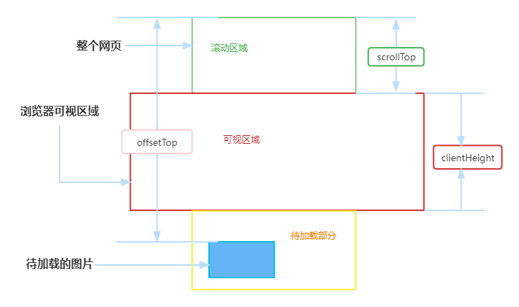
如上图所示,让在浏览器可视区域的图片显示,可视区域外的不显示。
这里介绍几个api函数:页可见区域宽:
document.body.clientWidth;
网页可见区域高:document.body.clientHeight;
网页可见区域宽:document.body.offsetWidth(包括边线的宽);
网页可见区域高:document.body.offsetHeight(包括边线的宽);
网页正文全文宽:document.body.scrollWidth
网页正文全文高:document.body.scrollHeight
网页被卷去的高:document.body.scrollTop
网页被卷去的左:document.body.scrollLeft
网页正文部分上:window.screenTop
网页正文部分左:window.screenLeft
屏幕分辨率的高:window.screen.height
屏幕分辨率的宽:window.screen.width
屏幕可用工作区高度:window.screen.availHeight
getBoundingClientRect()用于获得页面中某个元素的左,上,右和下分别相对浏览器视窗的位置。
HTMLElement.offsetTop为只读属性,它返回当前元素相对于其offsetParent元素的顶部的距离。
window.innerHeight浏览器窗口的视口(viewport)高度(以像素为单位);如果有水平滚动条,也包括滚动条高度。- 相关阅读:
数字营销面试题库和答案(搜索引擎、网站 URL 、网站标题、关键字、关键词优化)
带约束条件的运筹规划问题求解(模拟退火算法实现)
APP测试(四)弱网测试
Mac mini 2018 VS MacBookPro M1Pro 代码打包编译速度对比
阶段总结与展望——我的简历
不同MySQL服务的表以及库的数据迁移(/备份)
直播预告|一键观看关联网络与团伙欺诈的爱恨情仇
HttpClient
认证学习4 - Bearer认证(Token认证)讲解、代码实现、演示
vue路由-两个树形结构数据-递归处理方法
- 原文地址:https://blog.csdn.net/weixin_45771601/article/details/125901595
