-
微信小程序基本组件使用介绍
目录
1、视图容器 view
- 普通视图区域
- 类似于HTML中的div,是一个块级元素
- 常用来实现页面的布局效果

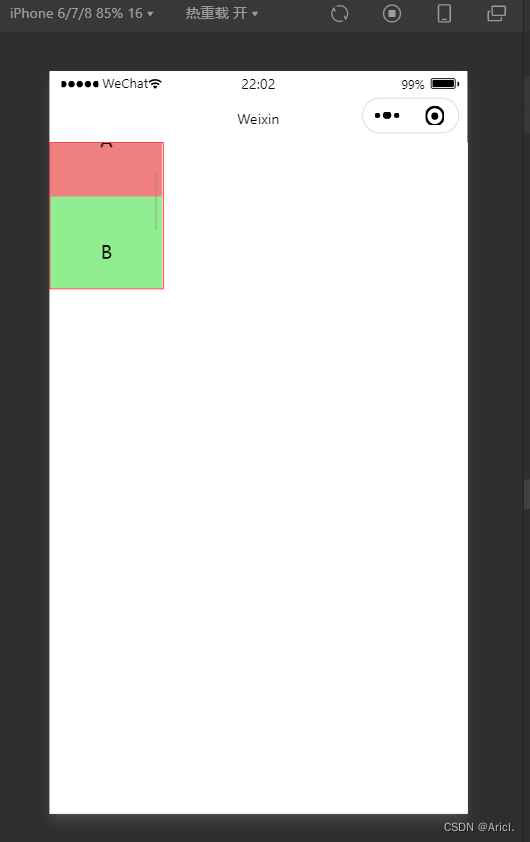
页面结构:
- <!--pages/view/view.wxml-->
- <view class="container1">
- <view>A</view>
- <view>B</view>
- <view>C</view>
- </view>
页面样式:
- /* pages/view/view.wxss */
- .container1 view{
- width: 100px;/*盒子的宽度与高度*/
- height: 100px;
- text-align: center;/*居中显示*/
- line-height: 100px; /*文本的行间距*/
- }
- .container1 view:nth-child(1){
- background-color:lightcoral;/*设置子块的背景颜色*/
- }
- .container1 view:nth-child(2){
- background-color: lightgreen;
- }
- .container1 view:nth-child(3){
- background-color: magenta;
- }
- .container1{
- display: flex;/*盒子横向布局*/
- justify-content: space-around;/*分散布局*/
- }
2、滚动视图容器 scroll-view
- 可滚动的视图区域
- 常用来实现滚动列表效果
页面结构:
- <!--pages/view/view.wxml-->
- <!-- scroll-x 横向滚动 scroll-y 纵向滚动 -->
- <scroll-view class="container1" scroll-y>
- <view>A</view>
- <view>B</view>
- <view>C</view>
- </scroll-view>
页面样式:
- /* pages/view/view.wxss */
- .container1 view{
- width: 100px;/*盒子的宽度与高度*/
- height: 100px;
- text-align: center;/*居中显示*/
- line-height: 100px; /*文本的行间距*/
- }
- .container1 view:nth-child(1){
- background-color:lightcoral;/*设置子块的背景颜色*/
- }
- .container1 view:nth-child(2){
- background-color: lightgreen;
- }
- .container1 view:nth-child(3){
- background-color: magenta;
- }
- .container1{
- /*包裹滚动列表的边框线及其宽度*/
- border :1px solid red;
- width: 100px;
- /*给其强制限定一个高度,超过该高度的部分将进行滚动显示*/
- height: 130px;
- }
3.轮播图 swiper&swiper-item
- 滑块视图容器
- 可内置swiper-item组件
- 一般用来实现图片的自动播放展示(这里以view块代替展示)
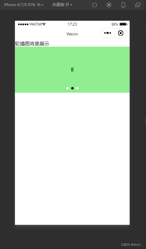
页面结构:
- <!--pages/swiper/swiper.wxml-->
- <text>轮播图效果展示</text>
- <!-- 轮播图的结构 ,最外层为包裹性容器-->
- <swiper class="swiper-container" indicator-dots indicator-color="white" autoplay circular>
- <!-- 第一张轮播图 -->
- <swiper-item>
- <view class="item">A</view>
- </swiper-item>
- <!-- 第二张轮播图 -->
- <swiper-item>
- <view class="item">B</view>
- </swiper-item>
- <!-- 第三张轮播图 -->
- <swiper-item>
- <view class="item">C</view>
- </swiper-item>
- </swiper>
页面样式:
- /* pages/swiper/swiper.wxss */
- .swiper-container{
- height: 150px;
- }
- .item{
- height: 100%;
- line-height: 150px;
- text-align: center;
- }
- swiper-item:nth-child(1) .item{
- background-color: lightblue;
- }
- swiper-item:nth-child(2) .item{
- background-color: lightgreen;
- }
- .swiper-item:nth-child(3) .item{
- background-color: lightseagreen;
- }
一些其它常用属性

4.文本组件text&富文本组件rich-text
- text类似于HTML中的span标签,是一个行内元素
- text可实现长按选中复制的功能(只能使用text)
- rich-text可以通过nodes属性节点,把HTML字符串渲染成对应的UI结构
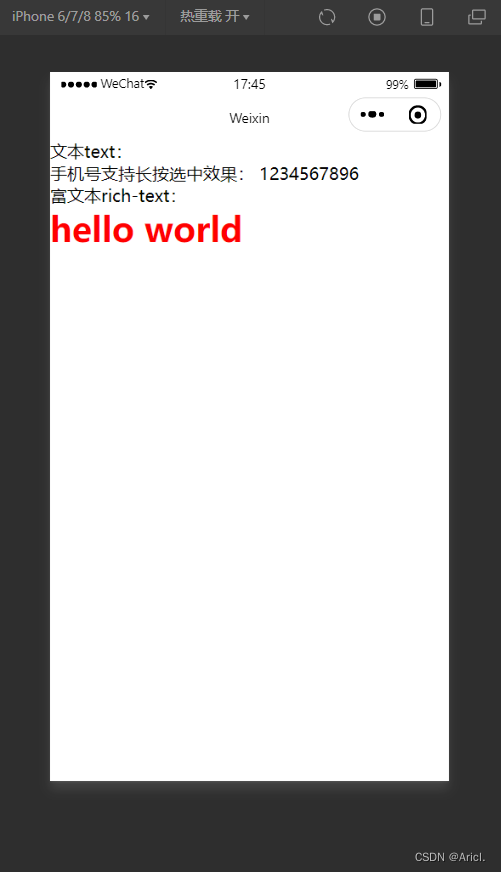
页面结构:
- <!--文本text与富文本rich-text的演示-->
- <text>文本text:</text>
- <view>
- 手机号支持长按选中效果:
- <!-- selectable属性表示文本可长按被选中,且只有在text标签中才有效 -->
- <text selectable>1234567896</text>
- </view>
- <text>富文本rich-text:</text>
- <rich-text nodes="<h1 style='color:red;'>hello world</h1>"></rich-text>
属性

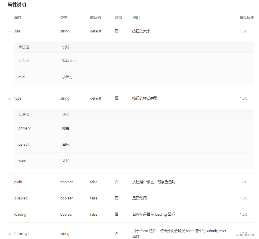
5.按钮组件button
- 其功能比HTML中的button丰富
- 可以通过open-type属性可以调用微信提供的各种功能(客服、转发、获取用户的授权、获取用户信息、打开定位服务等)

页面结构:
- <view>----------通过type属性指定按钮类型---------</view>
- <button>默认按钮</button>
- <button type="primary">主色调按钮</button>
- <button type="warn">警告按钮</button>
- <view>----------设置size=mini变成小尺寸按钮---------</view>
- <button size="mini">默认按钮</button>
- <button type="primary" size="mini">主色调按钮</button>
- <button type="warn" size="mini">警告按钮</button>
- <view>----------设置plain属性成为“镂空”型按钮---------</view>
- <button size="mini" plain="">默认按钮</button>
- <button type="primary" size="mini" plain>主色调按钮</button>
- <button type="warn" size="mini" plain="">警告按钮</button>
属性
6.图片组件image
- 用于展示图片元素
- 组件默认的宽度约为300px,高度约为240px

页面结构:
- <!--pages/image/image.wxml-->
- <text>添加图片演示</text>
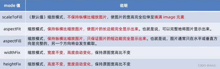
- <!-- heightFix高度固定,宽度自适应填满边框区域 -->
- <image src="/images/2.jfif" mode="heightFix"></image>
- <!-- widthFix宽度固定,高度自适应填满边框区域 -->
- <image src="/images/2.jfif" mode="widthFix"></image>
属性
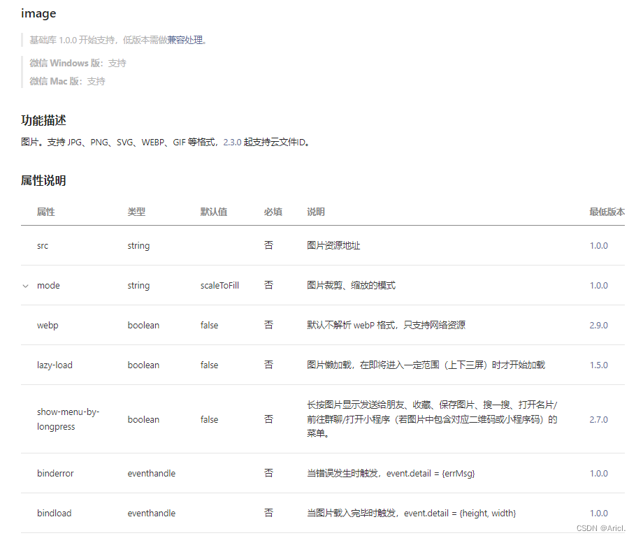
image mode重要属性
-
相关阅读:
Oracle 逻辑备份(数据迁移)
目标检测算法——YOLOV7——详解
【附源码】计算机毕业设计SSM社区老人健康服务跟踪系统
AlphaFold-multimer 复合物结构预测
java毕业设计游戏资讯网站Mybatis+系统+数据库+调试部署
【愚公系列】2022年09月 微信小程序-WebGL纹理材质的使用
862. 和至少为 K 的最短子数组 二分+栈思想/双端队列+滑窗
剑指 Offer II 062. 实现前缀树
罗丹明聚乙二醇磷脂,Rhodamine-PEG-DSPE,DSPE-PEG-Rhodamine,罗丹明PEG磷脂,磷脂PEG罗丹明,磷脂聚乙二醇罗丹明
SpringBoot SpringBoot 基础篇 4 基于 SpringBoot 的SSMP 整合案例 4.19 条件查询
- 原文地址:https://blog.csdn.net/qq_52487066/article/details/125608945