-
前端 CSS 经典:flex + margin 布局
前言:如今我们布局大多时候都是用的 flex 布局,但是有时我们也可以使用 margin 小技巧去完成布局。在弹性盒中当我们把 margin 某一个方向上设置为 auto,他的含义是用 margin 吃掉这个方向的剩余空间。
1. 元素垂直和水平居中
- html>
- <html lang="en">
- <head>
- <meta charset="utf-8" />
- <meta http-equiv="X-UA-Compatible" content="IE=edge" />
- <meta
- name="viewport"
- content="initial-scale=1.0, user-scalable=no, width=device-width"
- />
- <title>documenttitle>
- <style>
- .box {
- width: 500px;
- height: 500px;
- border: 1px solid;
- display: flex;
- }
- .item {
- width: 100px;
- height: 100px;
- background: blue;
- margin: auto;
- }
- style>
- head>
- <body>
- <div class="box">
- <div class="item">div>
- div>
- <script>script>
- body>
- html>

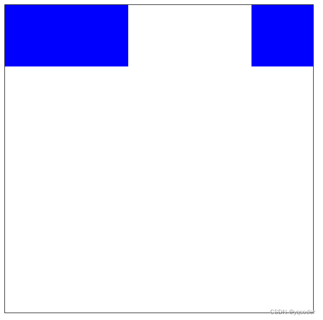
2. 三个子元素,两个居左一个居右
- html>
- <html lang="en">
- <head>
- <meta charset="utf-8" />
- <meta http-equiv="X-UA-Compatible" content="IE=edge" />
- <meta
- name="viewport"
- content="initial-scale=1.0, user-scalable=no, width=device-width"
- />
- <title>documenttitle>
- <style>
- .box {
- width: 500px;
- height: 500px;
- border: 1px solid;
- display: flex;
- }
- .item {
- width: 100px;
- height: 100px;
- background: blue;
- }
- style>
- head>
- <body>
- <div class="box">
- <div class="item">div>
- <div class="item">div>
- <div class="item" style="margin-left: auto">div>
- div>
- <script>script>
- body>
- html>
-
相关阅读:
Rust中的数据抓取:代理和scraper的协同工作
Unity Mono和.Net平台浮点算法的区别
2.2 常量
互联网、政务外网、政务专网、政务内网的区别
C++ Qt开发:Tab与Tree组件实现分页菜单
Spring 事务相关
【从0到1设计一个网关】自研网关的架构搭建
Openssl
C++ 字符串string
idea插件开发-UAST
- 原文地址:https://blog.csdn.net/weixin_64684095/article/details/139845274