-
HarmonyOS鸿蒙开发常用4种布局详细说明
介绍一下鸿蒙开发常用4种布局
1、线性布局
2、层叠布局
3、网格布局
4、列表布局1. 线性布局(Column/Row)
线性布局(LinearLayout)是开发中最常用的布局,通过线性容器Row(行)和Column(列)构建,它是其他布局的基础,其子元素在线性方向上(水平或垂直)依次排列,基本形式如下:
Column(列)
子元素在排列方向上的间距,可以通过组件参数space参数进行控制@Entry @Component struct Index { build() { Column({space:20}) { //一行 Row() { }.width('80%').height(50).backgroundColor(Color.Green) Row() { }.width('80%').height(50).backgroundColor(Color.Orange) Row() { }.width('80%').height(50).backgroundColor(Color.Yellow) Row() { }.width('80%').height(50).backgroundColor(Color.Blue) Row() { }.width('80%').height(50).backgroundColor(Color.Red) }.width('100%').alignItems(HorizontalAlign.Center) } }- 1
- 2
- 3
- 4
- 5
- 6
- 7
- 8
- 9
- 10
- 11
- 12
- 13
- 14
- 15
- 16
- 17
- 18
- 19
- 20
- 21
- 22
- 23
- 24
- 25
- 26
- 27
- 28
- 29
- 30
效果:

Row(行)@Entry @Component struct Index { build() { Row({space:20}) { Column() { }.width('15%').height(50).backgroundColor(Color.Red); Column() { }.width('15%').height(50).backgroundColor(Color.Orange); Column() { }.width('15%').height(50).backgroundColor(Color.Red); Column() { }.width('15%').height(50).backgroundColor(Color.Blue); Column() { }.width('15%').height(50).backgroundColor(Color.Pink); }.width('100%').padding(20).backgroundColor('#ccc') } }- 1
- 2
- 3
- 4
- 5
- 6
- 7
- 8
- 9
- 10
- 11
- 12
- 13
- 14
- 15
- 16
- 17
- 18
- 19
- 20
- 21
- 22
- 23
- 24
- 25

子元素排列与对齐
● 主轴:线性布局容器在布局方向上的轴线,Row容器主轴为横向,Column容器主轴为纵向。
● 交叉轴:垂直于主轴方向的轴线。Row容器交叉轴为纵向,Column容器交叉轴为横向。
子元素沿主轴方向的排列方式
可以通过justifyContent 属性进行控制,可选值如下:@Entry @Component struct Index { build() { Column({space:20}) { //一行 Row() { }.width('80%').height(50).backgroundColor(Color.Green) Row() { }.width('80%').height(50).backgroundColor(Color.Red) }.width('100%').height('100%').justifyContent(FlexAlign.Center) } }- 1
- 2
- 3
- 4
- 5
- 6
- 7
- 8
- 9
- 10
- 11
- 12
- 13
- 14
- 15
.justifyContent(FlexAlign.Center)

.justifyContent(FlexAlign.Start)

.justifyContent(FlexAlign.End)

.justifyContent(FlexAlign.SpaceBetween)

.justifyContent(FlexAlign.SpaceAround)

.justifyContent(FlexAlign.SpaceEvenly)

子元素沿交叉轴方向的对齐方式
可以通过alignItems 属性进行控制,可选值如下:@Entry @Component struct Index { build() { Column() { Row() { }.width('80%').height(50).backgroundColor(Color.Red) Row() { }.width('80%').height(50).backgroundColor(Color.Orange) Row() { }.width('80%').height(50).backgroundColor(Color.Yellow) }.width('100%').height('100%').alignItems(HorizontalAlign.Start) } }- 1
- 2
- 3
- 4
- 5
- 6
- 7
- 8
- 9
- 10
- 11
- 12
- 13
- 14
- 15
- 16
- 17
- 18
- 19
.alignItems(HorizontalAlign.Start)

.alignItems(HorizontalAlign.Center)

.alignItems(HorizontalAlign.End)
**2、层叠布局(Stack)
Stack布局是一种常用的布局方式,它允许将子元素沿垂直于屏幕的方向堆叠在一起,类似于图层的叠加。子元素可以按照其添加顺序依次叠加在一起,后添加的子元素会覆盖之前添加的子元素,层叠布局具有较强的页面层叠、位置定位能力,其使用场景有广告、卡片层叠效果等。
Stack容器中的子组件可通过zIndex属性设置其所在的层级,zIndex值越大,层级越高,即zIndex值大的组件会覆盖在zIndex值小的组件上方
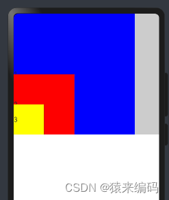
Stack 布局通常会和 position绝对定位配合使用,设置元素左上角相对于父容器左上角偏移位置配合使用,position语法示例:.position({ x: 180, y: 130 })@Entry @Component struct StackAlign { @State alignment: Alignment = Alignment.Center; build() { Column() { Stack() { Row() { Text('1') } .width(300).height(300).backgroundColor(Color.Yellow) Row() { Text('2') } .width(150).height(150).backgroundColor(Color.Red) Row() { Text('3') } .width(75).height(75).backgroundColor(Color.Green) } } .width('100%') } }- 1
- 2
- 3
- 4
- 5
- 6
- 7
- 8
- 9
- 10
- 11
- 12
- 13
- 14
- 15
- 16
- 17
- 18
- 19
- 20
- 21
- 22
- 23
- 24
- 25
- 26
- 27
- 28

.alignContent(Alignment.TopStart)
@Entry @Component struct StackAlign { @State alignment: Alignment = Alignment.Center; build() { Column() { Stack() { Row() { Text('1') } .width(300).height(300).backgroundColor(Color.Blue) Row() { Text('2') } .width(150).height(150).backgroundColor(Color.Red) Row() { Text('3') } .width(75).height(75).backgroundColor(Color.Yellow) } .width('100%').backgroundColor('#ccc').alignContent(Alignment.TopStart) } .width('100%') } }- 1
- 2
- 3
- 4
- 5
- 6
- 7
- 8
- 9
- 10
- 11
- 12
- 13
- 14
- 15
- 16
- 17
- 18
- 19
- 20
- 21
- 22
- 23
- 24
- 25
- 26
- 27

.alignContent(Alignment.TopEnd)

.alignContent(Alignment.Top)

.alignContent(Alignment.Start)

.alignContent(Alignment.Center)

.alignContent(Alignment.End)

.alignContent(Alignment.BottomStart)
.alignContent(Alignment.BottomEnd)

.alignContent(Alignment.Bottom)

**3、网格布局(Grid)
**
网格布局(Grid)是一种强大的页面排版方式,通过将页面划分为行和列组成的网格,使得子组件可以在这个二维网格中自由定位。网格布局的容器组件为Grid,子组件为GridItem,如下图所示。
用1fr来表示占1个’单位‘@Entry @Component struct Index { build() { Grid(){ GridItem(){}.backgroundColor(Color.Red) GridItem(){}.backgroundColor(Color.Green) GridItem(){}.backgroundColor(Color.Yellow) GridItem(){}.backgroundColor(Color.Brown) GridItem(){}.backgroundColor(Color.Orange) GridItem(){}.backgroundColor(Color.Black) GridItem(){}.backgroundColor(Color.Orange) GridItem(){}.backgroundColor(Color.Gray) GridItem(){}.backgroundColor(Color.Pink) }.width('100%').height(400).rowsTemplate('1fr 2fr 1fr').columnsTemplate('1fr 1fr 1fr').rowsGap(10).columnsGap(10) } }- 1
- 2
- 3
- 4
- 5
- 6
- 7
- 8
- 9
- 10
- 11
- 12
- 13
- 14
- 15
- 16
- 17
- 18
.rowsTemplate(‘1fr 2fr 1fr’)

.columnsTemplate(‘1fr 2fr 1fr’)

.rowStart(1).rowEnd(2)

.rowsGap(10).columnsGap(30)

当显示内容超出显示区域时,有滚动效果4、列表布局(List)
列表(List)是一种复杂的容器组件,使用列表可以轻松高效地显示结构化、可滚动的列表信息。列表布局的容器组件为List,子组件为ListItem或者ListItemGroup,其中,ListItem表示单个列表项,ListItemGroup用于列表数据的分组展示,其子组件也是ListItem,如下图所示
.listDirection(Axis.Vertical)@Entry @Component struct Index { build() { List({space:10}) { ListItem() { Text('list1') }.width('100%').backgroundColor(Color.Red) ListItemGroup() { ListItem() { Text('list2') }.width('100%') ListItem() { Text('list3') }.width('100%') }.width('100%').backgroundColor(Color.Yellow) }.width('100%').listDirection(Axis.Vertical) } }- 1
- 2
- 3
- 4
- 5
- 6
- 7
- 8
- 9
- 10
- 11
- 12
- 13
- 14
- 15
- 16
- 17
- 18
- 19
- 20
- 21
- 22

.listDirection(Axis.Horizontal)

.alignListItem(ListItemAlign.End)
.alignListItem(ListItemAlign.Start)

.alignListItem(ListItemAlign.Center)

scrollBar属性可控制滚动条样式@Entry @Component struct Index { @State contactsGroups: object[] = [ { title: 'A', contacts: [ '赵云', '李白', '王思' ], }, { title: 'B', contacts: [ '白叶', '伯乐' ], }, { title: 'C', contacts: [ '王大', '张三' ], }, { title: 'D', contacts: [ '白龙', '小明' ], }, { title: 'E', contacts: [ '盖伦', '石头', '光辉' ], } ] @Builder Header(item){ Text(item.title).fontSize(30).backgroundColor('#ccc').width('100%') } build() { List(){ ForEach(this.contactsGroups,(item)=>{ ListItemGroup({header:this.Header(item)}){ ForEach(item.contacts,(user)=>{ ListItem(){ Text(user) }.width('100%').height(50) }) } },item=>JSON.stringify(item)); }.width('100%').height(300).scrollBar(BarState.On) } }- 1
- 2
- 3
- 4
- 5
- 6
- 7
- 8
- 9
- 10
- 11
- 12
- 13
- 14
- 15
- 16
- 17
- 18
- 19
- 20
- 21
- 22
- 23
- 24
- 25
- 26
- 27
- 28
- 29
- 30
- 31
- 32
- 33
- 34
- 35
- 36
- 37
- 38
- 39
- 40
- 41
- 42
- 43
- 44
- 45
- 46
- 47
- 48
- 49
- 50
- 51
- 52
- 53
- 54
- 55
- 56
- 57
- 58
- 59
- 60
- 61
- 62

以上就是常用布局关注’猿来编码‘,微信订阅号,回复 ’布局‘,获取
-
相关阅读:
StackGres 数据库平台工程,使用 Citus + Patroni 创建生产级高可用分布式 PostgreSQL 分片集群
Docker从了解到部署应用的详细教程
若依集成MybatisPlus
VSCode配置用户代码段以及常用快捷键汇总
论文总结:3D Talking Face With Personalized Pose Dynamics
【MYSQL】约束
在ITSM中,实施变更管理的重要因素!
JavaScript——作用域和预解析,深度理解代码执行程序
网络工程试验(一)链路聚合的三种情况
【附源码】Python计算机毕业设计面向新疆人文旅游的自动问答系统
- 原文地址:https://blog.csdn.net/qq_36255346/article/details/136779593
