-
Bulk RNA-seq上下游分析
Bulk-RNA-seq上下游分析还是相对简单的,这次我以mouse为例,进行Bulk-RNA-seq上下游分析,并进行对应的图片绘制。
上游分析
1.软件准备
#安装所需软件 sudo apt install fastqc sudo apt install hisat2 sudo apt install cutadapt sudo apt install subread conda install -c bioconda multiqc conda install trim-galore #新建文件夹 mkdir anntation bam cleandata genome QC rawdata results- 1
- 2
- 3
- 4
- 5
- 6
- 7
- 8
- 9
- 10
2.文件准备
#下载fasta和gtf文件 wget -P genome/ -c https://ftp.ebi.ac.uk/pub/databases/gencode/Gencode_mouse/release_M25/GRCm38.p6.genome.fa.gz wget -P anntation/ -c https://ftp.ebi.ac.uk/pub/databases/gencode/Gencode_mouse/release_M25/gencode.vM25.annotation.gtf.gz gzip -dk genome/GRCm38.p6.genome.fa.gz #解压参考基因组 gzip -dk anntation/gencode.vM25.annotation.gtf.gz #解压基因注释文件 #Aspera下载fastq数据,比sra-tools快太多了,具体下载链接在EBI数据库中下载样本的TSV文件 #这里我们用的是单端SE测序的文件,挺古老,但是不管双端PE单端SE区别不大。 for i in {1..4} do ascp -i ~/.aspera/connect/etc/asperaweb_id_dsa.openssh -l 100M -T -P33001 -k 1 era-fasp@fasp.sra.ebi.ac.uk:/vol1/fastq/SRR137/00${i}/SRR137492${i}/SRR137492${i}.fastq.gz ./rawdata done- 1
- 2
- 3
- 4
- 5
- 6
- 7
- 8
- 9
- 10
- 11
3.trim_galore数据质控
通过fastqc质控,看一下测序数据的质量,看看哪些需要调整一下。fastq文件过滤这里我们用了trim_galore,除此之外fastp也很优秀,两者功能类似,但我认为fastp更好。
for i in 'ls ./rawdata/*.fastq.gz' do fastqc $i -o QC/ --noextract multiqc ./QC/*.zip -o ./QC ./TrimGalore-0.6.7/trim_galore --quality 25 --fastqc --phred33 --length 25 -j 10 \ --output_dir cleandata ${i} done #双端过滤可以加--paired,在末尾输入正反链- 1
- 2
- 3
- 4
- 5
- 6
- 7
- 8
4.hisat2比对
比对用的hisat2,比较常用,其他的比对工具还有gencode数据库的star和tophat2等。
#比对 #构建fasta的index hisat2-build genome/GRCm38.p6.genome.fa ./genome/mm10 for i in 'ls cleandata/*.gz' do x=${i%_trimmed.fq.gz} y=${x#cleandata/} hisat2 -p 10 -x genome/mm10 -U $i -S bam/$y.sam |tee $y.alignment.log #比对 samtools view -bS bam/$y.sam | samtools sort -@ 8 -o bam/$y-sort.bam #sort samtools index bam/$y-sort.bam #索引 done -p 线程 -U 单端测序,双端用-1 1.fa.gz -2 2.fq.gz -S 输出bam文件名 -x 参考基因组- 1
- 2
- 3
- 4
- 5
- 6
- 7
- 8
- 9
- 10
- 11
- 12
- 13
- 14
- 15
- 16
- 17
5.featureCounts定量
#计算count featureCounts \ -T 10 \ -g gene_name \ #得到的count矩阵的行名,gene_id or gene_name比较常用 -p \ -a annotation/gencode.vM25.annotation.gtf \ #gtf基因注释文件 -o results/final_featureCounts.txt \ #结果count矩阵 bam/*.bam #-T 线程 #-g gtf第9列为key=value的格式,包括gene_id,gene_name等 #-p PE时计算fragment,SE时计算read(SE时read和fragment一样)- 1
- 2
- 3
- 4
- 5
- 6
- 7
- 8
- 9
- 10
- 11
- 12
- 13
这样我们就得到后续下游分析所需的count矩阵了。
下游分析
在分析之前需要下载一系列的R包
install.packages( ) 下载一些常规的包
BiocManager::install( ) 下载bioconductor上的包#说实话我忘记哪些包需要下载了,但是遇到没有的包用install.packages( )或BiocManager::install( )都试一遍就行。 install.packages('ggplot2') install.packages('stingr') BiocManager::install('DESeq2') BiocManager::install('org.Mm.eg.db') BiocManager::install('clusterProfiler')- 1
- 2
- 3
- 4
- 5
- 6
1.文件预处理
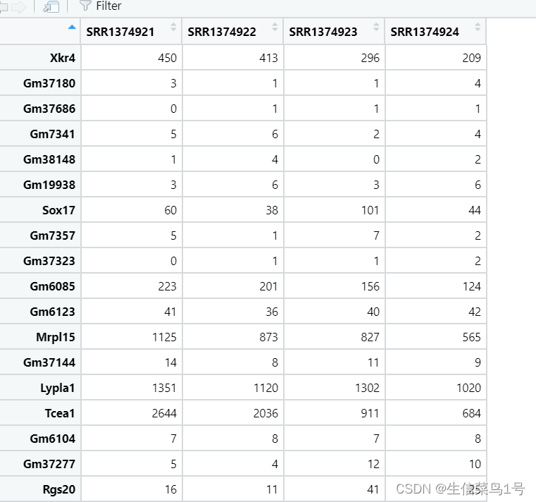
注意DESseq2用的是原始的count矩阵,也就是上一步我们得到的结果,不需要对测序深度和基因长度进行处理(RPKM、FPRM、CPM)。也不需要normal化,DESeq2有一套自己的处理方法。
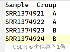
rm(list=ls()) options(stringsAsFactors = F) library(DESeq2) #负二项分布的广义线性模型来做差异表达做检验 #读取文件,final_featureCounts.txt为上一步得到的count矩阵数据 data <- read.table("final_featureCounts.txt", header=TRUE, skip=1, row.names=1) #调整列名,最终数据行名为基因,列名为样本名,因为最开始输出的列名是bam文件的全名,所以gsub替换掉,仅保留样品名。 colnames(data) <- gsub(".bam", "", colnames(data), fixed=TRUE) countdata <- data[ , 6:ncol(data)] colnames(countdata)=gsub('.sort','',colnames(countdata)) #预过滤,基因至少在75%样品中表达,否则就过滤,看自己样本具体情况,最少也得40% or 50%吧。 countdata=countdata[rowSums(countdata>0) >= floor(0.75*ncol(countdata)),] #读取分组文件,样品的顺序和count矩阵中的要一致 metadata <- read.table("metadata.txt", header=TRUE,row.names = 1) metadata$Group=factor(metadata$Group,levels = c('A','B'))- 1
- 2
- 3
- 4
- 5
- 6
- 7
- 8
- 9
- 10
- 11
- 12
- 13
- 14
- 15
- 16
- 17
- 18
矩阵修剪后的结果如下,其实样品一般3v3比较好,这种2v2说服力还是差一些。
分组文件如下图
2.DESeq2差异分析
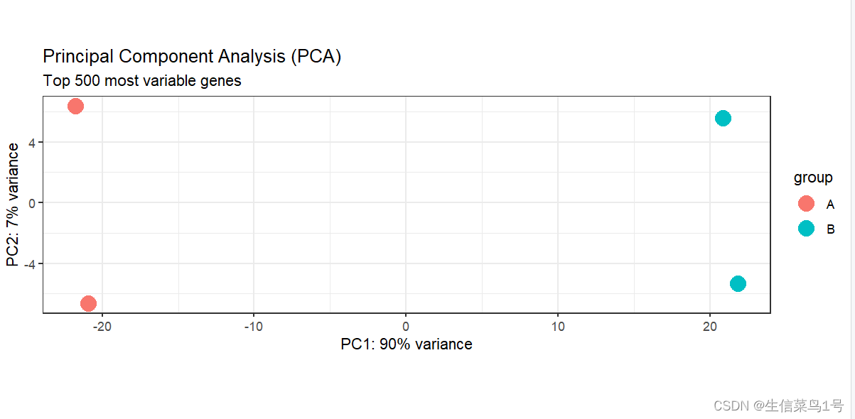
在差异分析过程中我们需要用cluster或者PCA看一下样品的聚类情况,以剔除不合群的样品,这个时候需要对矩阵进行一个类似log10(x+1)的处理,但这个处理后的数据仅仅是用来观察样品聚类情况,与我们进行的差异分析无关。
#DEseq2矩阵构建 dds <- DESeqDataSetFromMatrix(countData=countdata, colData=metadata, design=~Group) #normalize dds <- DESeq(dds) #PCA和cluster检查分组情况 library(ggplot2) #rlog标准化,通过标准化矩阵看一下样品的PCA和显著性差异基因热图,对count整体标准化 dds_rlog <- rlog(dds, blind=FALSE) #三种标准化的方法(DESeq2强烈不建议输入文件用归一化过的数据,这里这样处理主要是为了后续画PCA/热图/火山图等) #1.ntd <- normTransform(dds)或log2(dds+1) #简单的取log2(dds+1)(logarithm) #2.rld <- rlog(dds, blind=FALSE) #rlog适用于表达量分散以及低表达量占比高 (regularized logarithm) #2.vsd <- vst(dds, blind=FALSE) #对于大样本,vsd更快(varianceStabilizingTransformation) dds_rlog1=assay(dds_rlog) #用assay才能看具体矩阵大小 plotPCA(dds_rlog, intgroup="Group", ntop=5000) + theme_bw() + # 修改主体 geom_point(size=5) + # 增加点大小 #scale_y_continuous(limits=c(-10, 20)) + ggtitle(label="Principal Component Analysis (PCA)", subtitle="Top 500 most variable genes") #cluster plot(hclust(dist(t(dds_rlog1))), labels=colData(dds)$protocol) plot(hclust(dist(t(dds_rlog1))), labels=colData(dds)$time)- 1
- 2
- 3
- 4
- 5
- 6
- 7
- 8
- 9
- 10
- 11
- 12
- 13
- 14
- 15
- 16
- 17
- 18
- 19
- 20
- 21
- 22
- 23
- 24
PCA结果,利用这个图以及下面的cluster图,我们可以剔除一些离群的样本。
hclust函数利用欧氏距离计算的层次聚类图。

#差异分析 res <- results(dds, contrast=c("Group", "A", "B"), #谁和谁比对,前面是研究群体,后面的对照群体 pAdjustMethod="fdr", alpha=0.05) #显著性方法 res <- na.omit(res) res <- res[order(res$padj),] #res就是差异分析结果,用as.data.frame(res)可以转出来 summary(res) mcols(res, use.names=TRUE) #保存差异分析结果,把counts在样本内做了标准化,从而使不同样本的同一个基因具有可比性 resdata <- merge(as.data.frame(res), as.data.frame(counts(dds, normalized=TRUE)), by="row.names", sort=FALSE) write.csv(resdata, file="LoGlu_HiGlu_mm39_diff.csv", row.names=FALSE) #提取显著差异基因 diff_gene <- subset(res, padj < 0.05 & (log2FoldChange > 1 | log2FoldChange < -1)) write.table(x=as.data.frame(diff_gene), file="results_gene_annotated_significant.txt", sep="\t", quote=F, col.names=NA)- 1
- 2
- 3
- 4
- 5
- 6
- 7
- 8
- 9
- 10
- 11
- 12
- 13
- 14
- 15
- 16
- 17
- 18
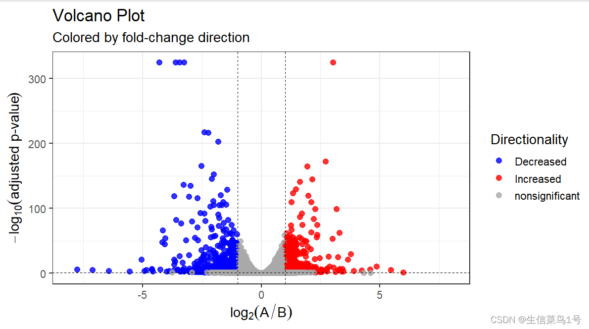
差异分析的阈值可以根据自己的数据来判断。一般就是取padj < 0.05, |logFC| > 1或2。
3.绘图
#Top40基因热图 mat <- assay(dds_rlog[row.names(diff_gene)])[1:40, ] #选择用来作图的列,行名对应样品,Group列对应样品分组 annotation_col <- data.frame( Group=factor(colData(dds_rlog)$Group), row.names=rownames(colData(dds_rlog)) ) #定义颜色,Group列与上一步一致,定义具体分组标签对应的颜色 ann_colors <- list( Group=c(A="lightblue", B="darkorange") ) library(pheatmap) library(RColorBrewer) pheatmap(mat=mat, color=colorRampPalette(c('green','black',"red"))(20), scale="row", # Scale genes to Z-score (how many standard deviations) annotation_col=annotation_col, # Add multiple annotations to the samples annotation_colors=ann_colors,# Change the default colors of the annotations fontsize=6.5, # Make fonts smaller cellwidth=55, # Make the cells wider show_colnames=F)- 1
- 2
- 3
- 4
- 5
- 6
- 7
- 8
- 9
- 10
- 11
- 12
- 13
- 14
- 15
- 16
- 17
- 18
- 19
- 20
- 21
- 22
- 23
- 24

#差异基因与basemean关系 plotMA(res, ylim=c(-5, 5)) plotDispEsts(dds) #差异最大基因它们的normalized count的比较 top_gene <- rownames(res)[which.max(res$log2FoldChange)] low_gene <- rownames(res)[which.min(res$log2FoldChange)] plotCounts(dds=dds, gene=top_gene, intgroup="Group", normalized=TRUE, transform=TRUE) plotCounts(dds=dds, gene=low_gene, intgroup="Group", normalized=TRUE, transform=TRUE) #差异分析基因的火山图 library(dplyr) vol_data <- data.frame(gene=row.names(res), pval=-log10(res$padj), lfc=res$log2FoldChange) # 设定上调与下调颜色 vol_data <- mutate(vol_data, color=ifelse(vol_data$lfc > 1 & vol_data$pval > 1.3 ,"Increased", ifelse(vol_data$lfc < -1 & vol_data$pval > 1.3 ,"Decreased",'nonsignificant')) ) vol_data$pval[1:5]=325 #过低的p值截断 vol <- ggplot(vol_data, aes(x=lfc, y=pval, color=color))+ ggtitle(label="Volcano Plot", subtitle="Colored by fold-change direction") + geom_point(size=2.5, alpha=0.8, na.rm=T) + scale_color_manual(name="Directionality", values=c(Increased="red", Decreased="blue", nonsignificant="darkgray")) + theme_bw(base_size=14) + theme(legend.position="right") + xlab(expression(log[2]("A" / "B"))) + ylab(expression(-log[10]("adjusted p-value"))) + geom_hline(yintercept=1.3, colour="black",lty=2,lwd=0.3)+ geom_vline(xintercept=c(-1,1), colour="black",lty=2,lwd=0.3)+ scale_x_continuous(limits = c(-8,8)) ggsave(vol,filename = '1.vol.pdf',width = 8,height = 6)- 1
- 2
- 3
- 4
- 5
- 6
- 7
- 8
- 9
- 10
- 11
- 12
- 13
- 14
- 15
- 16
- 17
- 18
- 19
- 20
- 21
- 22
- 23
- 24
- 25
- 26
- 27
- 28
- 29
- 30
- 31
- 32
- 33
- 34
- 35
- 36
- 37
- 38
- 39
- 40
- 41
- 42
- 43
- 44
- 45
- 46
火山图中有个问题,就是某些基因的P值太小,有的时候p值还会等于0,这是因为数值超出的R显示的范围,我的建议是截断这些p值,不然过小的p值会导致图形很难看。
4.富集分析
富集分析其实通俗的讲就是看得到的基因是否真的比正常情况下随机分布的要多。比如某物种总基因3万,某通路总基因500,我们分析得到3000个基因,如果正常分布的话应该有50个基因落在这条通路中,但实际上落在这条通路的基因有100个,显著的高于正常情况,所显著富集。
rm(list = ls())#清空环境变量 options(stringsAsFactors = F)##字符不作为因子读入 library(org.Mm.eg.db) library(clusterProfiler) a=read.table('results_gene_annotated_significant.txt',header = T,check.names = F) #转基因格式,从symbol转ENTREZID,用到小鼠的db包 gene.df <- bitr(rownames(a), fromType="SYMBOL", toType="ENTREZID", OrgDb = "org.Mm.eg.db",drop =T) #小鼠db包 #KEGG kk.diff<- enrichKEGG(gene = gene.df$ENTREZID, organism = 'mmu', #mmu是小鼠 pvalueCutoff = 0.05, #adjust p pAdjustMethod='fdr') #p值矫正方法 kk.diff@result$Description=gsub('\'','',kk.diff@result$Description) write.table(kk.diff,file="2.KEGG.txt",sep="\t",quote=F,row.names = F) #GO kk <- enrichGO(gene = gene.df$ENTREZID, OrgDb = 'org.Mm.eg.db', pvalueCutoff =0.05, #qvalueCutoff =1, pAdjustMethod='fdr', ont="all", #BP,CC,MF readable =T #,maxGSSize = 2000 ) kk@result$Description=gsub('\'','',kk@result$Description) write.table(kk,file="2.GO.txt",sep="\t",quote=F,row.names = F)- 1
- 2
- 3
- 4
- 5
- 6
- 7
- 8
- 9
- 10
- 11
- 12
- 13
- 14
- 15
- 16
- 17
- 18
- 19
- 20
- 21
- 22
- 23
- 24
- 25
- 26
- 27
- 28
- 29
- 30
enrich里的pvalue代表的是adj.pvalue,如果你需要的通路p值大于0.05,你可以pvalueCutoff = 1,qvalueCutoff =1 输出所有通路,然后自己在结果中筛选。实际上选择pvalue还是选择adjust pvalue看个人。
ont表示GO的种类,包括CC,MF,BP,也可以使用all全部输出。
maxGSSize表示通路的大小,默认只要500个基因以下的通路,自行选择,比如可以设置maxGSSize = 1000或者2000,再大的话就没有意义了。
之后就是绘图,有各种类型,包括基因数排序,p值排序,自己选择适合自己的就行。##GO plot a=read.table('2.GO.txt',header = T,sep = '\t') library(stringr) x=as.data.frame(str_split_fixed(a$GeneRatio,'/',n=2)) a$GeneRatio=as.numeric(x$V1)/as.numeric(x$V2) b=a[a$p.adjust<=0.05,] b=b[order(b$Count,decreasing = T),] b=b[10:1,] b$Description=factor(b$Description,levels = b$Description) library(ggplot2) p1=ggplot()+geom_point(data = b,aes(x=GeneRatio,y=Description, size=Count,color=p.adjust))+ scale_y_discrete(position = 'right')+ #调整y轴坐标位置,right or left scale_color_gradient(low = "#a313b9", high = "#ebdeed",name='P.adjust')+#low = "#E61F19", high = "#f6bdbb" theme_bw()+ theme(plot.title = element_text(hjust = 0.5))+ labs(y='',title = 'GO')+ #facet_grid(ONTOLOGY~.,scales = 'free',space = 'free')+ theme(plot.margin = margin(t=10,b=10,r=10,l=10))+ theme(panel.grid = element_line(size=0.2))+ scale_size_continuous(range = c(0.05,6) #,limits = c(20,600),breaks=c(100,300,500) ) ggsave(p1,filename = '3.GO.pdf',width =7,height = 4.5)- 1
- 2
- 3
- 4
- 5
- 6
- 7
- 8
- 9
- 10
- 11
- 12
- 13
- 14
- 15
- 16
- 17
- 18
- 19
- 20
- 21
- 22
- 23
- 24
- 25
- 26
- 27

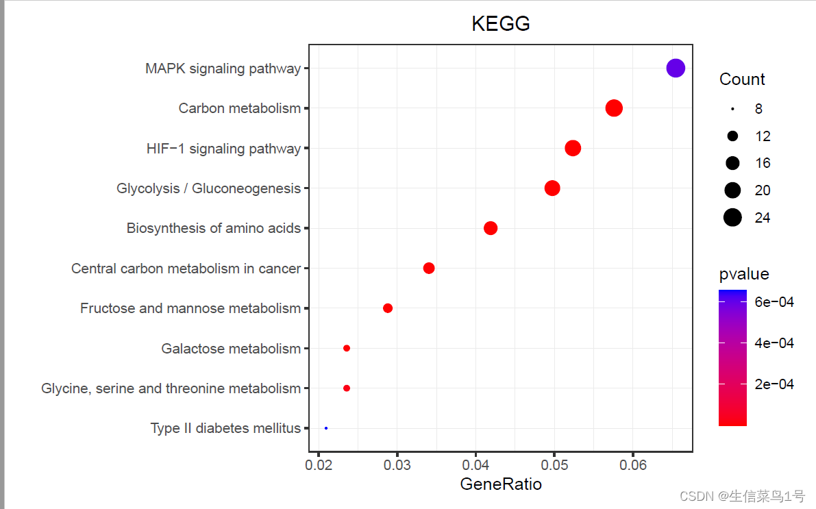
rm(list = ls())#清空环境变量 options(stringsAsFactors = F)##字符不作为因子读入 a=read.table('2.KEGG.txt',header = T,sep = '\t') a$Description=gsub(' - Mus musculus.+','',a$Description) library(stringr) x=as.data.frame(str_split_fixed(a$GeneRatio,'/',n=2)) a$GeneRatio=as.numeric(x$V1)/as.numeric(x$V2) b=a[a$pvalue<=0.05,] b=b[order(b$Count,decreasing = T),] b=b[10:1,] library(ggplot2) p1=ggplot()+geom_point(data = b,aes(x=GeneRatio,y=Description, size=Count,color=pvalue))+ scale_y_discrete(limits=b$Description)+ scale_color_gradient(low = "red", high = "blue")+ theme_bw()+ theme(plot.title = element_text(hjust = 0.5))+ labs(y='',title = 'KEGG')+ theme(plot.margin = margin(t=10,b=10,r=10,l=10))+ scale_size_continuous(range = c(0.2,5))+ theme(panel.grid = element_line(size=0.2)) ggsave(p1,filename = '3.KEGG.pdf',width =7.2,height = 4.5)- 1
- 2
- 3
- 4
- 5
- 6
- 7
- 8
- 9
- 10
- 11
- 12
- 13
- 14
- 15
- 16
- 17
- 18
- 19
- 20
- 21
- 22
- 23
- 24
- 25
- 26
- 27
- 28
- 29
- 30
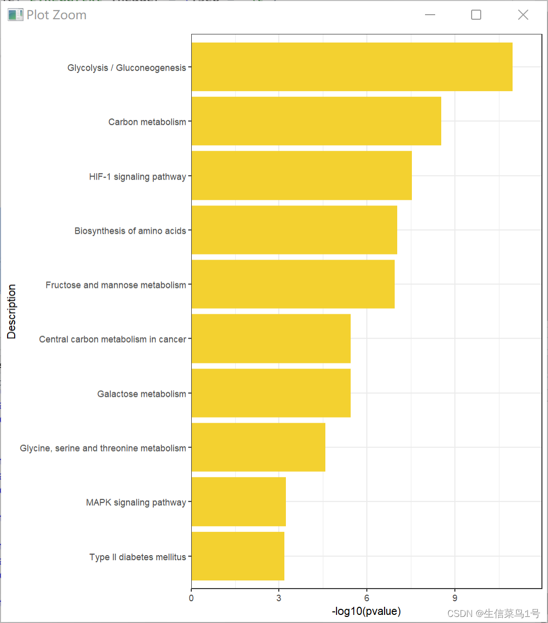
rm(list = ls())#清空环境变量 options(stringsAsFactors = F)##字符不作为因子读入 a=read.table('2.KEGG.txt',header = T,sep = '\t') a$Description=gsub(' - Mus musculus.+','',a$Description) library(stringr) x=as.data.frame(str_split_fixed(a$GeneRatio,'/',n=2)) a$GeneRatio=as.numeric(x$V1)/as.numeric(x$V2) b=a[a$pvalue<=0.05,] b=b[order(b$pvalue,decreasing = F),] b=b[10:1,] library(ggplot2) p1=ggplot()+ geom_bar(data=b,aes(x=-log10(pvalue),y=Description), stat = 'identity',fill='#f3d130')+ scale_y_discrete(limits=b$Description)+ theme_bw()+ scale_x_continuous(expand = c(0,0),limits = c(0,max(-log10(b$pvalue))+1)) ggsave(p1,filename = '3.KEGG.pdf',width =7.2,height = 4.5)- 1
- 2
- 3
- 4
- 5
- 6
- 7
- 8
- 9
- 10
- 11
- 12
- 13
- 14
- 15
- 16
- 17
- 18
- 19
- 20
- 21
- 22
- 23
- 24
- 25
- 26
-
相关阅读:
IDEA常用插件
WebKit Inside: CSS 样式表的匹配时机
如何提升网络安全应急响应与事件处置能力
springboot+文达云课堂 毕业设计-附源码210908
IO多路复用实现TCP客户端与TCP并发服务器
系统集成|第十九章(笔记)
【数据结构与算法】之深入解析“粉刷房子”的求解思路与算法示例
Scrapy与分布式开发(2.3):lxml+xpath基本指令和提取方法详解
哈里斯鹰算法优化BP神经网络(HHO-BP)回归预测研究(Matlab代码实现)
[云原生案例2.1 ] Kubernetes的部署安装 【单master集群架构 ---- (二进制安装部署)】节点部分
- 原文地址:https://blog.csdn.net/weixin_45694863/article/details/133399251
