-
前端移动web高级详细解析一
01-平面转换
简介
作用:为元素添加动态效果,一般与过渡配合使用
概念:改变盒子在平面内的形态(位移、旋转、缩放、倾斜)
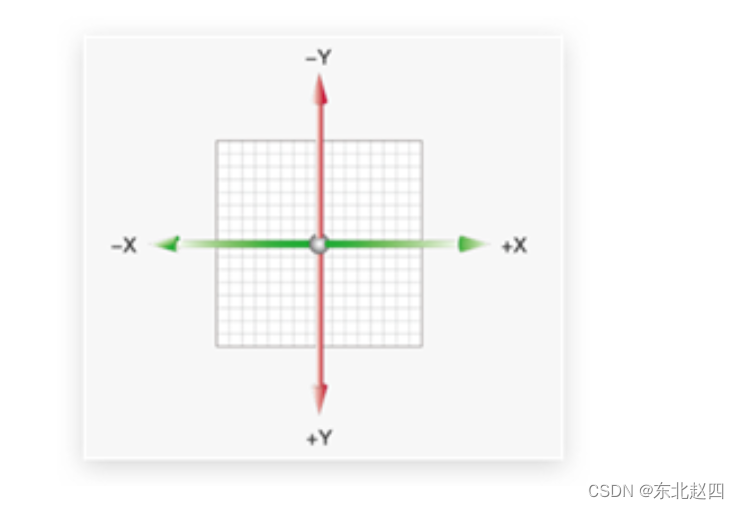
平面转换也叫 2D 转换,属性是 transform
平移
transform: translate(X轴移动距离, Y轴移动距离);-
取值
-
像素单位数值
-
百分比(参照盒子自身尺寸计算结果)
-
正负均可
-
-
技巧
-
translate() 只写一个值,表示沿着 X 轴移动
-
单独设置 X 或 Y 轴移动距离:translateX() 或 translateY()
-
定位居中
-
方法一:margin
-
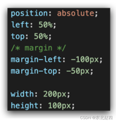
-
方法二:平移 → 百分比参照盒子自身尺寸计算结果
-

案例-双开门

-
HTML 结构
- <div class="father">
- <div class="left">div>
- <div class="right">div>
- div>
-
CSS 样式
- * {
- margin: 0;
- padding: 0;
- }
-
- /* 1. 布局:父子结构,父级是大图,子级是左右小图 */
- .father {
- display: flex;
- margin: 0 auto;
- width: 1366px;
- height: 600px;
- background-image: url(./images/bg.jpg);
-
- overflow: hidden;
- }
-
- .father .left,
- .father .right {
- width: 50%;
- height: 600px;
- background-image: url(./images/fm.jpg);
-
- transition: all .5s;
- }
-
- .father .right {
- /* right 表示的取到精灵图右面的图片 */
- background-position: right 0;
- }
-
- /* 2. 鼠标悬停的效果:左右移动 */
- .father:hover .left {
- transform: translate(-100%);
- }
-
- .father:hover .right {
- transform: translateX(100%);
- }
旋转
transform: rotate(旋转角度);-
取值:角度单位是 deg
-
技巧
-
取值正负均可
-
取值为正,顺时针旋转
-
取值为负,逆时针旋转
-
转换原点
默认情况下,转换原点是盒子中心点
transform-origin: 水平原点位置 垂直原点位置;取值:
-
方位名词(left、top、right、bottom、center)
-
像素单位数值
-
百分比
案例-时钟
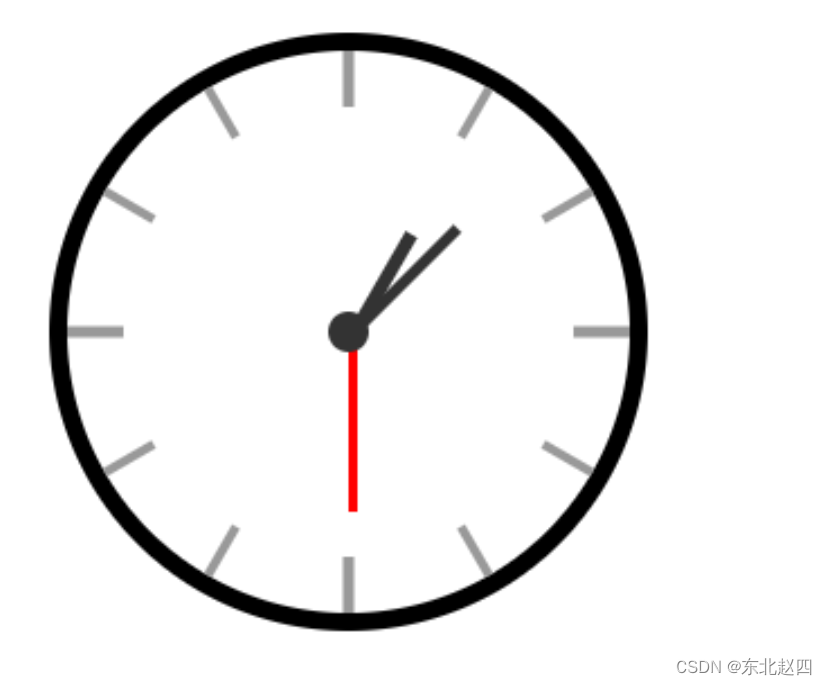
- .hour {
- width: 6px;
- height: 50px;
- background-color: #333;
- margin-left: -3px;
- transform: rotate(15deg);
- transform-origin: center bottom;
- }
-
- .minute {
- width: 5px;
- height: 65px;
- background-color: #333;
- margin-left: -3px;
- transform: rotate(90deg);
- transform-origin: center bottom;
- }
-
- .second {
- width: 4px;
- height: 80px;
- background-color: red;
- margin-left: -2px;
- transform: rotate(240deg);
- transform-origin: center bottom;
- }
多重转换
多重转换技巧:先平移再旋转
transform: translate() rotate();
-
多重转换原理:以第一种转换方式坐标轴为准转换形态
-
旋转会改变网页元素的坐标轴向
-
先写旋转,则后面的转换效果的轴向以旋转后的轴向为准,会影响转换结果
-
缩放
- transform: scale(缩放倍数);
- transform: scale(X轴缩放倍数, Y轴缩放倍数);
-
技巧
-
通常,只为 scale() 设置一个值,表示 X 轴和 Y 轴等比例缩放
-
取值大于1表示放大,取值小于1表示缩小
-
案例-播放特效
-
CSS 样式
- /* 1. 摆放播放按钮:图片区域的中间 */
- .box li {
- overflow: hidden;
- }
-
- .pic {
- position: relative;
- }
-
- .pic::after {
- position: absolute;
- left: 50%;
- top: 50%;
- /* margin-left: -29px;
- margin-top: -29px; */
- /* transform: translate(-50%, -50%); */
-
- content: '';
- width: 58px;
- height: 58px;
- background-image: url(./images/play.png);
- transform: translate(-50%, -50%) scale(5);
- opacity: 0;
-
- transition: all .5s;
- }
- /* 2. hover效果:大按钮,看不见:透明是0 → 小按钮,看得见:透明度1 */
- .box li:hover .pic::after {
- transform: translate(-50%, -50%) scale(1);
- opacity: 1;
- }
倾斜
transform: skew();取值:角度度数 deg
02-渐变
渐变是多个颜色逐渐变化的效果,一般用于设置盒子背景
分类:
-
线性渐变
-
径向渐变
-
线性渐变
- background-image: linear-gradient(
- 渐变方向,
- 颜色1 终点位置,
- 颜色2 终点位置,
- ......
- );
取值:
-
渐变方向:可选
-
to 方位名词
-
角度度数
-
-
终点位置:可选
-
百分比
-
案例-产品展示

-
HTML 结构
- <div class="box">
- <img src="./images/product.jpeg" alt="" />
- <div class="title">OceanStor Pacific 海量存储斩获2021 Interop金奖div>
- <div class="mask">div>
- div>
-
CSS 样式
- .mask {
- position: absolute;
- left: 0;
- top: 0;
- width: 100%;
- height: 100%;
- background-image: linear-gradient(
- transparent,
- rgba(0,0,0,0.5)
- );
- opacity: 0;
-
- transition: all .5s;
- }
-
- .box:hover .mask {
- opacity: 1;
- }
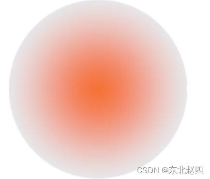
径向渐变
- background-image: radial-gradient(
- 半径 at 圆心位置,
- 颜色1 终点位置,
- 颜色2 终点位置,
- ......
- );
取值:
-
半径可以是2条,则为椭圆
-
圆心位置取值:像素单位数值 / 百分比 / 方位名词
03-综合案例

导航-频道
箭头旋转
- .x-header-nav .nav-item:hover .icon-down {
- transform: rotate(-180deg);
- }
频道列表
- .channel-layer {
- position: absolute;
- top: 60px;
- left: 50%;
- z-index: -2;
- width: 1080px;
- height: 120px;
- padding: 10px;
- margin-left: -540px;
- color: #72727b;
- background-color: #f5f5f5;
- border: 1px solid #e4e4e4;
- border-top: none;
- transition: all 0.5s;
- transform: translateY(-120px);
- }
-
- /* TODO 2. 弹窗频道 */
- .x-header-nav .nav-item:hover .channel-layer {
- transform: translateY(0);
- }
渐变按钮
搜索按钮
- .x-header-search form .btn {
- position: absolute;
- top: 0;
- right: 0;
- width: 60px;
- height: 40px;
- line-height: 40px;
- text-align: center;
- background-color: #f86442;
- border-top-right-radius: 20px;
- border-bottom-right-radius: 20px;
- background-image: linear-gradient(
- to right,
- rgba(255, 255, 255, 0.3),
- #f86442
- );
- }
登录按钮
- /* TODO 7. 渐变按钮 */
- .card .card-info .login {
- padding: 3px 34px;
- color: #fff;
- background-color: #ff7251;
- border-radius: 30px;
- box-shadow: 0 4px 8px 0 rgb(252 88 50 / 50%);
- background-image: linear-gradient(
- to right,
- rgba(255, 255, 255, 0.2),
- #ff7251
- );
- }
客户端按钮
- /* TODO 8. 径向渐变 */
- .download .dl .dl-btn {
- width: 68px;
- height: 34px;
- line-height: 34px;
- color: #fff;
- text-align: center;
- border-radius: 4px;
- background-image: radial-gradient(
- 50px at 10px 10px,
- rgba(255, 255, 255, 0.5),
- transparent
- );
- }
轮播图
- /* TODO 4. 摆放图片 */
- .banner .banner-list .banner-item.left {
- z-index: 0;
- transform: translate(-160px) scale(0.8);
- transform-origin: left center;
- }
-
- .banner .banner-list .banner-item.right {
- z-index: 0;
- transform: translate(160px) scale(0.8);
- transform-origin: right center;
- }
猜你喜欢
- /* TODO 5. 播放按钮和遮罩 */
- .album-item .album-item-box::after {
- position: absolute;
- left: 0;
- top: 0;
- content: '';
- width: 100%;
- height: 100%;
- background: rgba(0,0,0,.5) url(../assets/play.png) no-repeat center / 20px;
- opacity: 0;
- transition: all .5s;
- }
-
- .album-item .album-item-box:hover::after {
- opacity: 1;
- background-size: 50px;
- }
-
-
- /* TODO 6. 图片缩放 */
- .album-item .album-item-box:hover img {
- transform: scale(1.1);
- }
-
-
相关阅读:
qt的鼠标事件
QT day4
(52)性能分析 ---CPU的性能分析
Threejs着色器(GPU)编程——感温管网
【苍穹外卖 | 项目日记】第七天
【Java分享客栈】超简洁SpringBoot使用AOP统一日志管理-纯干货干到便秘
图情笔记 | 基于机构视角下的红色资源阅读推广服务
tomcat线程池-深度分析tomcat线程池设计与现实
对象密封的四种方式 Object.is Object.assign
Java版企业电子招标采购系统源码—企业战略布局下的采购寻源
- 原文地址:https://blog.csdn.net/qq_69748833/article/details/134080966
