-
多曲面卡片
多曲面卡片实现
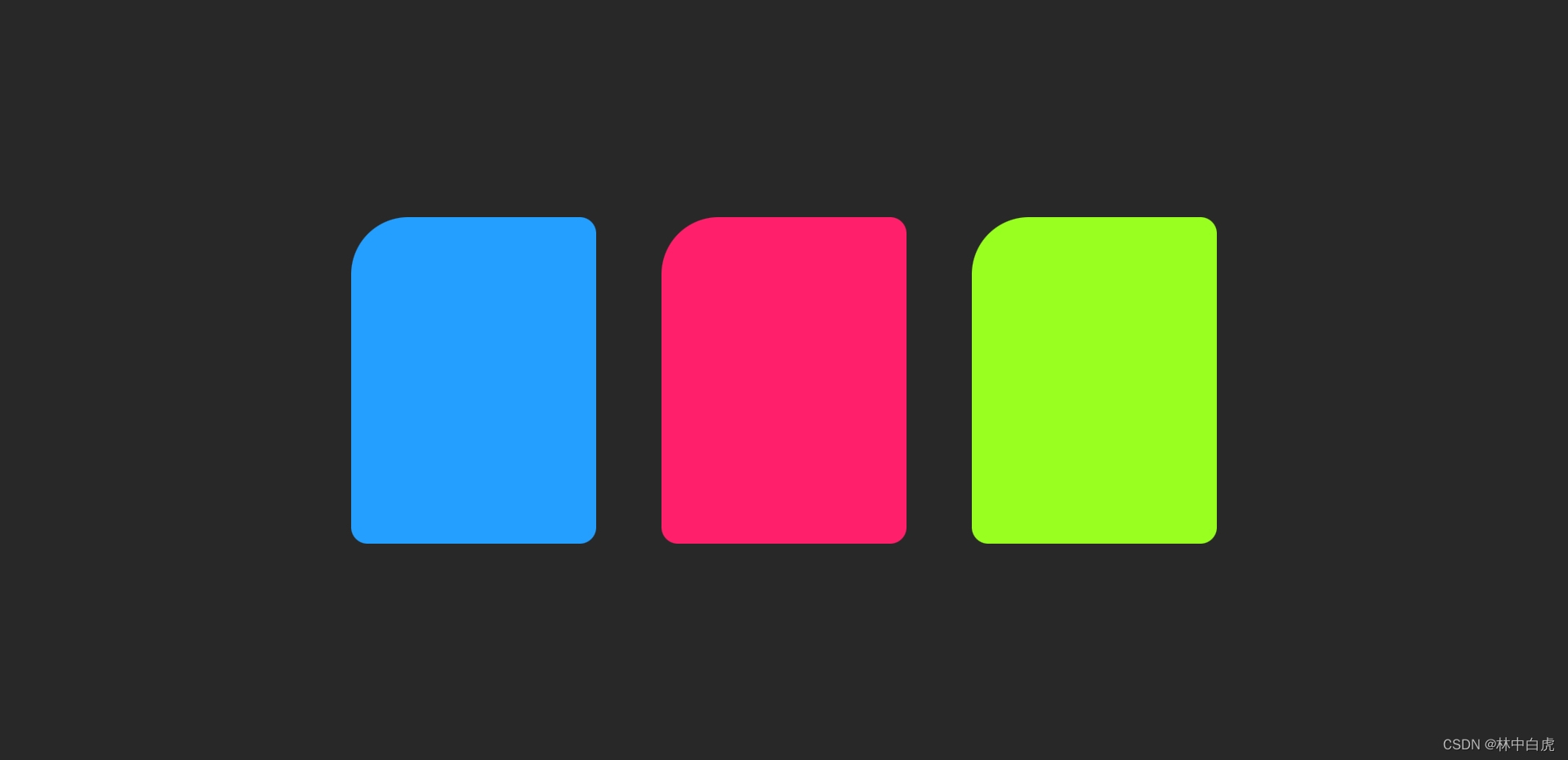
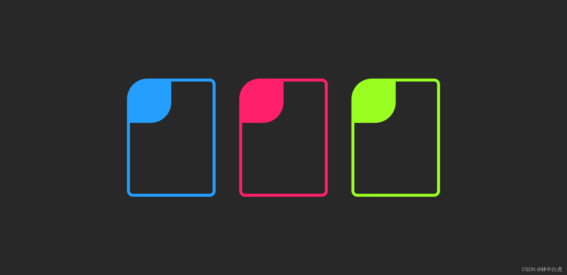
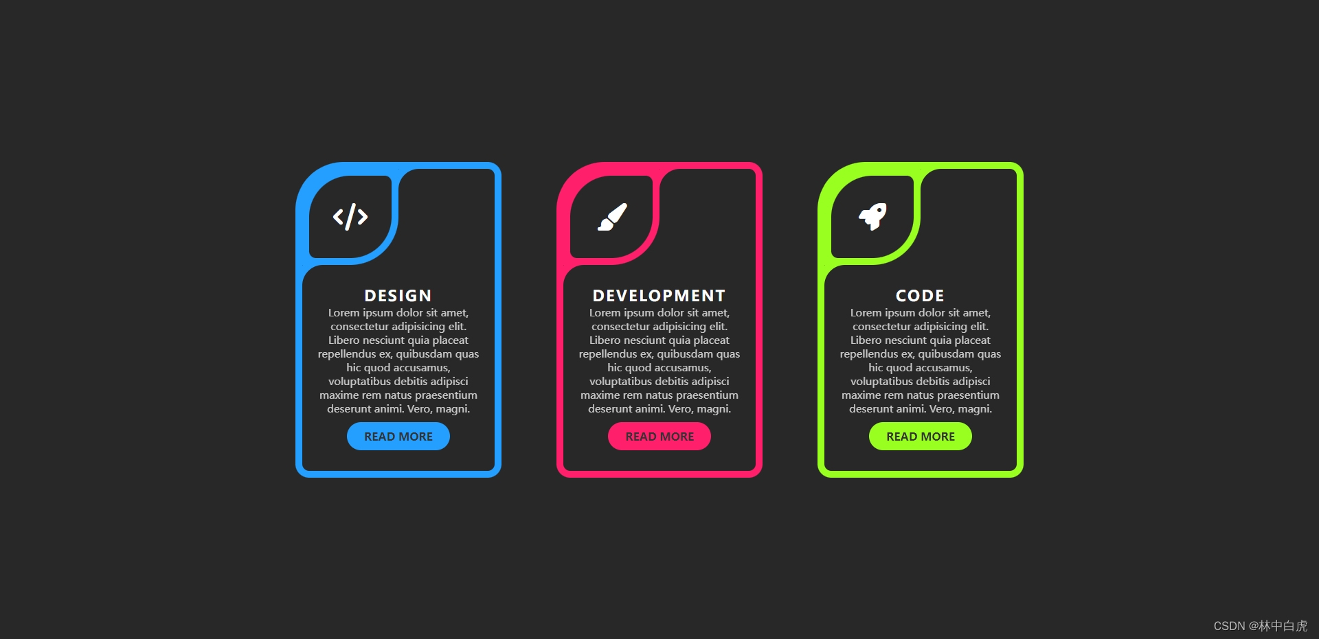
效果展示

CSS 知识点
- inset 属性运用
- 实现多曲面的思路
整体实现页面布局
<div class="card" style="--clr: #249eff"> <div class="box"> <div class="icon"> <div class="icon_box">div> div> <div class="content">div> div> div>- 1
- 2
- 3
- 4
- 5
- 6
- 7
- 8
- 9
.container .card { position: relative; width: 300px; height: 460px; background: var(--clr); border-radius: 20px; border-top-left-radius: 70px; overflow: hidden; }- 1
- 2
- 3
- 4
- 5
- 6
- 7
- 8
- 9
实现卡片头部整体部分
/* 定位在背景上,并且使用inset属性设置四周间距,从而形成边框 */ .container .card .box { position: absolute; inset: 10px; background: #282828; border-radius: 10px; } /* 设置图标容器样式 */ .container .card .box .icon { position: absolute; width: 140px; height: 140px; background: var(--clr); border-bottom-right-radius: 50%; }- 1
- 2
- 3
- 4
- 5
- 6
- 7
- 8
- 9
- 10
- 11
- 12
- 13
- 14
- 15
- 16
实现卡片图标部分左下角的弯曲部分
实现思路就是在
icon的容器中添加一个伪元素,伪元素使用box-shadow属性进行弯曲部分的实现,如下图橙色框框出的部分,我们只要设置对应的颜色就可以,形成图标部分左下角的弯曲部分。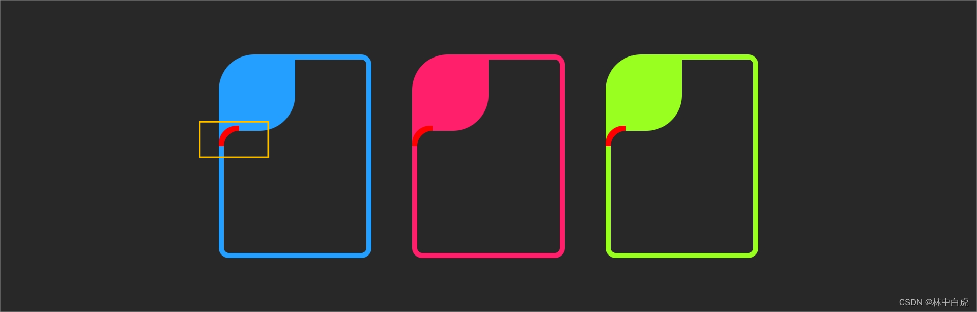
.container .card .box .icon::before { content: ""; position: absolute; bottom: -30px; left: 0; width: 30px; height: 30px; background: transparent; border-top-left-radius: 30px; box-shadow: -5px -5px 0 5px var(--clr); }- 1
- 2
- 3
- 4
- 5
- 6
- 7
- 8
- 9
- 10
- 11
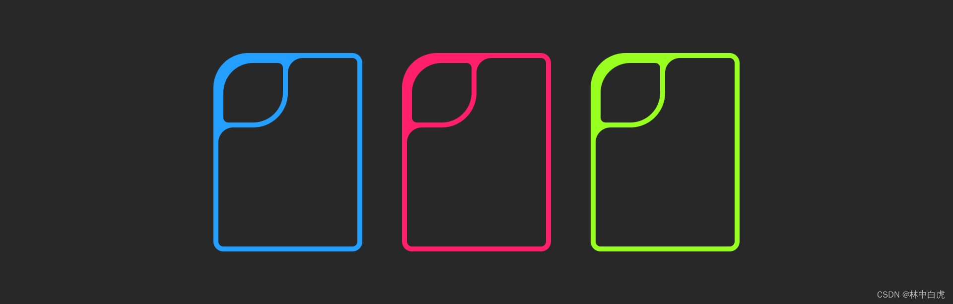
实现卡片图标部分右上角的弯曲部分
实现思路跟左下角部分实现思路一样。
.container .card .box .icon::after { content: ""; position: absolute; top: 0px; right: -30px; width: 30px; height: 30px; background: transparent; border-top-left-radius: 30px; box-shadow: -5px -5px 0 5px var(--clr); }- 1
- 2
- 3
- 4
- 5
- 6
- 7
- 8
- 9
- 10
- 11
实现图标容器样式
.container .card .box .icon .icon_box { position: absolute; inset: 10px; background: #282828; border-radius: 50%; border-top-right-radius: 10px; border-bottom-left-radius: 10px; }- 1
- 2
- 3
- 4
- 5
- 6
- 7
- 8
实现图标样式
<div class="icon_box"> <i class="fa-solid fa-code">i> div>- 1
- 2
- 3
.container .card .box .icon .icon_box { position: absolute; inset: 10px; background: #282828; border-radius: 50%; border-top-right-radius: 10px; border-bottom-left-radius: 10px; display: flex; justify-content: center; align-items: center; font-weight: 600; } .container .card .box .icon .icon_box i { font-size: 2.5em; color: #fff; }- 1
- 2
- 3
- 4
- 5
- 6
- 7
- 8
- 9
- 10
- 11
- 12
- 13
- 14
- 15
- 16
- 17
实现内容样式
.container .card .box .content { position: absolute; top: 150px; padding: 20px; text-align: center; } .container .card .box .content h2 { color: #fff; font-size: 1.35em; font-weight: 700; text-transform: uppercase; letter-spacing: 0.12em; } .container .card .box .content p { color: #fff; font-size: 0.95em; opacity: 0.75; margin: 0 0 10px; } .container .card .box .content a { background: var(--clr); display: inline-block; padding: 10px 25px; text-decoration: none; color: #333; text-transform: uppercase; font-weight: 600; border-radius: 30px; transition: 0.5s; } .container .card .box .content a:hover { letter-spacing: 0.2em; }- 1
- 2
- 3
- 4
- 5
- 6
- 7
- 8
- 9
- 10
- 11
- 12
- 13
- 14
- 15
- 16
- 17
- 18
- 19
- 20
- 21
- 22
- 23
- 24
- 25
- 26
- 27
- 28
- 29
- 30
- 31
- 32
- 33
- 34
- 35
- 36
- 37
完整代码下载
-
相关阅读:
从“AI玩具”到“创作工具”的云原生改造之路
0成本低代码入门指南,国产化+私有化的开源低代码平台如何获取?
Android开发笔记——快速入门(从入门ACT到Fragment放肆)
mysql使用--简单查询
工作整理日志
skywalking日志上送和链路追踪
澳洲猫罐头到底怎么样呢?我自己亲自喂养过的优质猫罐头分享
【ROS2初级11】安装最好的版本
200PLC转以太网与研华webaccess modbusTCP客户端在空调机上应用配置案例
Tornado 可以使用 nginx 提供负载均衡
- 原文地址:https://blog.csdn.net/qq_33003143/article/details/133822288
