-
Tailwind CSS浅析与实操
Tailwind CSS
一、Tailwind CSS简介
What is Tailwind CSS

- Tailwind CSS| TailwindCSS中文文档 | TailwindCSS中文网
- 官方解释:只需书写 HTML 代码,无需书写 CSS,即可快速构建美观的网站。本质上是一个工具集,包含了大量类似
flex、pt-4、text-center以及rotate-90等工具类,可以组合使用并直接在 HTML 代码上实现任何 UI 设计。 - 个人理解:Tailwind CSS 就是一套实用型的 CSS 框架,它不像其他的 CSS 框架一样提供了一些预定义的类来实现常用样式,而是提供了一组可以组合的原子类,可以通过组合这些原子类来定义样式。这些原子类都是非常小的样式类,它们只定义了一个具体的样式细节,例如背景色、文本颜色、字体大小、宽度、高度等。通过将它们组合在一起,可以快速而灵活地创建出各种不同的样式。
- 优点:
- 灵活,高度定制化
- 最终 CSS Bundle 极小,加快渲染速度
- 极大减少命名,设计心智负担
- 劣势:
- 内容样式强耦合,后期维护方面或存在压力
- 一定的学习成本
- Class 串稍长(@apply解决)
- 应用场景:
- 快速开发原型: Tailwind CSS 提供了大量的样式原子类,可以快速构建出漂亮且具有效果的原型。
- 用于大型 Web 应用: Tailwind CSS 的设计理念可以使开发者更快地开发出易于维护的 CSS 代码。同时,它强调样式的规律性,可以防止样式的重复定义,提高代码的可读性和易维护性。
- 与其他框架或库集成: Tailwind CSS 可以与其他框架或库集成,例如 React、Vue、Angular,以及其他的 CSS 框架,例如 Bootstrap。在不同的应用中,它可以作为一种简洁的样式定制解决方案。
- 移动应用开发: Tailwind CSS 的响应式设计可以轻松的应用到移动应用中,开发人员可以根据不同屏幕尺寸来确定相应的样式,提高移动应用的适应性。
Why choose Tailwind CSS
- 使用成本与许可:Tailwind CSS 是一个免费的开源项目,使用 MIT 许可证(MIT License)。这意味着可以免费使用、复制、修改、合并、出版发行、再授权、销售软件及其衍生品。所以从许可证方面来说,使用 Tailwind CSS 是没有直接的费用的,并且可以将其直接用于商业项目。
- 文档资料与学习曲线:Tailwind CSS 提供了详细的文档和示例,使得学习过程更加简化。使用方式类似Bootstrap,且提供了vscode自动补全插件,方便进行快速开发。

- 社区支持和更新频率: Tailwind CSS 社区非常庞大且活跃,拥有许多开发者、设计师和贡献者。可以在官方论坛、GitHub 仓库、Stack Overflow 和社交媒体等平台上找到大量的问题解答、教程、示例代码和实用资源。更新频率高,可以及时获取到 bug 修复、新功能和安全补丁,保持项目的稳定性和安全性。
- 性能和可扩展性:
- Tailwind CSS 在性能表现方面,采用了一种基于原子类的方法,只包含实际使用到的样式。这意味着不会加载不必要的代码,从而减小了文件大小,提高了加载速度。同时Tailwind CSS 提供了一套优化的构建工具和配置选项,无运行时依赖和快速响应式设计,使其具有良好的性能表现。
- Tailwind CSS 使用原子类构建块的方法,通过组合不同的类来定义样式,而不是使用预定义的组件。这种方法使得定制和扩展变得非常简单,可以根据项目需求自由组合和重用样式类。具有高度可定制化的配置选项,提供了插件系统,允许轻松地扩展框架功能;也可以与现有的组件库集成。
二、Tailwind CSS解决的问题
1.类名命名
- 一般标准做法是将CSS和HTML分开来实现关注点分离(separation of concerns),作为程序员,工作中的一大难点就是起名。>_<||
<div class="chat-notification"> <div class="chat-notification-logo-wrapper"> <img class="chat-notification-logo" src="/img/logo.svg" alt="ChitChat Logo"> div> <div class="chat-notification-content"> <h4 class="chat-notification-title">ChitChath4> <p class="chat-notification-message">You have a new message!p> div> div> <style> .chat-notification { display: flex; max-width: 24rem; margin: 0 auto; padding: 1.5rem; border-radius: 0.5rem; background-color: #fff; box-shadow: 0 20px 25px -5px rgba(0, 0, 0, 0.1), 0 10px 10px -5px rgba(0, 0, 0, 0.04); } .chat-notification-logo-wrapper { flex-shrink: 0; } .chat-notification-logo { height: 3rem; width: 3rem; } .chat-notification-content { margin-left: 1.5rem; padding-top: 0.25rem; } .chat-notification-title { color: #1a202c; font-size: 1.25rem; line-height: 1.25; } .chat-notification-message { color: #718096; font-size: 1rem; line-height: 1.5; } style>- 1
- 2
- 3
- 4
- 5
- 6
- 7
- 8
- 9
- 10
- 11
- 12
- 13
- 14
- 15
- 16
- 17
- 18
- 19
- 20
- 21
- 22
- 23
- 24
- 25
- 26
- 27
- 28
- 29
- 30
- 31
- 32
- 33
- 34
- 35
- 36
- 37
- 38
- 39
- 40
- 41
- 42
- 这种做法会起很多无所谓的名字,几周之后回来修改代码时根本搞不清楚样式应用到了哪些元素上,而且很可能在其它地方也会使用同样的类名,当尝试修改时就导致UI无法正常工作。

- 使用Tailwind CSS就不需要再起这些无所谓的类名了。
<div class="p-6 max-w-sm mx-auto bg-white rounded-xl shadow-lg flex items-center space-x-4"> <div class="shrink-0"> <img class="h-12 w-12" src="/img/logo.svg" alt="ChitChat Logo"> div> <div> <div class="text-xl font-medium text-black">ChitChatdiv> <p class="text-slate-500">You have a new message!p> div> div>- 1
- 2
- 3
- 4
- 5
- 6
- 7
- 8
- 9
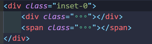
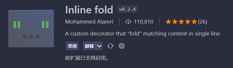
- 如果你觉得HTML中类名过多,可以在vscode中安装Inline fold插件,会自动折叠类名。
2.语法冗长
- 使用class定义类名,然后编写代码,如此反复可能会造成很大的代码量,使用Tailwind CSS能大大减少代码量,压缩代码体积。

3.样式定制
Tailwind CSS 和 Bootstrap 都是前端常用的 UI 框架,但它们的设计思路和使用方式存在一些区别:
- 设计哲学: Tailwind CSS 的设计哲学是提供一系列基础工具类,通过组合这些工具类来快速构建页面和 UI。而 Bootstrap 更注重提供各种 UI 组件和样式风格,以便快速搭建现成的页面。
- 样式组织方式: Tailwind CSS 使用原子级别的 CSS 类来构建页面,每个类只负责一个特定的样式,因此它的样式组织方式更加细粒度和灵活。而 Bootstrap 则更倾向于将多个样式组合成一个类,以便快速实现某个组件或效果。
- 自定义程度: Tailwind CSS 更容易进行自定义和扩展,因为它的样式都是单独的类,并且可以通过配置文件进行自定义。而 Bootstrap 设计更为全面和集成,因此在进行自定义时较为困难。
4.僵尸样式
- 使用class编写类名再编写样式,会造成样式冗余,也会出现虽然定义了样式,但是没有被使用到,变成“僵尸样式”
- Tailwind 会在针对生产环境进行构建时自动删除所有未使用到的 CSS 代码,也就是说 你所获得的最终的 CSS 代码包的尺寸是最小的。事实上,大部分 Tailwind 项目所生成的 CSS 代码包都小于 10kB 。
5.暗黑模式
- 使用暗黑模式前,你需要在
tailwind.config.js中配置:
/** @type {import('tailwindcss').Config} */ module.exports = { darkMode: 'class', // more options... }- 1
- 2
- 3
- 4
- 5
- 然后,你只需要少量的代码,就可以使用暗黑模式了:
<div class="w-32 h-32 bg-blue-500 dark:bg-green-500">div>- 1
三、Tailwind CSS语法规则
基本规则
- Tailwind CSS 是一种实用且强大的 CSS 框架,它提供了一些预设的样式类,可以让开发者快速地构建出美观的 UI 界面。下面是 Tailwind CSS 的基本使用方法和语法规则:
- 样式类结构:Tailwind CSS 的样式类采用以
类别-属性-值的结构命名,例如.bg-blue-500表示背景色为蓝色(blue),并且其颜色值为 500,类别为bg(背景)。 - 属性值的命名规则:在 Tailwind CSS 中,属性值分为数值、颜色和布尔值三种类型。数值采用数字表示,例如
w-20表示宽度为 20 像素;颜色采用单词或十六进制颜色值表示,例如bg-red-500表示红色背景(颜色值为 #EF4444);布尔值则采用true或false表示,例如hidden表示隐藏元素。 - 基础样式类:在 Tailwind CSS 中,有一些基础样式类用于一些常用的样式调整,例如:
.w-10表示元素的宽度;.text-xl表示字体大小.mx-auto表示水平居中;.text-center表示文本水平居中;.text-red-500表示字体颜色
- 响应式样式类:在 Tailwind CSS 中,有一些响应式样式类,用于在不同的屏幕尺寸下显示不同的样式。这些样式类命名规则为
{屏幕尺寸}:{属性}-{属性值},例如text-center sm:text-left表示在小屏幕尺寸下文本左对齐,在大屏幕尺寸下文本居中。 - 链接样式类:在 Tailwind CSS 中,有一些链接样式,用于美化页面中的链接效果,例如:
.underline表示下划线;.no-underline表示去掉下划线;.hover:underline表示鼠标悬停时出现下划线;.hover:text-red-500表示鼠标悬停时文本变为红色;
- 其他常用样式类:在 Tailwind CSS 中,还提供了许多其他常用样式类,例如:
.rounded表示圆角;.shadow表示阴影;.bg-gradient-to-r表示背景渐变。
通过以上的基本使用方法和语法规则,可以让您更加熟悉和了解 Tailwind CSS 的使用,从而更加高效地使用这个强大的 CSS 框架。
语法技巧
- Tailwind CSS 是一个快速、高效且高度可定制的 CSS 框架,它使用一组预定义类来快速构建 UI。以下是一些实用技巧,帮助您更好地利用 Tailwind CSS:
-
自定义颜色:在 tailwind.config.js 文件中,可以使用 theme 属性自定义颜色,这个属性包含一个颜色对象,您可以并据此为您的项目定义新的颜色。
-
响应式设计:Tailwind 提供了一系列响应式类,让您可以根据不同的屏幕尺寸为不同的设备定制 UI,例如:sm,md,lg等。
-
定制样式:Tailwind CSS 提供了许多原始的类,您可以轻松地将它们组合在一起创造出自定义样式的组合。
- 组合实用类:通常情况下,您可以通过多个实用类的组合来实现所需样式。例如,要在元素上添加40个像素的上边距和底边距,您可以将
pt-10(上边距为10) 和pb-10(底边距为10)两个实用类组合在一个元素上,即class="pt-10 pb-10"。 - 扩展现有实用类:您还可以通过添加前缀或后缀来扩展现有的实用类。例如,要创建一个自定义的
bg-opacity-90类,即给背景添加90%的不透明度,只需将bg-opacity-90类添加到bg-blue-500(蓝色背景)的后面,即class="bg-blue-500 bg-opacity-90"。 - 使用 @apply 来扩展样式:该功能允许您将多个实用类组合成自定义样式,然后将其应用于一个元素。例如,您可以创建一个自定义的
font-bold-uppercase类,然后使用@apply将font-bold uppercase两个类组合在一起:
less复制代码.font-bold-uppercase { @apply font-bold uppercase; }- 1
- 2
- 3
然后,可以应用该
font-bold-uppercase类到一个元素中:class="font-bold-uppercase"。 - 组合实用类:通常情况下,您可以通过多个实用类的组合来实现所需样式。例如,要在元素上添加40个像素的上边距和底边距,您可以将
-
文本样式:Tailwind CSS 提供了一些实用的类,可以快速设置文本的样式,例如: text-center(居中对齐文本)、text-2xl(增加文本大小)。
-
构建网格系统:您可以利用 Tailwind CSS 来构建网格系统,这使得在项目中创建布局变得更加容易。利用网格系统类将组件和元素对池进行行和列的多样化排列,能让您快速定位到您需要的布局。
ini复制代码Col 1Col 2Col 3- 1
- 2
- 3
- 4
- 5
-
定位元素:Tailwind 提供了各种定位元素的类,包括 z-index、position、top、right、bottom、left 等等,使您轻松定位元素的位置和层级。
-
缩放图像:利用 Tailwind CSS,您可以轻松地在UI中缩放图像,只需使用 w-和 h- 后缀来指定图像的宽高。
四、Tailwind CSS实践
1. 安装依赖
- 控制台输入以下命令:
# 初始化package.json文件 npm init -y # 安装tailwind npm install -D tailwindcss # 创建tailwind.config.js npx tailwindcss init- 1
- 2
- 3
- 4
- 5
- 6
- 7
- 8
- 此时项目结构如下:

- 修改content属性,使其能够定位到文件位置:
// tailwind.config.js module.exports = { //路径注意调整 content: ["./**/*.{html,js}"], theme: { extend: {}, }, plugins: [], }- 1
- 2
- 3
- 4
- 5
- 6
- 7
- 8
- 9
- 10
2.新建index.html和input.css文件
- 在当前目录下新建index.html
DOCTYPE html> <html lang="en"> <head> <meta charset="UTF-8"> <meta name="viewport" content="width=device-width, initial-scale=1.0"> <title>Documenttitle> <link rel="stylesheet" href="/dist/output.css"> head> <body> <h1 class="flex text-3xl font-bold underline text-blue-600"> Hello Tailwind CSS! h1> body> html>- 1
- 2
- 3
- 4
- 5
- 6
- 7
- 8
- 9
- 10
- 11
- 12
- 13
- 14
- 15
- 16
- 17
- 18
- 在当前目录下新建input.css
/* 引入 tailwind 的基础样式 */ @tailwind base; /* 引入 tailwind 的组件样式 */ @tailwind components; /* 引入 tailwind 的工具样式 */ @tailwind utilities;- 1
- 2
- 3
- 4
- 5
- 6
- 创建完文件后的项目结构:

3.tailwind编译
- 使用tailwindcss对当前项目进行编译然后输出css文件:
npx tailwindcss -i ./input.css -o ./dist/output.css- 1
- 执行完命令后的项目结构:

- 在浏览器端预览index.html

- 对于其它项目中的使用可以详见:TailwindCSS的使用,看这一篇就够了!
-
相关阅读:
记一次实战案例
read系统调用源码分析
PyTorch 学习笔记 1 —— Quick Start
Could not update Flowable database schema: unknown version from database:
C++ - 开放地址法的哈希介绍 - 哈希表的仿函数例子
QT-day1
43页县域农业大数据运营服务中心方案介绍
javaWeb项目中:连接mysql的驱动问题
PCL 空间两平面交线计算
【ESD专题】静电防护物品、静电测试工具及防静电符号
- 原文地址:https://blog.csdn.net/ASHIYI66/article/details/132616785
