-
博客系统(页面设计)
目录
之前我们已经学习了前端的三剑客(HTML、CSS、JS),今天我们来设计一个博客系统的页面设计,具体设计过程比较长,但是其中如果学会了博客列表页的设计,之后的详情页、登录页、编辑页就是一个复制粘贴的过程,稍微添加点细节就能完成博客系统的设计,重点是博客列表页的设计
一、学习计划

二、前期工作
首先创建 Blogging_system 文件,在这个文件里存放:
1️⃣创建一个 image 文件,存放一张图片(自己喜欢的,用来当博客背景),例如我的image 文件存放一个猫的图片(cat.jpg)

2️⃣创建一个 css 文件,再创建一个 common.css:用来存放公共的样式
- * 来存放公共的样式 */
- /* 写一个页面样式的起手式 */
- * {
- box-sizing: border-box;
- /* 去除浏览器默认样式 */
- padding: 0;
- margin: 0;
- }
3️⃣创建 blogging.html:用来存放设计博客页面的代码
- html>
- <html lang="en">
- <head>
- <meta charset="UTF-8">
- <meta http-equiv="X-UA-Compatible" content="IE=edge">
- <meta name="viewport" content="width=device-width, initial-scale=1.0">
- <title>博客系统列表页title>
- <link rel="stylesheet" href="css/common.css">
- head>
- <body>
- body>
- html>

三、列表页设计(重点掌握)
1.设计背景图
页面里有 html 和 body(注意 head 里边的内容不会写在页面上),所以 html 和 body 是构成页面的主体;则给页面设置背景就是给 body设置背景
1.1 common.css
上述说明要给 body 设置背景图,就要在公共样式中设计背景图:
1️⃣在进行插入图片时,要找准图片的位置,刚才我们图片的位置在common.css 上一级的文件夹中,则使用 ../来找到上一级文件,在通过 image 找到 cat.jpg
- body {
- /* 相对路径的写法 */
- background-image: url(../image/cat.jpg);
- }
2️⃣这个时候就把图片作为了背景图,但是这样简单的设计时不合理的,我们需要设计它的边边角角的问题:需要将图片填满整个元素:
- body {
- background-repeat: no-repeat;
- background-position: center center;
- /* 让图片尽可能填满整个元素 */
- background-size: cover;
- }

3️⃣这个时候发现图片并没有设置高度,才能正确显示:如果给 body 设置固定高度,就不能适应窗口大小;更希望 body 和浏览器窗口一样大,并且根据窗口大小自适应:将 html 高度设置成 100%,并且 body 高度也设置成 100%
- html {
- height: 100%;
- }
- body {
- height: 100%;
- }

❗❗height:100%的意思是当前元素的高度和父元素一样高
按照当前 html 代码的写法:body 的父元素是 html 元素,html 父元素是浏览器窗口
这里设计的思路:让 html 元素和浏览器窗口一样高,再让 body 和 html 一样高,此时 body 就和浏览器窗口一样高了
2. 编写导航栏
本质上就是一个 div,使用弹性布局,把里边的内容水平方向排序
2.1 image
首先我们设计一个 logo,我们把 logo 图片放到刚刚创建的 image 文件中

2.2 blogging.html
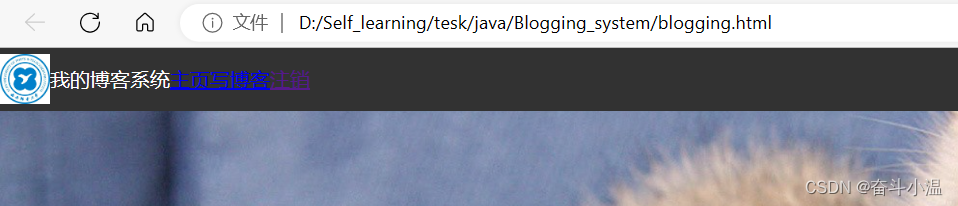
操作blogging.html,一个简单的博客系统需要有:我的博客系统、主页、写博客、注销等导航栏
- html>
- <html lang="en">
- <head>
- <meta charset="UTF-8">
- <meta http-equiv="X-UA-Compatible" content="IE=edge">
- <meta name="viewport" content="width=device-width, initial-scale=1.0">
- <title>博客系统列表页title>
- <link rel="stylesheet" href="css/common.css">
- head>
- <body>
- <div class="nav">
- <img src="image/Xi'an University of Posts & Telecommunications.jpg" alt="">
- <div class="title">我的博客系统div>
- <div class="spacer">div>
- <a href="blogging.html">主页a>
- <a href="blog_edit.html">写博客a>
- <a href="">注销a>
- div>
- body>
- html>

此时我们可以看到布局了,但是样式还没设置,所以看的不是很清晰
2.3 common.css
在 common.css 中设置样式
1️⃣根据 nav(导航栏)设置样式:设置导航栏高度、背景色为黑色,文本为白色
- /* 导航栏 */
- .nav {
- width: 100%;
- /* 导航栏一般高度都是 50px */
- height: 50px;
- background-color: rgb(50, 50, 50);
- color: white;
- }

此时我们看到了想要看到的,但是logo图片太大了
2️⃣设置logo图片大小:设置宽度高度
- /* 导航栏中的 logo */
- .nav img {
- width: 40px;
- height: 40px;
- }

这里看到文本时竖直排列,不合适
3️⃣文本设置为水平排列,这时候需要在父元素 .nav 里添加弹性布局, 让里面的元素水平方向排列,并且垂直居中
- /* 导航栏 */
- .nav {
- //...之前的代码
- /* 使用弹性布局, 让里面的元素水平方向排列 */
- display: flex;
- align-items: center;
- }
此时看到左右外边距太挤了,并且logo不好看
4️⃣首先让 logo 设置左右外边距,使之有一些缝隙,并且使得 logo 从圆形矩阵变为圆形,这个操作需要设置的是 logo 的问题,需要在 .nav img 中设置:
- /* 导航栏中的 logo */
- .nav img {
- //...之前的代码
- /* 左右设置外边距, 有一些缝隙 */
- margin-left: 30px;
- margin-right: 10px;
- /* 设置圆角矩形, 变成圆形 */
- border-radius: 20px;
- }

5️⃣设置a标签字体颜色为白色,并且去掉下划线,使之出现内边距,期望得到这些字体在右边
- .nav a {
- color: white;
- /* 去掉 a 标签的下划线 */
- text-decoration: none;
- /* 此处使用内边距把多个链接分出距离来 */
- /* 但是此处要注意使用外边距也行, 但是内边距更好, 能够扩大点击的范围 */
- padding: 0 10px;
- }
- .nav .spacer {
- width: 70%;
- }
此处的 .spacer 是使用了一个简单粗暴的写法:用来把后面的链接挤过去,注意看html中所写的

这个时候我们看起来的导航栏是一个不错的样式了
6️⃣设置透明度:最后可以根据个人习惯,可以把导航栏设置半透明效果,这个时候需要在我们写过的 .nav 中修改背景图(background-color)颜色进行透明度设置
background-color: rgba(50, 50, 50, 0.4);
✅此时的编写导航栏就已经完成了,是不是有一种豁然开朗的感觉
3. 实现页面的正文(版心)
正文设计也成为“版心”,需要实现居中对齐
3.1 blogging.html
操作blogging.html,在设置版心的时候,不仅需要居中对齐,也需要的是左侧放用户信息,右侧放博客列表
- <body>
- <div class="container">
- <div class="container-left">
- div>
- <div class="container-right">
- div>
- div>
- <body>
3.2 common.css
在 common.css 设置页面的主体部分样式:
1️⃣首先需要设置尺寸(宽度:并且水平居中;高度设置成和浏览器窗口一样高)
宽度比较好设置,那么高度怎么设置成和浏览器窗口一样高呢❓❓❓假设先设置成100%,看效果
- /* 页面的主体部分. 也称为 "版心" */
- .container {
- /* 设置成固定宽度, 水平居中 */
- width: 1000px;
- /* margin-left: auto;
- margin-right: auto; */
- margin: 0 auto;
- /* 设置高度, 和浏览器窗口一样高 */
- height: 100%;
- background-color: gray;
- }

这个时候我们发现最下边多出一块,是因为我们这里的 .container 并不是顶着导航栏上边往下的,而是导航栏下边开始;那么这个时候 container 的高度并不是 100%,而是在 100% 基础上减去导航栏的高度:height: calc(100% - 50px);
- /* 页面的主体部分. 也称为 "版心" */
- .container {
- /* 设置成固定宽度, 水平居中 */
- width: 1000px;
- /* margin-left: auto;
- margin-right: auto; */
- margin: 0 auto;
- /* 设置高度, 和浏览器窗口一样高 */
- height: calc(100% - 50px);
- background-color: gray;
- }

❗❗注意:在 height: calc(100% - 50px); 这种写法会有坑,这种写法是 CSS3 版本中的特性,calc 类似与函数一样(当然CSS实际上是没有函数的概念),calc参数就是可以对尺寸进行运算。这里写的 100%就会自动被替换成父元素的高度(此处就是 body 的高度)
❗❗注意:减号两侧必须要加空格;如果不加就不能正确识别(在CSS中根本不会存在算术运算的概念)
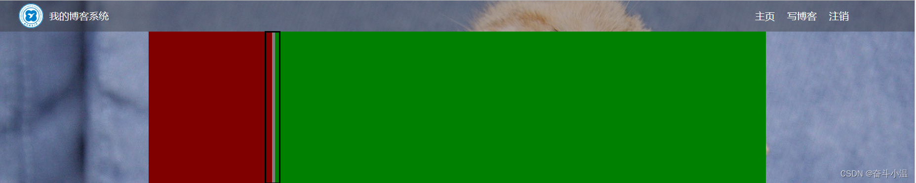
2️⃣设置弹性布局,并且设置左右侧信息的样式:首先我们将左侧信息栏样式设置为红色,右侧信息栏样式设置为绿色
- .container {
- //...之前的代码
- display: flex;
- }
- .container-left {
- height: 100%;
- width: 200px;
- background-color: rgb(128, 0, 0);
- }
- .container-right {
- height: 100%;
- width: 800px;
- background-color: rgb(0, 128, 0);
- }

此时我们就看到了左右布局
3️⃣使左右布局中间出现缝隙,使 .container-right 中的宽度设置为 width: 795px ,为了留出5px;最后使里边的元素能够等间距铺开
- .container {
- //...之前的代码
- display: flex;
- /* 让里边的元素能够等间距铺开 */
- justify-content: space-between;
- }
使左右布局中间出现缝隙,使 .container-right 中的宽度设置为 width: 795px ,为了留出5px;
- .container-right {
- height: 100%;
- /* 留出来 5px 的缝隙 */
- width: 795px;
- background-color: rgb(0, 128, 0);
- }
4. 实现个人信息
个人信息中有:用户头像、用户名、超链接/统计信息
前端页面的代码编写,一般都是先把 html 写好,再把页面结构确定好,然后在编写样式
4.1 blogging.html
1️⃣为了显示的比较清晰,我们先把背景样式去掉

首先编写左侧信息栏:
- <div class="container-left">
- <div class="card">
- <img src="image/avatar.png" alt="">
- <h3>奋斗小温h3>
- <a href="https:www.gitee.com">gitee 地址a>
- <div class="counter">
- <span>文章span>
- <span>分类span>
- div>
- <div class="counter">
- <span>2span>
- <span>1span>
- div>
- div>
- div>

这个时候样式还是比较混乱,则需要加上css样式
4.2 common.css 代码
1️⃣左侧信息栏:
- /* 设置用户信息区域 */
- .card {
- background-color: rgba(255, 255, 255, 0.8);
- border-radius: 10px;
- padding: 30px;
- }
- /* 设置用户头像 */
- .card img {
- /* 整个 .card 的宽度是 200px,.card 设置了四个方向的内边距为30px*/
- /* 剩下能放图片空间就是140px */
- width: 140px;
- height: 140px;
- /* 设置圆形头像 */
- border-radius: 70px;
- }
- .card h3 {
- /* 水平居中 */
- text-align: center;
- /* 这里使用内边距把用户名和头像,撑开一个距离,使用外边距也是ok的 */
- padding: 10px;
- }
- /* 设置 gitee 地址 */
- .card a {
- text-align: center;
- /* 文字设置成灰色 */
- color: gray;
- /* 去掉下划线 */
- text-decoration: none;
- /* 需要把a标签转成块元素,上述的文字水平居中才有意义 */
- display: block;
- /* 让a标签和下方有间距 */
- margin-bottom: 10px;
- /* 让a标签和下方有间隔 */
- margin-bottom: 10px;
- }
- .card .counter {
- display: flex;
- padding: 5px;
- justify-content: space-around;
- }

5.实现博客列表
5.1 blogging.html
1️⃣编写右侧信息栏(博客标题、时间、摘要、点击按钮用来查看博客具体内容):
- <div class="container-right">
- <div class="blog">
- <div class="title">我的第一篇博客div>
- <div class="date">2023-05-12 11:20:00div>
- <div class="desc">
- 从今天起,我要认真写代码,做一个奋斗小温,Lorem ipsum dolor sit amet consectetur adipisicing elit.
- div>
- <a href="blog_detail.html?blogId=1">查看全文 >> a>
- div>
- <div class="blog">
- <div class="title">我的第二篇博客div>
- <div class="date">2023-05-12 11:20:00div>
- <div class="desc">
- 从今天起,我要认真写代码,做一个奋斗小温,Lorem ipsum dolor sit amet consectetur adipisicing elit.
- div>
- <a href="blog_detail.html?blogId=1">查看全文 >> a>
- div>
- <div class="blog">
- <div class="title">我的第三篇博客div>
- <div class="date">2023-05-12 11:20:00div>
- <div class="desc">
- 从今天起,我要认真写代码,做一个奋斗小温,Lorem ipsum dolor sit amet consectetur adipisicing elit.
- div>
- <a href="blog_detail.html?blogId=1">查看全文 >> a>
- div>
- div>
5.2 common.css 代码
右侧信息栏需要在 .container-right 里编写:
- .container-right {
- height: 100%;
- /* 留出来 5px 的缝隙 */
- width: 795px;
- /* 加上一个白色半透明背景 */
- background-color: rgba(255, 255, 255, 0.8);
- /* 设计成圆角 */
- border-radius: 10px;
- /* 不要顶着边框写,加内边距 */
- padding: 20px;
- }

这个时候无门就需要设置 文字排版,博客列表是只有列表页独有的,而common.css 是公共样式,所以在CSS文件中创建一个blog_list.css,专门写 博客列表页 的专属样式
5.3 blog_list.css 中的代码
首先在html中引入这个文件:

在 blog_list.css 中的代码:
- /* 专门写 博客列表页 的专属样式 */
- /* 设置整个 blog div 的样式 */
- .blog {
- /* 设置内边距 */
- padding: 20px;
- }
- /* 设置博客的标题 */
- .blog .title {
- font-size: 22px;
- text-align: center;
- font-weight: 900;
- }
- /* 设置发布时间 */
- .blog .date {
- text-align: center;
- color: rgba(0, 128, 0);
- padding: 15px;
- }
- /* 设置摘要部分 */
- .blog .desc {
- /* em 也是一个单位,和 px 是并列的,1em == 一个文字的大小 */
- text-indent: 2em;
- }
- .blog a {
- /* 改成块级元素,此时才能够设置尺寸 */
- display: block;
- width: 150px;
- height: 40px;
- border: 2px solid black;/* 边框 */
- /* 把里边的文字改一下颜色,和下划线 */
- color: black;
- text-align: center;
- text-decoration: none;
- /* 查看文字设置居中:当文字的行高和元素高度一样的时候,文字恰好是垂直剧中的 */
- line-height: 40px;
- /* 水平居中 */
- margin: 10px auto;
- }

这个时候我们设计一个伪类选择器,不是选中元素,而是选中元素的某种状态,具体来说 :hover 就是选中了元素被鼠标悬停的状态;并且加上背景切换的过渡效果
- .blog a {
- //...之前的代码
- /* 加上背景切换的过渡效果,all 表示针对所有的变化都进行过度,0.8s 是过度的时间是0.8s */
- transition: all 0.8s;
- }
- /* :hover 是一个伪类选择器,不是选中元素,而是选中元素的某种状态 */
- /* 具体来说 :hover 就是选中了元素被鼠标悬停的状态 */
- .blog a:hover {
- background-color: gray;
- color: white;
- }

代码写到这里,实现博客列表页的代码就已经基本写完
四、博客详情页
需要重新定义一个页面,俗话说完事开头难,博客列表页写出来之后,后边就是复制粘贴,要注意一些细节问题
1.blog_detail.html
创建一个博客详情页:blog_detail.html
- html>
- <html lang="en">
- <head>
- <meta charset="UTF-8">
- <meta http-equiv="X-UA-Compatible" content="IE=edge">
- <meta name="viewport" content="width=device-width, initial-scale=1.0">
- <title>博客系统列表页title>
- <link rel="stylesheet" href="css/common.css">
- <link rel="stylesheet" href="css/blog_detail.css">
- head>
- <body>
- <div class="nav">
- <img src="image/Xi'an University of Posts & Telecommunications.jpg" alt="">
- <div class="title">我的博客系统div>
- <div class="spacer">div>
- <a href="blogging.html">主页a>
- <a href="blog_edit.html">写博客a>
- <a href="">注销a>
- div>
- <div class="container">
- <div class="container-left">
- <div class="card">
- <img src="image/bubu.jpg" alt="">
- <h3>奋斗小温h3>
- <a href="https:www.gitee.com">gitee 地址a>
- <div class="counter">
- <span>文章span>
- <span>分类span>
- div>
- <div class="counter">
- <span>2span>
- <span>1span>
- div>
- div>
- div>
- <div class="container-right">
- <h3>这是我的第一篇博客h3>
- <div class="date">2023-05-12 11:20:000div>
- <div class="content">
- <p>从今天起,我要认真写代码,做一个奋斗小温,Lorem ipsum dolor sit amet consectetur adipisicing elit.p>
- <p>从今天起,我要认真写代码,做一个奋斗小温,Lorem ipsum dolor sit amet consectetur adipisicing elit.p>
- <p>从今天起,我要认真写代码,做一个奋斗小温,Lorem ipsum dolor sit amet consectetur adipisicing elit.p>
- <p>从今天起,我要认真写代码,做一个奋斗小温,Lorem ipsum dolor sit amet consectetur adipisicing elit.p>
- <p>从今天起,我要认真写代码,做一个奋斗小温,Lorem ipsum dolor sit amet consectetur adipisicing elit.p>
- <p>从今天起,我要认真写代码,做一个奋斗小温,Lorem ipsum dolor sit amet consectetur adipisicing elit.p>
- div>
- div>
- div>
- body>
- html>

2. blog_detail.css
创建一个 blog_detail.css,用来存放博客详情页的专属样式
- /* 来存放博客详情页的专属样式 */
- .container-right h3 {
- font-size: 22px;
- text-align: center;
- font-weight: 900;
- padding: 20px 0;
- }
- .container-right .date {
- text-align: center;
- color: rgb(0, 128, 0);
- padding: 10px 0;
- }
- .container-right .content p {
- text-indent: 2em;
- margin-bottom: 5px;
- }

这个时候 博客详情页 就已经写完了
❗❗❗但是存在在一个问题(当段落比较长的时候看效果):

此时发现,当内容太长 超出一个屏幕的时候,浏览器窗口就自动带有滚动条了,此时就会把这个背景给滚没了,改进方法:把滚动条加到 container-right 上;在common.css中操作
- /* 来存放公共的样式 */
- .container-right {
- /* 当内容超出范围时,自动添加滚动条 */
- overflow: auto;
- }

五、编写博客登录页
更换不同的页面,创建一个 login.html
1.login.html
需要注意的是,在登录页面是没有注销的页面,需要去掉
- html>
- <html lang="en">
- <head>
- <meta charset="UTF-8">
- <meta http-equiv="X-UA-Compatible" content="IE=edge">
- <meta name="viewport" content="width=device-width, initial-scale=1.0">
- <title>博客登录页title>
- <link rel="stylesheet" href="css/common.css">
- head>
- <body>
- <div class="nav">
- <img src="image/Xi'an University of Posts & Telecommunications.jpg" alt="">
- <div class="title">我的博客系统div>
- <div class="spacer">div>
- <a href="blogging.html">主页a>
- <a href="blog_edit.html">写博客a>
- div>
- <div class="login-container">
- <div class="login-dialog">
- <h3>登录h3>
- <form action="">
- <div class="row">
- <span>用户名span>
- <input type="text" id="username">
- div>
- <div class="row">
- <span>密码span>
- <input type="password" id="password">
- div>
- <div class="row">
- <input type="submit" id="submit" value="登录">
- div>
- form>
- div>
- div>
- body>
- html>

2.login.css
在 CSS 文件中创建 login.css,用来编写博客登录页面的样式
- /* 这个是登录页的 css */
- /* 版心 */
- .login-container {
- width: 100%;
- height: calc(100% - 50px);/* 注意减号隔开 */
- /* 为了让 login-dialog 垂直水平居中, 使用弹性布局 */
- display: flex;
- justify-content: center;
- align-items: center;
- }
- /* 登录页尺寸和垂直居中 */
- .login-dialog {
- width: 500px;
- height: 350px;
- background-color: rgba(255, 255, 255, 0.8);
- /* 圆角边框 */
- border-radius: 10px;
- }
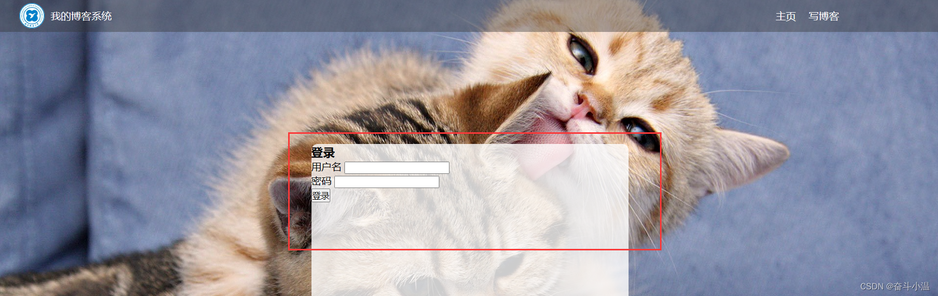
这样一个大体的登录页面已经设定好了,我们来具体实现以下登录标题,及每一行的文字细节
- /* 登录标题 */
- .login-dialog h3 {
- font-size: 24px;
- font-weight: 900;
- text-align: center;
- margin-top: 60px;
- margin-bottom: 40px;
- }
- /* 针对每一行的样式 */
- .row {
- height: 50px;
- width: 100%;
- display: flex;
- justify-content: space-around;
- align-items: center;
- }
- /* 每一行的文字 */
- .row span {
- font-size: 20px;
- width: 60px;
- }
- /* 用户名设置 */
- .row #username {
- width: 350px;
- height: 40px;
- font-size: 20px;
- text-indent: 10px;
- }
- .row #password {
- width: 350px;
- height: 40px;
- font-size: 20px;
- text-indent: 10px;
- }
- /* 登录按钮 */
- .row #submit {
- width: 150px;
- height: 40px;
- color: white;
- background-color: orange;
- text-align: center;
- /* 设置文字垂直居中 */
- line-height: 40px;
- /* 去掉按钮默认的边框 */
- border: none;
- border-radius: 10px;
- margin-top: 20px;
- }
- .row #submit:hover {
- background: gray;
- }

六、博客编辑页
1. blog_edit.html
创建一个新的窗口(blog_edit.html),其中导航栏与之前一样,需要的是设计博客编辑页的版心
- html>
- <html lang="en">
- <head>
- <meta charset="UTF-8">
- <meta http-equiv="X-UA-Compatible" content="IE=edge">
- <meta name="viewport" content="width=device-width, initial-scale=1.0">
- <title>博客编辑页title>
- <link rel="stylesheet" href="css/common.css">
- <link rel="stylesheet" href="css/blog_edit.css">
- head>
- <body>
- <div class="nav">
- <img src="image/Xi'an University of Posts & Telecommunications.jpg" alt="">
- <span class="title">我的博客系统span>
- <div class="spacer">div>
- <a href="#">主页a>
- <a href="#">写博客a>
- <a href="#">注销a>
- div>
- <div class="blog-edit-container">
- <div class="title">
- <input type="text" id="title" placeholder="输入文章标题">
- <button id="submit">发布文章button>
- div>
- <div id="editor">
- div>
- div>
- body>
- html>

2.blog_edit.css
在 CSS 中创建一个博客编辑页的专属样式(blog_edit.css),和前面的思想一样。
- /* 这个文件用来写博客编辑页的样式 */
- .blog-edit-container {
- width: 1000px;
- height: calc(100% - 50px);
- margin: 0 auto;
- }
- /* 注意, 使用后代选择器, 防止和导航栏中的 .title 冲突 */
- .blog-edit-container .title {
- height: 50px;
- display: flex;
- align-items: center;
- justify-content: space-between;
- }
- /* 标题的输入框 */
- #title {
- height: 40px;
- width: 895px;
- border: none;
- padding-left: 5px;
- font-size: 20px;
- border-radius: 5px;
- /* 去掉轮廓线. 鼠标选中后黑圈 */
- outline: none;
- /* 设置背景半透明 */
- background-color: rgba(255, 255, 255, 0.7);
- }
- /* 提交按钮 */
- #submit {
- height: 40px;
- width: 100px;
- color: white;
- background-color: orange;
- border-radius: 5px;
- border: none;
- }
- #submit:hover {
- background-color: gray;
- }

3.引入 editor.md
🌈editor.md 是一个开源的页面 markdown 编辑器组件. 官网参考:Editor.md - 开源在线 Markdown 编辑器 (pandao.github.io)
创建一个 editor.md 文件
1️⃣下载 editor.md 文件
从官网上下载到压缩包. 放到刚刚创建的 editor.md 文件
2️⃣引入 jQuery 文件
editor.md 这个组件要想正常使用,还依赖一个东西:jQuery 库(这是 JS 中世界最知名的一个库)
官网:jQuery CDN

创建一个 js 文件,创建 jquery.min.js,将上边打开的链接全部复制粘贴进入jquery.min.js,至此 jQuery 包导入成功
当然也可以直接使用网页版的不需要导入本地中
- <script src="https://code.jquery.com/jquery-3.7.0.min.js">script>
3.1 html 中引入 editor.md
- <script src="https://code.jquery.com/jquery-3.7.0.min.js">script>
- <link rel="stylesheet" href="editor.md/css/editormd.min.css" />
- <script src="editor.md/lib/marked.min.js">script>
- <script src="editor.md/lib/prettify.min.js">script>
- <script src="editor.md/editormd.js">script>
3.2 css 中引入样式
- #editor {
- border-radius: 10px;
- /* background-color: rgba(255, 255, 255, 0.8); */
- opacity: 80%;
- }
七、整体效果

博客列表页

博客详情页

博客登陆页

实现博客编辑页

八、整体代码
1.博客列表页
1.1 blogging.html
- html>
- <html lang="en">
- <head>
- <meta charset="UTF-8">
- <meta http-equiv="X-UA-Compatible" content="IE=edge">
- <meta name="viewport" content="width=device-width, initial-scale=1.0">
- <title>博客系统列表页title>
- <link rel="stylesheet" href="css/common.css">
- <link rel="stylesheet" href="css/blog_list.css">
- head>
- <body>
- <div class="nav">
- <img src="image/Xi'an University of Posts & Telecommunications.jpg" alt="">
- <div class="title">我的博客系统div>
- <div class="spacer">div>
- <a href="blogging.html">主页a>
- <a href="blog_edit.html">写博客a>
- <a href="">注销a>
- div>
- <div class="container">
- <div class="container-left">
- <div class="card">
- <img src="image/bubu.jpg" alt="">
- <h3>奋斗小温h3>
- <a href="https:www.gitee.com">gitee 地址a>
- <div class="counter">
- <span>文章span>
- <span>分类span>
- div>
- <div class="counter">
- <span>2span>
- <span>1span>
- div>
- div>
- div>
- <div class="container-right">
- <div class="blog">
- <div class="title">我的第一篇博客div>
- <div class="date">2023-05-12 11:20:00div>
- <div class="desc">
- 从今天起,我要认真写代码,做一个奋斗小温,Lorem ipsum dolor sit amet consectetur adipisicing elit.
- div>
- <a href="blog_detail.html?blogId=1">查看全文 >> a>
- div>
- <div class="blog">
- <div class="title">我的第二篇博客div>
- <div class="date">2023-05-12 11:20:00div>
- <div class="desc">
- 从今天起,我要认真写代码,做一个奋斗小温,Lorem ipsum dolor sit amet consectetur adipisicing elit.
- div>
- <a href="blog_detail.html?blogId=1">查看全文 >> a>
- div>
- <div class="blog">
- <div class="title">我的第三篇博客div>
- <div class="date">2023-05-12 11:20:00div>
- <div class="desc">
- 从今天起,我要认真写代码,做一个奋斗小温,Lorem ipsum dolor sit amet consectetur adipisicing elit.
- div>
- <a href="blog_detail.html?blogId=1">查看全文 >> a>
- div>
- div>
- div>
- body>
- html>
1.2 common.css
- /* 来存放公共的样式 */
- /* 写一个页面样式的起手式 */
- * {
- box-sizing: border-box;
- /* 去除浏览器默认样式 */
- padding: 0;
- margin: 0;
- }
- html {
- height: 100%;
- }
- body {
- /* 注意, 这里的相对路径的写法 */
- background-image: url(../image/cat.jpg);
- background-repeat: no-repeat;
- background-position: center center;
- /* 让图片尽可能填满整个元素 */
- background-size: cover;
- height: 100%;
- }
- /* 导航栏 */
- .nav {
- width: 100%;
- /* 导航栏一般高度都是 50px */
- height: 50px;
- background-color: rgba(50, 50, 50, 0.4);
- color: white;
- /* 使用弹性布局, 让里面的元素水平方向排列 */
- display: flex;
- align-items: center;
- }
- /* 导航栏中的 logo */
- .nav img {
- width: 40px;
- height: 40px;
- /* 左右设置外边距, 有一些缝隙 */
- margin-left: 30px;
- margin-right: 10px;
- /* 设置圆角矩形, 变成圆形 */
- border-radius: 20px;
- }
- .nav a {
- color: white;
- /* 去掉 a 标签的下划线 */
- text-decoration: none;
- /* 此处使用内边距把多个链接分出距离来 */
- /* 但是此处要注意使用外边距也行, 但是内边距更好, 能够扩大点击的范围 */
- padding: 0 10px;
- }
- .nav .spacer {
- width: 70%;
- }
- /* 页面的主体部分. 也称为 "版心" */
- .container {
- /* 设置成固定宽度, 水平居中 */
- width: 1000px;
- /* margin-left: auto;
- margin-right: auto; */
- margin: 0 auto;
- /* 设置高度, 和浏览器窗口一样高 */
- height: calc(100% - 50px);
- display: flex;
- /* 让里边的元素能够等间距铺开 */
- justify-content: space-between;
- }
- .container-left {
- height: 100%;
- width: 200px;
- }
- .container-right {
- height: 100%;
- /* 留出来 5px 的缝隙 */
- width: 795px;
- /* 加上一个白色半透明背景 */
- background-color: rgba(255, 255, 255, 0.8);
- /* 设计成圆角 */
- border-radius: 10px;
- /* 不要顶着边框写,加内边距 */
- padding: 20px;
- /* 当内容超出范围时,自动添加滚动条 */
- overflow: auto;
- }
- /* 设置用户信息区域 */
- .card {
- background-color: rgba(255, 255, 255, 0.8);
- border-radius: 10px;
- padding: 30px;
- }
- /* 设置用户头像 */
- .card img {
- /* 整个 .card 的宽度是 200px,.card 设置了四个方向的内边距为30px*/
- /* 剩下能放图片空间就是140px */
- width: 140px;
- height: 140px;
- /* 设置圆形头像 */
- border-radius: 70px;
- }
- .card h3 {
- /* 水平居中 */
- text-align: center;
- /* 这里使用内边距把用户名和头像,撑开一个距离,使用外边距也是ok的 */
- padding: 10px;
- }
- /* 设置 gitee 地址 */
- .card a {
- text-align: center;
- /* 文字设置成灰色 */
- color: gray;
- /* 去掉下划线 */
- text-decoration: none;
- /* 需要把a标签转成块元素,上述的文字水平居中才有意义 */
- display: block;
- /* 让a标签和下方有间距 */
- margin-bottom: 10px;
- /* 让a标签和下方有间隔 */
- margin-bottom: 10px;
- }
- .card .counter {
- display: flex;
- padding: 5px;
- justify-content: space-around;
- }
1.3 blog_list.css
- /* 专门写 博客列表页 的专属样式 */
- /* 设置整个 blog div 的样式 */
- .blog {
- /* 设置内边距 */
- padding: 20px;
- }
- /* 设置博客的标题 */
- .blog .title {
- font-size: 22px;
- text-align: center;
- font-weight: 900;
- }
- /* 设置发布时间 */
- .blog .date {
- text-align: center;
- color: rgba(0, 128, 0);
- padding: 15px;
- }
- /* 设置摘要部分 */
- .blog .desc {
- /* em 也是一个单位,和 px 是并列的,1em == 一个文字的大小 */
- text-indent: 2em;
- }
- .blog a {
- /* 改成块级元素,此时才能够设置尺寸 */
- display: block;
- width: 150px;
- height: 40px;
- border: 2px solid black;/* 边框 */
- /* 把里边的文字改一下颜色,和下划线 */
- color: black;
- text-align: center;
- text-decoration: none;
- /* 查看文字设置居中:当文字的行高和元素高度一样的时候,文字恰好是垂直剧中的 */
- line-height: 40px;
- /* 水平居中 */
- margin: 10px auto;
- /* 加上背景切换的过渡效果,all 表示针对所有的变化都进行过度,0.8s 是过度的时间是0.8s */
- transition: all 0.8s;
- }
- /* :hover 是一个伪类选择器,不是选中元素,而是选中元素的某种状态 */
- /* 具体来说 :hover 就是选中了元素被鼠标悬停的状态 */
- .blog a:hover {
- background-color: gray;
- color: white;
- }
2.博客详情页
2.1 biog_detail.html
- html>
- <html lang="en">
- <head>
- <meta charset="UTF-8">
- <meta http-equiv="X-UA-Compatible" content="IE=edge">
- <meta name="viewport" content="width=device-width, initial-scale=1.0">
- <title>博客系统详情页title>
- <link rel="stylesheet" href="css/common.css">
- <link rel="stylesheet" href="css/blog_detail.css">
- head>
- <body>
- <div class="nav">
- <img src="image/Xi'an University of Posts & Telecommunications.jpg" alt="">
- <div class="title">我的博客系统div>
- <div class="spacer">div>
- <a href="blogging.html">主页a>
- <a href="blog_edit.html">写博客a>
- <a href="">注销a>
- div>
- <div class="container">
- <div class="container-left">
- <div class="card">
- <img src="image/bubu.jpg" alt="">
- <h3>奋斗小温h3>
- <a href="https:www.gitee.com">gitee 地址a>
- <div class="counter">
- <span>文章span>
- <span>分类span>
- div>
- <div class="counter">
- <span>2span>
- <span>1span>
- div>
- div>
- div>
- <div class="container-right">
- <h3>这是我的第一篇博客h3>
- <div class="date">2023-05-12 11:20:000div>
- <div class="content">
- <p>从今天起,我要认真写代码,做一个奋斗小温,Lorem ipsum dolor sit amet consectetur elit.p>
- <p>从今天起,我要认真写代码,做一个奋斗小温,Lorem ipsum dolor sit amet consectetur elit.p>
- <p>从今天起,我要认真写代码,做一个奋斗小温,Lorem ipsum dolor sit amet consectetur elit.p>
- <p>从今天起,我要认真写代码,做一个奋斗小温,Lorem ipsum dolor sit amet consectetur elit.p>
- <p>从今天起,我要认真写代码,做一个奋斗小温,Lorem ipsum dolor sit amet consectetur elit.p>
- div>
- div>
- div>
- body>
- html>
2.2 blog_list.css
- /* 来存放博客详情页的专属样式 */
- .container-right h3 {
- font-size: 22px;
- text-align: center;
- font-weight: 900;
- padding: 20px 0;
- }
- .container-right .date {
- text-align: center;
- color: rgb(0, 128, 0);
- padding: 10px 0;
- }
- .container-right .content p {
- text-indent: 2em;
- margin-bottom: 5px;
- }
3.博客登录页
3.1 login.html
- html>
- <html lang="en">
- <head>
- <meta charset="UTF-8">
- <meta http-equiv="X-UA-Compatible" content="IE=edge">
- <meta name="viewport" content="width=device-width, initial-scale=1.0">
- <title>博客登录页title>
- <link rel="stylesheet" href="css/common.css">
- <link rel="stylesheet" href="css/login.css">
- head>
- <body>
- <div class="nav">
- <img src="image/Xi'an University of Posts & Telecommunications.jpg" alt="">
- <div class="title">我的博客系统div>
- <div class="spacer">div>
- <a href="blogging.html">主页a>
- <a href="blog_edit.html">写博客a>
- div>
- <div class="login-container">
- <div class="login-dialog">
- <h3>登录h3>
- <form action="">
- <div class="row">
- <span>用户名span>
- <input type="text" id="username">
- div>
- <div class="row">
- <span>密码span>
- <input type="password" id="password">
- div>
- <div class="row">
- <input type="submit" id="submit" value="登录">
- div>
- form>
- div>
- div>
- body>
- html>
3.2 login.css
- /* 这个是登录页的 css */
- /* 版心 */
- .login-container {
- width: 100%;
- height: calc(100% - 50px);/* 注意减号隔开 */
- /* 为了让 login-dialog 垂直水平居中, 使用弹性布局 */
- display: flex;
- justify-content: center;
- align-items: center;
- }
- /* 登录页尺寸和垂直居中 */
- .login-dialog {
- width: 500px;
- height: 350px;
- background-color: rgba(255, 255, 255, 0.8);
- /* 圆角边框 */
- border-radius: 10px;
- }
- /* 登录标题 */
- .login-dialog h3 {
- font-size: 24px;
- font-weight: 900;
- text-align: center;
- margin-top: 60px;
- margin-bottom: 40px;
- }
- /* 针对每一行的样式 */
- .row {
- height: 50px;
- width: 100%;
- display: flex;
- justify-content: space-around;
- align-items: center;
- }
- /* 每一行的文字 */
- .row span {
- font-size: 20px;
- width: 60px;
- }
- /* 用户名设置 */
- .row #username {
- width: 350px;
- height: 40px;
- font-size: 20px;
- text-indent: 10px;
- }
- .row #password {
- width: 350px;
- height: 40px;
- font-size: 20px;
- text-indent: 10px;
- }
- /* 登录按钮 */
- .row #submit {
- width: 150px;
- height: 40px;
- color: white;
- background-color: orange;
- text-align: center;
- /* 设置文字垂直居中 */
- line-height: 40px;
- /* 去掉按钮默认的边框 */
- border: none;
- border-radius: 10px;
- margin-top: 20px;
- }
- .row #submit:hover {
- background: gray;
- }
4.博客编辑页
4.1 blog_edit.html
- html>
- <html lang="en">
- <head>
- <meta charset="UTF-8">
- <meta http-equiv="X-UA-Compatible" content="IE=edge">
- <meta name="viewport" content="width=device-width, initial-scale=1.0">
- <title>博客编辑页title>
- <link rel="stylesheet" href="css/common.css">
- <link rel="stylesheet" href="css/blog_edit.css">
- <script src="https://code.jquery.com/jquery-3.7.0.min.js">script>
- <link rel="stylesheet" href="editor.md/css/editormd.min.css" />
- <script src="editor.md/lib/marked.min.js">script>
- <script src="editor.md/lib/prettify.min.js">script>
- <script src="editor.md/editormd.js">script>
- head>
- <body>
- <div class="nav">
- <img src="image/Xi'an University of Posts & Telecommunications.jpg" alt="">
- <span class="title">我的博客系统span>
- <div class="spacer">div>
- <a href="#">主页a>
- <a href="#">写博客a>
- <a href="#">注销a>
- div>
- <div class="blog-edit-container">
- <div class="title">
- <input type="text" id="title" placeholder="输入文章标题">
- <button id="submit">发布文章button>
- div>
- <div id="editor">
- div>
- div>
- <script>
- var editor = editormd("editor", {
- // 这里的尺寸必须在这里设置. 设置样式会被 editormd 自动覆盖掉.
- width: "100%",
- // 设定编辑器高度
- height: "calc(100% - 50px)",
- // 编辑器中的初始内容
- markdown: "# 在这里写下一篇博客",
- // 指定 editor.md 依赖的插件路径
- path: "editor.md/lib/"
- });
- script>
- body>
- html>
4.2 blog_edit.css
- /* 这个文件用来写博客编辑页的样式 */
- .blog-edit-container {
- width: 1000px;
- height: calc(100% - 50px);
- margin: 0 auto;
- }
- /* 注意, 使用后代选择器, 防止和导航栏中的 .title 冲突 */
- .blog-edit-container .title {
- height: 50px;
- display: flex;
- align-items: center;
- justify-content: space-between;
- }
- /* 标题的输入框 */
- #title {
- height: 40px;
- width: 895px;
- border: none;
- padding-left: 5px;
- font-size: 20px;
- border-radius: 5px;
- /* 去掉轮廓线. 鼠标选中后黑圈 */
- outline: none;
- /* 设置背景半透明 */
- background-color: rgba(255, 255, 255, 0.7);
- }
- /* 提交按钮 */
- #submit {
- height: 40px;
- width: 100px;
- color: white;
- background-color: orange;
- border-radius: 5px;
- border: none;
- }
- #submit:hover {
- background-color: gray;
- }
- #editor {
- border-radius: 10px;
- /* background-color: rgba(255, 255, 255, 0.8); */
- opacity: 80%;
- }
-
相关阅读:
JavaScript期末大作业 基于HTML+CSS+JavaScript技术制作web前端开发个人博客(48页)
如何全面的理解APS自动排产系统?
前端面试经典题--页面布局
redisson分布式锁原理剖析
二手物品交易管理系统
微服务框架-基于SpringCloudAlibaba的微服务架构
MaxScale读写分离
微电网与电动车蓄电池优化(Matlab代码实现)
【论文笔记】Aleph_star
六大维度全景呈现:《数据安全法》实施一周年行业洞察
- 原文地址:https://blog.csdn.net/m0_72161237/article/details/130626568