-
前端甘特图组件开发(二)
自定义时间轴功能

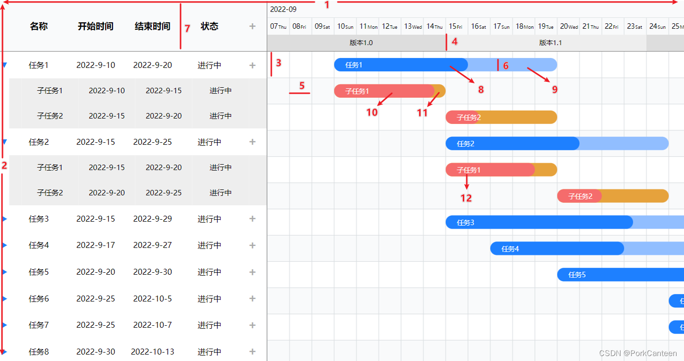
由于常见的甘特图时间轴只支持按照天/周/月/年或者固定的时间单位进行划分,但实际使用场景下有时候会需要按照特定且不规则的时间段对进度数据进行直观划分。因此本组件在原时间轴的基础上添加新的自定义时间轴,可通过数据配置自定义时间段及其标题,具体内容如下。
// 自定义时间轴数据 export const customisedList: Array<any> = [ { title: '版本1.0', startDate: '2022/9/7', endDate: '2022/9/15' }, { title: '版本1.1', startDate: '2022/9/15', endDate: '2022/9/24' }, { title: '版本2.0', startDate: '2022/9/24', endDate: '2022/9/30' }, { title: '版本2.1', startDate: '2022/9/30', endDate: '2022/10/5' }, { title: '版本2.2', startDate: '2022/10/5', endDate: '2022/10/13' }, ]- 1
- 2
- 3
- 4
- 5
- 6
- 7
- 8
<svg [attr.width]="dateConfig.svgWidth" [attr.height]="timeLineHeight"> <g *ngFor="let item of dateConfig.customisedList; let i = index;"> <rect [attr.x]="item.start * squareWidth" [attr.y]="0" [attr.width]="item.length * squareWidth" [attr.height]="timeLineHeight" [attr.fill]="i % 2 === 0 ? '#ddd' : '#eee'">rect> <text [attr.x]="(item.start + item.length / 2) * squareWidth - 12" [attr.y]="timeLineHeight / 2 + 4" style="font-size: 12px;">{{item.title}}text> g> svg>- 1
- 2
- 3
- 4
- 5
- 6
- 7
- 8
- 9
// 配置自定义时间轴 private setCustomisedData(): void { customisedList.forEach(item => { const start = (new Date(item.startDate).getTime() - this.dateConfig.startDate.getTime()) / (24 * 60 * 60 * 1000); const length = (new Date(item.endDate).getTime() - new Date(item.startDate).getTime()) / (24 * 60 * 60 * 1000); this.dateConfig.customisedList.push({ title: item.title, start, length }) }) }- 1
- 2
- 3
- 4
- 5
- 6
- 7
- 8
- 9
- 10
- 11
- 12
数据交互处理逻辑预留
本甘特图涉及数据的增删改查功能。其中具体的新增、编辑、删除均通过弹窗形式操作,本组件进行预留,此处仅提供点击事件。
① 添加新增按钮列,放置 + 符号
② 为 + 符号绑定单击事件(创建)
③ 为表格行添加双击事件(编辑)
④ 通过 Angular EventEmitter 将事件触发的方法暴露给调用的父组件注意:双击事件需要特殊处理,以避免重复触发单击事件
// 7. 点击任务自动滚动(单击) private time: number = 200; private timeout: any = null; public scrollToBar(row: any): void { clearTimeout(this.timeout); // 清除第一个单击事件 this.timeout = setTimeout(() => { // 单击事件 }, this.time) } // 8. 创建/编辑任务(双击) @Output() createTask = new EventEmitter(); @Output() createSubTask = new EventEmitter(); @Output() editTask = new EventEmitter(); public editRow(row: any = null, isCreate: boolean = false): void { clearTimeout(this.timeout); if (isCreate) { // 创建数据处理 if (row) { // 创建二级数据 this.createSubTask.emit(row); } else { // 创建一级数据 this.createTask.emit(row); } } else { // 双击编辑数据处理 this.editTask.emit(row); } }- 1
- 2
- 3
- 4
- 5
- 6
- 7
- 8
- 9
- 10
- 11
- 12
- 13
- 14
- 15
- 16
- 17
- 18
- 19
- 20
- 21
- 22
- 23
- 24
- 25
- 26
- 27
- 28
- 29
调用该组件时,定义并传入几个点击事件触发的内容即可。
<app-m-gantt (createSubTask)="createSubTask($event)" (createTask)="createTask($event)" (editTask)="editTask($event)"> app-m-gantt>- 1
- 2
- 3
- 4
- 5
// 需要自定义的样式(仅传入需要更改的属性) public styleOptions = { containerWidth: '1600px', } // 几个事件触发的函数 public createTask(e: any): void { console.log('创建一级数据'); } public createSubTask(e: any): void { console.log('创建二级数据', e); } public editTask(e: any): void { console.log('编辑数据', e); }- 1
- 2
- 3
- 4
- 5
- 6
- 7
- 8
- 9
- 10
- 11
- 12
- 13
- 14
样式布局调整&样式可配置化
- 样式布局调整
① 时间轴高度从表格高度获取
ngAfterViewInit(): void { // 根据表格高度设置进度条行高 this.lineHeight = document.querySelectorAll('.row')[0].clientHeight; }- 1
- 2
- 3
- 4
② 表格高度调整
由于表格 td 天然具有 padding: 1px,故需要将其取消,防止表格行高不一致,造成与右侧甘特图行数据无法对齐的问题。- 样式可配置化
① 将部分样式(例如进度条颜色、高度、表格高度等)进行整合,统一在ts文件中控制。
② 使用 Angular 的 @Input 接收调用本组件的父组件传入的样式值进行部分替换,达到自定义的效果。
// 自定义样式(父组件传入) @Input() options: any; // 1. 可定义变量 public containerWidth: string = '1500px'; // 容器宽度 // .... ngOnInit(): void { this.preprocessStyles(this.options); // ... } private preprocessStyles(styles: any): void { this.containerWidth = styles.containerWidth || this.containerWidth; // ... }- 1
- 2
- 3
- 4
- 5
- 6
- 7
- 8
- 9
- 10
- 11
- 12
- 13
- 14
调用该组件时传入即可
<app-m-gantt [options]="styleOptions">app-m-gantt>- 1
- 可配置样式列表
public containerWidth: string = '1500px'; // 1.容器宽度 public containerHeight: string = 'auto'; // 2.容器高度 public lineHeight: number = 43; // 3.行高 public timeLineHeight: number = 30; // 4.时间轴高度(单层) public squareWidth: number = 40; // 5.格子宽度 public barHeight: number = 24; // 6.进度条高度 public headHeight: number = 90; // 7.头部整体高度 public progressBarColor: string = '#1e80ff'; // 8.进度颜色 public barColor: string = '#91beff'; // 9.进度条颜色 public subBarColor: string = '#e6a23c'; // 10.子进度颜色 public subProgressBarColor: string = '#f56c6c'; // 11.子进度条颜色 public barFontColor: string = '#fff'; // 12.进度条文字颜色- 1
- 2
- 3
- 4
- 5
- 6
- 7
- 8
- 9
- 10
- 11
- 12
数据传入&&配置
使用 @Input 接收父组件传入的数据及配置项
- 数据格式
// 任务数据 public data: Array<any> = [ { id: '0', name: '任务1', startDate: '2022/9/10', endDate: '2022/9/20', status: '进行中', duration: 10, progress: 0.6 }, { id: '01', name: '子任务1', startDate: '2022/9/10', endDate: '2022/9/15', status: '进行中', duration: 5, progress: 0.9, parentId: '0' }, ... ] // 自定义时间轴数据 public customisedList: Array<any> = [ { title: '版本1.0', startDate: '2022/9/7', endDate: '2022/9/15' }, { title: '版本1.1', startDate: '2022/9/15', endDate: '2022/9/24' }, ... ]- 1
- 2
- 3
- 4
- 5
- 6
- 7
- 8
- 9
- 10
- 11
- 12
- 数据预处理
传入的数据由于有父子级关系,需提前增加部分属性。说明:- open:是否展开下属子项
- show:是否需要显示该项
- config.openSub:是否在初始化时展开所有子项
// 有下属子项的父项集合 const parents: Array<any> = []; // 展开子项 if (this.config.openSub) { data.forEach(row => { row.show = true; if (!row.parentId) { if (parents.indexOf(row.id) !== -1) { row.open = true } else { row.open = false } } }) } else { // 收起子项 data.forEach(row => { if (!row.parentId) { row.open = false; row.show = true; } else { row.show = false; } }) }- 1
- 2
- 3
- 4
- 5
- 6
- 7
- 8
- 9
- 10
- 11
- 12
- 13
- 14
- 15
- 16
- 17
- 18
- 19
- 20
- 21
- 22
- 23
- 24
- 25
其他
部分样式、显示内容暂未实现可配置化,后面有时间会持续完善。
本组件的开发流程希望能提供一种开发各类图表的思路,后续有类似的需求可以参考此思路进行高效开发。【项目GitHub地址】⭐️
原文地址
【个人博客】⭐️相关文章
【前端甘特图组件开发(一)】 -
相关阅读:
网页设计成品DW静态网页Html5响应式css3 (餐厅 6页 带轮播图)
JavaScript——JSON
Spine Web Player教程
优化 if else-if else 语句的使用
【Java 基础篇】Java List 使用指南:深入解析列表操作
python爬虫之app爬取-mitmproxy 的使用
python机器学习入门之opencv的安装与环境配置(超详细,避坑必看,包括没代码提示的解决)
TCP的三次握手、四次挥手
通过实例学习鸿蒙静态库的创建与使用
Spring 有几种事务隔离级别?
- 原文地址:https://blog.csdn.net/PorkCanteen/article/details/128075837
