-
Android Compose Bloom 项目实战 (二) : 欢迎页
1. 前言
上一篇文章我们讲到了Compose Bloom项目开发之前的一些配置及沉浸式状态栏的修改。
这篇文章接着上文,会介绍欢迎页的开发。需要实现的页面效果如下所示
2. 分析页面组件
根据UI图,我们可以可知,该页面是由背景和前面部分部分组成的。
3. 实现背景部分
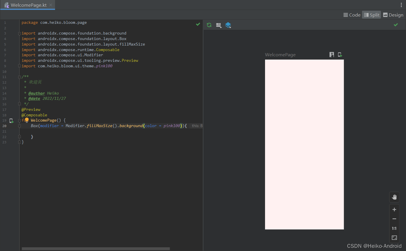
3.1 创建 WelcomePage
首先,我们需要先创建
WelcomePage.kt@Composable fun WelcomePage() { }- 1
- 2
- 3
3.2 将MainActivity设置为WelcomePage
class MainActivity : ComponentActivity() { override fun onCreate(savedInstanceState: Bundle?) { super.onCreate(savedInstanceState) WindowCompat.setDecorFitsSystemWindows(window, false) val controller = WindowCompat.getInsetsController(window, window.decorView) controller?.isAppearanceLightStatusBars = true setContent { BloomTheme { WelcomePage() // <-------- 设置为WelcomePage } } } }- 1
- 2
- 3
- 4
- 5
- 6
- 7
- 8
- 9
- 10
- 11
- 12
- 13
- 14
- 15
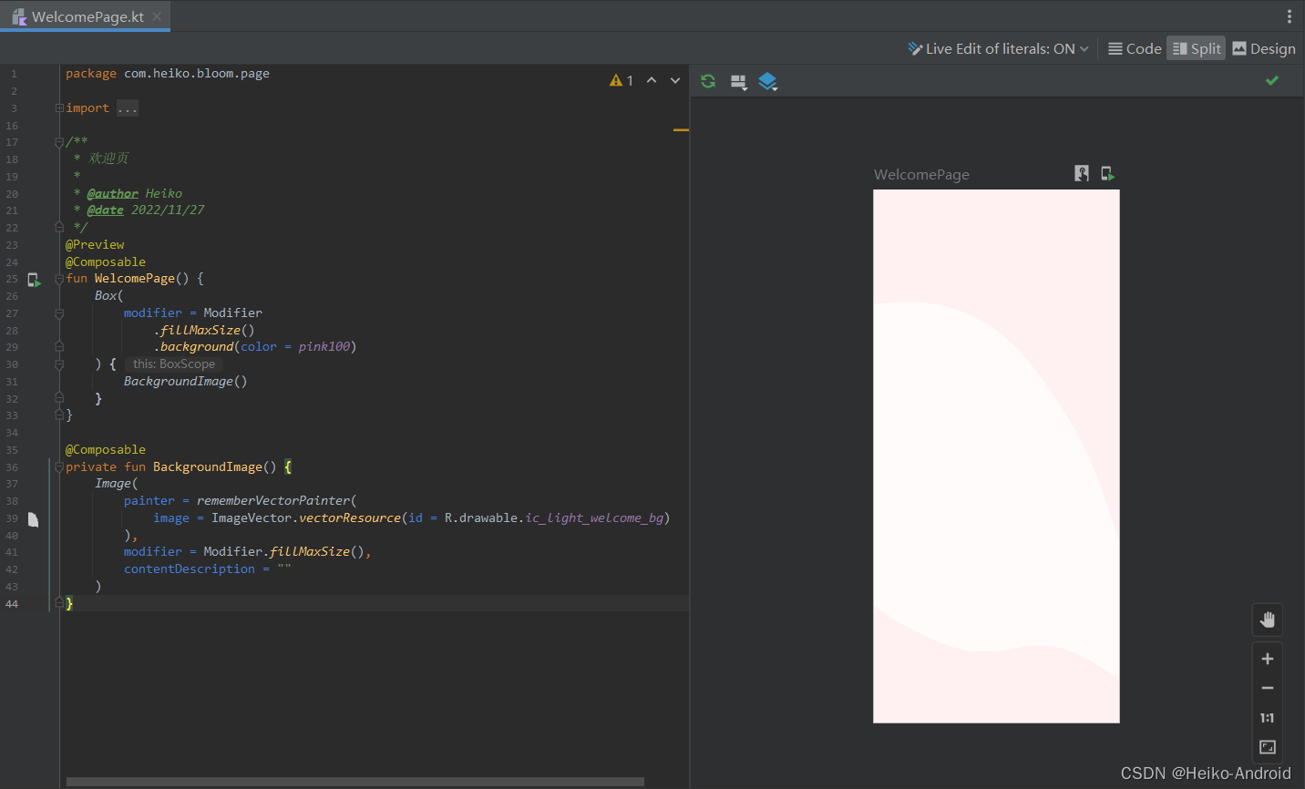
3.3 添加背景色
由设计稿可知,页面的背景色是pink100
@Preview @Composable fun WelcomePage() { Box(modifier = Modifier.fillMaxSize().background(color = pink100)){ } }- 1
- 2
- 3
- 4
- 5
- 6
- 7
我们使用快捷键
ctrl + shift + F5(Windows,其他系统请自行百度),可以预览到效果
3.3.2 设置白色的不规则形状图片
我们之前添加的资源文件里,
ic_light_welcome_bg.xml就是白色的不规则形状图片
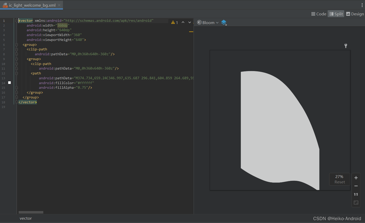
将其设置到页面中
@Composable private fun BackgroundImage() { Image( painter = rememberVectorPainter( image = ImageVector.vectorResource(id = R.drawable.ic_light_welcome_bg) ), modifier = Modifier.fillMaxSize(), contentDescription = "" ) }- 1
- 2
- 3
- 4
- 5
- 6
- 7
- 8
- 9
- 10
效果如下所示
4. 实现前面部分
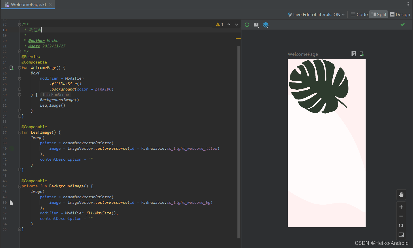
4.1 添加树叶图片
我们查看之前添加的资源文件里,
ic_light_welcome_illos.xml就是树叶的图片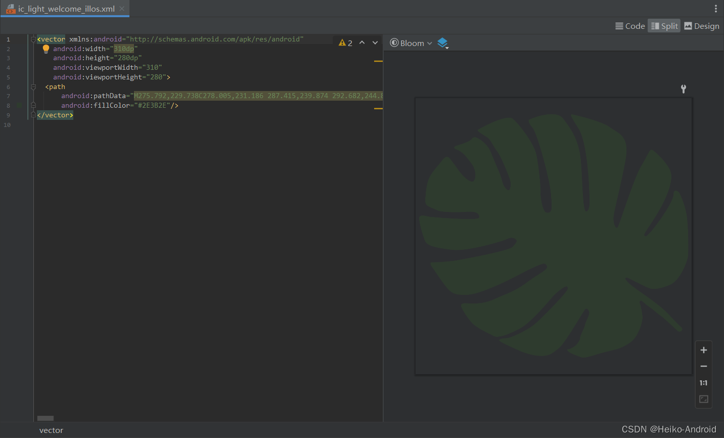
我们将图片设置到页面中@Composable fun LeafImage() { Image( painter = rememberVectorPainter( image = ImageVector.vectorResource(id = R.drawable.ic_light_welcome_illos) ), contentDescription = "" ) }- 1
- 2
- 3
- 4
- 5
- 6
- 7
- 8
- 9
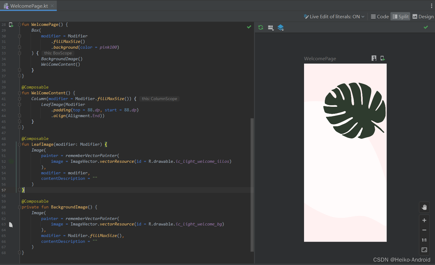
可以看到效果
发现这个页面是在最顶端,我们期望改变一下它的位置,可以给他设置padding在Compose里面,没有margin,而是通过padding的调用顺序,从而实现margin和padding的效果
这里我们用到了
Column布局,设置了align(Alignment.End))靠右摆放,所以把Modifier抽取了出来@Composable fun WelComeContent() { Column(modifier = Modifier.fillMaxSize()) { LeafImage(Modifier .padding(top = 88.dp, start = 88.dp) .align(Alignment.End)) } } @Composable fun LeafImage(modifier: Modifier) { Image( painter = rememberVectorPainter( image = ImageVector.vectorResource(id = R.drawable.ic_light_welcome_illos) ), modifier = modifier, contentDescription = "" ) }- 1
- 2
- 3
- 4
- 5
- 6
- 7
- 8
- 9
- 10
- 11
- 12
- 13
- 14
- 15
- 16
- 17
- 18
- 19
效果如下
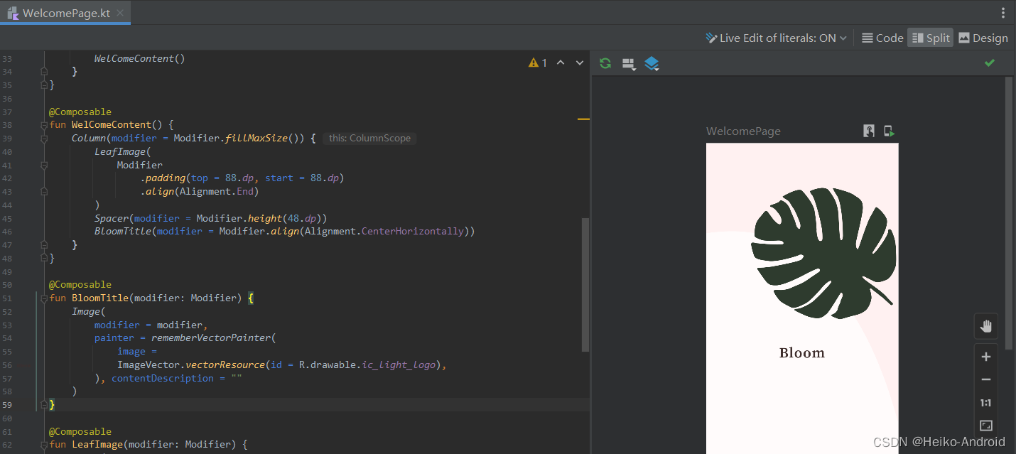
4.2 添加Bloom标题
Bloom这几个字也是用图片实现的,我们把它加上
Spacer(modifier = Modifier.height(48.dp)) BloomTitle(modifier = Modifier.align(Alignment.CenterHorizontally)) @Composable fun BloomTitle(modifier: Modifier) { Image( modifier = modifier, painter = rememberVectorPainter( image = ImageVector.vectorResource(id = R.drawable.ic_light_logo), ), contentDescription = "" ) }- 1
- 2
- 3
- 4
- 5
- 6
- 7
- 8
- 9
- 10
- 11
- 12
- 13
效果如下
4.3 添加副标题
Spacer(modifier = Modifier.height(8.dp)) BloomSubTitle(modifier = Modifier.align(Alignment.CenterHorizontally)) @Composable fun BloomSubTitle(modifier: Modifier) { Text( text = "Beautiful home garden solutions", style = subtitle1, color = gray, modifier = modifier ) }- 1
- 2
- 3
- 4
- 5
- 6
- 7
- 8
- 9
- 10
- 11
- 12
效果如下所示

4.4 添加注册账号按钮
Spacer(modifier = Modifier.height(40.dp)) CreateAccountButton() @Composable fun CreateAccountButton() { Button( onClick = { }, modifier = Modifier .padding(horizontal = 16.dp) .fillMaxWidth() .height(48.dp) .clip(medium), colors = ButtonDefaults.buttonColors(pink900) ) { Text(text = "Create Account", style = button, color = white) } }- 1
- 2
- 3
- 4
- 5
- 6
- 7
- 8
- 9
- 10
- 11
- 12
- 13
- 14
- 15
- 16
- 17
效果如下

4.5 添加登录按钮
Spacer(modifier = Modifier.height(24.dp)) LoginButton() @Composable fun LoginButton() { Text(text = "Log in", style = button, color = pink900) }- 1
- 2
- 3
- 4
- 5
- 6
- 7
最终效果如下
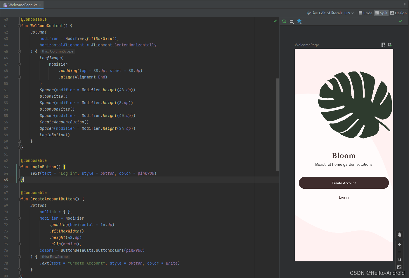
至此,我们就完成了欢迎页的界面,下一篇文章 我们将接着介绍登录页界面的实现。
Compose 项目实战 系列文章
Android Compose Bloom 项目实战 (一) : 项目说明与配置
Android Compose Bloom 项目实战 (二) : 欢迎页
Android Compose Bloom 项目实战 (三) : 登录页
Android Compose Bloom 项目实战 (四) : 主页 -
相关阅读:
立创EDA——PCB的走线(五)
【机器学习】Kmeans聚类算法
苹果认证Apple Store Connenct api的使用
【Redis系列】Redis上设置key,value的时候出现NOAUTH Authentication required提示如何解决?
vue实现轮播图详解
【Spring源码】自动注入·类型:autowireByType()详解
UD4KB100-ASEMI智能家居专用整流桥UD4KB100
P1045 [NOIP2003 普及组] 麦森数 python 题解
淘宝API接口,获得淘宝app商品详情原数据(Onebound数据)
二维码解码文字或者链接怎么做?二维码分解内容的方法
- 原文地址:https://blog.csdn.net/EthanCo/article/details/128065337