-
R语言绘制高密度散点图
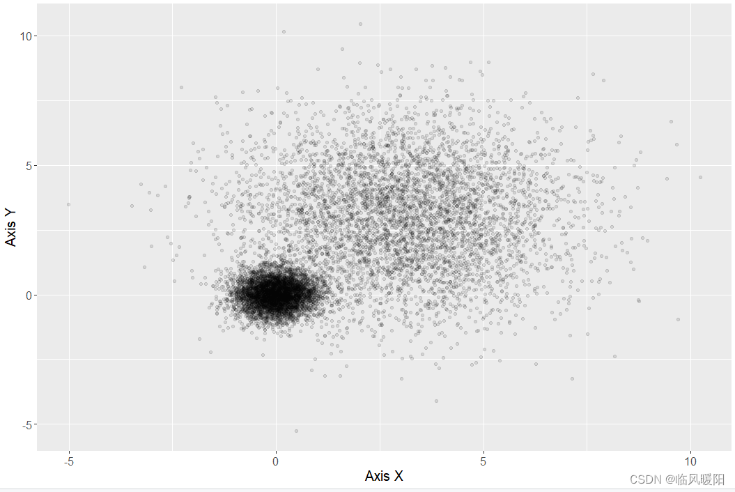
library(ggplot2) library(RColorBrewer) #-----------------------------(b) 带透明度设置的散点图------------------------------ mydata<-read.csv("HighDensity_Scatter_Data.csv",stringsAsFactors=FALSE) ggplot(data = mydata, aes(x,y)) + geom_point( colour="black",alpha=0.1)+ labs(x = "Axis X",y="Axis Y")+ theme( text=element_text(size=15,color="black"), plot.title=element_text(size=15,family="myfont",face="bold.italic",hjust=.5,color="black"), legend.position="none" )- 1
- 2
- 3
- 4
- 5
- 6
- 7
- 8
- 9
- 10
- 11
- 12
- 13
- 14
- 15
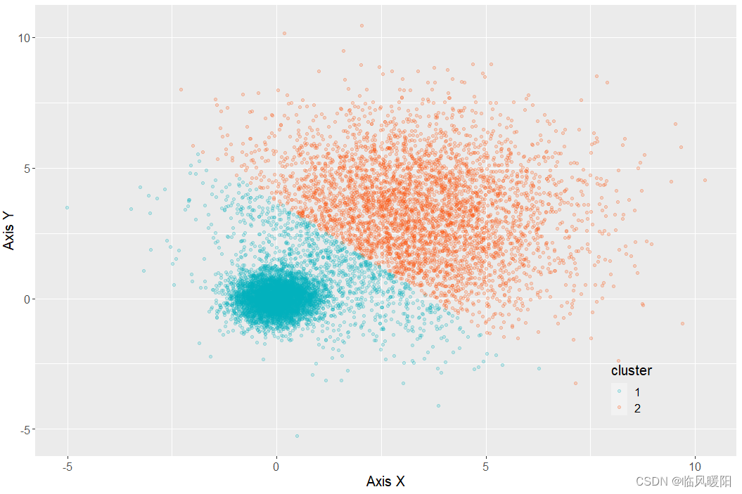
kmeansResult<- kmeans(mydata, 2, nstart = 20) mydata$cluster <- as.factor(kmeansResult$cluster) ggplot(data = mydata, aes(x,y,color=cluster)) + geom_point( alpha=0.2)+ scale_color_manual(values=c("#00AFBB", "#FC4E07"))+ labs(x = "Axis X",y="Axis Y")+ theme( text=element_text(size=15,color="black"), plot.title=element_text(size=15,family="myfont",face="bold.italic",color="black"), legend.background=element_blank(), legend.position=c(0.85,0.15) )- 1
- 2
- 3
- 4
- 5
- 6
- 7
- 8
- 9
- 10
- 11
- 12
- 13
- 14
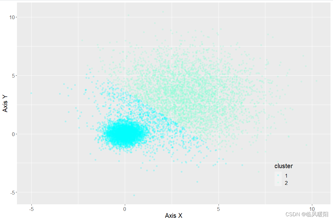
kmeansResult<- kmeans(mydata, 2, nstart = 20) mydata$cluster <- as.factor(kmeansResult$cluster) ggplot(data = mydata, aes(x,y,color=cluster)) + geom_point( alpha=0.2)+ scale_color_manual(values=c("#00FFFF", "#7FFFD4"))+ labs(x = "Axis X",y="Axis Y")+ theme( text=element_text(size=15,color="black"), plot.title=element_text(size=15,family="myfont",face="bold.italic",color="black"), legend.background=element_blank(), legend.position=c(0.85,0.15) )- 1
- 2
- 3
- 4
- 5
- 6
- 7
- 8
- 9
- 10
- 11
- 12
- 13
- 14
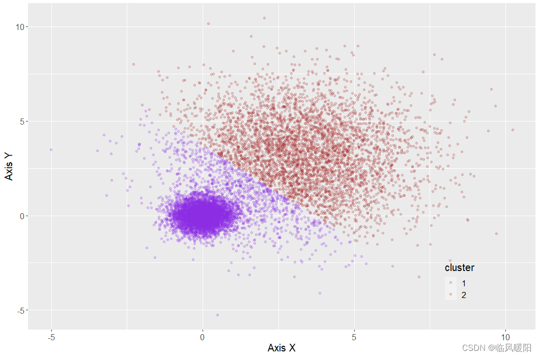
kmeansResult<- kmeans(mydata, 2, nstart = 20) mydata$cluster <- as.factor(kmeansResult$cluster) ggplot(data = mydata, aes(x,y,color=cluster)) + geom_point( alpha=0.2)+ scale_color_manual(values=c("#8A2BE2", "#A52A2A"))+ labs(x = "Axis X",y="Axis Y")+ theme( text=element_text(size=15,color="black"), plot.title=element_text(size=15,family="myfont",face="bold.italic",color="black"), legend.background=element_blank(), legend.position=c(0.85,0.15) )- 1
- 2
- 3
- 4
- 5
- 6
- 7
- 8
- 9
- 10
- 11
- 12
- 13
- 14
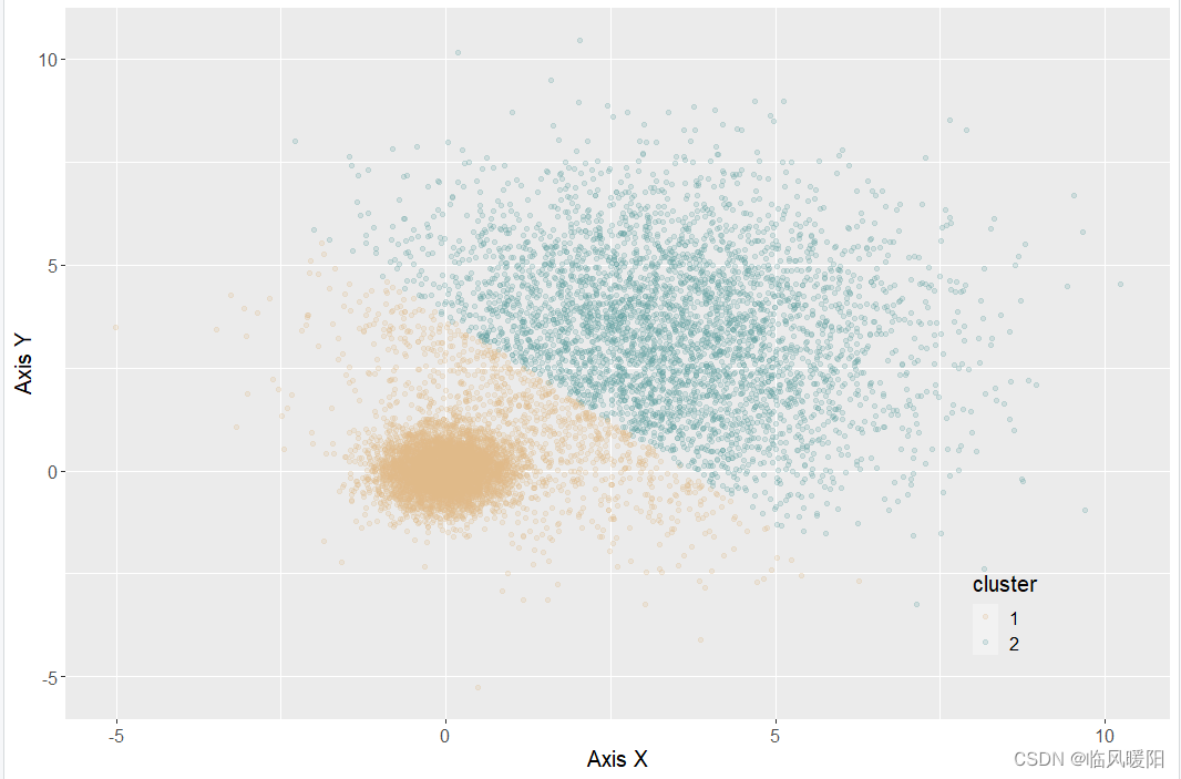
kmeansResult<- kmeans(mydata, 2, nstart = 20) mydata$cluster <- as.factor(kmeansResult$cluster) ggplot(data = mydata, aes(x,y,color=cluster)) + geom_point( alpha=0.2)+ scale_color_manual(values=c("#DEB887", "#5F9EA0"))+ labs(x = "Axis X",y="Axis Y")+ theme( text=element_text(size=15,color="black"), plot.title=element_text(size=15,family="myfont",face="bold.italic",color="black"), legend.background=element_blank(), legend.position=c(0.85,0.15) )- 1
- 2
- 3
- 4
- 5
- 6
- 7
- 8
- 9
- 10
- 11
- 12
- 13
- 14
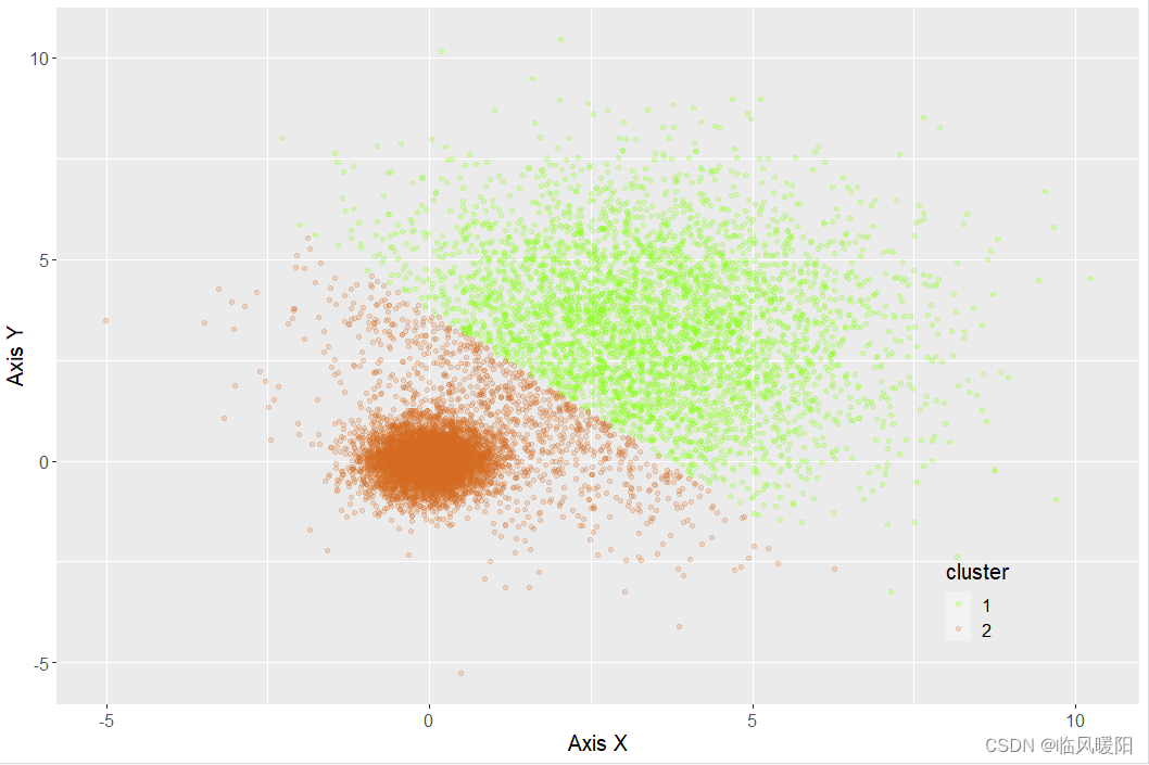
kmeansResult<- kmeans(mydata, 2, nstart = 20) mydata$cluster <- as.factor(kmeansResult$cluster) ggplot(data = mydata, aes(x,y,color=cluster)) + geom_point( alpha=0.2)+ scale_color_manual(values=c("#7FFF00", "#D2691E"))+ labs(x = "Axis X",y="Axis Y")+ theme( text=element_text(size=15,color="black"), plot.title=element_text(size=15,family="myfont",face="bold.italic",color="black"), legend.background=element_blank(), legend.position=c(0.85,0.15) )- 1
- 2
- 3
- 4
- 5
- 6
- 7
- 8
- 9
- 10
- 11
- 12
- 13
- 14
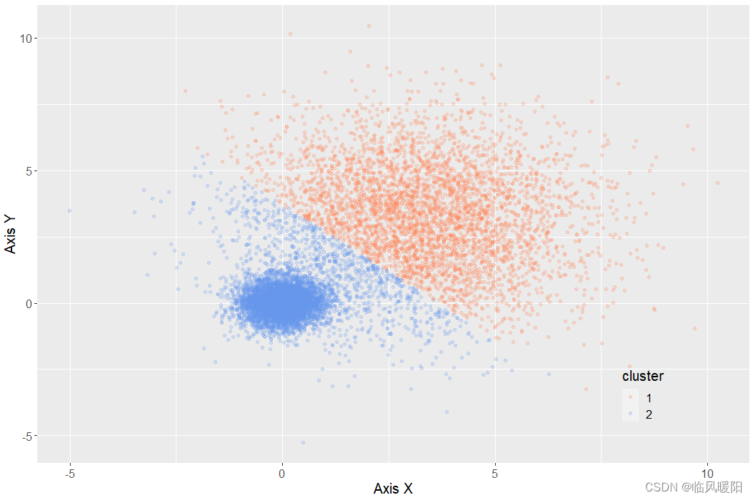
kmeansResult<- kmeans(mydata, 2, nstart = 20) mydata$cluster <- as.factor(kmeansResult$cluster) ggplot(data = mydata, aes(x,y,color=cluster)) + geom_point( alpha=0.2)+ scale_color_manual(values=c("#FF7F50", "#6495ED"))+ labs(x = "Axis X",y="Axis Y")+ theme( text=element_text(size=15,color="black"), plot.title=element_text(size=15,family="myfont",face="bold.italic",color="black"), legend.background=element_blank(), legend.position=c(0.85,0.15) )- 1
- 2
- 3
- 4
- 5
- 6
- 7
- 8
- 9
- 10
- 11
- 12
- 13
- 14
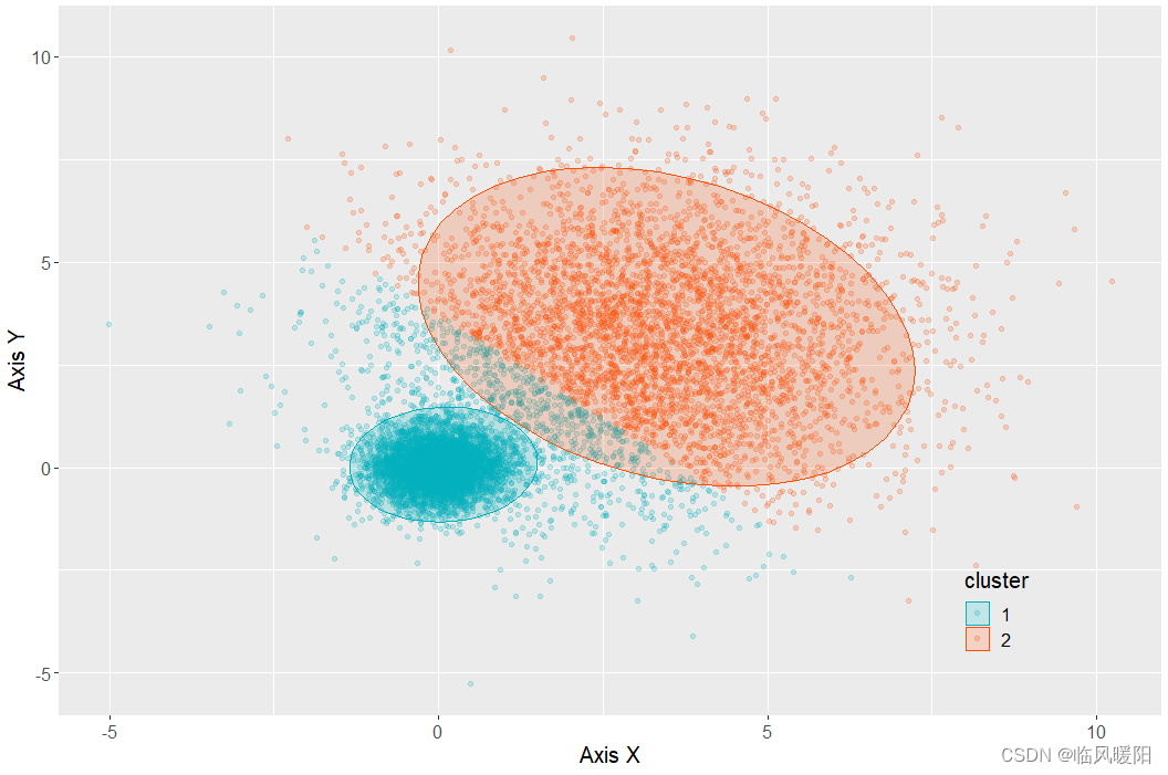
ggplot(data = mydata, aes(x,y,color=cluster)) + geom_point (alpha=0.2)+ # 绘制透明度为0.2 的散点图 stat_ellipse(aes(x=x,y=y,fill= cluster), geom="polygon", level=0.95, alpha=0.2) + #绘制椭圆标定不同类别,如果省略该语句,则绘制图3-1-7(c) scale_color_manual(values=c("#00AFBB","#FC4E07")) +#使用不同颜色标定不同数据类别 scale_fill_manual(values=c("#00AFBB","#FC4E07"))+ #使用不同颜色标定不同椭类别 labs(x = "Axis X",y="Axis Y")+ theme( text=element_text(size=15,color="black"), plot.title=element_text(size=15,family="myfont",face="bold.italic",color="black"), legend.background=element_blank(), legend.position=c(0.85,0.15) )- 1
- 2
- 3
- 4
- 5
- 6
- 7
- 8
- 9
- 10
- 11
- 12
- 13
- 14
开发工具:RStudio与微信Alt+A截屏工具
-
相关阅读:
基本Dos命令
【计算机网络】 7、websocket 概念、sdk、实现
01BFS最短距离的原理和C++实现
QML自定义TabView样式
Dcoker入门,小白也学得懂!
什么是AJAX?如何使用原生JavaScript进行AJAX请求?
Vue学习:el 与data的两种写法
62. 不同路径-动态规划-双百代码
如何修改jupyter notebook默认打开路径
Java 第三阶段增强分析需求,代码实现能力【JDBC】
- 原文地址:https://blog.csdn.net/m0_38127487/article/details/127971127