-
CSS进阶语法
CSS进阶语法
文章目录
1.选择器进阶
1.1 复合选择器
复合选择器分为:后代选择器和子代选择器

DOCTYPE html> <html lang="en"> <head> <meta charset="UTF-8"> <meta http-equiv="X-UA-Compatible" content="IE=edge"> <meta name="viewport" content="width=device-width, initial-scale=1.0"> <title>Documenttitle> <style> /* 找到div的儿子p设置文字颜色是红色 */ /* 父选择器 子选择器{} */ div p{ color: red; } style> head> <body> <p>这是一个p标签p> <div> <p>这是div的儿子pp> div> body> html>- 1
- 2
- 3
- 4
- 5
- 6
- 7
- 8
- 9
- 10
- 11
- 12
- 13
- 14
- 15
- 16
- 17
- 18
- 19
- 20
- 21
- 22
- 23
- 24


DOCTYPE html> <html lang="en"> <head> <meta charset="UTF-8"> <meta http-equiv="X-UA-Compatible" content="IE=edge"> <meta name="viewport" content="width=device-width, initial-scale=1.0"> <title>Documenttitle> <style> div>a{ color: red; } style> head> <body> <div> 父级 <a href="#">这是div里面的aa> <p> <a href="#">这是div里面p里面aa> p> div> body> html>- 1
- 2
- 3
- 4
- 5
- 6
- 7
- 8
- 9
- 10
- 11
- 12
- 13
- 14
- 15
- 16
- 17
- 18
- 19
- 20
- 21
- 22
- 23
- 24

1.2 并集选择器
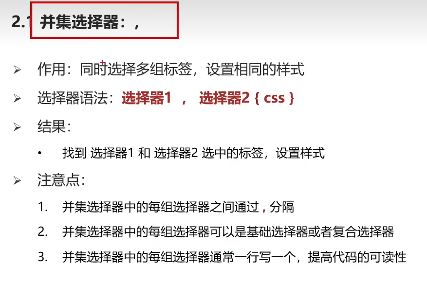
DOCTYPE html> <html lang="en"> <head> <meta charset="UTF-8"> <meta http-equiv="X-UA-Compatible" content="IE=edge"> <meta name="viewport" content="width=device-width, initial-scale=1.0"> <title>Documenttitle> <style> /* p div span h1 文字颜色为红色 */ /* 选择器1,选择器2{} */ p,div,span,h1{ color:red; } style> head> <body> <p>p标签p> <div>div标签div> <span>span标签span> <h1>h1标签h1> <h2>h2标签h2> body> html>- 1
- 2
- 3
- 4
- 5
- 6
- 7
- 8
- 9
- 10
- 11
- 12
- 13
- 14
- 15
- 16
- 17
- 18
- 19
- 20
- 21
- 22
- 23
- 24

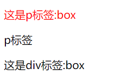
1.3 交集选择器

DOCTYPE html> <html lang="en"> <head> <meta charset="UTF-8"> <meta http-equiv="X-UA-Compatible" content="IE=edge"> <meta name="viewport" content="width=device-width, initial-scale=1.0"> <title>Documenttitle> <style> p.box{ color: red; } style> head> <body> <p class="box">这是p标签:boxp> <p>p标签p> <div class="box">这是div标签:boxdiv> body> html>- 1
- 2
- 3
- 4
- 5
- 6
- 7
- 8
- 9
- 10
- 11
- 12
- 13
- 14
- 15
- 16
- 17
- 18
- 19
- 20
- 21
1.4 hover伪类选择器

DOCTYPE html> <html lang="en"> <head> <meta charset="UTF-8"> <meta http-equiv="X-UA-Compatible" content="IE=edge"> <meta name="viewport" content="width=device-width, initial-scale=1.0"> <title>Documenttitle> <style> /* 鼠标悬停到文字,字体为红色背景为蓝色 */ a:hover{ color:red; background-color: blue; } /* 鼠标悬停到div时,div为绿色背景 */ div:hover{ background-color: green; } style> head> <body> <a href="#">这是超链接a> <div>div标签div> body> html>- 1
- 2
- 3
- 4
- 5
- 6
- 7
- 8
- 9
- 10
- 11
- 12
- 13
- 14
- 15
- 16
- 17
- 18
- 19
- 20
- 21
- 22
- 23
- 24
- 25
- 26
- 27

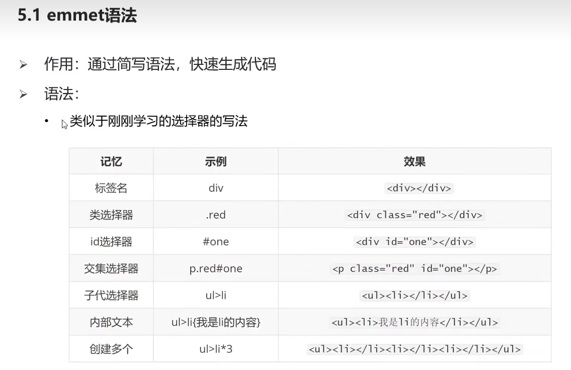
扩展:Emmet语法
2.背景属性进阶
2.1 背景颜色(background-color)
三种背景色格式:
- background-color:red
- background-color:#ccc
- background-color:rgba(0,0,0,0.5) //红色蓝三原色,a是透明度0-1
2.2 背景图片插入(background-image)

DOCTYPE html> <html lang="en"> <head> <meta charset="UTF-8"> <meta http-equiv="X-UA-Compatible" content="IE=edge"> <meta name="viewport" content="width=device-width, initial-scale=1.0"> <title>Documenttitle> <style> div{ width: 400px; height: 400px; background-color: pink; background-image: url(./1.png); /* 这里一定要加./来定位当前文件夹否则图片显示不出来 */ } style> head> <body> <div>背景div> body> html>- 1
- 2
- 3
- 4
- 5
- 6
- 7
- 8
- 9
- 10
- 11
- 12
- 13
- 14
- 15
- 16
- 17
- 18
- 19
- 20
- 21

2.3 背景图片平铺(background-repeat)
DOCTYPE html> <html lang="en"> <head> <meta charset="UTF-8"> <meta http-equiv="X-UA-Compatible" content="IE=edge"> <meta name="viewport" content="width=device-width, initial-scale=1.0"> <title>Documenttitle> <style> div{ width: 400px; height: 400px; background-color: pink; background-image: url(./1.png); /* 平铺图片 */ /* background-repeat: repeat; */ /* 不平铺图片 */ background-repeat: no-repeat; /* x轴平铺图片 */ /* background-repeat: repeat-x; */ /* y轴平铺图片 */ /* background-repeat: repeat-y; */ } style> head> <body> <div>背景div> body> html>- 1
- 2
- 3
- 4
- 5
- 6
- 7
- 8
- 9
- 10
- 11
- 12
- 13
- 14
- 15
- 16
- 17
- 18
- 19
- 20
- 21
- 22
- 23
- 24
- 25
- 26
- 27
- 28

2.4 背景图片位置(background-position)

DOCTYPE html> <html lang="en"> <head> <meta charset="UTF-8"> <meta http-equiv="X-UA-Compatible" content="IE=edge"> <meta name="viewport" content="width=device-width, initial-scale=1.0"> <title>Documenttitle> <style> div{ width: 400px; height: 400px; background-color: pink; background-image: url(./1.png); background-repeat: no-repeat; /* background-position: 0 0; */ /* background-position: right 0; */ /* background-position: right bottom; */ /* background-position: center center; */ /* background-position: center; */ /* background-position: 50px 0; */ /* background-position: 50px 100px; */ background-position: -50px -100px; } style> head> <body> <div>背景div> body> html>- 1
- 2
- 3
- 4
- 5
- 6
- 7
- 8
- 9
- 10
- 11
- 12
- 13
- 14
- 15
- 16
- 17
- 18
- 19
- 20
- 21
- 22
- 23
- 24
- 25
- 26
- 27
- 28
- 29

2.5 背景相关属性连写(background)

DOCTYPE html> <html lang="en"> <head> <meta charset="UTF-8"> <meta http-equiv="X-UA-Compatible" content="IE=edge"> <meta name="viewport" content="width=device-width, initial-scale=1.0"> <title>Documenttitle> <style> div{ /* background属性连写:背景色、背景图、背景图平铺不分先后顺序 */ width: 400px; height: 400px; background: pink url(./1.png) no-repeat center bottom; /* 背景图位置如果是英文单词可以颠倒位置 */ /* background: pink url(./1.png) no-repeat bottom center; */ /* 测试背景图位置如果是数值 */ /* 水平50px 垂直100px */ background: pink url(./1.png) no-repeat 50px 100px; background: pink url(./1.png) no-repeat 100px 50px; /* 结论: 不能颠倒,改了位置会改变 */ } style> head> <body> <div>背景div> body> html>- 1
- 2
- 3
- 4
- 5
- 6
- 7
- 8
- 9
- 10
- 11
- 12
- 13
- 14
- 15
- 16
- 17
- 18
- 19
- 20
- 21
- 22
- 23
- 24
- 25
- 26
- 27
- 28

2.6 背景图与img图片的区别

3.元素显示模式进阶
1.块级元素

2.行内元素

3.行内块元素

4.显示模式的转换


4.CSS三大特性:继承性、层叠性、优先级


5.盒子模型(padding、border、margin)
5.1 盒子模型的组成


DOCTYPE html> <html lang="en"> <head> <meta charset="UTF-8"> <meta http-equiv="X-UA-Compatible" content="IE=edge"> <meta name="viewport" content="width=device-width, initial-scale=1.0"> <title>Documenttitle> <style> div{ width: 200px; height: 300px; background-color: pink; /* 边框线 solid实线属性 */ border: 1px solid #000; /* 内边距:出现在内容和盒子边缘之间 */ padding: 20px; /* 外边距:两个盒子之间,出现在盒子外面 */ margin: 50px; } style> head> <body> <div>背景1div> <div>背景2div> body> html>- 1
- 2
- 3
- 4
- 5
- 6
- 7
- 8
- 9
- 10
- 11
- 12
- 13
- 14
- 15
- 16
- 17
- 18
- 19
- 20
- 21
- 22
- 23
- 24
- 25
- 26

5.2 盒子模型内容的宽度和高度

5.3 盒子模型边框


5.4 标准盒子模型大小计算
- 盒子内容的宽度:width+(border+padding)x2
- 盒子内容的长度:height+(border+padding)x2

5.5 盒模型(自动内减)

DOCTYPE html> <html lang="en"> <head> <meta charset="UTF-8"> <meta http-equiv="X-UA-Compatible" content="IE=edge"> <meta name="viewport" content="width=device-width, initial-scale=1.0"> <title>Documenttitle> <style> div{ width: 100px; height: 100px; background-color: pink; /* 边框线 */ border: 10px solid #000; /* 内边距:出现在内容和盒子边缘之间 */ padding: 20px; /* 变成CSS3的盒模型,好处:加了border和padding不需要手动减法 */ box-sizing: border-box; } style> head> <body> <div>背景1div> <div>背景2div> body> html>- 1
- 2
- 3
- 4
- 5
- 6
- 7
- 8
- 9
- 10
- 11
- 12
- 13
- 14
- 15
- 16
- 17
- 18
- 19
- 20
- 21
- 22
- 23
- 24
- 25
- 26

5.6 清除盒模型默认的内外边距

5.7 扩展:外边距合并现象、塌陷现象

DOCTYPE html> <html lang="en"> <head> <meta charset="UTF-8"> <meta http-equiv="X-UA-Compatible" content="IE=edge"> <meta name="viewport" content="width=device-width, initial-scale=1.0"> <title>Documenttitle> <style> div{ width: 100px; height: 100px; background-color: pink; } .one{ margin-bottom: 60px; } .two{ margin-top: 40px; } style> head> <body> <div class="one">背景1div> <div class="two">背景2div> body> html>- 1
- 2
- 3
- 4
- 5
- 6
- 7
- 8
- 9
- 10
- 11
- 12
- 13
- 14
- 15
- 16
- 17
- 18
- 19
- 20
- 21
- 22
- 23
- 24
- 25
- 26


DOCTYPE html> <html lang="en"> <head> <meta charset="UTF-8"> <meta http-equiv="X-UA-Compatible" content="IE=edge"> <meta name="viewport" content="width=device-width, initial-scale=1.0"> <title>Documenttitle> <style> .fater{ width: 300px; height: 300px; background-color: pink; } .son{ width: 100px; height: 100px; background-color: skyblue; margin-top: 50px; } style> head> <body> <div class="fater"> <div class="son">背景1div> div> body> html>- 1
- 2
- 3
- 4
- 5
- 6
- 7
- 8
- 9
- 10
- 11
- 12
- 13
- 14
- 15
- 16
- 17
- 18
- 19
- 20
- 21
- 22
- 23
- 24
- 25
- 26
- 27

6.CSS浮动
6.1 结构伪类选择器


DOCTYPE html> <html lang="en"> <head> <meta charset="UTF-8"> <meta http-equiv="X-UA-Compatible" content="IE=edge"> <meta name="viewport" content="width=device-width, initial-scale=1.0"> <title>Documenttitle> <style> li:first-child{ background-color: green; } li:last-child{ background-color: red; } style> head> <body> <ul> <li>第一个孩子li> <li>第二个孩子li> <li>第三个孩子li> <li>第四个孩子li> ul> body> html>- 1
- 2
- 3
- 4
- 5
- 6
- 7
- 8
- 9
- 10
- 11
- 12
- 13
- 14
- 15
- 16
- 17
- 18
- 19
- 20
- 21
- 22
- 23
- 24
- 25

6.2 伪元素

DOCTYPE html> <html lang="en"> <head> <meta charset="UTF-8"> <meta http-equiv="X-UA-Compatible" content="IE=edge"> <meta name="viewport" content="width=device-width, initial-scale=1.0"> <title>Documenttitle> <style> .father{ width: 300px; height: 300px; background-color: pink; } .father::before{ content: '老鼠'; } .father::after{ content: '大米'; } style> head> <body> <div class="father">爱div> body> html>- 1
- 2
- 3
- 4
- 5
- 6
- 7
- 8
- 9
- 10
- 11
- 12
- 13
- 14
- 15
- 16
- 17
- 18
- 19
- 20
- 21
- 22
- 23
- 24
- 25

6.3 浮动的作用与特点

DOCTYPE html> <html lang="en"> <head> <meta charset="UTF-8"> <meta http-equiv="X-UA-Compatible" content="IE=edge"> <meta name="viewport" content="width=device-width, initial-scale=1.0"> <title>Documenttitle> <style> /* 现在的作用 */ div{ width: 100px; height: 100px; } /* 两个都加了float:left,放下面的块放在上面来了 */ .one{ background-color: pink; float: left; } .two{ background-color: skyblue; float: left; } style> head> <body> <div class="one">onediv> <div class="two">twodiv> body> html>- 1
- 2
- 3
- 4
- 5
- 6
- 7
- 8
- 9
- 10
- 11
- 12
- 13
- 14
- 15
- 16
- 17
- 18
- 19
- 20
- 21
- 22
- 23
- 24
- 25
- 26
- 27
- 28
- 29

浮动的特点:
1.原代码(不加浮动)
DOCTYPE html> <html lang="en"> <head> <meta charset="UTF-8"> <meta http-equiv="X-UA-Compatible" content="IE=edge"> <meta name="viewport" content="width=device-width, initial-scale=1.0"> <title>Documenttitle> <style> .one{ width: 100px; height: 100px; background-color: pink; } .two{ width: 200px; height: 200px; background-color: skyblue; } .three{ width: 300px; height: 300px; background-color: orange; } style> head> <body> <div class="one">onediv> <div class="two">twodiv> <div class="three">threediv> body> html>- 1
- 2
- 3
- 4
- 5
- 6
- 7
- 8
- 9
- 10
- 11
- 12
- 13
- 14
- 15
- 16
- 17
- 18
- 19
- 20
- 21
- 22
- 23
- 24
- 25
- 26
- 27
- 28
- 29
- 30
- 31

- 情况一:one加入,float:left

- 情况二:one、two加入,float:left

浮动特点结论:

7.清除浮动

7.1 清除浮动的方法(额外标签、单伪标签、双伪标签、overflow)
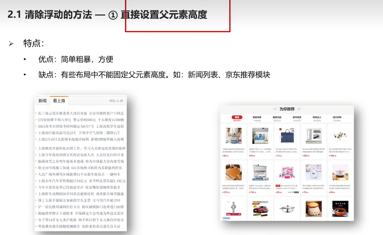
1.额外标签法
DOCTYPE html> <html lang="en"> <head> <meta charset="UTF-8"> <meta http-equiv="X-UA-Compatible" content="IE=edge"> <meta name="viewport" content="width=device-width, initial-scale=1.0"> <title>Documenttitle> <style> .top{ margin: 0 auto; width: 1000px; background-color: pink; } .bottom{ height: 100px; background-color: green; } .left{ float: left; width: 200px; height: 300px; background-color: #ccc; } .right{ float: right; width: 790px; height: 300px; background-color: skyblue; } .clearfix{ /* 清除左右两侧浮动的影响 */ clear:both; } style> head> <body> <div class="top"> <div class="left">div> <div class="right">div> <div class="clearfix">div> div> <div class="bottom">div> body> html>- 1
- 2
- 3
- 4
- 5
- 6
- 7
- 8
- 9
- 10
- 11
- 12
- 13
- 14
- 15
- 16
- 17
- 18
- 19
- 20
- 21
- 22
- 23
- 24
- 25
- 26
- 27
- 28
- 29
- 30
- 31
- 32
- 33
- 34
- 35
- 36
- 37
- 38
- 39
- 40
- 41
- 42
- 43
- 44
- 45

2.单伪元素清除法

每个项目基本都需要去除浮动,这个代码不需要记住,每次复制进去就行,代码不会改变
DOCTYPE html> <html lang="en"> <head> <meta charset="UTF-8"> <meta http-equiv="X-UA-Compatible" content="IE=edge"> <meta name="viewport" content="width=device-width, initial-scale=1.0"> <title>Documenttitle> <style> .top{ margin: 0 auto; width: 1000px; background-color: pink; } .bottom{ height: 100px; background-color: green; } .left{ float: left; width: 200px; height: 300px; background-color: #ccc; } .right{ float: right; width: 790px; height: 300px; background-color: skyblue; } .clearfix::after{ content: ''; display: block; clear: both; } style> head> <body> <div class="top clearfix"> <div class="left">div> <div class="right">div> div> <div class="bottom">div> body> html>- 1
- 2
- 3
- 4
- 5
- 6
- 7
- 8
- 9
- 10
- 11
- 12
- 13
- 14
- 15
- 16
- 17
- 18
- 19
- 20
- 21
- 22
- 23
- 24
- 25
- 26
- 27
- 28
- 29
- 30
- 31
- 32
- 33
- 34
- 35
- 36
- 37
- 38
- 39
- 40
- 41
- 42
- 43
- 44
- 45
3.双伪元素清除法

DOCTYPE html> <html lang="en"> <head> <meta charset="UTF-8"> <meta http-equiv="X-UA-Compatible" content="IE=edge"> <meta name="viewport" content="width=device-width, initial-scale=1.0"> <title>Documenttitle> <style> .top{ margin: 0 auto; width: 1000px; background-color: pink; } .bottom{ height: 100px; background-color: green; } .left{ float: left; width: 200px; height: 300px; background-color: #ccc; } .right{ float: right; width: 790px; height: 300px; background-color: skyblue; } /* .clearfix::before 作用:解决外边距塌陷问题 */ /* 外边距塌陷:父子标签,都是块级,子级加margin会影响父级的位置 */ /* 清除浮动 */ .clearfix::before, .clearfix::after{ content: ''; display: table; } /* 真正清除浮动的标签 */ .clearfix::after{ clear: both; } style> head> <body> <div class="top clearfix"> <div class="left">div> <div class="right">div> div> <div class="bottom">div> body> html>- 1
- 2
- 3
- 4
- 5
- 6
- 7
- 8
- 9
- 10
- 11
- 12
- 13
- 14
- 15
- 16
- 17
- 18
- 19
- 20
- 21
- 22
- 23
- 24
- 25
- 26
- 27
- 28
- 29
- 30
- 31
- 32
- 33
- 34
- 35
- 36
- 37
- 38
- 39
- 40
- 41
- 42
- 43
- 44
- 45
- 46
- 47
- 48
- 49
- 50
- 51
- 52
4.overflow清除浮动法

DOCTYPE html> <html lang="en"> <head> <meta charset="UTF-8"> <meta http-equiv="X-UA-Compatible" content="IE=edge"> <meta name="viewport" content="width=device-width, initial-scale=1.0"> <title>Documenttitle> <style> .top{ margin: 0 auto; width: 1000px; background-color: pink; overflow: hidden; } .bottom{ height: 100px; background-color: green; } .left{ float: left; width: 200px; height: 300px; background-color: #ccc; } .right{ float: right; width: 790px; height: 300px; background-color: skyblue; } style> head> <body> <div class="top"> <div class="left">div> <div class="right">div> div> <div class="bottom">div> body> html>- 1
- 2
- 3
- 4
- 5
- 6
- 7
- 8
- 9
- 10
- 11
- 12
- 13
- 14
- 15
- 16
- 17
- 18
- 19
- 20
- 21
- 22
- 23
- 24
- 25
- 26
- 27
- 28
- 29
- 30
- 31
- 32
- 33
- 34
- 35
- 36
- 37
- 38
- 39
- 40
- 41
8.CSS定位装饰
8.1 使用定位的步骤

8.2 相对定位

DOCTYPE html> <html lang="en"> <head> <meta charset="UTF-8"> <meta http-equiv="X-UA-Compatible" content="IE=edge"> <meta name="viewport" content="width=device-width, initial-scale=1.0"> <title>Documenttitle> <style> .box{ position: relative; left: 100px; top: 200px; /* 相对定位特点: */ /* 1.占有原来的位置 */ /* 2.仍然具有标签原来的显示模式特点 */ /* 3.改变位置参考自己原来的位置 */ width: 200px; height: 200px; background-color: pink; } style> head> <body> <p>测试定位测试定位测试定位测试定位测试定位测试定位测试定位测试定位测试定位p> <p>测试定位测试定位测试定位测试定位测试定位测试定位测试定位测试定位测试定位p> <p>测试定位测试定位测试定位测试定位测试定位测试定位测试定位测试定位测试定位p> <p>测试定位测试定位测试定位测试定位测试定位测试定位测试定位测试定位测试定位p> <div class="box">boxdiv> <p>测试定位测试定位测试定位测试定位测试定位测试定位测试定位测试定位测试定位p> <p>测试定位测试定位测试定位测试定位测试定位测试定位测试定位测试定位测试定位p> <p>测试定位测试定位测试定位测试定位测试定位测试定位测试定位测试定位测试定位p> <p>测试定位测试定位测试定位测试定位测试定位测试定位测试定位测试定位测试定位p> body> html>- 1
- 2
- 3
- 4
- 5
- 6
- 7
- 8
- 9
- 10
- 11
- 12
- 13
- 14
- 15
- 16
- 17
- 18
- 19
- 20
- 21
- 22
- 23
- 24
- 25
- 26
- 27
- 28
- 29
- 30
- 31
- 32
- 33
- 34

8.3 绝对定位

DOCTYPE html> <html lang="en"> <head> <meta charset="UTF-8"> <meta http-equiv="X-UA-Compatible" content="IE=edge"> <meta name="viewport" content="width=device-width, initial-scale=1.0"> <title>Documenttitle> <style> .box{ position: absolute; left: 0; top: 0; /* 绝对定位: */ /* 先找已经定位的父级,如果有这样的父级,则以这个父级为参照物定位 */ /* 有父级,但父级没有定位,以浏览器窗口为参照进行定位*/ /* 绝对定位特点 */ /* 1.脱标,不占为 */ /* 2.改变标签的显示模式特点:具备行内块特点(一行共存,宽高生效) */ width: 200px; height: 200px; background-color: pink; } style> head> <body> <p>测试定位测试定位测试定位测试定位测试定位测试定位测试定位测试定位测试定位p> <p>测试定位测试定位测试定位测试定位测试定位测试定位测试定位测试定位测试定位p> <p>测试定位测试定位测试定位测试定位测试定位测试定位测试定位测试定位测试定位p> <p>测试定位测试定位测试定位测试定位测试定位测试定位测试定位测试定位测试定位p> <div class="box">boxdiv> <p>测试定位测试定位测试定位测试定位测试定位测试定位测试定位测试定位测试定位p> <p>测试定位测试定位测试定位测试定位测试定位测试定位测试定位测试定位测试定位p> <p>测试定位测试定位测试定位测试定位测试定位测试定位测试定位测试定位测试定位p> <p>测试定位测试定位测试定位测试定位测试定位测试定位测试定位测试定位测试定位p> body> html>- 1
- 2
- 3
- 4
- 5
- 6
- 7
- 8
- 9
- 10
- 11
- 12
- 13
- 14
- 15
- 16
- 17
- 18
- 19
- 20
- 21
- 22
- 23
- 24
- 25
- 26
- 27
- 28
- 29
- 30
- 31
- 32
- 33
- 34
- 35
- 36

8.4 定位居中
DOCTYPE html> <html lang="en"> <head> <meta charset="UTF-8"> <meta http-equiv="X-UA-Compatible" content="IE=edge"> <meta name="viewport" content="width=device-width, initial-scale=1.0"> <title>Documenttitle> <style> .box{ /* 1.绝对定位的盒子不能使用左右margin auto居中 */ /* margin: 0 auto */ /* left:50%,整个盒子移动到浏览器中间偏右的位置 */ position: absolute; left: 50%; /* 把盒子向左移动:自己宽度的一半 */ margin-left: -150px; top: 50%; margin-top: -150px; width: 300px; height: 300px; background-color: pink; } style> head> <body> <div class="box">boxdiv> body> html>- 1
- 2
- 3
- 4
- 5
- 6
- 7
- 8
- 9
- 10
- 11
- 12
- 13
- 14
- 15
- 16
- 17
- 18
- 19
- 20
- 21
- 22
- 23
- 24
- 25
- 26
- 27
- 28

8.5 位移居中
DOCTYPE html> <html lang="en"> <head> <meta charset="UTF-8"> <meta http-equiv="X-UA-Compatible" content="IE=edge"> <meta name="viewport" content="width=device-width, initial-scale=1.0"> <title>Documenttitle> <style> .box{ /* 1.绝对定位的盒子不能使用左右margin auto居中 */ /* margin: 0 auto */ /* left:50%,整个盒子移动到浏览器中间偏右的位置 */ position: absolute; left: 50%; top: 50%; /* 位移:自己宽度高度的一半 */ transform: translate(-50%,-50%); width: 300px; height: 300px; background-color: pink; } style> head> <body> <div class="box">boxdiv> body> html>- 1
- 2
- 3
- 4
- 5
- 6
- 7
- 8
- 9
- 10
- 11
- 12
- 13
- 14
- 15
- 16
- 17
- 18
- 19
- 20
- 21
- 22
- 23
- 24
- 25
- 26
- 27

8.6 固定定位

DOCTYPE html> <html lang="en"> <head> <meta charset="UTF-8"> <meta http-equiv="X-UA-Compatible" content="IE=edge"> <meta name="viewport" content="width=device-width, initial-scale=1.0"> <title>Documenttitle> <style> .box{ /* 固定定位特点: */ /* 1.脱标,不占位置 */ /* 2.改变位置参考浏览器窗口 */ /* 3.具备行内块特点 */ position: fixed; left: 0; top: 0; width: 200px; height: 200px; background-color: pink; } style> head> <body> <p>测试定位测试定位测试定位测试定位测试定位测试定位测试定位测试定位测试定位p> <p>测试定位测试定位测试定位测试定位测试定位测试定位测试定位测试定位测试定位p> <p>测试定位测试定位测试定位测试定位测试定位测试定位测试定位测试定位测试定位p> <p>测试定位测试定位测试定位测试定位测试定位测试定位测试定位测试定位测试定位p> <div class="box">boxdiv> <p>测试定位测试定位测试定位测试定位测试定位测试定位测试定位测试定位测试定位p> <p>测试定位测试定位测试定位测试定位测试定位测试定位测试定位测试定位测试定位p> <p>测试定位测试定位测试定位测试定位测试定位测试定位测试定位测试定位测试定位p> <p>测试定位测试定位测试定位测试定位测试定位测试定位测试定位测试定位测试定位p> body> html>- 1
- 2
- 3
- 4
- 5
- 6
- 7
- 8
- 9
- 10
- 11
- 12
- 13
- 14
- 15
- 16
- 17
- 18
- 19
- 20
- 21
- 22
- 23
- 24
- 25
- 26
- 27
- 28
- 29
- 30
- 31
- 32
- 33
- 34

8.7 元素的层级关系

DOCTYPE html> <html lang="en"> <head> <meta charset="UTF-8"> <meta http-equiv="X-UA-Compatible" content="IE=edge"> <meta name="viewport" content="width=device-width, initial-scale=1.0"> <title>Documenttitle> <style> div{ width: 200px; height: 200px; } .one{ position: absolute; left: 20px; top: 50px; z-index: 1000; background-color: pink; } .two{ position: absolute; left: 50px; top: 100px; background-color: skyblue; z-index: 999; } /* 默认情况下,定位的盒子,后来者居上 */ /* z-index:整数,取值越大,显示顺序越靠上,z-index的默认值是0 */ /* z-index必须配合定位才能有用 */ style> head> <body> <div class="one">onediv> <div class="two">twodiv> body> html>- 1
- 2
- 3
- 4
- 5
- 6
- 7
- 8
- 9
- 10
- 11
- 12
- 13
- 14
- 15
- 16
- 17
- 18
- 19
- 20
- 21
- 22
- 23
- 24
- 25
- 26
- 27
- 28
- 29
- 30
- 31
- 32
- 33
- 34
- 35
- 36

9.CSS特殊定位装饰
9.1 垂直对齐方式

9.2 光标类型

9.3 圆角边框


9.4 溢出显示效果

9.5 元素显示隐藏

9.6 元素整体透明度

-
相关阅读:
SpreadsheetGear Version 9 Reail Crack
图详解第六篇:多源最短路径--Floyd-Warshall算法(完结篇)
python3教程:用concurrent执行多进程任务的方法
免费,C++蓝桥杯等级考试真题--第7级(含答案解析和代码)
DOM基础应用
以太网UDP数据回环实验
UbuntuToGo | Ubuntu 22.04.6 VMware UEFI启动 VHD虚拟磁盘
refseq数据库的特点_eureka如何剔除服务
Redis 集群搭建教程
【Java实战】创建第一个Springboot项目Hello world
- 原文地址:https://blog.csdn.net/qq_29678157/article/details/127895173
