-
时序分析 47 -- 时序数据转为空间数据 (六) 马尔可夫转换场 python 实践(中)
时序分析 47 时序数据转为空间数据 (六)
马尔可夫转换场 python 实践(中)
…接上
Step 6. MTF聚合压缩
正如理论部分所讨论的,我们为了可视化效果或者计算效率经常需要对MTF图像进行聚合压缩。详细信息请参见理论部分马尔可夫转换场。
image_size = 48 window_size, remainder = divmod(n_timestamps, image_size) X_amtf = np.reshape( X_mtf, (image_size, window_size, image_size, window_size) ).mean(axis=(1,3))- 1
- 2
- 3
- 4
- 5
另外我们也可采用分段聚合近似法(piecewise aggregation approximation),pyts包中已经为我们实现了这种算法。
fig = plt.figure(figsize=(5,4)) ax = fig.add_subplot(1,1,1) _, mappable_image = tsia.plot.plot_markov_transition_field(mtf=X_amtf, ax=ax, reversed_cmap=True) plt.colorbar(mappable_image);- 1
- 2
- 3
- 4

Step 7. 提取一些有趣的信息和指标
_=tsia.plot.plot_mtf_metrics(X_amtf)- 1

MTF的对角线表示bin值或者状态的自转换概率。我们可以通过上图看一下自转换概率的分布和其均值、标准差等。另外一个对角线比较难以解释,但可以通过图像给我们一些直观感觉。Step 8. 转换概率映射回原始信号
mtf_map = tsia.markov.get_mtf_map( tag_df, X_amtf, reversed_cmap=True ) tsia.plot.plot_colored_timeseries(tag_df, mtf_map)- 1
- 2
- 3
- 4

def plot_colored_timeseries(tag, image_size=96, colormap='jet'): # Loads the signal from disk: tag_df = pd.read_csv( f'{tag}.csv') tag_df['timestamp'] = pd.to_datetime(tag_df['timestamp'], format='%Y-%m-%dT%H:%M:%S.%f') tag_df = tag_df.set_index('timestamp') # Build the MTF for this signal: X = tag_df.values.reshape(1, -1) mtf = MarkovTransitionField(image_size=image_size, n_bins=n_bins, strategy=strategy) tag_mtf = mtf.fit_transform(X) # Initializing figure: fig = plt.figure(figsize=(28, 4)) gs = gridspec.GridSpec(1, 2, width_ratios=[1,4]) # Plotting MTF: ax = fig.add_subplot(gs[0]) ax.set_title('Markov transition field') _, mappable_image = tsia.plot.plot_markov_transition_field(mtf=tag_mtf[0], ax=ax, reversed_cmap=True) plt.colorbar(mappable_image) # Plotting signal: ax = fig.add_subplot(gs[1]) ax.set_title(f'Signal timeseries for tag {tag}') mtf_map = tsia.markov.get_mtf_map(tag_df, tag_mtf[0], reversed_cmap=True, step_size=0) _ = tsia.plot.plot_colored_timeseries(tag_df, mtf_map, ax=ax) return tag_mtf- 1
- 2
- 3
- 4
- 5
- 6
- 7
- 8
- 9
- 10
- 11
- 12
- 13
- 14
- 15
- 16
- 17
- 18
- 19
- 20
- 21
- 22
- 23
- 24
- 25
- 26
- 27
- 28
我们使用窗口8、把粒度放粗来观察一下。
stats = [] mtf = plot_colored_timeseries('signal-1', image_size=8) s = tsia.markov.compute_mtf_statistics(mtf[0]) s.update({'Signal': 'signal-1'}) stats.append(s)- 1
- 2
- 3
- 4
- 5

我们如何解释上图呢?- 平均来看,黄色的第一部分的转换概率平均为19%,整体看来这部分的转换概率并不是很高。
- 相反,第六部分也就是深蓝色的部分的转换概率很高,平均为50%。
- 蓝色部分的转换概率比较接近于正常的情况,这说明黄色部分的转换概率与正常情况存在偏离。
- 以相同方法观察一下其他数据来直观感受一下不同信号在MTF转化后的图像和指标的不同。
signal 2
mtf = plot_colored_timeseries('signal-2', image_size=48) _ = tsia.plot.plot_mtf_metrics(mtf[0]) s = tsia.markov.compute_mtf_statistics(mtf[0]) s.update({'Signal': 'signal-2'}) stats.append(s)- 1
- 2
- 3
- 4
- 5


signal 3
mtf = plot_colored_timeseries('signal-3', image_size=48) _ = tsia.plot.plot_mtf_metrics(mtf[0]) s = tsia.markov.compute_mtf_statistics(mtf[0]) s.update({'Signal': 'signal-3'}) stats.append(s)- 1
- 2
- 3
- 4
- 5


signal 4
mtf = plot_colored_timeseries('signal-4', image_size=48) _ = tsia.plot.plot_mtf_metrics(mtf[0]) s = tsia.markov.compute_mtf_statistics(mtf[0]) s.update({'Signal': 'signal-4'}) stats.append(s)- 1
- 2
- 3
- 4
- 5


signal 5
mtf = plot_colored_timeseries('signal-5', image_size=48) _ = tsia.plot.plot_mtf_metrics(mtf[0]) s = tsia.markov.compute_mtf_statistics(mtf[0]) s.update({'Signal': 'signal-5'}) stats.append(s)- 1
- 2
- 3
- 4
- 5


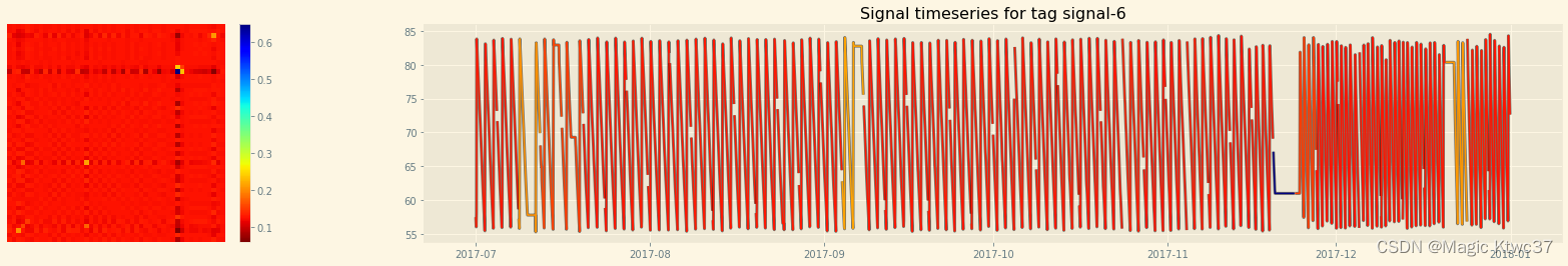
signal 6
mtf = plot_colored_timeseries('signal-6', image_size=48) _ = tsia.plot.plot_mtf_metrics(mtf[0]) s = tsia.markov.compute_mtf_statistics(mtf[0]) s.update({'Signal': 'signal-6'}) stats.append(s)- 1
- 2
- 3
- 4
- 5

signal 7
mtf = plot_colored_timeseries('signal-7', image_size=48) _ = tsia.plot.plot_mtf_metrics(mtf[0]) s = tsia.markov.compute_mtf_statistics(mtf[0]) s.update({'Signal': 'signal-7'}) stats.append(s)- 1
- 2
- 3
- 4
- 5


stats = pd.DataFrame(stats) stats.set_index('Signal')- 1
- 2

未完,待续… -
相关阅读:
C# 图片按比例进行压缩
WRF模式行业应用问题解析
Ebsynth——利用图像处理和计算机视觉的视频风格转换技术
vue自定义指令directives
基于遗传优化的模糊聚类算法(GA-FCM)matlab仿真
CDN加速解决VSCode下载速度慢的问题
Java反序列化之CommonsCollections(CC1)基础篇
CP AUTOSAR标准之CANInterface(AUTOSAR_SWS_CANInterface)(更新中……)
四轴飞控DIY Mark4 - 减震
前端基础建设与架构23 npm scripts:打造一体化的构建和部署流程
- 原文地址:https://blog.csdn.net/weixin_43171270/article/details/127855714
