-
酷炫效果 进度条
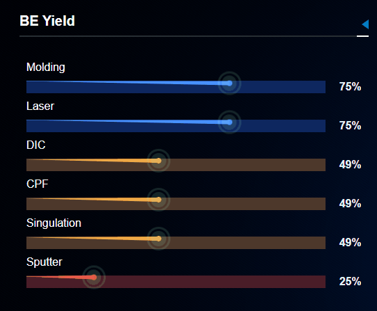
先上图,看下效果【这是本人纯css 渲染】
重要点记录:
1.从粗到细的进度条(设定父div 的相对定位,利用三角形的思想,渲染此进度条).progress { position: absolute; top: -0.01rem; left: -0.04rem; width: 0; height: 0; border: 3px solid transparent; border-right: var(--borderWidth) solid var(--borderColor); transform: rotate(0.6deg);//加旋转角度是因为 默认不是与父div对齐的,可根据自己的进行调整 }- 1
- 2
- 3
- 4
- 5
- 6
- 7
- 8
- 9
- 10
2.smtline 的css

.smt-line { display: inline-block; width: 100%; height: 0.35rem; border-bottom: 2px solid #282e33; position: relative; margin-bottom: 0.15rem; color: #fff; line-height: 0.25rem; font-size: 0.2rem; font-weight: bold; &:after { content: ""; display: inline-block; position: absolute; top: 0.1rem; right: 0; width: 0; height: 0; border: 0.07rem solid transparent; border-right: 0.1rem solid #0777c6; line-height: 14px; } &:before { content: ""; display: inline-block; position: absolute; width: 0.15rem; top: 0.325rem; right: 0; height: 0; border: 1px solid #fff; } } }- 1
- 2
- 3
- 4
- 5
- 6
- 7
- 8
- 9
- 10
- 11
- 12
- 13
- 14
- 15
- 16
- 17
- 18
- 19
- 20
- 21
- 22
- 23
- 24
- 25
- 26
- 27
- 28
- 29
- 30
- 31
- 32
- 33
- 34
- 35
- 36
- 37
完整代码如下:
<template> <div class="progress-be-yield"> <div class="smt-line">BE Yielddiv> <div class="beyield-box"> <div class="beyield" v-for="item in data"> <div class="name">{{ item.name }}div> <div class="content"> <div ref="value" class="value" :style="{ '--bgColor': item.value > 0.5 ? '#0e275f' : item.value > 0.25 ? '#4d382b' : '#4a1d28' }">div> <div class="text">{{ item.value * 100 }}%div> <div class="progress" v-if="divWidth" :style="{ '--borderWidth': item.value > 0.5 ? `${divWidth * item.value}px ` : item.value > 0.25 ? `${divWidth * item.value}px` : `${divWidth * item.value}px`, '--borderColor': item.value > 0.5 ? `#4891ff` : item.value > 0.25 ? `#f0aa48` : `#f04545`, }" >div> div> div> div> div> template> <script> export default { name: "ProgressBeYield", props: { data: Array }, watch: { data: { handler(newVal) { this.$nextTick(() => { this.divWidth = this.$refs.value[0].offsetWidth; console.log(this.divWidth); }); }, deep: true, immediate: true, }, }, computed: {}, data() { return { divWidth: 0, }; }, methods: {}, mounted() {}, }; script> <style scoped lang="scss"> .progress-be-yield { width: 100%; height: 100%; .beyield-box { padding: 0.1rem; .beyield { padding-top: 0.1rem; .name { color: #fff; font-size: 0.16rem; margin-bottom: 0.1rem; } .content { display: flex; justify-content: space-between; align-content: center; position: relative; .progress { position: absolute; top: -0.01rem; left: -0.04rem; width: 0; height: 0; border: 3px solid transparent; border-right: var(--borderWidth) solid var(--borderColor); transform: rotate(0.6deg); &:before { content: ""; display: inline-block; position: absolute; top: -0.04rem; left: calc(var(--borderWidth) - 0.04rem); width: 0.08rem; height: 0.08rem; background: var(--borderColor); border-radius: 50%; outline: 3px solid rgba(166, 255, 206, 0.15); outline-offset: 9px; animation: outlineOpacity 4s ease-in-out infinite; } &:after { content: ""; display: inline-block; position: absolute; top: -0.1rem; left: calc(var(--borderWidth) - 0.1rem); width: 0.2rem; height: 0.2rem; background: rgba(166, 255, 206, 0.15); border-radius: 50%; animation: widthHightOpacity 4s ease-in-out infinite; // animation-delay: 1s; } } .value { background-color: var(--bgColor); width: 100%; } .text { color: #ebedf0; margin-left: 0.2rem; font-size: 0.16rem; font-weight: bold; } } } } } @keyframes outlineOpacity { 0% { opacity: 1; outline-offset: 9px; } 50% { opacity: 0.4; outline-offset: 16px; } 100% { opacity: 1; outline-offset: 9px; } } @keyframes widthHightOpacity { 0% { opacity: 1; width: 0.2rem; height: 0.2rem; } 50% { left: calc(var(--borderWidth) - 0.15rem); top: -0.15rem; opacity: 0.4; width: 0.3rem; height: 0.3rem; } 100% { opacity: 1; width: 0.2rem; height: 0.2rem; } } style>- 1
- 2
- 3
- 4
- 5
- 6
- 7
- 8
- 9
- 10
- 11
- 12
- 13
- 14
- 15
- 16
- 17
- 18
- 19
- 20
- 21
- 22
- 23
- 24
- 25
- 26
- 27
- 28
- 29
- 30
- 31
- 32
- 33
- 34
- 35
- 36
- 37
- 38
- 39
- 40
- 41
- 42
- 43
- 44
- 45
- 46
- 47
- 48
- 49
- 50
- 51
- 52
- 53
- 54
- 55
- 56
- 57
- 58
- 59
- 60
- 61
- 62
- 63
- 64
- 65
- 66
- 67
- 68
- 69
- 70
- 71
- 72
- 73
- 74
- 75
- 76
- 77
- 78
- 79
- 80
- 81
- 82
- 83
- 84
- 85
- 86
- 87
- 88
- 89
- 90
- 91
- 92
- 93
- 94
- 95
- 96
- 97
- 98
- 99
- 100
- 101
- 102
- 103
- 104
- 105
- 106
- 107
- 108
- 109
- 110
- 111
- 112
- 113
- 114
- 115
- 116
- 117
- 118
- 119
- 120
- 121
- 122
- 123
- 124
- 125
- 126
- 127
- 128
- 129
- 130
- 131
- 132
- 133
- 134
- 135
- 136
- 137
- 138
- 139
- 140
- 141
- 142
- 143
- 144
- 145
- 146
- 147
- 148
- 149
- 150
- 151
- 152
- 153
- 154
- 155
- 156
- 157
- 158
重新修改了动画的样式 ,使动画更合理
@keyframes outlineOpacity { 0% { outline-color: rgba(166, 255, 206, 0); outline-offset: 7px; } 50% { outline-color: rgba(166, 255, 206, 0.15); outline-offset: 9px; } 100% { outline-color: rgba(166, 255, 206, 0); outline-offset: 11px; } } @keyframes widthHightOpacity { 0% { left: calc(var(--borderWidth) - 0.075rem); top: -0.075rem; opacity: 0; width: 0.15rem; height: 0.15rem; } 50% { left: calc(var(--borderWidth) - 0.1rem); top: -0.1rem; opacity: 0.8; width: 0.2rem; height: 0.2rem; } 100% { left: calc(var(--borderWidth) - 0.125rem); top: -0.125rem; opacity: 0; width: 0.25rem; height: 0.25rem; } }- 1
- 2
- 3
- 4
- 5
- 6
- 7
- 8
- 9
- 10
- 11
- 12
- 13
- 14
- 15
- 16
- 17
- 18
- 19
- 20
- 21
- 22
- 23
- 24
- 25
- 26
- 27
- 28
- 29
- 30
- 31
- 32
- 33
- 34
- 35
- 36
- 37
- 38
- 39
-
相关阅读:
代码随想录训练营第五十七天|647. 回文子串、516.最长回文子序列
ZFS存储池速度以及RAID说明
【负荷预测】布谷鸟(CS)算法优化BP神经网络的负荷及天气预测(Matlab代码实现)
Vue脚手架环境中简单使用MarkDown(只入门)
算法设计与分析 SCAU11079 可以移动的石子合并(优先做)
分布式系统中的相关概念
【爬虫】7.2. JavaScript动态渲染界面爬取-Selenium实战
Redis集群
html在线商城购物网站制作——基于HTML+CSS+JavaScript鲜花礼品电商网站
Vue+Element-ui+SpringBoot搭建后端汽车租赁管理系统
- 原文地址:https://blog.csdn.net/c_x_m/article/details/127788448
