-
css:两栏三栏布局
两栏布局左边固定右边自适应
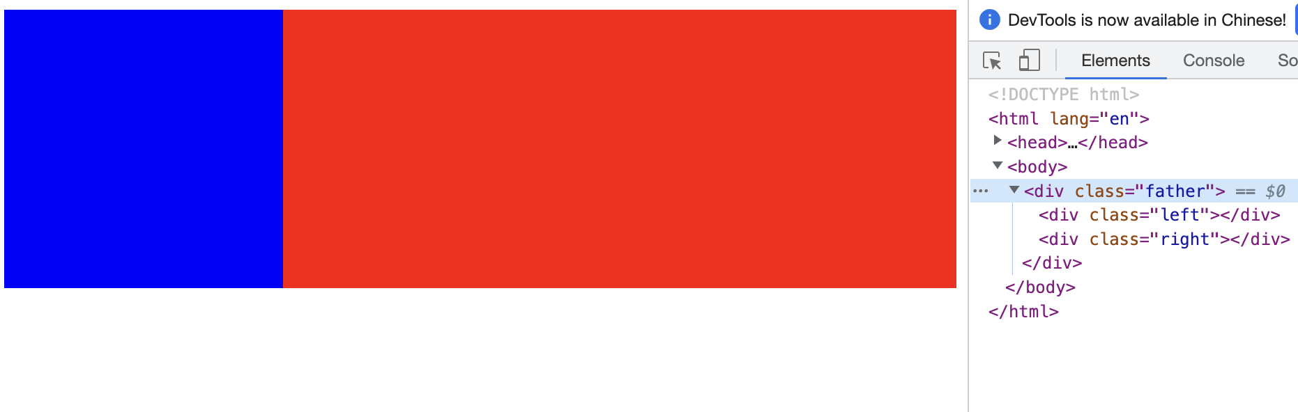
1、浮动方式
DOCTYPE html> <html lang="en"> <head> <style> .left { width: 200px; height: 200px; float: left; background-color: blue; } .right { margin-left: 200px; height: 200px; background-color: red; } style> head> <body> <div class="father"> <div class="left">div> <div class="right">div> div> body> html>- 1
- 2
- 3
- 4
- 5
- 6
- 7
- 8
- 9
- 10
- 11
- 12
- 13
- 14
- 15
- 16
- 17
- 18
- 19
- 20
- 21
- 22
- 23
- 24
2、定位方式
DOCTYPE html> <html lang="en"> <head> <style> .father { position: relative; height: 200px; } .left { position:absolute; width: 200px; height: 100%; background-color: blue; } .right { position:absolute; height: 100%; left:200px; right: 0; background-color: red; } style> head> <body> <div class="father"> <div class="left">div> <div class="right">div> div> body> html>- 1
- 2
- 3
- 4
- 5
- 6
- 7
- 8
- 9
- 10
- 11
- 12
- 13
- 14
- 15
- 16
- 17
- 18
- 19
- 20
- 21
- 22
- 23
- 24
- 25
- 26
- 27
- 28
- 29
- 30
- 31
- 32
3、flex方式
DOCTYPE html> <html lang="en"> <head> <style> .father { height: 300px; width: 100%; display: flex; } .left { width: 300px; height: 100%; background-color: blue; } .right { flex: 1; height: 100%; background-color: red; } style> head> <body> <div class="father"> <div class="left">div> <div class="right">div> div> body> html>- 1
- 2
- 3
- 4
- 5
- 6
- 7
- 8
- 9
- 10
- 11
- 12
- 13
- 14
- 15
- 16
- 17
- 18
- 19
- 20
- 21
- 22
- 23
- 24
- 25
- 26
- 27
- 28
- 29
- 30
三栏布局左右固定中自适应
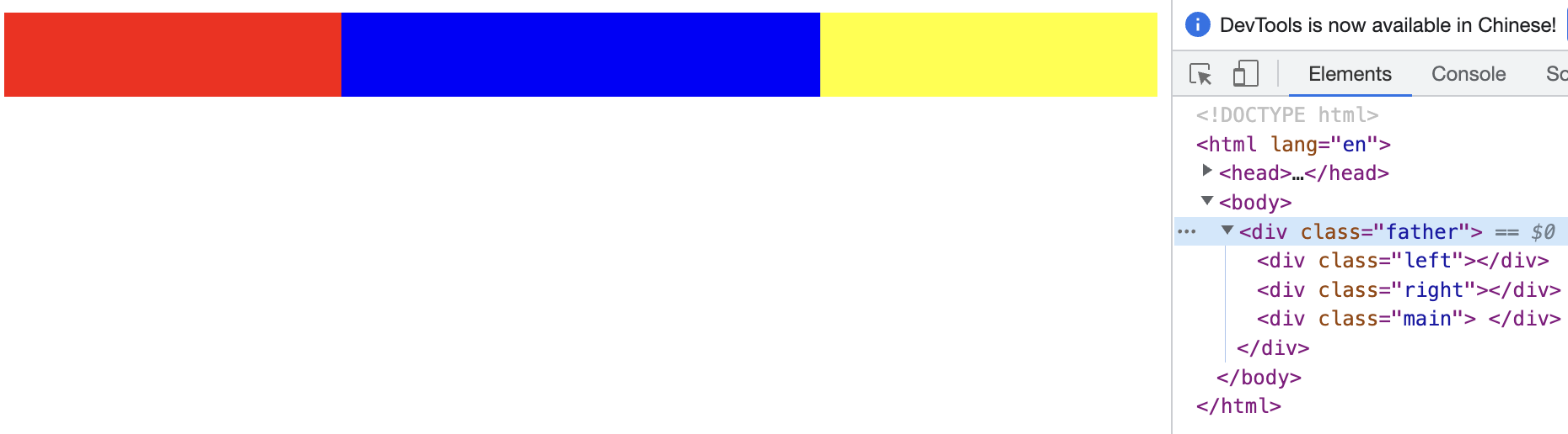
1、浮动方式
DOCTYPE html> <html lang="en"> <head> <style> .father{ height: 50px; } .left,.right,.main { height: 100%; } .left { width: 200px; float: left; background-color: red; } .main { margin-left: 200px; margin-right: 200px; background-color: blue; } .right { float: right; width: 200px; background-color: yellow; } style> head> <body> <div class="father"> <div class="left">div> <div class="right">div> <div class="main"> div> div> body> html>- 1
- 2
- 3
- 4
- 5
- 6
- 7
- 8
- 9
- 10
- 11
- 12
- 13
- 14
- 15
- 16
- 17
- 18
- 19
- 20
- 21
- 22
- 23
- 24
- 25
- 26
- 27
- 28
- 29
- 30
- 31
- 32
- 33
- 34
- 35
- 36
- 37
- 38
2、定位方式
DOCTYPE html> <html lang="en"> <head> <style> .father{ position: relative; height: 50px; } .left,.right,.main { position: absolute; height: 100%; } .left { left: 0; width: 200px; background-color: red } .main { left: 200px; right: 200px; background-color: blue } .right { right: 0; width: 200px; background-color: yellow } style> head> <body> <div class="father"> <div class="left">div> <div class="right">div> <div class="main"> div> div> body> html>- 1
- 2
- 3
- 4
- 5
- 6
- 7
- 8
- 9
- 10
- 11
- 12
- 13
- 14
- 15
- 16
- 17
- 18
- 19
- 20
- 21
- 22
- 23
- 24
- 25
- 26
- 27
- 28
- 29
- 30
- 31
- 32
- 33
- 34
- 35
- 36
- 37
- 38
- 39
- 40
3、flex方式
DOCTYPE html> <html lang="en"> <head> <style> .father { display: flex; height: 50px; } .left,.right,.main { height: 100%; } .left { width: 200px; background-color: red } .main { flex: 1; background-color: blue } .right { width: 200px; background-color: yellow } style> head> <body> <div class="father"> <div class="left">div> <div class="main"> div> <div class="right">div> div> body> html> ```- 1
- 2
- 3
- 4
- 5
- 6
- 7
- 8
- 9
- 10
- 11
- 12
- 13
- 14
- 15
- 16
- 17
- 18
- 19
- 20
- 21
- 22
- 23
- 24
- 25
- 26
- 27
- 28
- 29
- 30
- 31
- 32
- 33
- 34
- 35
- 36
- 37
- 38
-
相关阅读:
【Spring Boot】JPA — JPA入门
UE4创建一个角色类
【CCNA实验分享】三层交换机Vlan间路由
正则表达式二
欧洲FBA专线海运与陆运的差别
Servlet表单提交、前后端数据交换、页面跳转
联邦学习--记录
新建stm32工程——基于标准库也就是库函数的方式
Spring+SpringMVC+Mybatis的回顾
Nginx高级 第一部分:扩容
- 原文地址:https://blog.csdn.net/weixin_43972437/article/details/127773426
