-
第三章 常用布局
第三章 常用布局
线性布局容器
线性容器类表示按照水平方向或者竖直方向排列子组件的容器,ArkUI开发框架通过 Row 和 Colum 来实现线性布局。
主轴和交叉轴概念
主轴:在布局容器中,默认存在两根轴,分别是主轴和交叉轴,不同的容器中主轴的方向是不一样的。在Column容器中主轴的方向是垂直方向,在Row容器中主轴的方向是水平方向,在Flex容器中可以通过direction参数设置主轴的方向。Stack容器中没有明确主轴与交叉轴,通过设置alignContent参数来改变容器内组件的对齐方式。
交叉轴:与主轴垂直相交的轴线,如果主轴是垂直方向,则交叉轴就是水平方向;如果主轴是水平方向,则纵轴是垂直方向。Row水平布局
Row 按照水平方向布局子组件,主轴为水平方向,交叉轴为竖直方向。
1.Row定义
interface RowInterface { /** *当布局设置为水平方向时调用。 * @开始版本 7 */ (value?: { space?: string | number }): RowAttribute; }- 1
- 2
- 3
- 4
- 5
- 6
- 7
value:可选参数, space 表示横向布局子元素间距。
示例演示@Entry @Component struct Test { build() { Column() { // 模拟子组件之间的间隔为20 Row(){ Text() .width(90) .height('100%') .backgroundColor("#aabbcc") Text() .width(20) .height('100%') .border({width:1}) Text() .width(10) .height('100%') .layoutWeight(1) .backgroundColor("#ccbbaa") } .height(80) // 设置子组件之间的间隔为20 Row({space: 20}) { Text() .width(90) .height('100%') .backgroundColor("#aabbcc") Text() .width(20) .height('100%') .layoutWeight(1) .backgroundColor("#ccaabb") } .height(80) .margin({top: 10}) } .size({width:"100%",height:"100%"}) } }- 1
- 2
- 3
- 4
- 5
- 6
- 7
- 8
- 9
- 10
- 11
- 12
- 13
- 14
- 15
- 16
- 17
- 18
- 19
- 20
- 21
- 22
- 23
- 24
- 25
- 26
- 27
- 28
- 29
- 30
- 31
- 32
- 33
- 34
- 35
- 36
- 37
- 38
运行效果

1.整个界面分为2行.
2.第一行放3个Text组件.
3.第二行放2个Text组件。
4.第一行不设置Space。
5.第二行设置Space。
第一行在没有设置space参数时,利用水平布局的特性元素沿直线排列,利用第二Text宽度来达到子元素间距。第二行使用space,只需要2个Text就能实现同样的效果。2.Row属性
declare class RowAttribute extends CommonMethod<RowAttribute> { /** *设置垂直对齐时调用。 * @since 7 */ alignItems(value: VerticalAlign): RowAttribute; /** *设置水平对齐方式时调用 * @since 8 */ justifyContent(value: FlexAlign): RowAttribute; }- 1
- 2
- 3
- 4
- 5
- 6
- 7
- 8
- 9
- 10
- 11
- 12
- 13
3.alignItems子组件垂直对齐方式。
alignItems:设置子组件在垂直方向对齐方式。VerticalAlign 定义了3种对齐方式:
Top:设置子组件在竖直方向上居顶部对齐。
Center(默认值):设置子组件在竖直方向上居中对齐。
Bottom:设置子组件在竖直方向上居底部对齐。
演示3种垂直对齐方式:@Entry @Component struct Test { build() { Column({space:5}){ Row() { Text("Top") .fontSize(26) .backgroundColor("#aabbcc") } .alignItems(VerticalAlign.Top) // 设置子组件在竖直方向顶部对齐 .borderWidth(2) //设置容器组件边框 .borderColor(Color.Pink) //设置边框颜色 .width('100%') .height(60) Row() { Text("Center") .fontSize(26) .backgroundColor("#aabbcc") } .alignItems(VerticalAlign.Center) // 设置子组件在竖直方向居中对齐 .borderWidth(2) .borderColor(Color.Pink) .width('100%') .height(60) Row() { Text("Bottom") .fontSize(26) .backgroundColor("#aabbcc") } .alignItems(VerticalAlign.Bottom) // 设置子组件在竖直方向底部对齐 .borderWidth(2) .borderColor(Color.Pink) .width('100%') .height(60) } } }- 1
- 2
- 3
- 4
- 5
- 6
- 7
- 8
- 9
- 10
- 11
- 12
- 13
- 14
- 15
- 16
- 17
- 18
- 19
- 20
- 21
- 22
- 23
- 24
- 25
- 26
- 27
- 28
- 29
- 30
- 31
- 32
- 33
- 34
- 35
- 36
- 37
- 38
运行效果

4.justifyContent子组件水平方向对齐方式
justifyContent子组件在水平方向上的对齐方式。FlexAlign 定义了一下6种类型:
Start:左对齐
Center:水平居中
End:右对齐
SpaceBetween:两端对齐
SpaceAround:不均分对齐,左右2端间距为中间组件间距的二分之一。
SpaceEvenly:均分对齐
简单案例演示:@Entry @Component struct Test { build() { Column({space: 5}) { Row() { Text() .size({width: 90, height: 50}) .backgroundColor('#aabbcc') Text() .size({width: 90, height: 50}) .backgroundColor('#bbccaa') Text() .size({width: 90, height: 50}) .backgroundColor('#ccaabb') } .justifyContent(FlexAlign.Start)//左对齐 .size({width: "100%", height: 90}) .borderWidth(2) .borderColor(Color.Pink) Row() { Text() .size({width: 90, height: 50}) .backgroundColor('#aabbcc') Text() .size({width: 90, height: 50}) .backgroundColor('#bbccaa') Text() .size({width: 90, height: 50}) .backgroundColor('#ccaabb') } .justifyContent(FlexAlign.Center)//居中对齐 .size({width: "100%", height: 90}) .borderWidth(2) .borderColor(Color.Pink) Row() { Text() .size({width: 90, height: 50}) .backgroundColor('#aabbcc') Text() .size({width: 90, height: 50}) .backgroundColor('#bbccaa') Text() .size({width: 90, height: 50}) .backgroundColor('#ccaabb') } .justifyContent(FlexAlign.End)//右对齐 .size({width: "100%", height: 90}) .borderWidth(2) .borderColor(Color.Pink) Row() { Text() .size({width: 90, height: 50}) .backgroundColor('#aabbcc') Text() .size({width: 90, height: 50}) .backgroundColor('#bbccaa') Text() .size({width: 90, height: 50}) .backgroundColor('#ccaabb') } .justifyContent(FlexAlign.SpaceBetween)//两端对齐 .size({width: "100%", height: 90}) .borderWidth(2) .borderColor(Color.Pink) Row() { Text() .size({width: 90, height: 50}) .backgroundColor('#aabbcc') Text() .size({width: 90, height: 50}) .backgroundColor('#bbccaa') Text() .size({width: 90, height: 50}) .backgroundColor('#ccaabb') } .justifyContent(FlexAlign.SpaceAround)//不均分对齐 .size({width: "100%", height: 90}) .borderWidth(2) .borderColor(Color.Pink) Row() { Text() .size({width: 90, height: 50}) .backgroundColor('#aabbcc') Text() .size({width: 90, height: 50}) .backgroundColor('#bbccaa') Text() .size({width: 90, height: 50}) .backgroundColor('#ccaabb') } .justifyContent(FlexAlign.SpaceEvenly)//均分对齐 .size({width: "100%", height: 90}) .borderWidth(2) .borderColor(Color.Pink) } .padding(10) .size({width: "100%", height: '100%'}) } }- 1
- 2
- 3
- 4
- 5
- 6
- 7
- 8
- 9
- 10
- 11
- 12
- 13
- 14
- 15
- 16
- 17
- 18
- 19
- 20
- 21
- 22
- 23
- 24
- 25
- 26
- 27
- 28
- 29
- 30
- 31
- 32
- 33
- 34
- 35
- 36
- 37
- 38
- 39
- 40
- 41
- 42
- 43
- 44
- 45
- 46
- 47
- 48
- 49
- 50
- 51
- 52
- 53
- 54
- 55
- 56
- 57
- 58
- 59
- 60
- 61
- 62
- 63
- 64
- 65
- 66
- 67
- 68
- 69
- 70
- 71
- 72
- 73
- 74
- 75
- 76
- 77
- 78
- 79
- 80
- 81
- 82
- 83
- 84
- 85
- 86
- 87
- 88
- 89
- 90
- 91
- 92
- 93
- 94
- 95
- 96
- 97
- 98
- 99
- 100
- 101
- 102
- 103
运行效果

Column容器组件
Column 按照竖直方向布局子组件,主轴为竖直方向,交叉轴为水平方向。
1.Column定义介绍
interface ColumnInterface { (value?: { space?: string | number }): ColumnAttribute; }- 1
- 2
- 3
value:可选参数, space 表示设置 Column 的子组件垂直方向上的间距。
2.Column属性
declare class ColumnAttribute extends CommonMethod<ColumnAttribute> { alignItems(value: HorizontalAlign): ColumnAttribute; justifyContent(value: FlexAlign): ColumnAttribute; }- 1
- 2
- 3
- 4
Column属性设置刚好和Row的属性设置相反。
3.alignItems子组件水平对齐方式
alignItems:设置子组件在水平方向上的对齐格式。HorizontalAlign 定义了以下3种对其方式:
Start:设置子组件在水平方向上按照语言方向起始端对齐。
Center(默认值):设置子组件在水平方向上居左对齐。
End:设置子组件在水平方向上按照语言方向末端对齐。@Entry @Component struct Test { build() { Column({space: 5}) { Column() { Text("Start") .fontSize(22) .backgroundColor('#aabbcc') } .alignItems(HorizontalAlign.Start) .size({width: "100%", height: 60}) .borderWidth(2) .borderColor(Color.Pink) Column() { Text("Center") .fontSize(22) .backgroundColor('#aabbcc') } //.alignItems(HorizontalAlign.Center)//默认值 .size({width: "100%", height: 60}) .borderWidth(2) .borderColor(Color.Pink) Column() { Text("End") .fontSize(22) .backgroundColor('#aabbcc') } .alignItems(HorizontalAlign.End) .size({width: "100%", height: 60}) .borderWidth(2) .borderColor(Color.Pink) } } }- 1
- 2
- 3
- 4
- 5
- 6
- 7
- 8
- 9
- 10
- 11
- 12
- 13
- 14
- 15
- 16
- 17
- 18
- 19
- 20
- 21
- 22
- 23
- 24
- 25
- 26
- 27
- 28
- 29
- 30
- 31
- 32
- 33
- 34
运行效果:

4.justifyContent子组件垂直对齐方式
justifyContent:设置子组件在垂直方向上的对齐格式。 FlexAlign 定义了以下6种类型:
Start:顶端对齐
Center:垂直居中对齐
End:底端对齐
SpaceBetween:垂直两端对齐
SpaceAround:垂直不均分对齐。上下2端间距为中间组件间距的二分之一。
SpaceEvenly:均分对齐。
示例:@Entry @Component struct Test { build() { Column(){ Column() { Text() .size({width: 160, height: 25}) .backgroundColor('#aabbcc') Text() .size({width: 160, height: 25}) .backgroundColor('#bbccaa') Text() .size({width: 160, height: 25}) .backgroundColor('#ccaabb') } .alignItems(HorizontalAlign.Center) .justifyContent(FlexAlign.Start) .size({width: "100%", height: 120}) .borderWidth(2) .borderColor(Color.Pink) Column() { Text() .size({width: 160, height: 25}) .backgroundColor('#aabbcc') Text() .size({width: 160, height: 25}) .backgroundColor('#bbccaa') Text() .size({width: 160, height: 25}) .backgroundColor('#ccaabb') } .alignItems(HorizontalAlign.Center) .justifyContent(FlexAlign.Center) .size({width: "100%", height: 120}) .borderWidth(2) .borderColor(Color.Pink) Column() { Text() .size({width: 160, height: 25}) .backgroundColor('#aabbcc') Text() .size({width: 160, height: 25}) .backgroundColor('#bbccaa') Text() .size({width: 160, height: 25}) .backgroundColor('#ccaabb') } .alignItems(HorizontalAlign.Center) .justifyContent(FlexAlign.End) .size({width: "100%", height: 120}) .borderWidth(2) .borderColor(Color.Pink) Column() { Text() .size({width: 160, height: 25}) .backgroundColor('#aabbcc') Text() .size({width: 160, height: 25}) .backgroundColor('#bbccaa') Text() .size({width: 160, height: 25}) .backgroundColor('#ccaabb') } .alignItems(HorizontalAlign.Center) .justifyContent(FlexAlign.SpaceBetween) .size({width: "100%", height: 120}) .borderWidth(2) .borderColor(Color.Pink) Column() { Text() .size({width: 160, height: 25}) .backgroundColor('#aabbcc') Text() .size({width: 160, height: 25}) .backgroundColor('#bbccaa') Text() .size({width: 160, height: 25}) .backgroundColor('#ccaabb') } .alignItems(HorizontalAlign.Center) .justifyContent(FlexAlign.SpaceAround) .size({width: "100%", height: 120}) .borderWidth(2) .borderColor(Color.Pink) Column() { Text() .size({width: 160, height: 25}) .backgroundColor('#aabbcc') Text() .size({width: 160, height: 25}) .backgroundColor('#bbccaa') Text() .size({width: 160, height: 25}) .backgroundColor('#ccaabb') } .alignItems(HorizontalAlign.Center) .justifyContent(FlexAlign.SpaceEvenly) .size({width: "100%", height: 120}) .borderWidth(2) .borderColor(Color.Pink) } } }- 1
- 2
- 3
- 4
- 5
- 6
- 7
- 8
- 9
- 10
- 11
- 12
- 13
- 14
- 15
- 16
- 17
- 18
- 19
- 20
- 21
- 22
- 23
- 24
- 25
- 26
- 27
- 28
- 29
- 30
- 31
- 32
- 33
- 34
- 35
- 36
- 37
- 38
- 39
- 40
- 41
- 42
- 43
- 44
- 45
- 46
- 47
- 48
- 49
- 50
- 51
- 52
- 53
- 54
- 55
- 56
- 57
- 58
- 59
- 60
- 61
- 62
- 63
- 64
- 65
- 66
- 67
- 68
- 69
- 70
- 71
- 72
- 73
- 74
- 75
- 76
- 77
- 78
- 79
- 80
- 81
- 82
- 83
- 84
- 85
- 86
- 87
- 88
- 89
- 90
- 91
- 92
- 93
- 94
- 95
- 96
- 97
- 98
- 99
- 100
- 101
- 102
- 103
- 104
- 105
- 106
- 107
- 108
运行效果:

注:如果 Column 设置了 space 参数,则 justifyContent 参数不起作用
Flex布局
Flex是Flexible Box的缩写,意为”弹性布局”,用来为盒状模型提供最大的灵活性。Flex 和 Row 、 Column 组件一样,也有主轴和纵轴之分。
1.Flex定义
interface FlexInterface { (value?: FlexOptions): FlexAttribute; }- 1
- 2
- 3
value:设置子组件的排列样式。它的类型是FlexOptions对象。FlexOptions类型定义:
declare interface FlexOptions { direction?: FlexDirection; //设置布局的方向。 wrap?: FlexWrap; //Flex容器是单行/列排列还是多行/列布局。 justifyContent?: //FlexAlign;主轴上对齐方式 alignItems?: ItemAlign; //纵轴的对齐格式。 alignContent?: FlexAlign; //当纵轴上有额外空间时,多行内容的对齐。仅在wrap为Wrap 或WrapReverse下生效。 }- 1
- 2
- 3
- 4
- 5
- 6
- 7
2.布局方向
direction:子组件在Flex容器上排列的方向,即主轴的方向。FlexDirection 定义了4种排列方式。
declare enum FlexDirection { Row, //水平布局 (子组件由左向右排列) Column, //垂直布局 (子组件由上到下排列) RowReverse, //水平方向反转(子组件由右向左排列). ColumnReverse,//垂直方向反转(子组件由下上上排列). }- 1
- 2
- 3
- 4
- 5
- 6
1.从左到右水平排列
FlexDirection.Row:子组件水平排列,子组件由左向右排列。

图 排列示意图
示例:@Entry @Component struct Test { build() { Flex({direction: FlexDirection.Row}) { Text('Text1') .fontSize(16) .padding(10) .backgroundColor("#aabbcc") Text('Text2') .fontSize(16) .padding(10) .backgroundColor("#bbaacc") Text('Text3') .fontSize(16) .padding(10) .backgroundColor("#ccaabb") Text('Text4') .fontSize(16) .padding(10) .backgroundColor("#abcabc") } .width('100%') .height(60) .backgroundColor(Color.Orange) } }- 1
- 2
- 3
- 4
- 5
- 6
- 7
- 8
- 9
- 10
- 11
- 12
- 13
- 14
- 15
- 16
- 17
- 18
- 19
- 20
- 21
- 22
- 23
- 24
- 25
运行效果

2. 从右到左水平排列
FlexDirection.RowReverse:反转水平布局,子组件由右向左排列。
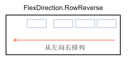
图 排列示意图
示例:@Entry @Component struct Test { build() { Flex({direction: FlexDirection.RowReverse}) { Text('Text1') .fontSize(16) .padding(10) .backgroundColor("#aabbcc") Text('Text2') .fontSize(16) .padding(10) .backgroundColor("#bbaacc") Text('Text3') .fontSize(16) .padding(10) .backgroundColor("#ccaabb") Text('Text4') .fontSize(16) .padding(10) .backgroundColor("#abcabc") } .width('100%') .height(60) .backgroundColor(Color.Orange) } }- 1
- 2
- 3
- 4
- 5
- 6
- 7
- 8
- 9
- 10
- 11
- 12
- 13
- 14
- 15
- 16
- 17
- 18
- 19
- 20
- 21
- 22
- 23
- 24
- 25
运行效果

3.从上到下垂直排列
FlexDirection.Column:垂直布局,由上到下排列。

图 排列示意图
示例@Entry @Component struct Test { build() { Flex({direction: FlexDirection.Column}) { Text('Text1') .fontSize(16) .padding(10) .backgroundColor("#aabbcc") Text('Text2') .fontSize(16) .padding(10) .backgroundColor("#bbaacc") Text('Text3') .fontSize(16) .padding(10) .backgroundColor("#ccaabb") Text('Text4') .fontSize(16) .padding(10) .backgroundColor("#abcabc") } .width('100%') .height(260) .backgroundColor(Color.Orange) } }- 1
- 2
- 3
- 4
- 5
- 6
- 7
- 8
- 9
- 10
- 11
- 12
- 13
- 14
- 15
- 16
- 17
- 18
- 19
- 20
- 21
- 22
- 23
- 24
- 25
运行效果

4.从下到上垂直排列
FlexDirection.ColumnReverse:反转垂直布局。子组件由下向上排列。

示例
@Entry @Component struct Test { build() { Flex({direction: FlexDirection.ColumnReverse}) { Text('Text1') .fontSize(16) .padding(10) .backgroundColor("#aabbcc") Text('Text2') .fontSize(16) .padding(10) .backgroundColor("#bbaacc") Text('Text3') .fontSize(16) .padding(10) .backgroundColor("#ccaabb") Text('Text4') .fontSize(16) .padding(10) .backgroundColor("#abcabc") } .width('100%') .height(260) .backgroundColor(Color.Orange) } }- 1
- 2
- 3
- 4
- 5
- 6
- 7
- 8
- 9
- 10
- 11
- 12
- 13
- 14
- 15
- 16
- 17
- 18
- 19
- 20
- 21
- 22
- 23
- 24
- 25
运行效果

3.主轴对齐方式
justifyContent:设置子组件在主轴上的对齐方式。FlexAlign 提供了以下 6 种对齐方式。
declare enum FlexAlign { Start, //row方向左对齐,column方向左对齐 Center, //元素以主轴方向为中心,第一个元素到行开始的距离与最后一个元素到行结束的距离相同 End, //元素在主轴的尾部对齐,最后一个元素在行尾对齐,其他元素与下一个元素对齐。 SpaceBetween,//弹性元素沿Flex主轴方向均匀分布,相邻元素之间的距离相同。第一个元素与行首对齐,最后一个元素与行尾对齐。 SpaceAround,//弹性元素沿Flex主轴方向均匀分布,相邻元素之间的距离相同。相邻元素之间距离的一半作为第一个元素之间的距离和最后一个元素到行尾之间的距离 SpaceEvenly,//Flex轴方向上的元素是均匀间隔的。相邻元素之间的间距、第一个元素与行首之间的间距以及最后一个元素与行尾之间的间距是相同的。 }- 1
- 2
- 3
- 4
- 5
- 6
- 7
- 8
1.主轴起始对齐
FlexAlign.Start主轴起始对齐
@Entry @Component struct Test { build() { Flex({direction: FlexDirection.Row, justifyContent: FlexAlign.Start}) { Text('Text1') .fontSize(16) .padding(10) .backgroundColor("#aabbcc") Text('Text2') .fontSize(16) .padding(10) .backgroundColor("#bbaacc") Text('Text3') .fontSize(16) .padding(10) .backgroundColor("#ccaabb") Text('Text4') .fontSize(16) .padding(10) .backgroundColor("#abcabc") } .width('100%') .height(260) .backgroundColor(Color.Orange) } }- 1
- 2
- 3
- 4
- 5
- 6
- 7
- 8
- 9
- 10
- 11
- 12
- 13
- 14
- 15
- 16
- 17
- 18
- 19
- 20
- 21
- 22
- 23
- 24
- 25
运行效果

start不同排列方向对应效果:
Row排列时:左对齐
RowReverse排列时:右对齐
Column排列时:Start为左对齐
ColumnReverse排列时:Start为左对齐2.主轴居中对齐
FlexAlign.Conter主轴居中对齐。
@Entry @Component struct Test { build() { Flex({direction: FlexDirection.Row, justifyContent: FlexAlign.Conter}) { Text('Text1') .fontSize(16) .padding(10) .backgroundColor("#aabbcc") Text('Text2') .fontSize(16) .padding(10) .backgroundColor("#bbaacc") Text('Text3') .fontSize(16) .padding(10) .backgroundColor("#ccaabb") Text('Text4') .fontSize(16) .padding(10) .backgroundColor("#abcabc") } .width('100%') .height(260) .backgroundColor(Color.Orange) } }- 1
- 2
- 3
- 4
- 5
- 6
- 7
- 8
- 9
- 10
- 11
- 12
- 13
- 14
- 15
- 16
- 17
- 18
- 19
- 20
- 21
- 22
- 23
- 24
- 25
运行效果

conter不同排列方向对应效果:
Row排列时:左右居中对齐
RowReverse排列时:左右居中对齐
Column排列时:上下居中对齐
ColumnReverse排列时:上下居中对齐3.主轴尾端对齐
FlexAlign.End主轴尾端对齐
@Entry @Component struct Test { build() { Flex({direction: FlexDirection.Row, justifyContent: FlexAlign.End}) { Text('Text1') .fontSize(16) .padding(10) .backgroundColor("#aabbcc") Text('Text2') .fontSize(16) .padding(10) .backgroundColor("#bbaacc") Text('Text3') .fontSize(16) .padding(10) .backgroundColor("#ccaabb") Text('Text4') .fontSize(16) .padding(10) .backgroundColor("#abcabc") } .width('100%') .height(260) .backgroundColor(Color.Orange) } }- 1
- 2
- 3
- 4
- 5
- 6
- 7
- 8
- 9
- 10
- 11
- 12
- 13
- 14
- 15
- 16
- 17
- 18
- 19
- 20
- 21
- 22
- 23
- 24
- 25
运行效果

end不同排列方向对应效果:
Row排列时:右对齐
RowReverse排列时:左对齐
Column排列时:上对齐
ColumnReverse排列时:上对齐4.两端对齐
FlexAlign.SpaceBetween:主轴两端对齐
@Entry @Component struct Test { build() { Flex({direction: FlexDirection.Row, justifyContent: FlexAlign.SpaceBetween}) { Text('Text1') .fontSize(16) .padding(10) .backgroundColor("#aabbcc") Text('Text2') .fontSize(16) .padding(10) .backgroundColor("#bbaacc") Text('Text3') .fontSize(16) .padding(10) .backgroundColor("#ccaabb") Text('Text4') .fontSize(16) .padding(10) .backgroundColor("#abcabc") } .width('100%') .height(260) .backgroundColor(Color.Orange) } }- 1
- 2
- 3
- 4
- 5
- 6
- 7
- 8
- 9
- 10
- 11
- 12
- 13
- 14
- 15
- 16
- 17
- 18
- 19
- 20
- 21
- 22
- 23
- 24
- 25
运行效果:

SpaceBetween不同排列方向对应效果:
Row排列时:左右两端对齐
RowReverse排列时:左右两端对齐
Column排列时:上下两端对齐
ColumnReverse排列时:上下两端对齐5.主轴不均分对齐
FlexAlign.SpaceAround:主轴不均分对齐。(第一个元素和最后一个元素为其它元素间距的二分之一)
@Entry @Component struct Test { build() { Flex({direction: FlexDirection.Row, justifyContent: FlexAlign.SpaceAround}) { Text('Text1') .fontSize(16) .padding(10) .backgroundColor("#aabbcc") Text('Text2') .fontSize(16) .padding(10) .backgroundColor("#bbaacc") Text('Text3') .fontSize(16) .padding(10) .backgroundColor("#ccaabb") Text('Text4') .fontSize(16) .padding(10) .backgroundColor("#abcabc") } .width('100%') .height(260) .backgroundColor(Color.Orange) } }- 1
- 2
- 3
- 4
- 5
- 6
- 7
- 8
- 9
- 10
- 11
- 12
- 13
- 14
- 15
- 16
- 17
- 18
- 19
- 20
- 21
- 22
- 23
- 24
- 25
运行效果:

SpaceAround不同排列方向对应效果:
Row排列时:元素间隔相等,头尾间隔为元素间隔的2分之1。
RowReverse排列时:元素间隔相等,头尾间隔为元素间隔的2分之1。
Column排列时:元素间隔相等,头尾间隔为元素间隔的2分之1。
ColumnReverse排列时:元素间隔相等,头尾间隔为元素间隔的2分之1。6.主轴均分对齐
FlexAlign.SpaceEvenly:主轴均分对齐
@Entry @Component struct Test { build() { Flex({direction: FlexDirection.Row, justifyContent: FlexAlign.SpaceEvenly}) { Text('Text1') .fontSize(16) .padding(10) .backgroundColor("#aabbcc") Text('Text2') .fontSize(16) .padding(10) .backgroundColor("#bbaacc") Text('Text3') .fontSize(16) .padding(10) .backgroundColor("#ccaabb") Text('Text4') .fontSize(16) .padding(10) .backgroundColor("#abcabc") } .width('100%') .height(260) .backgroundColor(Color.Orange) } }- 1
- 2
- 3
- 4
- 5
- 6
- 7
- 8
- 9
- 10
- 11
- 12
- 13
- 14
- 15
- 16
- 17
- 18
- 19
- 20
- 21
- 22
- 23
- 24
- 25
运行效果:

SpaceEvenly不同排列方向对应效果:
Row排列时:子元素间距均匀
RowReverse排列时:子元素间距均匀
Column排列时:子元素间距均匀
ColumnReverse排列时:子元素间距均匀4.交叉轴对齐方式
水平方向排列时,交叉轴就是垂直方向。垂直方向排列是,交叉轴就是水平方式

alignItems:设置子组件在交叉轴方向上的对齐方式.ItemAlign 定义了以下 6 种对齐方式:
declare enum ItemAlign { Auto,使用Flex容器中的默认配置。. Start,该元素位于Flex容器中,且跨轴方向头部对齐. Center,元素在Flex容器中居中,交叉轴方向对齐. End,该元素在Flex容器中按交叉轴方向下对齐. Baseline,在Flex容器中,跨轴方向的文本基线是对齐的。. Stretch,在Flex容器中,填充沿轴拉伸,如果未设置尺寸,则按容器大小拉伸. }- 1
- 2
- 3
- 4
- 5
- 6
- 7
- 8
1.交叉轴自动对齐
ItemAlign.Auto:交叉轴自动对齐。
@Entry @Component struct Test { build() { Flex({direction: FlexDirection.Row ,alignItems: ItemAlign.Auto}) { Text('Text1') .fontSize(10) .padding(10) .backgroundColor("#aabbcc") Text('Text2') .fontSize(10*2) .padding(10) .backgroundColor("#bbaacc") Text('Text3') .fontSize(10*3) .padding(10) .backgroundColor("#ccaabb") Text('Text4') .fontSize(10*4) .padding(10) .backgroundColor("#abcabc") } .width('100%') .height(260) .backgroundColor(Color.Pink) } }- 1
- 2
- 3
- 4
- 5
- 6
- 7
- 8
- 9
- 10
- 11
- 12
- 13
- 14
- 15
- 16
- 17
- 18
- 19
- 20
- 21
- 22
- 23
- 24
- 25
运行效果:

Auto不同排列方向对应效果:
Row排列时:默认顶部对齐
RowReverse排列时:默认顶部对齐
Column排列时:默认左对齐
ColumnReverse排列时:默认左对齐
alignItems: ItemAlign.Start和Auto效果一致。@Entry @Component struct Test { build() { Flex({direction: FlexDirection.Row ,alignItems: ItemAlign.Start}) { Text('Text1') .fontSize(10) .padding(10) .backgroundColor("#aabbcc") Text('Text2') .fontSize(10*2) .padding(10) .backgroundColor("#bbaacc") Text('Text3') .fontSize(10*3) .padding(10) .backgroundColor("#ccaabb") Text('Text4') .fontSize(10*4) .padding(10) .backgroundColor("#abcabc") } .width('100%') .height(260) .backgroundColor(Color.Pink) } }- 1
- 2
- 3
- 4
- 5
- 6
- 7
- 8
- 9
- 10
- 11
- 12
- 13
- 14
- 15
- 16
- 17
- 18
- 19
- 20
- 21
- 22
- 23
- 24
- 25
运行效果:

2.交叉轴居中对齐
ItemAlign.Conter:纵轴居中对齐
@Entry @Component struct Test { build() { Flex({direction: FlexDirection.Row ,alignItems: ItemAlign.Conter}) { Text('Text1') .fontSize(10) .padding(10) .backgroundColor("#aabbcc") Text('Text2') .fontSize(10*2) .padding(10) .backgroundColor("#bbaacc") Text('Text3') .fontSize(10*3) .padding(10) .backgroundColor("#ccaabb") Text('Text4') .fontSize(10*4) .padding(10) .backgroundColor("#abcabc") } .width('100%') .height(260) .backgroundColor(Color.Pink) } }- 1
- 2
- 3
- 4
- 5
- 6
- 7
- 8
- 9
- 10
- 11
- 12
- 13
- 14
- 15
- 16
- 17
- 18
- 19
- 20
- 21
- 22
- 23
- 24
- 25
运行效果:

3.交叉轴尾端对齐
ItemAlign.End:纵轴末尾对齐。
@Entry @Component struct Test { build() { Flex({direction: FlexDirection.Row ,alignItems: ItemAlign.End}) { Text('Text1') .fontSize(10) .padding(10) .backgroundColor("#aabbcc") Text('Text2') .fontSize(10*2) .padding(10) .backgroundColor("#bbaacc") Text('Text3') .fontSize(10*3) .padding(10) .backgroundColor("#ccaabb") Text('Text4') .fontSize(10*4) .padding(10) .backgroundColor("#abcabc") } .width('100%') .height(260) .backgroundColor(Color.Pink) } }- 1
- 2
- 3
- 4
- 5
- 6
- 7
- 8
- 9
- 10
- 11
- 12
- 13
- 14
- 15
- 16
- 17
- 18
- 19
- 20
- 21
- 22
- 23
- 24
- 25
运行效果:

4.交叉轴基线对齐
ItemAlign.Baseline:交叉轴基线对齐。
@Entry @Component struct Test { build() { Flex({direction: FlexDirection.Row ,alignItems: ItemAlign.Baseline}) { Text('Text1') .fontSize(10) .padding(10) .backgroundColor("#aabbcc") Text('Text2') .fontSize(10*2) .padding(10) .backgroundColor("#bbaacc") Text('Text3') .fontSize(10*3) .padding(10) .backgroundColor("#ccaabb") Text('Text4') .fontSize(10*4) .padding(10) .backgroundColor("#abcabc") } .width('100%') .height(260) .backgroundColor(Color.Pink) } }- 1
- 2
- 3
- 4
- 5
- 6
- 7
- 8
- 9
- 10
- 11
- 12
- 13
- 14
- 15
- 16
- 17
- 18
- 19
- 20
- 21
- 22
- 23
- 24
- 25
运行效果

5.交叉轴拉伸对齐
ItemAlign.Baseline:拉伸对齐。
@Entry @Component struct Test { build() { Flex({direction: FlexDirection.Row ,alignItems: ItemAlign.Baseline}) { Text('Text1') .fontSize(10) .padding(10) .backgroundColor("#aabbcc") Text('Text2') .fontSize(10*2) .padding(10) .backgroundColor("#bbaacc") Text('Text3') .fontSize(10*3) .padding(10) .backgroundColor("#ccaabb") Text('Text4') .fontSize(10*4) .padding(10) .backgroundColor("#abcabc") } .width('100%') .height(260) .backgroundColor(Color.Pink) } }- 1
- 2
- 3
- 4
- 5
- 6
- 7
- 8
- 9
- 10
- 11
- 12
- 13
- 14
- 15
- 16
- 17
- 18
- 19
- 20
- 21
- 22
- 23
- 24
- 25
运行效果:

拉伸以最高/宽的元素为基准
5.多行内容设置
wrap:设置子组件是单行/列还是多行/列排序。FlexWrap 提供了以下3种类型。
declare enum FlexWrap { NoWrap, //Flex容器的元素只有一个行列布局,子元素不可以超越容器. Wrap, //Flex容器的元素被安排在多行或多列中,并且子项允许超出容器. WrapReverse,// Flex容器的元素被反向排列为多行多列,子元素被允许超越容器。. }- 1
- 2
- 3
- 4
- 5
1.单行或单列
FlexWrap.NoWrap:水平或垂直排列时,不允许子组件多行或多列,子组件不可超出容器。默认值
@Entry @Component struct Test { build() { Flex({direction: FlexDirection.Row, wrap: FlexWrap.NoWrap}) { Text('Text1') .fontSize(16) .padding(10) .width(200) .backgroundColor("#aabbcc") Text('Text2') .fontSize(16) .padding(10) .width(200) .backgroundColor("#bbaacc") Text('Text3') .fontSize(16) .padding(10) .width(500) .backgroundColor("#ccaabb") } .width('100%') .height(60) .backgroundColor(Color.Pink) } }- 1
- 2
- 3
- 4
- 5
- 6
- 7
- 8
- 9
- 10
- 11
- 12
- 13
- 14
- 15
- 16
- 17
- 18
- 19
- 20
- 21
- 22
- 23
- 24
运行效果

注:当组件的宽/高超过父容器时,组件的宽/高会换算成百分比对子元素进行压缩
2.多行或多列
FlexWrap.Wrap:水平或垂直排列时,允许子组件多行或多列,子组件允许超出容器。
@Entry @Component struct Test { build() { Flex({direction: FlexDirection.Row, wrap: FlexWrap.Wrap}) { Text('Text1') .fontSize(16) .padding(10) .width(200) .backgroundColor("#aabbcc") Text('Text2') .fontSize(16) .padding(10) .width(200) .backgroundColor("#bbaacc") Text('Text3') .fontSize(16) .padding(10) .width(500) .backgroundColor("#ccaabb") } .width('100%') .height(60) .backgroundColor(Color.Pink) } }- 1
- 2
- 3
- 4
- 5
- 6
- 7
- 8
- 9
- 10
- 11
- 12
- 13
- 14
- 15
- 16
- 17
- 18
- 19
- 20
- 21
- 22
- 23
- 24
运行效果

当组件的宽/高超过父容器时,组件会换行。
3.反向多行或多列
FlexWrap.WrapReverse:和Warp属性类似,只不过他是反方向,垂直多行从下到上排列,水平多行从右到左排列。
@Entry @Component struct Test { build() { Flex({direction: FlexDirection.Row, wrap: FlexWrap.WrapReverse}) { Text('Text1') .fontSize(16) .padding(10) .width(200) .backgroundColor("#aabbcc") Text('Text2') .fontSize(16) .padding(10) .width(200) .backgroundColor("#bbaacc") Text('Text3') .fontSize(16) .padding(10) .width(500) .backgroundColor("#ccaabb") } .width('100%') .height(60) .backgroundColor(Color.Pink) } }- 1
- 2
- 3
- 4
- 5
- 6
- 7
- 8
- 9
- 10
- 11
- 12
- 13
- 14
- 15
- 16
- 17
- 18
- 19
- 20
- 21
- 22
- 23
- 24
运行效果

wrapReverse 效果和 布局方向设置成FlexDirection.RowReverse是一样的哦
6.交叉轴多行内容对齐方式
alignContent:交叉轴中有额外的空间时,多行内容的对齐方式。仅在wrap为Wrap或WrapReverse下生效。。FlexAlign 提供了以下 6 种对齐方式:
declare enum FlexAlign { Start, Center, End, SpaceBetween, SpaceAround, SpaceEvenly, }- 1
- 2
- 3
- 4
- 5
- 6
- 7
- 8
1.交叉轴方向起始对齐(多行或多列)
FlexAlign.Start:设置子组件在交叉轴方向起始对齐。默认值
@Entry @Component struct Test { build() { Flex({direction: FlexDirection.Row, wrap: FlexWrap.Wrap, alignContent: FlexAlign.Start}) { Text('Text1') .fontSize(16) .size({width: 90, height: 40}) .backgroundColor("#aabbcc") Text('Text2') .fontSize(16) .size({width: 90, height: 40}) .backgroundColor("#bbaacc") Text('Text3') .fontSize(16) .size({width: 90, height: 40}) .backgroundColor("#ccaabb") Text('Text4') .fontSize(16) .size({width: 90, height: 40}) .backgroundColor("#abcabc") Text('Text5') .fontSize(16) .size({width: 90, height: 40}) .backgroundColor("#abcabc") } .width('100%') .height(120) .backgroundColor(Color.Pink) } }- 1
- 2
- 3
- 4
- 5
- 6
- 7
- 8
- 9
- 10
- 11
- 12
- 13
- 14
- 15
- 16
- 17
- 18
- 19
- 20
- 21
- 22
- 23
- 24
- 25
- 26
- 27
- 28
- 29
运行效果:

2.多行交叉轴居中对齐
FlexAlign.Center:设置子组件在多行交叉轴居中对齐。
@Entry @Component struct Test { build() { Flex({direction: FlexDirection.Row, wrap: FlexWrap.Wrap, alignContent: FlexAlign.Center}) { Text('Text1') .fontSize(16) .size({width: 90, height: 40}) .backgroundColor("#aabbcc") Text('Text2') .fontSize(16) .size({width: 90, height: 40}) .backgroundColor("#bbaacc") Text('Text3') .fontSize(16) .size({width: 90, height: 40}) .backgroundColor("#ccaabb") Text('Text4') .fontSize(16) .size({width: 90, height: 40}) .backgroundColor("#abcabc") Text('Text5') .fontSize(16) .size({width: 90, height: 40}) .backgroundColor("#abcabc") } .width('100%') .height(120) .backgroundColor(Color.Pink) } }- 1
- 2
- 3
- 4
- 5
- 6
- 7
- 8
- 9
- 10
- 11
- 12
- 13
- 14
- 15
- 16
- 17
- 18
- 19
- 20
- 21
- 22
- 23
- 24
- 25
- 26
- 27
- 28
- 29
运行效果:

3.多行交叉轴尾端对齐
FlexAlign.End:设置子组件在多行交叉轴尾端对齐.
@Entry @Component struct Test { build() { Flex({direction: FlexDirection.Row, wrap: FlexWrap.Wrap, alignContent: FlexAlign.End}) { Text('Text1') .fontSize(16) .size({width: 90, height: 40}) .backgroundColor("#aabbcc") Text('Text2') .fontSize(16) .size({width: 90, height: 40}) .backgroundColor("#bbaacc") Text('Text3') .fontSize(16) .size({width: 90, height: 40}) .backgroundColor("#ccaabb") Text('Text4') .fontSize(16) .size({width: 90, height: 40}) .backgroundColor("#abcabc") Text('Text5') .fontSize(16) .size({width: 90, height: 40}) .backgroundColor("#abcabc") } .width('100%') .height(120) .backgroundColor(Color.Pink) } }- 1
- 2
- 3
- 4
- 5
- 6
- 7
- 8
- 9
- 10
- 11
- 12
- 13
- 14
- 15
- 16
- 17
- 18
- 19
- 20
- 21
- 22
- 23
- 24
- 25
- 26
- 27
- 28
- 29
运行效果:

4.多行交叉轴两端对齐
FlexAlign.SpaceBetween:多行纵轴两端对齐。
@Entry @Component struct Test { build() { Flex({direction: FlexDirection.Row, wrap: FlexWrap.Wrap, alignContent: FlexAlign.SpaceBetween}) { Text('Text1') .fontSize(16) .size({width: 90, height: 40}) .backgroundColor("#aabbcc") Text('Text2') .fontSize(16) .size({width: 90, height: 40}) .backgroundColor("#bbaacc") Text('Text3') .fontSize(16) .size({width: 90, height: 40}) .backgroundColor("#ccaabb") Text('Text4') .fontSize(16) .size({width: 90, height: 40}) .backgroundColor("#abcabc") Text('Text5') .fontSize(16) .size({width: 90, height: 40}) .backgroundColor("#abcabc") } .width('100%') .height(120) .backgroundColor(Color.Pink) } }- 1
- 2
- 3
- 4
- 5
- 6
- 7
- 8
- 9
- 10
- 11
- 12
- 13
- 14
- 15
- 16
- 17
- 18
- 19
- 20
- 21
- 22
- 23
- 24
- 25
- 26
- 27
- 28
- 29
运行效果:

5.多行交叉轴不均分对齐
FlexAlign.SpaceAround:多行纵轴不均分对齐。(第一个元素和最后一个元素为其它元素间距的二分之一)
@Entry @Component struct Test { build() { Flex({direction: FlexDirection.Row, wrap: FlexWrap.Wrap, alignContent: FlexAlign.SpaceAround}) { Text('Text1') .fontSize(16) .size({width: 90, height: 40}) .backgroundColor("#aabbcc") Text('Text2') .fontSize(16) .size({width: 90, height: 40}) .backgroundColor("#bbaacc") Text('Text3') .fontSize(16) .size({width: 90, height: 40}) .backgroundColor("#ccaabb") Text('Text4') .fontSize(16) .size({width: 90, height: 40}) .backgroundColor("#abcabc") Text('Text5') .fontSize(16) .size({width: 90, height: 40}) .backgroundColor("#abcabc") } .width('100%') .height(120) .backgroundColor(Color.Pink) } }- 1
- 2
- 3
- 4
- 5
- 6
- 7
- 8
- 9
- 10
- 11
- 12
- 13
- 14
- 15
- 16
- 17
- 18
- 19
- 20
- 21
- 22
- 23
- 24
- 25
- 26
- 27
- 28
- 29
运行效果:

6.多行交叉轴均分对齐
FlexAlign.SpaceEvenly:多行纵轴均分对齐.
@Entry @Component struct Test { build() { Flex({direction: FlexDirection.Row, wrap: FlexWrap.Wrap, alignContent: FlexAlign.SpaceEvenly}) { Text('Text1') .fontSize(16) .size({width: 90, height: 40}) .backgroundColor("#aabbcc") Text('Text2') .fontSize(16) .size({width: 90, height: 40}) .backgroundColor("#bbaacc") Text('Text3') .fontSize(16) .size({width: 90, height: 40}) .backgroundColor("#ccaabb") Text('Text4') .fontSize(16) .size({width: 90, height: 40}) .backgroundColor("#abcabc") Text('Text5') .fontSize(16) .size({width: 90, height: 40}) .backgroundColor("#abcabc") } .width('100%') .height(120) .backgroundColor(Color.Pink) } }- 1
- 2
- 3
- 4
- 5
- 6
- 7
- 8
- 9
- 10
- 11
- 12
- 13
- 14
- 15
- 16
- 17
- 18
- 19
- 20
- 21
- 22
- 23
- 24
- 25
- 26
- 27
- 28
- 29
运行效果:

Stack堆叠布局容器
ArkUI开发框架提了堆叠容器组件 Stack ,它的布局方式是把子组件按照设置的对齐方式顺序依次堆叠,后一个组件放在前一个组件上面。
1.Stack定义介绍interface StackInterface { (value?: { alignContent?: Alignment }): StackAttribute; }- 1
- 2
- 3
2.子组件的对齐方式
alignContent:设置子组件的对齐方式。Alignment定义了9种对齐方式:declare enum Alignment { /** * 顶部左对齐 */ TopStart, /** * 顶部水平居中对齐 */ Top, /** * 顶部右对齐 */ TopEnd, /** * 垂直左对齐 */ Start, /** * 中心点对齐 */ Center, /** * 垂直右对齐 * @since 7 */ End, /** * 底部左下角对齐 * @since 7 */ BottomStart, /** * 底部居中 * @since 7 */ Bottom, /** *底部右对齐 * @since 7 */ BottomEnd, }- 1
- 2
- 3
- 4
- 5
- 6
- 7
- 8
- 9
- 10
- 11
- 12
- 13
- 14
- 15
- 16
- 17
- 18
- 19
- 20
1.左上角对齐
alignContent: Alignment.TopStart
@Entry @Component struct Test { build() { Stack({alignContent: Alignment.TopStart}) { Text('Text1') .width(200) .height(180) .textAlign(TextAlign.End) .backgroundColor("#aabbcc") Text('Text2') .width(130) .height(100) .textAlign(TextAlign.End) .backgroundColor('#bbccaa') Text('Text3') // 被遮挡住了 .backgroundColor('#ccaabb') Text('Text4') .width(60) .height(45) .textAlign(TextAlign.End) .backgroundColor('#abcabc') } .backgroundColor(Color.Pink) .width("100%") .height('200') } }- 1
- 2
- 3
- 4
- 5
- 6
- 7
- 8
- 9
- 10
- 11
- 12
- 13
- 14
- 15
- 16
- 17
- 18
- 19
- 20
- 21
- 22
- 23
- 24
- 25
- 26
- 27
- 28
- 29
运行效果:

2.顶部水平居中对齐
alignContent: Alignment.Top
@Entry @Component struct Test { build() { Stack({alignContent: Alignment.Top}) { Text('Text1') .width(200) .height(180) .textAlign(TextAlign.End) .backgroundColor("#aabbcc") Text('Text2') .width(130) .height(100) .textAlign(TextAlign.End) .backgroundColor('#bbccaa') Text('Text3') // 被遮挡住了 .backgroundColor('#ccaabb') Text('Text4') .width(60) .height(45) .textAlign(TextAlign.End) .backgroundColor('#abcabc') } .backgroundColor(Color.Pink) .width("100%") .height('200') } }- 1
- 2
- 3
- 4
- 5
- 6
- 7
- 8
- 9
- 10
- 11
- 12
- 13
- 14
- 15
- 16
- 17
- 18
- 19
- 20
- 21
- 22
- 23
- 24
- 25
- 26
- 27
- 28
- 29
运行效果:

3.右上角对齐
alignContent: Alignment.TopEnd
@Entry @Component struct Test { build() { Stack({alignContent: Alignment.TopEnd}) { Text('Text1') .width(200) .height(180) .textAlign(TextAlign.End) .backgroundColor("#aabbcc") Text('Text2') .width(130) .height(100) .textAlign(TextAlign.End) .backgroundColor('#bbccaa') Text('Text3') // 被遮挡住了 .backgroundColor('#ccaabb') Text('Text4') .width(60) .height(45) .textAlign(TextAlign.End) .backgroundColor('#abcabc') } .backgroundColor(Color.Pink) .width("100%") .height('200') } }- 1
- 2
- 3
- 4
- 5
- 6
- 7
- 8
- 9
- 10
- 11
- 12
- 13
- 14
- 15
- 16
- 17
- 18
- 19
- 20
- 21
- 22
- 23
- 24
- 25
- 26
- 27
- 28
- 29
运行效果:

4.左侧居中对齐。
alignContent: Alignment.Start
@Entry @Component struct Test {
build() {
Stack({alignContent: Alignment.Start}) {
Text(‘Text1’)
.width(200)
.height(180)
.textAlign(TextAlign.End)
.backgroundColor(“#aabbcc”)Text('Text2') .width(130) .height(100) .textAlign(TextAlign.End) .backgroundColor('#bbccaa') Text('Text3') // 被遮挡住了 .backgroundColor('#ccaabb') Text('Text4') .width(60) .height(45) .textAlign(TextAlign.End) .backgroundColor('#abcabc') } .backgroundColor(Color.Pink) .width("100%") .height('200')- 1
- 2
- 3
- 4
- 5
- 6
- 7
- 8
- 9
- 10
- 11
- 12
- 13
- 14
- 15
- 16
- 17
- 18
}
}
运行效果:

5.中心点对齐
alignContent: Alignment.Center
@Entry @Component struct Test { build() { Stack({alignContent: Alignment.Center}) { Text('Text1') .width(200) .height(180) .textAlign(TextAlign.End) .backgroundColor("#aabbcc") Text('Text2') .width(130) .height(100) .textAlign(TextAlign.End) .backgroundColor('#bbccaa') Text('Text3') // 被遮挡住了 .backgroundColor('#ccaabb') Text('Text4') .width(60) .height(45) .textAlign(TextAlign.End) .backgroundColor('#abcabc') } .backgroundColor(Color.Pink) .width("100%") .height('200') } }- 1
- 2
- 3
- 4
- 5
- 6
- 7
- 8
- 9
- 10
- 11
- 12
- 13
- 14
- 15
- 16
- 17
- 18
- 19
- 20
- 21
- 22
- 23
- 24
- 25
- 26
- 27
- 28
- 29
运行效果:

6.右侧居中对齐
alignContent: Alignment.End
@Entry @Component struct Test { build() { Stack({alignContent: Alignment.End}) { Text('Text1') .width(200) .height(180) .textAlign(TextAlign.End) .backgroundColor("#aabbcc") Text('Text2') .width(130) .height(100) .textAlign(TextAlign.End) .backgroundColor('#bbccaa') Text('Text3') // 被遮挡住了 .backgroundColor('#ccaabb') Text('Text4') .width(60) .height(45) .textAlign(TextAlign.End) .backgroundColor('#abcabc') } .backgroundColor(Color.Pink) .width("100%") .height('200') } }- 1
- 2
- 3
- 4
- 5
- 6
- 7
- 8
- 9
- 10
- 11
- 12
- 13
- 14
- 15
- 16
- 17
- 18
- 19
- 20
- 21
- 22
- 23
- 24
- 25
- 26
- 27
- 28
- 29
运行效果:

7.左下角对齐
alignContent: Alignment.BottomStart
@Entry @Component struct Test { build() { Stack({alignContent: Alignment.BoottomStart}) { Text('Text1') .width(200) .height(180) .textAlign(TextAlign.End) .backgroundColor("#aabbcc") Text('Text2') .width(130) .height(100) .textAlign(TextAlign.End) .backgroundColor('#bbccaa') Text('Text3') // 被遮挡住了 .backgroundColor('#ccaabb') Text('Text4') .width(60) .height(45) .textAlign(TextAlign.End) .backgroundColor('#abcabc') } .backgroundColor(Color.Pink) .width("100%") .height('200') } }- 1
- 2
- 3
- 4
- 5
- 6
- 7
- 8
- 9
- 10
- 11
- 12
- 13
- 14
- 15
- 16
- 17
- 18
- 19
- 20
- 21
- 22
- 23
- 24
- 25
- 26
- 27
- 28
- 29
运行效果:

8.底部居中对齐
alignContent: Alignment.Bottom
@Entry @Component struct Test { build() { Stack({alignContent: Alignment.Boottom}) { Text('Text1') .width(200) .height(180) .textAlign(TextAlign.End) .backgroundColor("#aabbcc") Text('Text2') .width(130) .height(100) .textAlign(TextAlign.End) .backgroundColor('#bbccaa') Text('Text3') // 被遮挡住了 .backgroundColor('#ccaabb') Text('Text4') .width(60) .height(45) .textAlign(TextAlign.End) .backgroundColor('#abcabc') } .backgroundColor(Color.Pink) .width("100%") .height('200') } }- 1
- 2
- 3
- 4
- 5
- 6
- 7
- 8
- 9
- 10
- 11
- 12
- 13
- 14
- 15
- 16
- 17
- 18
- 19
- 20
- 21
- 22
- 23
- 24
- 25
- 26
- 27
- 28
- 29
运行效果
9.右下角对齐
alignContent: Alignment.BottomEnd
@Entry @Component struct Test { build() { Stack({alignContent: Alignment.BoottomEnd}) { Text('Text1') .width(200) .height(180) .textAlign(TextAlign.End) .backgroundColor("#aabbcc") Text('Text2') .width(130) .height(100) .textAlign(TextAlign.End) .backgroundColor('#bbccaa') Text('Text3') // 被遮挡住了 .backgroundColor('#ccaabb') Text('Text4') .width(60) .height(45) .textAlign(TextAlign.End) .backgroundColor('#abcabc') } .backgroundColor(Color.Pink) .width("100%") .height('200') } }- 1
- 2
- 3
- 4
- 5
- 6
- 7
- 8
- 9
- 10
- 11
- 12
- 13
- 14
- 15
- 16
- 17
- 18
- 19
- 20
- 21
- 22
- 23
- 24
- 25
- 26
- 27
- 28
- 29
运行效果:

根据以上示例可知: Stack 堆叠布局,尺寸较小的布局会有被遮挡的风险,在布局组件的时候需要注意一下。
本章练习
1.简答题
1.Row布局有哪些属性?
2.Column布局有哪些属性?
3.alignItems设置column和Row布局时,分别控制子组件什么方向的对齐?
4.Flex弹性布局有几种布局方向?2.实战练习。
1.OpenHarmony 短信登录及倒计时实现

编写代码,实现功能
1.布局拆分
首先我们来看一下布局,然后将布局分解成它的各个基础元素:
识别出它的行和列。
这个布局是否包含网格布局?
是否有重叠的元素?
界面是否需要选项卡?
留意需要对齐、内间距、或者边界的区域。
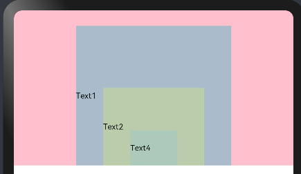
首先,识别出稍大的元素。在这个例子中,一个重叠图像,两个行区域,和一个文本区域。

实现堆叠布局
首先是背景图片,我们采用堆叠布局,用 Stack 来展示背景并铺满整个页面。 Stack({alignContent:Alignment.Center}){ Image($r('app.media.bg')) .size({width:'100%',height:'100%'}) }- 1
- 2
- 3
- 4
- 5
图片背景自己到百度上找一张
实现文本展示
第一行为一个文本展示,我们用 Text 来展示。Text("短信验证码倒计时") .fontSize(36) .fontColor(Color.White)- 1
- 2
- 3
4.实现输入框
TextInput({ placeholder: "请输入手机号" }) // 无输入时的提示文本(可选)。 .type(InputType.Normal) // 输入框类型 .placeholderColor(Color.Gray) // 设置placeholder颜色 .placeholderFont({ size: 20, weight: FontWeight.Normal, style: FontStyle.Normal }) // 设置placeholder文本样式 .enterKeyType(EnterKeyType.Next) // 设置输入法回车键类型 .caretColor(Color.Orange) // 设置输入框光标颜色 .maxLength(20) // 设置文本的最大输入字符数 .onChange((value: string) => { console.log("输入的数据是" + value) // 输入发生变化时,触发回调 this.text = value; }) .width(180) .height(50).backgroundColor(Color.White)- 1
- 2
- 3
- 4
- 5
- 6
- 7
- 8
- 9
- 10
- 11
- 12
- 13
- 14
- 15
- 16
- 17
5.实现短信验证码按钮
Button(this.flag ? `${this.sec}` + "s后重新获取" : "获取短信验证码", { type: ButtonType.Normal }) .width(150) .height(50) .backgroundColor(Color.Orange) .fontColor(Color.Black) .borderRadius(10) .onClick(() => { this.flag=true if(this.flag) { //倒计时 var T = setInterval(() => { if (this.sec <= 0) { clearTimeout(T) this.sec=30 //计时还原30秒 this.flag=false //倒计时结束改变按钮文字 } else { this.sec-- } }, 1000) } })- 1
- 2
- 3
- 4
- 5
- 6
- 7
- 8
- 9
- 10
- 11
- 12
- 13
- 14
- 15
- 16
- 17
- 18
- 19
- 20
- 21
- 22
6.完整代码
@Entry @Component struct Index { @State text: string = 'Hello World' @State sec:number=30 @State flag:boolean=false build() { Stack({alignContent:Alignment.Center}){ Image($r('app.media.bg')) .size({width:'100%',height:'100%'}) Column({space:20}){ Text("短信验证码倒计时") .fontSize(36) .fontColor(Color.White) Row(){ TextInput({ placeholder: "请输入手机号" }) // 无输入时的提示文本(可选)。 .type(InputType.Normal) // 输入框类型 .placeholderColor(Color.Gray) // 设置placeholder颜色 .placeholderFont({ size: 20, weight: FontWeight.Normal, style: FontStyle.Normal }) // 设置placeholder文本样式 .enterKeyType(EnterKeyType.Next) // 设置输入法回车键类型 .caretColor(Color.Orange) // 设置输入框光标颜色 .maxLength(20) // 设置文本的最大输入字符数 .onChange((value: string) => { console.log("输入的数据是" + value) // 输入发生变化时,触发回调 this.text = value; }) .width(180) .height(50).backgroundColor(Color.White) Button(this.flag ? `${this.sec}` + "s后重新获取" : "获取短信验证码", { type: ButtonType.Normal }) .width(150) .height(50) .backgroundColor(Color.Orange) .fontColor(Color.Black) .borderRadius(10) .onClick(() => { this.flag=true if(this.flag) { //倒计时 var T = setInterval(() => { if (this.sec <= 0) { clearTimeout(T) this.sec=30 //计时还原30秒 this.flag=false //倒计时结束改变按钮文字 } else { this.sec-- } }, 1000) } }) }.padding(10) } } .size({width:'100%',height:'100%'}) } }- 1
- 2
- 3
- 4
- 5
- 6
- 7
- 8
- 9
- 10
- 11
- 12
- 13
- 14
- 15
- 16
- 17
- 18
- 19
- 20
- 21
- 22
- 23
- 24
- 25
- 26
- 27
- 28
- 29
- 30
- 31
- 32
- 33
- 34
- 35
- 36
- 37
- 38
- 39
- 40
- 41
- 42
- 43
- 44
- 45
- 46
- 47
- 48
- 49
- 50
- 51
- 52
- 53
- 54
- 55
- 56
- 57
- 58
- 59
- 60
- 61
-
相关阅读:
力扣解法汇总592-分数加减运算
Kafka的安装及接入SpringBoot
Matlab论文插图绘制模板第60期—瀑布图(Waterfall)
深入剖析 Java 类属性与类方法的应用
IO进线程:进程间通信
SpringBoot快速搭建及打包
Flink-Java报错之org.apache.flink.api.common.functions.InvalidTypesException
人工智能在电力系统的典型应用有哪些
CSS transform
<Linux>(极简关键、省时省力)《Linux操作系统原理分析之Linux 进程管理 3》(7)
- 原文地址:https://blog.csdn.net/xy_focus/article/details/127687039
