-
【CSS】笔记7-HTML5新特征\CSS3
目录
2.1.E:first-child 和E:last-child
2.3 E:first-of-type和E:last-of-type
能够说出3-5个人HTML5新增布局和表单标签
能够说出CSS3的新增特效有哪些
一、HTML5新特性
HTML5的新特性主要针对以前不足,增加了一些新的标签、新的表单和新的表单属性
都有兼容性问题,基本是IE9+以上浏览器支持
1.语义化标签
以前布局都是div
新增带有语义标签
:头部标签 :内容标签 :定义文档某个区域 🏷注意
- 这种语义化标准主要针对搜索引擎
- 可以多次使用
- 在IE9,需要把这些元素转换为块级元素
- 其实,移动端更喜欢这些标签
2.多媒体标签
2.1.视频

语法
<video src="文件地址" controls="controls"><video>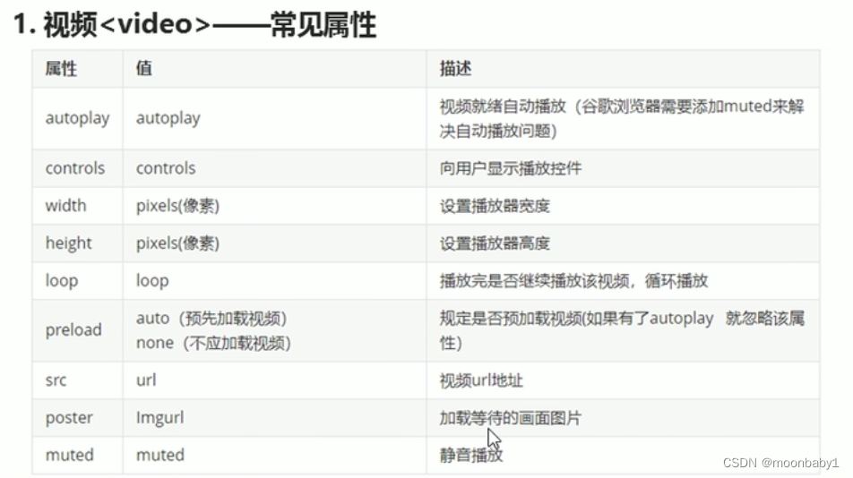
- 尽量使用MP4视频
- 启动aotuplay属性;谷歌浏览器加muted才可以自动播放
- 无限循环用loop
- 兼容性写法
- <video width="320" height="240" controls>
- <source src="movie.mp4" type="video/mp4">
- <source src="movie.ogg" type="video/ogg">
- 您的浏览器不支持 video 标签。
- </video>
2.2.音频
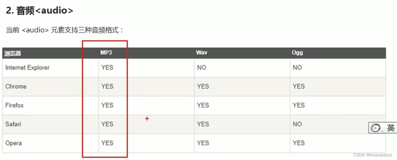
<audio src="文件地址" controls="controls"><audio>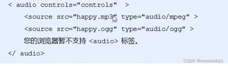

📢谷歌浏览器把音频和视频自动播放禁止了
2.3.多媒体标签总结
音频标签和视频标签使用方式基本一致
浏览器支持情况不同
谷歌浏览器把音频和视频自动播放禁止了
可以给视频标签添加muted属性来静音播放视频,音频不可以(可以通过JavaScript)
视频标签是重点,我们经常设置自动播放,不使用controls控件,循环和设置大小属性
3.新增input类型

4.新增表单属性
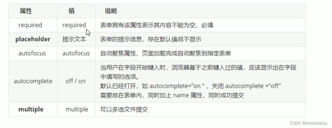
📢:required="required"可简写,其他属性同理

新知识点

二、CSS3新特性
CSS3 给我们新增了选择器,可以更加便捷,更加自由的选择目标元素。
- 属性选择器
- 结构伪类选择器
- 伪元素选择器
1.属性选择器
- 属性选择器可以根据元素特定的属性来选择元素,这样就可以不用借助于类或者id选择器

注意:类选择器,属性选择器,伪类选择器,权重为10
div[]权重11
div .icon权重11
- <!DOCTYPE html>
- <html lang="en">
- <head>
- <meta charset="UTF-8">
- <meta http-equiv="X-UA-Compatible" content="IE=edge">
- <meta name="viewport" content="width=device-width, initial-scale=1.0">
- <title>Document</title>
- </head>
- <style>
- /*必须是input 但是同时有value这个属性 []*/
- /*input[value] {
- color: pink;
- }*/
- input[type=text] {
- color: pink;
- }
- /*选择首先是div 然后具有class属性 并且属性值icon开头的元素*/
- div[class^=icon] {
- color: red;
- }
- section[class$=data] {
- color: blue;
- }
- </style>
- <body>
- <!-- 1.利用属性选择器就可以不用借助类或者id选择器 -->
- <!-- <input type="text" value="请输入用户名">
- <input type="text"> -->
- <!-- 2属性选择器还可以选择属性=值的某些元素 -->
- <input type="text">
- <input type="password">
- <!-- 3.属性选择器可以选择属性值开头的某些元素 -->
- <div class="icon1">小图标1</div>
- <div class="icon2">小图标2</div>
- <div class="icon3">小图标3</div>
- <div class="icon4">小图标4</div>
- <div>打酱油的</div>
- <!--4.属性选择器可以选择属性值结尾的某些元素 -->
- <section class="icon1-data">1</section>
- <section class="icon2-data">2</section>
- <section class="icon3-ico">3</section>
- </body>
- </html>

2.结构伪类选择器
- 结构伪类选择器主要根据文档结构来选择元素
- 常用于根据父级选择器选择里面的子元素
2.1.E:first-child 和E:last-child
2.2.nth-child(n)
- <!DOCTYPE html>
- <html lang="en">
- <head>
- <meta charset="UTF-8">
- <meta http-equiv="X-UA-Compatible" content="IE=edge">
- <meta name="viewport" content="width=device-width, initial-scale=1.0">
- <title>Document</title>
- <style>
- /*1.选择ul里第一个孩子 第一个孩子必须是li*/
- ul li:first-child {
- background-color: pink;
- }
- /*1.选择ul里最后一个孩子*/
- ul li:last-child {
- background-color: pink;
- }
- /*1.选择ul里第2孩子*/
- ul li:nth-child(2) {
- background-color: blue;
- }
- /*1.选择ul里第6孩子*/
- ul li:nth-child(6) {
- background-color: blue;
- }
- </style>
- </head>
- <body>
- <ul>
- <li>我是第1个孩子</li>
- <li>我是第2个孩子</li>
- <li>我是第3个孩子</li>
- <li>我是第4个孩子</li>
- <li>我是第5个孩子</li>
- <li>我是第6个孩子</li>
- <li>我是第7个孩子</li>
- <li>我是第8个孩子</li>
- </ul>
- </body>
- </html>
nth-child(n)选择某个父级元素的一个或多个特定的子元素(重点)
- n可以是数字,关键字和公式
- n如果是数字,就是选择第n个子元素,里面数字从1开始
- n可以是关键字:even 偶数,odd奇数 隔行变色
- n可以是公式:常见的公式如下(如果n是公式,则从0开始计算,但是第0个元素或者超出了元素的个数会被忽略)

- <!DOCTYPE html>
- <html lang="en">
- <head>
- <meta charset="UTF-8">
- <meta http-equiv="X-UA-Compatible" content="IE=edge">
- <meta name="viewport" content="width=device-width, initial-scale=1.0">
- <title>Document</title>
- <style>
- /*1.所以偶数even选出来*/
- ul li:nth-child(even) {
- background-color: pink;
- }
- /*2.所以奇数odd选出来*/
- ul li:nth-child(odd) {
- background-color: skyblue;
- }
- /*3.nth-child(n) 从0开始每次加1 往后面计算 这里面必须是n 不能是其他字母 选择了所有孩子*/
- ol li:nth-child(n) {
- background-color: skyblue;
- }
- ol li:nth-child(5n) {
- background-color: pink;
- }
- </style>
- </head>
- <body>
- <ul>
- <li>我是第1个孩子</li>
- <li>我是第2个孩子</li>
- <li>我是第3个孩子</li>
- <li>我是第4个孩子</li>
- <li>我是第5个孩子</li>
- <li>我是第6个孩子</li>
- <li>我是第7个孩子</li>
- <li>我是第8个孩子</li>
- </ul>
- <ol>
- <li>我是第1个孩子</li>
- <li>我是第2个孩子</li>
- <li>我是第3个孩子</li>
- <li>我是第4个孩子</li>
- <li>我是第5个孩子</li>
- <li>我是第6个孩子</li>
- <li>我是第7个孩子</li>
- <li>我是第8个孩子</li>
- </ol>
- </body>
- </html>

2.3 E:first-of-type和E:last-of-type
2.4区别
nth-child(n)和nth-of-type(n)区别?- nth-child 对父元素里面所有孩子排序选择(序号是固定的),先找到第n个孩子,然后看看是否和E匹配
- nth-of-type 对父元素里面指定子元素进行排序选择,先去匹配E,然后再根据E 找第n个孩子
- <!DOCTYPE html>
- <html lang="en">
- <head>
- <meta charset="UTF-8">
- <meta http-equiv="X-UA-Compatible" content="IE=edge">
- <meta name="viewport" content="width=device-width, initial-scale=1.0">
- <title>Document</title>
- <style>
- /*.nth-child会把所有盒子都排序 ;执行时候先看nth-child(1) 之后回去看 前面 div*/
- section div:nth-child(1) {
- background-color: red;
- }
- /*.nth-child会把指定元素盒子都排序 ;执行时候先看div 之后回去看 nth-of-type(a)第几个孩子*/
- section div:nth-of-type(1) {
- background-color: blue;
- }
- </style>
- </head>
- <body>
- <section>
- <p>光头强</p>
- <div>熊大</div>
- <div>熊二</div>
- </section>
- </body>
- </html>
2.5小结
- 结构伪类选择器一般用于选择父级里面的第几个孩子
- nth-child 对父元素里面所有孩子排序选择(序号是固定的),先找到第n个孩子,然后看看是否和E匹配
- nth-of-type 对父元素里面指定子元素进行排序选择,先去匹配E,然后再根据E找第n个孩子
- 关于nth-child(n), 我们要知道n是从0开始计算的,要记住常用的公式
- 如果是无序列表,我们肯定用 nth-child 更多
- 类选择器,属性选择器,伪类选择器,权重为10
3.伪元素选择器
- 伪元素选择器可以帮我们利用CSS创建新标签元素,而不需要HTML标签,从而简化HTML结构

📢
-
before 和 after 创建一个元素,但是是属于行内元素
before和after 都是一个盒子,都作为父元素的孩子 -
新创建的这个元素在文档树中是找不到的,所以我们称为伪元素
-
语法:element::before { }
- before是放在内容的前面,after是放在了内容的后面
- before 和 after 必须有 content 属性
- before 在父元素内容的前面创建元素 ,after 在父元素内容的后面插入元素
- 伪元素选择器 和 标签选择器 一样,权重为1;div::before权重是2
- 是行内元素没有宽高,如果需要要转为块或者行内块或者浮动定位
- <!DOCTYPE html>
- <html lang="en">
- <head>
- <meta charset="UTF-8">
- <meta http-equiv="X-UA-Compatible" content="IE=edge">
- <meta name="viewport" content="width=device-width, initial-scale=1.0">
- <title>Document</title>
- <style>
- div {
- width: 200px;
- height: 200px;
- background-color: pink;
- }
- div::before {
- display: inline-block;
- content: '我';
- width: 150px;
- }
- div::after {
- content: '小猪佩奇'
- }
- </style>
- </head>
- <body>
- <div>是</div>
- </body>
- </html>

3.1伪元素使用场景1:伪元素字体图标

伪元素、字体图标、定位
- html>
- <html lang="en">
- <head>
- <meta charset="UTF-8">
- <meta http-equiv="X-UA-Compatible" content="IE=edge">
- <meta name="viewport" content="width=device-width, initial-scale=1.0">
- <title>Documenttitle>
- <style>
- /*从iconmoon1的style.css粘*/
- @font-face {
- font-family: 'icomoon';
- src: url('fonts/icomoon.eot?cesqh3');
- src: url('fonts/icomoon.eot?cesqh3#iefix') format('embedded-opentype'),
- url('fonts/icomoon.ttf?cesqh3') format('truetype'),
- url('fonts/icomoon.woff?cesqh3') format('woff'),
- url('fonts/icomoon.svg?cesqh3#icomoon') format('svg');
- font-weight: normal;
- font-style: normal;
- font-display: block;
- }
- div {
- position: relative;
- width: 200px;
- height: 35px;
- border: 1px solid red;
- }
- div::after {
- position: absolute;
- top: 10px;
- right: 10px;
- font-family: 'icomoon';
- content: '\ea42';
- /*除了粘小框框还可以粘转移编码*/
- color: red;
- font-size: 1;
- }
- style>
- head>
- <body>
- <div>div>
- body>
- html>
3.2伪元素使用场景2:土豆遮罩
- <!DOCTYPE html>
- <html lang="en">
- <head>
- <meta charset="UTF-8">
- <meta http-equiv="X-UA-Compatible" content="IE=edge">
- <meta name="viewport" content="width=device-width, initial-scale=1.0">
- <title>Document</title>
- <style>
- .tudou {
- position: relative;
- width: 444px;
- height: 320px;
- background-color: pink;
- margin: 30px auto;
- }
- .tudou img {
- width: 100%;
- height: 100%;
- }
- .tudou::before {
- display: none;
- position: absolute;
- content: "";
- top: 0;
- left: 0;
- width: 100%;
- height: 100%;
- background: rgba(0, 0, 0, 0.4) url(./hot.png) no-repeat center;
- }
- /*鼠标经过tudou里面的before,遮罩层显示出来*/
- .tudou:hover::before {
- display: block;
- }
- </style>
- </head>
- <body>
- <div class="tudou">
- <!-- <div class="mask"></div> -->
- <img src="../定位/tudou.png" alt="">
- </div>
- <div class="tudou">
- <!-- <div class="mask"></div> -->
- <img src="../定位/tudou.png" alt="">
- </div>
- <div class="tudou">
- <!-- <div class="mask"></div> -->
- <img src="../定位/tudou.png" alt="">
- </div>
- </body>
- </html>

3.3伪元素使用场景3:伪元素清除浮动
- .clearfix:after {
- content: "";
- display: block;
- height: 0;
- clear: both;
- visibility: hidden;
- }
- .clearfix {
- /* IE6,7专有*/
- *zoom : 1;
- }
单冒号为了兼容IE8;用双冒号也可以
content后面一般单引号,双引号也可以


4.盒子模型
-
CSS3 中可以通过
box-sizing来指定盒模型 -
有2个值:这样我们计算盒子大小的方式就发生了改变
content-boxborder-box
box-sizing: content-box;
-
第一种情况是 CSS 的盒子模型,盒子大小为 width + padding + border
-
此种情况盒子大小为 宽度 + 内边距 + 边框,这也是我们之前写盒子所默认的
box-sizing: border-box;
- 第二种情况是 CSS3 的盒子模型,盒子大小为 width
- 此种情况盒子大小为 宽度,不包括内边距和边框,这样 padding 和 border 就不会撑大盒子了(前提是 padding 和 border 不会超过 width 宽度)
- 我们可以在以后的 css 通配符中添加 CSS3 盒子模型
- <!DOCTYPE html>
- <html lang="en">
- <head>
- <meta charset="UTF-8">
- <meta http-equiv="X-UA-Compatible" content="IE=edge">
- <meta name="viewport" content="width=device-width, initial-scale=1.0">
- <title>Document</title>
- <style>
- * {
- margin: 0;
- padding: 0;
- box-sizing: border-box;
- }
- div {
- width: 200px;
- height: 200px;
- background-color: pink;
- border: 20px solid red;
- padding: 15px;
- box-sizing: content-box;
- }
- p {
- width: 200px;
- height: 200px;
- background-color: pink;
- border: 20px solid red;
- padding: 15px;
- /*CSS3盒子模型 盒子最终的大小就是width 200的大小*/
- box-sizing: border-box;
- }
- </style>
- </head>
- <body>
- <div>小猪佩奇</div>
- <p>
- 小猪佩奇
- </p>
- </body>
- </html>
5.CSS3其他特性(了解)
5.1、滤镜filter
-
filter: CSS属性将模糊或颜色偏移等图形效果应用于元素(图片变模糊) -
语法:filter: 函数();例如filter: blur(5px);blur是一个函数,参数数值越大 图片越模糊 注意数组要加单位px
模糊处理:
blur,数值越大越模糊鼠标经过时不模糊
- <!DOCTYPE html>
- <html lang="en">
- <head>
- <meta charset="UTF-8">
- <meta http-equiv="X-UA-Compatible" content="IE=edge">
- <meta name="viewport" content="width=device-width, initial-scale=1.0">
- <title>Document</title>
- <style>
- img {
- /*blur是一个函数,参数数值越大 图片越模糊 注意数组要加单位px*/
- filter: blur(5px);
- }
- img:hover {
- filter: blur(0);
- }
- </style>
- </head>
- <body>
- <img src="../定位/tudou.png" alt="">
- </body>
- </html>
5.2calc函数
-
calc()此CSS函数让你在声明CSS属性值时执行一些计算(计算盒子宽度 width: calc 函数) -
width:calc(100% - 80px);
-
号里面可以使用 + - * / 来进行计算
子盒子比父盒子用于小30像素
- <!DOCTYPE html>
- <html lang="en">
- <head>
- <meta charset="UTF-8">
- <meta http-equiv="X-UA-Compatible" content="IE=edge">
- <meta name="viewport" content="width=device-width, initial-scale=1.0">
- <title>Document</title>
- <style>
- .father {
- width: 300px;
- height: 200px;
- background-color: pink;
- }
- .son {
- /*150px后必须有空格*/
- width: calc(100% - 30px);
- height: 30px;
- background-color: skyblue;
- }
- </style>
- </head>
- <body>
- <div class="father">
- <div class="son">
- </div>
- </div>
- </body>
- </html>
6.transition过渡🔥
-
过渡(transition)是CSS3中具有颠覆性的特征之一,我们可以在不使用 Flash 动画或JavaScript 的情况下,当元素从一种样式变换为另一种样式时为元素添加效果 -
过渡动画:是从一个状态渐渐的过渡到另外一个状态
-
过渡经常和:hover一起搭配使用
transition: 要过渡的属性 花费时间 运动曲线 何时开始- 要过渡的属性:想要变化的 CSS 属性,宽度高度,背景颜色,内外边距都可以,如果想要所有的属性都变化过渡,写一个all就可以。
- 花费时间:单位是秒(必须写单位) 比如0.5s
- 运动曲线:默认是ease(可以省略)
- 何时开始:单位是秒(必须写单位),可以设置延迟触发事件,默认是0s(可以省略)

过渡的口诀:谁做过渡给谁加(谁来变化给谁加)
- <!DOCTYPE html>
- <html lang="en">
- <head>
- <meta charset="UTF-8">
- <meta http-equiv="X-UA-Compatible" content="IE=edge">
- <meta name="viewport" content="width=device-width, initial-scale=1.0">
- <title>Document</title>
- <style>
- div {
- width: 200px;
- height: 100px;
- background-color: pink;
- /*transition变化的属性 花费时间 运动曲线 何时开始*/
- transition: width .5s ease 1s;
- /*如果多个属性 利用,分割*/
- transition: width .5s, width .5s;
- /*如果多个属性属性写all*/
- transition: all .5s;
- }
- div:hover {
- width: 400px;
- height: 200px;
- }
- </style>
- </head>
- <body>
- <div></div>
- </body>
- </html>
进度条案例
1.进度条如何布局
2.过渡的使用
- <!DOCTYPE html>
- <html lang="en">
- <head>
- <meta charset="UTF-8">
- <meta http-equiv="X-UA-Compatible" content="IE=edge">
- <meta name="viewport" content="width=device-width, initial-scale=1.0">
- <title>Document</title>
- <style>
- .bar {
- width: 150px;
- height: 15px;
- border: 1px solid red;
- border-radius: 7px;
- padding: 1px;
- }
- .bar_in {
- width: 50%;
- height: 100%;
- background-color: red;
- /*谁做过渡给谁加*/
- transition: width .5s;
- }
- /*鼠标经过父盒子 里面的子盒子宽度变*/
- /* .bar_in:hover 也是可以的*/
- .bar_in:hover .bar_in {
- width: 100%;
- }
- </style>
- </head>
- <body>
- <div class="bar">
- <div class="bar_in"></div>
- </div>
- </body>
- </html>
7.2D转换
转换(transform)是CSS3中具有颠覆性的特征之一,可以实现元素的位移,旋转,缩放等效果- 移动:translate
- 旋转:rotate
- 缩放:scale
二维坐标系:
2D转换是改变标签在二维平面上的位置和形状的一种技术,先来学习二维坐标系

7.1移动translate🔥
2D移动是2D转换里面的一种功能,可以改变元素在页面中的位置,类似定位。
语法:
- transform:translate(x,y);
- /* 或者分开写 */
- transform:translateX(n);
- transform:translateY(n);
重点📢
- 定义2D转换中的移动,沿着X和Y轴移动元素
- translate 最大的优点:不会影响到其他元素的位置
- translate 中的百分比单位是相对于自身元素的
translate:(50%,50%);
- 对行内标签没有效果
- <!DOCTYPE html>
- <html lang="en">
- <head>
- <meta charset="UTF-8">
- <meta http-equiv="X-UA-Compatible" content="IE=edge">
- <meta name="viewport" content="width=device-width, initial-scale=1.0">
- <title>Document</title>
- <style>
- /*移动盒子的位置: 定位 盒子外边距 2d转换移动*/
- div {
- width: 200px;
- height: 200px;
- background-color: pink;
- /*x就是x轴上移动位置 y就是y轴上移动位置 中间逗号分割*/
- /*transform: translate(100px, 100px);*/
- /*1,我们如果只移动x坐标*/
- /* transform: translate(100px, 0);
- transform: translateX(100px);*/
- }
- div:first-child {
- transform: translate(30px, 30px);
- /*position: relative;
- left: 50%;
- top: 30px;*/
- }
- div:last-child {
- background-color: purple;
- }
- </style>
- </head>
- <body>
- <div></div>
- <div></div>
- </body>
- </html>
案例:盒子实现垂直水平居中
- <!DOCTYPE html>
- <html lang="en">
- <head>
- <meta charset="UTF-8">
- <meta http-equiv="X-UA-Compatible" content="IE=edge">
- <meta name="viewport" content="width=device-width, initial-scale=1.0">
- <title>Document</title>
- <style>
- div {
- position: relative;
- width: 500px;
- height: 500px;
- background-color: pink;
- /*1.我们translate里面的参数可以用%
- 2.如果里面的参数是% 移动的距离是 盒子自身的宽度或者高度来对比的
- 这里的50% 就是50px 因为盒子的宽度是100px
- */
- /*transform: translate(50%);*/
- }
- p {
- position: absolute;
- top: 50%;
- left: 50%;
- width: 200px;
- height: 200px;
- background-color: purple;
- /*margin-top: -100px;
- margin-left: -100px;*/
- /*盒子往上走自己高度的一半 往左走长度的一半*/
- transform: translate(-50%, -50%);
- }
- span {
- transform: translate(300px, 300px);
- }
- </style>
- </head>
- <body>
- <div>
- <p></p>
- </div>
- <span>123</span>
- </body>
- </html>
1.使用绝对定位的
/*margin-top: -100px;
margin-left: -100px;*/
需要知道当前盒子的宽度长度,分别移动-xxx
如果写为
/*margin-top: -50%;
margin-left: -50%;*/
会是父盒子的50%,比如当前例子就是移动250px
2.行内标签无效
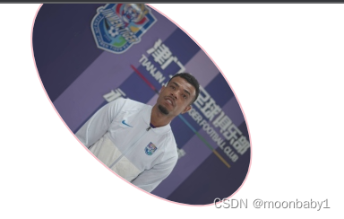
7.2旋转rotate🔥
2D旋转指的是让元素在2维平面内顺时针旋转或者逆时针旋转。
transform: rotate(度数)- rotate 里面跟度数,单位是 deg 比如 rotate(45deg)
- 角度为正时,顺时针,负时,为逆时针
- 默认旋转的中心点是元素的中心点
- <!DOCTYPE html>
- <html lang="en">
- <head>
- <meta charset="UTF-8">
- <meta http-equiv="X-UA-Compatible" content="IE=edge">
- <meta name="viewport" content="width=device-width, initial-scale=1.0">
- <title>Document</title>
- <style>
- img {
- width: 150px;
- transform: rotate(45deg);
- border-radius: 50%;
- border: 1px solid pink;
- transition: all .3;
- }
- img:hover {
- transform: rotate(360deg);
- }
- </style>
- </head>
- <body>
- <img src="../定位/tudou.png" alt="">
- </body>
- </html>

案例:三角形
- <!DOCTYPE html>
- <html lang="en">
- <head>
- <meta charset="UTF-8">
- <meta http-equiv="X-UA-Compatible" content="IE=edge">
- <meta name="viewport" content="width=device-width, initial-scale=1.0">
- <title>Document</title>
- <style>
- div {
- position: relative;
- width: 249px;
- height: 35px;
- border: 1px solid #000;
- }
- div::after {
- content: "";
- position: absolute;
- top: 8px;
- right: 15px;
- width: 10px;
- height: 10px;
- border-right: 1px solid #000;
- border-bottom: 1px solid #000;
- transform: rotate(45deg);
- transition: all 0.5s;
- }
- /*鼠标经过div 三角选择
- 鼠标经过div 里面的after*/
- div:hover::after {
- transform: rotate(225deg);
- }
- </style>
- </head>
- <body>
- <div></div>
- </body>
- </html>


7.3旋转中心点transform-origin🔥
2D转换中心点:我们可以设置元素转换的中心点 transform-origin
transform-origin: x y;
- 注意后面的参数x 和 y 用空格隔开
- x y 默认转换的中心点是元素的中心点(50% 50%)
- 还可以给x y 设置 像素或者方位名词(top bottom left right center)
- <!DOCTYPE html>
- <html lang="en">
- <head>
- <meta charset="UTF-8">
- <meta http-equiv="X-UA-Compatible" content="IE=edge">
- <meta name="viewport" content="width=device-width, initial-scale=1.0">
- <title>Document</title>
- <style>
- div {
- width: 200px;
- height: 200px;
- background-color: pink;
- margin: 100px auto;
- transition: all 1s;
- /*1.可以跟方位名词 绕左下角旋转*/
- transform-origin: left bottom;
- /*默认50% 50% 等价于 center center*/
- transform-origin: center center;
- /*3.可以是px像素 旋转点偏右上角*/
- transform-origin: 50px 50px;
- }
- div:hover {
- transform: rotate(360deg);
- }
- </style>
- </head>
- <body>
- <div></div>
- </body>
- </html>
案例
- <!DOCTYPE html>
- <html lang="en">
- <head>
- <meta charset="UTF-8">
- <meta http-equiv="X-UA-Compatible" content="IE=edge">
- <meta name="viewport" content="width=device-width, initial-scale=1.0">
- <title>Document</title>
- <style>
- div {
- overflow: hidden;
- width: 200px;
- height: 200px;
- border: 1px solid pink;
- margin: 100px auto;
- }
- div::before {
- content: '黑马';
- display: block;
- width: 100%;
- height: 100%;
- background-color: hotpink;
- transform: rotate(180deg);
- transform-origin: left bottom;
- transition: all .5s;
- }
- /*鼠标经过div 里面的before 复原*/
- div:hover::before {
- transform: rotate(0deg);
- /*transform-origin: left bottom;这句不写也可以*/
- }
- </style>
- </head>
- <body>
- <div></div>
- </body>
- </html>


7.4缩放scale
缩放:scale,只要给元素添加上了这个属性就能控制它放大还是缩小- transform: scale(x,y);
- 注意其中的x和y用逗号分割
- transform:scale(1,1): 宽和高都放大一倍,相当于没有放大
- transform:scale(2,2):宽和高都放大了2倍
- transform:scale(2):只写一个参数,第二个参数则和第一个参数一样,相当于 scale(2,2)
- transform:scale(0.5,0.5):缩小
- sacle缩放最大的优势:可以设置转换中心点缩放,默认以中心点缩放的,而且不影响其他盒子
- 数字正负都可以
- <!DOCTYPE html>
- <html lang="en">
- <head>
- <meta charset="UTF-8">
- <meta http-equiv="X-UA-Compatible" content="IE=edge">
- <meta name="viewport" content="width=device-width, initial-scale=1.0">
- <title>Document</title>
- <style>
- div {
- width: 200px;
- height: 200px;
- background-color: pink;
- margin: 100px auto;
- }
- div:hover {
- /*1.里面写的数字不跟单位 就是倍数的意思 1就是1倍 2就是2倍*/
- /*transform:scale(x,y)*/
- transform: scale(2, -1);
- }
- </style>
- </head>
- <body>
- <div></div>
- 1122321
- </body>
- </html>
案例:放大图片

- <!DOCTYPE html>
- <html lang="en">
- <head>
- <meta charset="UTF-8">
- <meta http-equiv="X-UA-Compatible" content="IE=edge">
- <meta name="viewport" content="width=device-width, initial-scale=1.0">
- <title>Document</title>
- <style>
- div {
- overflow: hidden;
- float: left;
- margin: 10px;
- }
- /*谁做过渡给谁加*/
- div img {
- transform: all 0.4;
- }
- div img:hover {
- transform: scale(1.1);
- }
- </style>
- </head>
- <body>
- <div><a href=""><img src="../定位/tudou.png" alt=""></a></div>
- <div><a href=""><img src="../定位/tudou.png" alt=""></a></div>
- <div><a href=""><img src="../定位/tudou.png" alt=""></a></div>
- </body>
- </html>
分页按钮案例
鼠标经过按钮放大

- <!DOCTYPE html>
- <html lang="en">
- <head>
- <meta charset="UTF-8">
- <meta http-equiv="X-UA-Compatible" content="IE=edge">
- <meta name="viewport" content="width=device-width, initial-scale=1.0">
- <title>Document</title>
- <style>
- li {
- float: left;
- width: 30px;
- height: 30px;
- border: 1px solid pink;
- margin: 10px;
- text-align: center;
- line-height: 30px;
- list-style: none;
- border-radius: 50%;
- cursor: pointer;
- transition: all .4s;
- }
- li:hover {
- transform: scale(1.2);
- }
- </style>
- </head>
- <body>
- <ul>
- <li>1</li>
- <li>2</li>
- <li>3</li>
- <li>4</li>
- <li>5</li>
- <li>6</li>
- <li>7</li>
- </ul>
- </body>
- </html>
7.52D转换综合写法
- 同时使用多个转换,其格式为: transform:translate() rotate() scale() 移动-旋转-缩放
- 其顺序会影响转换的效果(先旋转会改变坐标轴方向)
- 当我们同时有位移和其他属性时候,记得要将位移放到最前面
7.6 2D转换总结
- 转换transform 我们简单理解就是变形 有2D 和 3D 之分
- 我们暂且学了三个 分别是 位移 旋转 和 缩放
- 2D 移动 translate(x, y) 最大的优势是不影响其他盒子, 里面参数用%,是相对于自身宽度和高度来计算的
- 可以分开写比如 translateX(x) 和 translateY(y)
- 2D 旋转 rotate(度数) 可以实现旋转元素 度数的单位是deg
- 2D 缩放 sacle(x,y) 里面参数是数字 不跟单位 可以是小数 最大的优势 不影响其他盒子
- 设置转换中心点 transform-origin : x y; 参数可以百分比、像素或者是方位名词
- l当我们进行综合写法,同时有位移和其他属性的时候,记得要将位移放到最前
8、CSS3动画
动画 animation是CSS3中具有颠覆性的特征之一,可通过设置多个节点来精确控制一个或一组动画,常用来实现复杂的动画效果。
相比较过渡,动画可以实现更多变化,更多控制,连续自动播放等效果。
制作动画分为两步:
- 先定义动画
- 再使用(调用)动画
8.1、用keyframs定义动画
用 keyframes 定义动画(类似定义类选择器)
- @keyframes 动画名称 {
- 0%{
- width:100px;
- }
- 100%{
- width:200px;
- }
- }
- 0% 是动画的开始,100% 是动画的完成。这样的规则就是动画序列。
- 在 @keyframes 中规定某项 CSS 样式,就能创建由当前样式逐渐改为新样式的动画效果
- 动画是使元素从一种样式逐渐变化为另一种样式的效果。您可以改变任意多的样式任意多的次数。
- 请用百分比来规定变化发生的时间,或用关键词 “from” 和 “to”,等同于 0% 和 100%。
8.2使用动画
- div {
- width: 200px;
- height: 200px;
- background-color: pink;
- animation-name: move;
- animation-duration: 2s;
- animation-iteration-count: infinite;
- /*无限重复*/
- animation-direction: alternate;
- /*是否反方向 默认normal 反方向alternate*/
- }
案例:动画序列
- <!DOCTYPE html>
- <html lang="en">
- <head>
- <meta charset="UTF-8">
- <meta http-equiv="X-UA-Compatible" content="IE=edge">
- <meta name="viewport" content="width=device-width, initial-scale=1.0">
- <title>Document</title>
- <style>
- /* @keyframes move {
- from {
- transform: translateX(0px);
- }
- to {
- transform: translateX(1000px);
- }
- }*/
- @keyframes move {
- 0% {
- transform: translate(0, 0);
- }
- 25% {
- transform: translate(1000px, 0);
- }
- 50% {
- transform: translate(1000px, 500px);
- }
- 75% {
- transform: translate(0, 500px);
- }
- 100% {
- transform: translate(0, 0);
- }
- }
- div {
- width: 200px;
- height: 200px;
- background-color: pink;
- animation-name: move;
- animation-duration: 10s;
- }
- </style>
- </head>
- <body>
- <div></div>
- </body>
- </html>
8.3动画常见属性

8.4动画简写
/* animation:动画名称 持续时间 运动曲线 何时开始 播放次数 是否反方向 动画起始或者结束的状态 */
animation: move 5s linear 2s infinite alternate;
前面两个属性 name duration一定要写
- 简写属性里面不包含 animation-play-state
- 暂停动画:animation-play-state: puased; 经常和鼠标经过等其他配合使用
- l想要动画走回来 ,而不是直接跳回来:animation-direction: alternate
- 盒子动画结束后,停在结束位置: animation-fill-mode : forwards
案例:大数据热点图
- <!DOCTYPE html>
- <html lang="en">
- <head>
- <meta charset="UTF-8">
- <meta http-equiv="X-UA-Compatible" content="IE=edge">
- <meta name="viewport" content="width=device-width, initial-scale=1.0">
- <title>Document</title>
- <style>
- body {
- background-color: #333;
- }
- .map {
- position: relative;
- width: 918px;
- height: 706px;
- background: url(./images/map.png) no-repeat;
- margin: 0 auto;
- }
- .city {
- position: absolute;
- top: 253px;
- right: 286px;
- color: #fff;
- }
- .dotted {
- width: 8px;
- height: 8px;
- background-color: #09f;
- border-radius: 50%;
- }
- .city div[class^="pulse"] {
- /*保证我们小波纹在父盒子里面水平垂直居中 放大之后就会中心向四周发散*/
- position: absolute;
- top: 50%;
- left: 50%;
- transform: translate(-50%, -50%);
- width: 8px;
- height: 8px;
- box-shadow: 0 0 12px #009dfd;
- border-radius: 50%;
- animation: pulse 1.2s linear infinite;
- }
- .city div.pulse2 {
- animation-delay: 0.4s;
- }
- .city div.pulse3 {
- animation-delay: 0.8s;
- }
- @keyframes pulse {
- 0% {}
- 70% {
- /*不要用scale 因为会让阴影变大*/
- width: 40px;
- height: 40px;
- opacity: 1;
- }
- 100% {
- width: 70px;
- height: 70px;
- opacity: 0;
- }
- }
- </style>
- </head>
- <body>
- <div class="map">
- <div class="city">
- <div class="dotted"></div>
- <div class="pulse1"></div>
- <div class="pulse2"></div>
- <div class="pulse3"></div>
- </div>
- </div>
- </body>
- </html>
8.5速度曲线细节
animation-timing-function:规定动画的速度曲线,默认是“ease”
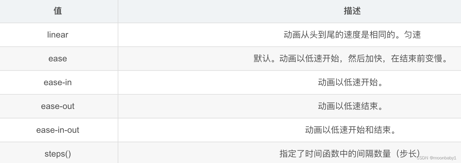
steps就是分几步完成动画
熊奔跑案例
- <!DOCTYPE html>
- <html lang="en">
- <head>
- <meta charset="UTF-8">
- <meta http-equiv="X-UA-Compatible" content="IE=edge">
- <meta name="viewport" content="width=device-width, initial-scale=1.0">
- <title>Document</title>
- <style>
- body {
- background-color: #ccc;
- }
- div {
- position: absolute;
- width: 190px;
- height: 150px;
- background: url(./images/pear.png) no-repeat;
- /*添加多个动画,都好分割*/
- /*animation: bear 1s steps(8) infinite;*/
- animation: bear 1s steps(8) infinite, move 1s forwards;
- }
- @keyframes bear {
- 0% {}
- 100% {
- background-position: -1708px 0;
- }
- }
- @keyframes move {
- 0% {
- left: 0;
- }
- 100% {
- left: 50%;
- margin-left: -95px;
- }
- </style>
- </head>
- <body>
- <div></div>
- </body>
- </html>
9、3D转换
我们生活的环境是3D的,照片就是3D物体在2D平面呈现的例子.
3D转换的特点:
- 近大远小。
- 物体后面遮挡不可见
当我们在网页上构建3D效果的时候参考这些特点就能产出3D效果。
9.1、三维坐标系
三维坐标系其实就是指立体空间,立体空间是由3个轴共同组成的。

- x轴:水平向右 注意: x 右边是正值,左边是负值
- y轴:垂直向下 注意: y 下面是正值,上面是负值
- z轴:垂直屏幕 注意: 往外面是正值,往里面是负值
3D 转换我们主要学习工作中最常用的 3D 位移 和 3D 旋转
9.2、3D位移translate3d
3D移动在2D移动的基础上多加了一个可以移动的方向,就是z轴方向
- translform:translateX(100px):仅仅是在x轴上移动
- translform:translateY(100px):仅仅是在Y轴上移动
- translform:translateZ(100px):仅仅是在Z轴上移动(注意:translateZ一般用px单位)
- transform:translate3d(x,y,z):其中 x、y、z 分别指要移动的轴的方向的距离;不可省略,没有就写0
因为z轴是垂直屏幕,由里指向外面,所以默认是看不到元素在z轴的方向上移动
9.3 、透视perspective
透视:在2D平面产生近大远小视觉立体,但是只是效果二维的- 如果想要在网页产生3D效果需要透视(理解成3D物体投影在2D平面内)
- 模拟人类的视觉位置,可认为安排一只眼睛去看
- 透视我们也称为视距:视距就是人的眼睛到屏幕的距离
- 距离视觉点越近的在电脑平面成像越大,越远成像越小
- 透视的单位是像素px

透视写在被观察元素的父盒子上面的
d:就是视距,视距就是一个距离人的眼睛到屏幕的距离。
z:就是 z轴,物体距离屏幕的距离,z轴越大(正值) 我们看到的物体就越大
透视越小盒子越大
【translateZ 】
- translform:translateZ(100px):仅仅是在Z轴上移动。
- 有了透视,就能看到translateZ 引起的变化了
- translateZ:近大远小
- translateZ:往外是正值
- translateZ:往里是负值
9.4、3D旋转rotate3d
3D旋转:3D旋转指可以让元素在三维平面内沿着 x轴,y轴,z轴或者自定义轴进行旋转。
- transform: rotateX(45deg) :沿着X轴正方向旋转45度
- transform: rotateY(45deg) :沿着Y轴正方向旋转45度
- transform: rotateZ(45deg) :沿着Z轴正方向旋转45度
- transform: rotate3d(x,y,z,deg) :沿着自定义轴旋转 deg为角度(了解即可)不要的写0;1,1,0是沿45度旋转
xyz是表示旋转轴的矢量,是标示你是否希望沿着该轴旋转,最后一个标示旋转的角度。
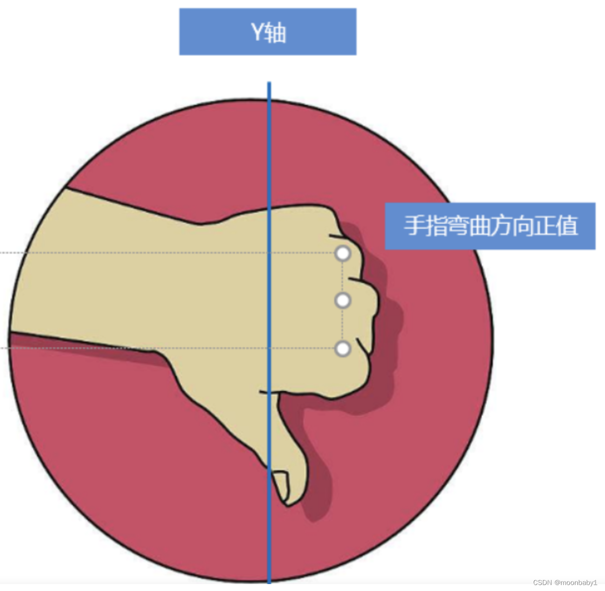
👉左手准则1
- 左手的手拇指指向 x轴的正方向
- 其余手指的弯曲方向就是该元素沿着x轴旋转的方向

👉左手准则②
- 左手的手拇指指向 y轴的正方向
- 其余手指的弯曲方向就是该元素沿着y轴旋转的方向(正值)
rotateZ和2d选择差不多
9.5、3D呈现transform-style
3D呈现:transform-style
- 控制子元素是否开启三维立体环境
transform-style: flat子元素不开启3d立体空间 默认的transform-style: preserve-3d子元素开启立体空间- 代码写给父级,但是影响的是子盒子
- 这个属性很重要
案例


- <!DOCTYPE html>
- <html lang="en">
- <head>
- <meta charset="UTF-8">
- <meta http-equiv="X-UA-Compatible" content="IE=edge">
- <meta name="viewport" content="width=device-width, initial-scale=1.0">
- <title>Document</title>
- <style>
- body {
- perspective: 500px;
- }
- .box {
- position: relative;
- width: 200px;
- height: 200px;
- margin: 100px auto;
- transform-style: preserve-3d;
- }
- .box:hover {
- transform: rotateY(60deg);
- }
- .box div {
- position: absolute;
- top: 0;
- left: 0;
- width: 100%;
- height: 100%;
- background-color: pink;
- }
- .box div:last-child {
- background-color: purple;
- transform: rotateX(60deg);
- }
- </style>
- </head>
- <body>
- <div class="box">
- <div></div>
- <div></div>
- </div>
- </body>
- </html>
案例:两面翻转

1.bottom往下移动17.5px;有移动有旋转,要先移动
2.粉色盒子往前移(构成中心立方体),往外走是正值
- <!DOCTYPE html>
- <html lang="en">
- <head>
- <meta charset="UTF-8">
- <meta http-equiv="X-UA-Compatible" content="IE=edge">
- <meta name="viewport" content="width=device-width, initial-scale=1.0">
- <title>Document</title>
- <style>
- * {
- margin: 0;
- padding: 0;
- }
- ul {
- margin: 100px;
- }
- ul li {
- float: left;
- margin: 0 5px;
- width: 120px;
- height: 35px;
- list-style: none;
- /*一会儿需要给box 旋转 也需要透视 干脆给li加 里面的盒子都有透视*/
- perspective: 500px;
- }
- .box {
- position: relative;
- width: 100%;
- height: 100%;
- transform-style: preserve-3d;
- transition: all .4s;
- }
- .box:hover {
- transform: rotateX(90deg);
- }
- .front,
- .bottom {
- position: absolute;
- left: 0;
- top: 0;
- width: 100%;
- height: 100%;
- }
- .front {
- background-color: pink;
- z-index: 1;
- transform: translateZ(17.5px)
- }
- .bottom {
- background-color: purple;
- /*如果有移动和其他样式 必须先写移动*/
- transform: translateY(17.5px) rotateX(-90deg);
- }
- </style>
- </head>
- <body>
- <ul>
- <li>
- <div class="box">
- <div class="front">111</div>
- <div class="bottom">222</div>
- </div>
- </li>
- <li>
- <div class="box">
- <div class="front">111</div>
- <div class="bottom">222</div>
- </div>
- </li>
- <li>
- <div class="box">
- <div class="front">111</div>
- <div class="bottom">222</div>
- </div>
- </li>
- </ul>
- </body>
- </html>
案例:旋转木马

- <!DOCTYPE html>
- <html lang="en">
- <head>
- <meta charset="UTF-8">
- <meta http-equiv="X-UA-Compatible" content="IE=edge">
- <meta name="viewport" content="width=device-width, initial-scale=1.0">
- <title>Document</title>
- <style>
- body {
- perspective: 1000px;
- }
- section {
- position: relative;
- width: 300px;
- height: 200px;
- margin: 150px auto;
- transform-style: preserve-3d;
- /*添加动画*/
- animation: rotate 3s linear infinite;
- }
- @keyframes rotate {
- 0% {
- transform: rotateY(0);
- }
- 100% {
- transform: rotateY(360deg);
- }
- }
- section:hover {
- /*鼠标暂停*/
- animation-play-state: paused;
- }
- section div {
- position: absolute;
- top: 0;
- left: 0;
- width: 100%;
- height: 100%;
- background: url(../定位/tudou.png);
- }
- section div:nth-child(1) {
- transform: translateZ(300px);
- }
- section div:nth-child(2) {
- /*先旋转好了再移动距离*/
- transform: rotateY(60deg) translateZ(300px);
- }
- section div:nth-child(3) {
- /*先旋转好了再移动距离*/
- transform: rotateY(120deg) translateZ(300px);
- }
- section div:nth-child(4) {
- /*先旋转好了再移动距离*/
- transform: rotateY(180deg) translateZ(300px);
- }
- section div:nth-child(5) {
- /*先旋转好了再移动距离*/
- transform: rotateY(240deg) translateZ(300px);
- }
- section div:nth-child(6) {
- /*先旋转好了再移动距离*/
- transform: rotateY(300deg) translateZ(300px);
- }
- </style>
- </head>
- <body>
- <section>
- <div></div>
- <div></div>
- <div></div>
- <div></div>
- <div></div>
- <div></div>
- </section>
- </body>
- </html>
三、浏览器私有前缀

-
相关阅读:
基于若依ruoyi-nbcio支持flowable流程角色,同时修改流转用户为username,流程启动做大调整(二)
443-C++基础语法(121-130)
【Python机器学习】零基础掌握LinearDiscriminantAnalysis判别分析
什么是二叉查找树?看完这篇就懂了
STM32——MPU6050六轴传感器
【Python零基础入门篇 · 3】:掌握数值类型、进制的转换
什么是大数据架构
10万字208道Java经典面试题总结(附答案)
2.2.5 SQL注入(盲注)
终于有阿里p9架构师分享出困扰我多年的分布式系统开发实战文档
- 原文地址:https://blog.csdn.net/hhcharming/article/details/127589035
