-
小程序自定义tabBar——原生
目录

笔记:
一、微信官方文档:
自定义 tabBar 可以让开发者更加灵活地设置 tabBar 样式,以满足更多个性化的场景。
- 在
app.json中的tabBar项指定custom字段,同时其余tabBar相关配置也补充完整。 - 所有 tab 页的 json 里需声明
usingComponents项,也可以在app.json全局开启。
二、效果动图
简单效果:

三、示例代码下载及配置
为了方便,可以直接下载demo

打开后,我新增一个页面,如下结构:

在app,json中 加上 "custom": true, 后,后面的页面配置就会失效。但还是要配置,list不能为空。
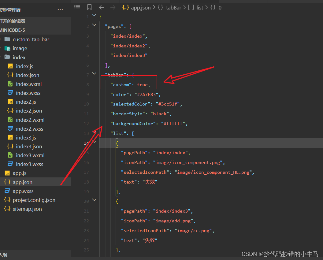
由于是直接下载微信官方文档提供的示例,对于我们想要的效果,仅需改动或新增即可。
四、遇到的问题
但也是遇到一些问题:
- 小程序自定义导航栏点击时会闪一下 将 cover-view 换成 view ,将 cover-image 换成 iamge 即可
- 报错:Some selectors are not allowed in component wxss, including tag name selectors, ID selectors, and attribute selectors。class="cover-image" 原因是:在组件 即Component的wxss中使用了不推荐的选择器, 用clas 选择器 即可
五、新增自定义样式
我的自定义tabbar:
custom-tab-bar组件中:
- js
- Component({
- data: {
- selected: 0,
- color: "#7A7E83",
- selectedColor: "#3cc51f",
- list: [{
- pagePath: "/index/index",
- iconPath: "/image/icon_component.png",
- selectedIconPath: "/image/icon_component_HL.png",
- text: "组件"
- },
- {
- pagePath: "/index/index3",
- iconPath: "/image/add.png",
- selectedIconPath: "/image/add.png",
- text: "发布"
- },
- {
- pagePath: "/index/index2",
- iconPath: "/image/icon_API.png",
- selectedIconPath: "/image/icon_API_HL.png",
- text: "接口"
- }
- ]
- },
- attached() {},
- methods: {
- switchTab(e) {
- const data = e.currentTarget.dataset
- const url = data.path
- wx.switchTab({
- url
- })
- this.setData({
- selected: data.index
- })
- },
- },
- })
- json
- {
- "component": true
- }
- wxml
- <view class="tab-bar">
- <view wx:for="{{list}}" wx:key="index" class="tab-bar-item" data-path="{{item.pagePath}}" wx:for-index="index" data-index="{{index}}" bindtap="switchTab">
- <image class=" {{selected == index?'active':''}}" src="{{selected===index?item.selectedIconPath:item.iconPath}}">image>
- <view class="{{ item.tuqi }}" wx:if="{{ selected===index }}" class="cover-view" style="color: {{selected === index ? selectedColor : color}} ">{{item.text}}view>
- view>
- view>
- wxss
- .tab-bar {
- position: fixed;
- bottom: 0;
- left: 0;
- right: 0;
- height: 48px;
- background: white;
- display: flex;
- padding-bottom: env(safe-area-inset-bottom);
- border-top: 1px solid #ccc;
- border-top-left-radius: 25rpx;
- border-top-right-radius: 25rpx;
- }
- .tab-bar-item {
- flex: 1;
- text-align: center;
- display: flex;
- justify-content: center;
- align-items: center;
- flex-direction: column;
- }
- .tab-bar-item image {
- transition: all .25s ease;
- width: 27px;
- height: 27px;
- }
- .tab-bar-item .cover-view {
- font-size: 20rpx;
- margin-top: 5rpx;
- animation-name: wipe-in-up; /*动画的名称 */
- animation-duration: 1000ms; /*动画从开始到结束的时间*/
- }
- .active {
- transition: property duration timing-function delay;
- transform: scale(1.2);
- border-radius: 50rpx;
- margin-top: -50rpx;
- transform: translateY(-10rpx);
- animation-name: wipe-in-up; /*动画的名称 */
- animation-duration: 1000ms; /*动画从开始到结束的时间*/
- }
- @keyframes wipe-in-up {
- from {
- clip-path: inset(100% 0 0 0);
- }
- to {
- clip-path: inset(0 0 0 0);
- }
- }
- [transition-style="in:wipe:up"] {
- animation: 2.5s cubic-bezier(.25, 1, .30, 1) wipe-in-up both;
- }
- .tq {
- margin-top: -50rpx;
- }
六、完整代码
完整代码:GitHub - YXHLHM/-TabBar-: 微信小程序 自定义 tabBar
拜~~
- 在
-
相关阅读:
个推支持海外消息推送,助力APP扬帆出海
C++多线程--std::thread
Java的一些常见类【万字介绍】
MySQL如何对SQL做prepare预处理(解决IN查询SQL预处理仅能查询出一条记录的问题)
Word文档设置表格可跨页
vue路由切换时,若是一个路径但是参数不同,页面不会变化
我上半年深陷泥淖的往事
力扣:125. 验证回文串(Python3)
一个命令就可启用的微信机器人WhoChat
访问 GitHub 方法
- 原文地址:https://blog.csdn.net/qq_61122628/article/details/127453014
