-
R语言学习笔记
R可以作为计算使用
print(1+1) print(1+exp(3)+sin(0.5)) x = c(1, 2, 3) print(x) print(x^2) print(x^3) print(sum(x)) print(sum(x^3)) print(sum(1, 2))- 1
- 2
- 3
- 4
- 5
- 6
- 7
- 8
- 9

R中的数据集
向量
euro #欧元汇率,长度为11,每个元素都有命名
landmasses #48个陆地的面积,每个都有命名
precip #长度为70的命名向量
rivers #北美141条河流长度
state.abb #美国50个州的双字母缩写
state.area #美国50个州的面积
state.name #美国50个州的全称
因子
state.division #美国50个州的分类,9个类别
state.region #美国50个州的地理分类
矩阵、数组
euro.cross #11种货币的汇率矩阵
freeny.x #每个季度影响收入四个因素的记录
state.x77 #美国50个州的八个指标
USPersonalExpenditure #5个年份在5个消费方向的数据
VADeaths #1940年弗吉尼亚州死亡率(每千人)
volcano #某火山区的地理信息(10米×10米的网格)
WorldPhones #8个区域在7个年份的电话总数
iris3 #3种鸢尾花形态数据
Titanic #泰坦尼克乘员统计
UCBAdmissions #伯克利分校1973年院系、录取和性别的频数
crimtab #3000个男性罪犯左手中指长度和身高关系
HairEyeColor #592人头发颜色、眼睛颜色和性别的频数
occupationalStatus #英国男性父子职业联系
类矩阵
eurodist #欧洲12个城市的距离矩阵,只有下三角部分
Harman23.cor #305个女孩八个形态指标的相关系数矩阵
Harman74.cor #145个儿童24个心理指标的相关系数矩阵
数据框
airquality #纽约1973年5-9月每日空气质量
anscombe #四组x-y数据,虽有相似的统计量,但实际数据差别较大
attenu #多个观测站对加利福尼亚23次地震的观测数据
attitude #30个部门在七个方面的调查结果,调查结果是同一部门35个职员赞成的百分比
beaver1 #一只海狸每10分钟的体温数据,共114条数据
beaver2 #另一只海狸每10分钟的体温数据,共100条数据
BOD #随水质的提高,生化反应对氧的需求(mg/l)随时间(天)的变化
cars #1920年代汽车速度对刹车距离的影响
chickwts #不同饮食种类对小鸡生长速度的影响
esoph #法国的一个食管癌病例对照研究
faithful #一个间歇泉的爆发时间和持续时间
Formaldehyde #两种方法测定甲醛浓度时分光光度计的读数
Freeny #每季度收入和其他四因素的记录
dating from #配对的病例对照数据,用于条件logistic回归
InsectSprays #使用不同杀虫剂时昆虫数目
iris #3种鸢尾花形态数据
LifeCycleSavings #50个国家的存款率
longley #强共线性的宏观经济数据
morley #光速测量试验数据
mtcars #32辆汽车在11个指标上的数据
OrchardSprays #使用拉丁方设计研究不同喷雾剂对蜜蜂的影响
PlantGrowth #三种处理方式对植物产量的影响
pressure #温度和气压
Puromycin #两种细胞中辅因子浓度对酶促反应的影响
quakes #1000次地震观测数据(震级>4)
randu #在VMS1.5中使用FORTRAN中的RANDU三个一组生成随机数字,共400组。#该随机数字有问题。在VMS2.0以上版本已修复。
rock #48块石头的形态数据
sleep #两药物的催眠效果
stackloss #化工厂将氨转为硝酸的数据
swiss #瑞士生育率和社会经济指标
ToothGrowth #VC剂量和摄入方式对豚鼠牙齿的影响
trees #树木形态指标
USArrests #美国50个州的四个犯罪率指标
USJudgeRatings #43名律师的12个评价指标
warpbreaks #织布机异常数据
women #15名女性的身高和体重
列表
state.center #美国50个州中心的经度和纬度
类数据框
ChickWeight #饮食对鸡生长的影响
CO2 #耐寒植物CO2摄取的差异
DNase #若干次试验中,DNase浓度和光密度的关系
Indometh #某药物的药物动力学数据
Loblolly #火炬松的高度、年龄和种源
Orange #桔子树生长数据
Theoph #茶碱药动学数据
时间序列数据
airmiles #美国1937-1960年客运里程营收(实际售出机位乘以飞行哩数)
AirPassengers #Box & Jenkins航空公司1949-1960年每月国际航线乘客数
austres #澳大利亚1971-1994每季度人口数(以千为单位)
BJsales #有关销售的一个时间序列
BJsales.lead #前一指标的先行指标(leading indicator)
co2 #1959-1997年每月大气co2浓度(ppm)
discoveries #1860-1959年每年巨大发现或发明的个数
ldeaths #1974-1979年英国每月支气管炎、肺气肿和哮喘的死亡率
fdeaths #前述死亡率的女性部分
mdeaths #前述死亡率的男性部分
freeny.y #每季度收入
JohnsonJohnson #1960-1980年每季度Johnson & Johnson股票的红利
LakeHuron #1875-1972年某一湖泊水位的记录
lh #黄体生成素水平,10分钟测量一次
lynx #1821-1934年加拿大猞猁数据
nhtemp #1912-1971年每年平均温度
Nile #1871-1970尼罗河流量
nottem #1920-1939每月大气温度
presidents #1945-1974年每季度美国总统支持率
UKDriverDeaths #1969-1984年每月英国司机死亡或严重伤害的数目
sunspot.month #1749-1997每月太阳黑子数
sunspot.year #1700-1988每年太阳黑子数
sunspots #1749-1983每月太阳黑子数
treering #归一化的树木年轮数据
UKgas #1960-1986每月英国天然气消耗USAccDeaths #1973-1978美国每月意外死亡人数
uspop #1790–1970美国每十年一次的人口总数(百万为单位)
WWWusage #每分钟网络连接数
Seatbelts #多变量时间序列。和UKDriverDeaths时间段相同,反映更多因素。
EuStockMarkets #多变量时间序列。欧洲股市四个主要指标的每个工作日记录,共1860条记录。查看数据

变量或数据集的具体描述help(mtcars)- 1
R中的包
install.packages("somepackage") library("somepackage")- 1
- 2
举个例子
install.packages("tidyverse") library(tidyverse)- 1
- 2
查看
View(iris)- 1
数据结构
查看形状 dim() 查看列 names() 查看数据结构 str()- 1
- 2
- 3
- 4
- 5
- 6
隔离变量(数据的筛选)
Structure of data
help(mtcars)- 1
[, 1] mpg Miles/(US) gallon 油耗
[, 2] cyl Number of cylinders 气缸
[, 3] disp Displacement (cu.in.) 位移
[, 4] hp Gross horsepower 马力
[, 5] drat Rear axle ratio 后轴传动比
[, 6] wt Weight (1000 lbs)
[, 7] qsec 1/4 mile time
[, 8] vs Engine (0 = V-shaped, 1 = straight)
[, 9] am Transmission (0 = automatic, 1 = manual) 手动、自动
[,10] gear Number of forward gears 几个前进档位
[,11] carb Number of carburetors 化油器数量
dim(mtcars)- 1

names(mtcars)- 1

查看变量数据类型str(mtcars)- 1

隔离变量
通过使用从数据框中选择一个变量DataName$VariableName并将结果存储在向量中。
mpg= mtcars$mpg- 1
请注意,RStudio具有代码完成功能,因此将自动预测您的命令。当您键入时mtcars$,所有变量的名称都会出现。

class(mpg) str(mpg)- 1
- 2

length(mpg)- 1

sum(mpg)- 1

sort(mpg)- 1

降序 sort(mpg, decreasing = T)- 1
- 2
对变量的5个最低值求和。 sum(sort(mpg)[1:5])- 1
- 2
选择子集
mpg[1] mpg[5] mpg[c(1,5)] mtcars$mpg[c(1,5)] mtcars[1,1] mtcars[5,1] #mpg is 1st colu- 1
- 2
- 3
- 4
- 5
- 6

变更分类
您可能不同意R的初始分类,并且想要更改它。

class(mtcars$carb) carbF = factor(mtcars$carb) class(carbF)- 1
- 2
- 3

ageCanVote = factor(setNames(c(16, 18, 18, "Unknown"), c("Austria", "Australia", "Afghanistam", "Zambia"))) as.numeric(ageCanVote) # This is a mistake, as it converts to the rank of the factor level as.numeric(as.character(ageCanVote)) # This converts properly- 1
- 2
- 3

绘图

ggplot安装install.packages("ggplot2") library(ggplot2)- 1
- 2
柱状图绘制
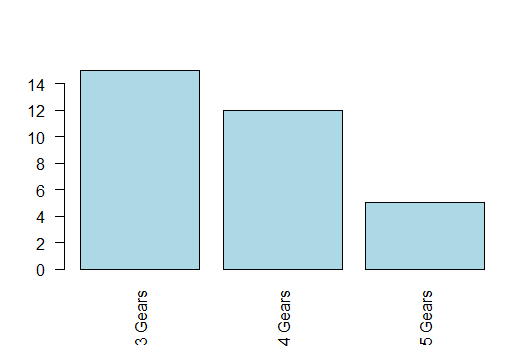
查看32个样本的前进挡个数> barplot(mtcars$gear)- 1

查看值的统计数量(每个值有几个)table(mtcars$gear)- 1

counts = table(mtcars$gear) barplot(counts)- 1
- 2

help(barplot)- 1

barplot(counts, names.arg=c("3 Gears","4 Gears","5 Gears"),col="lightblue")- 1

par(las=2) barplot(counts, names.arg=c("3 Gears","4 Gears","5 Gears"),col="lightblue")- 1
- 2
par(las=1) barplot(counts, names.arg=c("3 Gears","4 Gears","5 Gears"),col="lightblue")- 1
- 2

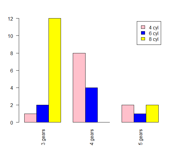
counts1 = table(mtcars$cyl, mtcars$gear) barplot(counts1,names.arg=c("3 Gears","4 Gears","5 Gears"),col=c("lightblue","lightgreen","lightyellow"),legend = rownames(counts1)) barplot(counts1,names.arg=c("3 Gears","4 Gears","5 Gears"),col=c("lightblue","lightgreen","lightyellow"),legend = c("4 cyl","6 cyl","8 cyl")) barplot(counts1, names.arg = c("3 Gears", "4 Gears", "5 Gears"), col = c("lightblue", "lightgreen", "lightyellow"), legend = c("4 cyl", "6 cyl", "8 cyl"), beside = TRUE)- 1
- 2
- 3
- 4
- 5


library(ggplot2) # Select the mtcars data, and focus on cyl as factor (qualitative) on x axis p = ggplot(mtcars, aes(x=factor(cyl))) # 指定x轴y轴的数据 p + geom_bar() # Produce a barplot 是柱状图- 1
- 2
- 3
- 4
- 5

library(ggplot2) # Select the mtcars data, and focus on cyl as factor (qualitative) on x axis p = ggplot(mtcars, aes(y=factor(cyl))) # 指定x轴y轴的数据 p + geom_bar()- 1
- 2
- 3
- 4


https://blog.csdn.net/qq_42458954/article/details/82356061


# mpg data p1 = ggplot(mpg, aes(class)) # Select the mpg data, and focus on class as x axis 最后一列列名为class p1 + geom_bar() # (1) Produce a barplot p1 + geom_bar(aes(weight = displ)) # (2) Produce a barplot with counts from displacement variable- 1
- 2
- 3
- 4
- 5
说明:g1= ggplot(mpg, aes(x=class))

g1 + geom_bar() # 注意到赋值的对象直接可以使用在“+”运算中常用的 aes 参数有:
-
x= / y= :这是基本参数。
-
fill= / color= :一般指定一个因子,让 ggplot2 自动根据因子的水平数分配颜色并绘图。
-
shape= :类似上,不过是自动分配点样式。


双重条形图
p1 + geom_bar(aes(fill = drv)) # 一般指定一个因子,让 ggplot2 自动根据因子的水平数分配颜色并绘图 p1 +geom_bar(aes(fill = drv), position = position_stack(reverse = TRUE)) +coord_flip() +theme(legend.position = "top") # (4) Customising (3)- 1
- 2

直方图
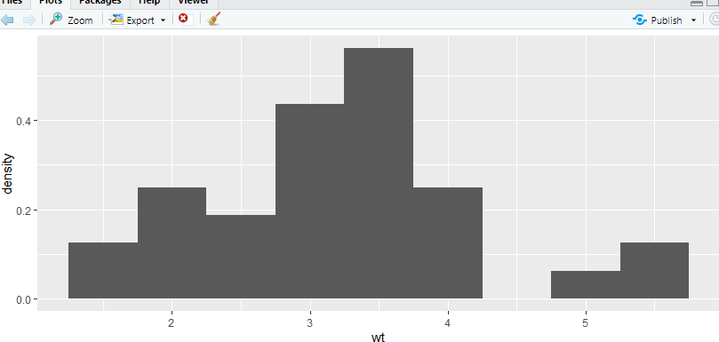
hist(mtcars$wt)- 1

hist(mtcars$wt,freq=F)- 1

我们将考虑概率直方图(第二个),这意味着直方图的总面积为1。hist(mtcars$wt, br=seq(0,6,by=0.5), freq=F, col="lightgreen",xlab="weight of cars (1000 lbs)",main="Histogram of Weights of Cars US 1973-74")- 1
br=seq(0,6,by=1) seq是(开始, 结束, by=步长)

ggplot直方图
使用aes(y=…density…)将原始直方图转换为概率直方图。p = ggplot(data=mtcars, aes(x=wt)) # Select the mtcars data, and focus on wt (quantitative) on x axis p + geom_histogram(aes(y=..density..),binwidth=0.5) + xlab('Weight')+ylab('Density') # Produce a histogram with x and y axis labels- 1
- 2
- 3
箱线图
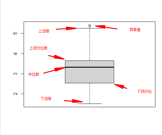
箱线图是定量变量的另一个摘要。
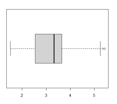
产生一个单一的汽车的重量箱线图。boxplot(mtcars$wt)- 1

boxplot(mtcars$wt, horizontal = T)- 1
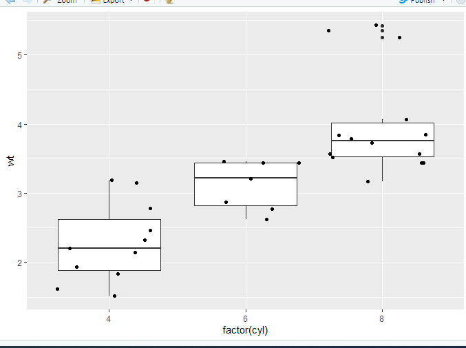
用在箱线图中boxrpolt(y~x1),表示将x1视作分组变量,分组输出y1的箱线图boxplot(mtcars$wt~mtcars$cyl) boxplot(mtcars$wt~mtcars$cyl, names=c("4 cyl", "6 cyl","8 cyl"),ylab="Weight of cars (1000 lbs)")- 1
- 2

ggplot箱线图
p = ggplot(data=mtcars, aes(x="", y=wt)) # Select the mtcars data, and focus on wt (quantitative) on y axis (with no filtering on x axis) p + geom_boxplot() # Produce a boxplot- 1
- 2
- 3

双箱线图
p = ggplot(data=mtcars, aes(x=factor(cyl),y=wt)) # Select the mtcars data, and focus on wt (quantitative) on y axis and cyl (qualitative) on x axis p + geom_boxplot() # Produce a boxplot, of wt filtered by cyl- 1
- 2

geom_jitter绘制带有少量随机噪声的点。我们使用它来调查小数据集中的过度绘图。有时候,数据量大,我们需要显示每一个数据点,可以很直观的看到数据的分布情况。在文章中这种图是很常见的。我们只需要在上面的箱形图中加入geom_jitter函数就可以啦p = ggplot(data=mtcars, aes(x=factor(cyl),y=wt)) p + geom_boxplot() + geom_jitter()- 1
- 2
p = ggplot(data=mtcars, aes(x=factor(cyl),y=wt)) p + geom_boxplot() + coord_flip() #横向转换坐标:把x轴和y轴互换,没有特殊参数 p + geom_boxplot(notch = TRUE) p + geom_boxplot(outlier.colour = "green", outlier.size = 3) #outlier 异常处理- 1
- 2
- 3
- 4
notch参数:如果为假(默认),则制作标准盒图。如果为真,做一个缺口盒图。凹槽用来比较组;如果两个盒子的凹槽不重叠,说明中位数有显著差异。notchwidth参数:如果指定notch参数为TRUE的话,指定切口宽度,默认0.5。

boxplot(mpg~cyl,data=mtcars,notch=TRUE,col="green",xlab="Number of Cylinders",ylab="MPG",main="Boxplot for MPG by Number of Cylinders") - 1
- 2

p + geom_boxplot(aes(fill = factor(cyl))) p + geom_boxplot(aes(fill = factor(am)))- 1
- 2
1

2

Mosaicplot 马赛克图 暂时不讲
counts2 = table(mtcars$gear, mtcars$am) # Produces contingency table plot(counts2) # Produces mosaic plot from contingency table- 1
- 2

https://cran.rproject.org/web/packages/ggmosaic/vignettes/ggmosaic.html散点图
plot(mtcars$wt,mtcars$mpg)- 1

plot(mtcars$wt,mtcars$mpg, xlab="Car Weight", ylab="Miles per Gallon",col="darkred",pch=19)- 1

abline(lm(mtcars$mpg~mtcars$wt))- 1

lm是用来适应线性模型的。它可用于进行回归、单层分析方差分析和协方差分析。
Usage lm(formula, data, subset, weights, na.action, method = "qr", model = TRUE, x = FALSE, y = FALSE, qr = TRUE, singular.ok = TRUE, contrasts = NULL, offset, ...)- 1
- 2
- 3
- 4
Arguments | 参数
- formula:指要拟合的模型形式,
- data:是一个数据框,包含了用于拟合模型的数据。
Example | 例子
lm(mtcars$mpg~mtcars$wt)- 1

abline 函数的作用是在一张图表上添加直线(参考线), 可以是一条斜线,通过x或y轴的交点和斜率来确定位置;也可以是一条水平或者垂直的线,只需要指定与x轴或y轴交点的位置就可以了

plot(mtcars)- 1

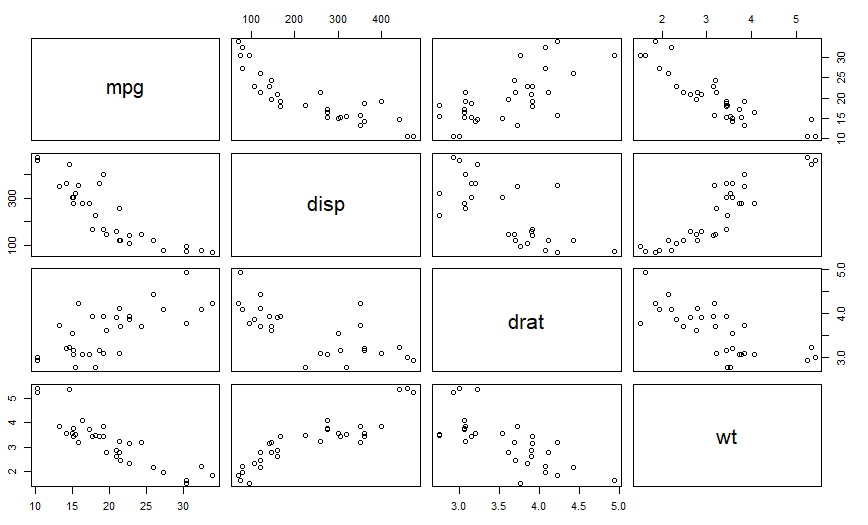
pairs(~mpg+disp+drat+wt,data=mtcars)- 1
用在回归模型中lm(yx1+x2),右边为自变量,左边为因变量。

pairs(mtcars)- 1
ggplot中散点图的使用
p = ggplot(mtcars, aes(wt, mpg)) # Select the mtcars data, and focus on wt (quantitative) on x axis and mpg (quantiative) on y axis p + geom_point() # Produce a scatterplot of mpg vs wt- 1
- 2

p + geom_point(aes(colour = factor(cyl))) # Colour the points by cyl (qualitative)- 1
下面几个颜色绘制方法等价
aes(col = x)
aes(fg = x)
aes(color = x)
aes(colour = x)


p + geom_point(aes(shape = factor(cyl))) # Shape the points by cyl (qualitative)- 1

p + geom_point(aes(shape = factor(cyl))) + scale_shape(solid = FALSE)- 1

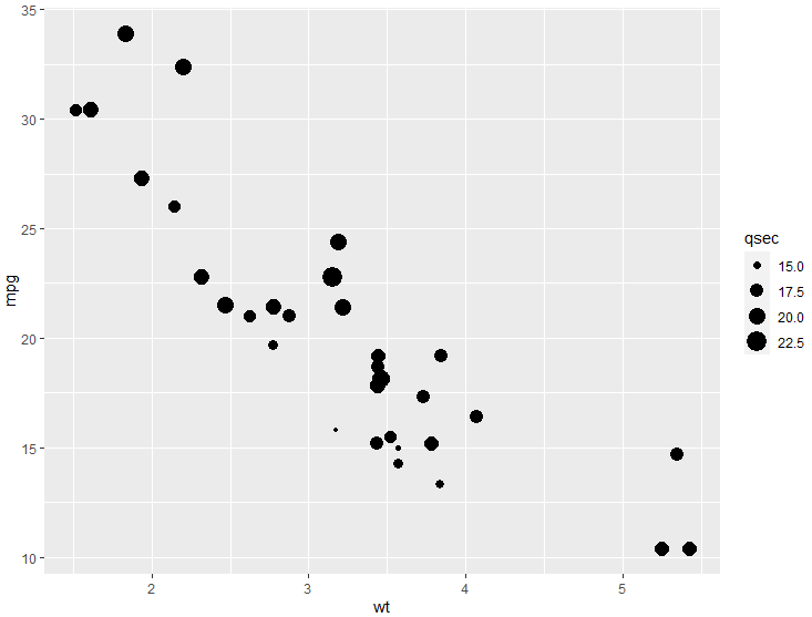
p + geom_point(aes(size = qsec)) # Size the points by qsec (qualitative)- 1

p + geom_point(aes(colour = cyl)) + scale_colour_gradient(low = "blue") # Colour the points by cyl (quantitative)- 1

install.packages("plotly") library("plotly") p1 = plot_ly(mtcars, x = ~mpg, y = ~wt, type="scatter") print(p1)- 1
- 2
- 3
- 4

ggplot2
函数可用以下的代码模板概括:
ggplot(data = ) +( mapping = aes( ), stat = , position = ) + + - 1
- 2
- 3
- 4
- 5
- 6
- 7
- 8
其中,这7个参数分别为数据集(DATA)、几何对象( GEOM_FUNCTION)、映射集合(MAPPING)、统计变换(STAT)、位置调整(POSITION)、坐标系(COORINATE_FUNCTION)和分面模式(FACET_FUNCTION)。
这套模板也可以作为我们学习ggplot2的总领,搞清楚每幅图中的这7个参数并能熟练地运用它们,在可视化这个领域就有了“初窥门径”的境界了。
废话不多说,接下来就拆开这套函数,将7个参数逐个击破。
关于要输入ggplot的数据其实应该在可视化之前就处理好了,但是要注意的是输入的是数据类型必须要是data.frame(or other object coercible by fortify() ?)。在上游处理好数据后,便可以使用ggplot进行可视化处理。
映射集合
在使用aes()函数确定x、y轴的关系以及数据后,就可以作图了。以下用ggplot2包中自带的数据集mpg进行绘图(散点图)
displ 和 hwy 是 数据集mpg中的列名ggplot(data = mpg) + geom_point(aes(x=displ, y=hwy)) #hwy:highway miles per gallon #displ:engine displacement, in litres- 1
- 2
- 3
- 4

factor(变量)
因子类型的转化

R语言绘图
使用ggplot2绘图
导入依赖library(ggplot2)- 1
绘制柱状图
> mtcars$gear [1] 4 4 4 3 3 3 3 4 4 4 4 3 3 3 3 3 3 4 4 4 3 3 3 3 3 4 5 5 5 5 5 4 > class(mtcars$gear) [1] "numeric" > barplot(mtcars$gear)- 1
- 2
- 3
- 4
- 5

- 统计一组数中元素的情况
> table(mtcars$gear) 3 4 5 15 12 5 > counts = table(mtcars$gear) > barplot(counts)- 1
- 2
- 3
- 4
- 5
- 6

添加横坐标标签和定义柱状图颜色> barplot(counts, names.arg = c("3 gears","4 gears", "5 挡")) > barplot(counts, names.arg = c("3 gears","4 gears", "5 挡"), col="red") > barplot(counts, names.arg = c("3 gears","4 gears", "5 挡"), col="lightblue") > barplot(counts, names.arg = c("3 gears","4 gears", "5 挡"), col="pink")- 1
- 2
- 3
- 4
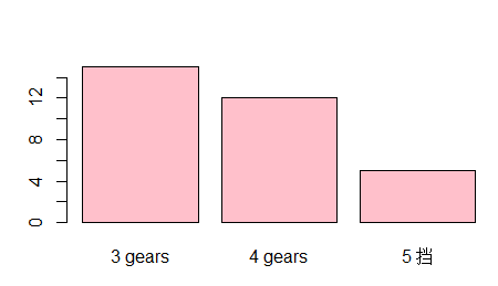
标签显示变成竖直> par(las=2) > barplot(counts, names.arg = c("3 gears","4 gears", "5 挡"), col="pink")- 1
- 2

多个条状图绘制

上面这样没有图例很难辨认数据的情况
指定字段绘制图形> counts1 = table(mtcars$cyl, mtcars$gear) > counts1 3 4 5 4 1 8 2 6 2 4 1 8 12 0 2 > barplot(counts1, names.arg = c("3 gears","4 gears", "5 gears"), col=c("pink", "blue", "yellow"),legend=rownames(counts1)) > rownames(counts1) [1] "4" "6" "8"- 1
- 2
- 3
- 4
- 5
- 6
- 7
- 8
- 9
- 10

自定义图例 传入一个向量> barplot(counts1, names.arg = c("3 gears","4 gears", "5 gears"), col=c("pink", "blue", "yellow"),legend=c("4 cyl", "6 cyl","8 cyl"))- 1

指定 beside = TRUE> barplot(counts1, names.arg = c("3 gears","4 gears", "5 gears"), col=c("pink", "blue", "yellow"),legend=c("4 cyl", "6 cyl","8 cyl"), beside = TRUE)- 1
ggplot绘图"套路"> ggplot(mtcars) # ggplot函数没有任何显示, 这里只是做数据集等准备操作 > p = ggplot(mtcars) > p + geom_bar() 错误: stat_count() requires an x or y aesthetic. Run `rlang::last_error()` to see where the error occurred. > p = ggplot(mtcars, aes(x=factor(cyl))) #指定 cyl为横坐标 > p + geom_bar()- 1
- 2
- 3
- 4
- 5
- 6
- 7


更换数据集mpg绘图

> p1 = ggplot(mpg, aes(class)) > aes(class) Aesthetic mapping: * `x` -> `class` > table(mpg$class) 2seater compact midsize minivan pickup subcompact suv 5 47 41 11 33 35 62 > p1 + geom_bar()- 1
- 2
- 3
- 4
- 5
- 6
- 7
- 8
- 9

p1 = ggplot(mpg, aes(class)) # p1 + geom_bar(aes(weight=displ)) p1 + geom_bar(aes(weight=year)) # 这里是属于这类所有值的相加- 1
- 2
- 3

双重条形图p1 = ggplot(mpg, aes(class)) p1 + geom_bar(aes(fill= drv)) # fill 是让ggplot自动根据因子的水平分数分配颜色等值- 1
- 2

指定为水平条状图p1 = ggplot(mpg, aes(class)) # p1 + geom_bar(aes(fill= drv)) # fill 是让ggplot自动根据因子的水平分数分配颜色等值 # 水平 p1 + geom_bar(aes(fill= drv), position = position_stack(reverse = TRUE))+ coord_flip() + theme(legend.position = "bottom")- 1
- 2
- 3
- 4
- 5

直方图
> hist(mtcars$wt)- 1

# 变成总面积为1的概率分布直方图 > hist(mtcars$wt, freq = F)- 1
- 2

直方图参数增加
br 横坐标刻度范围 xlab横轴标签 main是标题hist(mtcars$wt, freq = F, br=seq(0, 6, by =0.5),col = 'red', xlab = 'weight of cars', main = '车重直方图')- 1
举一反三
> barplot(mtcars$wt, xlab = "车的重量", ylab = "数量", main = "数据标题", col = 'yellow')- 1
- 2

ggplot 直方图
p = ggplot(data=mtcars, aes(x=wt)) # 使用 aes(y=..density..) 将原始直方图变成概率直方图 p+geom_histogram(aes(y=..density..), binwidth = 0.5)+xlab("Weight") + ylab('density')- 1
- 2
- 3

箱线图
boxplot(mtcars$wt)- 1
boxplot(mtcars$wt, horizontal = T)- 1

用在箱线图中的~: boxplot(y~x1),表示将x1视作分组变量, 分组输出y1的箱线图boxplot(mtcars$wt~mtcars$cyl)- 1

上面是将气缸作为分组变量,分组输出车重的箱线图boxplot(mtcars$wt~mtcars$cyl, names=c("4 cyl", "6 cyl","8 cyl"), ylab = "weight of cars (1000lbs)")- 1

ggplot箱线图
p = ggplot(data=mtcars, aes(x="", y=wt)) p + geom_boxplot()- 1
- 2

气缸和车重双变量箱线图p = ggplot(data=mtcars, aes(x=factor(cyl), y=wt)) p + geom_boxplot()- 1
- 2

p = ggplot(data=mtcars, aes(x=factor(cyl), y=wt)) p + geom_boxplot()+geom_jitter()- 1
- 2

p = ggplot(data=mtcars, aes(x=factor(cyl), y=wt)) > p + geom_boxplot()+ coord_flip() # 横向转换坐标:把x轴和y轴互换, 没有特殊参数- 1
- 2
p + geom_boxplot(notch = TRUE)- 1
会有凹槽用来比较组, 两个盒子凹槽不重叠, 说明中位数有显著差异

p + geom_boxplot(outlier.colour = "green", outlier.size = 5)- 1
设置异常值

boxplot(mpg~cyl, data = mtcars, notch=TRUE, col='green')- 1

散点图
特性: 两个变量之间的关系分布图
plot(mtcars$wt, mtcars$mpg)- 1

精细化plot(mtcars$wt, mtcars$mpg, xlab = "Car weight", ylab = "Miles per Gallon", col="red", pch=17)- 1

数据拟合plot(mtcars$wt, mtcars$mpg, xlab = "Car weight", ylab = "Miles per Gallon", col="red", pch=17) abline(lm(mtcars$mpg~mtcars$wt)) # lm 是线性模型的意思- 1
- 2
- 3

简单说一下 lm 函数Usage lm(formula, data, subset, weights, na.action, method = "qr", model = TRUE, x = FALSE, y = FALSE, qr = TRUE, singular.ok = TRUE, contrasts = NULL, offset, ...)- 1
- 2
- 3
- 4
-formula:指要拟合的模型形式,
- data:是一个数据框,包含了用于拟合模型的数据。
lm(mtcars$mpg~mtcars$wt) 对 mpg和wt进行线性模型分析, 中间用~- 1

abline 函数的作用是在一张图表上添加直线(参考线), 可以是一条斜线,通过x或y轴的交点和斜率来确定位置;也可以是一条水平或者垂直的线,只需要指定与x轴或y轴交点的位置就可以了

plot
plot(mtcars)- 1

成对关系图更好看出两个变量之间的 关系pairs(mtcars)- 1

plot(~mpg+disp+drat+wt,data = mtcars)- 1

ggplot散点图
library(ggplot2) p = ggplot(mtcars, aes(wt, mpg)) > p + geom_point()- 1
- 2
- 3

p = ggplot(mtcars, aes(wt, mpg)) p + geom_point(aes(colour = factor(cyl)))- 1
- 2

传入的不是因子p = ggplot(mtcars, aes(wt, mpg)) p + geom_point(aes(colour = cyl))- 1
- 2

p = ggplot(mtcars, aes(wt, mpg)) p + geom_point(aes(colour = factor(gear)))- 1
- 2

下面几个颜色绘制方法等价
aes(col = x)
aes(fg = x)
aes(color = x)
aes(colour = x)p = ggplot(mtcars, aes(wt, mpg)) p + geom_point(aes(shape = factor(cyl)))- 1
- 2

p + geom_point(aes(shape = factor(cyl))) + scale_shape(solid = FALSE)- 1

p = ggplot(mtcars, aes(wt, mpg)) p + geom_point(aes(size=qsec))- 1
- 2
p = ggplot(mtcars, aes(wt, mpg)) p + geom_point(aes(color=cyl)) + scale_colour_gradient(low = "red")- 1
- 2

p = ggplot(mtcars, aes(wt, mpg)) p + geom_point(aes(color=cyl, size=qsec)) + scale_colour_gradient(low = "red")- 1
- 2

plotly
install.packages("plotly") p = plot_ly(mtcars, x=~mpg, y=~wt, type="scatter") print(p)- 1
- 2
- 3

基本统计数值
查看键值情况

平均数和中位数

标准差和方差


数据总结

查看筛选子集的的统计结果
选择重量大于或等于 3 的汽车的 mpg的统计结果summary(mtcars$mpg[mtcars$wt >=3])- 1

数据框的条件筛选
选出数据符合气缸个数等于6的所有数据mtcars[which(mtcars$cyl==6),]- 1

相关系数
cor(mtcars)- 1


绘制曲线
先删除所有变量
rm(list=ls())- 1
绘制曲线
> par(mfrow=c(3, 1)) # 几行几列 > curve(dnorm(x), -1, 1) # curve(函数, 范围) > curve(dnorm(x), -5, 5) # curve(函数, 范围) > curve(sin, -2*pi, 2*pi) # curve(函数, 范围)- 1
- 2
- 3
- 4

- dnorm(x, mean = 0, sd = 1, log = FALSE) 的返回值是正态分布概率密度函数值,比如dnorm(z)则表示:标准正态分布密度函数f(x)在x=z处的函数值。
- pnorm(q, mean = 0, sd = 1, lower.tail = TRUE, log.p = FALSE) 返回值是正态分布的分布函数值,比如pnorm(z)等价于P[X ≤ z]
- qnorm(p, mean = 0, sd = 1, lower.tail = TRUE, log.p = FALSE) 的返回值是给定概率p后的下分位点.
- rnorm(n, mean = 0, sd = 1) 的返回值是n个正态分布随机数构成的向量。
曲线绘制
- dnorm(x, mean = 0, sd = 1, log = FALSE) 的返回值是正态分布概率密度函数值,比如dnorm(z)则表示:标准正态分布密度函数f(x)在x=z处的函数值。
- pnorm(q, mean = 0, sd = 1, lower.tail = TRUE, log.p = FALSE) 返回值是正态分布的分布函数值,比如pnorm(z)等价于P[X ≤ z]
- qnorm(p, mean = 0, sd = 1, lower.tail = TRUE, log.p = FALSE) 的返回值是给定概率p后的下分位点.
- rnorm(n, mean = 0, sd = 1) 的返回值是n个正态分布随机数构成的向量。
curve(dnorm(x), xlim=c(-2, 2), ylab="",axes=FALSE,xlab = "") axis(1, at=c(-2,-1,0,0.8,1,2), pos = 0) # axis # 第一个参数 side表示要操作的坐标轴,取值1、2、3、4分别代表下、左、上、右; # at表示刻度线及刻度值所在位置; # pos 表示轴线所在的位置- 1
- 2
- 3
- 4
- 5
- 6

填充颜色
以数据(x,y)为坐标,依次连接所有的点,绘出一个多边形
x = 1:10 y = rnorm(x) x1 = c(2, 4, 4) y1 = c(0, 0, 1) plot(x, y, type = 'l') polygon(x, y, col='green') polygon(x1, y1, col='red')- 1
- 2
- 3
- 4
- 5
- 6
- 7

curve(dnorm(x), xlim = c(-2, 2), ylab = "", axes=FALSE) abline(h=0) sequence = seq(-2, 0.8, 0.1) polygon(x =c(sequence, 0.8, -2), y=c(dnorm(c(sequence)), 0, 0), col='purple') axis(1, at=c(-2,-1,0,0.8,1,2), pos = 0)- 1
- 2
- 3
- 4
- 5


直方图添加正太曲线
hist(mtcars$wt, prob=T) # prob=T指定为频率 默认是频数 m =mean(mtcars$wt) s =sd(mtcars$wt) curve(dnorm(x, mean = m, sd = s), col='red', lwd=2, add = TRUE) # lwd=2线的宽度 # add=TRUE 代表加载直方图上- 1
- 2
- 3
- 4
- 5

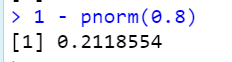
要计算 P(Z < 0.8),请使用pnorm.pnorm(0.8) [1] 0.7881446- 1
- 2
计算 P(Z > 0.8):
第一种
第二种

计算 P(0.3 < Z < 0.7):


上面是均值为5 标准差为4

线性模型
先生成散点图
plot(mtcars$mpg, mtcars$wt, xlab = "mpg", ylab = "weight", main = "scatter of mpg vs wt")- 1

计算相关系数

绘制散点图的线性模型plot(mtcars$mpg, mtcars$wt, xlab = "mpg", ylab = "weight", main = "scatter of mpg vs wt") L = lm(wt~mpg, data = mtcars) # 因变量 ~ 自变量 abline(L, col='red', lwd=3)- 1
- 2
- 3
- 4

L = lm(wt~mpg,data=mtcars) plot(mtcars$mpg,L$residuals, xlab = "mpg", ylab = "Residuals") abline(h = 0, col = "blue")- 1
- 2
- 3

-
相关阅读:
使用Spring WebSocket实现实时通信功能
install flash_atten
探索SOCKS5与SK5代理在现代网络环境中的应用
初识springmvc
2022年最新最详细IDEA关联数据库方式、在IDEA中进行数据库的可视化操作(包含图解过程)
Java 8 Stream API可以怎么玩?
openGauss学习笔记-105 openGauss 数据库管理-管理用户及权限-默认权限机制
智慧公厕:提升城市形象的必备利器
阿里云国际站:密钥管理服务
CVE-2021-44228 log4j RCE漏洞原理详细分析排查和修补
- 原文地址:https://blog.csdn.net/qq_39276337/article/details/127334611