-
新冠疫情历史数据可视化分析
3.2 读取世界各国历史数据
import chardet import pandas as pd # 查看文件编码格式 with open('alltime_world.csv', 'rb') as f: data = f.read() encoding = chardet.detect(data)['encoding'] # print(encoding) # 读取数据 alltime_world = pd.read_csv("./alltime_world.csv",encoding=encoding) # print(alltime_world) # 创建中文列名字典 name_dict = {'date':'日期','name':'名称', 'today_confirm':'当日新增确诊', 'today_suspect':'当日新增疑似','today_heal':'当日新增治愈', 'today_dead':'当日新增死亡','today_severe':'当日新增重症', 'today_storeConfirm':'当日现存确诊','total_confirm':'累计确诊', 'total_suspect':'累计疑似','total_heal':'累计治愈', 'total_dead':'累计死亡','total_severe':'累计重症', 'total_input':'累计境外输入','today_input':'当日境外输入'} # print(name_dict) # 更改列名 alltime_world.rename(columns=name_dict,inplace=True) # 展示前5行数据 print(alltime_world.head(5)) # 查看数据的基本信息 alltime_world.info() # 查看数据的描述性统计信息 alltime_world.describe()- 1
- 2
- 3
- 4
- 5
- 6
- 7
- 8
- 9
- 10
- 11
- 12
- 13
- 14
- 15
- 16
- 17
- 18
- 19
- 20
- 21
- 22
- 23
- 24
- 25
- 26
- 27
- 28
- 29
- 30
- 31
- 32
- 33

3.3 查看每天出现疫情的国家数量变化趋势(预处理)
import pandas as pd # 将日期更改成datetime格式 alltime_world['日期'] = pd.to_datetime(alltime_world['日期']) # 对日期进行分组聚合,统计每个分组的样本数 value = alltime_world.groupby('日期').size() # 将日期转换成列表 time = [i.strftime('%m-%d') for i in value.index] time- 1
- 2
- 3
- 4
- 5
- 6
- 7
- 8
- 9
- 10
- 11
- 12

3.4 查看每天出现疫情的国家数量变化趋势
import pyecharts import pyecharts.options as opts from pyecharts.charts import Line # 绘制出现疫情国家数量折线图 line = Line().add_xaxis(# 配置x轴 xaxis_data =time # 输入x轴数据 ) line. add_yaxis(# 配置y轴 series_name = "", # 设置图例名称 y_axis = value, # 输入y轴数据 symbol_size = 10, # 设置点的大小 label_opts = opts.LabelOpts(is_show=False), # 标签设置项:显示标签 is_smooth = True # 绘制平滑曲线 ) # 设置全局配置项 line.set_global_opts(title_opts = opts.TitleOpts(title = "疫情出现国家数量变化折线图", pos_left = "center"), # 设置图标题和位置 axispointer_opts = opts.AxisPointerOpts(is_show = True, link = [{"xAxisIndex": "all"}]), # 坐标轴指示器配置 # x轴配置项 xaxis_opts = opts.AxisOpts(type_ = "category"), # y轴配置项 yaxis_opts = opts.AxisOpts(name = "疫情出现国家数量"), # 轴标题 ) line.render()- 1
- 2
- 3
- 4
- 5
- 6
- 7
- 8
- 9
- 10
- 11
- 12
- 13
- 14
- 15
- 16
- 17
- 18
- 19
- 20
- 21
- 22
- 23
- 24
- 25
- 26
- 27
- 28
- 29
- 30
3.5 绘制世界国家累计确诊动态排名条形图(定义获取每日数据的函数)
import pyecharts.options as opts # 将数据按照日期分组 grouped_world = dict(list(alltime_world.groupby('日期'))) # 定义函数,获取每天的数据 def transform_bar(date): date_data = grouped_world[date] # 当天累计确诊按照降序排列的国家名称 x = date_data.sort_values('累计确诊',ascending=False)['名称'].values.tolist() # 当天累计确诊的最值,用于控制横轴范围 y_max = date_data['累计确诊'].max() # 当天国家个数小于10 y = [] if len(x)<=10: for i in range(len(x)): # 定义每个条形的名称,值和颜色 y.append( opts.BarItem( name=x[i], # 名称 value=date_data.sort_values('累计确诊',ascending=False)['累计确诊'].values.tolist()[i], # 值 itemstyle_opts=opts.ItemStyleOpts(color=country_color[country_color['中文']==x[i]]['颜色'].values[0]) # 颜色 ) ) # 当天国家个数大于10 else: # 选出前10个国家 x = x[:10] for i in range(10): y.append( opts.BarItem( name=x[i], value=date_data.sort_values('累计确诊',ascending=False)['累计确诊'].values.tolist()[i], itemstyle_opts=opts.ItemStyleOpts(color=country_color[country_color['中文']==x[i]]['颜色'].values[0]) ) ) return x,y,y_max- 1
- 2
- 3
- 4
- 5
- 6
- 7
- 8
- 9
- 10
- 11
- 12
- 13
- 14
- 15
- 16
- 17
- 18
- 19
- 20
- 21
- 22
- 23
- 24
- 25
- 26
- 27
- 28
- 29
- 30
- 31
- 32
- 33
- 34
- 35
- 36
- 37
输出 None
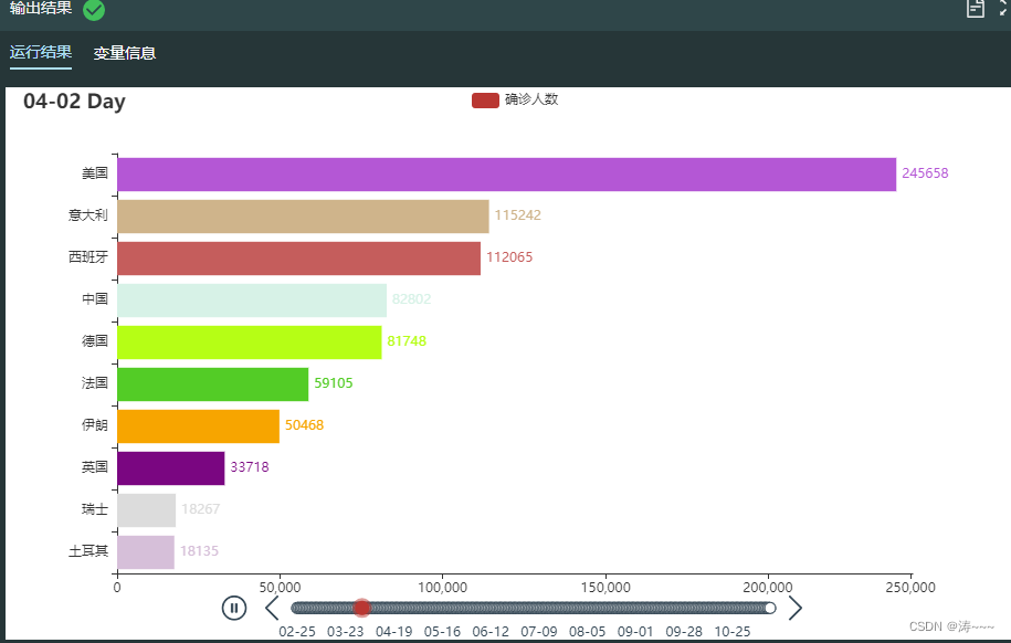
3.6 绘制世界累计确诊动态排名条形图
# 载入时间轴组件和柱状图 from pyecharts.charts import Timeline from pyecharts.charts import Bar import pyecharts.options as opts # 实例化时间轴组件 tl = Timeline() tl.add_schema(is_auto_play=True, # 自动播放 play_interval=200, # 播放频率 is_loop_play=True) # 循环播放 # 循环作图 for date in list(grouped_world.keys())[36:]: # 将日期转为字符串,并去掉年份 _date = date.strftime("%Y-%m-%d")[5:] # 调用函数获取数据 x,y,y_max = transform_bar(date) # 绘制条形图 bar = Bar(init_opts=opts.InitOpts()).add_xaxis(x).add_yaxis("确诊人数", y).reversal_axis()# 添加横轴和纵轴数据,交换两个轴的位置,相当于绘制条形图 # 系列配置项 bar.set_series_opts(label_opts=opts.LabelOpts(is_show=True, position='right')) # 全局配置项 bar.set_global_opts(legend_opts=opts.LegendOpts(is_show=True), # 显示图例 title_opts=opts.TitleOpts("{} Day".format(_date)), # 图标题 xaxis_opts = opts.AxisOpts(max_=int(y_max)+5000), # 设置横轴刻度最大值 yaxis_opts = opts.AxisOpts(is_inverse=True)) # 反向纵轴 # 在时间轴组件中添加图形 tl.add(bar, "{}".format(_date)) # 渲染 tl.render()- 1
- 2
- 3
- 4
- 5
- 6
- 7
- 8
- 9
- 10
- 11
- 12
- 13
- 14
- 15
- 16
- 17
- 18
- 19
- 20
- 21
- 22
- 23
- 24
- 25
- 26
- 27
- 28
- 29
- 30
- 31
3.7 多国累计确诊和新增确诊变化趋势分析(预处理)
import pandas as pd # 根据日期和名称两列进行分组聚合,选取累计确诊一列数据,并将名称一列由行索引转换为列索引 countries_total = alltime_world.groupby(['日期','名称'])['累计确诊'].mean().unstack() # 根据日期和名称两列进行分组聚合,选取当日新增确诊一列数据,并将名称一列由行索引转换为列索引 countries_today = alltime_world.groupby(['日期','名称'])['当日新增确诊'].mean().unstack() # 输出结果 print('============累计确诊数据============\n', countries_total.sample()) print('============当日新增确诊数据============\n',countries_today.sample())- 1
- 2
- 3
- 4
- 5
- 6
- 7
- 8
- 9
- 10
- 11

3.8 多国累计确诊和新增确诊变化趋势分析
import pandas as pd from pyecharts.charts import Line, Grid import pyecharts.options as opts list = ['中国', '日本', '韩国', '美国', '英国', '西班牙', '印度', '巴西', '法国', '俄罗斯'] # 绘制第一张图表:多国累计确诊折线图 # 配置x轴 l1 = Line().add_xaxis( xaxis_data = time # 输入x轴数据 ) for c in list: # 配置y轴 l1.add_yaxis( series_name = c, # 设置图例名称 y_axis = countries_total[c]/10000, # 输入y轴数据 is_connect_nones=True, # 连接空数据 symbol_size = 10, # 设置点的大小 label_opts = opts.LabelOpts(is_show=False), # 标签设置项:显示标签 linestyle_opts = opts.LineStyleOpts(width=1.5), # 线条宽度和样式 is_smooth = True # 绘制平滑曲线 ) # 设置全局配置项 l1.set_global_opts( title_opts = opts.TitleOpts( title = "", pos_left = "center" # 设置图标题和位置 ), axispointer_opts = opts.AxisPointerOpts( is_show = True, link = [{"xAxisIndex": "all"}] # 坐标轴指示器配置 ), # x轴配置项 xaxis_opts = opts.AxisOpts( type_ = "category", boundary_gap = True # 坐标轴两边是否留白 ), # y轴配置项 yaxis_opts = opts.AxisOpts( name = "累计确诊(万人)", # 轴标题 splitline_opts=opts.SplitLineOpts(is_show=True), # 显示图表分割线 axisline_opts = opts.AxisLineOpts(is_show=False) # 隐藏坐标轴轴线 ), # 图例配置项 legend_opts = opts.LegendOpts( pos_left ='7%' # 图例的位置 ) ) # 绘制第二张图表:多国当日新增确诊折线图 l2 = Line().add_xaxis(xaxis_data = time) for c in list: l2.add_yaxis( series_name=c, y_axis=countries_total[c]/10000, # 添加数据 symbol_size=10, is_connect_nones=True, label_opts = opts.LabelOpts(is_show = False), linestyle_opts = opts.LineStyleOpts(width = 1.5), is_smooth = True ) l2.set_global_opts( # 设置坐标轴指示器 axispointer_opts = opts.AxisPointerOpts( is_show = True, link = [{"xAxisIndex": "all"}] # 对x轴所有索引进行联动 ), # x轴配置项 xaxis_opts = opts.AxisOpts( is_show=False, type_ = "category" # 类型 ), # y轴配置项 yaxis_opts = opts.AxisOpts( name = "当日新增确诊(万人)", splitline_opts=opts.SplitLineOpts(is_show=True), axisline_opts = opts.AxisLineOpts(is_show=False) ), # 图例设置 legend_opts = opts.LegendOpts( is_show=False ) ) # 绘制分组折线图 # 设置图形的长和宽 grid = Grid( init_opts = opts.InitOpts( width = "1000px", height = "600px" ) ) # 添加第一个图表 grid.add( chart=l1, grid_opts = opts.GridOpts(pos_left = 80, pos_right = 20, height = "35%") # 直角坐标系网格配置项 ) # 添加第二个图表 grid.add( chart = l2, grid_opts = opts.GridOpts(pos_left = 80, pos_right = 20, pos_top = "55%", height = "35%") ) # 利用notebook进行渲染 grid.render()- 1
- 2
- 3
- 4
- 5
- 6
- 7
- 8
- 9
- 10
- 11
- 12
- 13
- 14
- 15
- 16
- 17
- 18
- 19
- 20
- 21
- 22
- 23
- 24
- 25
- 26
- 27
- 28
- 29
- 30
- 31
- 32
- 33
- 34
- 35
- 36
- 37
- 38
- 39
- 40
- 41
- 42
- 43
- 44
- 45
- 46
- 47
- 48
- 49
- 50
- 51
- 52
- 53
- 54
- 55
- 56
- 57
- 58
- 59
- 60
- 61
- 62
- 63
- 64
- 65
- 66
- 67
- 68
- 69
- 70
- 71
- 72
- 73
- 74
- 75
- 76
- 77
- 78
- 79
- 80
- 81
- 82
- 83
- 84
- 85
- 86
- 87
- 88
- 89
- 90
- 91
- 92
- 93
- 94
- 95
- 96
- 97
- 98
- 99
- 100
- 101
- 102
- 103
- 104
- 105
- 106
- 107
- 108
- 109

3.9 世界各国历史数据可视化分析(拓展)
# 读取数据 import pandas as pd alltime_world = pd.read_csv("alltime_world_2020_11_16.csv")- 1
- 2
- 3
输出 None
3.11 读取中国历史数据
import chardet import pandas as pd # 查看文件编码格式 with open('./alltime_China.csv', 'rb') as f: data = f.read() encoding = chardet.detect(data).get("encoding") # 数据读取 alltime_china = pd.read_csv('./alltime_China.csv',encoding=encoding) # 展示前5行数据 print(alltime_china.head(5)) # 查看数据的基本信息 alltime_china.info() # 查看数据的描述性统计信息 alltime_china.describe()- 1
- 2
- 3
- 4
- 5
- 6
- 7
- 8
- 9
- 10
- 11
- 12
- 13
- 14
- 15
- 16
- 17
- 18
- 19

3.12 中国疫情历史数据可视化分析
import pandas as pd from pyecharts.charts import Line, Grid import pyecharts.options as opts # 将日期改成datetime格式 alltime_china['日期'] = pd.to_datetime(alltime_china['日期']) # 按时间顺序排列 alltime_china.sort_values(['日期'], inplace=True) # 将日期转换成列表 time = [i.strftime('%m-%d') for i in alltime_china['日期']] # 返回列标签,选取除日期以外的后8个标签 columns_name = alltime_china.columns[1:] # 绘制折线图 line = Line().add_xaxis(# 配置x轴 xaxis_data = time # 输入x轴数据 ) for i in columns_name: line.add_yaxis(# 配置y轴 series_name = i, # 设置图例名称 y_axis = alltime_china[i], # 输入y轴数据 symbol_size = 10, # 设置点的大小 label_opts = opts.LabelOpts(is_show=False), # 标签设置项:显示标签 linestyle_opts = opts.LineStyleOpts(width=1.5), # 线条宽度和样式 is_smooth = True # 绘制平滑曲线 ) # 设置全局配置项 line.set_global_opts(title_opts = opts.TitleOpts(title = "", pos_left = "center"), # 设置图标题和位置 axispointer_opts = opts.AxisPointerOpts(is_show = True, link = [{"xAxisIndex": "all"}]), # 坐标轴指示器配置 # x轴配置项 xaxis_opts = opts.AxisOpts(type_ = "category", boundary_gap = True), # 坐标轴两边是否留白 # y轴配置项 yaxis_opts = opts.AxisOpts(name = "人数", # 轴标题 splitline_opts=opts.SplitLineOpts(is_show=True), # 显示图表分割线 axisline_opts = opts.AxisLineOpts(is_show=False)), # 隐藏坐标轴轴线 # 图例配置项 legend_opts = opts.LegendOpts(pos_left='12%') # 图例的位置 ) line.render()- 1
- 2
- 3
- 4
- 5
- 6
- 7
- 8
- 9
- 10
- 11
- 12
- 13
- 14
- 15
- 16
- 17
- 18
- 19
- 20
- 21
- 22
- 23
- 24
- 25
- 26
- 27
- 28
- 29
- 30
- 31
- 32
- 33
- 34
- 35
- 36
- 37
- 38
- 39
- 40
- 41
- 42
- 43
- 44
- 45
- 46
- 47
- 48

3.13 全国与二次爆发省市新增确诊对比折线图
# 将数据按照名称分组 grouped_province = alltime_province.groupby('名称') # 提取出全国5月1日后的新增确诊人数 newconfirm_0501 = alltime_china.set_index('日期').loc['2020-05-01':, '当日新增确诊'] # 加载绘图类Line from pyecharts.charts import Line import pyecharts.options as opts line1 = Line(init_opts = opts.InitOpts(width = "1100px", height = "500px")).add_xaxis(# 配置x轴 xaxis_data = newconfirm_0501.index.tolist() # 输入x轴数据 ) # 添加全国数据 line1.add_yaxis(# 配置y轴 series_name = '全国', # 设置图例名称 y_axis = newconfirm_0501.values.tolist(), # 输入y轴数据 symbol_size = 10, # 设置点的大小 label_opts = opts.LabelOpts(is_show=False), # 标签设置项:显示标签 linestyle_opts = opts.LineStyleOpts(width=1.5), # 线条宽度和样式 is_smooth = True, # 绘制平滑曲线 ) # 添加北京、辽宁和新疆三个省的数据 for i in ['北京','辽宁','新疆']: line1.add_yaxis(# 配置y轴 series_name = i, # 设置图例名称 y_axis = grouped_province.get_group(i).set_index('日期').loc['2020-05-01':,'当日新增确诊'].values.tolist(), # 输入y轴数据 symbol_size = 10, # 设置点的大小 label_opts = opts.LabelOpts(is_show=False), # 标签设置项:显示标签 linestyle_opts = opts.LineStyleOpts(width=1.5), # 线条宽度和样式 is_smooth = True, # 绘制平滑曲线 ) # 设置全局配置项 line1.set_global_opts(title_opts = opts.TitleOpts(title = "", pos_left = "center"), # 设置图标题和位置 axispointer_opts = opts.AxisPointerOpts(is_show = True, link = [{"xAxisIndex": "all"}]), # 坐标轴指示器配置 # x轴配置项 xaxis_opts = opts.AxisOpts(type_ = "category", boundary_gap = True), # 坐标轴两边是否留白 # y轴配置项 yaxis_opts = opts.AxisOpts(name = "人数",interval=30,max_=280), # 轴标题 # 图例配置项 legend_opts = opts.LegendOpts(pos_left ='12%') # 图例的位置 ) # 渲染 line1.render()- 1
- 2
- 3
- 4
- 5
- 6
- 7
- 8
- 9
- 10
- 11
- 12
- 13
- 14
- 15
- 16
- 17
- 18
- 19
- 20
- 21
- 22
- 23
- 24
- 25
- 26
- 27
- 28
- 29
- 30
- 31
- 32
- 33
- 34
- 35
- 36
- 37
- 38
- 39
- 40
- 41
- 42
- 43
- 44
- 45
- 46
- 47
- 48
- 49
- 50

3.14 中国历史数据可视化分析(拓展)
# 读取数据 import pandas as pd alltime_china = pd.read_csv("alltime_China_v1.csv") alltime_province = pd.read_csv("alltime_province_2020_11_16.csv")- 1
- 2
- 3
- 4
- 5
输出 None
3.16 读取美国各州历史数据
import chardet import pandas as pd # 查看文件编码格式 with open('./alltime_usa.csv','rb') as f: data = f.read() encoding = chardet.detect(data).get("encoding") # 读取数据 alltime_state = pd.read_csv('./alltime_usa.csv',encoding=encoding) # 创建中文列名字典 name_dict = {'date':'日期', 'name':'名称', 'today_confirm':'当日新增确诊', 'today_suspect':'当日新增疑似', 'today_heal':'当日新增治愈', 'today_dead':'当日新增死亡', 'today_severe':'当日新增重症', 'today_storeConfirm':'当日现存确诊', 'total_confirm':'累计确诊', 'total_suspect':'累计疑似', 'total_heal':'累计治愈', 'total_dead':'累计死亡', 'total_severe':'累计重症', 'total_input':'累计境外输入', 'today_input':'当日境外输入'} # 更改列名 alltime_state.rename(columns=name_dict,inplace=True) # 展示前5行数据 print(alltime_state.head(5)) # 查看数据的基本信息 alltime_state.info() # 查看数据的描述性统计信息 alltime_state.describe()- 1
- 2
- 3
- 4
- 5
- 6
- 7
- 8
- 9
- 10
- 11
- 12
- 13
- 14
- 15
- 16
- 17
- 18
- 19
- 20
- 21
- 22
- 23
- 24
- 25
- 26
- 27
- 28
- 29
- 30
- 31

3.17 美国每100万累计确诊所用天数柱状图
# 将数据按照名称分组,提取出美国的数据 grouped_usa = alltime_world.groupby('名称').get_group('美国') # 设定组距 import numpy as np bins = np.arange(0,1e7+2e6,1e6).tolist() # 设置横轴数据 bins_label = [str(int(bins[i]/1e4))+'万~'+str(int(bins[i+1]/1e4)) + '万' for i in range(len(bins)-1)] bins_label[0] = '0~100万' # 对累计确诊这一列进行等距离散化 confirm_cutted = pd.cut(x=grouped_usa['累计确诊'],bins=bins,labels=False) # 统计每组值的个数得到每100万累计确诊所用天数 confirm_days = confirm_cutted.value_counts().sort_index().values.tolist() # 绘制柱状图 from pyecharts.charts import Bar from pyecharts.charts import Line import pyecharts.options as opts # 实例化绘图类,添加横轴、纵轴数据 bar_ = Bar().add_xaxis(xaxis_data = bins_label).add_yaxis('天数',confirm_days) # 设置全局配置项 bar_.set_global_opts(title_opts = opts.TitleOpts(title = "美国每100万累计确诊所用天数", pos_left = "left"), # 设置图标题和位置 xaxis_opts=opts.AxisOpts(axislabel_opts=opts.LabelOpts(rotate=35)) ) # 添加趋势折线 line_ = Line().add_xaxis(xaxis_data=bins_label) line_.add_yaxis( series_name="", y_axis=[i+10 for i in confirm_days], label_opts=opts.LabelOpts(is_show=False), ) # 设置层叠组件 bar_.overlap(line_).render()- 1
- 2
- 3
- 4
- 5
- 6
- 7
- 8
- 9
- 10
- 11
- 12
- 13
- 14
- 15
- 16
- 17
- 18
- 19
- 20
- 21
- 22
- 23
- 24
- 25
- 26
- 27
- 28
- 29
- 30
- 31
- 32
- 33
- 34
- 35
- 36
- 37
- 38
- 39
- 40
- 41

3.18 美国各州累计死亡动态地图(获取数据)
# 将数据按照日期分组 grouped_state = alltime_state.groupby('日期') # 定义获取每日数据的函数 def transform_map(date): # 获取当天数据 date_data = grouped_state.get_group(date) # 添加州英文名称 date_data['英文名称'] = date_data['名称'].replace(state_name['中文名称'].values,state_name['英文名称'].values) # 提取出各州英文名称和累计死亡人数的嵌套列表 y = date_data[['英文名称','累计死亡']].values.tolist() return y- 1
- 2
- 3
- 4
- 5
- 6
- 7
- 8
- 9
- 10
- 11
- 12
输出 None
3.19 美国各州累计死亡动态地图
# 加载时间轴组件 from pyecharts.charts import Timeline,Map import pyecharts.options as opts # 实例化时间轴组件 tl = Timeline() tl.add_schema(is_auto_play=True, # 自动播放 play_interval=200, # 播放频率 is_loop_play=True) # 循环播放 for date in grouped_state.groups.keys(): _date = date[5:] # 获取数据 heatmap_data = transform_map(date) # 绘制地图 map_ = Map().add(series_name = "累计死亡人数", # 设置提示框标签 data_pair = heatmap_data, # 输入数据 maptype = "美国", # 设置地图类型为世界地图 is_map_symbol_show = False # 不显示标记点 ) # 设置系列配置项 map_.set_series_opts(label_opts=opts.LabelOpts(is_show=False)) # 不显示国家(标签)名称 # 设置全局配置项 map_.set_global_opts(legend_opts=opts.LegendOpts(is_show=True), title_opts=opts.TitleOpts("{} Day".format(_date)), visualmap_opts = opts.VisualMapOpts(pieces=[ # 自定义分组的分点和颜色 {"min": 10000,"color":"#800000"}, # 栗色 {"min": 5000, "max": 10000, "color":"#B22222"}, # 耐火砖 {"min": 1000, "max": 5000,"color":"#CD5C5C"}, # 印度红 {"min": 100, "max": 1000, "color":"#BC8F8F"}, # 玫瑰棕色 {"max": 100, "color":"#FFE4E1"}, # 薄雾玫瑰 ], is_piecewise = True)) # 在时间轴组件中添加图形 tl.add(map_, "{}".format(_date)) # 渲染 tl.render()- 1
- 2
- 3
- 4
- 5
- 6
- 7
- 8
- 9
- 10
- 11
- 12
- 13
- 14
- 15
- 16
- 17
- 18
- 19
- 20
- 21
- 22
- 23
- 24
- 25
- 26
- 27
- 28
- 29
- 30
- 31
- 32
- 33
- 34
- 35
- 36
- 37
- 38
- 39
- 40

3.20 绘制美国3月每日新增确诊人数与股票涨跌变化折线图
# 将数据按名称分组并提取出美国的数据 grouped_usa = alltime_world.groupby('名称').get_group('美国') # 提取出3月美国单日新增确诊人数数据 usa_data = grouped_usa[grouped_usa['日期'].isin(stock['日期'].values)][['日期','当日新增确诊']] # 载入绘图类 from pyecharts.charts import Line, Grid import pyecharts.options as opts l1 = Line().add_xaxis(# 配置x轴 xaxis_data = stock['日期'].values.tolist() # 输入x轴数据 ) l1.add_yaxis(# 配置y轴 series_name = "单日新增人数", # 设置图例名称 y_axis = usa_data['当日新增确诊'].values.tolist(), # 输入y轴数据 symbol_size = 10, # 设置点的大小 label_opts = opts.LabelOpts(is_show=False), # 标签设置项:显示标签 linestyle_opts = opts.LineStyleOpts(width=1.5, type_='dotted'), # 线条宽度和样式 is_smooth = True, # 绘制平滑曲线 ) # 设置全局配置项 l1.set_global_opts(title_opts = opts.TitleOpts(title = "3月美国单日新增人数与股票指数涨幅对比折线图", pos_left = "center"), # 设置图标题和位置 axispointer_opts = opts.AxisPointerOpts(is_show = True, link = [{"xAxisIndex": "all"}]), # 坐标轴指示器配置 # x轴配置项 xaxis_opts = opts.AxisOpts(type_ = "category", boundary_gap = True), # 坐标轴两边是否留白 # y轴配置项 yaxis_opts = opts.AxisOpts(name = "单日新增人数"), # 轴标题 # 图例配置项 legend_opts = opts.LegendOpts(pos_left ='7%') # 图例的位置 ) l2 = Line().add_xaxis(xaxis_data = stock['日期'].values.tolist()) l2.add_yaxis(series_name = "上证指数", y_axis = stock['SSEC'], # 添加上证指数数据 symbol_size = 10, label_opts = opts.LabelOpts(is_show = False), linestyle_opts = opts.LineStyleOpts(width = 1.5), # 设置线宽 is_smooth = True) l2.add_yaxis(series_name = "日经225指数", y_axis = stock['N225'], # 添加日经225指数数据 symbol_size = 10, label_opts = opts.LabelOpts(is_show = False), linestyle_opts = opts.LineStyleOpts(width = 1.5), is_smooth = True) l2.add_yaxis(series_name = "纳斯达克综合指数", y_axis = stock['NASDAQ'], # 添加纳斯达克综合指数数据 symbol_size = 10, label_opts = opts.LabelOpts(is_show = False), linestyle_opts = opts.LineStyleOpts(width = 1.5), is_smooth = True) l2.set_global_opts(axispointer_opts = opts.AxisPointerOpts( # 设置坐标轴指示器 is_show = True, link = [{"xAxisIndex": "all"}]), # 对x轴所有索引进行联动 xaxis_opts = opts.AxisOpts(grid_index = 1, # x轴开始的索引 type_ = "category", # 类型 boundary_gap = True, position = "top", # 坐标轴位置 axisline_opts = opts.AxisLineOpts(is_on_zero=True)), # x轴或y轴的轴线是否在另一个轴的0刻度上 yaxis_opts = opts.AxisOpts(is_inverse = False, name = "涨跌幅(%)",name_gap = 25), # 轴线设置 legend_opts = opts.LegendOpts(pos_bottom = '50%',pos_right = '70') # 图例设置 ) # 绘制组合图形 grid = Grid(init_opts = opts.InitOpts(width = "1024px", height = "768px")) # 设置图形的长和宽 grid.add(chart=l1, # 添加第一个图表 grid_opts = opts.GridOpts(pos_left = 50, pos_right = 50, height = "35%")) # 直角坐标系网格配置项 grid.add(chart = l2, # 添加第二个图表 grid_opts = opts.GridOpts(pos_left = 50, pos_right = 50, pos_top = "55%", height = "35%")) # 渲染 grid.render()- 1
- 2
- 3
- 4
- 5
- 6
- 7
- 8
- 9
- 10
- 11
- 12
- 13
- 14
- 15
- 16
- 17
- 18
- 19
- 20
- 21
- 22
- 23
- 24
- 25
- 26
- 27
- 28
- 29
- 30
- 31
- 32
- 33
- 34
- 35
- 36
- 37
- 38
- 39
- 40
- 41
- 42
- 43
- 44
- 45
- 46
- 47
- 48
- 49
- 50
- 51
- 52
- 53
- 54
- 55
- 56
- 57
- 58
- 59
- 60
- 61
- 62
- 63
- 64
- 65
- 66
- 67
- 68
- 69
- 70
- 71
- 72
- 73
- 74
- 75
- 76
- 77
- 78
- 79
- 80
- 81
- 82
- 83
- 84
3.21 美国各州历史数据可视化分析(拓展)
# 读取数据 import pandas as pd alltime_world = pd.read_csv("alltime_world_2020_11_16.csv") alltime_usa = pd.read_csv("alltime_usa_v1.csv",encoding='GBK') state_name = pd.read_csv("state_name.csv")- 1
- 2
- 3
- 4
- 5
- 6
输出 None
-
相关阅读:
华为防火墙基本配置ASPF与Server-map表
【状语从句练习题】主将从现原则
GameStop NFT 市场分析
[工业互联-4]:工业有线互联总线之IO-Link
西电数据库实验-学生学籍管理系统 数据库设计
【Proteus仿真】【STM32单片机】汽车尾灯控制设计
冰冰学习笔记:二叉树的进阶OJ题与非递归遍历
测试工作管理与规范
设计模式:模板模式(C#、JAVA、JavaScript、C++、Python、Go、PHP)
P1025 [NOIP2001 提高组] 数的划分(dfs搜有顺序)
- 原文地址:https://blog.csdn.net/weixin_47219875/article/details/126805109
