-
ECharts数据可视化项目【4】
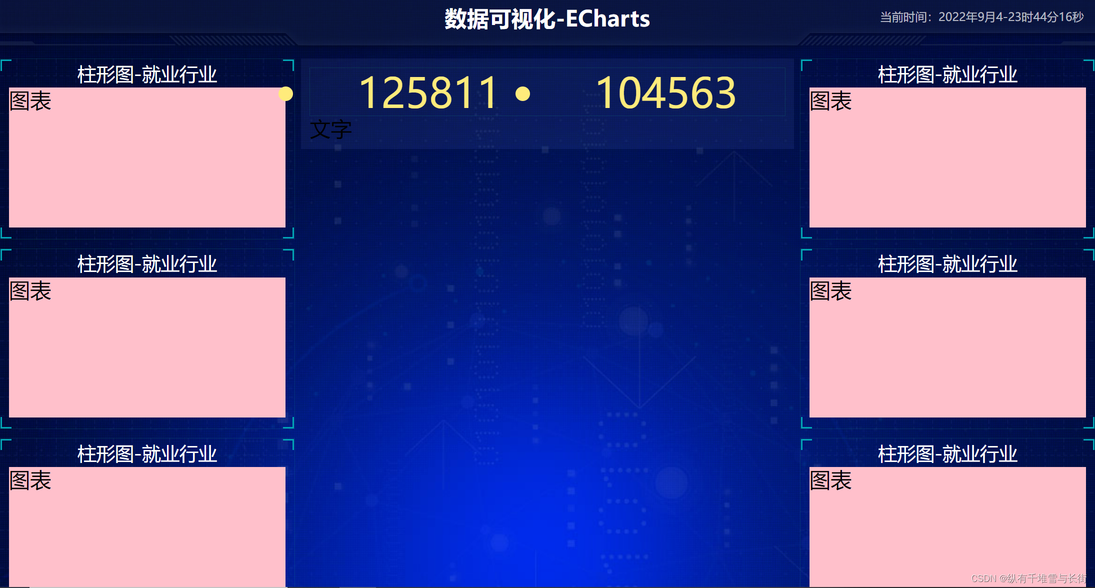
中间布局
- 上面是no 数字模块
- 下面是map 地图模块
no模块部分
- 数字模块 no 有个背景颜色 rgba(101, 132, 226, 0.1); 有个15像素的内边距
- 注意中间列 column 有个 左右 10px 下 15px 的外边距
- no 模块里面上下划分 上面是数字(no-hd) 下面 是 相关文字说明(no-bd)
- no-hd 数字模块 有一个边框 1px solid rgba(25, 186, 139, 0.17)
- no-hd 数字模块 里面分为两个小li 每个小li高度为 80px 文字大小为 70px 颜色为 #ffeb7b 字体是图标字体 electronicFont
- no-hd 利用 after 和 before制作2个小角, 边框 2px solid #02a6b5 宽度为 30px 高度为 10px
- 小竖线 给 第一个小li after 就可以 1px宽 背景颜色为 rgba(255, 255, 255, 0.2); 高度 50% top 25% 即可
- no-bd 里面也有两个小li 高度为 40px 文字颜色为 rgba(255, 255, 255, 0.7) 文字大小为 18px 上内边距为 10px
<div class="column"> <!-- no模块制作 --> <div class="no"></div> </div>- 1
- 2
- 3
- 4
.no{ background: rgba(101, 132, 226, 0.1); padding: 0.1875rem; }- 1
- 2
- 3
- 4
column 有个 左右 10px 下 15px 的外边距
.column:nth-child(2){ flex:5; margin:0 .125rem .1875rem; }- 1
- 2
- 3
- 4
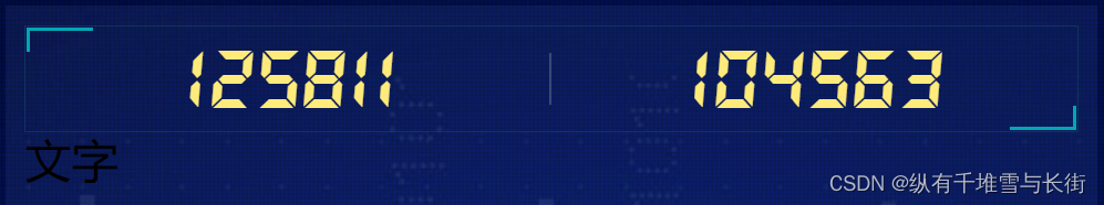
我们想要的效果如下:

- no-hd
有一个边框,并且有一个高度,这个高度给里面的子模块,两个小li。所以我们可以这么做,no-hd是一个div里面放ul,ul里面放两个小li,每个小li里面都有一个高度,里面包含文字就行。
<div class="no"> <div class="no-hd"> <ul> <li>125811</li> <li>104563</li> </ul> </div> <div class="no-bd">文字</div> </div>- 1
- 2
- 3
- 4
- 5
- 6
- 7
- 8
- 9
.no{ background: rgba(101, 132, 226, 0.1); padding: 0.1875rem; .no-hd { position: relative; border: 1px solid rgba(25, 186, 139, 0.17); ul { display: flex; li { flex: 1; text-align: center; height: 1rem; line-height: 1rem; font-size: 0.875rem; color: #ffeb7b; } } } }- 1
- 2
- 3
- 4
- 5
- 6
- 7
- 8
- 9
- 10
- 11
- 12
- 13
- 14
- 15
- 16
- 17
- 18
- 19
- 20
结果为:
这个中间的小圆点我们可以在刚开始的时候就去掉li{ list-style: none; }- 1
- 2
- 3
接着这个字体的样式和我们想要的效果也不一样。这时我们需要用到图标字体,首先需要声明字体,我们可以放到最开始的时候
/* 声明字体*/ @font-face { font-family: electronicFont; src: url(../font/DS-DIGIT.TTF); }- 1
- 2
- 3
- 4
- 5
接着直接使用在no-hd样式中font-family

no-hd 利用 after 和 before制作2个小角&::before { content: ""; position: absolute; width: 30px; height: 10px; border-top: 2px solid #02a6b5; border-left: 2px solid #02a6b5; top: 0; left: 0; } &::after { content: ""; position: absolute; width: 30px; height: 10px; border-bottom: 2px solid #02a6b5; border-right: 2px solid #02a6b5; right: 0; bottom: 0; }- 1
- 2
- 3
- 4
- 5
- 6
- 7
- 8
- 9
- 10
- 11
- 12
- 13
- 14
- 15
- 16
- 17
- 18
- 19
- 20
结果:
中间还有一条小竖线,这个怎么来做呢?
给一个小li加一个伪元素ul { display: flex; li { position: relative; flex: 1; text-align: center; height: 1rem; line-height: 1rem; font-size: 0.875rem; color: #ffeb7b; font-family: electronicFont; &:first-child::after { content: ""; position: absolute; height: 50%; width: 1px; background: rgba(255, 255, 255, 0.2); right: 0; top: 25%; } } }- 1
- 2
- 3
- 4
- 5
- 6
- 7
- 8
- 9
- 10
- 11
- 12
- 13
- 14
- 15
- 16
- 17
- 18
- 19
- 20
- 21
- 22
综上:no-hd布局是加了一个边框,两个小角是给no-hd加一个after,before伪元素,里面再通过flex布局,划分左右两个小li,每个小li高度为80px,小竖线是第一个小li的after伪元素。- no-bd
它的做法几乎和上面是一样的,就是一个ul里面放两个小li,小li还是水平夫人内部,文字水平居中就行。
<div class="no-bd"> <ul> <li>前端需求人数</li> <li>市场供应人数</li> </ul> </div>- 1
- 2
- 3
- 4
- 5
- 6
.no-bd{ ul{ display: flex; li{ flex: 1; height: 0.5rem; line-height: 0.5rem; text-align: center; font-size: 0.225rem; color: rgba(255, 255, 255, 0.7); padding-top: 0.125rem; } } }- 1
- 2
- 3
- 4
- 5
- 6
- 7
- 8
- 9
- 10
- 11
- 12
- 13
- 14
结果为:

-
相关阅读:
多任务系统(操作系统)
Java版工程行业管理系统源码-专业的工程管理软件-提供一站式服务
ERA5再分析资料下载攻略
一文彻底搞懂ZAB算法,看这篇就够了!!!
聊一聊 Rust 的 stack overflow
MySQL学习——选项文件的使用
Ap和F107数据来源及处理
优化算法|MOAVOA:一种新的多目标人工秃鹰优化算法(Matlab代码实现)
5、超链接标签
【开源】基于SpringBoot的高校学院网站的设计和实现
- 原文地址:https://blog.csdn.net/qq_40992225/article/details/126696474
