-
千峰HTML5+CSS3学习笔记
千峰HTML5+CSS3学习笔记
写在前面
- 学习链接:千锋HTML5前端开发教程1000集:
[1集: 183集],共183集 - 感想 | 摘抄
- 查询标签在各大浏览器中的兼容问题:caniuse
- 费曼学习技巧:以教促学
- 行内元素转块元素的方法:
- display: block;
- position: absolute;
- float: left;
- 浮动和绝对定位的区别:
- float:半脱离,文字环绕
- absolute:全脱离,不会出现文字环绕效果
- 伪类和伪元素的区别(:和::的区别)
- Animate.css动画演示
- 学习时遇到的问题
1. 前言
- 居中:
- WEB(网页)的组成部分
- HTML结构:W3C制定了机构HTML的语法、标准
- CSS表现:W3C制定了表现CSS的语法、标准
- JS行为:W3C、ECMA制定了行为标准(W3C DOM,ECMAScript)
2. HTML
-
标记
- 常规标记,双标记
- 空标记,单标记
-
:特殊切固定的文档声明标签
-
hr:水平线

-
特殊符号

-
div标签
- 没有具体含义,用来划分页面的区域,独占一行。
- 输入
div*3可以直接键入三行div
-
span标签
- 没有实际意义,主要应用在对于文本独立修饰的时候,内容有多宽就占用多宽的空间距离。
-
li标签
- li里面可以随意放标签,但是ol里面只能放置li
- 数字是自动生成的
- params:
- type:1,a,A,i,I
- start:取值只能是一个数字
-
ul标签
- 快捷创建:
ul>li{aaa}*3 - ul里面只能放li,li里面可以放其他标签
- 默认是黑色的实心圆
- params:
- type:disc、circle、square、none(用得最多)
- 快捷创建:
-
dl标签
- 自定义列表
- 主要用于图文混排
- dl > dt+dd
-
图片标签
-
同级目录
- 相对路径
code.gif./code.gif
- 绝对路径
- 相对路径
-
返回上一级后查找路径
../code.gif
-
图片标签的属性

-
宽高设置
- 只设置一个属性:等比例缩放
- 设置两个属性:按设置缩放
-
-
超链接标签
-
能够实现不同页面的跳转

-
target="_self":默认值,当前窗口打开 -
target="_blank":新窗口打开
-
-
表格:
-
表格创建快捷键:
table>tr*3>td*3 -
表格属性:

-
行tr的属性,table row

-
单元格td属性:table data

- 如果一个单元格的设置宽度,影响的是这一整列的宽度
- 如果一个单元格的设置宽度,影响的是这一整行的高度
-
表格合并
- 合并列:Colspan = 所要合并的单元格的列数 必须给td
- 合并行:Rowspan = 所要合并的单元格的行数 必须给td
-
-
表单标签

-
form中method的post和get的区别

-
3. CSS
-
cascading style sheets,层叠样式表
-
作用:修饰网页信息的显式样式
-
CSS语法:

- 1
- 2
- 3
- 4
- 5
- 6
- 7
- 8
-
内部样式表、外部样式表、行内样式表
-
外部样式的创建

-
外部css导入
<style> @import url(index.css); style>- 1
- 2
- 3

-
行内

-
就近原则:
!important>行内>内部>外部
-
3.1 选择器
-
为什么要用选择器:
要使用CSS对HTML页面中的元素实现一对一,一对多或者多对一的控制,这就需要用到CSS选择器
-
元素选择器/类型选择器(element选择器),如:
div{width:100px; height: 100px; background:red;}
-
class选择器/类选择器

- 优先级也是就近原则,这里就近只的是style定义的顺序,而不是class的继承顺序
-
id选择器

- 不能给一个标签用上多个id
-
* 通配符/通配符选择器

-
群组选择器:提出公共代码,节约代码量
div, p, h1, box1 { background-color: yellow; }- 1
- 2
- 3
-
后代选择器
div p { background-color: aqua; }- 1
- 2
- 3
- 底层查找逻辑:从右到左,先找子类,再找父类
-
伪类选择器

-
需要遵循顺序编写
<style> a:link { color: red; } a:visited { color: aqua; } a:hover { color: blue; } a:active { color: coral; } style>- 1
- 2
- 3
- 4
- 5
- 6
- 7
- 8
- 9
- 10
- 11
- 12
- 13
- 14
- 15
- 16
- 17
-
link-visited-hover-active
-
-
选择器的权重
-
当多个选择器,选中的是同一个元素,且都为他们定义了样式,如果属性发生了冲 选择器的权重

-
包含选择器:子类选择器(嵌套的)的权重要大于普通元素的选择器
-
3.2 CSS属性
-
文本属性
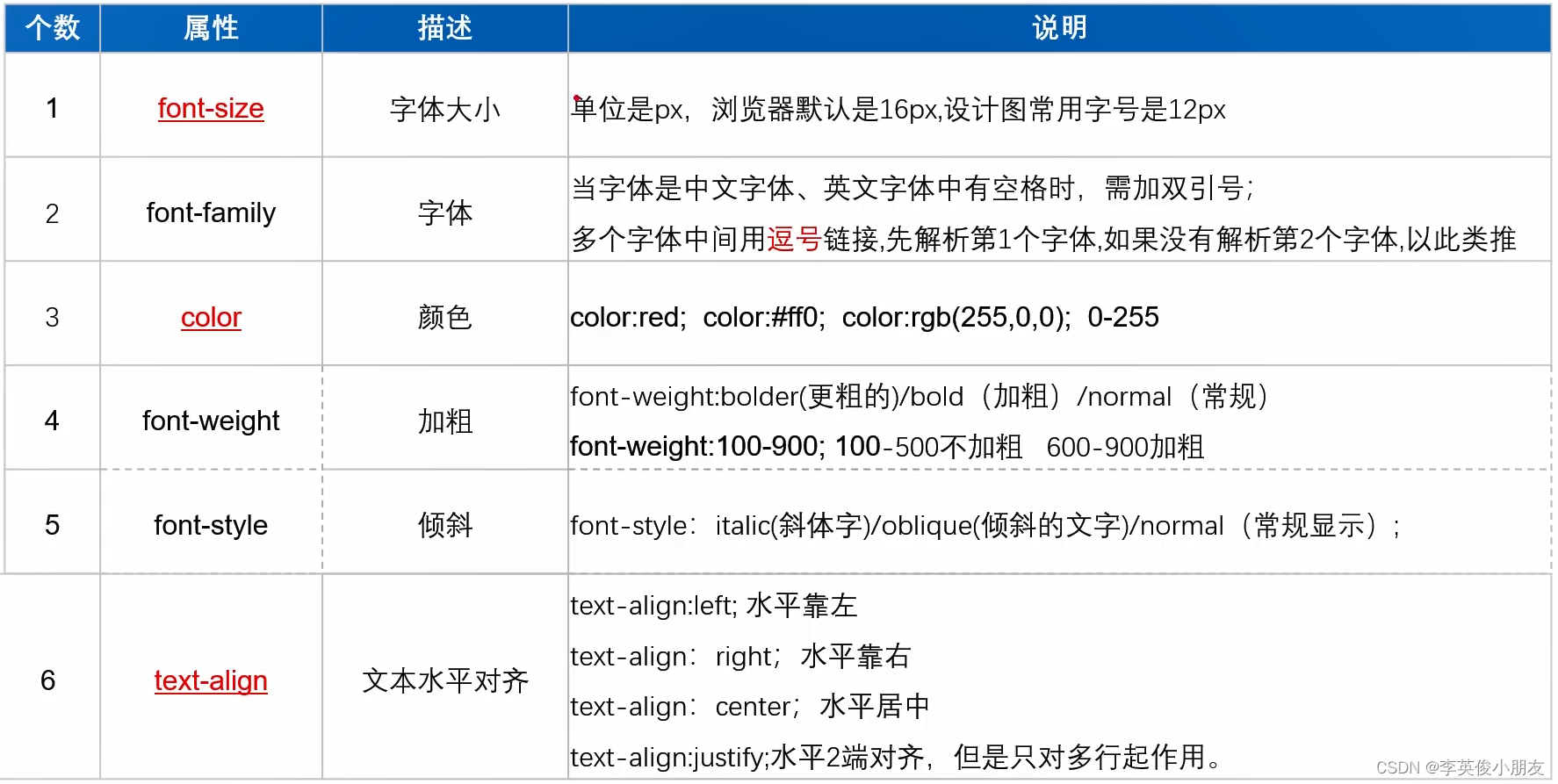

- 100:细体,lighter
- 400:正常,normal
- 700:加粗,bold
- 900:更粗,bolder
-
文本间距
- 词间距,word-spacing:针对英文的词之间的间距
- 字符间距,letter-spacing:字符与字符之间,文字与文字之间
-
首行缩进,text-indent
- 只对首行生效
- 2em,指当前字体大小的2个字符
-
文字装饰:
-
下划线、上划线、删除线
-
如果想要多条线
text-decoration: line-through underline overline;- 1
-
-
文本转换:text-transform,大写、小写,首字母大写
-
font:
.p_font { font: italic bold 20px/1em 微软雅黑; }- 1
- 2
- 3
-
列表属性

- 设置图片的话,需要对每一个li定义类,每个类设置不同的图片
- list-style:合并写法
-
背景属性

-
背景图片小于盒子大小:默认平铺效果
-
背景图片大于盒子大小:裁剪显示左上角的部分
-
background-repeat:
- repeat:默认平铺
- repeat-x:x轴平铺
- repeat-y:y轴平铺
- no-repeat:不平铺
-
background-size:
- 100px 100px
- 100% 100%
- cover:把背景图像扩展至足够大,以使背景图像完全覆盖背景区域,有一部分会被裁掉
- contain:把图像扩展至最大尺寸,以使其宽度和高度完全适应内容区域,有一部分背景无法铺满
-
background-attachment:
- 默认是scroll
- 设置fixed可以制作视差效果
-
背景属性的符合写法:
-
用空格隔开
-
顺序可以换
-
可以只取一个值,放在后面能覆盖前面的值
-
background-size属性只能单独用
-
顺序可以随便换
-
位置的顺序要贴着写,不能随便换
div { width: 600px; height: 600px; /* background-color: yellow; background-image: url(pics/马卡龙.png); background-repeat: no-repeat; background-position: center; background-attachment: fixed; */ background: yellow url(pics/马卡龙.png) no-repeat center fixed; }- 1
- 2
- 3
- 4
- 5
- 6
- 7
- 8
- 9
- 10
- 11
-
-
-
浮动属性

-
作用:
- 让竖着的东西横着来
- 定义网页中的其他文本如何绕着该元素显示
-
浮动是见缝插针的,能往下排就往下排,其次才会换行

-
-
清浮动
-
写固定高度
-
清浮动的clear用法

-
当前浮动元素后面补一个盒子,不设置宽高,clear:both
-
overflow: hidden
- 通过隐藏的bfc让浮动的元素计算高度
-
4. 盒子模型
-
什么是盒子模型


-
padding:内边距
- 一个值,四个方向都一样
- 两个值,上下,左右
- 三个值,上 左右 下
- 四个值,上右下做
- 单独设置某一个方向的padding:
padding-left,类似的,top、bottom、left、right - padding不支持负数
-
border:边框
- 样式:
- solid
- double
- dashed
- dotted
- 背景色也能蔓延到边框,即boder压在bg-color上的
- boder属性拆分:
- border-width
- border-style
- border-color
- 样式:
-
margin:外边距
- 支持多个方向一起写:
margin: 10px 20px 30px 40px; - 也支持属性拆分:
- margin-top
- margin-left
- …
- 很多标签自带margin值,所以有时候会需要将margin设置为0
- 外边距支持设置负值,盒子往反方向移动
- 最快屏幕居中方案:
margin: 0 auto;,上下为0,左右自动;上下auto是没有意义的 - 外边距的特性:
- 兄弟关系,两个盒子垂直外边距与水平外边距的问题
- 垂直方向上,外边距取最大值。
- 水平方向上,外边距合并处理。
- 父子关系,给子加外边距,但作用于父身上了,怎么解决
- 方案1:子margin-top ==> 父的padding-top,注意高度计算
- 方案2:给父盒子设置边框,transparent:透明
- 方案3:加浮动,子和父都可以
- 方案4:overflow:hidden,BFC
- 兄弟关系,两个盒子垂直外边距与水平外边距的问题
- 支持多个方向一起写:
4.1 溢出属性
-
溢出属性(容器的)

-
空余空间

- nowrap:不换行
- pre:显示空格、回车,不换行
- pre-wrap:显示空格,回车,换行
- pre-line:显示回车,不显示空格,换行
-
省略号显示

4.2 元素显示类型
-
元素显示类型

-
块元素:
display: blockdisplay: list-item- 独占一行显示
- p标签放文本可以,不能放块级元素
-
行内:
display: inline- 不能设置长宽
- padding和margin只有左右有用,上下没用
-
行内块:
- 既能设置宽高,又能跟其他标签一起分享空间
display: inline-blockimg、input
-
元素类型互相转换:设置display属性
display: none,隐藏属性- 空格:子代选择器,
.item li:子代中有li的都选中 - > :亲代选择器,
.item>li:只选择自己的亲儿子
-
安利首页设计
- 版心
- 通栏
- 留白
4.3 定位
-
定位 position
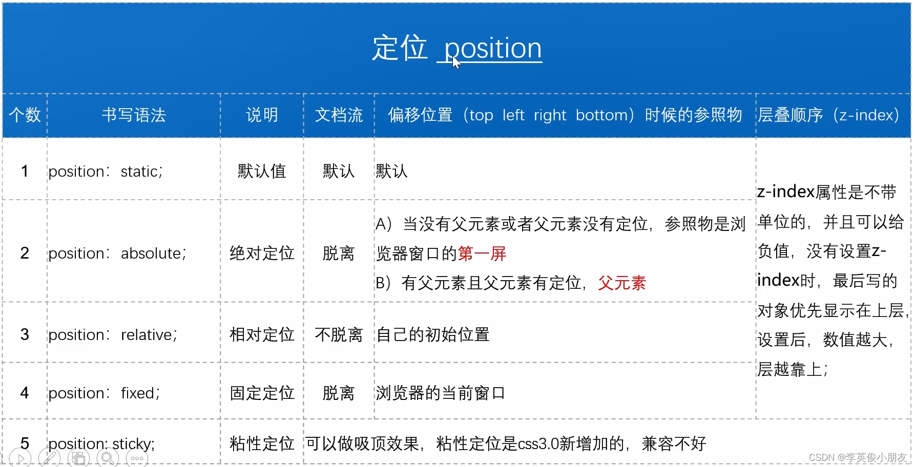
- 粘性定位:导航栏粘住顶部
- 固定定位:广告永远显示在右下角
- 相对定位:自己的位置进行偏移,但是不改变原位置的占位
- 绝对定位:常用于基于父类的定位,一般box为相对定位,子类pic为绝对定位。
- 绝对定位属性的设置会使得行内元素改为块元素。
-
层级
- z-index:层级
- z-index越大,层级越大,越靠顶层显示(负值也可)
- 需要配合定位使用
- 绝对定位在层级上的表示
- 父子关系:设置子盒子的z-index为负值,可以让父盒子顶层显示
- 兄弟关系:如果都是绝对定位,根据z-index的值显示谁在顶层
-
锚点
4.4 精灵图
-
CSS Sprites

-
图片整合的优势:
- 通过图片整合来减少对服务器的请求次数,从而提高面的加载速度。
- 通过整合图片来减少图片的体积。

4.5 宽高自适应
-
网页布局中经常要定义元素的宽和高。但很多时候我们希望元素的大小能够根据窗口或子元素自动调整,这就是自适应
-
width不设置或者auto就是自适应
使用场景:
- 导航栏
- 通栏布局
-
高度自适应:
- 元素高度的默认值:
{height: auto;} - 设置最小高度:
min-height
- 元素高度的默认值:
-
浮动元素的高度自适应
- 父元素不写高度时,子元素写了浮动后,父元素会发生高度塌陷
- 方法1:给父元素添加声明
overflow:hidden(缺点:会隐藏溢出的元素) - 方法2:在浮动元素下方添加空块元素,并给该元素添加声明:
clear:both; height:0;overflow:hidden;(缺点:在结构里增加了空的标签,不利于代码可读性,且降低了浏览器的性能) - 方法3:万能清除浮动法
- 选择符:
after{content:" "; clear:both; display:block; height:0; visibility:hidden;/overflow:hidden;}
- 选择符:
-
伪元素

-
隐藏的区别:
display:none:不占位的隐藏visibility:hidden:占位的隐藏
4.6 窗口自适应
-
盒子根据窗口的大小进行改变
设置方法:
html, body{height:100%;} -
calc()函数的使用cal()函数:用于动态计算长度值;- 需要注意的是,运算符前后都需要保留一个空格,例如:
width: calc(100% - 10px); - 任何长度值都可以使用
calc()函数进行计算; calc()函数支持加减乘除的运算;calc()函数使用标准的数学运算优先级规则;
-
多栏复杂布局

DOCTYPE html> <html lang="en"> <head> <meta charset="UTF-8"> <meta http-equiv="X-UA-Compatible" content="IE=edge"> <meta name="viewport" content="width=device-width, initial-scale=1.0"> <title>Documenttitle> <style> * { margin: 0; padding: 0; } html, body { height: 100%; } .top, .bottom { width: 100%; height: 50px; background: #ccc; } .middle { height: calc(100% - 100px); background: yellow; } .left, .right { width: 100px; height: 100px; background: red; float: left; } .center { width: calc(100% - 200px); height: 100%; background: blue; float: left; } style> head> <body> <div class="top">div> <div class="middle"> <div class="left">div> <div class="center">div> <div class="right">div> div> <div class="bottom">div> body> html>- 1
- 2
- 3
- 4
- 5
- 6
- 7
- 8
- 9
- 10
- 11
- 12
- 13
- 14
- 15
- 16
- 17
- 18
- 19
- 20
- 21
- 22
- 23
- 24
- 25
- 26
- 27
- 28
- 29
- 30
- 31
- 32
- 33
- 34
- 35
- 36
- 37
- 38
- 39
- 40
- 41
- 42
- 43
- 44
- 45
- 46
- 47
- 48
- 49
- 50
- 51
- 52
- 53
- 54
- 55
- 56
- 57
- 58
- 59
- 60
5. 表单进阶
-
单选框
<input type="radio" name="sex" id="woman" checked> <label for="woman">女label>- 1
- 2
- name:表示单选框所在的组,该组下所有的radio都要设置同样的name
- input.id + label.for:使文字部分可以点击选中
-
复选框
- 基本跟单选框一样,就是
type="checkbox"
- 基本跟单选框一样,就是
-
上传文件
-
图片按钮-代替提交按钮
<form action=""> <input type="image" src="imgs/search_pic_green.png"> form>- 1
- 2
- 3
-
隐藏按钮
-
禁用和只读属性
-
下拉菜单
-
格式
<select size="3" multiple> <option value="ln">辽宁option> <option selected>山东option> <option>山西option> <option>湖北option> select>- 1
- 2
- 3
- 4
- 5
- 6
-
select支持的属性
- size:下拉菜单显示的个数,多的话就增加滚动条
- multiple:支持多项选择
-
option支持的属性
- value:提供给后端需要用的value值
- selected:默认选中
-
-
文本域
- 一般通过css来控制宽和高
- placeholder: 预置文本,提示文字
- textarea默认的value值是写在双标签内部的,注意空格问题,所以写的时候,不要进行换行啊啥的
- 通过在css中设置resize:重新设置大小
- vertical:垂直方向
- horizontal:水平方向
- both:两个方向
- none:两个方向都不能resize
-
字段集
-
fieldset
<fieldset> <legend>皮卡丘legend> <input type="radio" name="a">男 <br> <input type="radio" name="a">女 fieldset>- 1
- 2
- 3
- 4
- 5
- 6
-
6. HTML5新特性
-
HTML5发展史

-
HTML5的浏览器兼容

-
HTML5语法

-
HTML5新增语义化标签

-
新增的语义化标签没有实际性的作用,跟div没啥区别,就说做一个名字的参考,使用的时候还是要结合css使用
-
比如制作一个盒子模型的界面
DOCTYPE html> <html lang="en"> <head> <meta charset="UTF-8"> <meta http-equiv="X-UA-Compatible" content="IE=edge"> <meta name="viewport" content="width=device-width, initial-scale=1.0"> <title>Documenttitle> <style> * { margin: 0; padding: 0; } html, body { height: 100%; } header, footer { height: 50px; line-height: 50px; text-align: center; background: orange; } section { height: calc(100% - 100px); } nav, aside { width: 100px; height: 100%; background: #ccc; float: left; } main { float: left; width: calc(100% - 200px); height: 100%; background: white; } aside p { font-style: 12px; color: white; } main .article1 { height: 60%; } main .article2 { height: 40%; } style> head> <body> <header>Headerheader> <section> <nav> <figure>navfigure> <ul> <li>111li> <li>111li> <li>111li> <li>111li> ul> nav> <main> <article class="article1"> <header>article-headerheader> <p>Lorem ipsum dolor sit amet consectetur, adipisicing elit. Cupiditate nihil tempore quibusdam sequi ab, nemo repellat ipsa nobis sit eius est. Voluptas quam nisi repellat est fugiat explicabo rerum quod.p> <footer>article-footerfooter> article> <article class="article2"> <header>article-headerheader> <p>Lorem ipsum dolor sit amet consectetur, adipisicing elit. Cupiditate nihil tempore quibusdam sequi ab, nemo repellat ipsa nobis sit eius est. Voluptas quam nisi repellat est fugiat explicabo rerum quod.p> <footer>article-footerfooter> article> main> <aside class="aside_p"> <figure>asidefigure> <p>Lorem ipsum dolor sit amet, consectetur adipisicing elit. Necessitatibus repellat perspiciatis ea nobis dolore cupiditate tempore quidem eius, modi eveniet fuga enim beatae quibusdam earum fugit in, iure aut. Quaerat?p> aside> section> <footer>Footerfooter> body> html>- 1
- 2
- 3
- 4
- 5
- 6
- 7
- 8
- 9
- 10
- 11
- 12
- 13
- 14
- 15
- 16
- 17
- 18
- 19
- 20
- 21
- 22
- 23
- 24
- 25
- 26
- 27
- 28
- 29
- 30
- 31
- 32
- 33
- 34
- 35
- 36
- 37
- 38
- 39
- 40
- 41
- 42
- 43
- 44
- 45
- 46
- 47
- 48
- 49
- 50
- 51
- 52
- 53
- 54
- 55
- 56
- 57
- 58
- 59
- 60
- 61
- 62
- 63
- 64
- 65
- 66
- 67
- 68
- 69
- 70
- 71
- 72
- 73
- 74
- 75
- 76
- 77
- 78
- 79
- 80
- 81
- 82
- 83
- 84
- 85
- 86
- 87
- 88
- 89
- 90
- 91
- 92
- 93
- 94
- 95
- 96
-
效果:

-
-
video和audio的应用

- 之前的霸主flash,由于安全性、计算资源使用效率低,被抛弃了
- audio:
- video:
-
增强表单

<form action=""> <div> 颜色选择:<input type="color" name="color"> div> <div> 邮箱输入:<input type="email" name="email"> div> <div> url地址(完整地址):<input type="url" name="url"> div> <div> 电话号码:<input type="tel" name="tel"> div> <div> 滑块效果:<input type="range" name="range" min="100" max="200" value="100" step="10"> div> <div> 数字类型:<input type="number" name="number" min="1" max="10" value="6" step="2"> div> <div> 搜索:<input type="search" name="search"> div> <div> 日期选择框:<input type="date", name="date"> 月份选择框:<input type="month", name="date"> 周数选择框:<input type="week", name="date"> 时间选择框:<input type="datetime-local", name="date"> div> <input type="submit"> form>- 1
- 2
- 3
- 4
- 5
- 6
- 7
- 8
- 9
- 10
- 11
- 12
- 13
- 14
- 15
- 16
- 17
- 18
- 19
- 20
- 21
- 22
- 23
- 24
- 25
- 26
- 27
- 28
- 29
- 30
-
数据列表

- 提供选项列表
- 支持模糊搜索查询
-
增强表单属性

7. CSS3基础
7.1 CSS3选择器

-
优雅降级和渐进增强

-
层级选择器
-
+ 的意思是:当前元素的后面第一个兄弟
.child+li { background: yellow; }- 1
- 2
- 3
-
~ 的意思是:当前元素的后面所有的亲兄弟
.child~li { background: yellow; }- 1
- 2
- 3
-
-
属性选择器

实践:
DOCTYPE html> <html lang="en"> <head> <meta charset="UTF-8"> <meta http-equiv="X-UA-Compatible" content="IE=edge"> <meta name="viewport" content="width=device-width, initial-scale=1.0"> <title>Documenttitle> <style> div[class]{ background: yellow; } p[class]{ background: red; } /* 完全匹配 */ /* div[class=box1]{ border: 2px dashed blue; } */ /* 包含匹配 */ div[class~="box1"]{ border: 2px dashed blue; } /* 模糊匹配 */ div[class^="b"]{ color: green; } div[class$="2"]{ color: gray; } div[class*="1"]{ color: orange; } input[name] { background: yellow; } input[type=email]{ background: red; } style> head> <body> <div class="box1">div111div> <div class="box2">div222div> <div>div333div> <div class="box1">div444div> <div class="box1 box3">div555div> <p class="p1">p111p> <p class="p2">p222p> <p>p333p> <div> 用户名:<input type="text" name="username"> <br> 密码:<input type="password" name="password"><br> 年龄:<input type="number" name="age"><br> 邮箱:<input type="email" name="email"><br> div> body> html>- 1
- 2
- 3
- 4
- 5
- 6
- 7
- 8
- 9
- 10
- 11
- 12
- 13
- 14
- 15
- 16
- 17
- 18
- 19
- 20
- 21
- 22
- 23
- 24
- 25
- 26
- 27
- 28
- 29
- 30
- 31
- 32
- 33
- 34
- 35
- 36
- 37
- 38
- 39
- 40
- 41
- 42
- 43
- 44
- 45
- 46
- 47
- 48
- 49
- 50
- 51
- 52
- 53
- 54
- 55
- 56
- 57
- 58
- 59
- 60
- 61
- 62
7.2 伪类选择器
-
结构伪类选择器

- 通过
nth-child(n)实现奇数和偶数的css设置:- 奇数:n改为2n-1,或者odd
- 偶数:n改为2n,或者even
- 通过
-
目标伪类选择器
E:targe选择匹配E的所有元素,且匹配元素被相关URL指向- 通常跟锚点结合使用
- 手风琴:每次只打开一个,折叠面板
-
UI状态伪类选择器

E:focus:焦点,会匹配此伪类选择器- checkbox有自己的默认样式,如果没有清除该默认样式的化,不收伪类选择器的样式控制。清除样式:
appearance: none;
-
否定伪类选择器

<style> li:not(:first-child){ background: yellow; } li:not(:nth-child(2n+1)){ background: yellow; } style>- 1
- 2
- 3
- 4
- 5
- 6
- 7
- 8
-
动态伪类选择器

7.3 阴影
-
文本阴影
<style> /* param1 水平方向的位移 param2 垂直方向的位移 param3 模糊程度 param4 阴影颜色 , 支持多个阴影 */ div{ text-shadow: -10px -10px 1px red, 10px 10px 1px yellow; } style>- 1
- 2
- 3
- 4
- 5
- 6
- 7
- 8
- 9
- 10
- 11
- 12
-
盒子阴影

7.4 圆角边框
-
border-radius -
接收 px和% 单位
-
接收一个值:四个角是一样的
-
接收两个值:左上右下,左下右上一致
-
三个值:左上,左下右上,右下
-
四个值:从左上开始,顺时针方向
-
单个角的设置:
border-bottom-left-radius: 20px; -
border-radius: 30px/60px;:每个角,水平方向走30,垂直方向走60 -
border-radius: 10px 20px 30px 40px/50px 60px 70px 80px;:从左上角开始,顺时针方向水平的四个走向/垂直的四个走向 -
正方形变成⚪:
border-radius的值设置为盒子长宽的一半,要考虑border和padding -
设置成50%,可以直接设置成⚪,不需要考虑border和padding
-
半圆:
<style> div { width: 100px; height: 50px; background: green; margin: 0 auto; border-radius: 50px 50px 0 0; } style>- 1
- 2
- 3
- 4
- 5
- 6
- 7
- 8
- 9
-
扇形:
<style> div { width: 100px; height: 100px; background: green; margin: 0 auto; border-radius: 200px 0 0 0; } style>- 1
- 2
- 3
- 4
- 5
- 6
- 7
- 8
- 9
7.5 字体引入

DOCTYPE html> <html lang="en"> <head> <meta charset="UTF-8"> <meta http-equiv="X-UA-Compatible" content="IE=edge"> <meta name="viewport" content="width=device-width, initial-scale=1.0"> <title>Documenttitle> <style> @font-face { font-family: lt; src: url(datas/HYXiRuJ.ttf); } div{ font-family: lt; font-size: 50px; color: red; text-shadow: 5px 0px 0px green; } style> head> <body> <div>很枯燥啊马飞!div> body> html>- 1
- 2
- 3
- 4
- 5
- 6
- 7
- 8
- 9
- 10
- 11
- 12
- 13
- 14
- 15
- 16
- 17
- 18
- 19
- 20
- 21
- 22
- 23
- 24
7.6 怪异盒模型
-
怪异盒模型

-
box-sizing: border-box -
怪异盒模型以宽高为基础,padding和border只会挤压内部空间,而不是像平常出现的外扩情况。margin是一样的。
-
使用场景:排列时,子组件不会因为加了padding而换行
7.7 弹性盒
-
display:flex -
影响
- 子元素默认横向排列
- 如果子元素是行内元素,则子元素会变成块级元素
- 只有一个元素的时候,父元素增加
margin:auto会使得子元素实现水平和垂直居中
-
默认情况下,水平方向是主轴,垂直方向是侧轴,子元素按照 主轴 排列。
-
设置主轴方向:
flex-direction: column -
调整主轴对齐方向:
justify-content: space-between;- flex-start
- flex-end
- center
- space-between:两端对齐
- space-around:距离环绕
-
调整侧轴对齐方向:
align-items: center; -
折行:
flex-wrap:wrap -
调整折行之后的行间距:
- flex-start
- flex-end
- center
- space-around
- space-between
-
加了
display:flex属性的盒子叫做 容器,里面的子盒子叫做 项目 -
项目的对齐:
align-self: stretchDOCTYPE html> <html lang="en"> <head> <meta charset="UTF-8"> <meta http-equiv="X-UA-Compatible" content="IE=edge"> <meta name="viewport" content="width=device-width, initial-scale=1.0"> <title>Documenttitle> <style> .box { width: 300px; height: 120px; border: 1px solid #000; margin: 10px auto; display: flex; } .box div { width: 60px; /* height: 60px; */ border: 1px dashed red; box-sizing: border-box; } .div1 { align-self: flex-start; } .div2 { align-self: flex-end; } .div3 { align-self: center; } .div4 { align-self: baseline; } .div5 { align-self: stretch; } style> head> <body> <div class="box"> <div class="div1">111div> <div class="div2">222div> <div class="div3">333div> <div class="div4">444div> <div class="div5">555div> div> body> html>- 1
- 2
- 3
- 4
- 5
- 6
- 7
- 8
- 9
- 10
- 11
- 12
- 13
- 14
- 15
- 16
- 17
- 18
- 19
- 20
- 21
- 22
- 23
- 24
- 25
- 26
- 27
- 28
- 29
- 30
- 31
- 32
- 33
- 34
- 35
- 36
- 37
- 38
- 39
- 40
- 41
- 42
- 43
- 44
- 45
- 46
- 47
- 48
-
项目调整顺序:
order: 1- order不设置时,为0
- order越大,越往后面排
- order可以取负值,越小越往前排
- 如果父容器设置了
flex-direction:row-reverse,那么也是按照reverse之后的顺序进行排序,取负值则往前排,取正值则往后排
-
项目剩余宽高:
flex: 1-
占满剩余空间
-
如果有多个项目都设置了flex,则各自占用的空间按照flex的比例进行平分
-
纵轴作主轴时同理
-
三栏布局样例
DOCTYPE html> <html lang="en"> <head> <meta charset="UTF-8"> <meta http-equiv="X-UA-Compatible" content="IE=edge"> <meta name="viewport" content="width=device-width, initial-scale=1.0"> <title>Documenttitle> <style> * { margin: 0; padding: 0; } html, body { height: 100%; } body{ display: flex; } .box1, .box3 { width: 100px; background: gray; } .box2 { flex: 1; background: yellow; } style> head> <body> <div class="box1">div> <div class="box2">div> <div class="box3">divc> body> html>- 1
- 2
- 3
- 4
- 5
- 6
- 7
- 8
- 9
- 10
- 11
- 12
- 13
- 14
- 15
- 16
- 17
- 18
- 19
- 20
- 21
- 22
- 23
- 24
- 25
- 26
- 27
- 28
- 29
- 30
- 31
- 32
- 33
- 34
-
8. 移动端布局
-
模拟器上显示的分辨率:CSS像素,设备的独立像素
-
物理分辨率:设备像素
-
设备像素比(dpr)=物理像素/CSS像素
-
iphone6 1css的像素 == 2物理像素;s5 1css像素 == 3物理像素
-
设计稿:
- 物理分辨率
- 为了清晰的页面
- 只需要提供一份
- 需要用到的布局有
- 百分比布局
- 弹性盒布局
- rem布局
-
重要代码:
-
移动端布局

-
:用户不允许缩放
-
-
内部控件拥有自己的滚动条:overflow:auto
-
隐藏滚动条:
::-webkit-scrollbar{ display: none; }- 1
- 2
- 3
-
调整行间距从上面开始显示:
align-content: flex-start; -
文字居中显示:
text-align: center; -
flex横向排列不运行被挤压:
flex-shrink: 0;
9. 多列布局
-
目的:实现蘑菇街、小红书这种的,瀑布流布局
-
多列布局


-
多列布局案例
DOCTYPE html> <html lang="en"> <head> <meta charset="UTF-8"> <meta http-equiv="X-UA-Compatible" content="IE=edge"> <meta name="viewport" content="width=device-width, initial-scale=1.0"> <title>Documenttitle> <style> div{ height: 300px; background: yellow; /* 显示的列数 */ column-count: 5; /* 调整列间距 */ column-gap: 30px; /* 列边框 */ column-rule: 2px solid red; /* 列高度统一 */ /* 把balance换成auto,则每列会优先把父盒子占满 */ column-fill: balance; /* 调整列宽 */ column-width: 500px; } div>h1 { /* 横跨所有的列 */ column-span: all; text-align: center; } style> head> <body> <div> <h1>赵钱孙礼h1> Lorem ipsum dolor sit amet consectetur adipisicing elit. Aut voluptatibus, obcaecati molestiae deleniti porro tenetur earum doloribus, quibusdam ipsa corporis, officiis assumenda natus inventore amet ducimus quisquam commodi molestias dolor?Lorem ipsum dolor sit, amet consectetur adipisicing elit. Fugiat adipisci, ad voluptates modi recusandae at enim illo maiores sint quidem rerum soluta similique, nisi consectetur cumque suscipit sed porro exercitationem! Lorem ipsum, dolor sit amet consectetur adipisicing elit. Odit vero eos facilis recusandae omnis dolore exercitationem debitis temporibus, illo magni quidem mollitia nesciunt fugiat sequi, non eveniet ex nihil accusantium! Lorem ipsum dolor sit amet consectetur adipisicing elit. Culpa, minima unde expedita molestias sint eos eligendi asperiores itaque consequuntur magni, consequatur delectus cupiditate sapiente! Ipsa nam provident pariatur illo sint? div> body> html>- 1
- 2
- 3
- 4
- 5
- 6
- 7
- 8
- 9
- 10
- 11
- 12
- 13
- 14
- 15
- 16
- 17
- 18
- 19
- 20
- 21
- 22
- 23
- 24
- 25
- 26
- 27
- 28
- 29
- 30
- 31
- 32
- 33
- 34
- 35
- 36
- 37
- 38
- 39
- 40
10. 响应式布局
-
常见的布局方案

-
模块中的内容:挤压-拉(布局不变)

-
模块中的内容:换行-平铺(布局不变)

-
模块中的内容:删减-增加(布局不变)

-
模块位置变换(布局改变)

-
模块展示方式改变:隐藏-展开(布局改变)

-
响应式布局特点
- 设计特点:
- 面对不同分辨率设备灵活性强
- 能够快捷解决多设备显示适应问题
- 缺点:
- 兼容各种设备工作量大,效率低下
- 代码累赘,会出现隐藏无用的元素,加载时间加长
- 其实这也是一种折中性质的设计解决方案,多方面因素影响而达不到最佳效果
- 一定程度上改变了网站原有的布局结构,会出现用户混淆的情况
- 设计特点:
-
媒体查询的含义:
媒体查询可以让我们根据设备显示器的特性(比如视口宽度、屏幕比例、设备方向:横向或纵向)为其设定CSS样式,媒体查询由媒体类型和一个或多个检测媒体特性的条件表达式组成。媒体查询中可用于检测的媒体特性有width、height和color等。使用媒体查询,可以在不改变页面内容的情况下,为特定的一些输出设备定制显示效果。
-
媒体查询操作方式
实际操作为:对设备提出询问(称作表达式)开始,如果表达式结果为真,媒体查询中的CSS被应用,如果表达式结果为假,媒体查询内的CSS将被忽略
-
媒体查询结构
@media all and (min-width:320px){ body {background-color:blue;} }- 1
- 2
- 3
-
-
设备类型(默认为all)

-
screen是媒体类型中的一种,CSS2.1定义了10种媒体类型
-
and被称为关键字,其他关键字还包括not(排除某种设备),only(限定某种设备)
-
(min-width:400px)就是媒体特性,其被放置在一对括号中 -
常用设置


-
11. 布局单位
-
px, em, rem 之争
- px: 500px
- em: 相对单位,相对于父元素的字体大小
- rem: 相对单位,相对于根元素的字体大小
-
px转rem插件推荐

-
js中fontsize计算:
fontsize = 当前设备的css布局宽度/物理分辨率(设计稿的宽度)*基准font-size -
vh与vw
- vh:view-height
- vw:view-width
- 100vh == 视口的高度
- 100vw == 视口的宽度
- 100vw和100%的区别
- 没有滚动条的时候,可以看作两者等价
- 在有滚动条的时候,100vw包含滚动条,窗口大小占满;而100%是刨除滚动条剩余的空间占满
12. 渐变
-
CSS3 渐变
- CSS3 渐变(gradient)可以让你在两个或者多个指定的颜色之间显示平稳过渡。以前,你必须使用图像来实现这些效果,现在通过使用CSS3的渐变即可实现。
- 此外,渐变效果的元素在放大时看起来效果更好,因为渐变是由浏览器生成的。
-
线性渐变

- 支持多颜色渐变
- 支持方向:to left、to right bottom…
- 支持任意方向:30deg…
-
径向渐变


- 如果效果无法正常显示,需要在radial-gradient函数前加上:
-webkit-,火狐浏览器需要加-moz-
- 如果效果无法正常显示,需要在radial-gradient函数前加上:
-
重复渐变:重复线性渐变

-
太极绘制:
DOCTYPE html> <html lang="en"> <head> <meta charset="UTF-8"> <meta http-equiv="X-UA-Compatible" content="IE=edge"> <meta name="viewport" content="width=device-width, initial-scale=1.0"> <title>Documenttitle> <style> body { background: lightblue; } div { width: 200px; height: 200px; background: linear-gradient(white 50%, black 50%); margin: 10px auto; display: flex; align-items: center; border-radius: 50%; } div::before { content: ""; display: block; width: 100px; height: 100px; background: radial-gradient(white 20%, black 25%); border-radius: 50%; } div::after { content: ""; display: block; width: 100px; height: 100px; background: radial-gradient(black 20%, white 25%); border-radius: 50%; } style> head> <body> <div>div> body> html>- 1
- 2
- 3
- 4
- 5
- 6
- 7
- 8
- 9
- 10
- 11
- 12
- 13
- 14
- 15
- 16
- 17
- 18
- 19
- 20
- 21
- 22
- 23
- 24
- 25
- 26
- 27
- 28
- 29
- 30
- 31
- 32
- 33
- 34
- 35
- 36
- 37
- 38
- 39
- 40
- 41
- 42
13. 动画
-
动画过渡属性

-
注意:
display: none /block无法支持动画过渡 -
针对该情况的动画制作,可以使用
height:0的改变来实现,并设置overflow:hidden
-
-
动画过渡类型

-
样例
DOCTYPE html> <html lang="en"> <head> <meta charset="UTF-8"> <meta http-equiv="X-UA-Compatible" content="IE=edge"> <meta name="viewport" content="width=device-width, initial-scale=1.0"> <title>Documenttitle> <style> ul { list-style: none; } li { width: 200px; height: 50px; border: 1px solid gray; } ul:hover li:nth-child(1) { width: 600px; transition: all 2s linear; } ul:hover li:nth-child(2) { width: 600px; transition: all 2s ease; } ul:hover li:nth-child(3) { width: 600px; transition: all 2s ease-in; } ul:hover li:nth-child(4) { width: 600px; transition: all 2s ease-out; } ul:hover li:nth-child(5) { width: 600px; transition: all 2s ease-in-out; } ul:hover li:nth-child(6) { width: 600px; transition: all 2s cubic-bezier(0.075, 0.82, 0.165, 1); } style> head> <body> <ul> <li>li> <li>li> <li>li> <li>li> <li>li> <li>li> <li>li> ul> body> html>- 1
- 2
- 3
- 4
- 5
- 6
- 7
- 8
- 9
- 10
- 11
- 12
- 13
- 14
- 15
- 16
- 17
- 18
- 19
- 20
- 21
- 22
- 23
- 24
- 25
- 26
- 27
- 28
- 29
- 30
- 31
- 32
- 33
- 34
- 35
- 36
- 37
- 38
- 39
- 40
- 41
- 42
- 43
- 44
- 45
- 46
- 47
- 48
- 49
- 50
- 51
- 52
- 53
- 54
- 55
- 56
- 57
- 58
- 59
- 60
- 61
- 62
-
-
动画过渡单一属性
- transition-property
- 现在就可以监控多个属性了
- 比如
transition-property: height background
- transition-duration
- transition-delay
- transition-timing-function
- transition-property
-
2d属性-transform
-
translate()

-
使用transform的优点

-
设置left-合成图层

-
设置translate-独立图层

-
-
scale()

- 如果设置的是负值,则为倒着的放大或者缩小
- 支持X轴、Y轴单独放大
- 从左上角放大:
transform-origin: left top;- 改变中心点的位置
- center、left top、left center…
-
rotate()
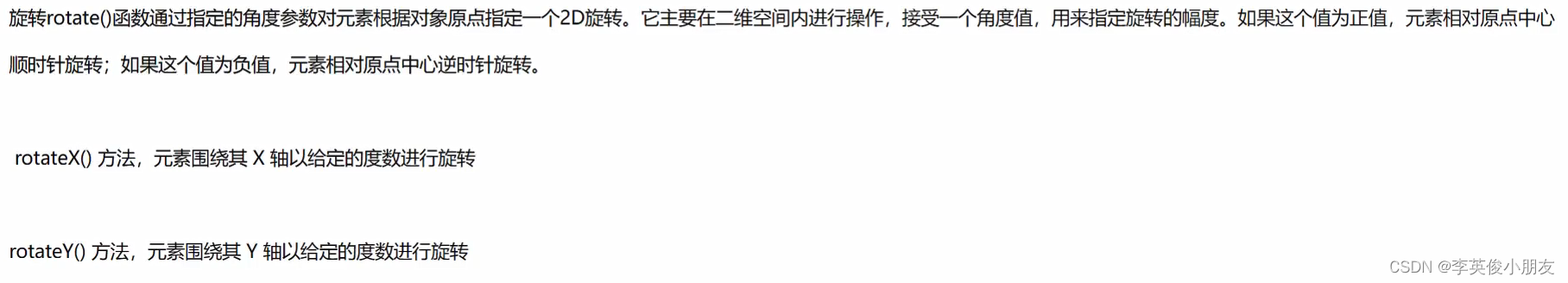
-
正值:顺时针
-
负值:逆时针
-
rotateX和rotateY会在三维空间中旋转
-
rotate = rotateZ 等价
-
绕着左上角的点旋转:
transform-origin: left top; -
折扇效果:
DOCTYPE html> <html lang="en"> <head> <meta charset="UTF-8"> <meta http-equiv="X-UA-Compatible" content="IE=edge"> <meta name="viewport" content="width=device-width, initial-scale=1.0"> <title>Documenttitle> <style> * { margin: 0; padding: 0; } ul { list-style: none; } ul { margin: 10px auto; width: 400px; height: 300px; /* border: 5px solid gray; */ position: relative; } li { width: 60px; height: 200px; position: absolute; left: 50%; margin-left: -30px; bottom: 30px; text-align: center; transform-origin: bottom center; border-radius: 10px; transition: all 2s; font-size: 10px; } ul li:not(:nth-child(7)) { opacity: 0; } ul:hover li { opacity: 1; } ul li:nth-child(1){ background: #b8f1cc; } ul li:nth-child(2){ background: #b8f1ed; } ul li:nth-child(3){ background: #f1f1b8; } ul li:nth-child(4){ background: #f1ccb8; } ul li:nth-child(5){ background: #d9b8f1; } ul li:nth-child(6){ background: #f1b8f1; } ul li:nth-child(7) { background: #ff9b6a; } ul li:nth-child(8){ background: #f9b747; } ul li:nth-child(9){ background: #fecf45; } ul li:nth-child(10){ background: #e3a04f; } ul li:nth-child(11){ background: #f1ccb8; } ul li:nth-child(12){ background: #b8d38f; } ul li:nth-child(13){ background: #ddff95; } ul:hover li:nth-child(1) { transform: rotate(90deg); } ul:hover li:nth-child(13) { transform: rotate(-90deg); } ul:hover li:nth-child(2) { transform: rotate(75deg); } ul:hover li:nth-child(12) { transform: rotate(-75deg); } ul:hover li:nth-child(3) { transform: rotate(60deg); } ul:hover li:nth-child(11) { transform: rotate(-60deg); } ul:hover li:nth-child(4) { transform: rotate(45deg); } ul:hover li:nth-child(10) { transform: rotate(-45deg); } ul:hover li:nth-child(5) { transform: rotate(30deg); } ul:hover li:nth-child(9) { transform: rotate(-30deg); } ul:hover li:nth-child(6) { transform: rotate(15deg); } ul:hover li:nth-child(8) { transform: rotate(-15deg); } style> head> <body> <ul> <li>好运li> <li>快乐li> <li>健康li> <li>顺意li> <li>平安li> <li>喜乐li> <li>暴富li> <li>升职li> <li>加薪li> <li>可爱li> <li>美丽li> <li>成功li> <li>发财li> ul> body> html>- 1
- 2
- 3
- 4
- 5
- 6
- 7
- 8
- 9
- 10
- 11
- 12
- 13
- 14
- 15
- 16
- 17
- 18
- 19
- 20
- 21
- 22
- 23
- 24
- 25
- 26
- 27
- 28
- 29
- 30
- 31
- 32
- 33
- 34
- 35
- 36
- 37
- 38
- 39
- 40
- 41
- 42
- 43
- 44
- 45
- 46
- 47
- 48
- 49
- 50
- 51
- 52
- 53
- 54
- 55
- 56
- 57
- 58
- 59
- 60
- 61
- 62
- 63
- 64
- 65
- 66
- 67
- 68
- 69
- 70
- 71
- 72
- 73
- 74
- 75
- 76
- 77
- 78
- 79
- 80
- 81
- 82
- 83
- 84
- 85
- 86
- 87
- 88
- 89
- 90
- 91
- 92
- 93
- 94
- 95
- 96
- 97
- 98
- 99
- 100
- 101
- 102
- 103
- 104
- 105
- 106
- 107
- 108
- 109
- 110
- 111
- 112
- 113
- 114
- 115
- 116
- 117
- 118
- 119
- 120
- 121
- 122
- 123
- 124
- 125
- 126
- 127
- 128
- 129
- 130
- 131
- 132
- 133
- 134
- 135
- 136
- 137
- 138
- 139
-
-
-
transform的顺序问题:


很尴尬:这里补了一下图片,因为原图片违规了。。。这。。。https://img-blog.csdnimg.cn/d9399dfd5f814eb9bfa5d6538630b133.png
- 多个属性要写在一个transform中,多个transform会被覆盖
- 属性的顺序需要按照逻辑顺序排列,比如先位移再旋转和缩放
-
倾斜

- skewX:拽着右小角,往右拉动,使得偏离垂直倾斜一定的夹角
-
关键帧动画
-
animation和transition的区别

-
infinite:动画循环执行无限次 -
animation符合属性,检索或者设置对象所应用的动画特效


-
transform中的 100% 是相对于自身的100%,所以类似
transform: translateX(-100%);的写法特别好用 -
动画只不过是镜花雪月,动画跑完之后就会回到初始的状态。通过设置
animation-fill-mode: forwards来使动画保留到最后一帧的状态;如果是backwords,就是保留初始一帧的状态 -
通过设置
animation: run 1s linear reverse;reverse来实现模块的弹出动画和收回动画
-
-
轮播案例
-
为了实现无缝轮播,通常会把第一张图复制一份放到最后
-
案例代码:
DOCTYPE html> <html lang="en"> <head> <meta charset="UTF-8"> <meta http-equiv="X-UA-Compatible" content="IE=edge"> <meta name="viewport" content="width=device-width, initial-scale=1.0"> <title>Documenttitle> <style> * { margin: 0; padding: 0; } .swiper-container { width: 640px; height: 300px; margin: 0 auto; overflow: hidden; } .swiper-container img { width: 640px; height: 300px; } .swiper-slide { float: left; } .swiper-wrapper { width: 9999px; animation: swiperrun 10s linear infinite; } .swiper-wrapper:hover{ animation-play-state: paused; } @keyframes swiperrun { 0% { transform: translateX(0px); } 5%{ transform: translateX(-640px); } 25%{ transform: translateX(-640px); } 30%{ transform: translateX(-1280px); } 50%{ transform: translateX(-1280px); } 55%{ transform: translateX(-1920px); } 75%{ transform: translateX(-1920px); } 80%{ transform: translateX(-2560px); } 100%{ transform: translateX(-2560px); } } style> head> <body> <div class="swiper-container"> <div class="swiper-wrapper"> <div class="swiper-slide"> <img src="imgs/桌面图片/p1.jpg" alt=""> div> <div class="swiper-slide"> <img src="imgs/桌面图片/p2.jpg" alt=""> div> <div class="swiper-slide"> <img src="imgs/桌面图片/p3.jpg" alt=""> div> <div class="swiper-slide"> <img src="imgs/桌面图片/p4.jpg" alt=""> div> <div class="swiper-slide"> <img src="imgs/桌面图片/p1.jpg" alt=""> div> div> div> body> html>- 1
- 2
- 3
- 4
- 5
- 6
- 7
- 8
- 9
- 10
- 11
- 12
- 13
- 14
- 15
- 16
- 17
- 18
- 19
- 20
- 21
- 22
- 23
- 24
- 25
- 26
- 27
- 28
- 29
- 30
- 31
- 32
- 33
- 34
- 35
- 36
- 37
- 38
- 39
- 40
- 41
- 42
- 43
- 44
- 45
- 46
- 47
- 48
- 49
- 50
- 51
- 52
- 53
- 54
- 55
- 56
- 57
- 58
- 59
- 60
- 61
- 62
- 63
- 64
- 65
- 66
- 67
- 68
- 69
- 70
- 71
- 72
- 73
- 74
- 75
- 76
- 77
- 78
- 79
- 80
- 81
- 82
- 83
- 84
- 85
- 86
- 87
- 88
- 89
-
-
逐帧动画案例
-
animation: run 5s steps(1, end);:- steps中的1代表过程是否进行插帧,如果是1的话,不插帧,直接进行跳跃;该值越大,则过渡的帧越多,动画过渡越细腻。
- end:保留的当前帧,看不到最后一帧,动画结束
- start:保留下一帧,看不到第一帧,从第一帧很快跳到最后一帧
-
技巧,使用strep-start(保留第一帧),最后多搞一个空白帧
-
假设有4个动作,那么需要制作5个帧,每个帧涵盖范围是0-100%,帧间隔则为100/4=25%。类似的背景偏移从0出发,向着负值偏移,累计增加。
-
样例:
DOCTYPE html> <html lang="en"> <head> <meta charset="UTF-8"> <meta http-equiv="X-UA-Compatible" content="IE=edge"> <meta name="viewport" content="width=device-width, initial-scale=1.0"> <title>Documenttitle> <style> div { width: 200px; height: 300px; background-image: url(./imgs/frams/2.jpg); animation: run 0.5s step-start infinite; } @keyframes run { 0% { background-position: 0px 0; } 25% { background-position: -180px 0; } 50% { background-position: -360px 0; } 75% { background-position: -540px 0; } 100% { background-position: -720px 0; } } style> head> <body> <div>div> body> html>- 1
- 2
- 3
- 4
- 5
- 6
- 7
- 8
- 9
- 10
- 11
- 12
- 13
- 14
- 15
- 16
- 17
- 18
- 19
- 20
- 21
- 22
- 23
- 24
- 25
- 26
- 27
- 28
- 29
- 30
- 31
- 32
- 33
- 34
- 35
- 36
- 37
- 38
- 39
- 40
- 41
- 42
- 43
- 44
- 45
- 46
-
-
Animate动画库
- Animate.css动画演示
- caniuse.com:查询浏览器版本是否支持的网站
-
3D场景

transform-style: preserve-3d;:flat是2d舞台;preserve-3d是3d舞台
-
景深

-
设置景深是为了实现观察,近大远小的情况
-
3D位移
DOCTYPE html> <html lang="en"> <head> <meta charset="UTF-8"> <meta http-equiv="X-UA-Compatible" content="IE=edge"> <meta name="viewport" content="width=device-width, initial-scale=1.0"> <title>Documenttitle> <style> .box { width: 500px; height: 500px; border: 5px solid black; transform-style: preserve-3d; position: relative; margin: 0 auto; perspective: 900px; transform: rotateY(30deg); } .center { position: absolute; width: 200px; height: 200px; background: red; left: 50%; top: 50%; margin-left: -100px; margin-top: -100px; transition: all 1s; } .box:hover .center { /* transform: translateZ(500px); */ transform: translate3d(200px, 200px, 600px); } style> head> <body> <div class="box"> <div class="center">div> div> body> html>- 1
- 2
- 3
- 4
- 5
- 6
- 7
- 8
- 9
- 10
- 11
- 12
- 13
- 14
- 15
- 16
- 17
- 18
- 19
- 20
- 21
- 22
- 23
- 24
- 25
- 26
- 27
- 28
- 29
- 30
- 31
- 32
- 33
- 34
- 35
- 36
- 37
- 38
- 39
- 40
- 41
- 42
- 43
- 44
-
3D旋转:
transform: rotate3d(0.11, 1, 1, 30deg);
- x轴旋转比例
- y轴旋转比例
- z轴旋转比例
- 上述比例要乘上的度数
-
3D缩放

- scaleX,scaleY,scaleZ,scale3d
- 使用时需要加上旋转和景深使用
transform-style:preserve-3d; perspective:800px;transform:scaleZ(10) rotateX(45deg);
-
-
立方体样例
DOCTYPE html> <html lang="en"> <head> <meta charset="UTF-8"> <meta http-equiv="X-UA-Compatible" content="IE=edge"> <meta name="viewport" content="width=device-width, initial-scale=1.0"> <title>Documenttitle> <style> * { margin: 0; padding: 0; } .box { width: 600px; height: 600px; margin: 0 auto; border: 5px solid gray; transform-style: preserve-3d; position: relative; transform: rotateX(30deg) rotateY(30deg); animation: run 5s linear infinite; } @keyframes run { 0%{ transform: rotateY(30deg) rotateX(30deg); } 25%{ transform: rotateY(300deg) rotateX(300deg); } 75%{ transform: rotateY(360deg) rotateX(360deg); } 100%{ transform: rotateY(30deg) rotateX(30deg); } } .box div { width: 200px; height: 200px; position: absolute; left: 50%; top: 50%; margin-left: -100px; margin-top: -100px; line-height: 200px; text-align: center; font-size: 50px; opacity: 0.8; } .box div:nth-child(1){ background: gray; transform: translateZ(100px); } .box div:nth-child(2){ background: cadetblue; transform: translateX(-100px) rotateY(-90deg); } .box div:nth-child(3){ background: purple; transform: translateY(-100px) rotateX(90deg); } .box div:nth-child(4){ background: green; transform: translateY(100px) rotateX(-90deg); } .box div:nth-child(5){ background: red; transform: translateX(100px) rotateY(90deg); } .box div:nth-child(6){ background: skyblue; transform: translateZ(-100px) rotateY(-180deg); } h1 { font-size: 100px; color: red; background: yellow; text-shadow: 4px 4px 4px #000; } style> head> <body> <h1>欢迎涛总莅临检查h1> <div class="box"> <div>暴富div> <div>快乐div> <div>多福div> <div>无敌div> <div>安康div> <div>幸运div> div> body> html>- 1
- 2
- 3
- 4
- 5
- 6
- 7
- 8
- 9
- 10
- 11
- 12
- 13
- 14
- 15
- 16
- 17
- 18
- 19
- 20
- 21
- 22
- 23
- 24
- 25
- 26
- 27
- 28
- 29
- 30
- 31
- 32
- 33
- 34
- 35
- 36
- 37
- 38
- 39
- 40
- 41
- 42
- 43
- 44
- 45
- 46
- 47
- 48
- 49
- 50
- 51
- 52
- 53
- 54
- 55
- 56
- 57
- 58
- 59
- 60
- 61
- 62
- 63
- 64
- 65
- 66
- 67
- 68
- 69
- 70
- 71
- 72
- 73
- 74
- 75
- 76
- 77
- 78
- 79
- 80
- 81
- 82
- 83
- 84
- 85
- 86
- 87
- 88
- 89
- 90
- 91
- 92
- 93
- 94
- 95
- 96
14. 网格布局
-
网格布局的概念和flex布局的区别

-
容器和项目

-
行和列

-
单元格

-
网格线

-
网格布局中的属性
含义:网格布局中的属性和flex中的布局属性类似,分为了两类,一类容器属性;一类是项目属性
-
容器属性

-
行列划分

-
功能函数:repeat()
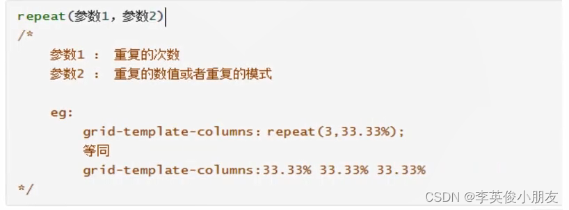
-
auto-fill关键字(自动填充)配合功能函数使用
grid-template-columns:repeat(auto-fill, 33.33%) -
fr关键字(列宽片段)

-
实践
.box { width: 600px; height: 600px; border: 5px solid gray; display: grid; /* 1. 固定值 */ /* grid-template-rows: 200px 200px 200px; */ /* grid-template-columns: 200px 200px 200px; */ /* 2. 百分比方式 */ /* grid-template-rows: 25% 25% 25% 25%; grid-template-columns: 25% 25% 25% 25%; */ /* 3. repeat */ /* grid-template-rows: repeat(3, 33.3%); */ /* grid-template-columns: repeat(3, 33.3%); */ /* 4. repeat autofill */ /* grid-template-rows: repeat(auto-fill, 300px); grid-template-columns: repeat(auto-fill, 33.3%); */ /* 5. fr 片段 */ /* grid-template-rows: 100px 1fr 300px; grid-template-columns: 100px 1fr 300px; */ /* 6. minmax */ /* grid-template-rows: minmax(100px, 200px) 200px 400px; grid-template-columns: 200px 200px 200px; */ /* 7. auto */ grid-template-rows: 100px auto 200px; grid-template-columns: 100px 200px auto; }- 1
- 2
- 3
- 4
- 5
- 6
- 7
- 8
- 9
- 10
- 11
- 12
- 13
- 14
- 15
- 16
- 17
- 18
- 19
- 20
- 21
- 22
- 23
- 24
- 25
- 26
- 27
- 28
- 29
- 30
- 31
- 32
- 33
- 34
-
-
列间距

-
指定区域

-
指定区域代码实践:
DOCTYPE html> <html lang="en"> <head> <meta charset="UTF-8"> <meta http-equiv="X-UA-Compatible" content="IE=edge"> <meta name="viewport" content="width=device-width, initial-scale=1.0"> <title>Documenttitle> <style> .box { width: 650px; height: 320px; border: 5px solid red; margin: 0 auto; display: grid; grid-template-rows: repeat(3, 100px); grid-template-columns: repeat(6, 100px); grid-template-areas: 'a a a a b b' 'a a a a c c' 'd d e f c c'; overflow: hidden; grid-gap: 10px 10px; } .box img { width: 100%; } .box img:nth-child(1) { grid-area: a; } .box img:nth-child(2) { grid-area: d; } .box img:nth-child(3) { grid-area: e; } .box img:nth-child(4) { grid-area: f; } .box img:nth-child(5) { grid-area: b; } .box img:nth-child(6) { grid-area: c; } style> head> <body> <div class="box"> <img src="imgs/桌面图片/p1.jpg" alt=""> <img src="imgs/桌面图片/p2.jpg" alt=""> <img src="imgs/桌面图片/p3.jpg" alt=""> <img src="imgs/桌面图片/p4.jpg" alt=""> <img src="imgs/桌面图片/p5.jpg" alt=""> <img src="imgs/桌面图片/p6.jpg" alt=""> div> body> html>- 1
- 2
- 3
- 4
- 5
- 6
- 7
- 8
- 9
- 10
- 11
- 12
- 13
- 14
- 15
- 16
- 17
- 18
- 19
- 20
- 21
- 22
- 23
- 24
- 25
- 26
- 27
- 28
- 29
- 30
- 31
- 32
- 33
- 34
- 35
- 36
- 37
- 38
- 39
- 40
- 41
- 42
- 43
- 44
- 45
- 46
- 47
- 48
- 49
- 50
- 51
- 52
- 53
- 54
- 55
- 56
- 57
- 58
- 59
- 60
- 61
- 62
- 63
- 64
- 65
- 66
- 67
-
-
项目排列顺序

-
单元格内容对齐(重点:复合属性)

-
单元格项目对齐(重点:复合属性)
place-content: justify-content align-content直接配置两个属性place-items: justify-items align-items同理
-
项目属性
-
网格线合并(单一属性)

-
从项目(items)的角度实现网格的合并(每个跨线的多少)
DOCTYPE html> <html lang="en"> <head> <meta charset="UTF-8"> <meta http-equiv="X-UA-Compatible" content="IE=edge"> <meta name="viewport" content="width=device-width, initial-scale=1.0"> <title>Documenttitle> <style> .box { width: 600px; height: 600px; display: grid; border: 5px solid gray; grid-template-columns: repeat(3, 200px); grid-template-rows: repeat(3, 200px); } /* .box div:nth-child(1){ grid-column-start: 1; grid-column-end: 3; } */ .box div:nth-child(2) { /* grid-column-start: 2; grid-column-end: 4; grid-row-start: 1; grid-row-end: 3; */ /* 更简洁的方法 */ grid-column: 2/4; grid-row: 1/3; } style> head> <body> <div class="box"> <div>1div> <div>2div> <div>3div> <div>4div> <div>5div> <div>6div> <div>7div> <div>8div> <div>9div> div> body> html>- 1
- 2
- 3
- 4
- 5
- 6
- 7
- 8
- 9
- 10
- 11
- 12
- 13
- 14
- 15
- 16
- 17
- 18
- 19
- 20
- 21
- 22
- 23
- 24
- 25
- 26
- 27
- 28
- 29
- 30
- 31
- 32
- 33
- 34
- 35
- 36
- 37
- 38
- 39
- 40
- 41
- 42
- 43
- 44
- 45
- 46
- 47
- 48
-
-
实践重构
<!DOCTYPE html> <html lang="en"> <head> <meta charset="UTF-8"> <meta http-equiv="X-UA-Compatible" content="IE=edge"> <meta name="viewport" content="width=device-width, initial-scale=1.0"> <title>Document</title> <style> .box { width: 650px; height: 320px; border: 5px solid red; margin: 0 auto; display: grid; grid-template-rows: repeat(3, 100px); grid-template-columns: repeat(6, 100px); grid-template-areas: 'a a a a b b' 'a a a a c c' 'd d e f c c'; overflow: hidden; grid-gap: 10px 10px; } .box img { width: 200%; } .box img:nth-child(1) { grid-column: 1/5; grid-row: 1/3; } .box img:nth-child(2) { grid-column: 1/3; grid-row: 3/4; } .box img:nth-child(3) { grid-column: 3/4; grid-row: 3/4; } .box img:nth-child(4) { grid-column: 4/5; grid-row: 3/4; } .box img:nth-child(5) { grid-column: 5/7; grid-row: 1/2; } .box img:nth-child(6) { grid-column: 5/7; grid-row: 2/4; } </style> </head> <body> <div class="box"> <img src="imgs/桌面图片/p1.jpg" alt=""> <img src="imgs/桌面图片/p2.jpg" alt=""> <img src="imgs/桌面图片/p3.jpg" alt=""> <img src="imgs/桌面图片/p4.jpg" alt=""> <img src="imgs/桌面图片/p5.jpg" alt=""> <img src="imgs/桌面图片/p6.jpg" alt=""> </div> </body> </html>- 1
- 2
- 3
- 4
- 5
- 6
- 7
- 8
- 9
- 10
- 11
- 12
- 13
- 14
- 15
- 16
- 17
- 18
- 19
- 20
- 21
- 22
- 23
- 24
- 25
- 26
- 27
- 28
- 29
- 30
- 31
- 32
- 33
- 34
- 35
- 36
- 37
- 38
- 39
- 40
- 41
- 42
- 43
- 44
- 45
- 46
- 47
- 48
- 49
- 50
- 51
- 52
- 53
- 54
- 55
- 56
- 57
- 58
- 59
- 60
- 61
- 62
- 63
- 64
- 65
- 66
- 67
- 68
- 69
- 70
- 71
- 72
- 73
-
15. 杀青
-
这里借用kerwin老师的结束语杀青啦:「青青误我,我误青青。书说至此,有始有终。」

-
只能说感恩、感激千锋教育、感谢kerwin老师分享的课程,受益良多。
-
天道酬勤、厚积薄发,愿所有的努力都不被辜负。
-
终于可以开始学js啦,期待已久~
- ☁️ 我的CSDN:
https://blog.csdn.net/qq_21579045 - ❄️ 我的博客园:
https://www.cnblogs.com/lyjun/ - ☀️ 我的Github:
https://github.com/TinyHandsome - 🌈 我的bilibili:
https://space.bilibili.com/8182822 - 🥑 我的思否:
https://segmentfault.com/u/liyj - 🍅 我的知乎:
https://www.zhihu.com/people/lyjun_ - 🐧 粉丝交流群:1060163543,神秘暗号:为干饭而来
碌碌谋生,谋其所爱。🌊 @李英俊小朋友
- 学习链接:千锋HTML5前端开发教程1000集:
-
相关阅读:
04 Spring MVC 源码总结 - 启动流程
2022年最新广西交安安全员考试题库及答案
搭个网页应用,让ChatGPT帮我写SQL
再见华科,你好字节
linux【5】:Shell 编程
[4G/5G/6G专题基础-157]: 无线数据承载DRB与无线信令承载SRB
Serverless 数仓技术与挑战 - 张雁飞|3306π
计算机毕设 基于机器学习的文本聚类 - 可用于舆情分析
贪心算法和动态规划
数据容器分类总结
- 原文地址:https://blog.csdn.net/qq_21579045/article/details/126626027
