-
使用flex布局实现,7种经典布局案例
flex的基础知识
基础概念可以参考: https://www.ruanyifeng.com/blog/2015/07/flex-grammar.html
1.两列布局
效果

代码:DOCTYPE html> <html lang="en"> <head> <meta charset="UTF-8"> <title>两列布局title> <style> *{ margin: 0; padding: 0; } .box { display: flex; height: 200px; } .left { background-color: yellow; /* flex-basis定义该项目在分配主轴空间之前提前获得200px的空间 */ flex-basis: 200px; /* flex-grow定义该项目不分配剩余空间 */ flex-grow: 0; } /*.center {*/ /* background-color: red;*/ /* !* flex-basis定义该项目在分配主轴空间之前提前获得200px的空间 *!*/ /* flex-basis: 500px;*/ /* !* flex-grow定义该项目不分配剩余空间 *!*/ /* flex-grow: 0;*/ /*}*/ .main { background-color: green; /* flex-grow定义main占满剩余空间 */ flex-grow: 1; } style> head> <body> <div class="box"> <div class="left">leftdiv> <div class="main">maindiv> div> body> html>- 1
- 2
- 3
- 4
- 5
- 6
- 7
- 8
- 9
- 10
- 11
- 12
- 13
- 14
- 15
- 16
- 17
- 18
- 19
- 20
- 21
- 22
- 23
- 24
- 25
- 26
- 27
- 28
- 29
- 30
- 31
- 32
- 33
- 34
- 35
- 36
- 37
- 38
- 39
- 40
- 41
- 42
- 43
2.水平/垂直居中
效果:

代码:DOCTYPE html> <html lang="en"> <head> <meta charset="UTF-8"> <title>水平/垂直居中title> <style> .box { display: flex; justify-content: center; align-items: center; height: 500px; width: 500px; background-color: green; } .content { height: 200px; width: 200px; background-color: yellow; line-height: 200px; text-align: center; } style> head> <body> <div class="box"> <div class="content">我是子元素,我要垂直居中div> div> body> html>- 1
- 2
- 3
- 4
- 5
- 6
- 7
- 8
- 9
- 10
- 11
- 12
- 13
- 14
- 15
- 16
- 17
- 18
- 19
- 20
- 21
- 22
- 23
- 24
- 25
- 26
- 27
- 28
- 29
- 30
- 31
- 32
3.两栏/三栏布局
效果:

coding:DOCTYPE html> <html lang="en"> <head> <meta charset="UTF-8"> <title>两栏/三栏布局title> head> <style> * { padding: 0; margin: 0; } .box { display: flex; height: 200px; margin-bottom: 30px; } .left { background-color: yellow; flex-basis: 200px; /* flex-basis定义该项目在分配主轴空间之前提前获得200px的空间 */ flex-grow: 0; /* flex-grow定义该项目不分配剩余空间 */ } .main { background-color: green; flex-grow: 1; /* flex-grow定义main占满剩余空间 */ } .right { background-color: blue; flex-basis: 100px; flex-grow: 0; } style> <body> <div class="box"> <div class="left">leftdiv> <div class="main">maindiv> div> <div class="box"> <div class="left">leftdiv> <div class="main">maindiv> <div class="right">rightdiv> div> body> html>- 1
- 2
- 3
- 4
- 5
- 6
- 7
- 8
- 9
- 10
- 11
- 12
- 13
- 14
- 15
- 16
- 17
- 18
- 19
- 20
- 21
- 22
- 23
- 24
- 25
- 26
- 27
- 28
- 29
- 30
- 31
- 32
- 33
- 34
- 35
- 36
- 37
- 38
- 39
- 40
- 41
- 42
- 43
- 44
- 45
- 46
- 47
- 48
- 49
- 50
4.等分宽高

code:DOCTYPE html> <html lang="en"> <head> <meta charset="UTF-8"> <title>等分宽高title> head> <style> * { margin: 0; padding: 0; } nav { display: flex; } a { flex-grow: 1; font-size: 30px; text-decoration: none; text-align: center; } nav a:nth-child(odd){ background: pink; } nav a:nth-child(even){ background: goldenrod; } style> <body> <nav> <a href="#">中a> <a href="#">华a> <a href="#">人a> <a href="#">民a> <a href="#">共a> <a href="#">和a> <a href="#">国a> nav> body> html>- 1
- 2
- 3
- 4
- 5
- 6
- 7
- 8
- 9
- 10
- 11
- 12
- 13
- 14
- 15
- 16
- 17
- 18
- 19
- 20
- 21
- 22
- 23
- 24
- 25
- 26
- 27
- 28
- 29
- 30
- 31
- 32
- 33
- 34
- 35
- 36
- 37
- 38
- 39
- 40
- 41
- 42
5.圣杯布局
效果:

code:DOCTYPE html> <html lang="en"> <head> <meta charset="UTF-8"> <title>圣杯布局title> head> <style> * { margin: 0; padding: 0; } .box { display: flex; flex-direction: column; width: 100%; height: 500px; background-color: yellow; text-align: center; font-size: 30px; min-height:100vh; } header, footer { flex: 0 0 80px; line-height: 80px; background: pink; } .content { display: flex; flex: 1; } nav { order: -1; background-color: blue; flex: 0 0 80px; } aside { background-color: green; flex: 0 0 80px; } main { flex: 1; } style> <body> <div class="box"> <header>headerheader> <div class="content"> <main>mainmain> <nav>navnav> <aside>asideaside> div> <footer>footerfooter> div> body> html>- 1
- 2
- 3
- 4
- 5
- 6
- 7
- 8
- 9
- 10
- 11
- 12
- 13
- 14
- 15
- 16
- 17
- 18
- 19
- 20
- 21
- 22
- 23
- 24
- 25
- 26
- 27
- 28
- 29
- 30
- 31
- 32
- 33
- 34
- 35
- 36
- 37
- 38
- 39
- 40
- 41
- 42
- 43
- 44
- 45
- 46
- 47
- 48
- 49
- 50
- 51
- 52
- 53
- 54
- 55
- 56
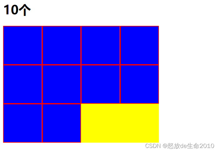
6.流式布局
效果:
code
DOCTYPE html> <html lang="en"> <head> <meta charset="UTF-8"> <title>流式布局title> head> <style> .box { display: flex; flex-flow: row wrap; height: 300px; width: 400px; background-color: yellow; } .content { flex: 0 0 25%; background-color: blue; border: 2px solid red; box-sizing: border-box; } style> <body> <h1>10个h1> <div class="box"> <div class="content">div> <div class="content">div> <div class="content">div> <div class="content">div> <div class="content">div> <div class="content">div> <div class="content">div> <div class="content">div> <div class="content">div> <div class="content">div> div> body> html>- 1
- 2
- 3
- 4
- 5
- 6
- 7
- 8
- 9
- 10
- 11
- 12
- 13
- 14
- 15
- 16
- 17
- 18
- 19
- 20
- 21
- 22
- 23
- 24
- 25
- 26
- 27
- 28
- 29
- 30
- 31
- 32
- 33
- 34
- 35
- 36
- 37
7.基于flex的响应式布局
效果图
屏幕尺寸大于640px

高度不够4个盒子的总和时

屏幕尺寸小于640px时

code:DOCTYPE html> <html lang="en"> <head> <meta charset="UTF-8"> <title>结合响应式布局的综合运用title> head> <style> * { padding: 0; margin: 0; } .box div { width: 150px; padding: 20px; } .box1 { height: 120px; background-color: red; } .box2 { height: 100px; background-color: blue; } .box3 { height: 40px; background-color: pink; } .box4 { height: 200px; background-color: yellow; } @media (min-width: 640px) { .box { display: flex; flex-direction: row; justify-content: space-between; align-items: center; } } @media (max-width: 640px) { .box { display: flex; flex-direction: row; align-items: flex-start; justify-content: space-between; flex-wrap: wrap; } .box4 { order: -1; } } style> <body> <div class="box"> <div class="box1">div> <div class="box2">div> <div class="box3">div> <div class="box4">div> div> body> html>- 1
- 2
- 3
- 4
- 5
- 6
- 7
- 8
- 9
- 10
- 11
- 12
- 13
- 14
- 15
- 16
- 17
- 18
- 19
- 20
- 21
- 22
- 23
- 24
- 25
- 26
- 27
- 28
- 29
- 30
- 31
- 32
- 33
- 34
- 35
- 36
- 37
- 38
- 39
- 40
- 41
- 42
- 43
- 44
- 45
- 46
- 47
- 48
- 49
- 50
- 51
- 52
- 53
- 54
- 55
- 56
- 57
- 58
- 59
- 60
- 61
- 62
- 63
- 64
- 65
- 66
- 67
- 68
- 69
- 70
参考:
https://www.bookstack.cn/read/css-grid-flex/flex-README.md
完,大功告成!
-
相关阅读:
【Linux】基础:Linux环境基础开发工具——yum
金融工程学学习笔记第一章
数字IC设计经验整理(二)
助力特殊儿童,AIGC时代打开情感陪伴新篇章
计算机网络学习任务
基于kubeasz部署高可用k8s集群
ChinaSoft 论坛巡礼|开源软件供应链论坛
使用kubekey的all-in-one安装K8S1.24及KubeSphere3.3
222. 完全二叉树的节点个数
基于SpringBoot+Vue+uniapp的小型超市管理系统(源码+lw+部署文档+讲解等)
- 原文地址:https://blog.csdn.net/baidu_21349635/article/details/126651465