-
uniapp控制data字段来控制元素显示隐藏
今天遇到了一个界面的数据是一个json数据实现的动态绑定,里面有对应的字符串绑定或者数组遍历,但是其的状态是根据data中的数据是否为空来控制”完成“和”未完成“的显示状态的。
vue 提倡 状态驱动界面,用data里面字段,控制界面的组件显示或者隐藏就非常合理了。不同字段对应的不同的显示逻辑,也就很合理了。
数据为单个字符串时:
<div v-if="info">{{info}}</div> <div v-else>暂时没有数据...</div>- 1
- 2
数据为数组或者对象时:
<div v-if="arr.length"> <p v-for="item of arr">{{item}}</p> </div> <div v-else>暂时没有数据...</div>- 1
- 2
- 3
- 4
不过还可以不要将这些放在v-if=""中,使用计算属性或函数控制。。。
dom增加属性
<view :class="isShow">内容内容</view>- 1
data中增加isShow默认值
data() { return{ isShow: "domhide", } }- 1
- 2
- 3
- 4
- 5
在style中声明domhide和domshow两个class
.domhide{display: none;} .domshow{display: block;}- 1
- 2
在load中增加计时程序
onLoad() { if (this.timer) { clearInterval(this.timer); } this.timer = setInterval(() => { this.isShow= "domshow"; }, 5000); },- 1
- 2
- 3
- 4
- 5
- 6
- 7
- 8
uniapp中实现文本行数/高度超过隐藏就并显示更多按钮
- uni.createSelectorQuery()返回一个 SelectorQuery 对象实例。可以在这个实例上使用 select
等方法选择节点,并使用 boundingClientRect 等方法选择需要查询的信息。 - selectorQuery.selectAll(selector)在当前页面下选择匹配选择器 selector 的所有节点,返回一个
NodesRef 对象实例,可以用于获取节点信息。
<template> <view class="problem"> <view class="card-box" v-for="(item,index) in list" :key="index"> <view class="title mb20">Q{{index+1}}: {{item.title}}</view> <!-- 文本超过360rpx时溢出隐藏,并显示展开按钮 --> <view class="desc" ref="desc" style="white-space:pre-wrap;"> <view class="inline" :style="{ 'height': elData[index].height >= 360?'360rpx':'auto', 'transition': 'height .2s' }">{{item.content}} </view> <view class="more row-center mt20" v-if="elData[index].height >= 360" @click="elData[index].height = 0"> 展开 <u-icon name="arrow-down" color="#999"></u-icon> </view> <view class="more row-center mt20" v-if="elData[index].height == 0" @click="elData[index].height = 370"> 收起 <u-icon name="arrow-up" color="#999"></u-icon> </view> </view> </view> </view> </template> <script> import { problem } from '@/api/user.js' export default { data() { return { // 多个文本数据列表 list: [], // 每个文本的信息 elData: [], } }, mounted() { this.getProblem() }, methods: { getProblem() { // 获取文本信息的api接口 problem problem().then(res => { this.list = res.data.list; // 等待渲染完成在获取页面元素信息 this.$nextTick(() => { let el = uni.createSelectorQuery().selectAll('.desc') el.boundingClientRect(res => { console.log(res) // 拿到类名为 desc 的全部元素信息 this.elData = res; }).exec() }) }) }, } } </script> <style> page { background-color: #FFFFFF; } .problem { padding: 0 30rpx; } .card-box { box-shadow: 0 0 20rpx rgba(0, 0, 0, 0.1); margin: 40rpx 0 0 0; border-radius: 10rpx; padding: 40rpx 30rpx 0 30rpx; } .title { font-weight: 500; font-size: 30rpx; color: #101010; } .desc { font-weight: 300; font-size: 26rpx; color: #333; padding-bottom: 30rpx; } .desc .inline { overflow: hidden; } .open { color: #999; font-weight: 300; background-color: #FFFFFF; padding: 0 20rpx 35rpx; } </style>- 1
- 2
- 3
- 4
- 5
- 6
- 7
- 8
- 9
- 10
- 11
- 12
- 13
- 14
- 15
- 16
- 17
- 18
- 19
- 20
- 21
- 22
- 23
- 24
- 25
- 26
- 27
- 28
- 29
- 30
- 31
- 32
- 33
- 34
- 35
- 36
- 37
- 38
- 39
- 40
- 41
- 42
- 43
- 44
- 45
- 46
- 47
- 48
- 49
- 50
- 51
- 52
- 53
- 54
- 55
- 56
- 57
- 58
- 59
- 60
- 61
- 62
- 63
- 64
- 65
- 66
- 67
- 68
- 69
- 70
- 71
- 72
- 73
- 74
- 75
- 76
- 77
- 78
- 79
- 80
- 81
- 82
- 83
- 84
- 85
- 86
- 87
- 88
- 89
transition过渡效果
transition: 1s; // 过渡效果时间 transition: width 1s ,height 2s ,background 3s; // 宽度1s完成变化,高度2s完成变化,背景色3s完成变化- 1
- 2
uniapp开发小程序实现滑动页面控制元素的显示和隐藏效果
实现思路:通过小程序API中的触摸事件,配合CSS来实现元素的显示和隐藏。ps(也想过另一种通过监听页面滚动的方式来实现,不过效果一定很差0.0)
<view class="container" @touchmove="handletouchstart" @touchend="handletouchend"> <view class="column popupfx" :class="specClass" @click="createHaibao">我是要发生变化的元素</view> </view>- 1
- 2
- 3
data() { return { specClass: 'hide', }; }, methods:{ handletouchstart() { this.specClass = 'show'; }, handletouchend() { this.specClass = 'hide'; },}- 1
- 2
- 3
- 4
- 5
- 6
- 7
- 8
- 9
- 10
- 11
- 12
- 1
- 2
- 3
- 4
- 5
- 6
- 7
- 8
- 9
- 10
- 11
- 12
- 13
- 14
- 15
- 16
- 17
- 18
- 19
- 20
- 21
- 22
- 23
- 24
- 25
- 26
- 27
- 28
- 29
- 30
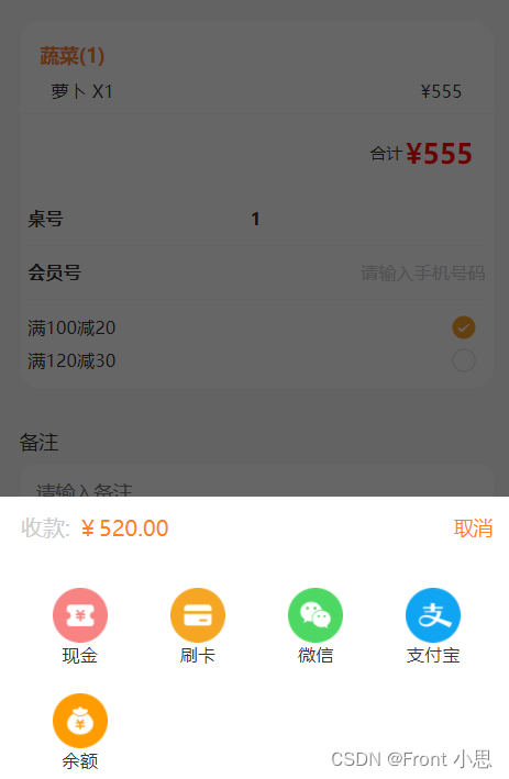
uniapp父组件控制显示隐藏
我们开发uniapp时会用到uview的组件,很方便,但项目中可能会对组件进行二次修改,设置成时候自己项目的功能、样式,如果多处需要用到,可能需要进行二次封装,这时候就会涉及到父子传参等问题,这篇文章主要是为了记录解决父组件控制子组件的显示隐藏问题,下面以u-popup组件为例吧!
<!--子组件--> <template> <view class="payment"> <!-- 弹出框 --> <u-popup mode="bottom" v-model="show" :mask-close-able='false'> <view class="popUpBox"> <view class="popUpBoxPriceBox flex"> <view class="proceeds">收款: <text>¥520.00</text></view> <view class="close" @click="onClose">取消</view> </view> <view class="paymentBigBox "> <view class="onePayment flex" v-for="(item,i) in modeOfPayment" @click="onPay(i)"> <image :src="item.image"></image> <text>{{item.name}}</text> </view> </view> </view> </u-popup> </view> </template> <script> export default { name:"payment", props: { showModal:{ type:Boolean, } }, data() { return { show: false, //弹出框显示状态 modeOfPayment: [{ image: '../static/settleAccounts/weixin.png', name: '微信' },{ image: '../static/settleAccounts/zhifubao.png', name: '支付宝' },{ image: '../static/settleAccounts/yue.png', name: '余额' }], }; }, watch:{ //因为是单项数据流,v-modal控制的组件显示隐藏,父组件不可以通过props内的参数直接改变子元素参数,所以我们通过watch来监控数据的变化,间接修改show的数据 showModal(val) { this.show=val } }, methods:{ onClose(){ this.show=false this.$emit('close',this.show) //通知父组件隐藏了 }, } } </script>- 1
- 2
- 3
- 4
- 5
- 6
- 7
- 8
- 9
- 10
- 11
- 12
- 13
- 14
- 15
- 16
- 17
- 18
- 19
- 20
- 21
- 22
- 23
- 24
- 25
- 26
- 27
- 28
- 29
- 30
- 31
- 32
- 33
- 34
- 35
- 36
- 37
- 38
- 39
- 40
- 41
- 42
- 43
- 44
- 45
- 46
- 47
- 48
- 49
- 50
- 51
- 52
- 53
- 54
- 55
- 56
- 57
- 58
- 59
- 60
<!--父组件--> <template> <view> <button @click="showPay">点击显示</button> <payment :showModal="showPay" @close="onclose"></payment> </view> </template> <script> import payment from "../../components/payment.vue" export default { data() { return { showPay:false,//显示支付方式 } }, components: { payment }, methods:{ onclose(show){ this.showPay=show console.log(show,"子组件传过来的值----") }, showPay(){ this.showPay=true //传给子组件动态控制显示隐藏 } } } </script>- 1
- 2
- 3
- 4
- 5
- 6
- 7
- 8
- 9
- 10
- 11
- 12
- 13
- 14
- 15
- 16
- 17
- 18
- 19
- 20
- 21
- 22
- 23
- 24
- 25
- 26
- 27
- 28
- 29
-
相关阅读:
支付宝 v3 验签如何实现
spring transaction propagation 02 isolation
ssm基于java的线上阅读平台的设计与实现毕业设计源码291023
基于wifi控制的51单片机温度报警器
Mac Redis 安装 RedisJSON模块教程
『Linux小程序』进度条
AIDL 如何分片传输大量 Parcelable 数据列表
docker相关知识
深度学习中的黑科技:自监督学习(Self-Supervised Learning)
我工作中踩过的坑--服务器管理篇
- 原文地址:https://blog.csdn.net/weixin_45788691/article/details/116065729
