-
【统计机器学习】线性回归模型
相关知识
概率论,是研究随机现象数量规律的数学分支。随机现象是相对于决定性现象而言的,例如太阳东升西落。随机现象是指在基本条件不变的情况下,每一次试验或观察前,不能肯定会出现哪种结果,呈现出偶然性。例如,掷一硬币,可能出现正面或反面。
数理统计是数学的一个分支,分为描述统计和推断统计。它以概率论为基础,研究大量随机现象的统计规律性。描述统计的任务是搜集资料,进行整理、分组,编制次数分配表,绘制次数分配曲线,计算各种特征指标,以描述资料分布的集中趋势、离中趋势和次数分布的偏斜度等。推断统计是在描述统计的基础上,根据样本资料归纳出的规律性,对总体进行推断和预测。
(描述统计——>推断统计)计算机角度的机器学习和统计角度的机器学习,对一些名称的定义可能会有些不同。
例如机器学习 统计机器学习 Unsupervised Learning (无监督学习) Clustering 聚类 Supervised Learning 监督学习 回归分析 Semi-Supervised Learning … Reinforcement Learning … … … 变量类型
分类数据:职业、地址、性别
连续数据:年龄、收入
分类数据(但有顺序含义):High school ,BSc,MSc,PhDY的变量类型决定了问题,以及用什么方法解决问题

什么时候用统计方法、什么时候用机器学习、什么时候用机器学习呢?

只有特征和样本量都很大(样本量超过200,特征超过20)的时候,我们考虑机器学习的方法。
除此之外,经典的统计方法或者统计学习方法几乎可以解决所有问题。(当然了,机器学习也可以用,但是工程上没有必要)模型在不同数据量场景下的效果:

线性回归模型实例
心法:定(任务,方法同数据准备阶段,通过数据量和预测任务来判断)、数、模、训、测、上
数:分析(任务)、理解、清晰、构建、选择、提取
模:模型、损失、优化器 (基于数据量和预测类型选择模型。)
训练:迭代、调参、降损失
定(问题定义)
预测房价、很明显的线性回归任务,而且特征数目少于20,首选线性回归。
数(数据准备)
1,2 分析(问题,看Y)和 理解(特征,看X)
#1 问题分析 #(房价预测,回归任务,) from sklearn import datasets boston = datasets.load_boston() print(boston.DESCR) boston.shape #分析(分析Y的类型,判断问题类型) y = boston.target y = pd.DataFrame(y) y.describe() # 理解 house = boston.data house = pd.DataFrame(house,columns=['CRIM', 'ZN', 'INDUS', 'CHAS', 'NOX', 'RM', 'AGE', 'DIS', 'RAD', 'TAX', 'PTRATIO', 'B', 'LSTAT']) house.info()# 查看基本的描述统计 house.describe()- 1
- 2
- 3
- 4
- 5
- 6
- 7
- 8
- 9
- 10
- 11
- 12
- 13
- 14
- 15
- 16
- 17
Data Set Characteristics:
:Number of Instances: 506 :Number of Attributes: 13 numeric/categorical predictive. Median Value (attribute 14) is usually the target. :Attribute Information (in order): - CRIM per capita crime rate by town - ZN proportion of residential land zoned for lots over 25,000 sq.ft. - INDUS proportion of non-retail business acres per town - CHAS Charles River dummy variable (= 1 if tract bounds river; 0 otherwise) - NOX nitric oxides concentration (parts per 10 million) - RM average number of rooms per dwelling - AGE proportion of owner-occupied units built prior to 1940 - DIS weighted distances to five Boston employment centres - RAD index of accessibility to radial highways - TAX full-value property-tax rate per $10,000 - PTRATIO pupil-teacher ratio by town - B 1000(Bk - 0.63)^2 where Bk is the proportion of black people by town - LSTAT % lower status of the population - MEDV Median value of owner-occupied homes in $1000's- 1
- 2
- 3
- 4
- 5
- 6
- 7
- 8
- 9
- 10
- 11
- 12
- 13
- 14
- 15
- 16
- 17
- 18
- 19
- 首先是分析数据标签,要明白任务的需求。数据挖掘任务主要分为两类:回归与分类。
- 回归指标签值是连续值的任务,例如用到的数据集,要求预测房价信息,房价是一个连续的变量,因此这样的任务属于回归问题(Regression)
- 分类指标签值离散的任务,例如鸢尾花(Iris)数据集,收集三种鸢尾花的萼片长度,宽度等信息,要求根据这些信息预测鸢尾花属于哪种类别,因此标签就是1,2,3,代表三类鸢尾花。这种任务属于分类任务。


通过分析可知,房价标签是连续数据,因此是回归任务。- 特征X理解-初步理解
研究思路:
先看首先研究单变量的数据类型、分布情况、是否有离群值、是否有缺失值等情况,再研究变量之间的关系:相关性分析等。
house_data.head() house_data.info() house_data.describe()- 1
- 2
- 3


通过这几张基本统计表,我们可以看:
- 是否有缺失值
- 数据是否和我们理解的不同,例如处于[0-1]的值却>1
- 方差特别小的特征也考虑删除,或者说取值唯一的特征是没有意义的。(举例,如果在一次考试中,大家的数学成绩都是100分,那么是没有办法通过数学成绩来区分每位同学的能力的,也就是说数学这门课没有区分性,不具有分析的意义,可以删掉。)
- 方差太大说明数据不太可能是正态的,因为不够集中。(补充说明:标准差是方差开根号,标准差越大,对于正太分布来说,分布图像越矮胖,因此数据不集中。而标准差越小,对于正太分布来说,图像越矮瘦,数据集中。
- 对于是否有离群值后面我们需要通过箱线图或者散点图等可视化分析后才能得知。

上述这些统计的结果可以为下一步,特征清洗做准备。
- 特征X的理解-变量关系分析
继续,我们绘制所有特征的柱状图如下,来分析各特征的分布情况。通过对变量分布的观察,对于那些非正太的分布,例如长尾分布,我们会考虑取ln来进一步提取信息,但是有时候取ln会降低模型的可解释性。(这部分可以在scatter plot matrix中一起画出来,我们这里先单独画出来分析,以后就直接用scatter plot matrix就可以了)
参考资料
https://blog.csdn.net/laffycat/article/details/125883973
http://t.csdn.cn/lGF1A
https://blog.csdn.net/qq_37596349/article/details/105378996DataFrame绘制直方图
DataFrame.hist(data, column=None, by=None, grid=True, xlabelsize=None, xrot=None, ylabelsize=None, yrot=None, ax=None, sharex=False, sharey=False, figsize=None, layout=None, bins=10, **kwds)
figsize:指要创建的图形的尺寸(以英寸为单位)。默认情况下, 它使用matplotlib.rcParams中的值。
bins:默认值10。它是指要使用的直方图bin的数量。如果给出整数值, 则它将返回bin +1 bin边缘的计算值。(从图上看,这个参数决定了柱状图的粗细,bins越大,图中的柱子越细。import seaborn as sns # house[['CHAS', 'RAD']].hist() house_data[['CRIM', 'ZN', 'INDUS', 'CHAS', 'NOX', 'RM', 'AGE', 'DIS', 'RAD', 'TAX', 'PTRATIO', 'B', 'LSTAT','price']].hist(figsize = (10, 15))- 1
- 2
- 3
- 4

scatter plot matrix 绘制方法
绘制方法1:# 绘制scatter plot matrix散点图矩阵 pd.plotting.scatter_matrix(house_data, alpha=0.3, figsize=(14,10),diagonal='hist') for # diagonal : {'hist', 'kde'} 在对角线上选择“kde”和“hist”来进行核密度估计或直方图绘制。- 1
- 2
- 3

绘制方法2:import seaborn as sns # 任意两个变量间的相关性散点图 sns.set() cols = house_data.columns # 罗列出数据集的所有列 sns.pairplot(house_data[cols], size = 2.5) # 成对画出任意两列的散点图 plt.show() # 显示函数- 1
- 2
- 3
- 4
- 5
- 6

从可视化的角度来研究变量之间的相关性,最简单的方法就是将两个特征对应的坐标点在坐标系下描述出来,研究他们的变化趋势,每一个点的坐标是一个二元组 ( X A ( i ) , X B ( i ) ) (X_{A}^{(i)},X_{B}^{(i)}) (XA(i),XB(i)),其中 X A ( i ) X_{A}^{(i)} XA(i)表示第 i i i个样本特征 A A A的值,而 X A ( i ) X_{A}^{(i)} XA(i)表示第 i i i个样本特征 B B B的值.从上面的图像可以看出,有些变量实际上是有相似(A高B高)的分布情况的,或者相反的分布情况的(A高B低),这样的性质称为变量之间的相关性。 (注意,这里不考虑标签的相关性)
相关性一般有两种情况:- 正相关:如果特征A的增加(减少)会导致特征B增加(减少),即特征A与特征B变化趋势相同
- 负相关:如果特征A的增加(减少)会导致特征B减少(增加),即特征A与特征B变化趋势相反
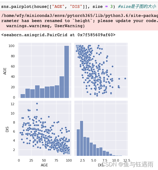
- 首先,我们先看图像呈“对角线分布的”,即/或者\这两种类型分布的图像,这样的图像说明这两个变量间有较强的相关性,是可以被消除共线性的“嫌疑对象”。如图中的DIS和AGE

,尽管他不是严格的直线分布,但至少其分布呈现带状.然后成对画出任意两列的散点图
sns.pairplot(house_data[["AGE", "DIS"]], size = 3) #size是子图的大小- 1
其次,可以看那些趋势明显比较单调,但是不太像直线,而是类似“对数函数”的图像,例如图中的DIS和NOX,因为这类图像,只要对数化,就可以得到类似直线的效果,那么也可以被处理.成对画出任意两列的散点图(带对数处理)
sns.pairplot(np.log(house[["NOX", "DIS"]]), size = 3) #size是子图的大小- 1

最后,还需关注最后一行(列)与其他行(列)的关系,也就是特征与标签的关系,如果这两者出现较强相关性,那么我们需要留意这些特征,因为这些特征对标签有着比较直接的关系,例如RM和LSTAT成对画出任意两列的散点图(带对数处理)
sns.pairplot(np.log(house_data[["RM", "LSTAT", "price"]]), size = 3) #size是子图的大小- 1

通过图像 我们发现一个问题,就是最上面price=50的电很奇怪,因此它刚好就是50,有点太奇怪了,不高不低,然后我们去翻记录资料,发现>50的全部标记为50了,因此这些数据对应我们分析来说肯定是不友好的,所以需要删除掉.
通过散点图矩阵,我们可以确定哪些变量(通过左对角线看:大多数长尾分布的都需要转换)应该转化为对数尺度(注意,一旦转换,则对应的标签也需要转换),并且对于相关行较高的变量我们可以进行删减,但是相关性通过图像确定不够客观,我们考虑通过相关系数的热土来查看,见下文.
除了先用图,对相关性进行基本的分析外,我们可以用数据继续对相关性进行定量描述.
-
协方差

计算协方差house.cov()#只有数值型变量才能算,类别或文本需要编码后才能计算.

但是协方差只能看出正相关和负相关,其大小并没有意义,这是因为每个特征的量纲不同,直接乘积后求期望,所得到的量纲又是不尽相同,因此我们需要对其做“无量纲化”处理 -
相关系数
 计算相关系数:
- 单项相关系数的计算
def Corr(X, Y): ''' 计算随机变量X,Y的相关系数. X: np.array or pd.Series. Y: np.array or pd.Series. ''' COV_XY = np.cov(X, Y) #协方差矩阵 std_X = np.std(X) #X的标准差 std_Y = np.std(Y) #Y的标准差 Corr_Matrix = COV_XY / (std_X * std_Y) return Corr_Matrix- 1
- 2
- 3
- 4
- 5
- 6
- 7
- 8
- 9
- 10
- 11
- 12
- 13
# (np.cov(house['AGE'], house['DIS'])/ ((np.std(house['AGE']) * np.std(house['DIS']))))[0,1] # 利用自己实现的函数进行单项相关系数的计算 Corr(house['AGE'], house['DIS'])- 1
- 2
- 3
- 全表相关系数的计算
# 直接计算相关性系数 Corr_Matrix = house.corr() Corr_Matrix- 1
- 2
- 3
- 热力图展示相关性系数
#correlation matrix f, ax = plt.subplots(figsize=(12, 9)) # 设置画布 sns.heatmap(Corr_Matrix, vmax=.8, square=True # 画热力图- 1
- 2
- 3


从相关系数的热图当中,我们可以看出哪些变量是高度相关的,对于高度相关的变量,我们希望在回归模型中去除某个或者某些变量.
注意
- 当两个变量呈正相关或者负相关时,我们称两个变量是相关的。如果两个变量有较强的相关性时,将这些变量一起用,会有很多是冗余的,那么两个相关性高的变量如何去筛选呢? 最简单的是随机去掉一个,但是显然不合理,因此可以根据一些评价模型来选择).
- 因为变量之间有较强的相关性,那么变量与变量之间是可以相互表示的,所以在建模时,需要尽可能消除特征之间的共线性,也就是尽量使用相关性比较小的特征,这样可以减少训练时间,使得模型的学习效果更好。
3 特征清洗
- 缺失值统计和处理
这里的数据没有缺失值,因此不需要进行清洗了.
4 特征构建
5 特征选择
6 特征提取
模(模型搭建)
基于对数据的分析和理解,我们拟采用线性回归来构建房价越模型.
下面这一部分是数据准备的工作:import numpy as np import pandas as pd from sklearn import datasets boston = datasets.load_boston() #波士顿房价数据集,预测房价,因此是回归任务 x = boston.data[:,5] y = boston.target from sklearn.model_selection import train_test_split x_train, x_test, y_train, y_test = train_test_split(x, y, random_state=626) print(x_train.shape) print(y_train.shape) print(x_test.shape) print(y_test.shape) x_train = x_train.reshape(-1,1) y_train = y_train.reshape(-1,1) x_test = x_test.reshape(-1,1) y_test = y_test.reshape(-1,1)- 1
- 2
- 3
- 4
- 5
- 6
- 7
- 8
- 9
- 10
- 11
- 12
- 13
- 14
- 15
- 16
- 17
- 18
训(模型训练)
from sklearn.linear_model import LinearRegression lin_reg = LinearRegression() lin_reg.fit(x_train, y_train) lin_reg.intercept_ #截距 lin_reg.coef_ #系数- 1
- 2
- 3
- 4
- 5
plt.scatter(x_train, y_train) # 画散点图 plt.plot(x_train, lin_reg.predict(x_train), color='r') #画线图 plt.show() #展示图片- 1
- 2
- 3
测(模型测试和评估)
回归模型中,模型的测试和评估指标如下

y_predict = lin_reg.predict(x_test) ## MSE mse_test = np.sum((y_predict - y_test)**2) / len(y_test) mse_test ## RMSE from math import sqrt rmse_test = sqrt(mse_test) rmse_test ## MAE mae_test = np.sum(np.absolute(y_predict-y_test)) / len(y_test) mae_test from sklearn.metrics import mean_squared_error from sklearn.metrics import mean_absolute_error print(mean_squared_error(y_test, y_predict)) print(mean_absolute_error(y_test, y_predict)) ## R^2 (下面是三种输出相关性系数R^2的方式) 1 - mean_squared_error(y_test, y_predict) / np.var(y_test) from sklearn.metrics import r2_score r2_score(y_test, y_predict) lin_reg.score(x_test, y_test)- 1
- 2
- 3
- 4
- 5
- 6
- 7
- 8
- 9
- 10
- 11
- 12
- 13
- 14
- 15
- 16
- 17
- 18
- 19
- 20
- 21
- 22
- 23
- 24
- 25
- 26
补充正则化线性回归的相关算法:
X = boston.data y = boston.target X.shape y.shape X = X[y < 50.0] y = y[y < 50.0] # Ridge from sklearn.model_selection import train_test_split X_train, X_test, y_train, y_test = train_test_split(X, y, random_state=626) from sklearn.linear_model import Ridge ridge_reg = Ridge(alpha=1, solver='cholesky', random_state=626) ridge_reg.fit(X_train, y_train) ridge_reg.intercept_ ridge_reg.coef_ ridge_reg.predict(X_test) # Lasso from sklearn.linear_model import Lasso lasso_reg = Lasso(alpha=0.1) lasso_reg.fit(X_train, y_train).coef_ lasso_reg.predict(X_test) #Elastic Net from sklearn.linear_model import ElasticNet elastic_net = ElasticNet(alpha=0.1, l1_ratio=0.5) elastic_net.fit(X_train, y_train) # elastic_net.predict(y_test) elastic_net.coef_- 1
- 2
- 3
- 4
- 5
- 6
- 7
- 8
- 9
- 10
- 11
- 12
- 13
- 14
- 15
- 16
- 17
- 18
- 19
- 20
- 21
- 22
- 23
- 24
- 25
- 26
- 27
- 28
- 29
但是,一些1维的线性回归模型不够用,我们引入多项式回归.
Polynomial Regression (多项式回归)- 所有可能的交互都要被添加到多项式回归当中
- 逐个添加
example 1:
np.random.seed(626) m = 100 X = 6 * np.random.rand(m,1) - 3 y = 0.5 * X**2 + X + 2 + np.random.randn(m,1) plt.plot(X, y, 'b.') plt.xlabel("$x_1$", fontsize=18) plt.ylabel("$y$", rotation=0, fontsize=18) plt.show() from sklearn.preprocessing import PolynomialFeatures poly_features = PolynomialFeatures(degree=2, include_bias=False) X_poly = poly_features.fit_transform(X) X[0:5] X_poly[0:5] lin_reg = LinearRegression() lin_reg.fit(X_poly, y) lin_reg.intercept_, lin_reg.coef_- 1
- 2
- 3
- 4
- 5
- 6
- 7
- 8
- 9
- 10
- 11
- 12
- 13
- 14
- 15
- 16
- 17
- 18
- 19
- 20
example2:
X_new = np.linspace(-3,3,100).reshape(100,1) X_new_poly = poly_features.transform(X_new) y_new = lin_reg.predict(X_new_poly) plt.plot(X, y, 'b.') plt.plot(X_new, y_new, 'r-', linewidth=2, label='Prediction') plt.xlabel("$x_1$", fontsize=18) plt.ylabel("$y$", rotation=0, fontsize=18) plt.legend(loc='upper left', fontsize=14) plt.axis([-3,3,0,10]) plt.show() from sklearn.preprocessing import PolynomialFeatures from sklearn.preprocessing import StandardScaler from sklearn.pipeline import Pipeline def PolynomialRegression(degree): return Pipeline([ ('poly', PolynomialFeatures(degree=degree)), ('std_scaler', StandardScaler()), ('lin_reg', LinearRegression()) ])- 1
- 2
- 3
- 4
- 5
- 6
- 7
- 8
- 9
- 10
- 11
- 12
- 13
- 14
- 15
- 16
- 17
- 18
- 19
- 20
- 21
模型评估常用三件套
- 学习曲线(随着学习数据的增多,模型的损失结果,对于回归模型,需要依此增大数据量来实现这个过程,这与深度学习不同,深度学习记每个batch即可,而回归需要,不断增加数据集.)
- 训练集、测试集、验证集合划分 (最简单的划分方式就是:2/3-4/5的样本作为训练集其余的样本作为测试集)
- 交叉验证 (通常取5或者10折)
X = boston.data y = boston.target X = X[y < 50.0] y = y[y < 50.0] from sklearn.model_selection import train_test_split X_train, X_test, y_train, y_test = train_test_split(X, y, random_state=10) from sklearn.linear_model import LinearRegression from sklearn.metrics import mean_squared_error train_score = [] test_score = [] for i in range(1, 76): lin_reg = LinearRegression() lin_reg.fit(X_train[:i], y_train[:i]) y_train_predict = lin_reg.predict(X_train[:i]) train_score.append(mean_squared_error(y_train[:i], y_train_predict)) y_test_predict = lin_reg.predict(X_test) test_score.append(mean_squared_error(y_test, y_test_predict))- 1
- 2
- 3
- 4
- 5
- 6
- 7
- 8
- 9
- 10
- 11
- 12
- 13
- 14
- 15
- 16
- 17
- 18
- 19
- 20
- 21
- 22
- 23
- 24
- 25
绘制损失(均方误差)下降曲线图像(学习曲线)
plt.plot([i for i in range(1, 76)], np.sqrt(train_score), label="train") plt.plot([i for i in range(1, 76)], np.sqrt(test_score), label="test") plt.legend() plt.show()- 1
- 2
- 3
- 4
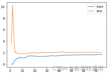
def plot_learning_curve(algo, X_train, X_test, y_train, y_test): train_score = [] test_score = [] for i in range(1, len(X_train)+1): algo.fit(X_train[:i], y_train[:i]) y_train_predict = algo.predict(X_train[:i]) train_score.append(mean_squared_error(y_train[:i], y_train_predict)) y_test_predict = algo.predict(X_test) test_score.append(mean_squared_error(y_test, y_test_predict)) plt.plot([i for i in range(1, len(X_train)+1)], np.sqrt(train_score), label="train") plt.plot([i for i in range(1, len(X_train)+1)], np.sqrt(test_score), label="test") plt.legend() plt.axis([0, len(X_train)+1, 0, 4]) plt.show() ## underfitted model plot_learning_curve(LinearRegression(), X_train, X_test, y_train, y_test)- 1
- 2
- 3
- 4
- 5
- 6
- 7
- 8
- 9
- 10
- 11
- 12
- 13
- 14
- 15
- 16
- 17
- 18
- 19
- 20
- 21
- 22

## proper model (合适的模型) poly2_reg = PolynomialRegression(degree=2) plot_learning_curve(poly2_reg, X_train, X_test, y_train, y_test)- 1
- 2
- 3

## overfitted model 过拟合模型,多项式的项数选择太多 poly20_reg = PolynomialRegression(degree=20) plot_learning_curve(poly20_reg, X_train, X_test, y_train, y_test)- 1
- 2
- 3
- 4

## CV from sklearn.model_selection import cross_val_score- 1
- 2
Other Related Methodologies(其他相关方法)
-
相关阅读:
【设计模式】单例模式的7种实现方法
六位一体Serverless化应用,帮你摆脱服务器的烦恼
acwing算法基础之基础算法--快速排序
jmeter-常用的一些java代码
Java注解
记录一个因变量遮蔽引起的“友尽”级bug
vue 自动生成面包屑导航
Golang爬虫封装
C++——C++入门
【智能优化算法】基于倭黑猩猩优化算法求解单目标优化问题附matlab代码
- 原文地址:https://blog.csdn.net/adreammaker/article/details/126106012