-
css02
盒子模型
组成:
content->padding->border->margin
物品 填充物 包装盒 盒子与盒子之间的间距- 1
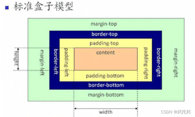
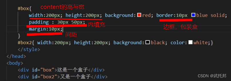
content:内容区域width和height组成的padding:内边距(内填充)
只写一个值:30px(上下左右)
写两个值:30px40px(上下、左右)
写四个值:30px40px50px60px(上、右、下、左)
单一样式只能写一个值:
padding-left
padding-right
padding-top
padding-bottommargin:外边距(外填充)
只写一个值:
30px(上下左右)
写两个值:30p×40px(上下、左右)
写四个值:30px40px50px60px(上、右、下、左)
单一样式只能写一个值:
margin-left
margin-right
margin-top
margin-bottom
注意:- 背景颜色会填充到margin以内的区域。
- 文字会在contentl区域
- padding不能出现负值,margin;是可以出现负值(出现盒子重叠)。
"en"> "UTF-8"> "viewport" content="width=device-width, initial-scale=1.0"> "X-UA-Compatible" content="ie=edge">Document "box">这是一个盒子"text">- 1
- 2
- 3
- 4
- 5
- 6
- 7
- 8
- 9
- 10
- 11
- 12
- 13
- 14
- 15
- 16
- 17
- 18
- 19
- 20
- 21
- 22
- 23
- 24
- 25
- 26
- 27
- 28
- 29
- 30
- 31
- 32
- 33
- 34
- 35
- 36
- 37
- 38
- 39
- 40
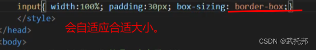
bsx-size
盒尺寸,可以改变盒子模型的展示形态。
默认值:content-box: width、height->content
border-box: width.height -content padding border(三个区域均分)

"en"> "UTF-8"> "viewport" content="width=device-width, initial-scale=1.0"> "X-UA-Compatible" content="ie=edge">Document "box1">"box2">- 1
- 2
- 3
- 4
- 5
- 6
- 7
- 8
- 9
- 10
- 11
- 12
- 13
- 14
- 15
- 16
- 17
- 18
- 19
- 20
- 21
- 22
- 23
- 24
- 25
- 26
- 27
- 28
Document 这是一些内容盒子案例
Document "box1">"box2">"box3">"box4">"box5">"box6">- 1
- 2
- 3
- 4
- 5
- 6
- 7
- 8
- 9
- 10
- 11
- 12
- 13
- 14
- 15
- 16
- 17
- 18
- 19
- 20
- 21
- 22
- 23
- 24
- 25
- 26
- 27
- 28
- 29
- 30
- 31
margin叠加问题
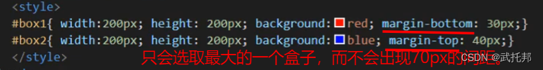
当给两个盒子同时添加上下外边距的时候,就会出现叠加的问题。这个问题只在上下有,左右是没有这个叠加问题的。
解决方案:
只给一个元素添加间距。

扩展
matgin自适应
他可以自动的适应浏览器。
上下不可以,左右可以。

不设置宽(content盒子)。

marge传递问题

解决方法:
给父元素加边框。标签分类
按类型
block:div、p、ul、1i、h1…
1.独占一行
2.支持所有样式(颜色,大小等等)
3,不写宽的时候,跟父元素的宽相同(body相同)
4.所占区域是一个矩形
inline:span、a、em、strong、img
1.挨在一起的(中间有间隙)
2.有些样式不支持,例如:width、height、margin、padding
3.不写宽的时候,宽度由内容决定(没有内容不显示)
4.所占的区域不一定是矩形(会随着浏览器的页面大小改变)
5.内联标签之间会有空隙,原因:换行产生的
inline-block input,select …
1.挨在一起,但是支持宽高
注:布局一般用块标签,修饰文本一般用内联标签按内容
Flow:流内容
Metadata:元数据
Sectioning:分☒
Heading:标题
Phrasing:措辞
Embedded:嵌入的
Interactive:互动的

按显示
;替换元素 靠元素改变样式。 img图片上是inline类型,不过支持宽高。 <ing src="./img/1.ipg" alt=""> <input type="checkbox"> <input type="text"> 非替换元素 <hi>标签hi> 直接显示- 1
- 2
- 3
- 4
- 5
- 6
- 7
- 8
- 9
- 10
```cssDocument "./img/1.jpg" alt="">
- 1
- 2
- 3
- 4
- 5
- 6
- 7
- 8
- 9
- 10
- 11
- 12
- 13
- 14
- 15
- 16
- 17
- 18
- 19
- 20
- 21
- 22
- 23
- 24
- 25
- 26
- 27
- 28
- 29
- 30
- 31
- 32
- 33
- 34
- 35
- 36
- 37
- 38
### 显示框类型(改变元素原有类型) div{width:100px;height:100px;background:red;display:inline;} span{width:100px;height:100px;background:red;display:block;} 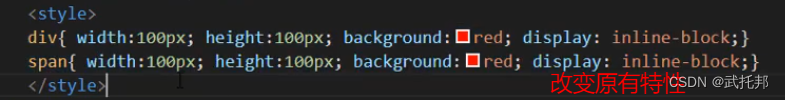 diaplay:none;//不显示任何内容。(而且不占空间的) 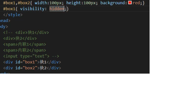 display:block inline inline-block none .. 区别: display:none 不占空间的隐藏 visibility:hidden占空间的隐藏 ```cssDocument 块1块2- 1
- 2
- 3
- 4
- 5
- 6
- 7
- 8
- 9
- 10
- 11
- 12
- 13
- 14
- 15
- 16
- 17
- 18
- 19
- 20
- 21
- 22
- 23
- 24
- 25
- 26
- 27
- 28
- 29
- 30
- 31
- 32
- 33
- 34
- 35
- 36
- 37
- 38
- 39
- 40
- 41
- 42
- 43
- 44
标签嵌套
ul、1i dl、dt、dd table、tr、td 块能够嵌套内联 <div> <span>span> <a href="#">a> div> 块嵌套块 <div> <div>div> div> 特殊: 错误的写法: <p> <div>div> p> 内联是不能嵌套块 错误的 <span> <div>div> span> 特殊: 正确的写法: <a href="#"> <div>div> a> a不可以嵌套a- 1
- 2
- 3
- 4
- 5
- 6
- 7
- 8
- 9
- 10
- 11
- 12
- 13
- 14
- 15
- 16
- 17
- 18
- 19
- 20
- 21
- 22
- 23
- 24
- 25
- 26
- 27
- 28
溢出隐藏
滚动条
<style> /div{width:300px;height:200px;border:1px black solid;overflow:hidden;}* /div{width:300px;height:200px;border:1px black solid;overflow:scroll;}* /div{width:300px;height:200px;border:1px black solid;overflow:auto;* div{width:300px;height:200px;border:1px black solid;overflow-y:auto;} style>- 1
- 2
- 3
- 4
- 5
- 6
"en"> "UTF-8"> "viewport" content="width=device-width, initial-scale=1.0"> "X-UA-Compatible" content="ie=edge">Document 溢出隐藏 溢出隐藏 溢出隐藏 溢出隐藏 溢出隐藏 溢出隐藏 溢出隐藏 溢出隐藏 溢出隐藏 溢出隐藏 溢出隐藏 溢出隐藏 溢出隐藏 溢出隐藏 溢出隐藏 溢出隐藏 溢出隐藏 溢出隐藏 溢出隐藏 溢出隐藏 溢出隐藏 溢出隐藏 溢出隐藏 溢出隐藏 溢出隐藏 溢出隐藏 溢出隐藏 溢出隐藏 溢出隐藏 溢出隐藏 溢出隐藏 溢出隐藏 溢出隐藏 溢出隐藏 溢出隐藏 溢出隐藏 溢出隐藏 溢出隐藏 溢出隐藏 溢出隐藏 溢出隐藏 溢出隐藏 溢出隐藏 溢出隐藏 溢出隐藏 溢出隐藏 溢出隐藏 溢出隐藏 溢出隐藏 溢出隐藏 溢出隐藏 溢出隐藏 溢出隐藏 溢出隐藏 溢出隐藏 溢出隐藏 溢出隐藏 溢出隐藏 溢出隐藏 溢出隐藏- 1
- 2
- 3
- 4
- 5
- 6
- 7
- 8
- 9
- 10
- 11
- 12
- 13
- 14
- 15
- 16
- 17
- 18
- 19
- 20
- 21
- 22
- 23
- 24
- 25
- 26
- 27
- 28
- 29
- 30
- 31
- 32
透明度与首饰

不过会导致所有的子内容都变得透明,于是用rgba;

手势:当鼠标移上标记位置的时候,鼠标旁边会出现不同的,只是叫做手势。

但有时候觉得系统给的手势太丑了。可以用图片自定义。
总结:- opacity:0(透明)~1(不透明)0.5(半透明)
注:占空间、所有的子内容也会透明 - rgba():0 1
注:可以让指定的样式透明,而不影响其他样式 - cursor:手势
default:默认箭头
要实现自定义手势:
准备图片:.cur、.ic0
cursor url(./img/cursor.ico),auto;
Document "div1">这是一个块这是一个段落
"div2">这又是一个块- 1
- 2
- 3
- 4
- 5
- 6
- 7
- 8
- 9
- 10
- 11
- 12
- 13
- 14
- 15
- 16
- 17
- 18
- 19
- 20
- 21
- 22
最大和最小宽高

min-height同理。

min-width min-height
max-width max-height
%单位:换算->已父容器的大小进行换算的"en"> "UTF-8"> "viewport" content="width=device-width, initial-scale=1.0"> "X-UA-Compatible" content="ie=edge">Document "box1">"box2">- 1
- 2
- 3
- 4
- 5
- 6
- 7
- 8
- 9
- 10
- 11
- 12
- 13
- 14
- 15
- 16
- 17
- 18
- 19
- 20
- 21
- 22
- 23
- 24
- 25
- 26
- 27
- 28
- 29
- 30
- 31
- 32
- 33
- 34
- 35
- 36
- 37
- 38
- 39
- 40
- 41
- 42
- 43
- 44
- 45
- 46
- 47
- 48
- 49
- 50
- 51
css默认样式
只要看浏览器的盒子模型。是否有值。
没有默认样式的:div、span
有默认样式的:
body -marign 8px
h1->margin:上下21.440px
font-weight bold
p->margin:上下16px
margin:上下16px
padding:左4ow
默认点:list-style:disc
a->text-decoration:underline;
因为有些默认样式会影响到我们正常开关,所以要去掉。.所以有了reset。"en"> "UTF-8"> "viewport" content="width=device-width, initial-scale=1.0"> "X-UA-Compatible" content="ie=edge">Document - 1
- 2
- 3
- 4
- 5
- 6
- 7
- 8
- 9
- 10
- 11
- 12
- 13
- 14
- 15
- 16
- 17
- 18
- 19
- 20
- 21
- 22
- 23
- 24
- 25
- 26
- 27
- 28
- 29
- 30
- 31
- 32
- 33
css reset

css reset
*{margin:0;padding:0;} 相当于全局变量。 优点:不用考虑哪些标签有默认的margin和padding 缺点:稍微的影响性能
指定种类
body,p,h1,ul{margin:0;padding:0;} ul{list-style none;}
a{text-decoration:none;color:#999;} img{dispaly:block}问题的现象:图片跟容器底部有一些空隙。 内联元素的对齐方式是按照文字基线对齐的,而不是文字底线对齐的。
vertical-align:baseline;基线对齐方式,
默认值 img{vertical-align:bottom;}解决方式是推荐的。ps
快捷键:
ctrl+r:显示隐藏标尺
在标尺上可以拖拽参考线
可以通过移动工具拖拽回去,也可以在视图菜单中选择清除所有的参考线
图层中的小眼睛可以对当前图层进行显示隐藏
alt+滚轮:可以对图片进行放大缩小
png等图片的切图流程:
1.通过矩形选框工具,选择指定的区域
微调:alt减少区域shift增加区域上下左右键进行微调
利用参考线记录量取的位置,以便以后测量其他的值
2.ctr1+c:复制图层
3.ctrl+n:新建图层
4.ctr1+v:粘贴图层
5.存储为web格式
png等图片切图流程
矩形选框选取区域
ctrl c
ctrl n
ctrl v"en"> "UTF-8"> "viewport" content="width=device-width, initial-scale=1.0"> "X-UA-Compatible" content="ie=edge">Document - 1
- 2
- 3
- 4
- 5
- 6
- 7
- 8
- 9
- 10
- 11
- 12
- 13
- 14
- 15
- 16
- 17
- 18
- 19
- 20
- 21
- 22
- 23
- 24
- 25
- 26
- 27
- 28
- 29
- 30
- 31
- 32
- 33
新浪练习
Document "main">"#">探索趣图
- "first-line"> "#">测试文字测试文字测试文字
- "#">测试文字测试文字测试文字
- "#">测试文字测试文字测试文字
- 1
- 2
- 3
- 4
- 5
- 6
- 7
- 8
- 9
- 10
- 11
- 12
- 13
- 14
- 15
- 16
- 17
- 18
- 19
- 20
- 21
- 22
- 23
- 24
- 25
- 26
- 27
- 28
- 29
- 30
- 31
- 32
- 33
- 34
- 35
- 36
- 37
- 38
- 39
- 40
- 41
- 42
- 43
- 44
- 45
- 46
- 47
- 48
- 49
- 50
- 51
浮动

相当于浮动的在更高的地方。不在包里面。
脱离文档流,延迟父容器靠左或靠右进行排列。
left、right、none
f1oat注意点
只会影响后面的元素。
内容默认提升半层,比如说文字等等。
默认宽根据内容决定。
换行排列,会自动。
主要给块元素添加,但也可以给内联元素添加。Document "box1">"box2">- 1
- 2
- 3
- 4
- 5
- 6
- 7
- 8
- 9
- 10
- 11
- 12
- 13
- 14
- 15
- 16
- 17
- 18
- 19
浮动注意点
"en"> "UTF-8"> "viewport" content="width=device-width, initial-scale=1.0"> "X-UA-Compatible" content="ie=edge">Document - 1
- 2
- 3
- 4
- 1
- 2
- 3
- 4
- 5
- 6
- 7
- 8
- 9
- 10
- 11
- 12
- 13
- 14
- 15
- 16
- 17
- 18
- 19
- 20
- 21
- 22
- 23
- 24
- 25
- 26
- 27
- 28
- 29
- 30
- 31
- 32
- 33
- 34
- 35
- 36
- 37
清除浮动
(相当于抵制浮动带来的原有影响,(还在块里面))
上下排列:clear属性,
表示清除浮动的,left、right、both
嵌套排列:固定宽高
不推荐,不能把高度固定死,不适合做自适应的效果。
父元素浮动:不推荐,因为父容器浮动也会影响到后面的元素。
overflow:hidden(BFC规范),如果有子元素想溢出,那么会受到影响。
display:inline-block(BFc规范),不推荐,父容器会影响到后面的元素。
设置空标签:不推荐,会多添加一个标签。
after伪类:推荐,是空标签的加强版,目前各大公司的做法。

"en"> "UTF-8"> "viewport" content="width=device-width, initial-scale=1.0"> "X-UA-Compatible" content="ie=edge">Document "box1" class="clear">aaaaaaa"box2">- 1
- 2
- 3
- 4
- 5
- 6
- 7
- 8
- 9
- 10
- 11
- 12
- 13
- 14
- 15
- 16
- 17
- 18
- 19
- 20
- 21
- 22
- 23
- 24
- 25
- 26
- 27
- 28
- 29
- 30
- 31
- 32
- 33
- 34
- 35
- 36
- 37
- 38
浮动练习
Document "main">"title">外媒评论精选
- "clear">
"l pic"> "#">"l content">
测试标题测试标题
测试段落测试段落测试段落测试段落测试段落测试段落测试段落测试段落测试段落... "#">[详细]
- "clear">
"l pic"> "#">"l content">
测试标题测试标题
测试段落测试段落测试段落测试段落测试段落测试段落测试段落测试段落测试段落... "#">[详细]
- "clear">
"l pic"> "#">"l content">
测试标题测试标题
测试段落测试段落测试段落测试段落测试段落测试段落测试段落测试段落测试段落... "#">[详细]
- 1
- 2
- 3
- 4
- 5
- 6
- 7
- 8
- 9
- 10
- 11
- 12
- 13
- 14
- 15
- 16
- 17
- 18
- 19
- 20
- 21
- 22
- 23
- 24
- 25
- 26
- 27
- 28
- 29
- 30
- 31
- 32
- 33
- 34
- 35
- 36
- 37
- 38
- 39
- 40
- 41
- 42
- 43
- 44
- 45
- 46
- 47
- 48
- 49
- 50
- 51
- 52
- 53
- 54
- 55
- 56
- 57
- 58
- 59
- 60
- 61
- 62
- 63
- 64
- 65
- 66
- 67
- 68
- 69
- 70
- 71
- 72
- 73
- 74
- 75
- 76
- 77
- 78
- 79
- 80
- 81
- 82
- 83
position


-
相关阅读:
【C语言基础】:深入理解指针(终篇)
50天50个前端小项目(纯html+css+js)第八天(形成波浪动画结合登录表单)
鸿蒙 harmonyos 线程 并发 总结 async promise Taskpool woker(二)多线程并发 Taskpool
怒刷LeetCode的第11天(Java版)
2183440-36-8,APN-C3-PEG4-alkyne 性能稳定功能连接体
Seata四大模式之XA模式详解及代码实现
智能终端信息安全概念(四):硬件安全技术—主芯片安全技术(2)
基于改进莱维飞行和混沌映射的粒子群优化BP神经网络预测股票价格研究(Matlab代码实现)
mysql高级篇
【LeetCode-中等】343. 整数拆分(详解)
- 原文地址:https://blog.csdn.net/m0_62953927/article/details/125992320
