-
【纯css】实现无限滚动循环组件,无js
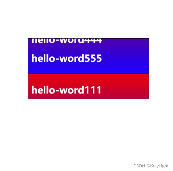
实现原理是两个一样内容的div的transform css动画。
把背景图片改成透明可能更加好看一些没有css动画产生的裂缝。
- <!DOCTYPE html>
- <html lang="en">
- <head>
- <meta charset="UTF-8">
- <title>Title</title>
- <style>
- .view{
- display: block;
- height: 200px;
- width: 400px;
- border: 1px solid black;
- overflow: hidden;
- position: absolute;
- left: 400px;
- top: 200px;
- }
- .view>.page{
- animation: dot linear 3s infinite;
- /*border: 1px solid black;*/
- /*border-bottom: 1px solid black;*/
- height: auto;
- padding: 10px;
- color: white;
- box-sizing: border-box;
- background-image: linear-gradient(red,blue);width: 100%;
- }
- @keyframes dot {
- 0%{
- transform: translateY(0);
- }100%{
- transform: translateY(-100%);
- }
- }
- </style>
- </head>
- <body>
- <div class="view">
- <div class="page" style="">
- <h1>hello-word111</h1>
- <h1>hello-word222</h1>
- <h1>hello-word333</h1>
- <h1>hello-word444</h1>
- <h1>hello-word555</h1>
- </div>
- <div class="page" style="">
- <h1>hello-word111</h1>
- <h1>hello-word222</h1>
- <h1>hello-word333</h1>
- <h1>hello-word444</h1>
- <h1>hello-word555</h1>
- </div>
- </div>
- </body>
- </html>
-
相关阅读:
vue项目 自己封装的组件没有发布npm如何在其他项目使用及组件如何注册
XML详解--语法、DTD、schema
图片太大,怎么压缩图片大小?
Springboot-实现防重复提交功能
网络基础-ICMP协议
面对史上最难求职季,哪些测试技能更容易拿到offer?
中国电子学会2023年09月份青少年软件编程Scratch图形化等级考试试卷四级真题(含答案)
ESP32C3 LuatOS TM1650②动态显示累加整数
torchvision中数据集的使用
Java多线程
- 原文地址:https://blog.csdn.net/qq_33014695/article/details/125536545
